
Do you want to make your bedroom a beautiful and peaceful haven in 2025? The bedroom color trends of this year are a mix of calm and statement colors, where peaceful and modern elegance are united. However, what colors are you supposed to adopt to ensure that your bedroom is not only fashionable but also practical? In this article, I will take you through the most inspiring and contemporary bedroom colors, their effect on interior design, and how you can use them to create your dream bedroom.
Whether it is the coolness of blues and greens to the warm embrace of cocoa brown and champagne gold, I will demonstrate how to use these colors with intent and proportion. We will discuss considerate mixes of furniture, textural decoration, and clever plans to aid you in establishing a mood that suits your preference and requirements. No matter your style inclination, whether minimalist, dark glamour, or retro retro-revival, there is something here to suit all tastes and temperaments.
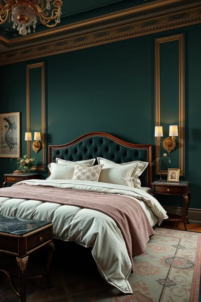
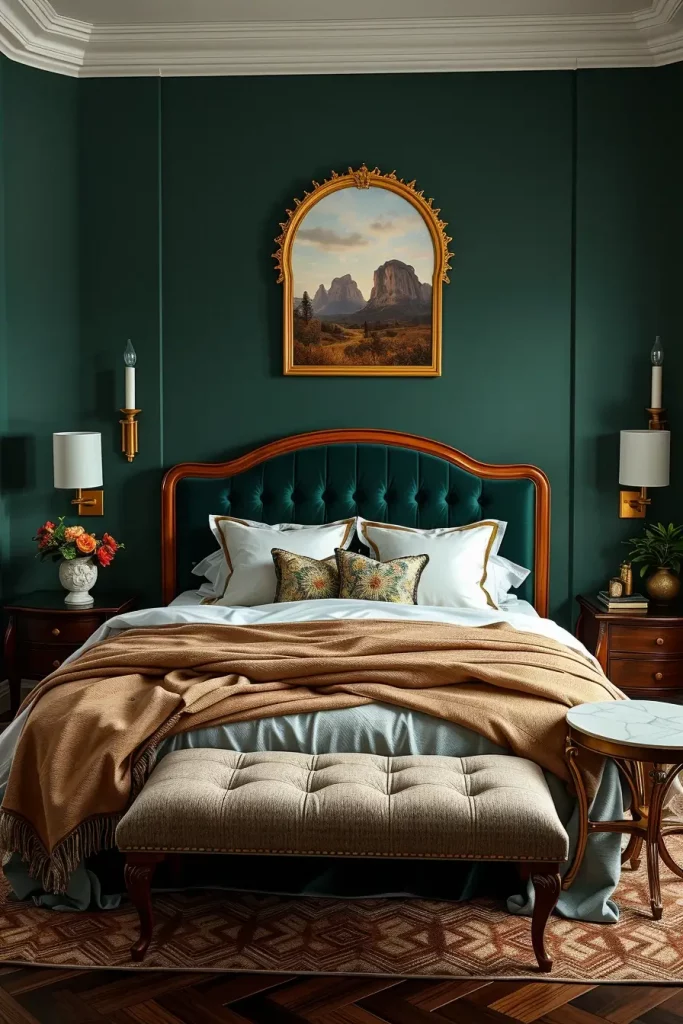
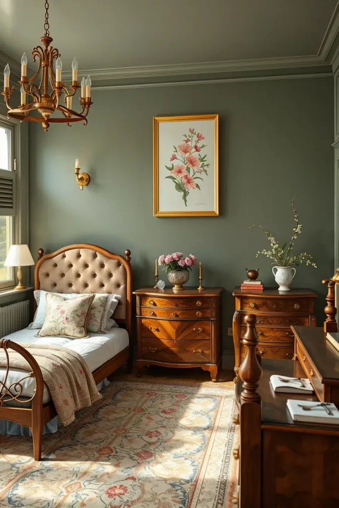
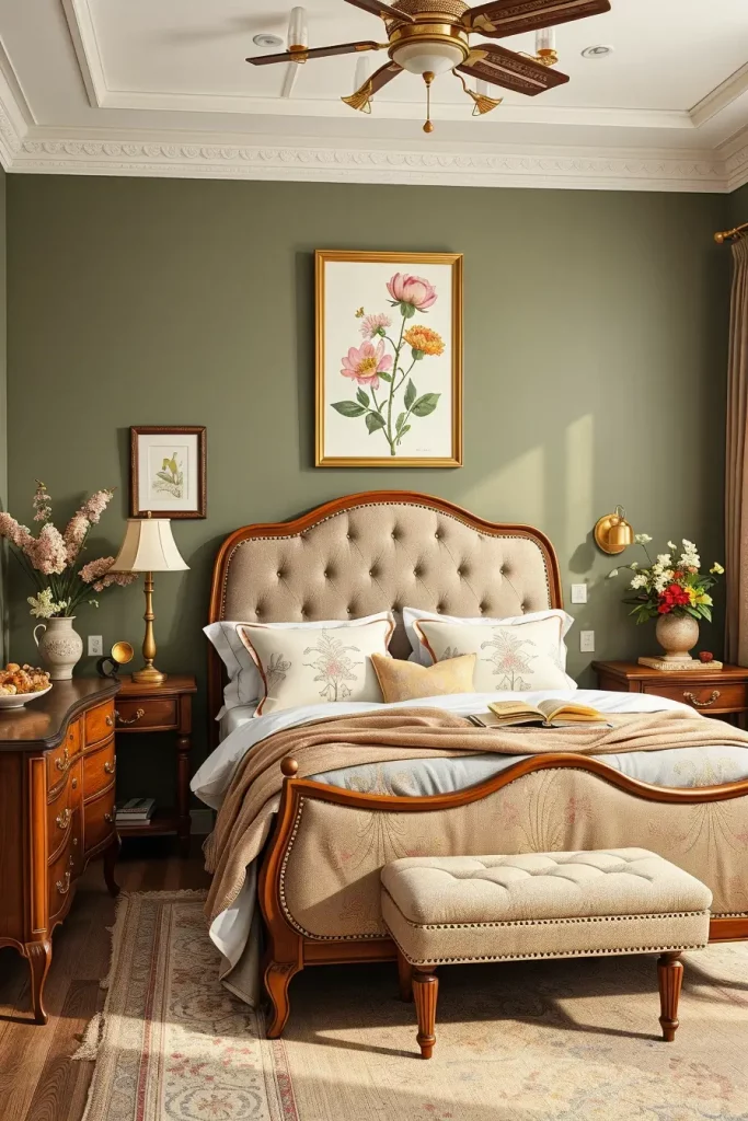
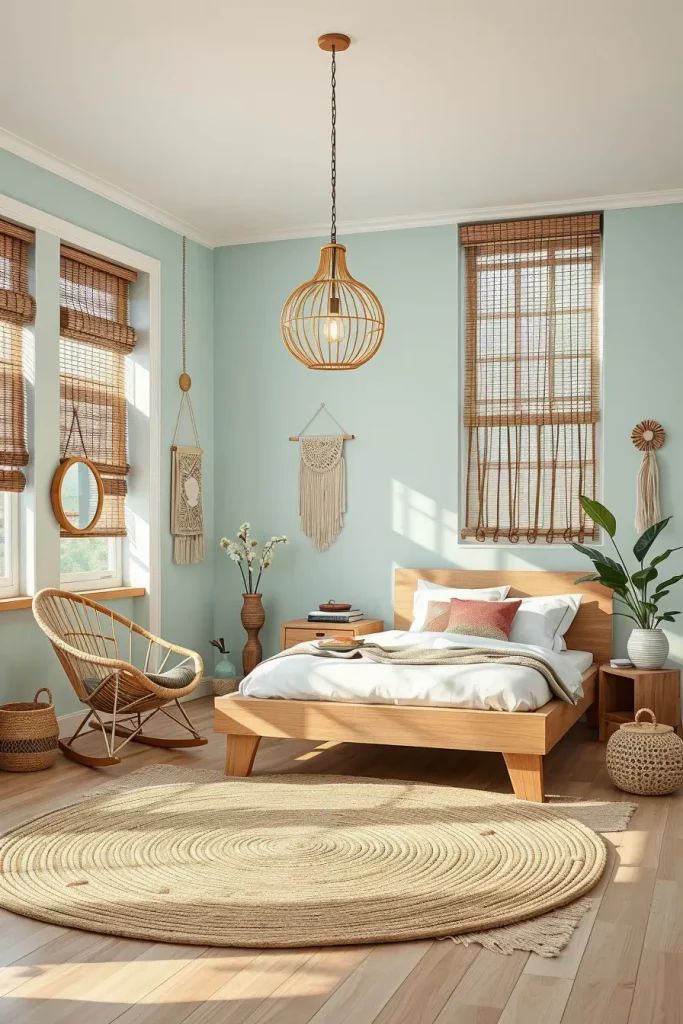
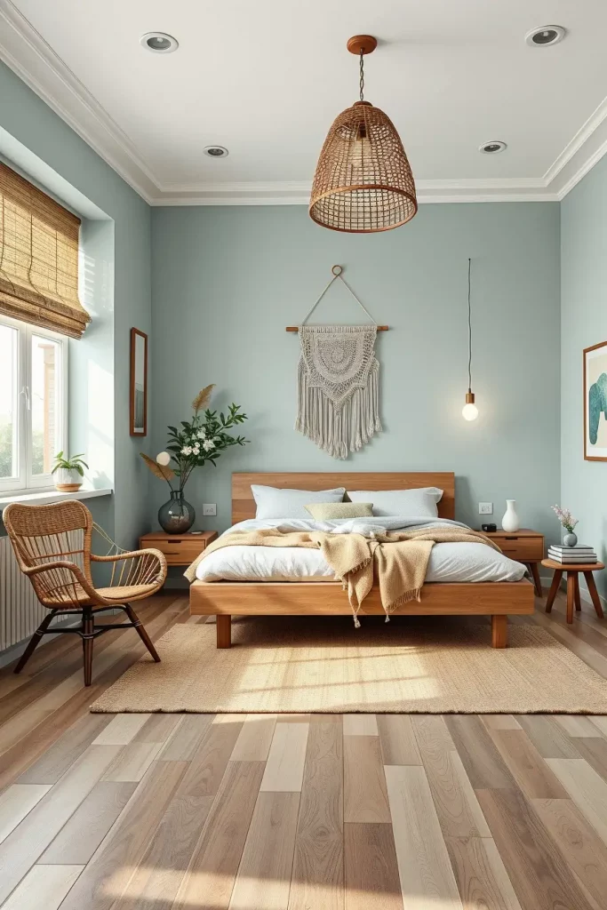
Earthy Tones Make a Calm Comeback
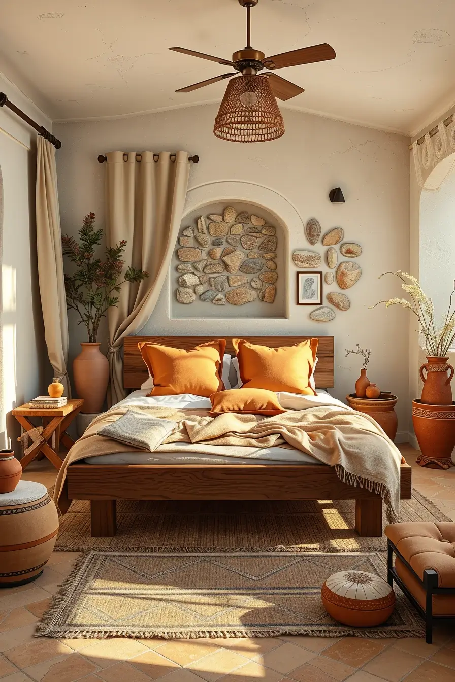
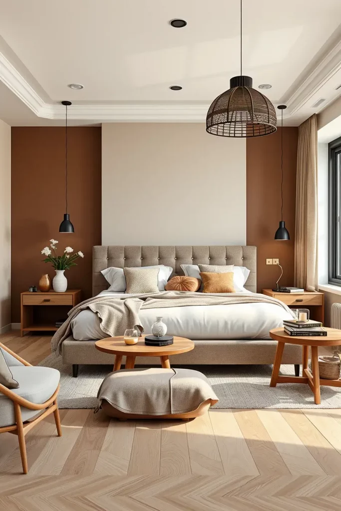
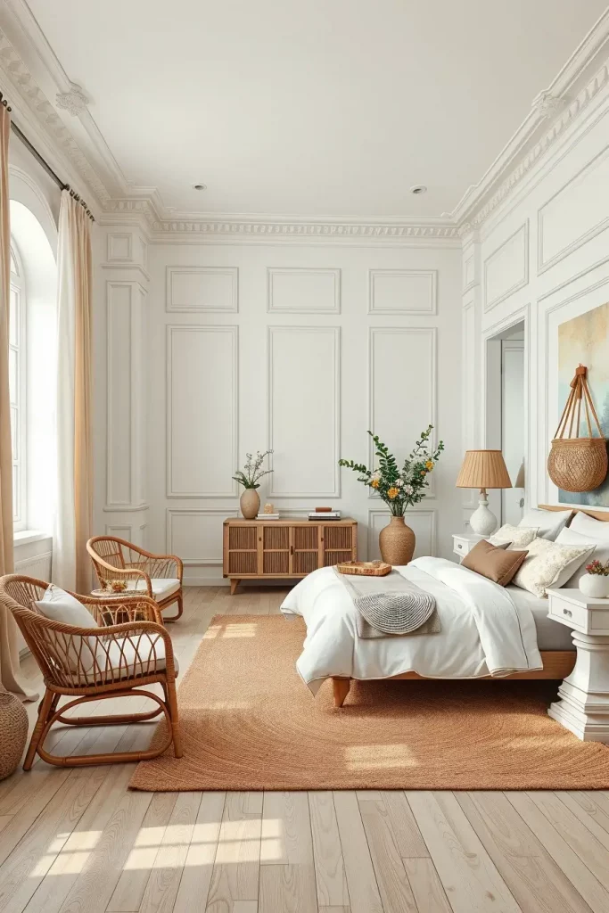
Earthy colors are again becoming the center of attention in 2025, bringing back the feeling of nature and grounding to bedroom design. I have observed that such shades as ochre, raw sienna, warm browns, and terracotta have become more and more popular in relaxing, biophilic-inspired interiors. These colors resemble the appearance of earth, clay, and sun-dried scenery, which gives a feeling of security and stability, and therefore, are ideal in the bedroom. They also make big or minimalistic spaces feel more personal and cocooned, which is the result of their natural richness.
When I am working with earthy colors, I tend to pair them with natural wood furniture, such as walnut bedframes or reclaimed wood nightstands, as well as natural fabrics, such as linen or wool in neutral colors. This is supplemented with accent pieces such as rattan lighting, terracotta pots, or handwoven jute rugs that do not interfere with the earth tones palette. These tones can also be mixed with the metallic accents, namely bronze and matte black, which create depth and contrast.
Professionally, I believe earthy colors are perfect to customers who want to have relaxing surroundings. According to Architectural Digest, this palette provides an ageless foundation to rustic and modern interior design and minimizes visual clutter and maximizes mental clarity. Natural lighting also blends perfectly with earthy colors and this can make the bedrooms appear more airy and spacious.
To take this trend to the next level, I would suggest using tactile wall finishes, clay paint or limewash in earthy tones. The natural appearance is reinforced by these finishes and provides a slight movement and shadow to the space, enriching the sensory impression of the color.
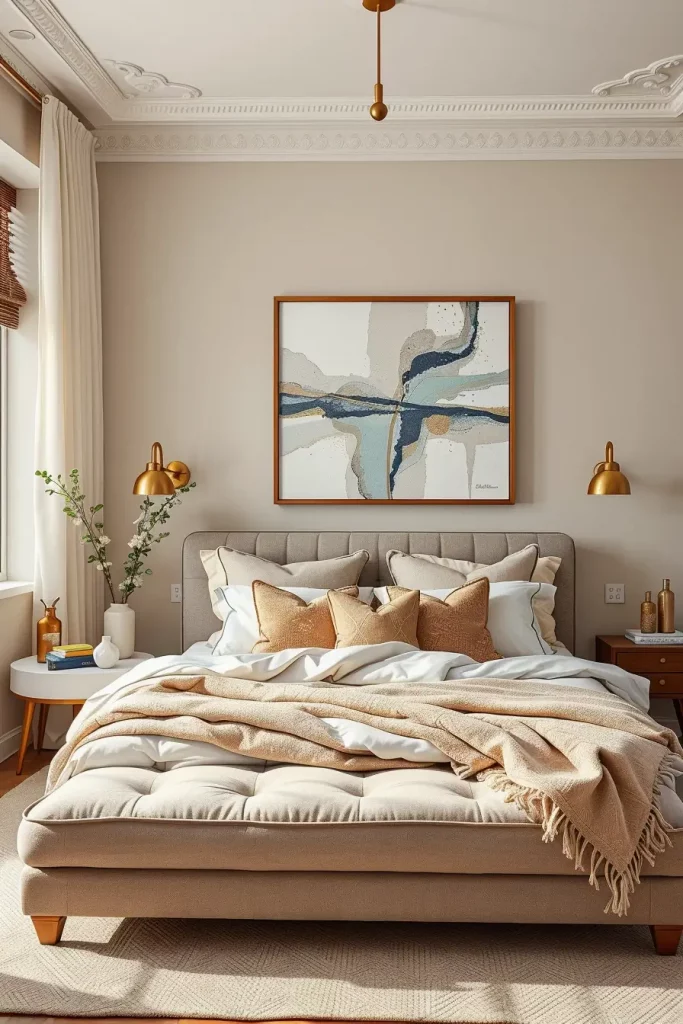
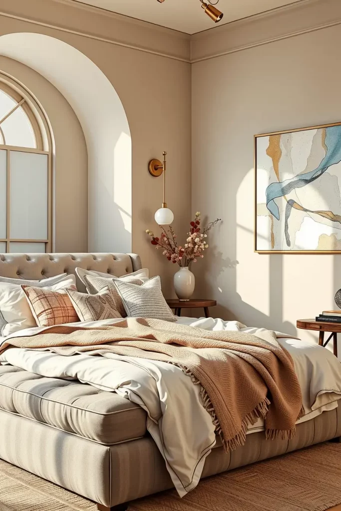
Warm Neutrals for Cozy Modern Spaces
Warm neutrals are also transitioning away from the simple beige to more subtle shades such as almond, soft mocha, and creamy latte. These shades, in my opinion, are the best combination of modern design and eternal comfort. They provide the comfort of classic interiors and they also balance out the straight lines of modern design. These neutrals bring a natural light to life and give a sophisticated softness to any bedroom decor.
I tend to advise warm neutrals on the walls to provide a harmonious background that will enable furniture and textiles to shine. There is a layered and breathable look of a light oatmeal wall, a low-profile caramel-colored upholstered bed, taupe wool throw blankets, and ivory drapes. The atmosphere is light but luxurious with floating shelves, plain wood dressers and plush area carpets in matching hues.
As an individual, I feel that warm neutrals are ideal in transitional design styles. I often use the concepts voiced by Elle Decor, which highlights the ability of warm neutrals to act as a flexible backdrop to the seasonal decoration and art. The trick to maintaining this trend is to add different textures, boucl e cushions, brushed cotton bedding, and ribbed ceramic lamps.
The one improvement that I would recommend to this trend is contrasting black or charcoal accents, either in the form of thin pendant lights or minimalistic side tables, to avoid making the look too soft or flat. This earthy touch gives the scene weight but does not overpower the serene mood.
Desert Beige and Clay for Organic Serenity
Soft clay and desert beige colors are inspired by dry landscapes and provide a calm sun-washed color scheme that is ideal to use in bedroom design. These tones especially help to make a cozy and calm getaway- which is perfect after a hard day. These colors have a down-to-earth, natural quality that is subtle and refined, with the reddish tones of clay and the earthiness of desert beige.
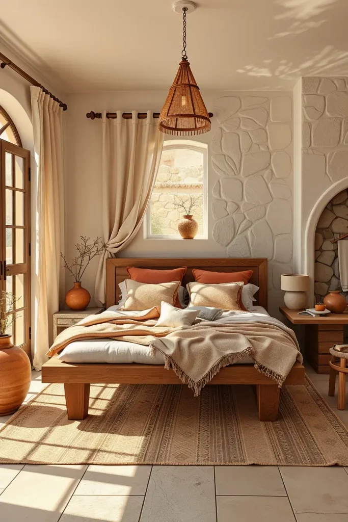
I prefer to combine these tones with low-profile, light wood platform beds, stoneware vases and light-filtering linen curtains in my projects. The color story is held together by accent pillows and wall decorations in shades of burnt orange or sandstone. Using natural materials such as caned wood and clay ceramics enhances the palette’s connection to the outdoors.

Stylistically speaking, I think desert beige and clay colors are very versatile. They are beautiful in a minimalist style but can also accommodate bohemian or Mediterranean elements. Dwell Magazine states that these grounded colors contribute to mindfulness and are becoming more popular in wellness-oriented design.
To take this aesthetic even further, I would recommend adding some textiles with desert patterns or incorporating natural stone on one accent wall to highlight the naturalistic quality of this color scheme. These touches transform the room into the exquisitely curated one.
Sage Green for a Restorative Escape
In 2025, sage green remains a powerful trend because it is relaxing and rejuvenating. This is a muted green that is soft and links us to nature but also provides a new twist on the classic bedroom palette. I usually advise people to place sage in their bedrooms as it helps to relax, concentrate and feel like nature is nurturing them. It is also flexible to use with light and dark accents and is thus practical and beautiful.
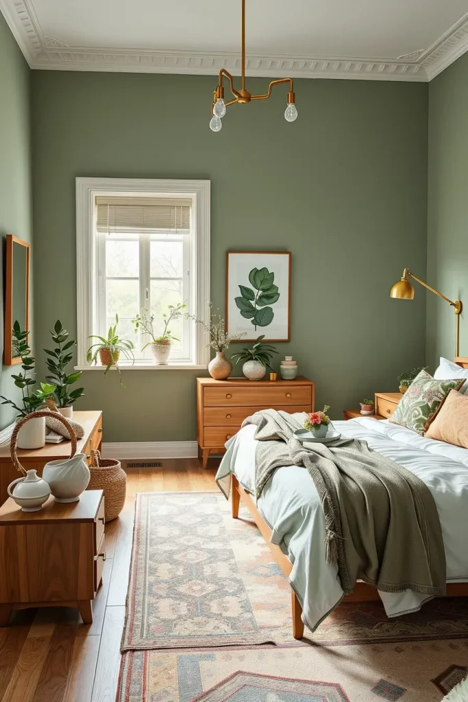
I usually design sage green walls with matte brass fittings, cream upholstered headboards and light oak mid century modern furniture. The palette is kept consistent with layered white and soft green bedding, and a soft light provided by frosted sconces provides a soft ambiance. I also add ceramic planters and accents in the shade of eucalyptus to support the botanical theme of the design.
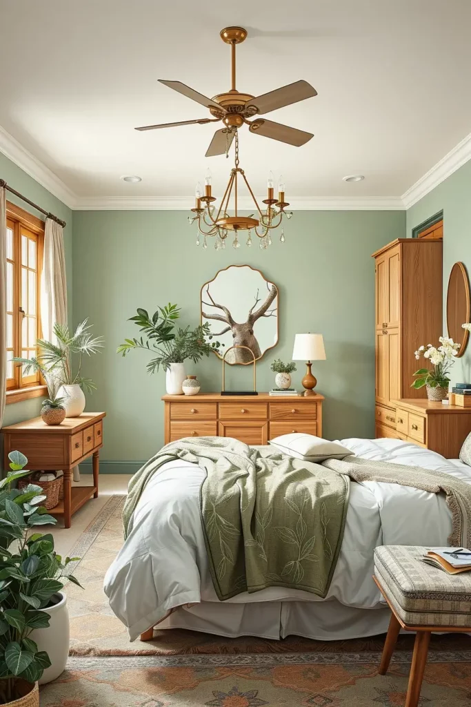
I think that the best color of the bedroom is sage green since it can easily fit the changing trends. House Beautiful has observed that sage can be applied as a foundation color or accent, and that it can be applied in small and large bedrooms because it has a mild saturation.
Should I elaborate on this palette, I would suggest to add some texture with a grasscloth wallpaper or a green velvet bench at the end of the bed. These touches add to the textural nature of the space and are in line with the calming nature of sage.
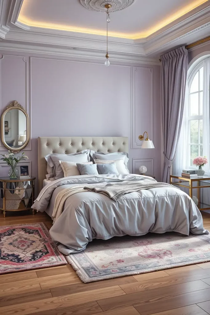
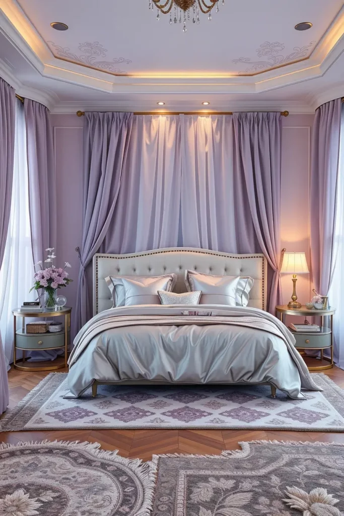
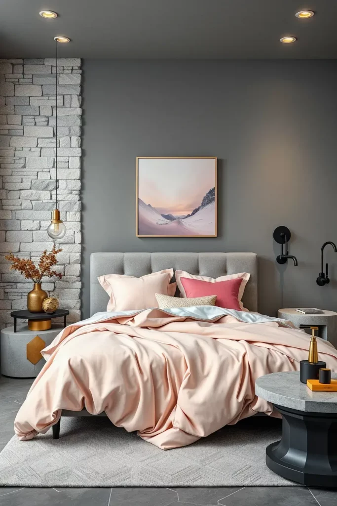
Dusky Rose as the New Neutral
The new neutral that is trending in 2025 is dusky rose, which is taking the place of beige in most design-savvy interiors. Its subtle pink undertones give it a warm touch without being too feminine to fit in all kinds of design tastes. I am discovering that dusky rose offers a warm, romantic setting that is nevertheless earthy and grown-up a great combination of qualities in a bedroom color trend.
I prefer to use plush materials such as velvet or suede when using dusky rose, especially on cushions or bench upholstery. The palette is not too pink because of white oak furniture and creamy accents. Adding rose-colored lamps or art that has blush in it adds an additional layer to the color without overpowering the room.
My professional judgment is that dusky rose creates a sense of calm and depth to minimalist areas. It is neutral and expressive at the same time, as Veranda Magazine states, and can be styled in many different ways. It is a place to go when one wants to find a relaxing place that is not sterile and boring.
I would finish this palette by adding a contemporary blush-colored mural or a light watercolor wallpaper to create a visual appeal to one of the walls. This gives it a sense of motion and makes the color dynamic, but soothing.
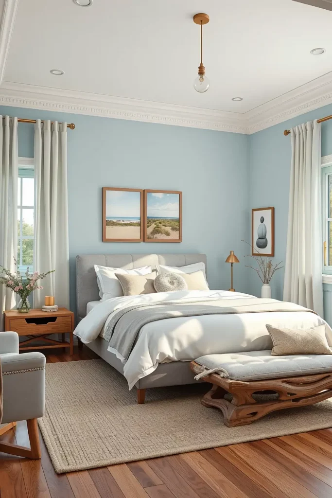
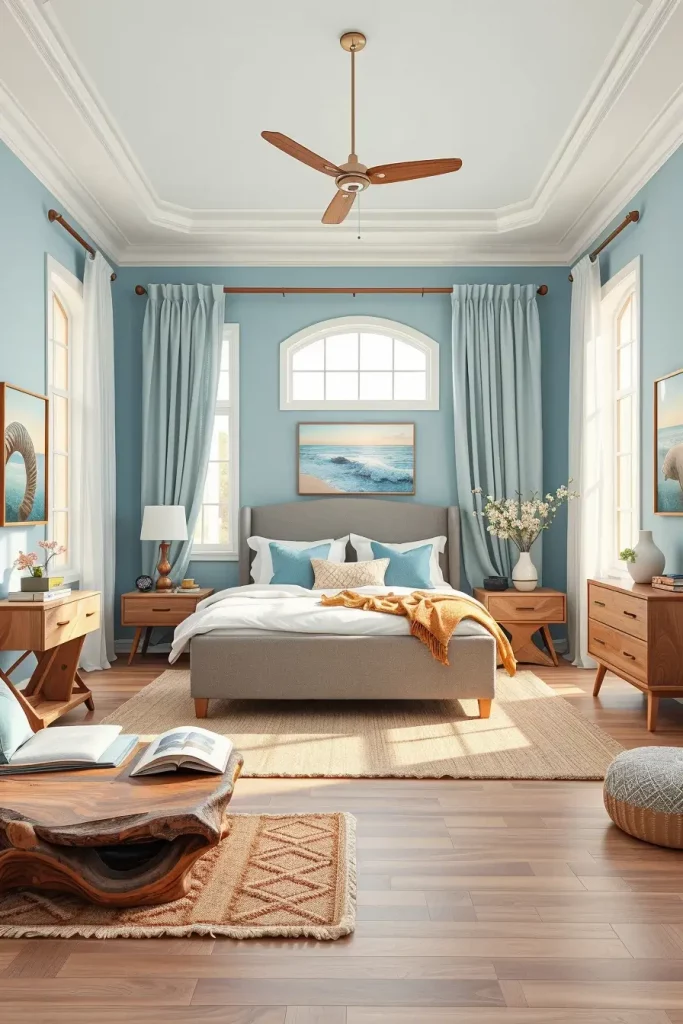
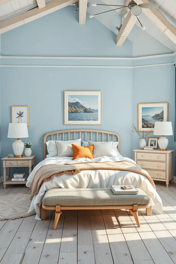
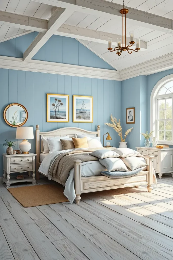
Sky Blue and Cloud White Pairing
The combination of sky blue and cloud white creates a light airy feeling to bedrooms in 2025. This color scheme is inspired by the open sky and the gentle daylight and uplifts the soul and makes the room visually larger. I usually recommend this color scheme when dealing with smaller bedrooms or homes that are inspired by the coast because it makes the space brighter and more tranquil.
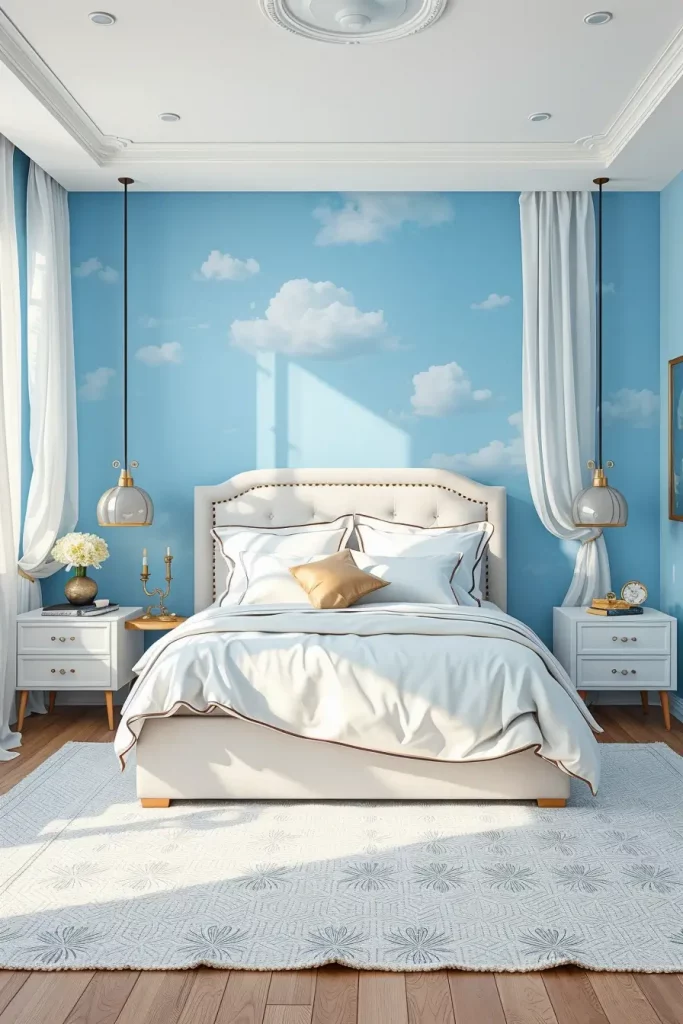
My favorite combination is a pale blue accent wall behind the bed, white bedding with blue trim, and floating nightstands in bleached wood. The look is kept clean and sophisticated with woven white baskets, glass vases, and modest silver touches. In the case of window treatments, sheer white curtains allow the natural light to wash over the room, adding to the ethereal quality of the colors.
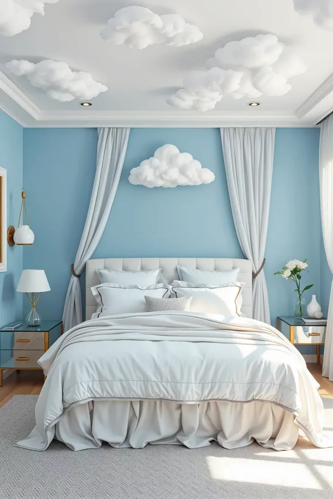
As an individual, I can say that this palette makes me think logically and stay emotionally stable. Better Homes & Gardens states that blue hues are calming and should be used in areas where relaxation and recharging are the most important. When they are combined with white, the room does not become heavy or dark.
To broaden this palette, you can add white ceiling molding to give architectural interest or a light blue ceiling to give an immersive effect. This also enhances the sky theme and intensifies the relaxing atmosphere.
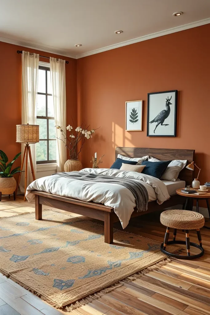
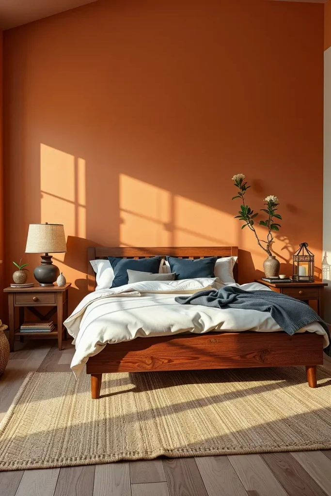
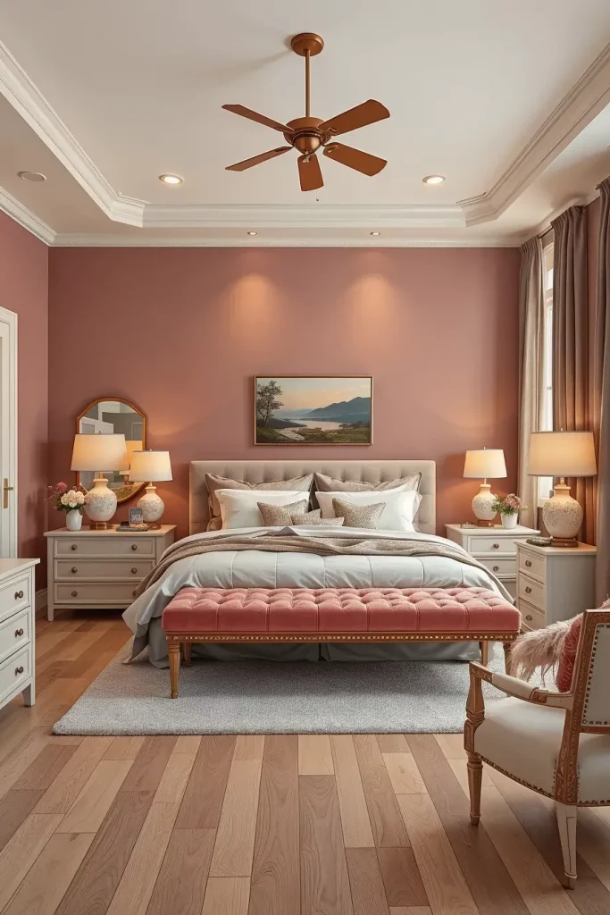
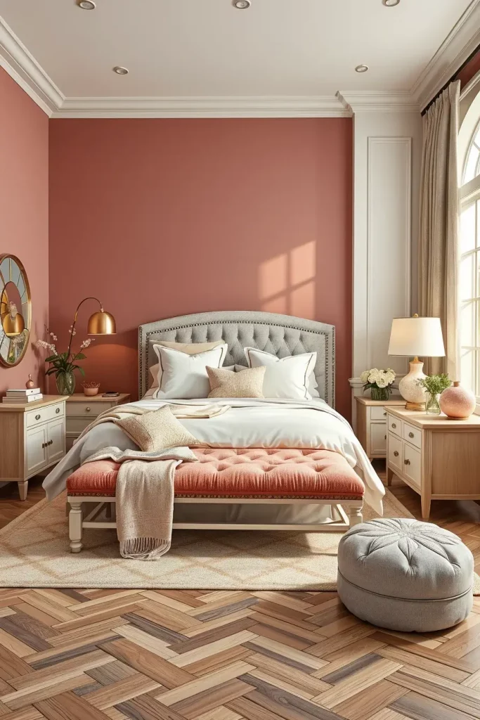
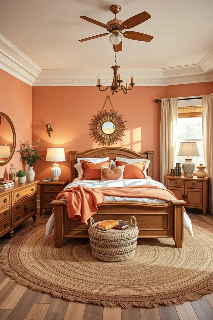
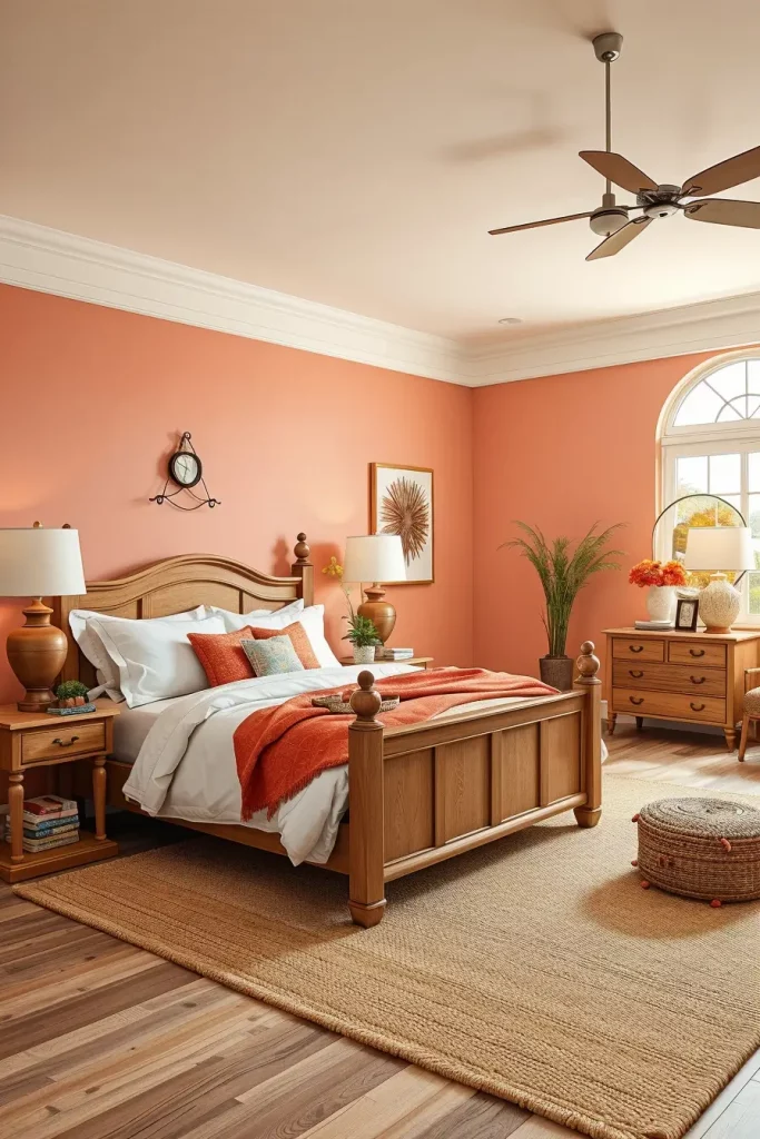
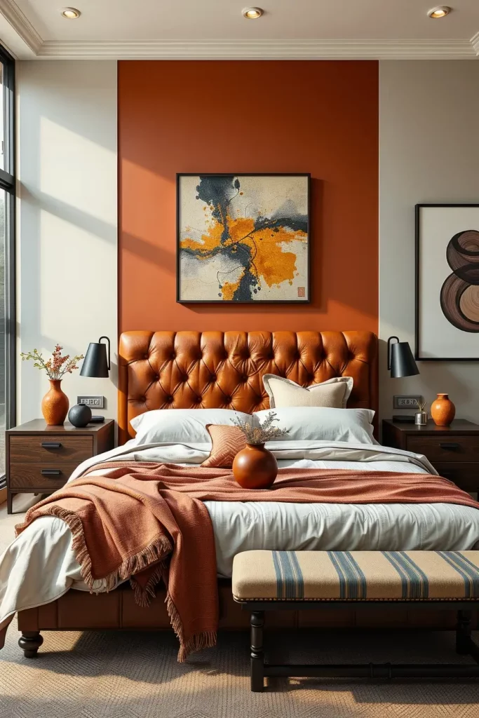
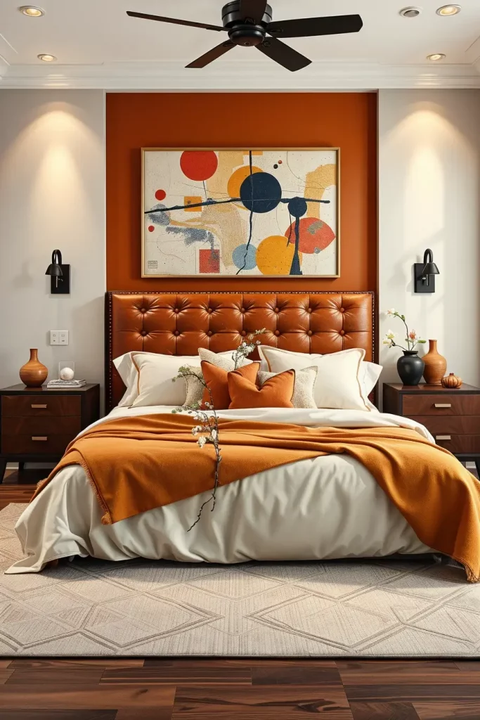
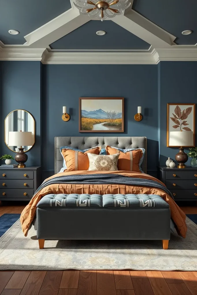
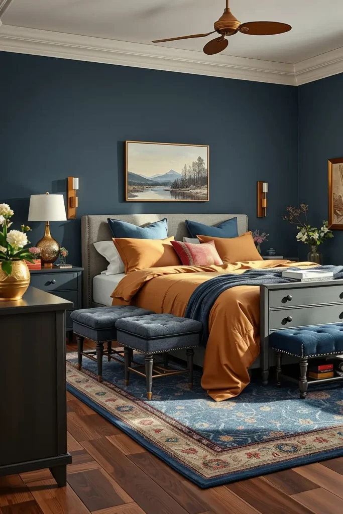
Rich Terracotta with Cream Accents
Rich terracotta is an audacious but classic color that gives depth and drama to any bedroom. Combined with cream accents, it still has a feeling of class and coziness. In large bedrooms, I think terracotta can work well, as its richness can be used to make it intimate and focused. The cream softens the aggressiveness and the retreat has a visual balance.
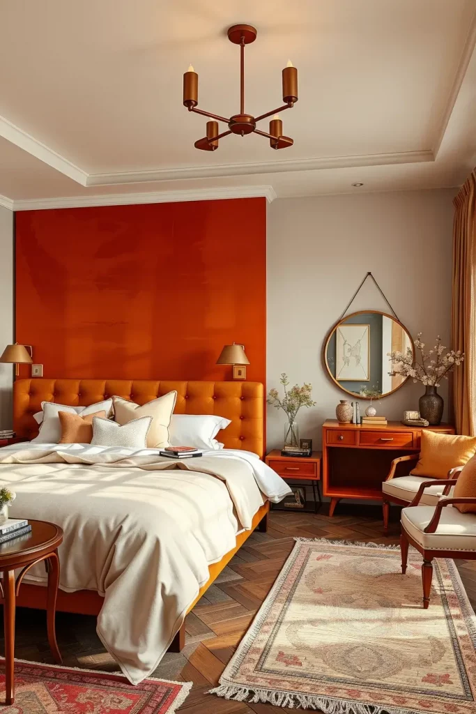
I adore terracotta on one feature wall usually behind the bed with matching cream-coloured bedding and textured throws. The setting is finished off with natural wood furniture that has reddish undertone, woven pendant lighting, and ivory area rugs. This palette is also enhanced by bronze or copper hardware to give it an earthy-luxurious look.
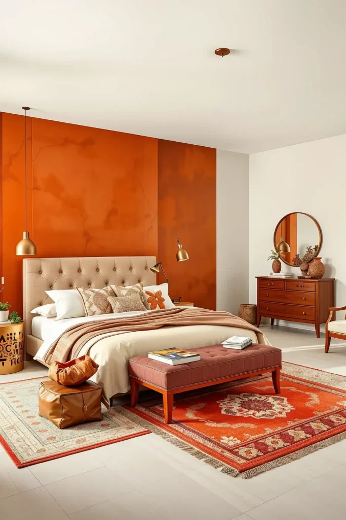
I think terracotta is a more mature way of using color, as opposed to the bright colors. Domino magazine has featured its revival in contemporary interiors due to its coziness and classic sense. It is popular with designers who want to combine the old and the new.
A piece of advice I would give is to add some terracotta-patterned wallpaper or textured plaster finishes to make the room look lived-in and artisanal. This additional depth of character can transform the room into a soulful one.
Soft Charcoal for Subtle Sophistication
Soft charcoal adds depth to a bedroom and does not overwhelm the senses. This color provides the drama of black and a hint of softness, so it can be used in large and small rooms alike. I discover that the walls made of soft charcoal also provide a grounding effect and promote restfulness but still feel refined. It is a flexible foundation on which one can layer textures and accents that show a mature taste.
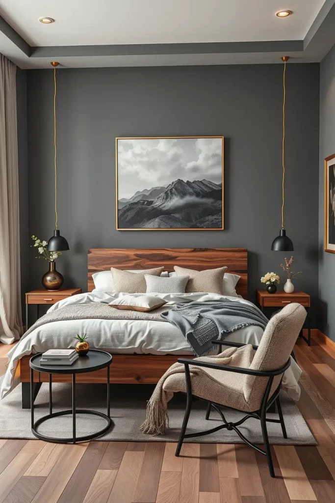
In a design where I would use this tone, I would combine it with creamy-white bedding, dark walnut or blackened steel bedframes and light-toned flooring to contrast it. The atmosphere is welcoming and accent lighting, such as warm white sconces or gold bedside lamps, is used. The charcoal background is a perfect contrast to artwork with grayscale or minimal linework, which adds to the modern aesthetic.
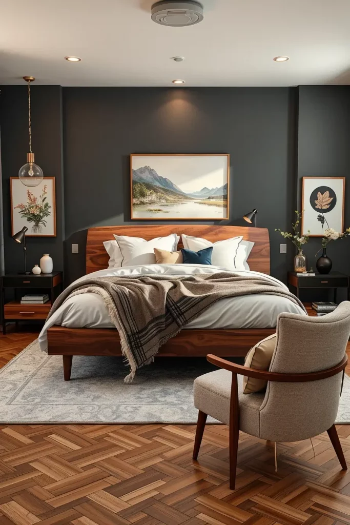
I have found that clients who desire a mature and hotel-like bedroom are attracted to this color. Luxe Interiors + Design refers to soft charcoal as one of the most sophisticated options of a moody and yet livable interior. It serves as a visual anchor and enables all the other elements to feel purposeful and edited.
To fill this room, I would suggest the use of texture, e.g. boucle chairs, velvet headboards, or matte stone decor, so that the room does not seem too flat or cold. The balance between darker colors depends on texture.
Lavender Fog for a Dreamy Effect
Lavender fog is a light cool purple with a misty overcoat that is surprising to become a trend in 2025 bedrooms. This playful color creates a sense of tranquility and peace of mind with a new twist to the conventional pastels. I frequently use this color when creating a design that is calm, dreamy, and not using the obvious neutrals when a client desires a tranquil environment.
I prefer to combine lavender fog with brushed nickel fixtures, light gray or silver bedding, and transparent side tables made of lucite or glass. There are soft carpets in powdery shades and gauzy lavender curtains that add to the ethereal feel. The color can be used on all four walls or as an accent behind the bed depending on how bold the client is.
Lavender fog is a novelty that is earthy. HGTV predicts that lavender hues will take over wellness and sleep-oriented design because they have a subtle effect on mood. It also works well with evening light, which makes the space look romantic and ambient.
The one thing I would recommend to make this room more special is the indirect light behind the floating headboard or along the perimeter of the ceiling. This enhances the misty effect and the floating serenity which is characteristic of the lavender fog.
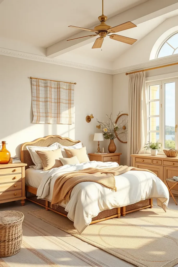
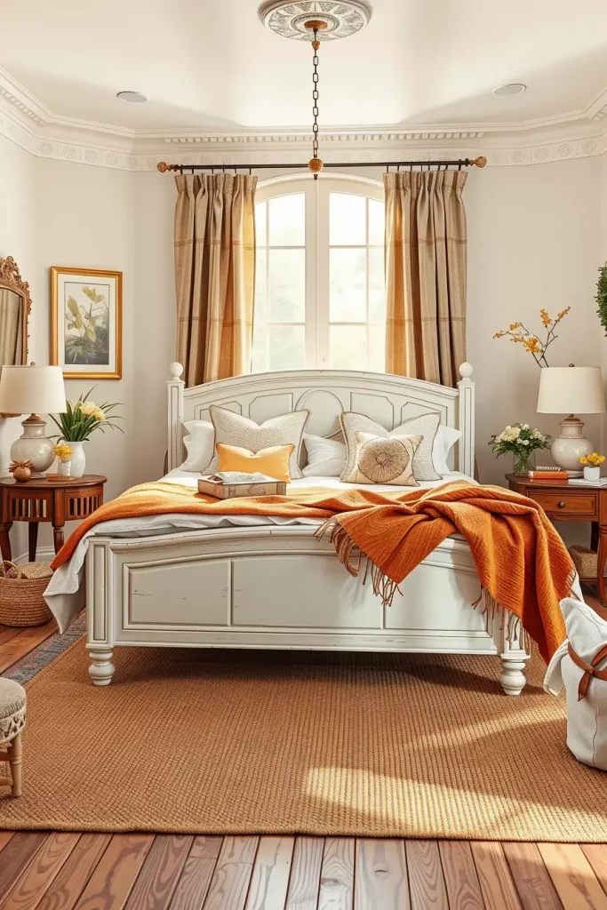
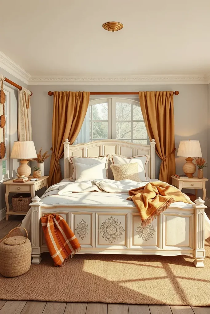
Golden Sand and Sun-Kissed Accents
Golden sand evokes the sun-kissed atmosphere of seaside holidays and introduces a holiday-like mood into the bedroom. This color trend is about optimism and easy luxury, two things that we will be seeing in the 2025 interiors. I personally love this tone because it immediately brings the vibe of a room up, but it also has a calming, stable foundation.
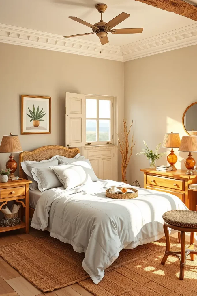
I usually apply golden sand to walls or bedding and combine it with light-colored wood furniture, linen fabrics, and natural materials such as cane, seagrass or driftwood. Amber glass lamps, brass knobs, or golden-colored wall art are the examples of sun-kissed accents that bring a luxurious shimmer to the palette. Off-white shades in light-filtering shades tone down the brightness of the room, making it restful.
In my career, I perceive golden sand as a major contributor to biophilic design, which incorporates nature-inspired colors and textures. According to Better Homes & Gardens, next year will be marked by sun-washed yellows that will characterize the happiest interiors. I think it is especially inspiring in bedrooms that have a lot of natural light.
In case I had to extend this idea, I would suggest including warm-toned abstract art or a sculptural headboard made of pale oak. These facts further the story of organic luxury without being too overwhelming.
Forest Green Depth for Grounded Bedrooms
Forest green is a very saturated color that creates a feeling of relaxation and grandeur of nature. In 2025, this tone has been established as a key to designing down-to-earth, cocooning bedrooms. I especially enjoy it in high ceiling rooms or large windowed rooms where it provides depth and shape without being overbearing.
I usually have forest green as a feature wall or in accessories such as velvet headboards, deep green linen bedding and plush armchairs. The combination of dark walnut dressers, or marble nightstands with brass fixtures makes the look upscale and serene. The room is not too dark because of ivory and soft beige accents.
I have observed the use of forest green in modern rustic and transitional interiors in my practice. House & Garden observes that it can bring about emotional serenity and provide a dramatic setting to more assertive accents. In my opinion, this tone is perfect to make a person feel like he/she is nested in his/her bedroom, particularly, in winter.
To further layer the visuals, I would recommend the use of a forest-green patterned wallpaper on the ceiling or behind built-in shelves. It is a surprising position that contributes to the immersive experience and character.
Muted Mustard for Contemporary Warmth
Muffled mustard is no longer the flashy yellow of yesterday, but is more sophisticated, sunburned and deep. This shade brings vintage-modern coziness to bedrooms that are in need of character. I tend to bring this color in the picture when the clients desire something unusual but familiar. It goes so well with neutral bases and provides an emotional boost of energy.
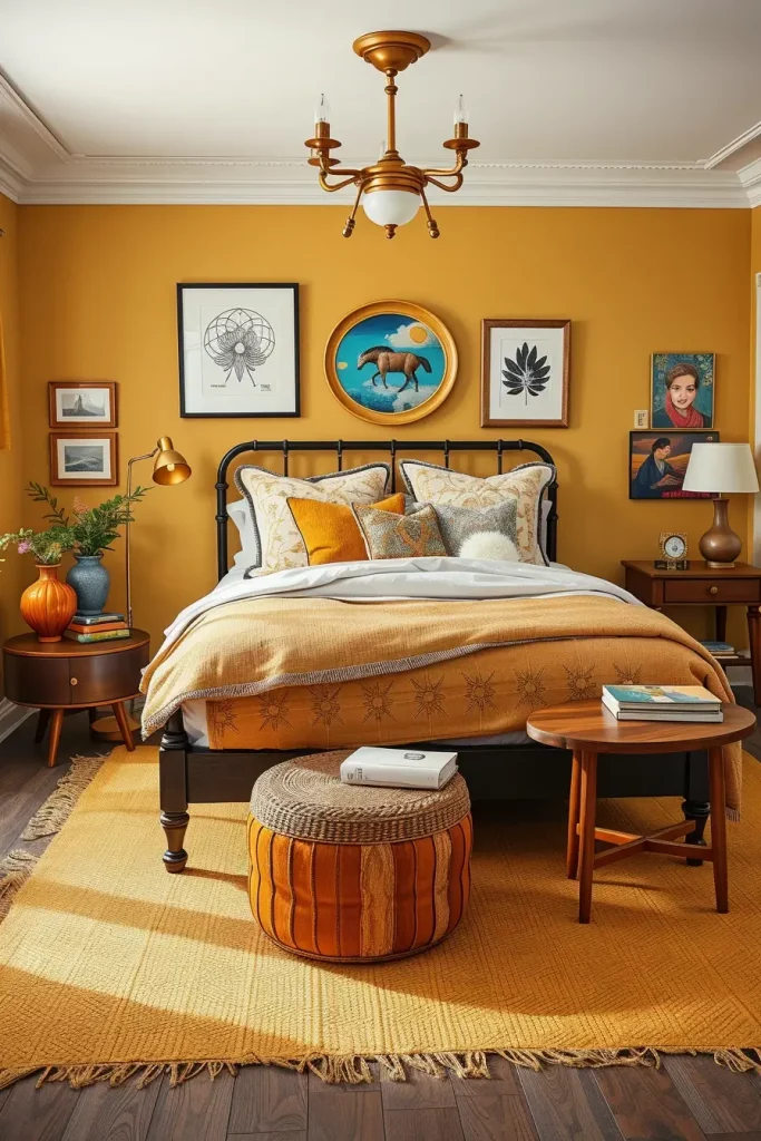
In this palette, I would recommend the use of mustard by using upholstered furniture like an accent chair, a fabric headboard, or cushions with texture. It is purposeful when it is based on a palette of camel, off-white, or taupe. The appearance is completed with black metal frames, walnut side tables, and some woven textures.
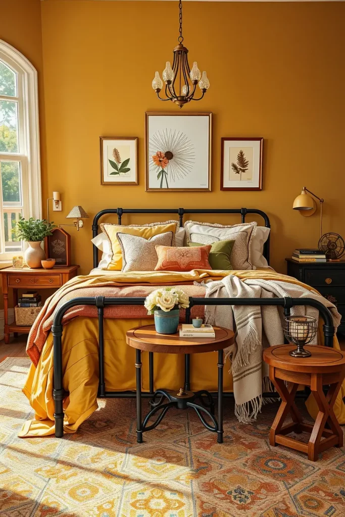
Personally, I adore muted mustard because it is more versatile than I expected. It is becoming popular in wellness-oriented interiors due to its rich, earthy nature that does not strain the eyes as observed in Interior Design Magazine. It works particularly well in vintage-modern and mid-century bedroom plans.
To finish this theme, I would add a curated gallery wall with black and sepia colors or even an antique mirror to reflect the nostalgic features that mustard brings. These works support the color narrative without vying with each other.
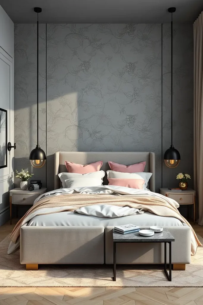
Stone Grey and Blush Pink Harmony
Stone grey and blush pink are a sophisticated combination that can be described as cool and elegant, yet soft and romantic. The combination is ideal when one desires a contemporary look with a slight feminine touch. I find this combination to be effective in master suites and guest bedrooms where I want to make it feel welcoming but polished.
I usually begin with a soft grey on the walls and add blush pink in bedding, throw pillows, or an upholstered bench. Minimalist black or brass fixtures ensure that the appearance is not too sweet. The grey is anchored by the addition of concrete-effect dresser or bedside tables. The design is completed with blush curtains or a rug that adds the necessary warmth to it.
In my opinion, this color scheme is very luxurious but not pretentious. According to Elle Decor, the combination of blush-pink-and-grey is timeless but with a modern twist. I believe it is particularly attractive to the people who like minimalism but still desire to have some personality in color.
To continue the design development, I would add sculptural lighting fixtures, e.g., matte white pendants or blush-colored glass sconces. These provide both form and functionality and support the beauty of the palette.
Copper and Taupe for Timeless Appeal
Copper and taupe are two colors that can form a classy and long-lasting color story in 2025. The combination adds coziness and understated affluence to bedrooms. I frequently recommend this plan to clients seeking something luxurious and subtle something that would make a home feel like a boutique hotel.
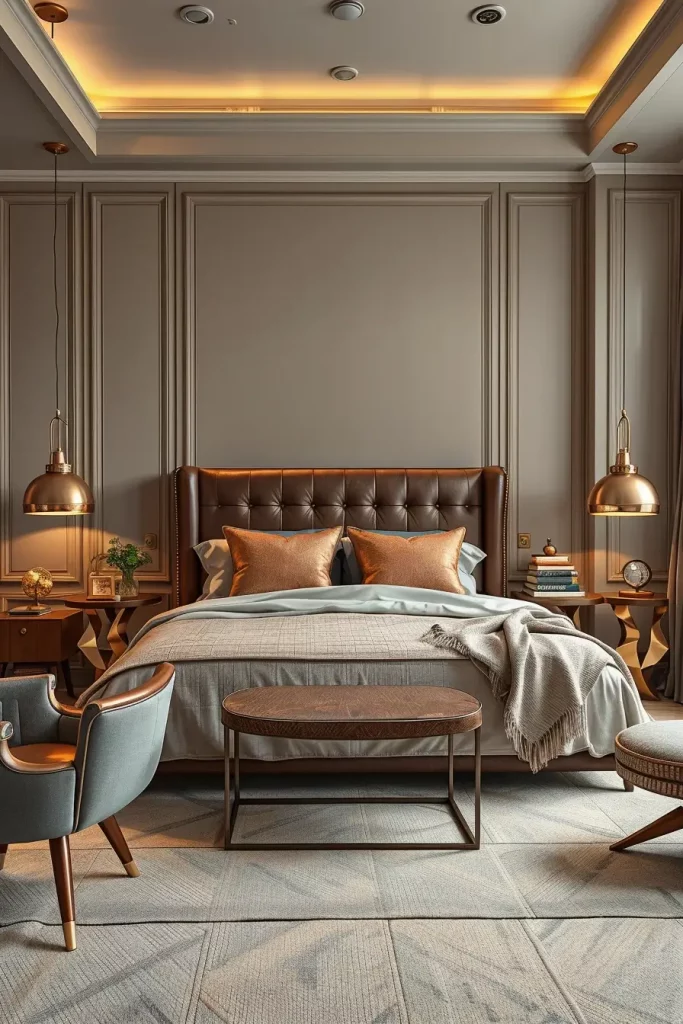
Walls are taupe, which is a calming background, and copper, in the form of pendant lights, picture frames, or metallic side tables, provides a warm and textural element. The soft furnishings of greige, cream, and dusty brown add depth without taking the stage. This scheme also looks great with leather headboards or caramel-colored pieces of wood.
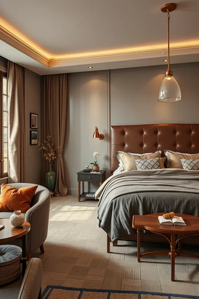
As a professional, I consider this combination of palette to be one of the most advanced ones that are in fashion. Architectural Digest has commended copper as a way of combining tradition and innovation. I have discovered that even minor copper details can take a taupe room to the next level and give it that “quiet luxury” that is so sought after nowadays.
A copper-hued mirror or light-reflective wallpaper with a light sheen is one of the ways I would give depth to this arrangement. Such details make the light more and improve the mood, but not overwhelm the room.
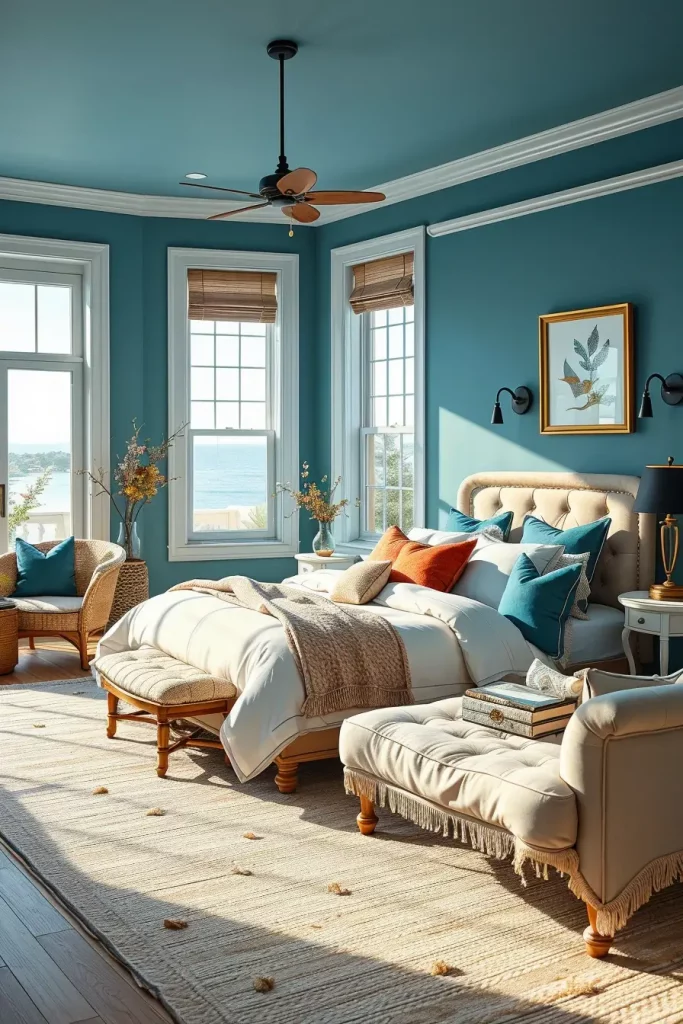
Water-Inspired Blues and Greens
I think water-inspired blues and greens will make bedroom interiors feel calm and fluid in 2025. These shades are perfect to encourage relaxation and calm particularly in bedrooms that are meant to be relaxing. I tend to suggest these colors to individuals who want to have a spa-like retreat at their homes. The light turquoise, seafoam, and coastal teal colors bring the nature and provide a new interpretation of traditional cool colors.
To complement this color palette, I use pale blue walls and sea-glass-colored drapes, clean white linens, and accents of driftwood furniture. The bedframe is upholstered in light grey and the throw pillows are eucalyptus-coloured; the wall art is ocean-themed. I also like matte paint finishes instead of glossy ones to maintain the natural, relaxing look. Rugs made of soft materials in sandy beige or stone grey will ground the room and add to the organic palette.
Personally, I have discovered that blue-green shades can also be used to make small spaces look larger. As Elle Decor notes, the addition of coastal colors can reduce the level of stress and help sleep more deeply. On a personal note, I would recommend dimmable warm-white light fittings in such areas to ensure that the room has a serene glow at night.
Or you might want to go a bit bolder with teal accents, say in a bench or a wardrobe, to ground the lightness. The examples of the ways to layer in the metallic details such as brushed nickel or matte brass to create the visual contrast could be added to this section.
Pastel Peach in Minimalist Settings
I have observed that pastel peach is becoming popular in minimalist bedrooms since it adds a little warmth without interfering with the clean lines that characterize this design style. It is particularly effective in smaller rooms or when one wants a touch of color without dominating the look. In 2025, it is an ideal tone to soften the hard edges of architecture and bring some humanity to it.
To create a subtle vibrancy when designing with pastel peach, I tend to incorporate off-white walls and bed linens or curtains that are tinted with peach. A natural oak platform bed with a low profile and a sculptural white lamps and thin nightstands balance the form and color. The minimalistic appearance is complemented by floating shelves, ceramics vases, and linen textures, which make the space welcoming.
I think that this color possesses a special property to reflect the natural light that can make a small room look larger and more spacious. I read a recent trend report from Architectural Digest that praised pastel peach as a “quietly optimistic” tone that balances both energy and serenity—ideal for a bedroom.
The only thing that may be lacking here is the concept of introducing contrast with the help of earthy browns or charcoal grey accessories, e.g. a single armchair or area rug, to balance out the overall lightness.
Cocoa Brown for a Masculine Touch
The cocoa brown is a down-to-earth and deep color that would be ideal in making a masculine bedroom that would have a classic look. I have applied this color in the projects where the clients desired a more intimate, warmer atmosphere, yet modern and powerful. Cocoa tones are warm, but not too red or orange and are therefore very versatile.
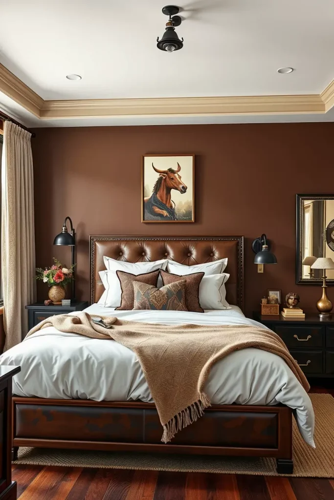
Dark brown feature walls with leather or suede headboards, dark wood dressers and black sconces in an industrial style are some of the elements that I frequently incorporate in this palette. Contrast can be provided by crisp white bedding, and layering and softness can be provided by wool or cashmere throws in oatmeal and grey. I adore raw wood furniture, usually walnut or espresso-colored, to bring the masculine look to the next level without being too heavy.
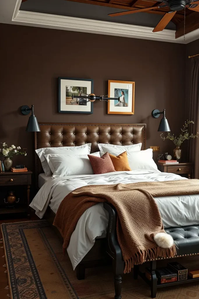
I know that this scheme works particularly well in apartments or rooms that have little natural light in the city. House Beautiful reports that the earthy browns are making a comeback as they make people feel more connected to their space, which I believe we all can use. A brown bedroom can also use textured finishes such as plaster paint or tactile fabrics to ensure that it does not appear flat.
A possible extension of this arrangement would be to add forest green or bronze as a complementary accent color, either in the form of artwork, pillows or metallic fixtures.
Smoky Plum for Moody Elegance
Smoky plum is one of the best options I have discovered in my work when I have to make a bedroom look intimate, elegant, and artistic. This dark shade of color is halfway between dramatic and elegant, which is why it is ideal in romantic and reflective surroundings. It suits rooms of medium to large sizes and with some natural light to counter the darkness of the color.
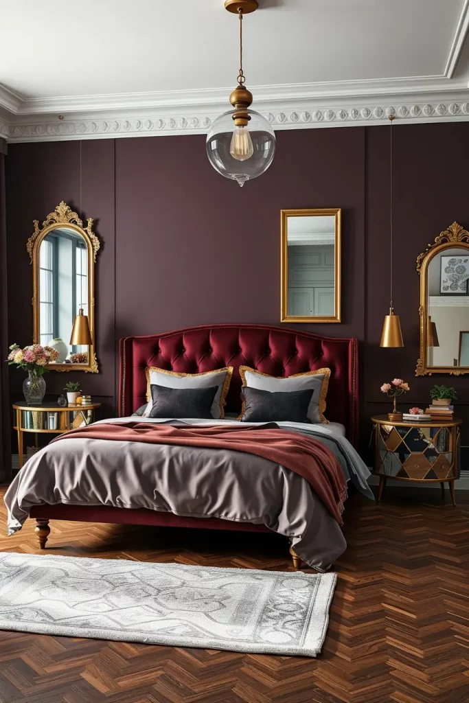
I usually leave the ceiling and trims light when I am using smoky plum, usually in pale greys or whites, so as not to make the room feel closed in. I prefer to apply this color on the wall that is behind the bed and I will complete it with velvet upholstery, antique-style gold mirrors and dark wood flooring. Plum also looks wonderful with linen bedding in a muted mauve or dusty rose that adds some texture and layering to the room.
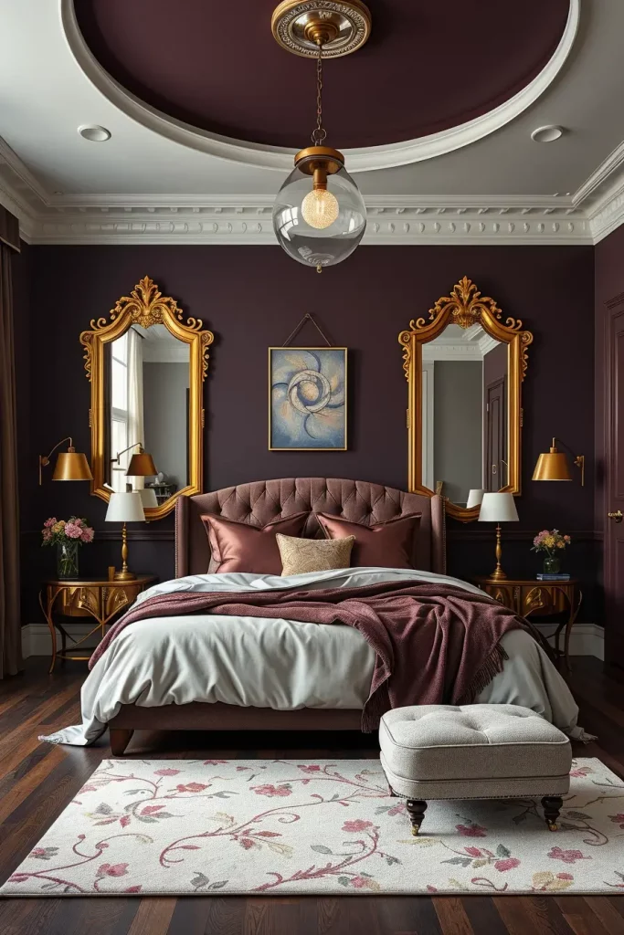
I believe that this color is magic when you need to add some mystery but not to be gothic. According to Domino Magazine, the deep plum color is returning in 2025 as a luxury statement that is modern and historically rich. Personally, I use glass pendant lighting that has a warm amber glow to enhance the ambiance.
To add more color to this segment, I would propose including a piece of art or a mural with plum undertones or a sculptural lamp to give it a personality.
Ice Blue with White-Washed Wood
Ice blue and white-washed wood is a combination that I always suggest when it comes to airy and beach-themed bedroom transformations. It gives a fresh clean background that is both young and adult. The ice blue is a little cool that reminds the sky and the sea, and the white-washed wood tones bring the space to the coastal, carefree atmosphere.
In this palette, I would like to have pale blue painted walls or blue-coloured wallpaper with little pattern. Wooden floors or panels painted white immediately make the room lighter, and the Scandinavian-style furniture in white or beige keeps the contrast soft. I prefer to use cotton or linen as a decor, minimalist ceramic lamps, and nature photography in white frames.
And, to me, there has always been something very admirable about the way this scheme functions in both coastal houses and city bedrooms that require lightening. A report from Dwell magazine listed ice blue among the “Top 5 Fresh Pastels of 2025,” highlighting its ability to cool down a room while keeping it bright.
I may want to include a touch of silver or brushed aluminum- in light fixtures or cabinet pulls- to add a bit of edge to this look and not make it too childish.
Matte Black Accent Walls for Contrast
Matte black no longer belongs only to ultra-modern interiors. I have successfully applied it as a bold contrast in bedrooms where the clients desired something visually striking but elegant. The depth, architectural features, and a sophisticated tone may be achieved by a single matte black accent wall behind the headboard that does not overwhelm the room.
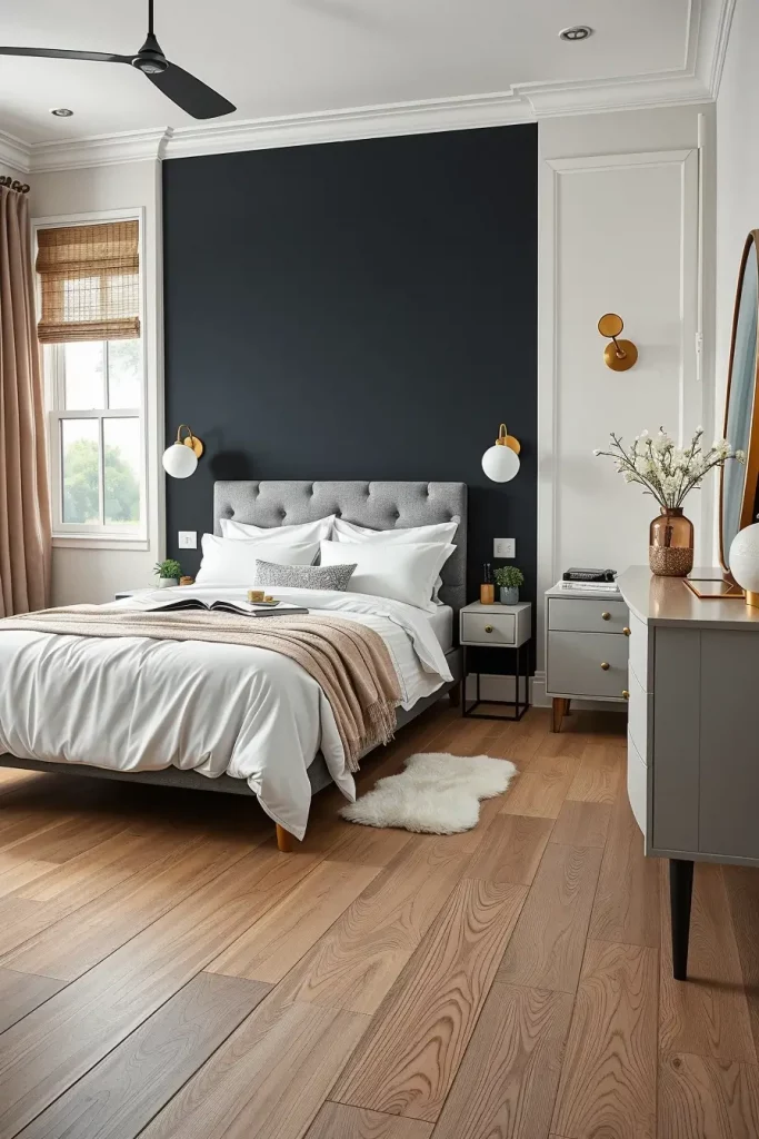
To create a room around this wall, I tend to use light-colored flooring such as pale oak or white-washed planks, white or cream bedding and metal accents in brushed brass or matte nickel. Clean line furniture with black legs or detailing will help unify the palette and I would always recommend soft lighting, globe sconces or floor lamps with diffusers to prevent harsh shadows.
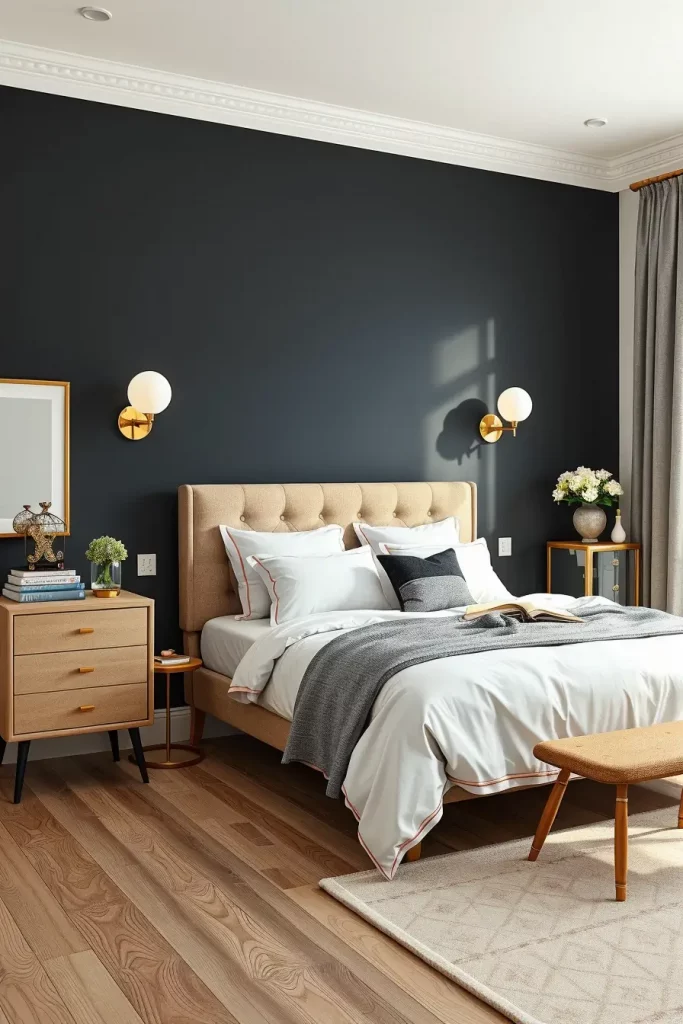
My experience with matte black is that it is dramatic yet still leaves room to layer subtly. I often quote designer Nate Berkus, who said in an Elle Decor interview that “black is the anchor that makes every other color pop.” I concur and I think it is a good trick to make a piece of artwork, bedding, or other soft items pop.
The thing that would finish off this section is an example of matte black paired with deep green or navy accessories, maybe in the form of a velvet bench or striking throw.
Soft Coral for a Welcoming Glow
In 2025, soft coral is moving into the phase as a friendly, welcoming shade that gives an impression of hospitality and understated charisma. I adore this color in bedrooms that are meant to be uplifting and relaxing at the same time. It is not loud but introduces energy and is therefore an ideal transition between neutrals and more vibrant colors.
I tend to use this color on walls in a matte or eggshell finish, and combine it with warm wood furniture in honey oak or mid-tone maple. The look is completed with white or off-white bed linens and pillows, lampshades or artwork accented with coral. The room is cohesive and grounded with natural fiber rugs and baskets and warm-toned metal decor such as copper.
My take? This color is great in guest rooms or nurseries as well. Better Homes & Gardens also lists soft coral as one of the best warm shades of 2025, especially since it encourages optimism and emotional comfort, which are two attributes I appreciate in any relaxing environment.
You could also include woven textures or terracotta ceramics in this scheme to bring in a cultural dimension and a textural richness.
Whispering Lilac for a Feminine Flair
I have noticed an increased interest in using whispering lilac in bedrooms that are feminine in their energy. This color is not too much to be considered elegant but enough to be elegant. It looks marvelous in bedrooms that are meant to be comfortable, reflective, and expressive. Lilac is a versatile alternative to blush pink, which is becoming popular in 2025 and has a slightly cooler and equally tender feel.
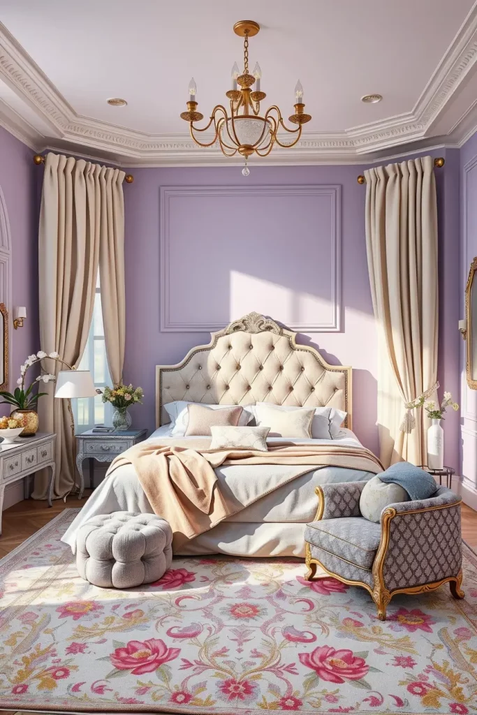
Whispering lilac is a favorite of mine to design with and I always like to use light cream or ivory as a secondary tone. The tufted lavender headboard, lilac-colored walls, white sheer curtains, and a mixture of silver and pale gold details make a balanced room. To give it a light texture, I usually include a knit blanket or plush velvet pillows in similar colors. A floral patterned and slightly purple toned area rug helps to ground the scheme.
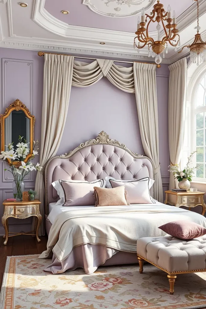
In my opinion, this color scheme is more suitable in the rooms that are supposed to be dreamy and relaxed. Whispering lilac was recently named one of the most expressive neutrals of the year by Apartment Therapy, and I have to say I agree: it has personality without being pushy. I would suggest warm white LED lighting, which would make this palette even softer and would not create harsh shadows.
A mirrored nightstand or a pale mauve ottoman would be a good addition to add depth to the space, but still remain in the lilac spectrum.
Linen White in Textural Schemes
Linen white is not merely a neutral, it is the background on which considerate textural layering is made in the bedroom trends of 2025. I adore to work with this color as it is welcoming and at the same time has airy natural lightness. It provides an ideal canvas to play with materials and architectural detail, particularly when it comes to clients who adore soft minimalism or Nordic design.
I use linen white walls in a typical design, woven rattan furniture, cream bedding, jute rugs, and oatmeal-colored textiles. The walls or the ceiling can be made more interesting by panel detailing, but the overall effect should be clean and minimal. I would also add knitted throws, boucle chairs and ceramic table lamps to add some texture without disturbing the monochrome color scheme.
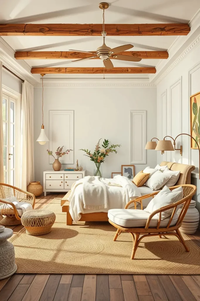
I tend to use these soft neutrals in my design philosophy, particularly in smaller areas. According to The Spruce, one of the best 2025 interior design strategies to make bedrooms cozy and sophisticated is to cover a neutral base with light and tactile materials. This color provides me with the option to change a room with the seasons without having to change the fundamentals.
The only thing I would add is one or two sculptural pieces to add depth and contrast, say a textured wall art piece or a standing lamp with a handwoven shade.
Ocean Teal and Driftwood Combinations
The combination of ocean teal and the driftwood color makes a strong appeal to coastal lifestyle, which I find so refreshing. The combination brings richness and dynamism into the room and suits better bigger bedrooms or rooms that have a lot of natural light. The teal adds a sense of life and the driftwood colors provide a sense of grounding and earthiness.
I adore using teal in rooms with this scheme on an accent wall or in textiles such as velvet cushions, linen drapery or area rugs. The driftwood is used in bed frames, dressers, or beams on the ceiling, anything that can anchor the space with a feel of the rustic. I have discovered that combining these colors with matte black fixtures or white accents is a great way to balance the cool and warm tones.
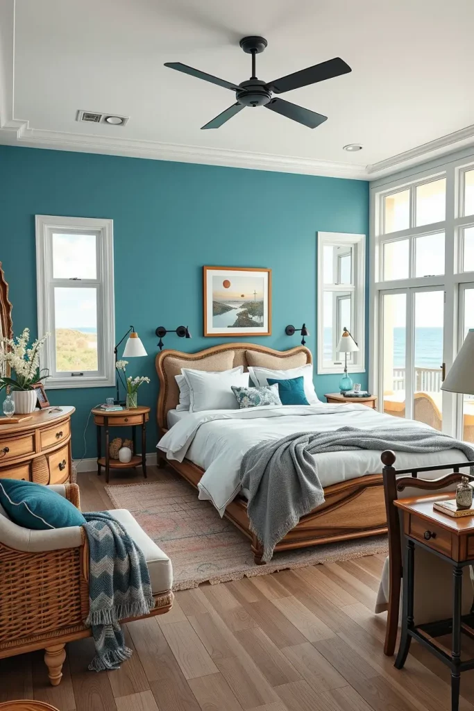
Personally, this combination is stimulating but not exhausting. Designers at House & Garden UK predict that ocean teal will be the most popular color in wellness-centered interiors in 2025, as it is a refreshing color. I believe that to be the case, it is ideal to anyone who seeks a retreat that is near nature.
One of the changes that could be made is to include some craftsmanship elements like handblown glass pendant lights or reclaimed wood side tables to make the room more curated and personal.
Dusty Olive and Brass for Vintage Vibes
Brass and dusty olive details add an immediate vintage appeal to any bedroom, particularly to those who like understated luxury and natural color schemes. I am attracted to this mix as it reminds me about the past, but it does not go too far into the traditional styles. It is warm, layered, and lived-in, which is ideal for grown-up rooms that do not feel cold.
I would use dusty olive painted walls or drapes, and a button-tufted headboard in taupe or mushroom colors. In the case of furniture, I prefer walnut or medium-tone wood, and I combine it with old brass handles or fixtures. I also add antique-type lighting, e.g., dome lamps or sconces, and decoration, e.g., embroidered cushions or antique botanical prints.
Design-wise, this palette is best suited to older houses or city apartments with a history and a personality. I read an article in Veranda Magazine that referred to dusty olive as the new neutral when it comes to vintage interiors, and I agree. The tone sounds sophisticated without being stuffy and leaves you much space to work with decor.
This would be a fantastic touch to add a layer of patterned wallpaper or antique mirrors to bring out the vintage feel without overwhelming the palette.
Warm Greige for a Balanced Palette
I believe that warm greige is the perfect in-between color to those who cannot decide between gray and beige. This color will be necessary in 2025 to make balanced bedrooms that are both clean and comfortable. I have applied it in many projects to make it a grounded space that feels flexible and contemporary.
Practically, I tend to apply warm greige on the walls, and the upholstered bedframe and off-white or caramel-colored bedding are used as well. It is all about layering- the texture is created with wool throws, chunky-knit pillows, and woven blinds. The contrast is created with brass or black fixtures, and neutral abstract art gives the visual interest without breaking the calm.
I have observed that clients have been attracted to this color due to the fact that it forms a foundation that they can work on as their tastes change. MyDomaine has listed warm greige as one of the most livable colors of 2025, and it is especially suitable in multi-purpose rooms such as home offices that serve as bedrooms. I personally like its versatility, it can be used with so many design styles, minimalist to transitional.
The only thing that would complete this appearance would be a gentle accent, such as a sage-green bench or warm amber glass decor, to complement the organic appearance without making it too busy.
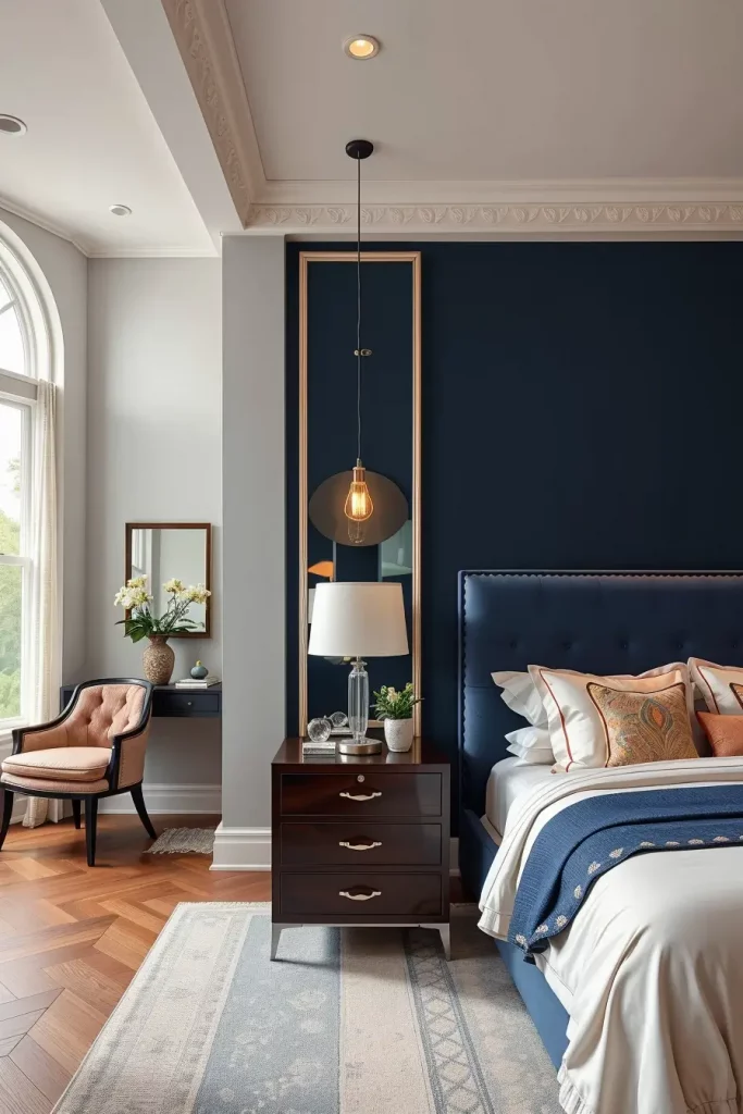
Deep Navy and Bone White Duo
One of my favorite high-contrast combinations in 2025 is the deep navy and bone white combination. It is dramatic, but timeless, and fits both classic and modern design. I will suggest this pair to customers who are seeking a statement piece that is still classy and refined.
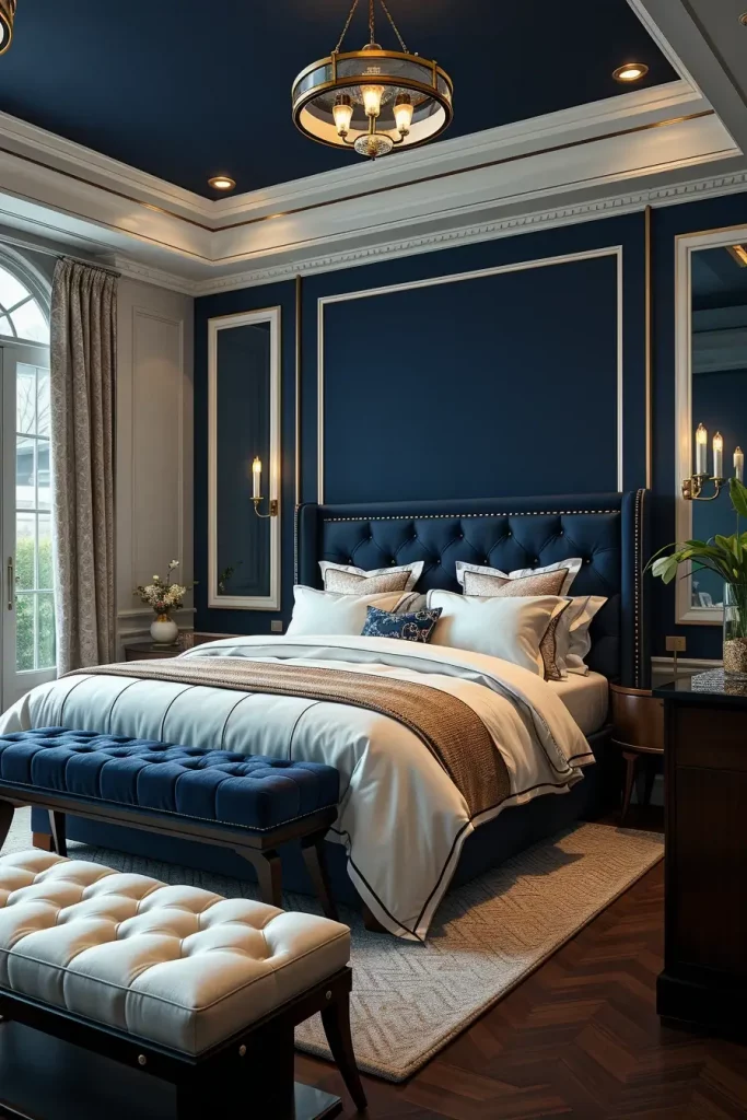
I usually paint one wall in deep navy, usually behind the bed, and keep the rest of the walls, bedding, and trim in bone white. The color scheme is harmonized by a tufted navy headboard, bone-colored linen window treatments, and nightstands made of dark-stained wood. I will usually introduce chrome or crystal elements in lamps and chandeliers to introduce contrast in reflecting light.
I have found that this color scheme is most effective in medium to large rooms that are well lit. Architectural Digest has called it the power duo of high-impact yet restful interiors, which is how I apply it to make a statement and bring tranquility. The navy balances the room and the white lifts it, so it is a yin-yang balance.
To enhance this appearance further, I would recommend installation of patterned wallpaper or paneling in the navy section to add some depth without making the room look busy.
Champagne Gold in Luxe Bedrooms
Champagne gold is a core color that I would suggest when clients request something that is luxurious but not flashy. This luxurious metal sound gives a slight sparkle and warmth that immediately upgrades the room. It is perfect in luxury bedrooms that tend toward glamour without being glamorous.
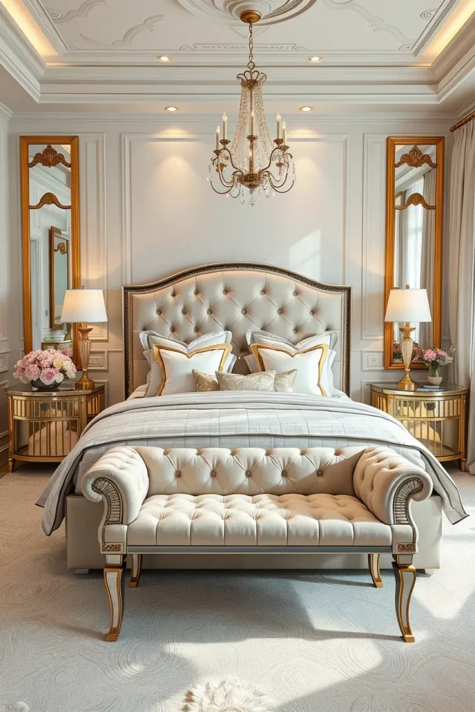
In a standard champagne gold bedroom, I apply the color in lighting fittings, picture frames or curtain rods. It is a plush room that is not excessive with a tufted cream headboard and champagne piping, satin or silk pillows, and textures layered in gold-beige hues. I like to combine it also with ivory or blush or soft grey so as not to be gaudy.
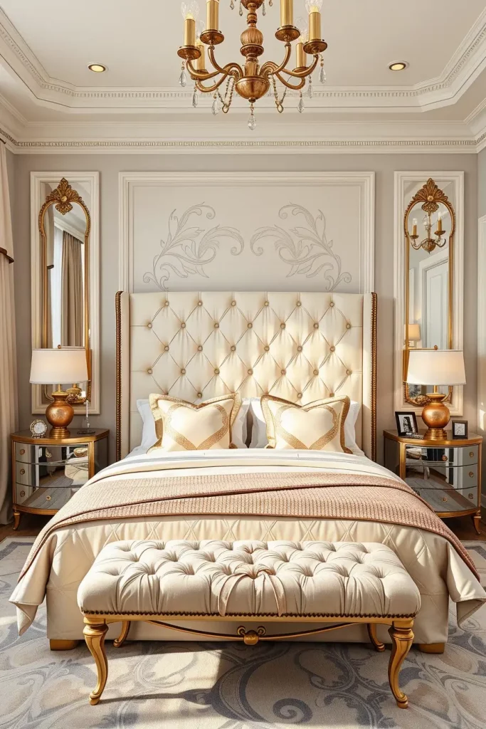
This color has been particularly effective in master bedrooms or guest suites where the first impression is important. According to Vogue Living, champagne gold is the sophisticated solution to metallic addiction, and I cannot disagree. It introduces light and richness but not in an overt way.
To finish this design, I would introduce some mirrored nightstands or a velvet bench at the foot of the bed to enhance the effect of comfort and discreet luxury.
Misty Mint with Natural Fibers
Misty mint will become a popular trend in 2025 as an option to cool the bedroom with a gentle and organic atmosphere. I’ve worked with this shade several times, and it’s one of the most tranquil hues I’ve seen—perfect for smaller spaces or areas with limited natural light. It is a greenish tint that brings the feeling of calmness and easily combines with such nature-based materials as rattan, jute, and raw wood. It is a down-to-earth yet refreshing effect, which suits individuals who need a minimalist yet cozy environment.
One of my recent bedroom projects involved misty mint on the four walls to give it a cocoon effect. I balanced the walls with a low profile platform bed of light oak, and layered on textured linen bedding, woven blinds and macram em wall art. We crowned it all with a rattan armchair in the corner and an oversized jute rug to create a visual warmth and floor softness.
The best part about this arrangement is that it is easy to maintain an airy feeling and yet add comforting textures. In an article from Elle Decor, designers noted how “mint hues reframe the room’s energy with a hint of nostalgia and optimism,” and I couldn’t agree more. It’s one of those timeless colors that offers a contemporary twist when paired with the right elements.
To complete this look even further, I would recommend a soft pendant, either of linen or bamboo, and maybe a tall floor plant in a woven pot. That introduces more natural materials and links the color scheme to nature even more.
Burnt Sienna as a Bold Base
Burnt sienna will be one of the preferred base colors in 2025 among the people who desire their bedroom to exude warmth, depth and maturity. Personally, I think this shade is perfect to use when one wants to escape the cool neutrals and make a space with character. The rusty undertones are earthy rich and look fantastic with dark woods, brass fixtures, and plush fabrics such as velvet or chenille.
Last season I had painted an accent wall behind a canopy bed in burnt sienna and added layers of cognac leather headboards, deep cherry nightstands and matte black sconces. This made the room look luxurious and masculine, but not at the expense of coziness. I chose ivory bedding as well to brighten it up and used terracotta vases and burnt orange cushions to add tonal complexity.
Personally, I find that burnt sienna is an earthy color that can be used to give a feeling of enclosure, thus it works well in a large bedroom or a loft-style design. In the recent past, Architectural Digest featured its revival, stating that burnt sienna provides a sense of place and emotional depth, especially when used in multi-textural layers. It is also very versatile, you can make it boho, modern or even rustic.
To complete this appearance, I would think of hanging a large abstract painting which would include the use of sienna, beige and black colors. It would be a piece of art that would connect the color and the decor that surrounds it.
Soft Amber and Wheat Blends
The soft amber and wheat colors will be one of the best bedroom colors in 2025, especially to people who desire a warm but sunny atmosphere. I adore using these tones as they emit a soft golden light that makes a room more inviting. They’re excellent for creating that perfect morning mood and pair wonderfully with light oak, brushed brass, and cream textiles.
In one of the designs, I painted the walls in a pale amber color and I employed flax linen curtains, a white-washed bedframe and beige boucle cushions to keep the room feeling soft. The bed area rug, which was wheat colored, was a base of the palette, and I added warmth by using natural-colored throw blankets and caramel-colored table lamps.
One of the most common questions that clients raise with me is how to achieve a balance between sunny tones without the space appearing too yellow or fake. My tip: matte finishes and layer with various shades of cream and beige. Better Homes & Gardens singled out this palette because of its sunbaked serenity, which I totally agree with- it is the adult version of cheerful.
What would make this appearance even more? I believe that a neutral-colored minimalist wall tapestry or an old amber-glass pendant lamp would be a perfect addition to the texture narrative.
Harmonizing Multitone Palettes for 2025
Multitone palettes are not a fad, it is a design approach to 2025 bedroom design. These palettes are combined effectively with each other when applied with a deft hand, either in the same tonal range or in contrast to one another to create a layered effect. I have enjoyed applying this method to different projects and it has always provided a complex and lively effect.
A recent bedroom of mine had a slate blue wall, warm taupe bedding and brushed gold fixtures. It ended up with a room that was curated and complete, yet not rigid. I applied different hues of the same palette on furniture, such as a light gray dresser, a dull navy rug and a bench upholstered with charcoal. It enabled all the nooks of the room to be purposeful but casual.
I really think that multitone palettes make a space look more lived in and personal. Veranda Magazine predicted that 2025 will be biased towards palettes that imply quiet luxury with tone-on-tone layering instead of stark contrast and I am already experiencing this to be the case with clients who desire richness without drama.
To make it even more refined, I would introduce wall sconces that would be hung on the walls and have a matte metal finish and introduce artwork that would reflect the colors used in the room. This assists in creating unity in the color scheme.
These popular color schemes are the best place to start when it comes to planning your bedroom update in 2025 to make it look fresh and yet personal. Whether you’re drawn to soothing mints, earthy siennas, or layered multitone schemes, the right color can truly transform your environment. Which of these shades is your favorite? Leave a comment and share your ideas with me, I would be glad to know what motivates your design process.