

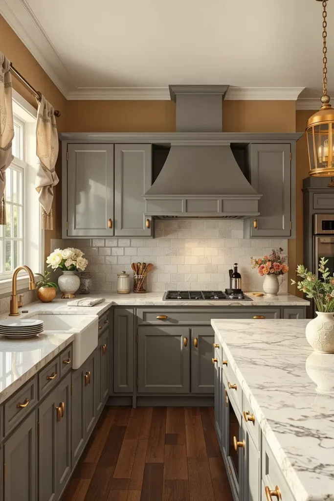
The right selection of the color combinations of the walls in the kitchen can totally change the atmosphere and the usability of a cooking area. Have you ever asked yourself why certain kitchens immediately seem luxurious, cozy or sophisticated? It is frequently a matter of the appropriate combination of tones, materials and lighting. Here, I will tell you some of my favorite color combinations that make really modern and stylish kitchens each with a personality of their own. No matter what your style is, whether it is to make a statement or a soft romantic touch, these ideas will assist you in creating a beautiful and functional space.
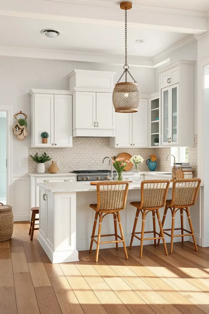
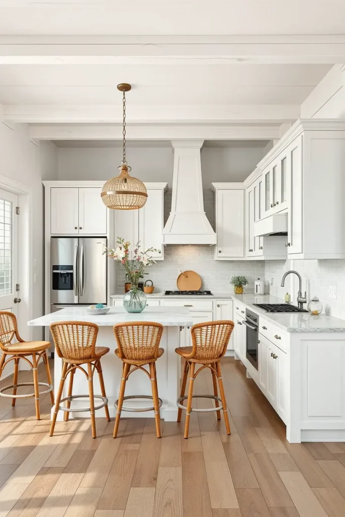
Elegant White And Gold Harmony For Luxe Kitchens
Personally, I think that the combination of white walls and small gold details makes a kitchen look luxurious immediately. White is an eternal foundation, and it takes the natural and artificial light wonderfully, and gold accents, be it in handles, faucets, or trim, make it warm and elegant. This combination is especially successful in modern kitchens with an open design since the reflective surfaces increase the sense of space.
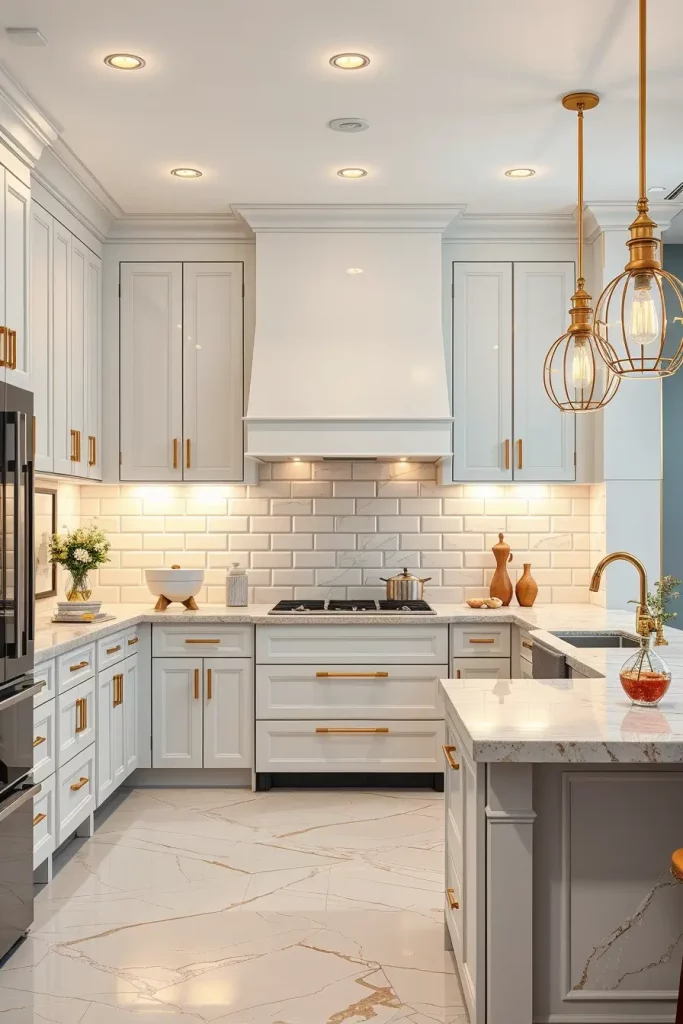
In cabinetry and countertops I tend to use a high gloss white lacquer with a marble or quartz countertop with soft gold veining. The finishing touches include gold pendant lights over a central island and brushed gold cabinet hardware to make sure that all the details support the luxe look. I also like to keep backsplashes simple and clean, and I would use glossy white subway tiles or marble slabs to keep the accent on the gold.
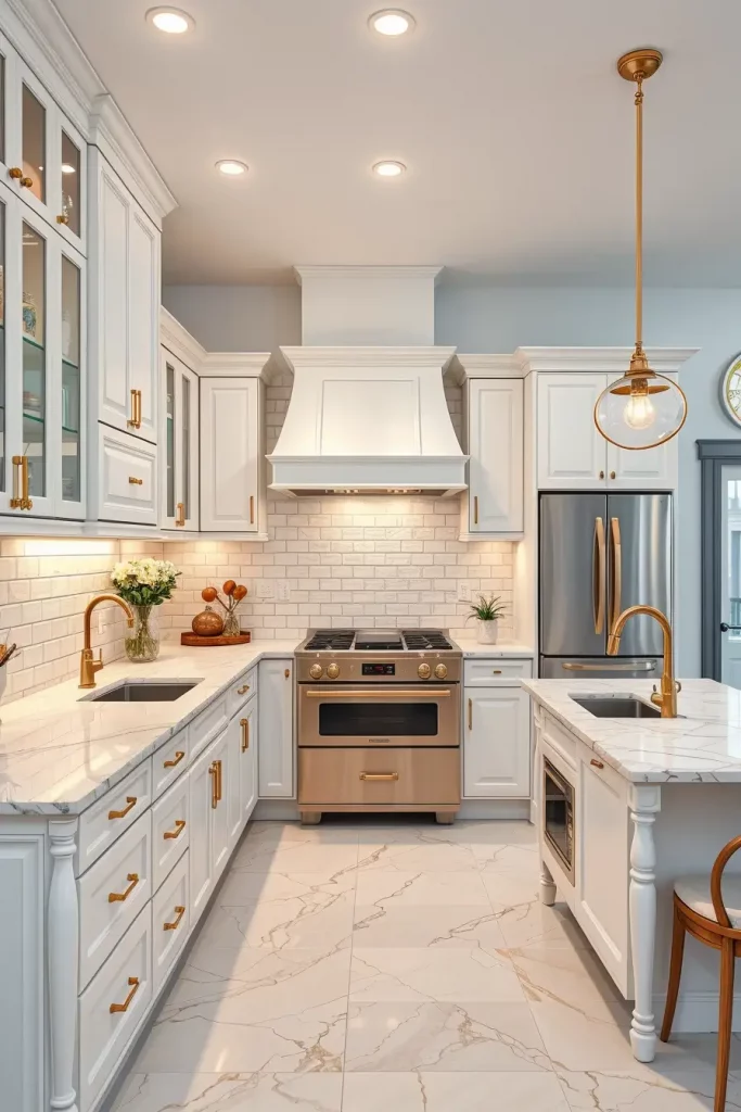
On a personal level, I have witnessed this color scheme make even small kitchens look more luxurious than they are. According to the top interior designers, such as Nate Berkus, a hint of metallic coziness combined with white will give the place a classic beauty without making it too heavy.
To make this scheme even more perfect, I would add under-cabinet LED lighting with a warm tone to emphasize the gold details in the evening.
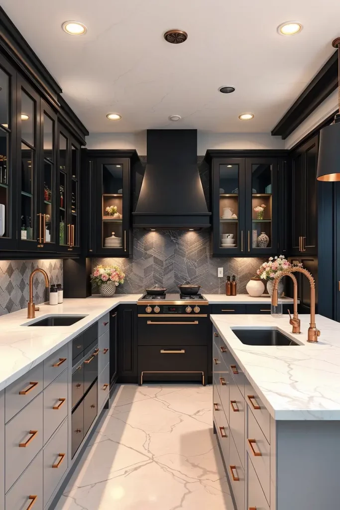
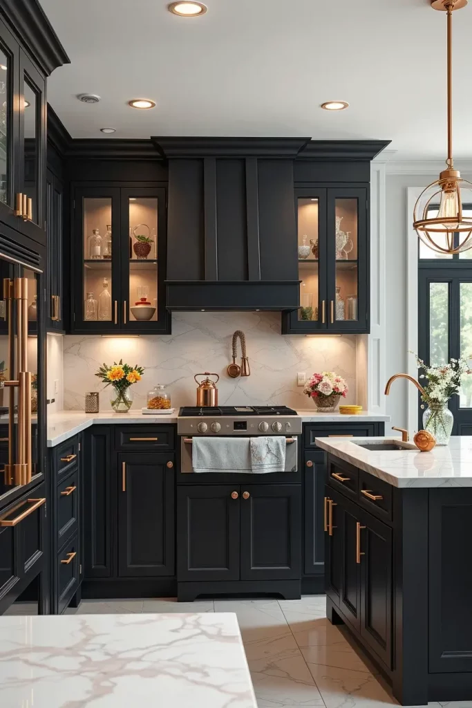
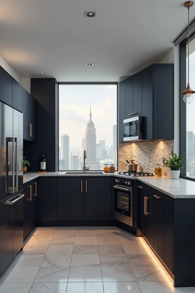
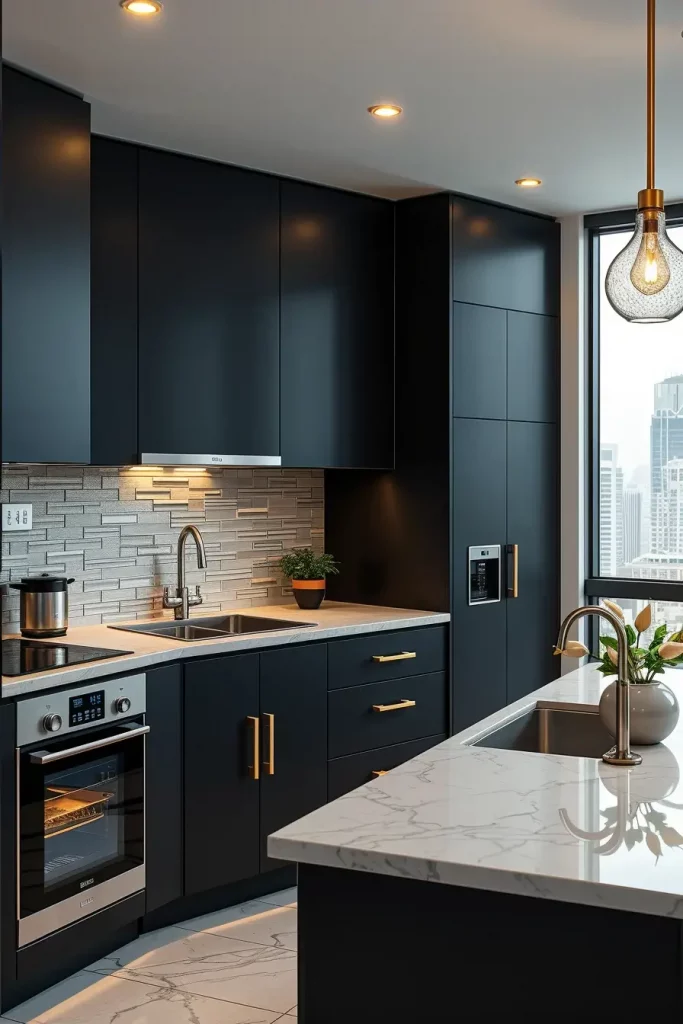
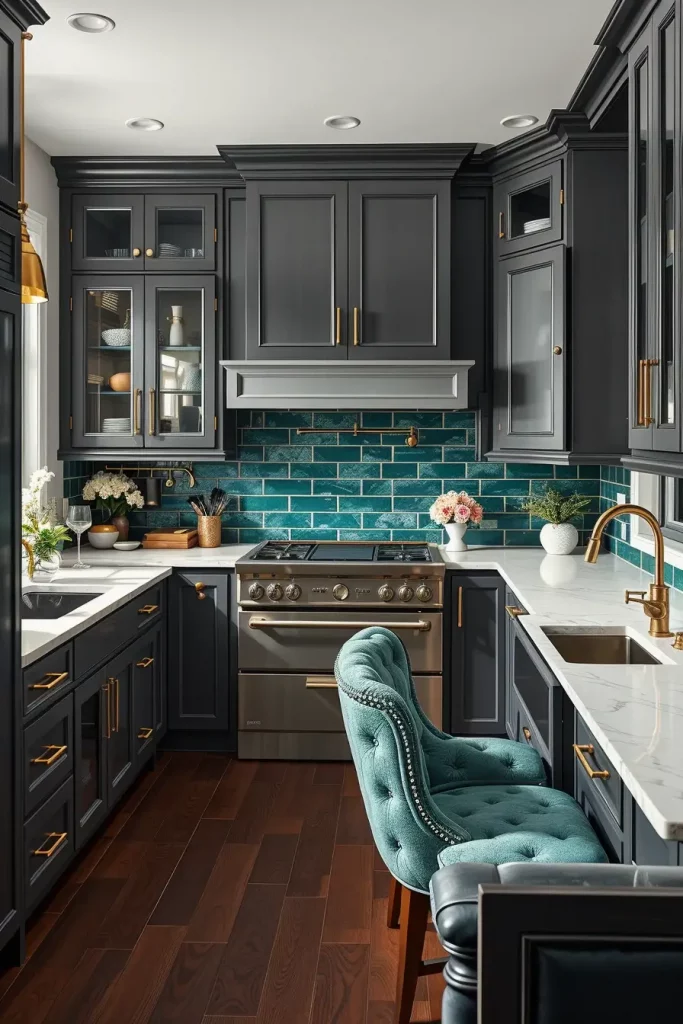
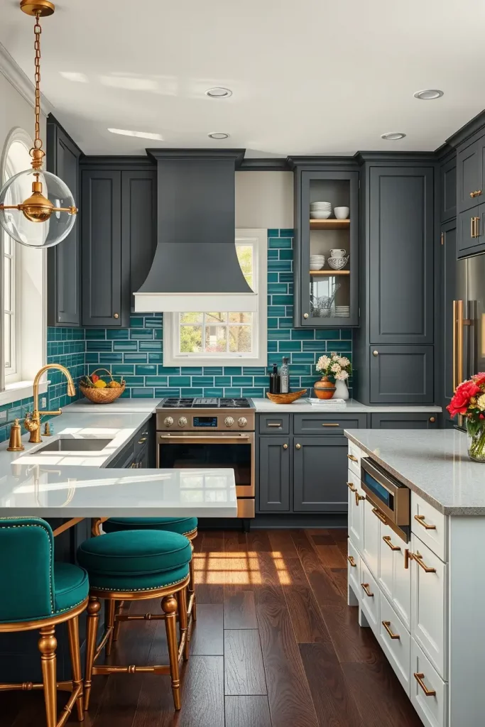
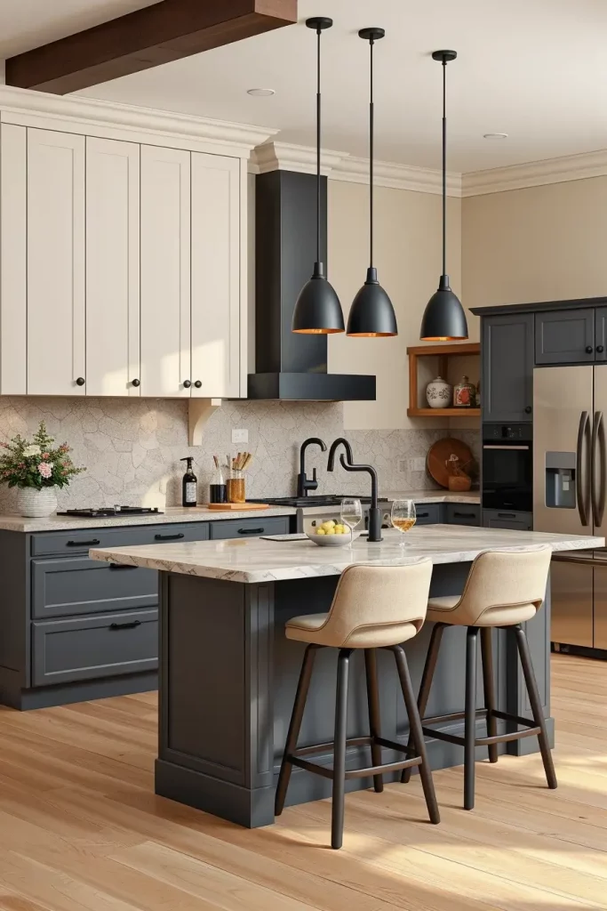
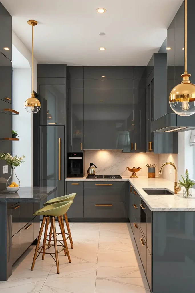
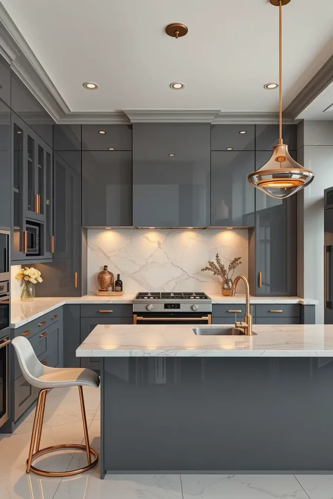
Sleek Charcoal And Brass Accents For A Bold Statement
The kitchen is daring and welcoming with a mix of deep charcoal walls and brass. The dramatic gray is rich and the brass accents add a warm glow to soften the boldness. This combination is ideal in open-plan kitchens which combine with dining spaces, as it forms a delineated, fashionable area without being claustrophobic.
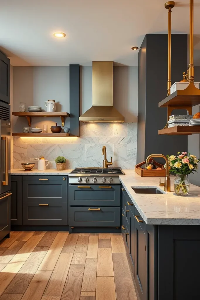
I would usually suggest matte charcoal cabinets or feature wall with lighter natural stone countertops. Brass may be added in the form of fixtures, cabinet pulls and even open shelving brackets. A brass range hood with a polished finish can be used as a focal point, which will attract the eye upwards and create a balance with the darker colors.
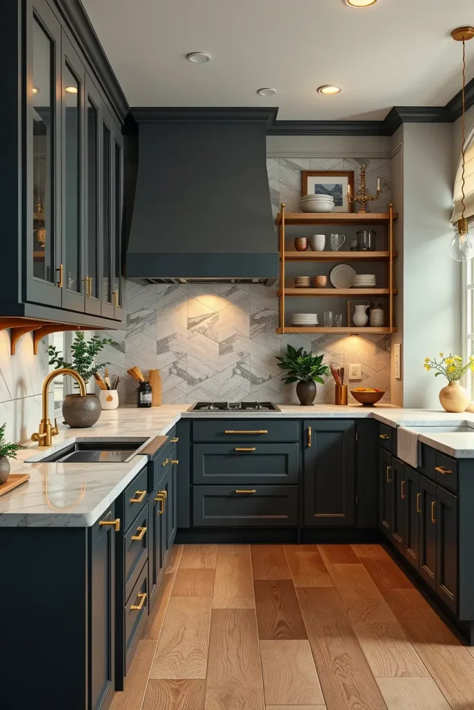
In my opinion, this mixture is luxurious but down-to-earth. It is frequently lauded in upscale design magazines such as Architectural Digest as being able to straddle the gap between modern and classic tastes. Charcoal is also fingerprint- and smudge-proof, which is a convenient option in a busy kitchen.
In case I would be improving this scheme further, I would include a light oak floor to add warmth and natural element so that the overall appearance does not turn out too heavy.
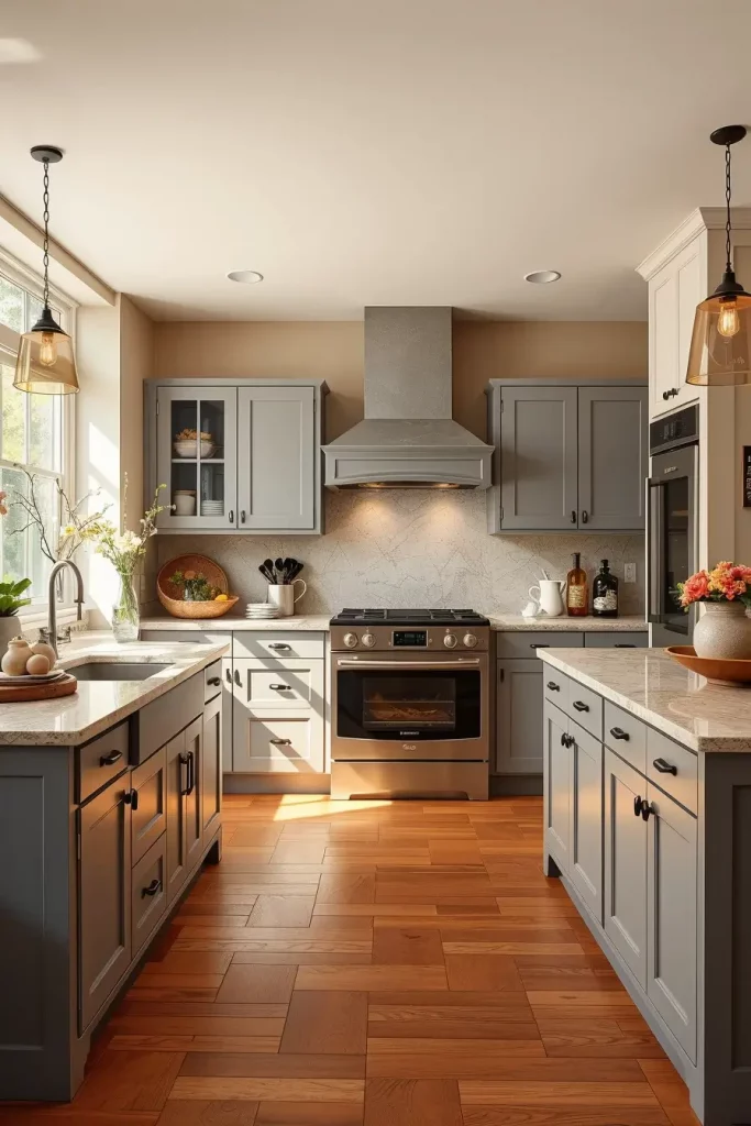
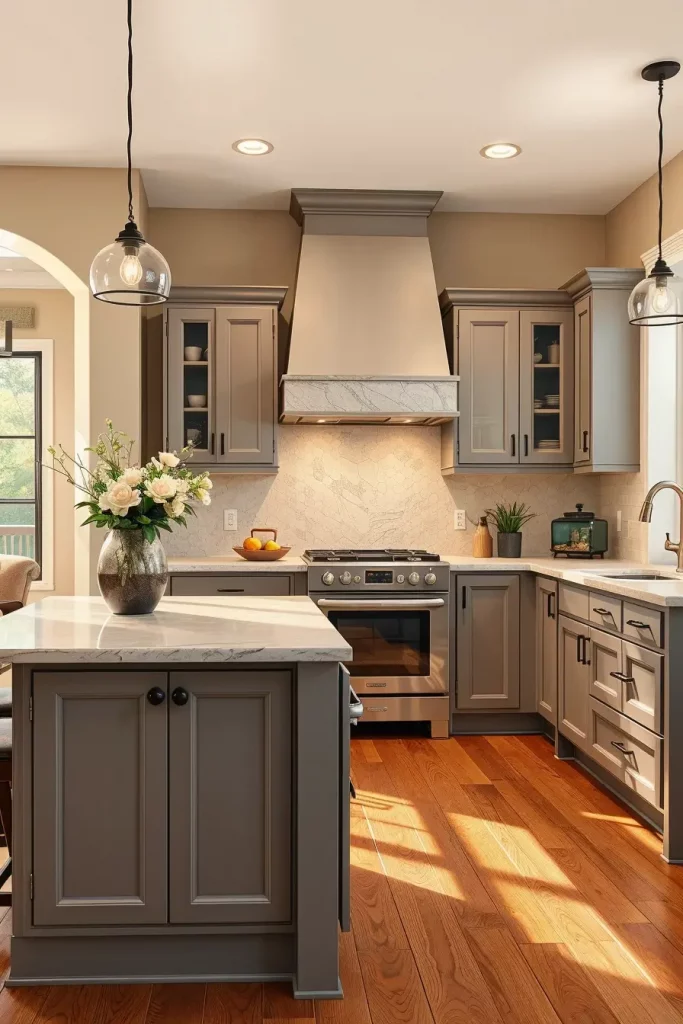
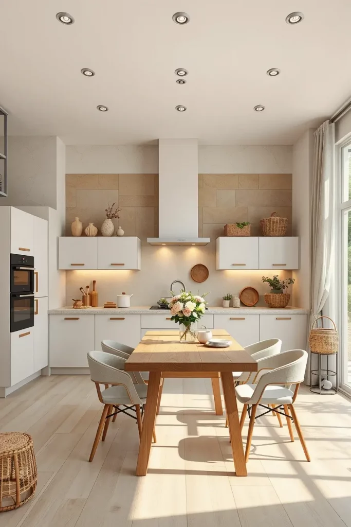
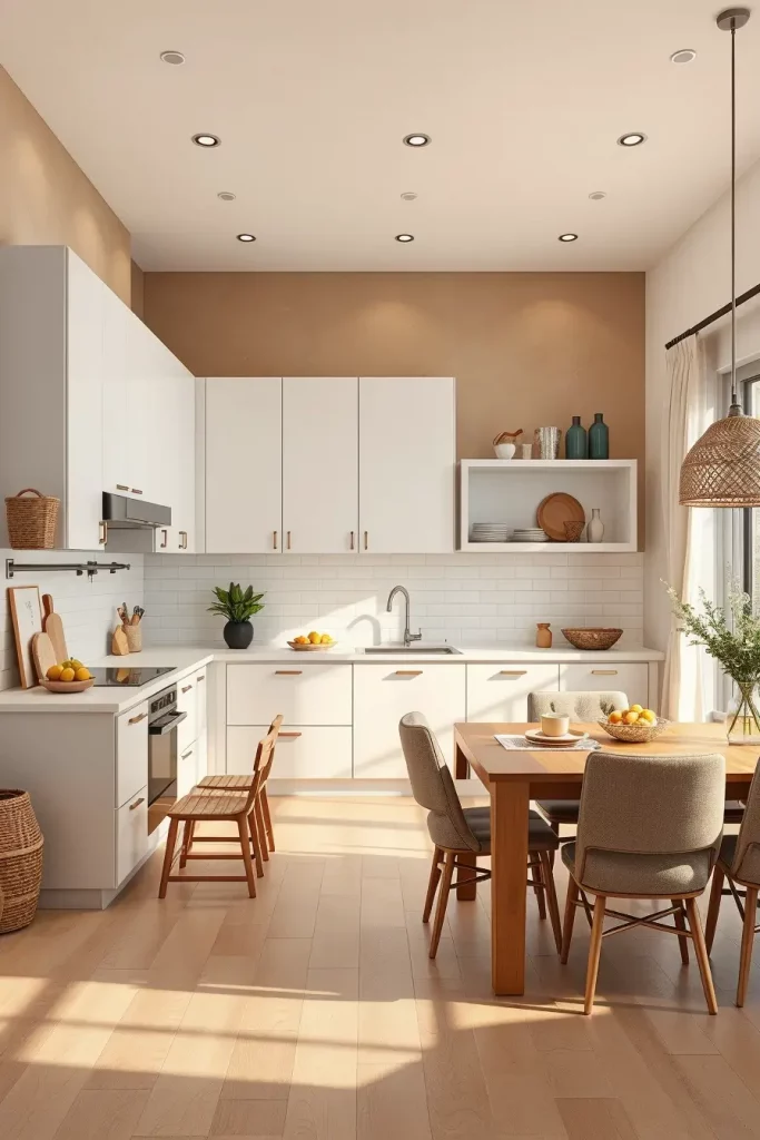
Soft Dove Gray And Warm Beige For Understated Sophistication
The combination of dove gray and warm beige makes a kitchen subtle yet sophisticated and infinitely versatile. The soft contrast of these tones creates the impression of the airy and welcoming space but at the same time does not lose the sense of the elegance. This color scheme suits best to homeowners who want to create a neutral, and calm atmosphere that will suit different seasonal changes in the interior.
I tend to paint cabinetry or the bottom half of the walls dove gray and save warm beige on the upper walls or backsplash. Limestone or light granite countertops will easily fit into this scheme, but brushed nickel fixtures will keep the soft metallic touch. The subdued style is finished with light linen curtains and ceramic accessories.
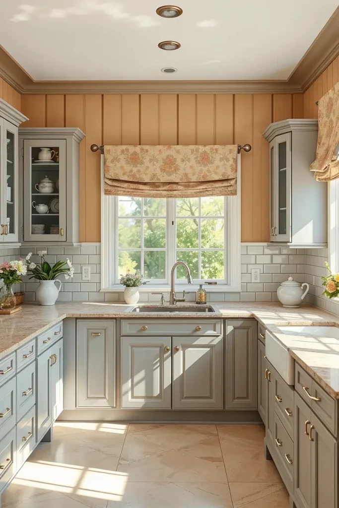
I have always liked how this mixture can be used in varying light. It is fresh and stimulating in the morning, warm and close in the evening. This palette is suggested by many professional designers to increase resale value, since it is attractive to many tastes.
In order to perfect this scheme, I would propose the use of textured wall panels or beadboard to add more depth to the use of color.
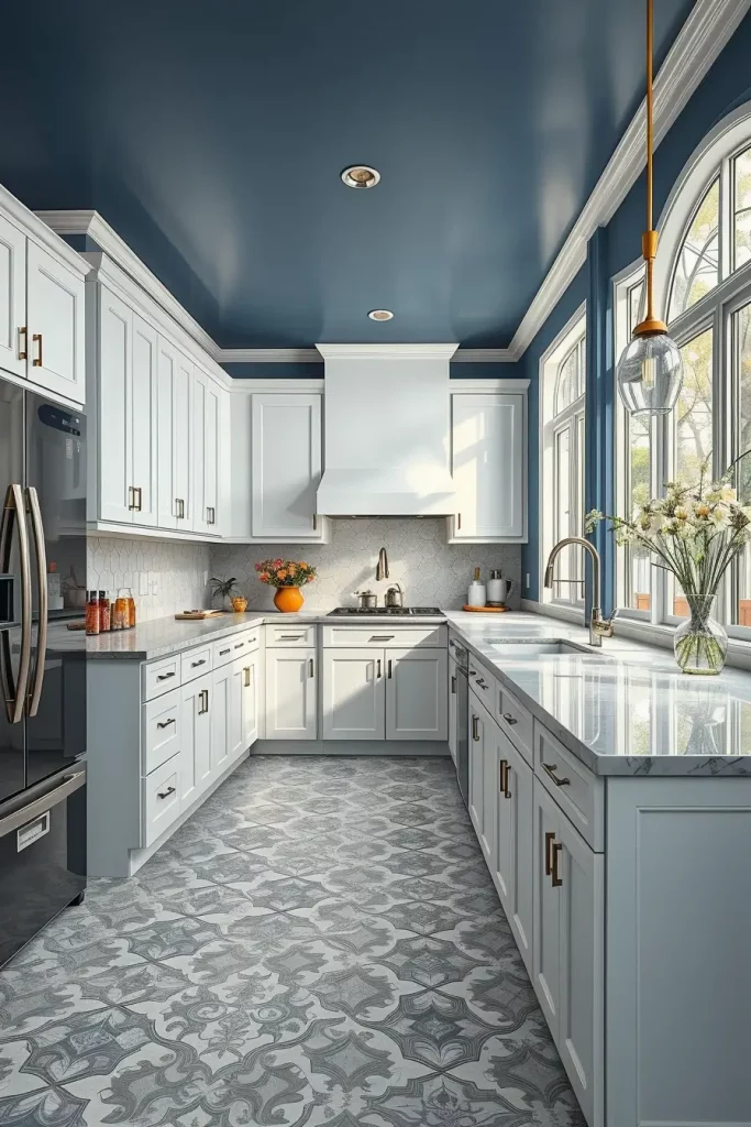
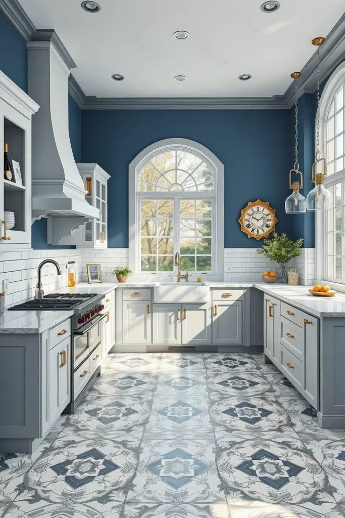
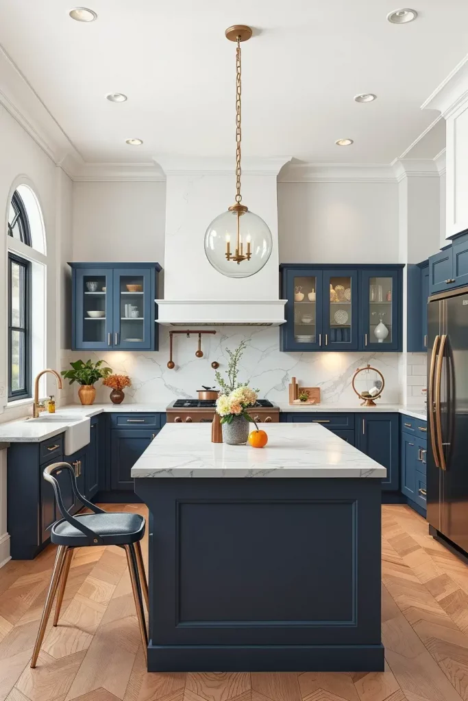
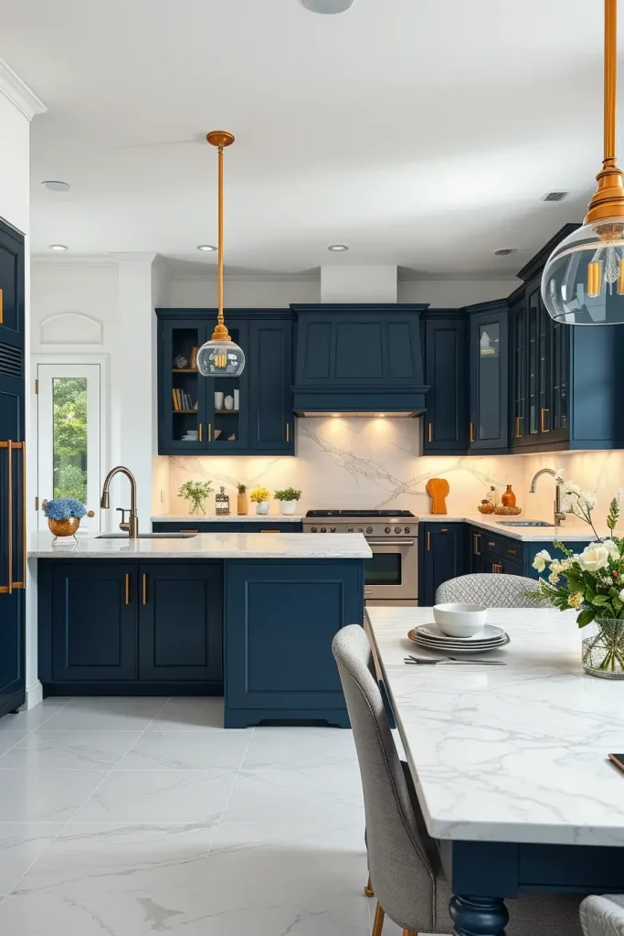
Crisp White And Navy Blue For Nautical Refinement
A combination of clean white and navy blue immediately adds a nautical, but elegant touch to a kitchen. The white lightens the room and navy adds depth and a feeling of tradition. This combination is very effective in seaside houses or urban kitchens seeking a hint of nautical style.
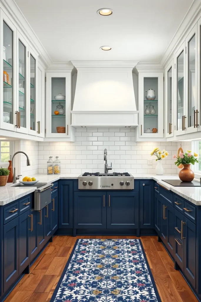
I tend to employ navy on the lower cabinets or a feature wall in my designs and white takes over the upper cabinets and ceiling. The clean appearance is supported by polished chrome fixtures, white quartz countertops, and a white subway tile backsplash. To be more personal, I prefer to introduce a navy-and-white patterned runner in the middle of the kitchen floor.
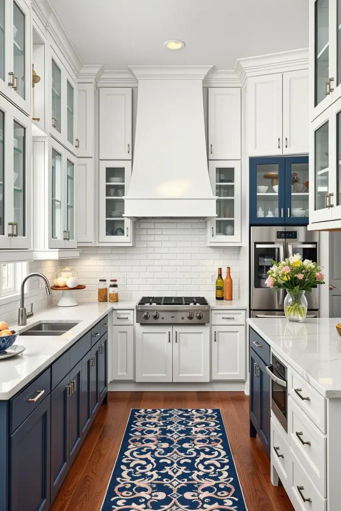
I never find this combination dated. Designers such as Sarah Richardson believe that navy is a safe and stylish color that looks great with both warm and cool accents.
To take this scheme to the next level, I would suggest fitting glass-front upper cabinets to display nautical-themed dinnerware or glassware, but not so literal as to be too on-the-nose.
Black And White Contrast For High-End Minimalism
A black and white color scheme is a pillar of contemporary, luxurious minimalism. Black provides strong contrast, and white has an impression of openness and cleanliness. This pairing is dramatic in kitchens that have clean lines, handleless cabinets, and focus on negative space.
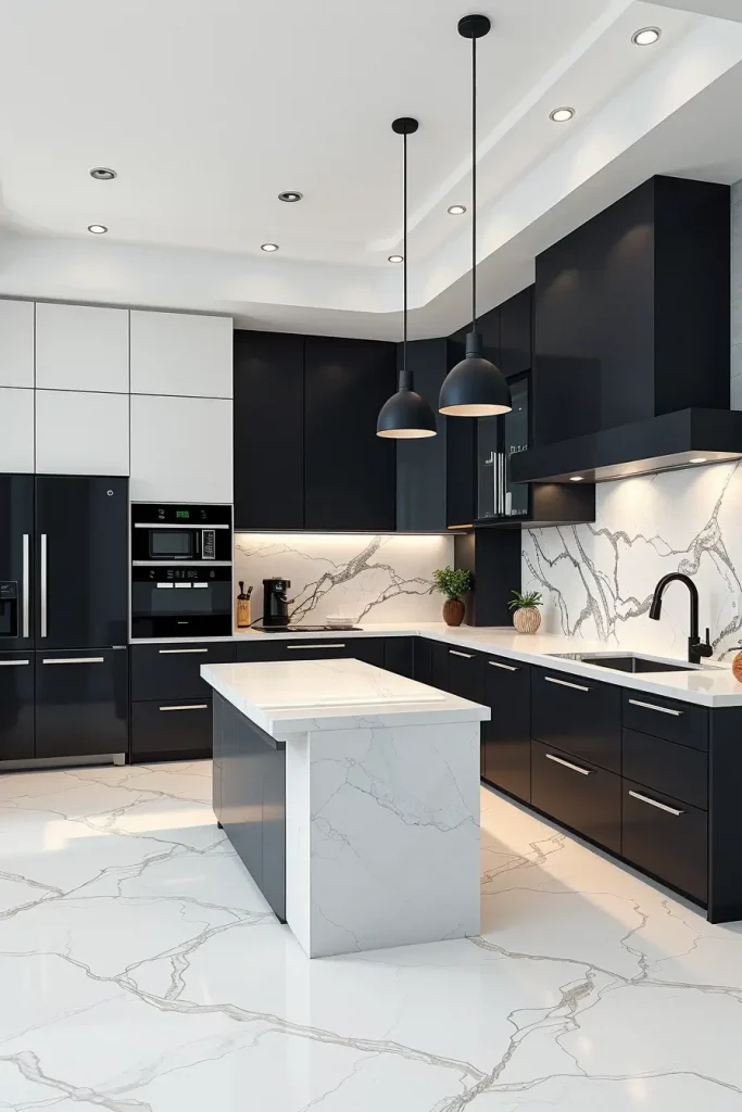
My favorite is black base cabinets with matte finish and glossy white upper cabinets. The two are connected by a waterfall-style island made of white quartz with light gray veining. Black pendant lights and matte black faucets are minimalist and provide unity without clutter.
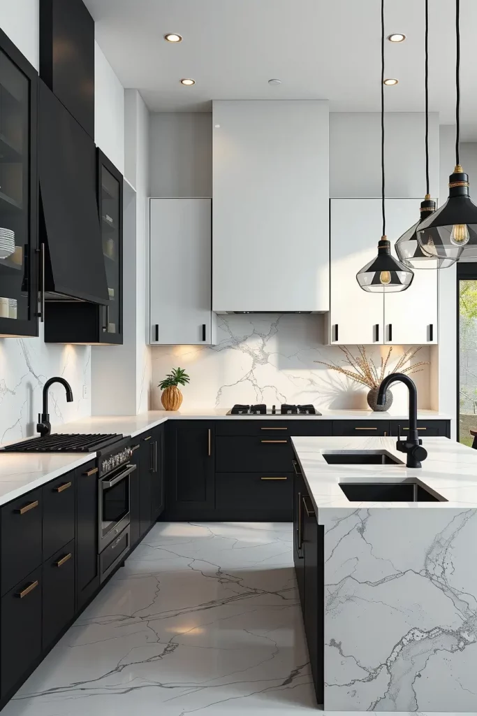
I have learned through experience that this combination needs balance, too much black will make a kitchen look heavy and too much white may make it sterile. Black accents are well placed to keep the design grounded, but airy. Most luxurious designers recommend the use of natural texture, such as wood or stone, to neutralize the monochrome effect.
In case of improving this appearance, I would insert a white marble backsplash with a black vein to combine the two colors in a non-obtrusive, but effective manner.
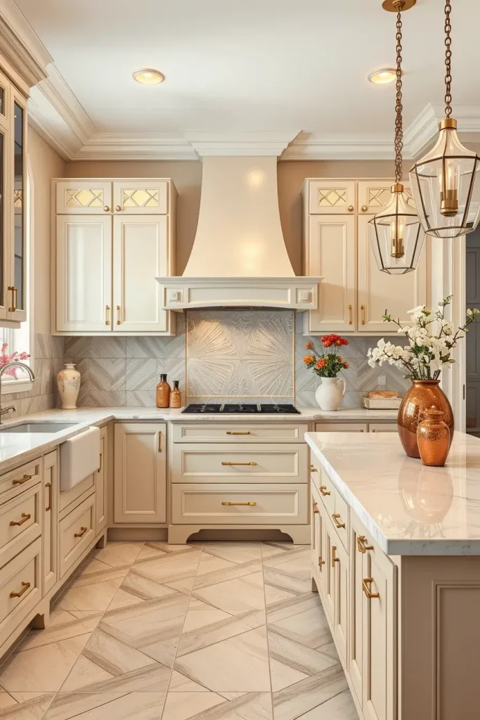
Cream And Deep Walnut For Timeless Luxury
Deep walnut cabinetry and cream walls combine to give a timeless feel of luxury. Walnut wood is warm and rich, and cream walls maintain the overall impression light and friendly. It is a perfect match in both traditional and transitional kitchens.
I prefer to contrast the dark color of walnut with cream quartz countertops and cream-tiled backsplash. The warmth of the wood is complemented by gold or brass hardware and a classic chandelier over the island introduces elegance.
I feel this palette is soothing and lasting to me personally. According to House Beautiful, wood tones such as walnut never really go out of fashion, and when combined with a creamy neutral, they are both luxurious and friendly.
To improve the design, I could incorporate the use of subtle crown molding painted in cream so as to blend the cabinetry and the walls together.
Ivory And Sage Green For Organic Elegance
The combination of ivory walls and sage green accents makes the kitchen look fresh, organic and serene. The soft green adds a hint of nature to the interior and ivory keeps it bright and neutral. The scheme is especially effective in kitchens that have a lot of natural light.
I tend to use sage green on the lower cabinets or as an accent wall and the rest of the ivory. Sage is a perfect complement to a butcher-block countertop, which brings a warm and textural feel. The look is kept charming, but modern with antique brass fixtures and open shelving with ceramic jars or glass containers.
Elle Decor has featured this palette in its design features as one that can combine contemporary and classic in a seamless fashion. I use it a lot in my own projects with clients who are looking to do something other than a white kitchen but still have that light open airy feel.
In case I would be polishing it further, I would add botanical art or a patterned tile backsplash with the undertones of sage to tie the design together.
Silver Gray And Marble White For Contemporary Chic
Silver gray walls with marble white accents are in my opinion the ultimate modern kitchen design. The metallic tone is soft and does not overpower but the marble effect gives it a texture and a visual appeal. This combination works particularly well in areas where the lines are sleek and the ornamentation is minimal and the materials themselves are the focus.
In this appearance, I prefer silver gray on the walls and use marble white in countertops, backsplashes, and even floors in case the budget permits. The gray is complemented by stainless steel appliances that give the whole a high-end look. Polished chrome hardware provides the right amount of shine to bring out the modern feel without being too distracting to the palette.
I think this combination is lovely in a small and a large kitchen. Decorators such as Kelly Wearstler tend to emphasize the need to combine cool colors with natural stone in order to make the atmosphere of elegant minimalism. It is a mixture that is contemporary but classic.
To further strengthen the design I would add a little under-cabinet lighting to bring out the veining of the marble and to give the walls some depth.
Champagne Beige And Off-White For Subtle Glamour
Champagne beige walls combined with off-white cabinetry have a slight hint of glamour, but it is not something that would be considered flashy but rather sophisticated. The champagne beige has warm undertones that make it glow, and off-white maintains the room airy and open. It is a combination that goes well particularly in kitchens that have a lot of natural light.
I prefer to match this plan with polished brass or gold hardware, to add a touch of glamour, and creamy quartz countertops. The same palette is applied to a textured backsplash that is not supposed to overpower the delicate sophistication. The look is finished off with a crystal or glass pendant light over the island that throws warm reflections throughout the room.
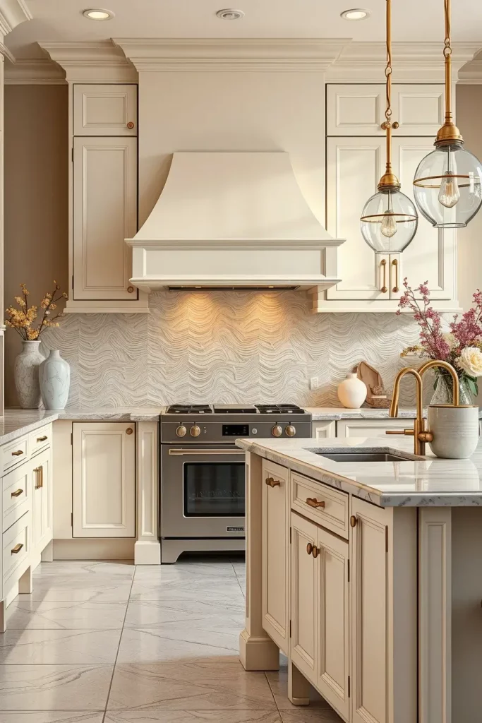
In my opinion, it is one of the most versatile palettes of people who prefer luxury without striking contrasts. In an article by House & Garden, specialists observe that the combination of soft metallics and neutrals makes a space look modern and comfortable.
To make it even more refined, I would add some decorative pieces, e.g. vases made of ceramics or art in gold frames to tie the tones together.
Slate Blue And Polished Chrome For Cool Sophistication
A cool, composed sophistication is added to any kitchen by slate blue walls and polished chrome details. The blue color is not too personal and the chrome accents make it clear and modern. This is a fantastic combination in high ceiling kitchens with plenty of natural light.
I tend to leave cabinetry white or very light gray when I use slate blue to counter the richness of the color. Reflective chrome fixtures, cabinet handles and light fittings are used to add a brightening effect to the room. The color is beautifully matched with a white marble or quartz countertop that has slight gray veining.
I like that this color combination provides a feeling of peace and orderliness, which is perfect in a kitchen. Elle Decor suggests that slate blue is a growing trend in contemporary houses because of its color-neutral balance.
To enhance the scheme, I would add patterned floor tiles in gray and white colours to bring in some interest but not to conflict.
Warm Taupe And Antique Gold For Rich Comfort
Warm taupe walls and antique gold details make the kitchen look warm and upscale at the same time. Taupe is a neutral base and antique gold gives it an old-fashioned richness which is ideal in modern kitchens as well as transitional kitchens.
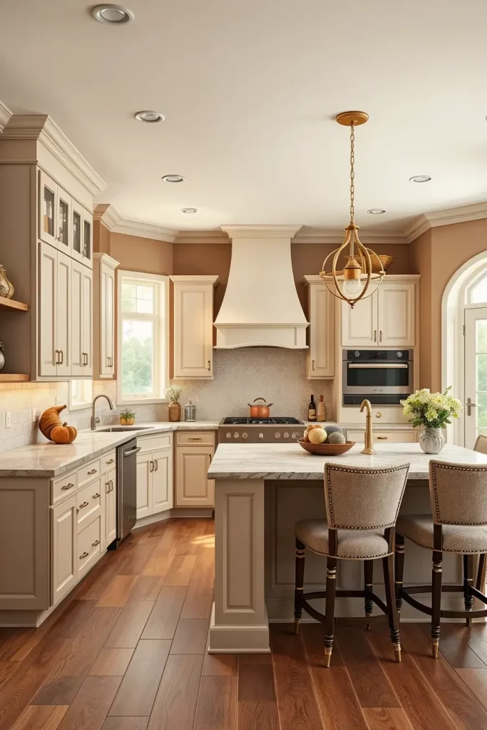
I tend to paint the walls in a warm taupe and leave the cabinetry in a lighter neutral, letting the gold accents, like pendant lighting, hardware and faucet fixtures, take center stage. The palette is complemented by natural stone countertops in cream or beige, and all of this is connected with a warm wood floor.
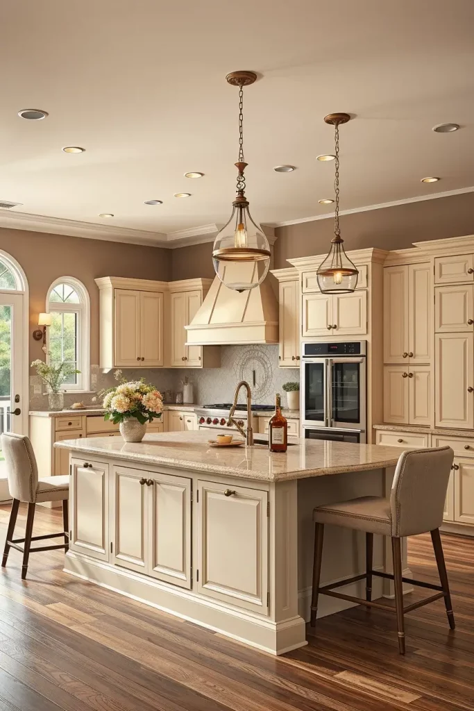
I have seen this combination attract clients who want to have a friendly place that is not cheap. Warm metallics in taupe colors are a common suggestion of interior design professionals to create an understated luxury.
To put the final touches, I would include upholstered bar stools with a fabric that captures the gold color so that the scheme would be cohesive in all directions.
Cloud White And Blush Pink For Soft Modern Romance
The combination of cloud white walls and blush pink accents will make the kitchen soft and romantic, which is ideal in a modern kitchen. The white is kept bright and the blush pink helps to warm it up and give the playful effect without overpowering the room.
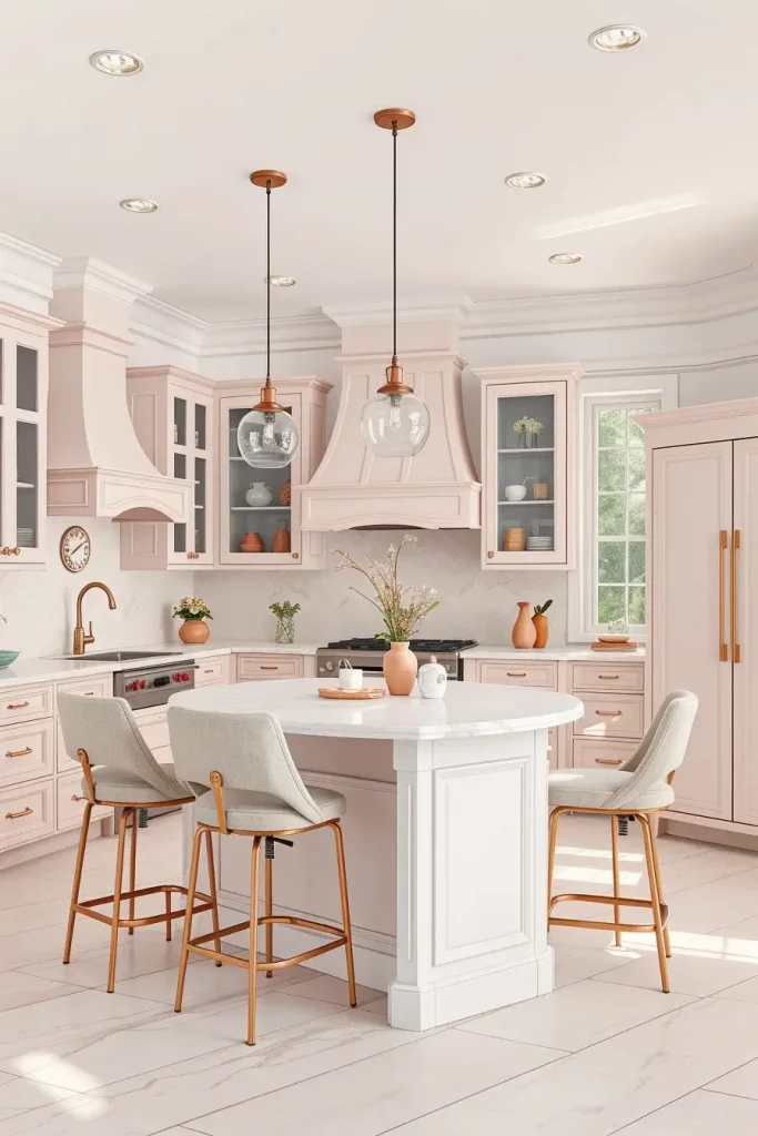
I prefer to add blush pink into the kitchen with cabinetry, bar stools or even a painted feature wall, but leave the rest of the kitchen crisp white. The pink colors are complemented by rose gold or copper fixtures. In case of countertops, I would use white quartz to maintain the appearance clean and airy.
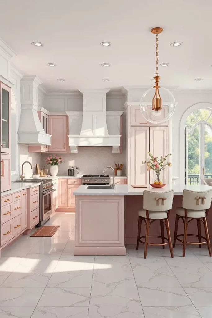
In my experience, this arrangement is effective when the kitchen is open to a living or dining room. Blush pink is a trendy alternative to the more striking reds or oranges, and many design blogs feature it as a more muted pop of color that is easy to live with.
I would add soft-textured fabrics, such as linen seat cushions or curtains, in contrasting colours, to finish the look.
Onyx Black And Rose Gold For Striking Drama
The combination of onyx black walls and rose gold details makes the kitchen look dramatic and glamorous at the same time. Black is rich and decadent, and rose gold is warm and contemporary metallic.
I tend to suggest matte black cabinets with rose gold hardware, light fixtures, and even small appliances to keep the flow. White marble countertops with light pink veins assist in bridging the two tones in a beautiful way.
I adore this combination because it is bold and sophisticated at the same time. When talking to the top interior designers in the US, most emphasize that the combination of dark colors and warm metallics creates a harmonious, luxurious look.
In case I would be doing more to this design, I would recommend the installation of accent lighting in glass-front cabinets to showcase rose gold accessories.
Pure White And Teal For Fresh Designer Appeal
A mixture of pure white walls and strong teal accents creates a fresh designer-like kitchen. White is a classic and clean base and teal is a playful and elegant shot of color. This combination is especially suitable in kitchens that are going after a modern coastal feel.
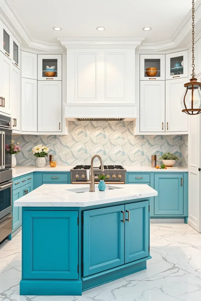
I prefer teal on lower cabinets or a central island, and pure white prevails on walls and upper cabinets. The look is sharpened with brushed nickel hardware and fixtures, and white marble countertops pull it all together.
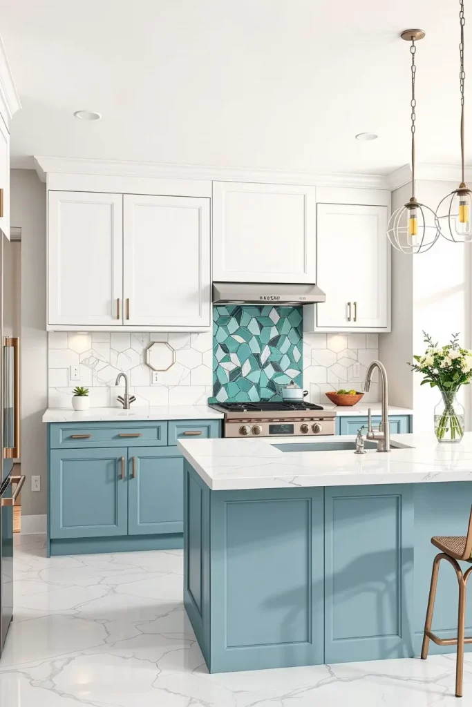
I think this is an ideal mix to have color without compromising on class. Design trend reports have found that teal has been increasing in popularity due to its ability to mix with warm and cool colors.
I would incorporate a geometric-patterned backsplash in white and teal to add to the scheme as a subtle but consistent design feature.
Almond Cream And Olive Green For Earthy Refinement
By using almond cream and olive green in a kitchen design, I want to create an environment that is down to earth and inherently sophisticated. The walls are softened with almond cream and deepened with olive green and organic feel. This combination is perfect in kitchens where the desire is to maintain a lightness but with a hint of earthiness and is therefore a popular choice in open plan kitchens where the kitchen is integrated with the living room.
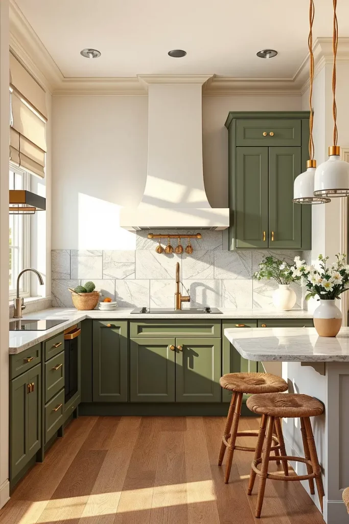
I tend to use custom cabinets painted olive green with a matte finish in a kitchen such as this one, and contrast it with almond cream walls. The neutral tone of a polished stone backsplash unites the appearance, and brushed brass hardware adds a slight shine. I also prefer light wood or stone flooring to keep a unified natural palette.
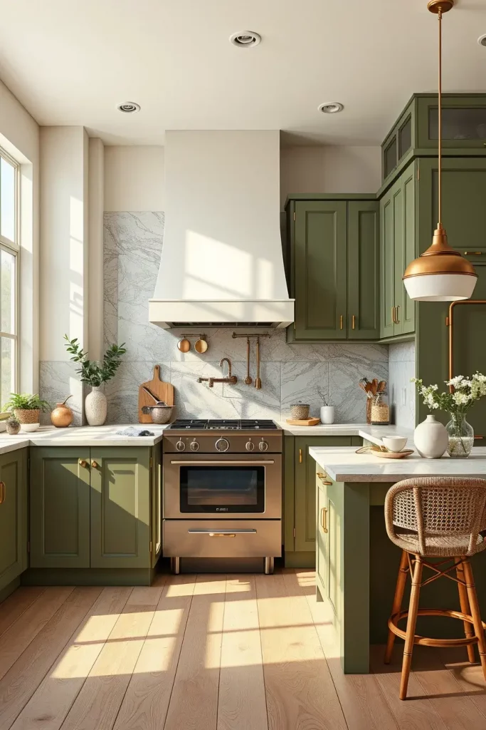
In my experience, this color combination is classic, but new. Elle Decor has mentioned that natural greens in combination with warm creams can create a sense of being in touch with nature which is precisely the effect I am going to achieve. It is perfect in the homeowner who prefers a quiet but elegant kitchen.
To make this section even more interesting, I would recommend introducing more textural details such as woven bar stools or ceramic pendant lights as they would go well with the earthy color scheme but introduce a sense of texture.
Pale Gray And Burnished Copper For Industrial Elegance
When I use pale gray and burnished copper in the design, I create an industrial kitchen that is still warm and cozy. The walls are pale gray, an ideal neutral background to the dramatic metallic sheen of copper, which immediately lifts the area. This combination is ideal in city dwellings or loft-like apartments where modern minimalism is combined with tactile warmth.
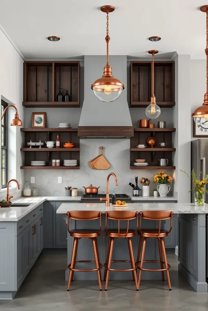
In the case of furniture and fixtures, I tend to choose matte gray cabinetry, open shelving in dark wood, and copper pendant lights as accent pieces. The design is held together by a visual thread that is made up of copper handles and taps. An industrial edge is supported by a textured backsplash, possibly in a concrete effect.
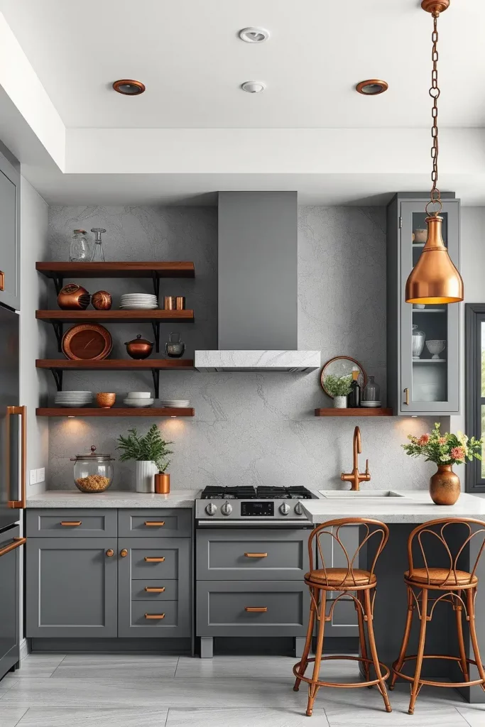
In my opinion, the trick to this combination is balance. Copper is overwhelming, but when combined with pale gray it is brought down to earth. Architectural Digest has also emphasized the fact that gray is a very versatile color to use as a foundation of metallic accents, and I completely concur with that.
Should I be extending this design, I would include a statement copper range hood or I would include copper-framed bar stools to create a dramatic but unified finish.
Soft Sand And Pearl White For Coastal Luxury
The kitchen is made breezy and luxurious with a soft sand and pearl white palette that reminds of upscale coastal resorts. I enjoy this mixture to achieve an open and airy but timelessly elegant space.
On the primary components, I would normally employ pearl white wall and cabinetry, and soft sand-colored backsplash tile or stone counter tops. The color scheme is enhanced by the light oak flooring, and the chrome or brushed nickel fixtures keep the style elegant and beach-like.
On a personal level, this palette is ideal to use among homeowners who wish to capture the essence of a peaceful and oceanfront setting without being too thematic in their decor. House Beautiful has also noted that layered neutrals in soft tones can open up a room and make it seem larger and brighter, something I frequently want to achieve in smaller kitchens.
I would complete this style by including woven pendant lights or rattan stools to create a hint of coastal living without making the design too dated.
Matte Black And Platinum For Sleek Urban Style
When matte black and platinum are combined in a kitchen, the result is an immediate sense of sleek, bold, and unapologetically modern. I prefer to apply this pair to city apartments or modern houses where the kitchen is the statement itself.
I tend to choose matte black cabinets and minimalist handles and contrast them with platinum-colored backsplash tiles or metallic paint on the walls. Appliances that match in finish and are built in add to the homogeneous, luxury appearance. Light gray or platinum white polished stone or quartz countertop brings in brightness.
I think this is a drama and precision mix. Designers quoted in Dwell say that dark tones combined with metallics is a traditional method of creating luxury in small rooms- a philosophy that I frequently follow.
In case I wanted to elaborate on this appearance, I would add under-cabinet LED lighting to illuminate the platinum surfaces and add a futuristic touch.
Linen White And Mocha Brown For Warm Sophistication
When I use linen white and mocha brown, I want a kitchen that is rich and welcoming but sophisticated. The linen white is creamy and warm and works well on walls, and the mocha brown cabinetry or accents provide a grounding effect.
I tend to select solid wood cabinets which are mocha in color, with linen white walls and light marble countertops. Additional sophistication is provided by bronze hardware and warm-colored pendant lights.
In practice, this combination is gorgeous in the kitchens with a lot of natural light, as it adds the warmth to the palette. This method is often suggested by Better Homes & Gardens when it comes to family-friendly areas that have a hint of sophistication, and it is also my personal design philosophy.
To make it even better, I would add upholstered dining chairs that were made of linen blend to match the wall color and make it softer.
Light Gray And Canary Yellow For Subtle Energy
The kitchen is filled with a light gray and canary yellow combination that brings a bright and sophisticated atmosphere. This blend is my favorite when it is required to add a bit of color to the space without making it too loud.
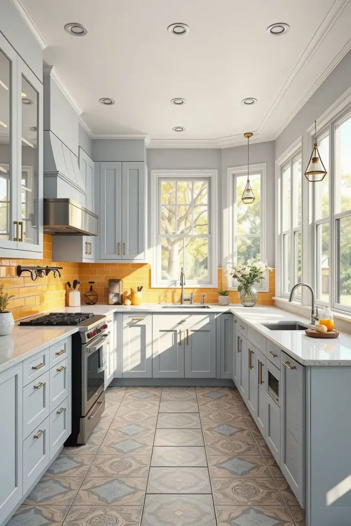
I generally have light gray walls and cabinets, and I add canary yellow with backsplash tiles, seating, or small appliances. The yellow is tempered by a white quartz countertop, and the stainless steel fixtures help the design remain contemporary.
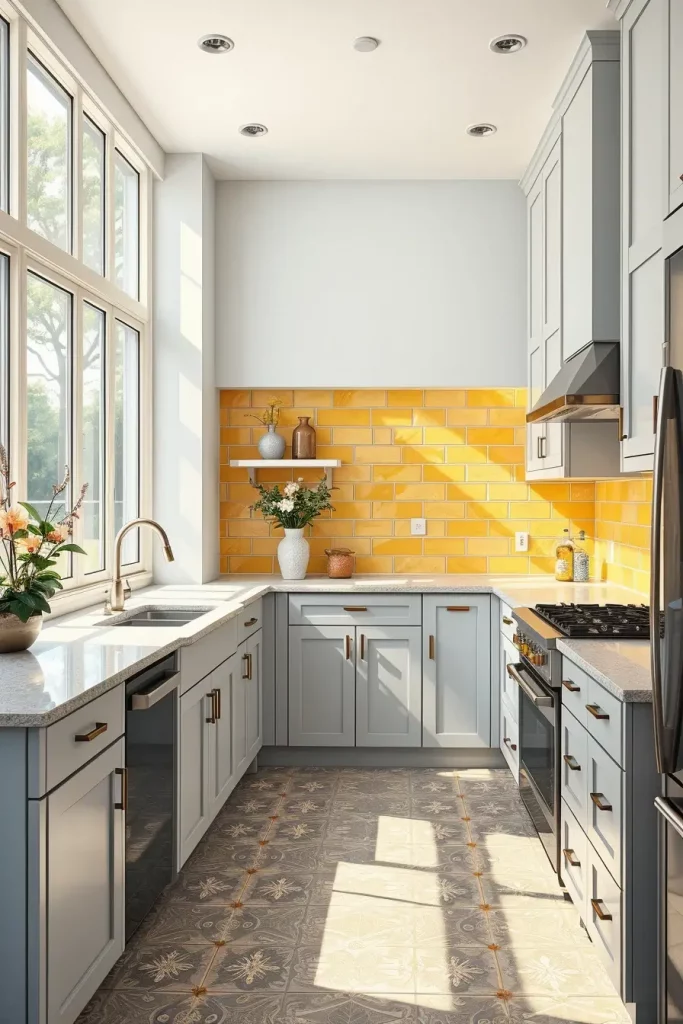
To me, this is an ideal combination of colors in the morning-oriented rooms where the natural light can enhance the brightness of the yellow. Interior designers usually emphasize on the fact that yellow should be used sparingly in contemporary kitchens, and this is what I take to heart.
To enhance this appearance, I would add patterned floor tiles that would use both colors to create a fun but consistent end result.
Powder Blue And Soft White For Serene Modernity
Powder blue and soft white in a kitchen will create a relaxed, fresh and contemporary environment. I prefer this ensemble in houses where the kitchen is a quiet place of repose.
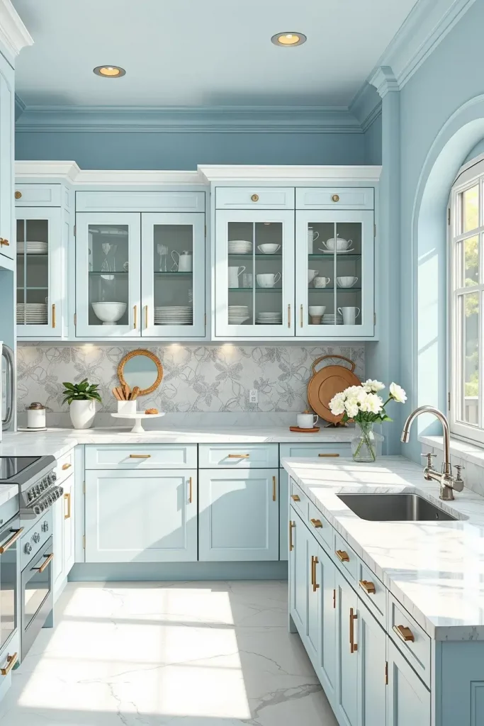
I tend to paint the walls a powder blue and use soft white cabinetry and marble or quartz countertops to make a crisp contrast. The chrome or polished nickel fixtures provide a hint of class, and the glass-front cabinets contribute to the light atmosphere.
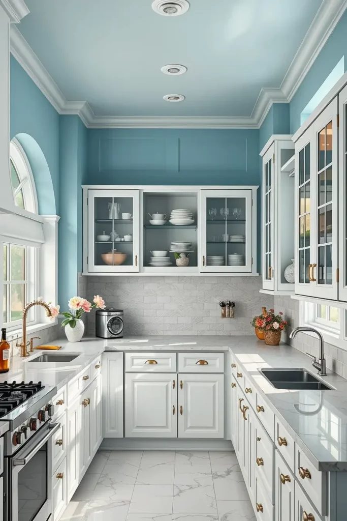
In my personal experience with design, I have discovered that this palette works particularly well in smaller kitchens because the light colors open it up. Southern Living says that light blues with whites can help to minimize visual clutter and help to make the cooking space peaceful, which is something I never forget.
In the event that I would like to elaborate further on this point, I would propose open shelves with well-organized dishware in contrasting colors to perfect the peaceful impression.
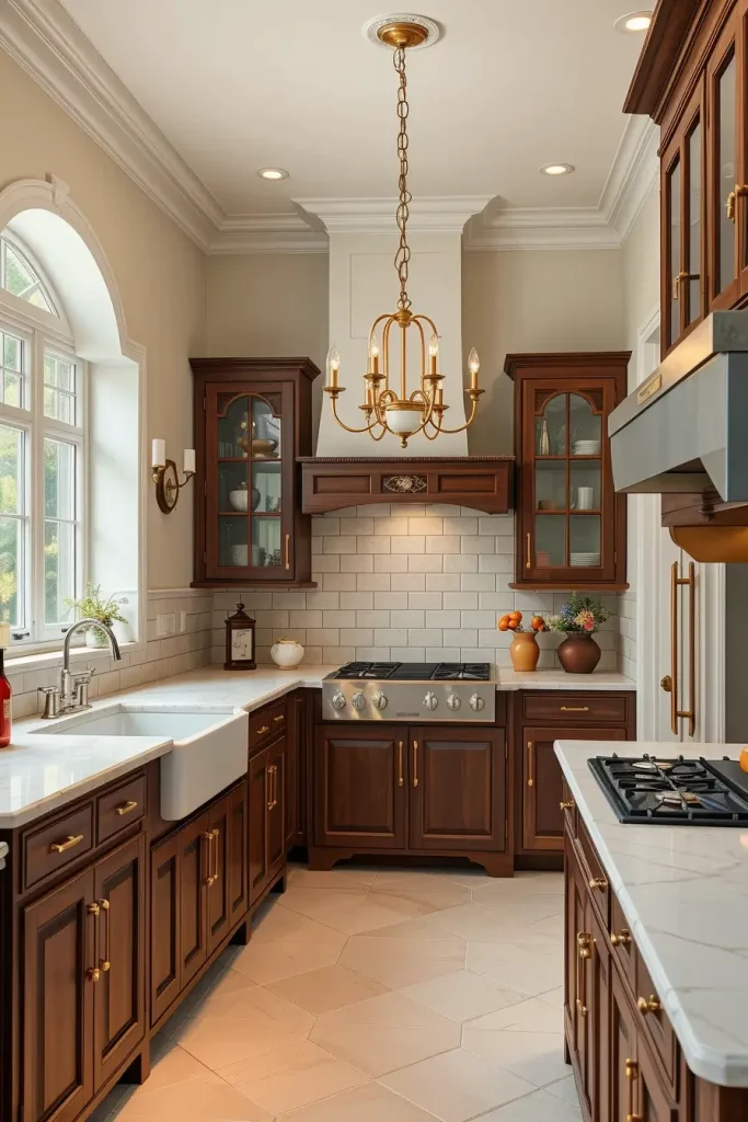
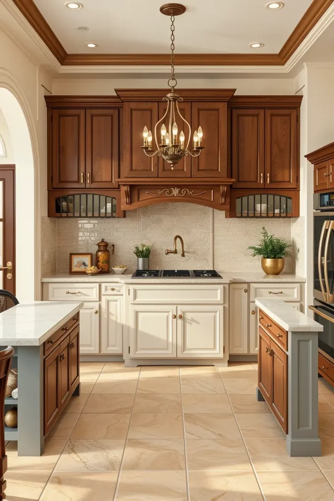
Rich Espresso And Cream For Classic Designer Flair
The combination of espresso and cream makes the kitchen look classy and vintage at the same time. I wear this combination when I do not want to be too formal but I want to create an impression of warmth and sophistication. The dark espresso provides drama and stability, and cream shades prevent the room to feel closed.
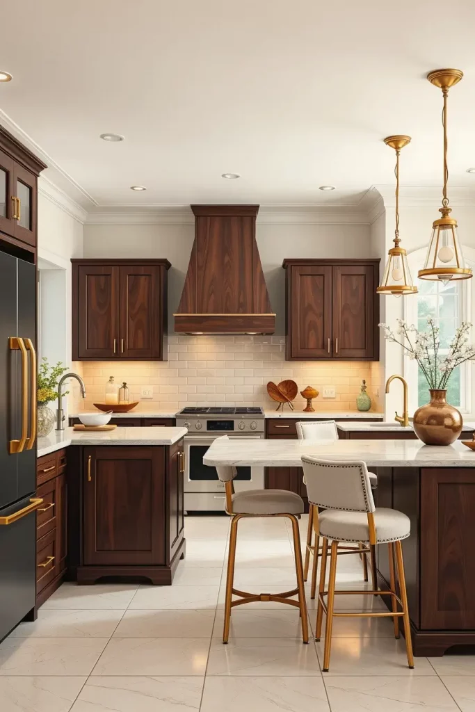
I have used espresso-toned cabinetry in high-quality wood in many of my designs, with cream-painted walls or cream-colored subway tile backsplashes. The palette is complemented by a quartz or marble countertop in an off-white color. I also like warm lighting fixtures in brushed brass or gold to make the espresso richer.
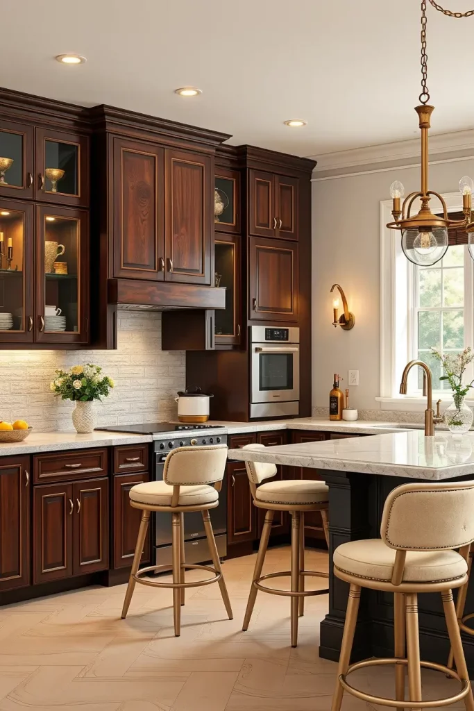
Based on my personal experience, this is a brilliant combination especially in a place where the kitchen is a central meeting point because it is a balance between luxury and comfort. House & Garden designers frequently mention that a combination of dark wood tones and creamy neutrals is a heritage-inspired look that is nonetheless modern.
To take this idea even further, I would recommend incorporating cream-upholstered bar stools or dining chairs to connect the walls to the seating and have a smooth flow of design.
Whisper White And Charcoal Blue For Refined Contrast
By choosing whisper white and charcoal blue, I want to have a subtle but impressive kitchen appearance. The overall palette is softened by whisper white, and the charcoal blue gives depth and the feeling of refinement. This combination is particularly appropriate in contemporary houses where the kitchen is used as a cooking and entertaining area.
I tend to use whisper white walls and ceiling to maintain the brightness of the environment and use charcoal blue cabinetry with sleek and minimal hardware. The white marble backsplash with the slight veining looks fantastic with both of these colors and I prefer to add stainless steel or brushed nickel fixtures to add a touch of polish.
I personally like this combination to be versatile, it can be used in both small kitchens and open-plan layouts. Architectural Digest has also lauded deep blues as a way to achieve a bold but timeless effect, which I can relate to my philosophy of design.
To take this area to the next level, I would include a charcoal blue kitchen island with warm metallic finish pendant lights to create contrast and focal point.
Warm Beige And Stone Gray For Balanced Elegance
The kitchen palette is composed of warm beige and stone gray that gives the impression of balance and subtle sophistication. I prefer to apply this combination to those clients who desire a relaxing environment and do not want to lose a bit of modernity.
Practically, I would paint the walls warm beige to give the background a soft look and stone gray cabinetry with matte or satin finish. A beige-colored backsplash and light stone countertops make a layered appearance. The design is tied together with warm wooden floors and simple black hardware.
In my opinion, such a palette is very versatile and can be used both in modern and transitional designs. Beige has frequently been mentioned by Elle Decor as a returning neutral that is warm but not overwhelming to the rest of the design, which I have found to be true in my own work.
To add even more appeal to this scheme, I would propose stone gray bar stools or open shelving to repeat the tone of the cabinetry and reinforce the visual rhythm.
Graphite Gray And Emerald Green For Luxe Boldness
A graphite gray and emerald green kitchen is one that is desired by people who want a statement-making, luxurious kitchen. I think this is a strong combination since it combines a deep, contemporary neutral with a rich jewel tone that cannot be ignored.
I normally apply graphite gray cabinets or accent walls and emerald green backsplash tiles or wall paint. The contrast is made with quartz or marble countertops in a clean white color, and the opulence is given by brass or gold fixtures. The flooring of dark-stained wood assists in grounding the appearance.
Personally, I find this combination works best in a kitchen that has a lot of natural light, because it adds depth to the emerald color. Better Homes & Gardens has proposed jewel-toned accents as a major trend in creating drama in otherwise neutral kitchens, and this is what I have done.
To take this idea to the next level, I would add emerald-upholstered chairs or green glass pendants to add another level of style.
Bright White And Coral For Contemporary Vibrance
When I select bright white and coral, I am aiming to have a modern kitchen that will be energetic but controlled. The white is bright to keep the space crisp and coral adds a bit of personality and warmth.
To achieve a balanced appearance, I apply bright white on walls, cabinetry and countertops, and coral on a feature wall, backsplash tiles or bar stool upholstery. The design is maintained fresh and modern with stainless steel appliances.
I am particularly fond of this combination in coastal inspired modern kitchens where coral can be a nod to sunset without being too on the nose. In Coastal Living, designers have mentioned that coral is best used with a heavy neutral, and I have found this to be so true.
To be more interesting, I would suggest incorporating coral-patterned fabrics or smaller accent pieces such as vases and planters to give the palette a bit of a connective thread.
Pale Beige And Slate For Soothing Neutral Sophistication
The mixture of pale beige and slate makes a down-to-earth, elegant kitchen, which is calm, but substantial. I prefer this mix on contemporary houses that want to achieve a discreet luxury.
I usually prefer light beige walls and slate lower cabinets and island units. Creamy stone-colored countertops and a backsplash of slate tone keep the harmony, and matte black fixtures provide definition. This is a perfect place to use light wood or tile flooring.
As a professional, I can say that this color scheme is ideal when the clients are interested in having a kitchen that looks both classic and modern. Slate is frequently mentioned in interior design publications because of its capability to provide depth without overwhelming, which is something I like in smaller kitchens.
To make this scheme even better, I would include textured fabric bar stools in beige to provide a soft contrast to the smooth slate cabinetry.
Deep Burgundy And Soft Cream For Opulent Warmth
A rich burgundy and cream kitchen is luxurious and gives a feeling of richness that can hardly be achieved. This is a palette I apply to homeowners that desire a space that is luxurious but inviting.
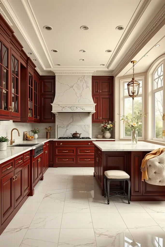
I tend to use deep burgundy cabinetry and island bases and soft cream walls and ceiling. The palette is united by marble or quartz countertops in soft cream with slight veining. The luxurious effect is finished with brass or gold lighting and hardware.
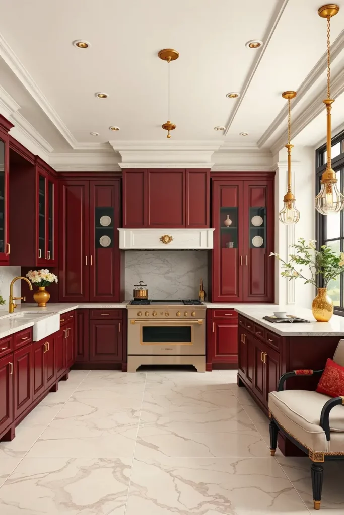
Personally, I would use this combination in a kitchen that has large windows because the natural light would tone down the intensity of the burgundy. Designers in Traditional Home magazine have raved about warm red tones to bring comfort into large open spaces-a philosophy I agree with.
To finish this off, I would recommend adding soft cream upholstered seating and maybe a burgundy framed open shelf to reflect the cabinetry.
Pearl Gray And Soft Mint For Refreshing Elegance
Pearl Gray with Soft Mint is one of my favorites when it comes to kitchens that require a fresh but classy look. The light gray is soothing and neutral and the mint adds a touch of colour, which adds energy without being distracting. The combination is ideal in contemporary open-plan kitchens where you would like to maintain an airy and welcoming appearance. It also reflects natural light in a very beautiful way making the kitchen look bigger and brighter.
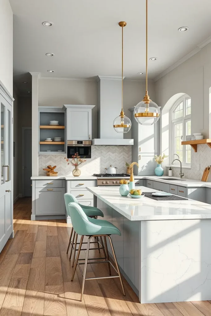
In the case of cabinetry, I tend to suggest a matte light gray finish that matches the walls, and brushed nickel handles. The scheme is completed by a soft white quartz countertop with light veining. I would also recommend bar stools that are covered with light mint fabric to support the palette. The island has minimalist pendant lights that help the space feel modern and a sleek stainless steel backsplash provides a little modern edge.
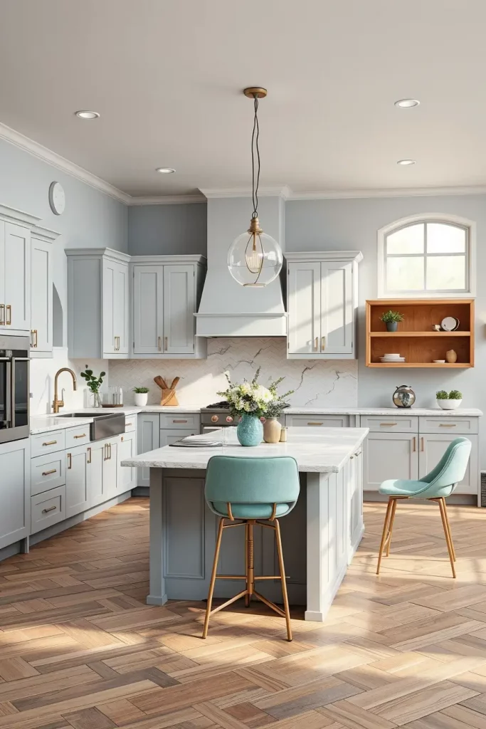
Based on my experience, this palette is especially popular among clients who desire a relaxed but joyful atmosphere. Elle Decor reports that mint and other soft green hues have been popular in luxury kitchen design in recent years due to their ability to provide a relaxing background with the freedom to add playful details. It has worked magic in small kitchens where every visual decision counts.
In case I wanted to enhance this setup, I would add a few open shelves made of light oak to give the place warmth and texture. This would interrupt the solid color of the wall but at the same time maintain the overall design.
Rich Teal And Warm Ivory For Designer Drama
When customers request a kitchen that is big on personality and classic in style, I will tend to recommend Rich Teal walls with Warm Ivory trim and cabinets. The deep teal immediately brings a depth and sophistication and the ivory introduces a soft counterbalance to ensure the room does not feel too heavy. This is a dramatic pairing in high ceilinged kitchens or in kitchens with lots of natural light as it is lovely with daylight and evening lighting.
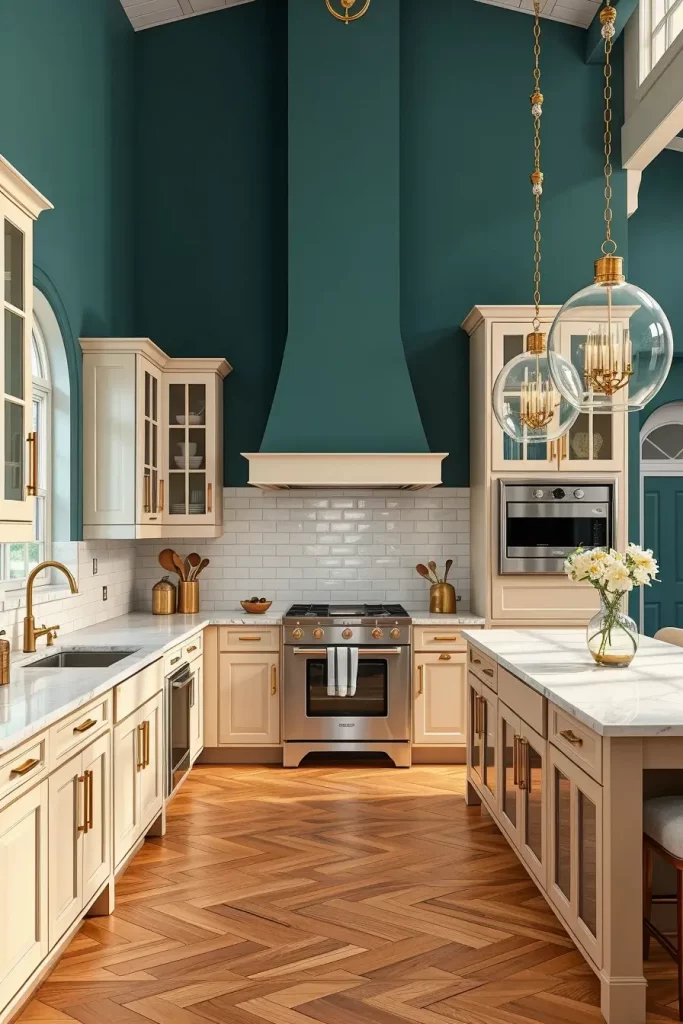
I tend to combine this scheme with shaker style cabinetry in ivory and marble countertops with light gray veining. Gold hardware is perfect here, and it is very warm and designer. As a backsplash, I prefer shiny white subway tiles that would reflect light and provide texture. The look can be unified with statement lighting, like large glass pendants, that does not distract the eye away from the wall colors.
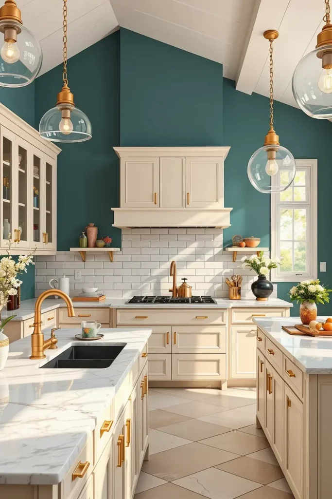
I have observed that teal promotes the feeling of richness and luxury in my own projects. Architectural Digest notes that deep jewel tones such as teal can help a room feel both earthy and lively, particularly when paired with a light neutral. I think it is an excellent option when it comes to the kitchens that are more about the entertaining, as it makes a memorable background.
To make the design even more luxurious, I would add some metallic elements, e.g., a brass fruit bowl or a gold-decorated tray, to make the room more luxurious.
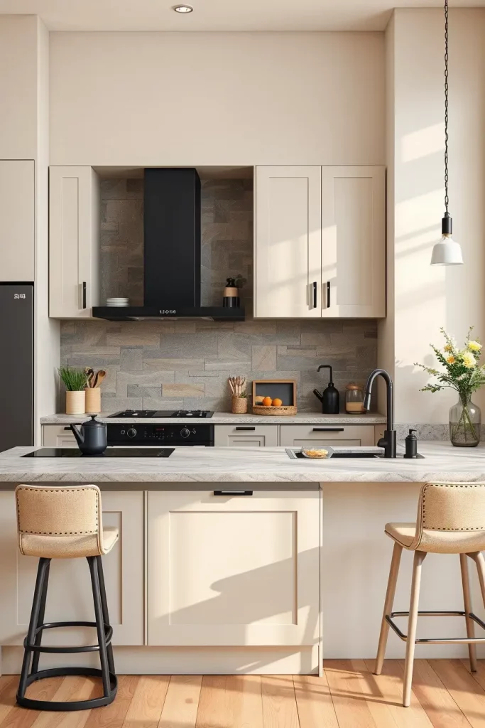
Sandstone Beige And Warm White For Inviting Minimalism
Sandstone Beige with Warm White is a great combination that will satisfy the minimalists who do not want a sterile kitchen. The natural, earthy base is provided by sandstone, and the overall appearance is softened by warm white. This combination is grounded and domestic, and it is perfect in family kitchens or in the areas where the comfort is the primary aim.
When it comes to furniture, I tend to suggest flat-panel cabinetry in warm white with built-in handles to have a clean profile. An accent wall constructed of sandstone behind open shelving can be used to create interest but not clutter. I would combine this with a light wood dining table and neutral colored upholstered chairs. The space is not crowded with subtle lighting, including recessed LEDs along the ceiling.
I have discovered that clients that select this palette love the timelessness of the palette. Neutral kitchens are frequently mentioned in Better Homes & Gardens as one of the best resale kitchens, due to their broad appeal. Sandstone and warm white have always provided a calming, yet fashionable look in my projects.
To give this more of a dynamic look, I would recommend the use of a few textured pieces, like woven baskets or linen curtains to give it some depth and warmth without disrupting the minimalist theme.
Smoke Gray And Champagne For Understated Luxury
In case the aim is elegance, Smoke Gray with Champagne accents is a very beautiful and elegant choice. The modern background is set by the cool and smoky tones, and champagne adds a slight metallic warmth to the room. This combination is particularly suitable in kitchens that have smooth, modern design.
I usually match smoke gray walls with high-gloss cabinetry of the same tone to make a smooth appearance. Pendant lights, bar stool legs and faucet fixtures in champagne color can add that subtle metallic feel without overwhelming the palette. The two colors are separated by a marble island with soft beige veining.
In my opinion, this mix will attract customers, who desire a bit of glamour but not to the extreme. House Beautiful reports that soft metallics such as champagne are becoming trendy since they provide a sophisticated alternative to either gold or silver. I have witnessed this combination to give a high-end, sophisticated look even in small kitchens.
In case I wanted to improve this design further, I would add a champagne-tinted glass backsplash to diffusely reflect light and complement the metallic details.
The right combination of colors on the kitchen wall can be more than a change of appearance of your space, it can determine the mood, increase the functionality, and express your own personal style. Be it the cool sophistication, dramatic flair, cozy minimalism, or discreet opulence, the proper palette will turn your kitchen into the place where you want to spend your time. Which combination do you identify with? Leave your comments below.