
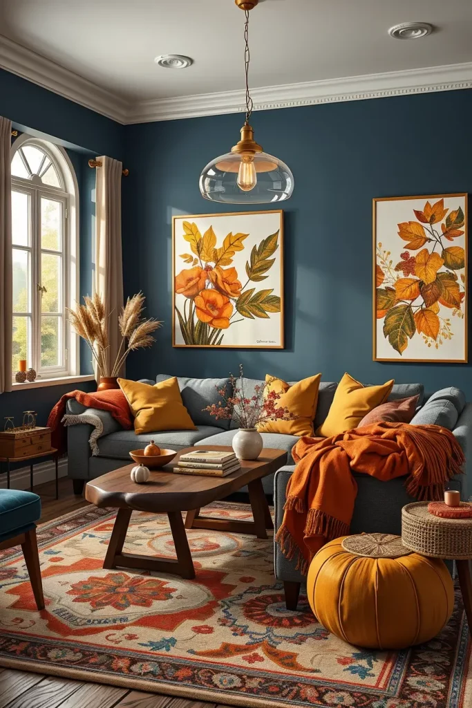
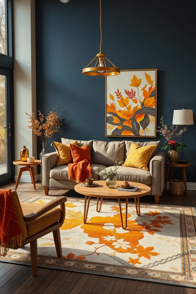
With the cool autumn breeze blowing in, there is no better time to redecorate your living room with contemporary fall living room colors that are warm, cozy and full of fall charm. But what can you do to select shades that are up to date but timeless? What tones will go well with your current furniture and decorations? This article will present my thoughts on the popular fall color schemes, including deep terracotta and light beige, and how each color can make your room a cozy place. I will also provide handy hints on layering textures, combining hues, and accenting in such a way that your living room will be stylish and inviting throughout the year.
Warm Terracotta Tones For A Cozy Autumn Feel
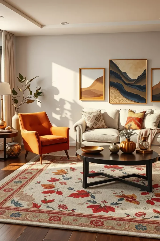
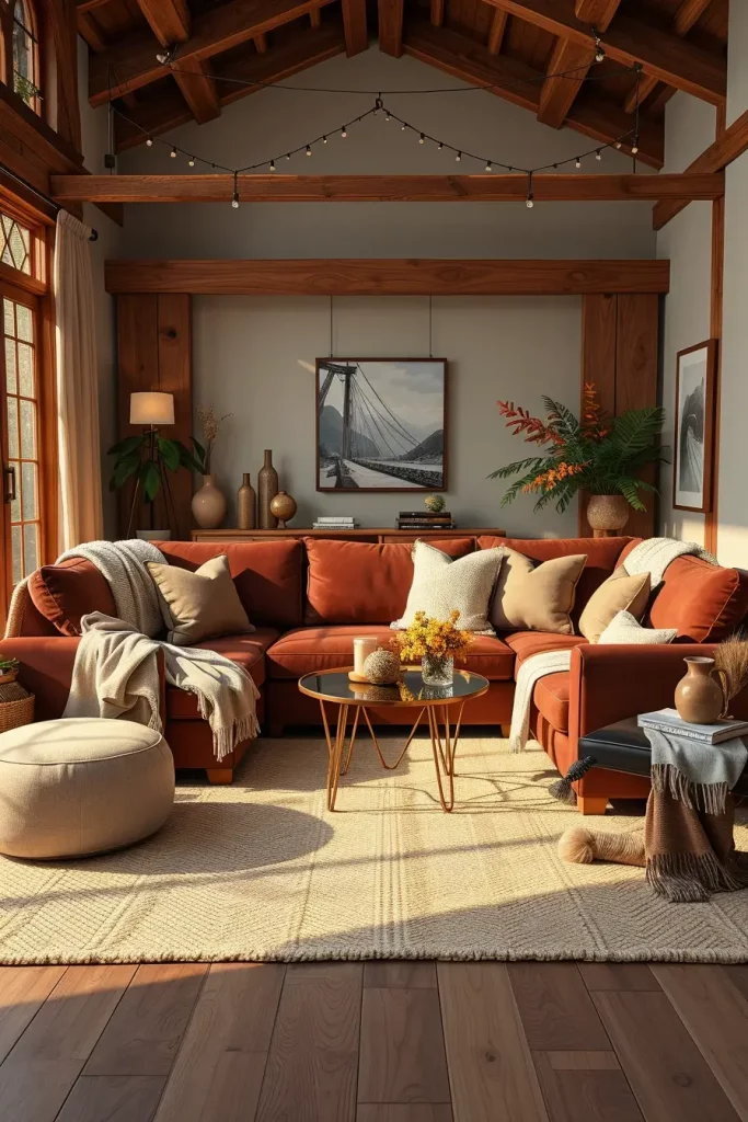
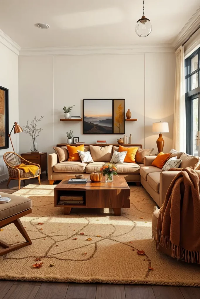
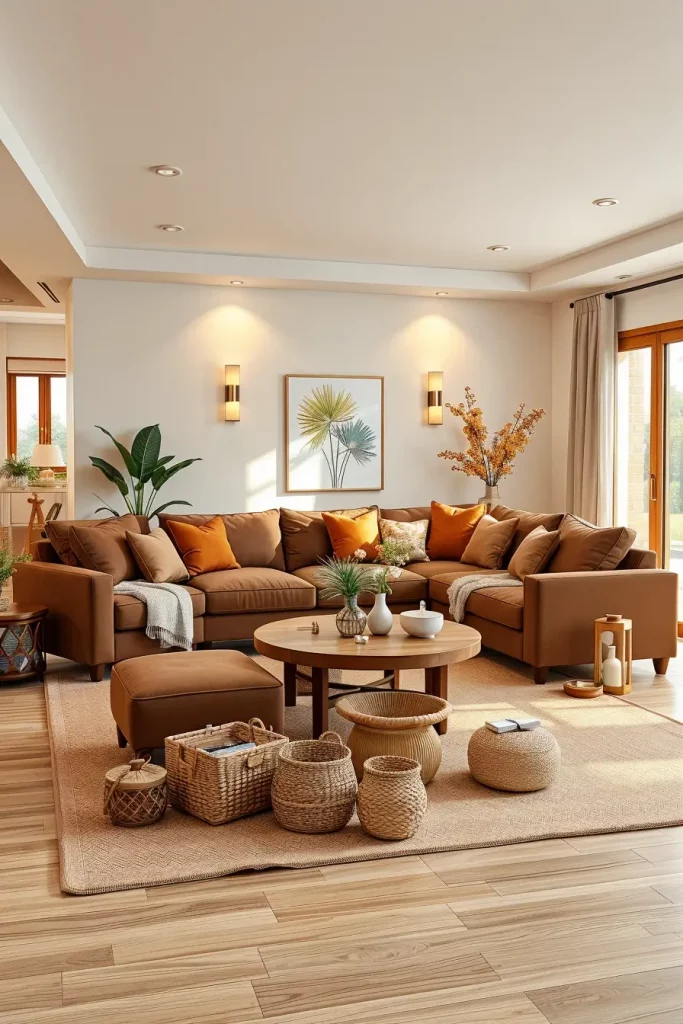
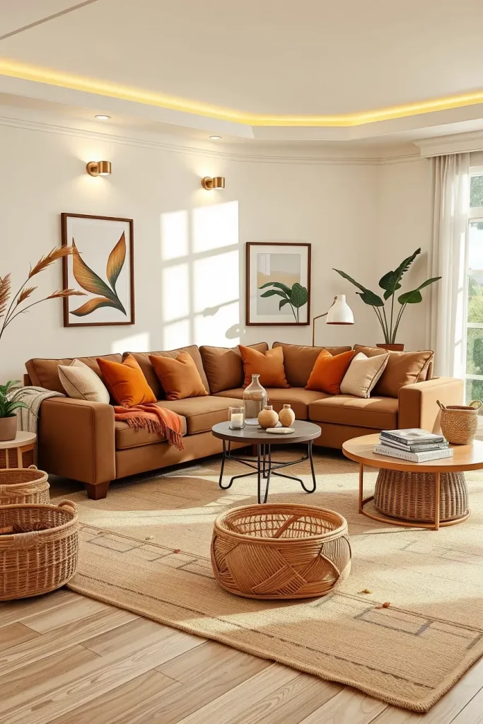
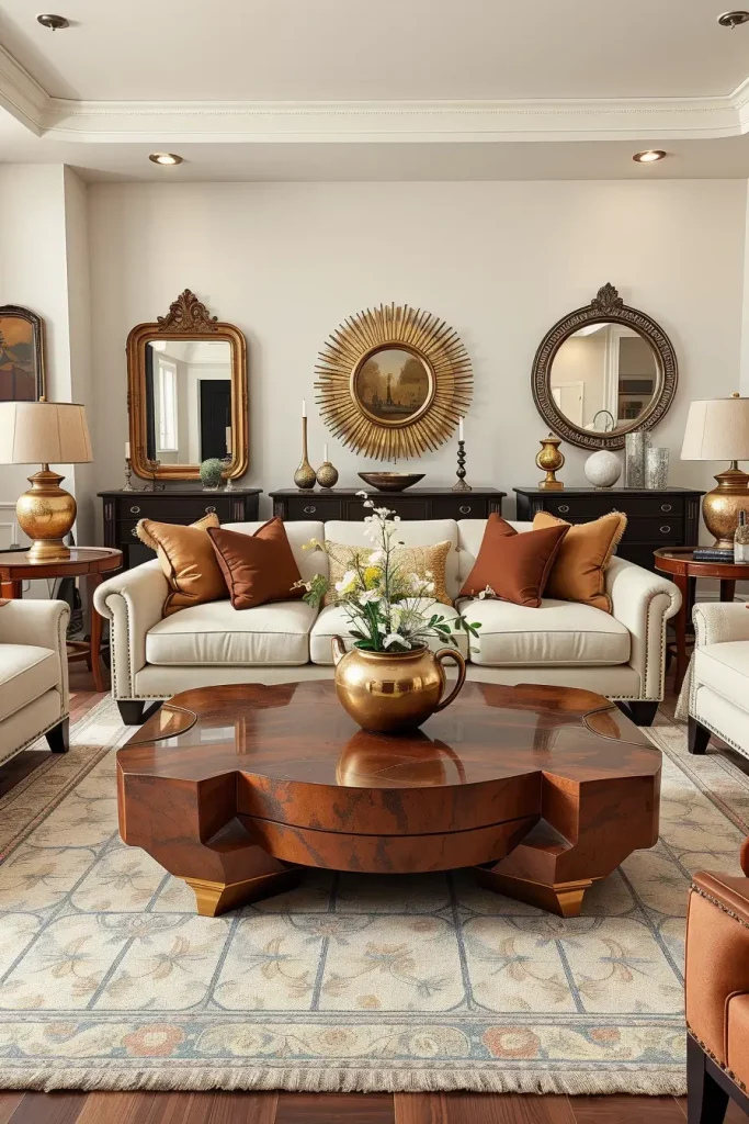
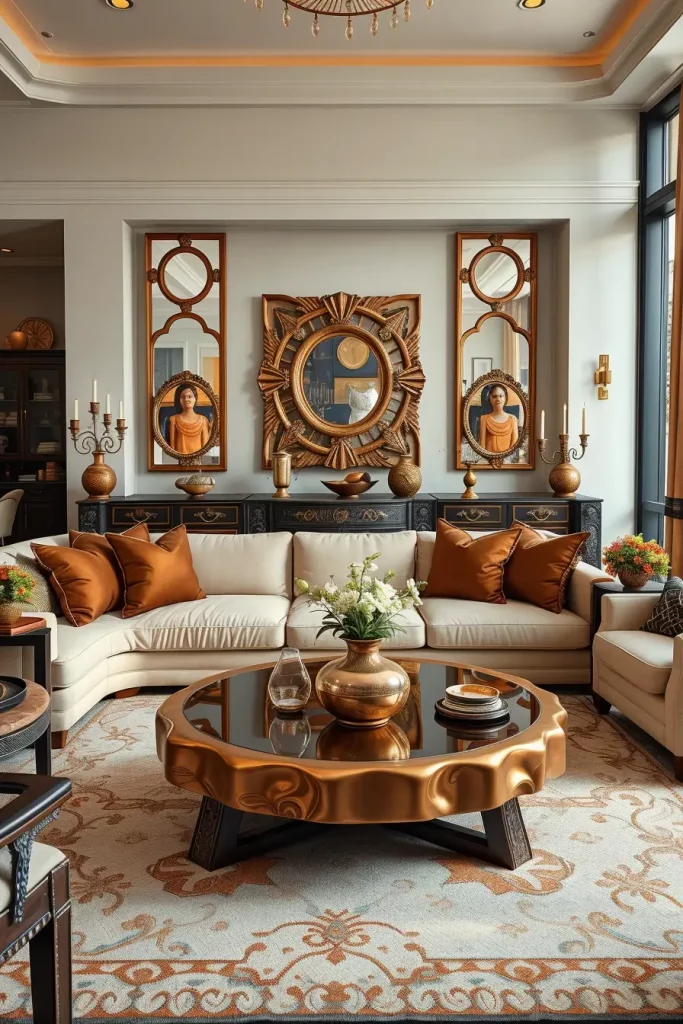
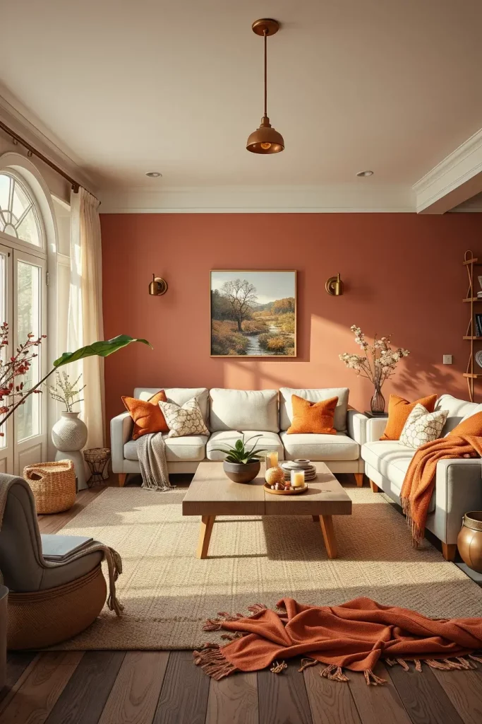
Warm terracotta colors have always been one of my favorite fall color choices. They introduce the rustic beauty of autumn foliage into your home and still have a down to earth grace. The walls or accent pieces made of terracotta create the background of a warm but modern atmosphere, which is a perfect match with the natural wood and soft lighting. This tone is particularly useful in open-concept design where it can be used to move easily between different spaces.
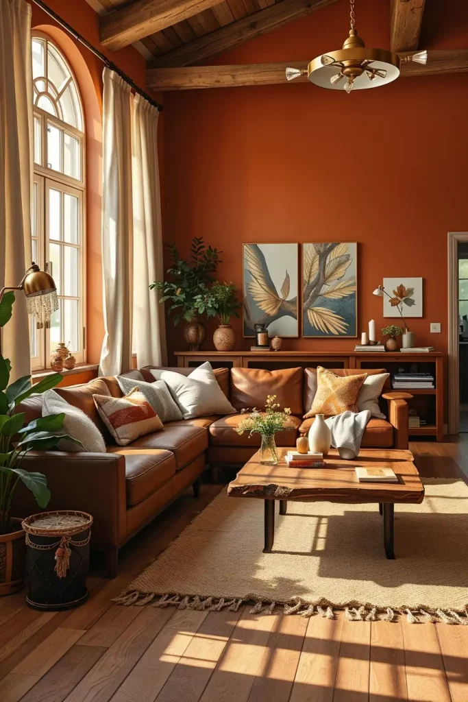
In designing with terracotta, I tend to use deep brown leather sofas, natural jute rugs and off-white linen curtains to counter the richness of the color. The room has depth and texture with a reclaimed wood coffee table or ceramic vases in coordinating tones. Muted brass or bronze fixtures are also worth adding to add the autumn glow without overwhelming the color scheme.
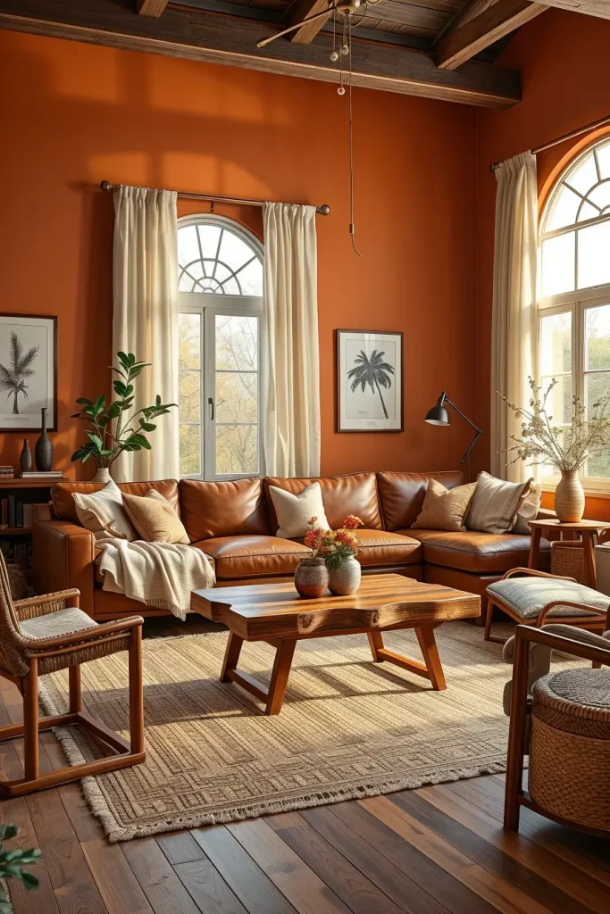
In my experience, terracotta can be overdone, so I recommend accentuating a feature wall or a large piece of furniture so that the color can be seen and not overwhelm the room. Designers such as Emily Henderson have observed that terracotta works especially well with layered textiles, which is why it is so perfect to use in the colder months to create a soft and lived-in environment.
To finish off this style, I would suggest a couple of well-placed throw pillows in rust, cream and burnt orange to complement the fall living room colors palette.
Golden Ochre Accents To Brighten Your Space
One of my favorite colors to use in the autumn in a living room is golden ochre to add light and warmth to the room. Its sunny undertones brighten the mood but do not seem too bright, producing a sophisticated seasonal radiance. In a contemporary environment, I prefer to use ochre as a secondary color in moderation, either with pillows, throws, or even an upholstered chair, so as to balance the room without overpowering it.
Golden ochre is a perfect match to warm gray walls, light oak flooring, and matte black fixtures in my designs. The comfort level is added by layering with natural fabrics such as wool and cotton. A clean modular sofa in a neutral color will offer a neutral canvas upon which to layer ochre accents, and abstract wall art in complementary colors can help unify the scheme.
I, personally, believe that this color looks best when paired with other earthy tones, like olive or taupe, to keep the palette earthy. Architectural Digest has noted that ochre is particularly effective in rooms with less natural light as it will naturally bounce warmth into the room.
And in case I was adding more here, I would consider introducing ochre by way of patterned textiles or ceramic accessories in a subtle but effective seasonal touch.
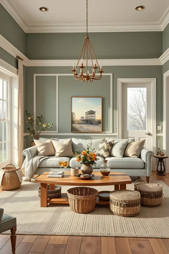
Deep Olive Green For An Earthy Fall Atmosphere
Deep olive green is ideal to achieve a nature-inspired autumn look that is sophisticated. It is lush and soothing, like the richness of late-season foliage. I have frequently used olive as a wall color or on a larger upholstered item such as an armchair to achieve a moody yet warm atmosphere.
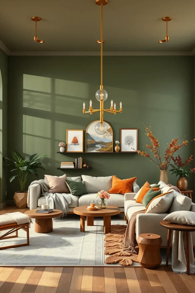
I harmonize olive green with cream or beige upholstery, brass light fixtures, and walnut furniture in my design. This mixes the best in the green without making the space too dark. The tactile interest is created by the layering of wool blankets, velvet cushions, and woven baskets.
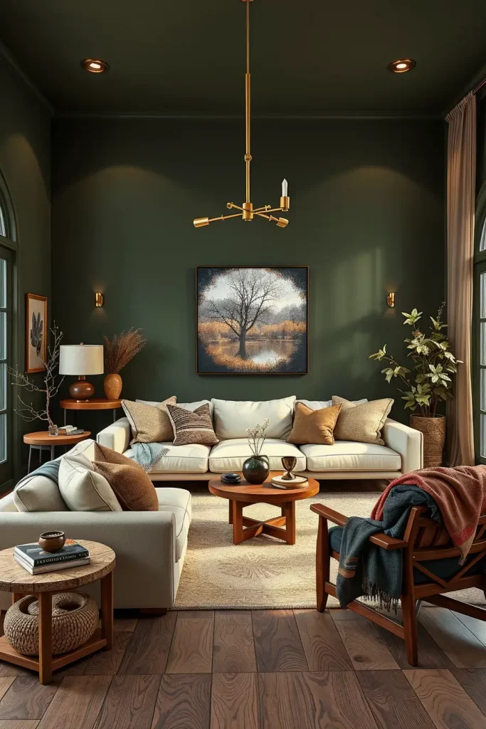
Personally, olive green looks good with warm light. A combination of table lamps and wall sconces provides a warm light that goes well with the richness of the shade. Recently House Beautiful pointed out that olive green looks lovely with terracotta accents to create a cohesive autumn color scheme.
To take this look to the next level I would incorporate some understated botanical prints or plants in ceramic pots to reflect the natural influence of the hue.
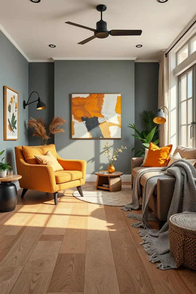
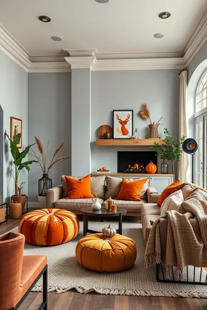
Muted Pumpkin Shades For Subtle Seasonal Charm
Although the bright orange may be overwhelming, the dulled pumpkin tones give a more subtle and sophisticated nod to fall. I have used this color in modern living rooms to make them have a character without sacrificing on the elegance. It is so pretty on accent chairs, ottomans, or even painted cabinetry in open-plan rooms.
I would combine muted pumpkin with neutral walls, cream-colored sofas, and dark wood furniture in a standard arrangement. An orange, beige and brown patterned rug can be used to unify the room. The shade is especially complemented by warm metallics such as aged gold or brushed copper.
On a personal level, I like the way muted pumpkin can fit into a more minimal design, but still indicate the change of season. Elle Decor recommends using it in smaller quantities to achieve timeless effect that can be used even outside fall months.
When I was polishing this up a bit more I would include pumpkin colored throw blankets that have a soft woven texture to add a comfortable and approachable feel.
Rustic Copper Hues To Add Autumn Glow
Copper rusty tones add a cozy touch and a touch of metal to a living room, which is why they are ideal in the fall. They are not too daring and give depth to the design, and they can enhance a contemporary design when applied wisely. Copper is my favorite in decorative accessories, light fixtures, and even accent wall treatments.
The combination I like the most is copper and charcoal gray walls, tan leather sofas, and walnut wood furniture. The warm palette is completed by adding textured cushions in cream and cinnamon colors. Metallic copper vases or candleholders will add a touch of shine without being too much.
Copper, I have found, is most effective as a secondary color. Designers have suggested that it is good because it casts a warm light that makes a room more intimate. I have found it to work especially well in the evening when the lighting is layered and soft.
In this idea, I would also include a statement copper pendant light to make a focal point and add to the overall glow of the area.
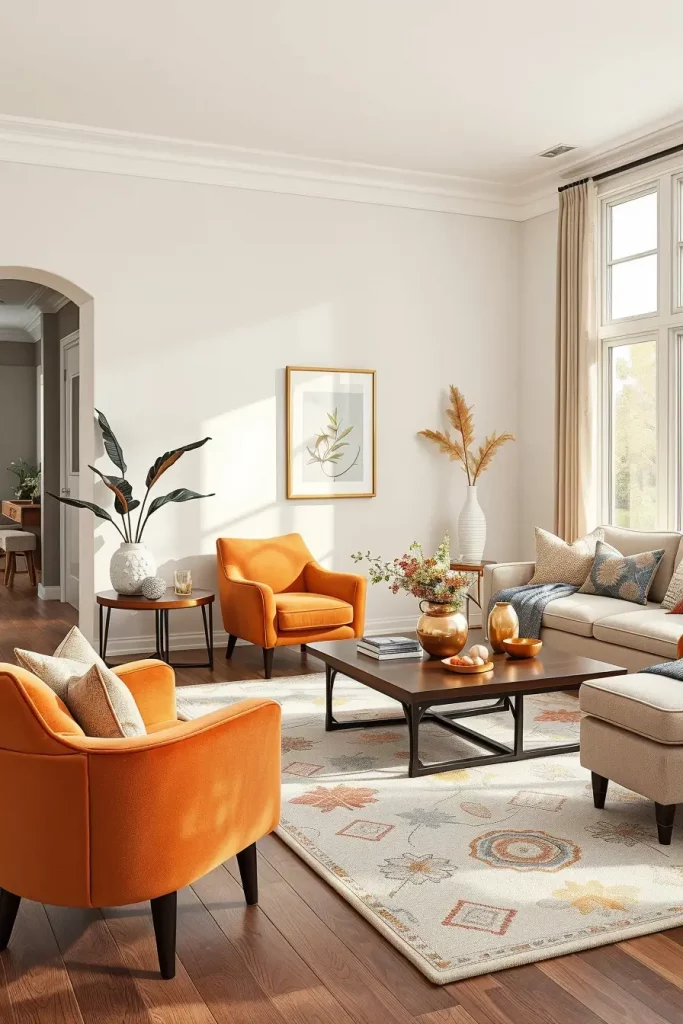
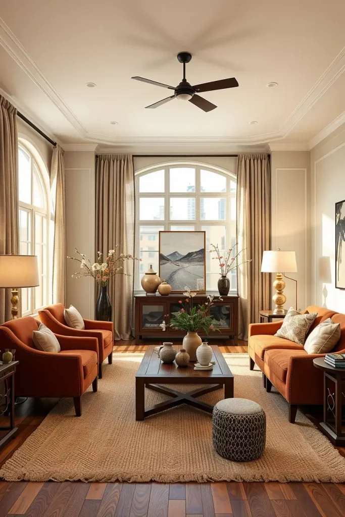
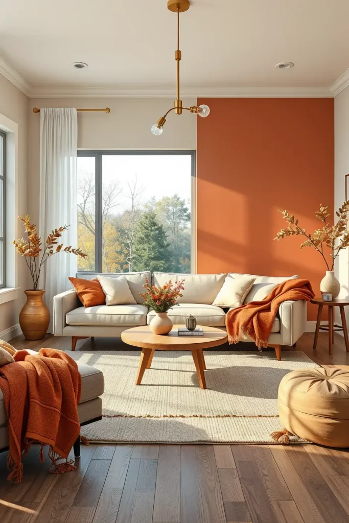
Burnt Orange Highlights For Modern Comfort
Burnt orange is a very dramatic but comfortable fall color to use in a living room. It is richer than typical orange and still has a good seasonal association. This shade works especially well in modern settings when it is tempered with cooler neutrals.
To make a balanced scheme, I would incorporate burnt orange in the form of throw pillows, poufs, or an area rug, with light gray walls, ash wood furniture, and black metal accents. Soft knits or velvet textiles may assist in creating a plush effect in the room.
Burnt orange is a mood-enhancing accent color that I use in my personal design work without being overwhelming to the eye. In a recent article, Real Simple observed that this color looks lovely with deep blues to create a modern update to fall decor.
To improve this space, I would suggest a patterned throw in burnt orange and cream to give texture and warmth.
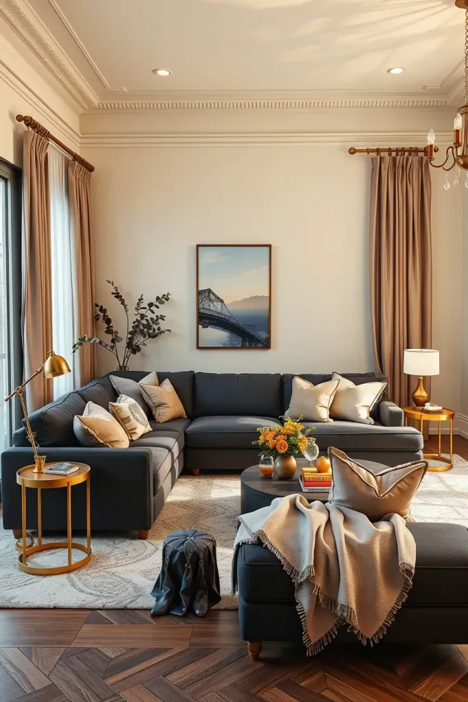
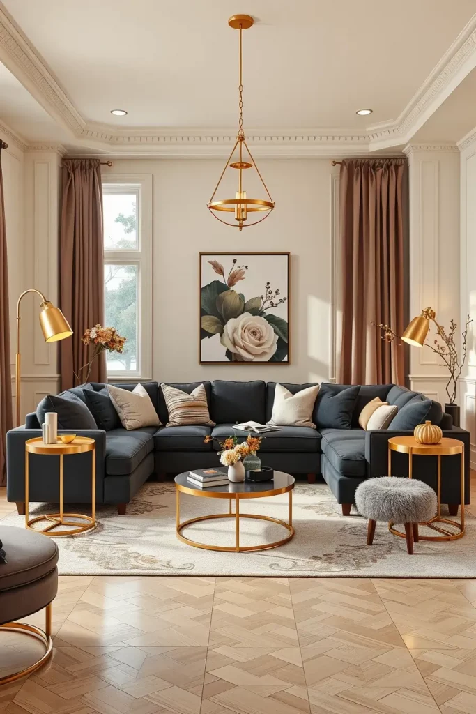
Charcoal Gray With Warm Undertones
The warm charcoal gray is a flexible base to a contemporary fall living room. It enables the use of seasonal colors and makes the overall appearance sophisticated and modern. I have used this frequently as a wall color or in larger pieces of furniture such as sectionals because it is grounding.
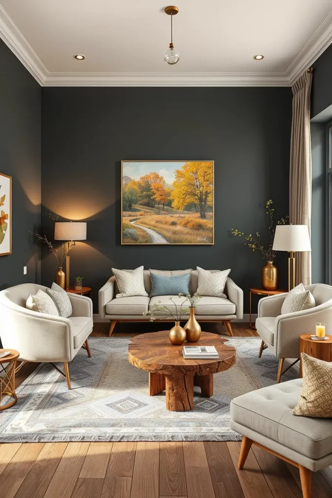
The combination I use most frequently is charcoal and natural wood coffee tables, cream accent chairs, and metallic accessories in gold or bronze. Rugs can be layered, such as a textured wool over a flatweave, to provide a visual and tactile warmth.
I think that charcoal is an underused fall color, and with warm undertones, it can make a room warm and comfortable, but still sophisticated. Better Homes and Gardens has focused on flexibility so that it can be updated with new accent colors on a seasonal basis.
In order to add more to this palette, I would add a big framed autumn landscape painting above the sofa to connect to the seasonal theme.
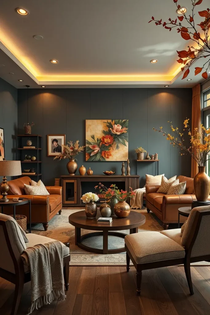
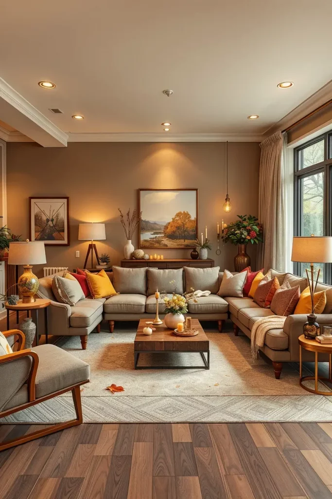
Chocolate Brown Shades For A Grounded Look
I have always liked the way chocolate brown colors can be used to anchor a contemporary living room and provide depth and richness. This color immediately transports a feeling of stability and warmth, which makes it ideal in the fall. Chocolate brown makes a solid foundation on which seasonal colors can be layered, whether on a sofa, an accent wall, or as a large piece, such as a media cabinet.
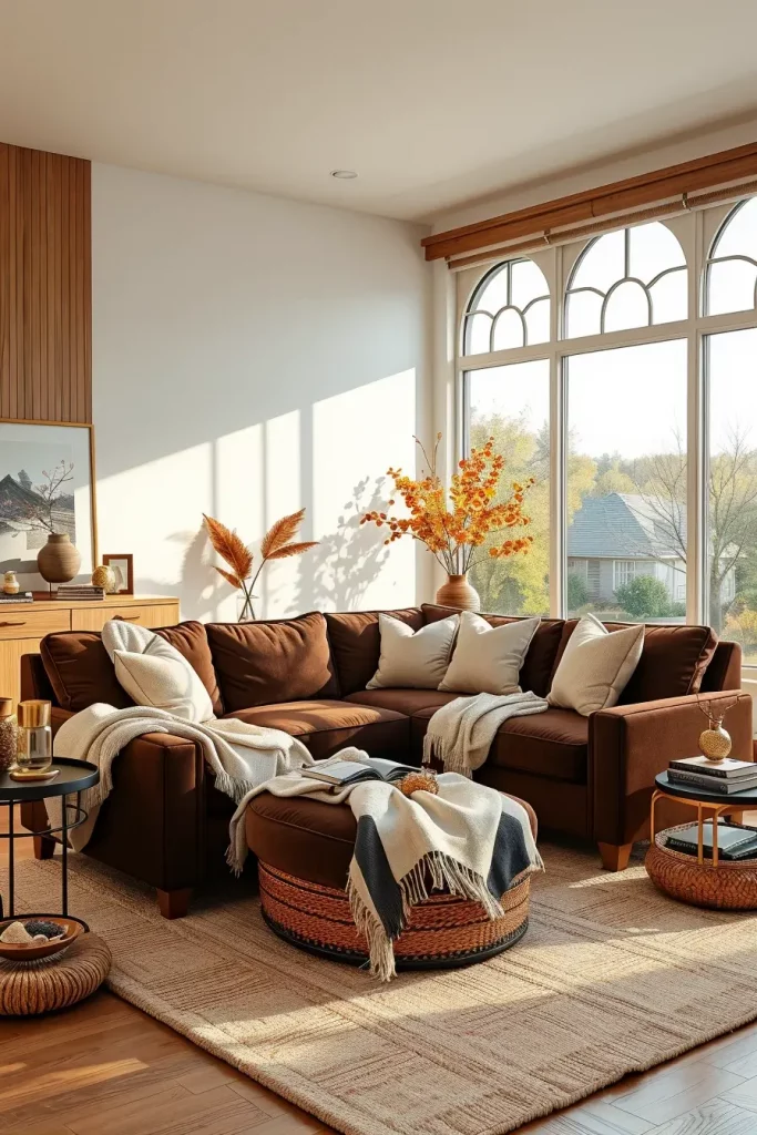
I prefer to add some lighter neutrals when I style with chocolate brown, such as cream throw blankets, beige cushions, and natural wood finishes. The room can be made luxurious with a big sectional in chocolate brown velvet, and a wool rug under feet will add comfort.
I think chocolate brown should be complemented with the slight metallic touch in bronze or brushed gold not to be too heavy. Better Homes & Gardens recommends that it is best combined with warm whites and greenery to keep the palette fresh and still have the cozy autumn atmosphere.
In this part, I would include some warm-colored artwork or prints with some orange and gold to connect to the wider fall living room colors palette.
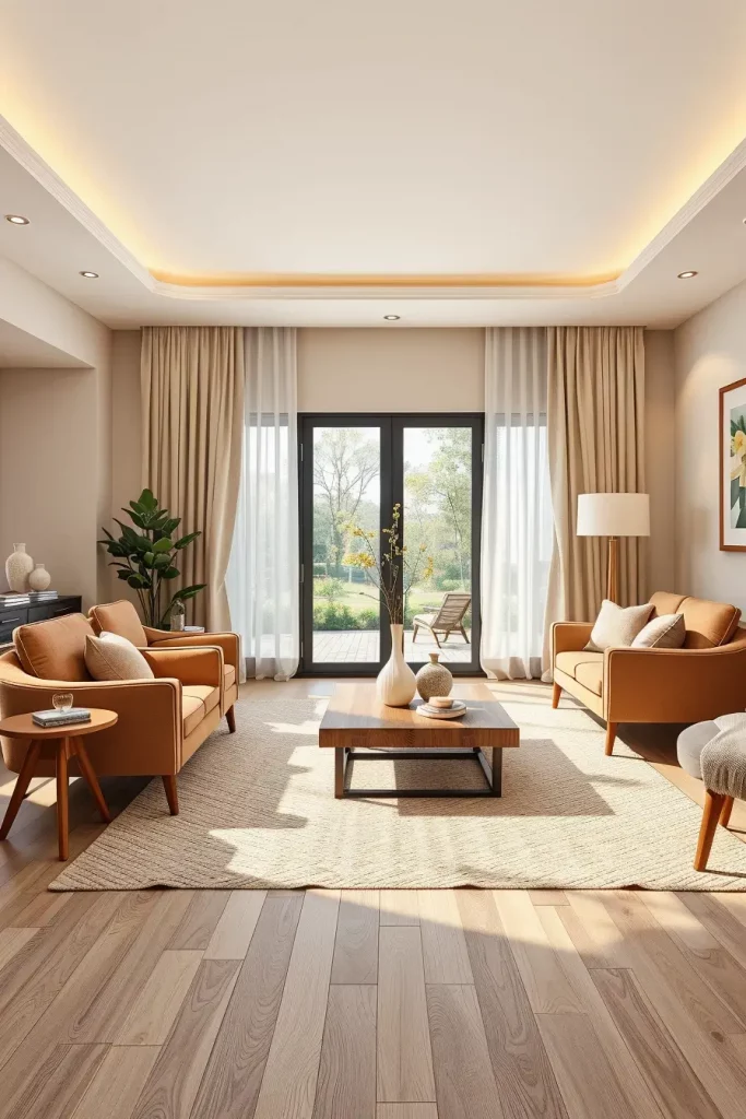
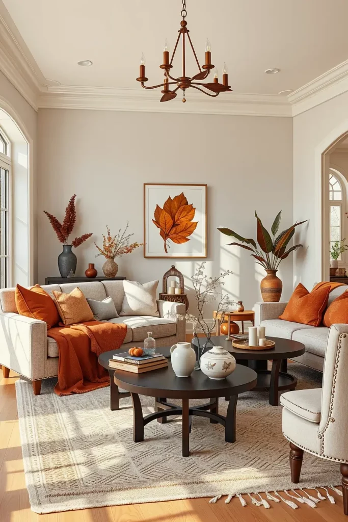
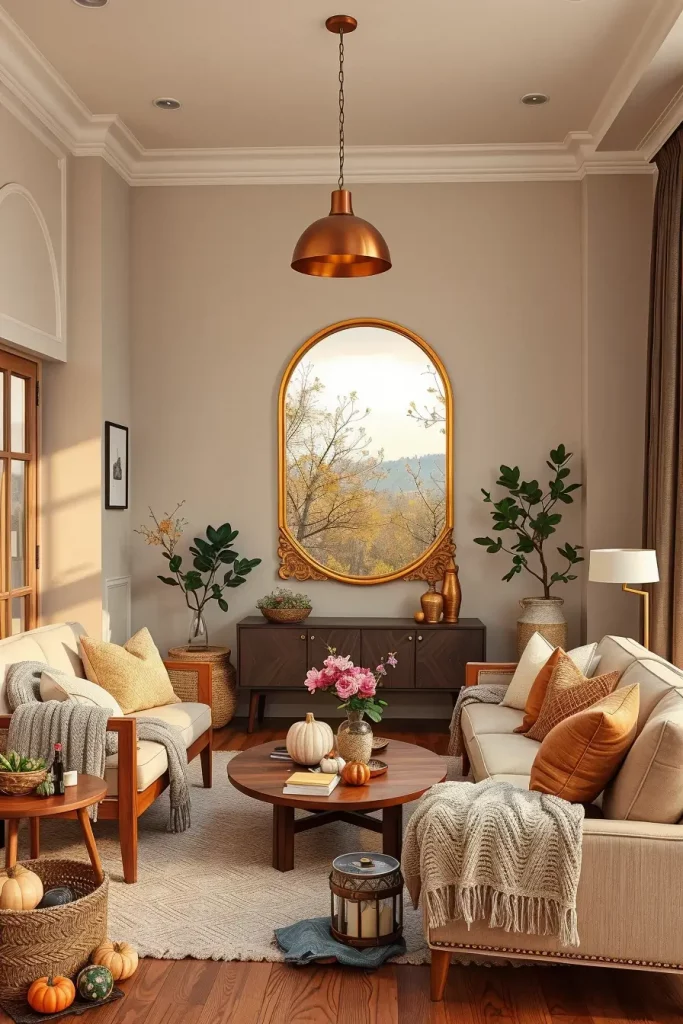
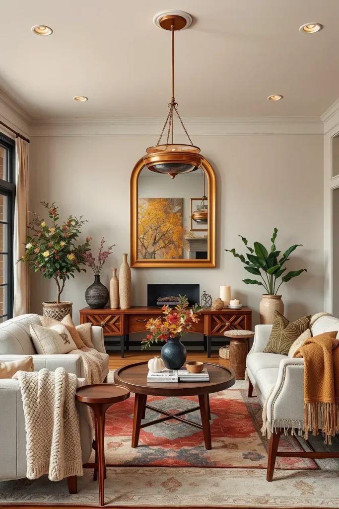
Soft Beige Neutrals With Fall Accents
My favorite is soft beige neutrals when I need to make a universal background that can be used to change the season. This color has a subtle sophistication that you can either dress up or down according to the accents that you use. It gives the ideal backdrop to warmer colours in fall such as terracotta, mustard, or burnt orange.
Beige walls or sofas look gorgeous with textured throws, woven baskets and light wood side tables in my designs. Seasonal patterned cushions in seasonal colours can be added to keep up to date without a complete redesign. The earthy look can be further enhanced with natural fiber rugs, e.g. sisal or jute.
In my experience, beige is very good in smaller living rooms since it reflects light, and thus the room appears open. Beige is a popular recommendation by interior experts in transitional decor because it can easily match with summer and winter decorations.
In case I was improving this area, I would bring in a big statement mirror with a warm-colored frame to bounce light and tie the fall accents together.
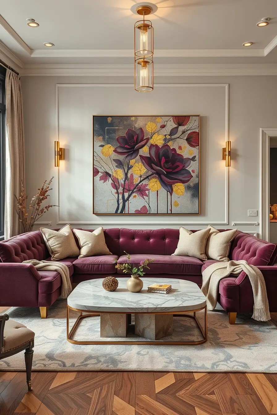
Rich Burgundy Details For Sophisticated Warmth
One of the most indulgent fall colors, rich burgundy will instantly give a living room depth and drama. I have applied it on accent chairs, curtains or throw pillows to make a sophisticated but welcoming environment. It has a jewel tone that works well in rooms that have warm lighting.
I prefer to tone down burgundy with something lighter, either ivory or warm beige, so that it does not dominate the room. The color can be enhanced by adding artwork in gold frames or brass lamps. The entire palette is united with a soft, patterned rug that uses burgundy threads.
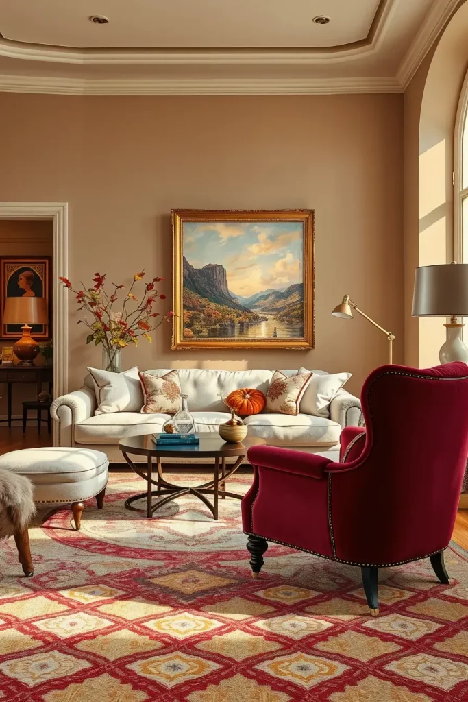
In my opinion, burgundy works best in a room with layered lighting, such as table lamps, floor lamps and wall sconces, to achieve a cozy feeling. House Beautiful designers also tend to mention burgundy as a classic fall color since it is seasonal but not trendy.
In the case of this palette, I would also recommend the addition of a soft velvet throw in the same tone to add to the comfort and the visual depth.
Deep Mustard Yellow For A Modern Rustic Feel
Deep mustard yellow adds an immediate feeling of warmth to a contemporary fall living room. It is not as bright as regular yellow and therefore more refined and adjusted to the earthy colors of the season. I have frequently used it as an accent wall or on occasional chairs or patterned fabrics.
My favorite pairing is deep mustard and dark walnut furniture, charcoal highlights, and soft cream upholstery. This mixture creates a balanced coolness and heat. The cozy factor is increased by textured cushions and knitted throws in mustard and neutral colours.
I think that mustard yellow may be a daring decision, yet it is worth taking the risk when it is applied strategically. Architectural Digest has noted that it is especially effective when combined with black accents in a modern rustic style.
In case I was decorating this arrangement, I would introduce a huge area rug with discreet mustard designs to connect the color to the rest of the design in a more harmonious way.
Sage Green For A Calm Autumn Palette
One of my favorite colors to add a peaceful, relaxing atmosphere to a fall living room is sage green. Its subdued color scheme appeals to nature and is still modern. I have done sage on walls, on upholstery, and even on decorative ceramics to make a harmonious palette.
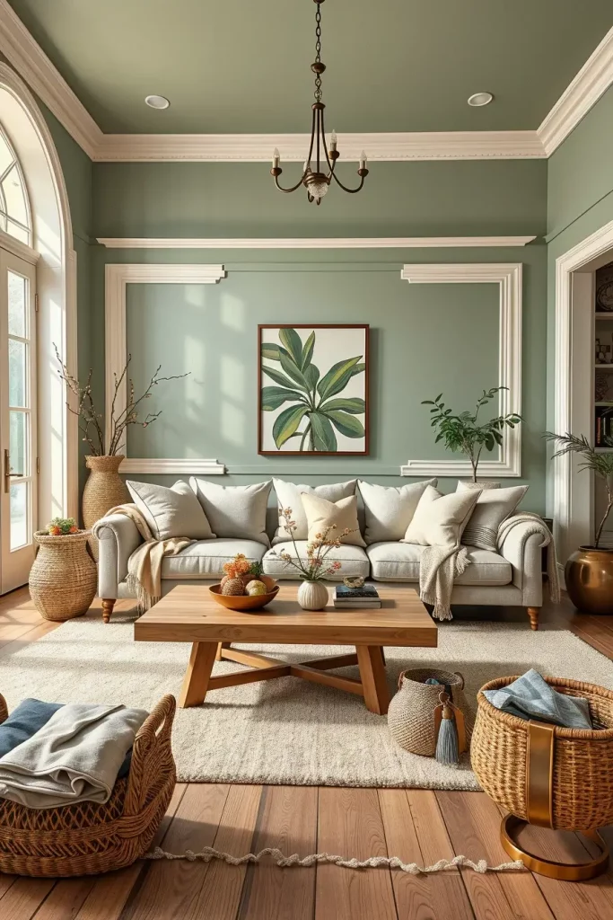
Sage is a color that I use frequently in combination with warm white walls, light oak coffee tables and linen cushions in soft beige or cream. Storage baskets made of woven material and wool rugs can be used to provide texture without taking away the natural beauty of the color.
My experience tells me that sage green is an excellent color to combine with brass or matte black hardware because it offers a versatile combination that can be applied both in traditional and modern settings. According to Elle Decor, it is a color that can be used throughout several seasons, which is a wise investment.
In case I needed to make the place more seasonal, I would add some terracotta accents to make the place more fall-like without making it too harsh.
Warm Taupe For Transitional Fall Styling
Warm taupe is an ideal fall transitional color that is right in between beige and gray. It provides a neutral ground that works with a broad variety of accent colors, including deep burgundy and golden ochre. I usually suggest taupe to people who are not ready to make a serious step towards autumn and use bright colors.
I incorporate taupe in my designs on walls or bigger furniture such as sectionals. Combining it with warm wood finishes, soft cream textiles, and metallic accents makes a coherent and welcoming appearance. Different textures in the room can be united with a taupe area rug with a faint pattern.
Personally, I would say that taupe is a classic option since it can fit the season so well. It is often suggested by designers as a flexible background to changing decorations.
To make the whole picture complete, I would add layered lighting to enhance the coziness of taupe and add more fall atmosphere with table lamps, floor lamps, and candles.
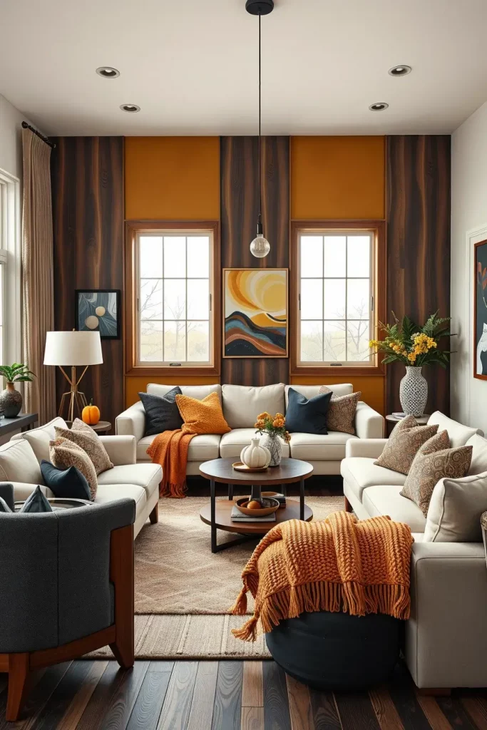
Amber Tones To Capture Seasonal Light
The amber tones are bright and thus suitable to capture the golden autumn light. I have frequently incorporated amber in glass decorations, throw pillows or on the wall to add warmth to a living room without overpowering it.
To create a harmonious palette, I combine amber with off-white walls, mid-tone wood furniture and soft gray fabrics. Amber glass vases or candleholders can be added to add a little bit of glow to the room. The color scheme is connected with a patterned rug with some touches of amber.
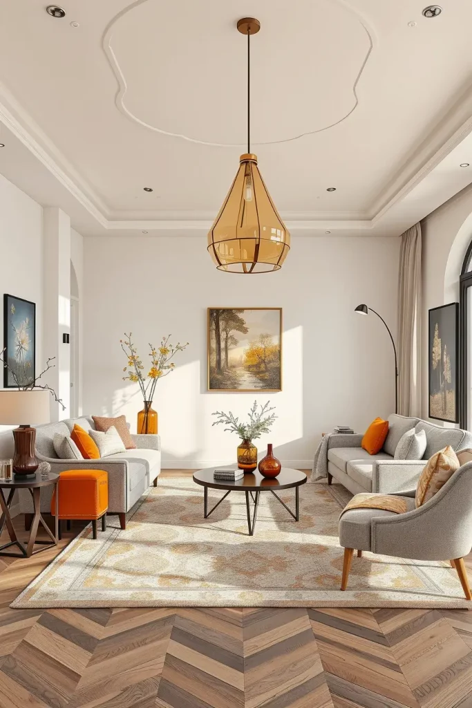
In my opinion, amber is most successful in rooms that are well lit by natural light, so that the warmth can be reflected and magnified. It is frequently suggested by designers to be used in cosy reading corners or areas where one is to relax.
To add to this appearance, I would introduce a statement amber-coloured pendant light to guide the eye upwards and make the most of the seasonal glow.
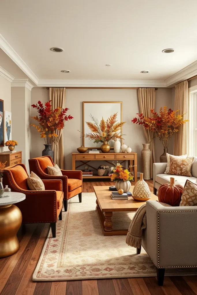
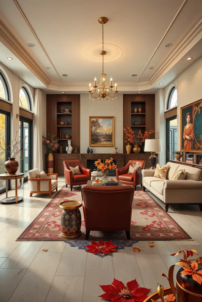
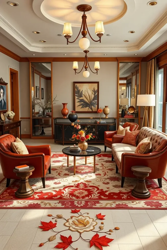
Brick Red Elements For Cozy Fall Vibes
I have always liked that brick red can immediately warm up a living room and yet it feels contemporary. This dark, earthy color can be used wonderfully as an accent on the walls, on a soft sofa, or even as decorative throws. The color naturally goes well with fall materials such as leather, wool and velvet and the room looks grounded and welcoming.
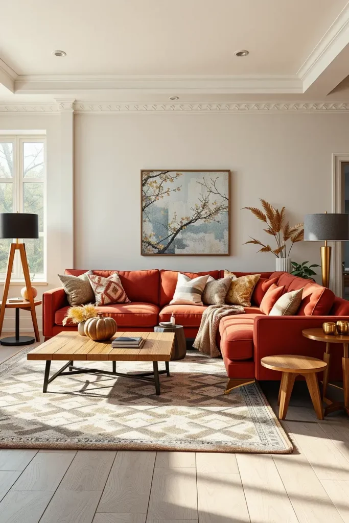
In the case of furniture, I prefer to use a brick red sectional or armchair with neutral walls and light wood coffee tables to ensure that the area is not too heavy. To counterbalance the warmth, it is possible to add metal floor lamps in matte black or brushed gold. Geometric area rugs in dull colors can be used to unify the entire appearance.
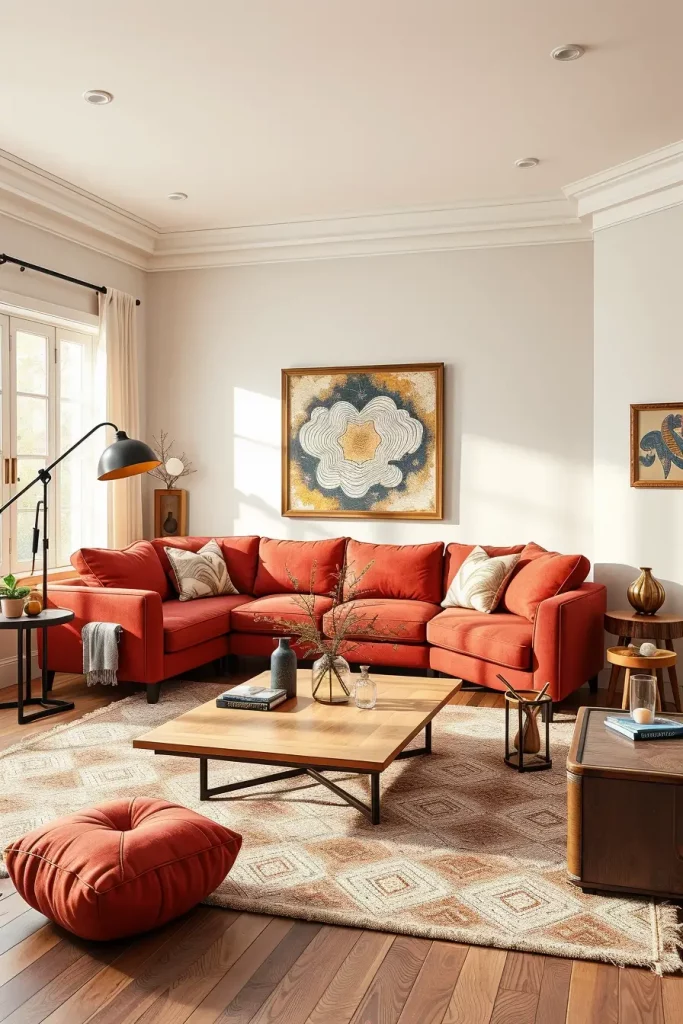
In my experience, it is important to include a moderate amount of brick red. I once did a small apartment and we just used brick red on the main sofa and accent cushions- it was a dramatic effect but not overwhelming. Elle Decor interior designers tend to suggest using such vivid colors with lighter neutral tones to balance the color schemes.
To take this look to the next level, I would recommend some textured wall art in cream and tan, and a pair of rustic wood side tables to add to the warm fall feeling.
Walnut Wood And Brown Color Harmony
Walnut wood is one of my favorites in the design work as it has a rich natural color that is ideal during the fall. When combined with brown upholstery or wall decor, it makes a color balance that is both timeless and contemporary. This is a good combination particularly with open plan living rooms where you need a warm yet sophisticated feel.
Walnut wood furniture, like coffee tables, shelving units or TV consoles, adds a touch of craftsmanship and depth. I would combine them with soft brown sofas, caramel colored cushions and off white walls to achieve a layered and welcoming appearance.
I have observed that this palette has been found to be very relaxing to the clients since it reminds them of nature without being too rustic. Architectural Digest lists the combination of wood tones and warm neutrals as one of the most timeless fall trends in modern homes.
In case I was making this arrangement a little more refined I would include a big, soft brown rug and include metallic side lamps in copper to give it a little bit of brightness and not clash with the warmth of the browns.
Blush Nude With Warm Metallic Accents
Blush nude might not be your first choice when it comes to fall colors, but combined with warm metallics (gold, bronze) it makes a very chic and modern fall appearance. The pale pink undertones add a touch of warmth that is so well suited to modern interiors.
I would select a blush-colored accent chair or sofa in the living room with gold-framed mirrors, bronze side tables, and light beige walls. Muted blush or champagne-colored throw blankets will finish the look and maintain the palette.
I did a downtown loft once and we had blush nude curtains and gold curtain rods- it was subtle luxury. House Beautiful has also recommended blush tones with metals to create a luxurious, yet friendly look.
I would also add some velvet cushions in darker fall colors such as burnt orange or plum to further autumnize the room.
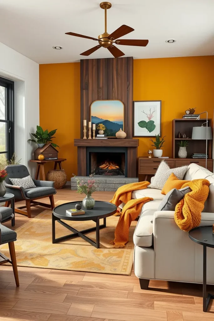
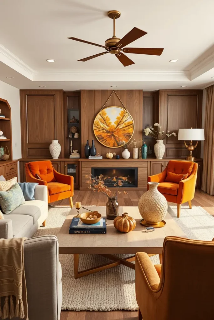
Honey Gold Shades For A Modern Fall Look
Honey gold is a bright but warm shade that reminds the richness of autumn leaves and is modern and fresh at the same time. I prefer it in upholstery or throw pillows or even as an accent wall color to give a bold yet welcoming effect.
The furniture may be an armchair in honey gold and a sofa in charcoal grey, or an ottoman in gold tones in front of a neutral couch. The brightness of the gold is well balanced with wooden elements, particularly in medium oak.
I think honey gold is most effective in combination with a couple of grounding colors such as grey or brown. Better Homes & Gardens designers suggest limiting the use of gold tones to large rooms and going all out in smaller ones to create a jewel-box effect.
To make this style more sophisticated, I would incorporate warm-colored wall art and rugs with a texture that is neutral to allow the gold to shine without the room feeling too busy.
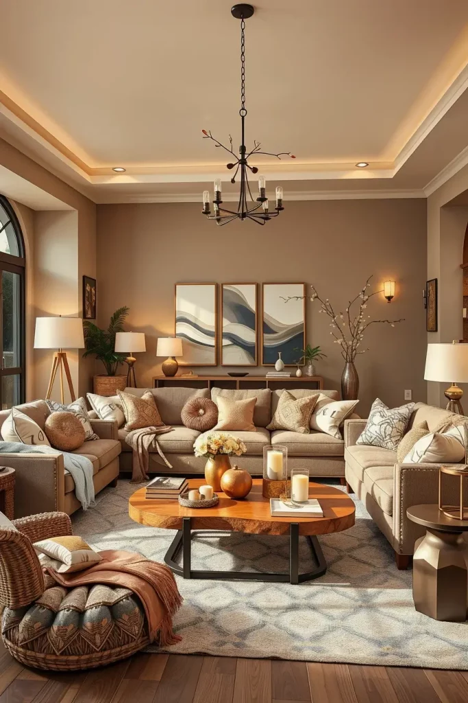
Espresso Brown For A Bold Autumn Statement
Espresso brown is dark, theatrical and ideal to create a statement in a fall living room. It is rich and immediately brings sophistication and coziness, particularly in rooms that receive a lot of natural light.
I tend to apply espresso brown on leather sofas, accent walls or even cabinetry. Combining it with cream or beige makes it less harsh in appearance and still comfortable. Glass coffee tables and brass lighting fixtures can assist to lighten the mood without losing the boldness.
I had a client who had a large open living space and I changed the entire feel of the room by adding espresso brown shelving and a corresponding leather sectional- it gave the room a feeling of solid elegance. Interior design specialists tend to emphasize the need to balance these dark colors with lighter accents to prevent the effect of being closed-in.
To complement this appearance, I would add textured throw pillows of warm rust or mustard color and a large area rug of light coloring to bring contrast.
Forest Green For An Inviting Seasonal Touch
Forest green is a deep, earthy color that seems particularly apt during fall. It links the inside to the outside and looks so pretty with other autumnal colours.
I would suggest a forest green sofa or accent chair and walnut wood tables and cream walls. Brass or gold lighting fixtures may be used to give it a bit of class and a woven area rug may be used to soften the overall effect.
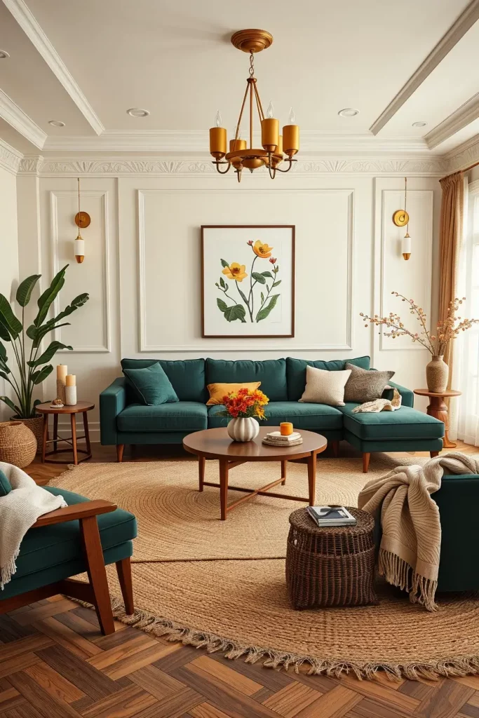
I find forest green can be magic in areas where you need depth but do not want to get too dark. Designers tend to say that green, combined with wood, produces a soothing, harmonious atmosphere.
I would complete this aesthetic with botanical prints in warm frames and soft cream throw blankets to create a warm seasonal feel.
Cinnamon Brown With Soft Cream Pairings
Cinnamon brown is one of those colors that are comforting right away. Combined with soft creamy tones, it makes a comfortable but bright palette that is ideal in the fall.
I enjoy cinnamon brown on accent chairs, rugs or even drapery and combining it with cream sofas or walls. Wood furniture pieces can be light and still bring warmth without the room getting too dark.
I have even created a reading corner with cinnamon brown cushions and cream upholstery, which seemed to be classic and ideal to spend autumn afternoons. This is a combination that many design experts suggest when it comes to smaller rooms as cream will brighten up the room and cinnamon will provide depth.
To complete the look and make it even more sophisticated, I would include some gold elements and some cream vases with texture to complete it.
Deep Plum For A Rich Fall Accent
Deep plum is among those colors that immediately make a living room look sophisticated. Its deep jewel-like color is ideal in fall, and it will bring warmth to the room without being overwhelming. I have always seen it used very well as an accent wall color, on velvet sofas, or even in plush area rugs.

When I design with deep plum I prefer to contrast it with neutral beige or soft grey furniture. A marble coffee table and gold lighting can be used to make plum velvet sofa look luxurious and modern. Soft cream or metallic cushions are used to add lightness to the mood, but retain the elegance.
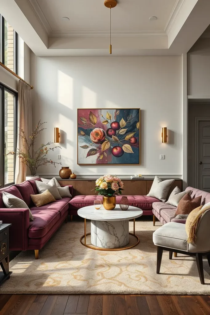
Deep plum can be luxurious in a space, as I have found in my experience, but it should be used strategically. I have used plum curtains in one of my clients living room that has high ceilings and it looked fabulous. Interior designers tend to recommend deep plum to be combined with metallics to make it richer.
In order to complete this style, I would suggest putting some abstract wall art with accents of plum and gold and some glass or ceramic accessories of the same color.
Mocha And Caramel Tones For Warmth
Two of the shades are mocha and caramel, which when put together give a living room a warm, cafe-like comfort. They are so flexible and fit in both modern and transitional homes.
I use mocha on bigger pieces of furniture such as sectionals and caramel on smaller items such as cushions, throws or ottomans. The caramel-colored wood tables and a mocha sofa, along with the soft cream walls, make the space balanced and inviting.
I loved one of my projects where I layered various shades of brown, mocha to caramel with soft beige rugs. This style gave depth but did not seem heavy and was very well accepted by the homeowners.
To finish this arrangement, I would include woven baskets with textures to store items and warm-colored light to underline the feeling of coziness.
Soft Clay Shades For A Modern Organic Feel
Modern interior design with soft clay tones is grounded and organic, which is why it is perfect in the fall. Their soft, earthy sensuality is perfect with natural materials such as wood, linen and stone.
In the case of furniture, I prefer clay-colored armchairs or sofas and neutral beige walls with walnut or oak tables. Area rugs that have texture and linen curtains will also contribute to the tactile nature of the space.
In my opinion, the use of soft clay hues can be used to fill the gap between minimalism and warmth. I have done a minimalist loft with clay-colored cushions and an accent wall of the same color that made it seem much friendlier without sacrificing the clean lines.
To add to this palette, I would add ceramic vases of the same tones and layered lighting, table lamps and floor lamps to create a soft ambient light.
Burnished Bronze For A Luxurious Fall Look
Burnished bronze is rich, warm, metallic and it immediately upgrades a fall living room. It is a flexible finish which can be applied in lighting, furniture frames and decorative accessories.
I tend to use burnished bronze in my designs with dark wood furniture and neutrals fabrics. A cream sofa and rich brown cushions are combined with a bronze coffee table and give the room an autumn-ready elegant look.
I have found that bronze is particularly good in rooms that have good natural light because the warm metallics take the sunlight wonderfully. This color is often suggested in design magazines to create a quiet glamour in contemporary interiors.
I would use bronze-framed mirrors, metallic candle holders and warm-colored wall art to reinforce the luxurious feel to create a more layered impression.
Dusty Rose With Autumn Neutrals
Dusty rose is delicate, romantic and surprisingly versatile in the fall when combined with warm neutrals such as beige, tan and cream. The subtle color is added by its muted pink undertones that do not overwhelm the palette.
My favorite application of dusty rose is in accent chairs, cushions, or throw blankets, with neutral-colored sofas and wooden coffee tables. This color is modern and fresh with the help of light beige walls.
As an individual, dusty rose can be used in small and large rooms, I have previously designed a small living room with dusty rose curtains and they made the ideal focal point without making the room look smaller.
To add to this appearance, I would recommend using textured materials such as knitted throws and linen cushions, and warm ambient lighting.
Warm Charcoal With Gold Accessories
Warm charcoal is a gentler version of traditional dark grey and, therefore, it is ideal in fall interiors. It is paired with gold accessories, which adds elegance and depth to the living room and does not seem cold.
I would suggest a warm charcoal on bigger pieces such as sofas, accent walls or area rugs and add a touch of gold with coffee tables, floor lamps or picture frames. This combination is especially suited to walls in cream or beige.
I recently did a project with a warm charcoal sectional with gold-legged side tables and brass pendant lights it was modern but welcoming.
I would go further to include textured cushions in taupe and ivory and layered curtains to de-emphasize the overall look.
Mahogany Reds For A Deep Seasonal Palette
Mahogany red is a daring and deep color, which brings the feeling of fall, but also introduces some drama to the living room. It goes magnificently with dark browns, golds, and neutral creams.
Mahogany red in leather armchairs or stained wood tables in furniture is something I prefer. The color is a classy focal point when combined with a cream sofa and brass lighting fixtures.
I have witnessed how this palette is magical in big living rooms, particularly when contrasted with light floors and abundant natural light. Design experts believe that mahogany hues are ideal to make a warm yet sophisticated autumn interior.
To make the appearance even more polished, I would add a patterned rug with red and gold undertones, and one or two decorative vases or bowls of the same hues.
Muted Coral For Gentle Autumn Energy
Muted coral is, in my opinion, one of the most underestimated fall colors of a modern living room. It is the ideal combination of coziness and restraint, so it can be combined with neutral and contrasting accents without any difficulties. The color is soft and earthy with a hint of the autumn sunset glow that does not dominate the room. I tend to apply it to accent walls or large pieces of upholstered furniture, and it is welcoming and yet fresh and modern.
I tend to use creamy white sofas, light oak coffee tables and textured rugs when I design around muted coral to achieve a balance in the room. Gold-toned or brass light fixtures are also very pretty and give a touch of seasonal glow. The more neutral palette can be overlaid with the less-intense terracotta or rust throw blankets that are not dominating. It is a good shade to use with natural fabrics and I tend to use linen or cotton upholstery.
I have observed that muted coral is best used in areas that are well lit with natural light. I used it in my own house on a feature wall behind a sofa and the impact was amazing- it immediately made the room feel cosier and more welcoming. Elle Decor designers have also singled out muted coral as a transitional color, which is ideal in autumn decor, particularly in combination with contemporary metallics.
To this appearance, I would include some handwoven baskets as storage and soft sheer curtains to increase the flow of light. Some strategically placed potted greenery would also add a hint of freshness, to counter the coziness of the coral hues.
Warm Ivory With Subtle Fall Undertones
My favorite hue to make a living room airy but still seasonal is a warm ivory. It has a sufficient amount of warmth that can represent the coziness of autumn and still make the living room look light and airy. The shade is also very convenient especially in small spaces where darker shades would be too overbearing. I tend to use it on walls, large furniture items or even curtains to make a versatile backdrop that can be used all year round.
When I style with warm ivory, I like to add fall undertones by layering accessories- rust colored cushions, burnt orange throws, and dark wood accent tables. The mixture adds depth without causing the room to feel too autumnal. I also prefer to add textured ivory carpets and neutral ceramic vases to make it look soft and sophisticated.
Warm ivory is an ageless option that I have discovered in my design work. It is also highly commended by experts like the Architectural Digest which regularly uses it in seasonal makeovers due to its flexibility of fitting into new decor themes. Personally, I adore the way it looks with both sparse and luxuriously textured interiors.
To further reinforce this arrangement, I would introduce brushed brass floor lamps and some patterned pillows that introduce some hints of gold or olive to the arrangement. A coffee table runner with texture would also be a good idea to avoid a too formal look.
Midnight Blue With Autumn Color Pops
To clients who desire a richer, bolder appearance, I usually recommend midnight blue as a background color in their fall living room. This dark, brooding color provides a classy backdrop against which to bring in lighter fall elements such as amber, gold and burned sienna. It is a color that looks just as good on the walls or on large upholstered pieces of furniture, and the result is dramatic but modern elegance.
I prefer to add warm metallics in the form of coffee tables or shelving units when I style around midnight blue. The darkness can be interrupted with mustard yellow cushions, rust-colored throws, and even pumpkin-orange ceramics that will tie the palette to the fall season. The overall look can also be given dimension with a combination of velvet and woven textures.
My own experience has been that midnight blue is a lovely color to match with natural wood. In a different work, I used midnight blue sectional sofa, walnut coffee table, and gold pendant lighting to design a comfortable and luxurious interior. House Beautiful designers also suggest deep blues should be used in fall interiors to create the balance between warmth and depth.
To complement this color scheme, I would recommend a large patterned area rug with some gold and rust, and artwork with abstract autumn landscapes to slightly reflect the seasonal theme.
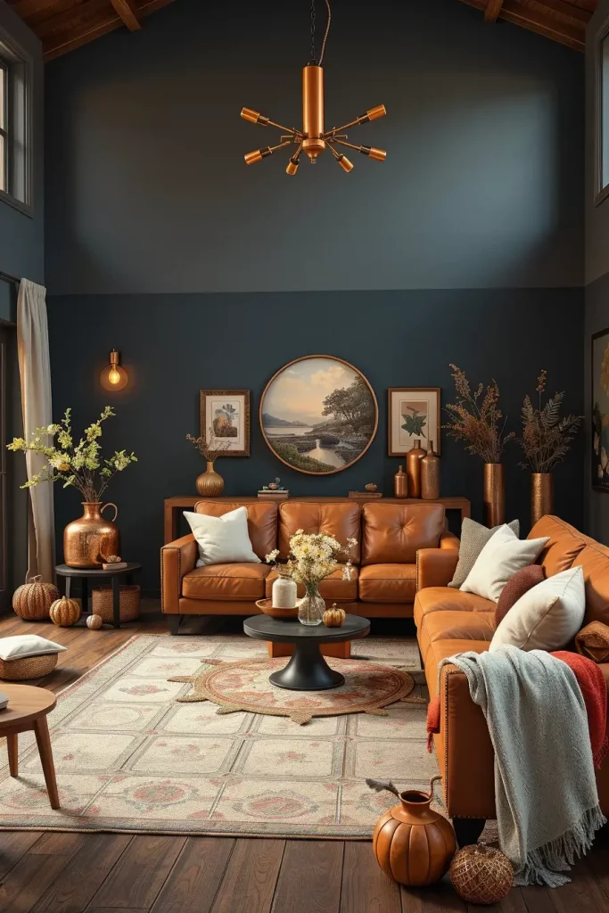
Copper And Brass Finishes For Seasonal Glow
Although it might be neutral in terms of walls and furniture, I have witnessed how copper and brass accents can immediately add a fall-inspired coziness to a living room. These metals are so light reflective and introduce a golden glow that is just right to fall evenings. I also tend to put them in light fixtures, mirror frames, and decorative bowls to make the place elegant and luxurious.
In mixing copper and brass with other materials, I prefer to mix it with warm-toned wood, creamy upholstery, and layered textiles such as chunky knit throws. The metals are particularly effective when used with deep greens, navy blues and burnt oranges, colors that inherently complement the shine.
I have applied copper pendant lighting above coffee tables in my own projects to make a warm focal point. The publications such as Veranda magazine also remark that such finishes are especially useful in providing a soft, luminous atmosphere in the cooler months.
To further streamline the appearance, I would recommend a couple of decorative trays or candleholders of the same metallic hues. It will harmonize the accents and will make the room more sophisticated and purposeful.
The introduction of the appropriate colors to your contemporary fall living room can totally change the mood- it will become warm, welcoming, and simply chic. Muted coral, warm ivory, midnight blue, copper and brass accents, the trick is to combine seasonal tones with classic ones. I’d love to hear which fall color inspires you most—share your thoughts in the comments below!