
Hallways are often overlooked, but I see them as one of the best places to express personality and creativity throughout the home. For the Fall 2026 season, artistic hallway design is moving beyond simple decoration and toward thoughtfully composed spaces with distinctive artwork, sculptural lighting, textured walls, mirrors, and expressive details. In this collection, I explore a range of hallway interiors that show how different materials, patterns, colors, and decorative elements can completely change the character of a passageway. Some designs feel soft and elegant, while others make a stronger statement with dramatic wallpaper, oversized artwork, or architectural lighting. I especially love how these ideas balance visual impact with practical features such as seating, consoles, storage, and clear circulation. As you explore these Artistic Hallways Ideas to Fall 2026 Season, you will find inspiration for turning an ordinary hallway into a memorable part of your home.
White Brick Hallway With Sculptural Mirror And Lavender Arrangement
The first hallway immediately catches my attention with its white textured brick wall and a compact white console-style surface positioned along it. An oval mirror with an ornate raised frame becomes the focal point, while a long white planter-like container holds an arrangement of purple stems. Small decorative figures and objects sit beneath and around the mirror, and a soft neutral rug covers part of the pale floor. The predominantly white palette gives the space an airy appearance, while the purple accents introduce a noticeable point of color.
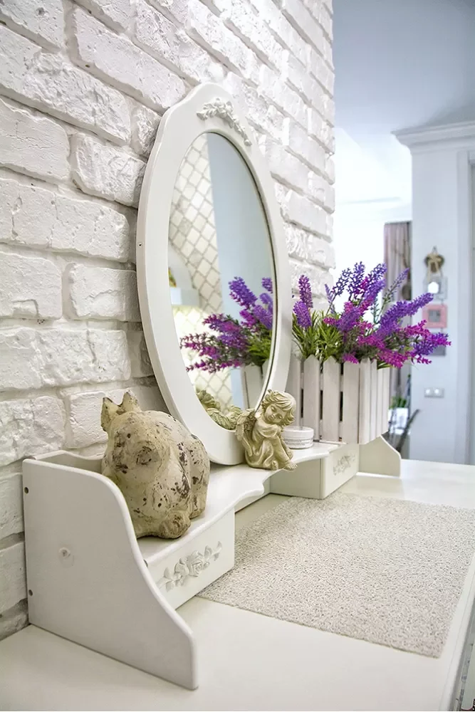
I like how the narrow furniture keeps the circulation area open while still creating a defined decorative zone. The mirror adds depth and reflects the surrounding interior, which is particularly useful in a hallway where natural space can be limited. The combination of the textured wall, curved mirror, small accessories, and purple arrangement creates several layers of visual interest without filling the passage with bulky pieces.
From my perspective, this is a good example of how a hallway can feel personal through a small number of carefully arranged details. I would pay particular attention to the balance between the decorative objects and the available surface area, keeping enough clear space for practical use. The curved outline of the mirror also softens the strong horizontal and vertical lines of the brick wall and furniture.
Long White Hallway With Gallery Artwork And Patterned Floor
This hallway has a much more architectural and understated appearance, with white paneled doors lining both sides and a long corridor leading toward a brighter room. The floor is finished with large gray tiles arranged diagonally, with small decorative details appearing at some of the intersections. Several framed artworks are visible along the walls, including a prominent portrait at the far end. The ceiling remains simple, with recessed and dark cylindrical fixtures providing illumination.
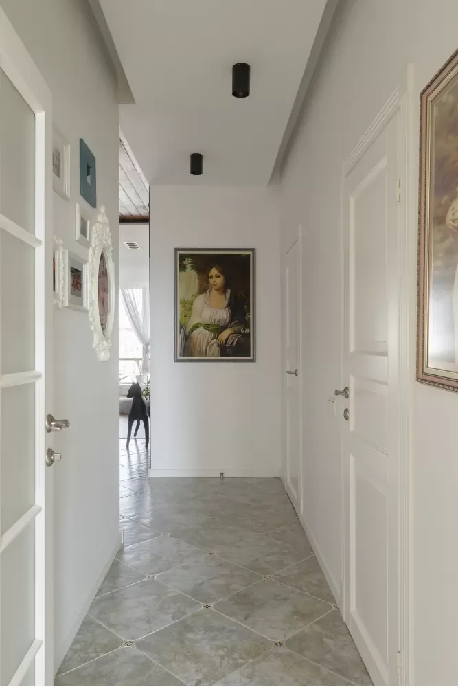
The strength of this hallway comes from its clean proportions and uninterrupted circulation. The repeated doors establish a strong rhythm, while the artwork gives the otherwise restrained walls a more personal quality. I especially like the way the portrait at the end creates a visual destination, encouraging the eye to travel through the entire corridor rather than stopping immediately at the entrance.
For a similar effect, I would focus on maintaining the clear geometry already visible here instead of overcrowding the walls. The artwork can become the decorative element while the doors, molding, and flooring provide the architectural structure. I also find the contrast between the pale walls and cooler gray floor practical for a high-traffic passage because the floor visually separates the walking surface from the surrounding walls.
Dark Botanical Wallpaper Hallway With Statement Pendant
The third hallway takes a much more dramatic decorative approach. A large section of dark wallpaper covered with an intricate botanical pattern dominates the main wall, creating an immediate focal point. In front of it is a floating wood-toned console with a glass vase and dried stems, while a small round upholstered stool sits below. A large mirror reflects the space, and an elaborate pendant light made from layered, leaf-like forms hangs overhead. The surrounding walls and doors are finished in warm muted beige tones.
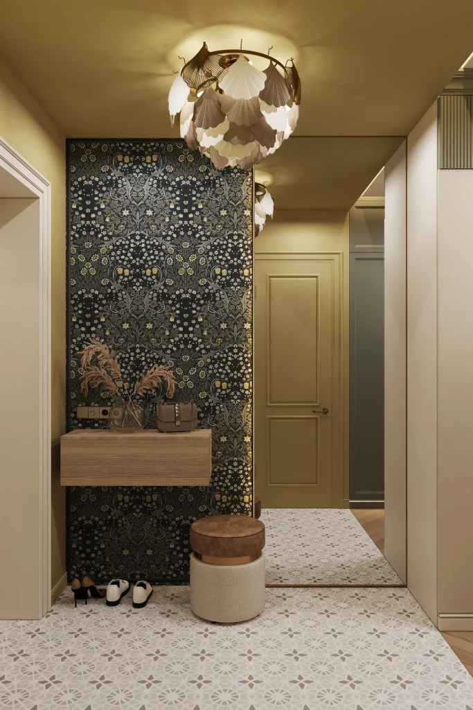
I think the composition works particularly well because the dark patterned wall is concentrated in one clearly defined area rather than spreading across the entire corridor. The console gives the wall practical purpose, while the stool adds another functional element without visually competing with the wallpaper. The pendant is also important because its sculptural shape echoes the organic character of the pattern behind it.
When I look at a hallway like this, I would treat the feature wall almost like a piece of artwork. The surrounding surfaces are relatively quiet, allowing the patterned section and pendant to carry most of the visual weight. This approach is especially effective when I want a hallway to have a strong identity without changing every surface in the space.
Geometric Hallway Art With Warm Wood Slat Divider
This hallway introduces a distinctly contemporary artistic statement through a large framed geometric composition. The artwork uses tall arches and curved forms in muted gray, cream, and gold tones, creating a graphic pattern across the wall. A warm wood frame surrounds the composition, while a vertical wood slat divider stands prominently in the foreground. Track lighting is directed toward the artwork, making the decorative surface the clear center of attention.
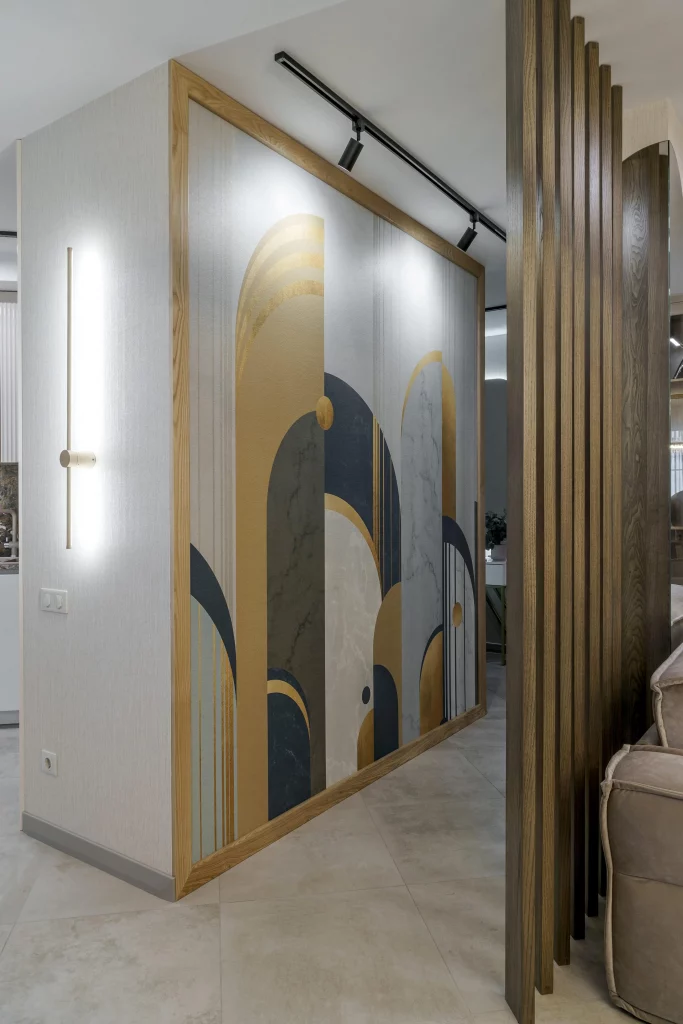
I like the way the artwork is treated as an architectural feature rather than simply a small picture hung on an empty wall. Its large scale fills the available surface and gives the hallway a strong visual direction. At the same time, the vertical wood slats introduce texture and partially separate the hallway from the adjoining room without completely closing the view.
For me, this image demonstrates how lighting can make artwork feel integrated into the architecture. The track lights emphasize the geometric shapes and help the framed composition remain visually important even when the hallway is viewed from an angle. If I were recreating this idea, I would keep the surrounding finishes restrained so the large-scale artwork and wood detailing remain the dominant features.
Elegant Hallway With Botanical Artwork And Velvet Bench
The fifth hallway combines decorative wall treatment, traditional architectural detailing, and a sophisticated seating arrangement. A large botanical artwork occupies the central wall, framed by white decorative columns and molding. An oval gold-framed mirror sits over the artwork, while a long upholstered bench in a warm terracotta tone stretches beneath it. Two slim consoles stand to either side, and crystal-like pendant fixtures hang from the ceiling. The floor features a herringbone arrangement in warm neutral tones.
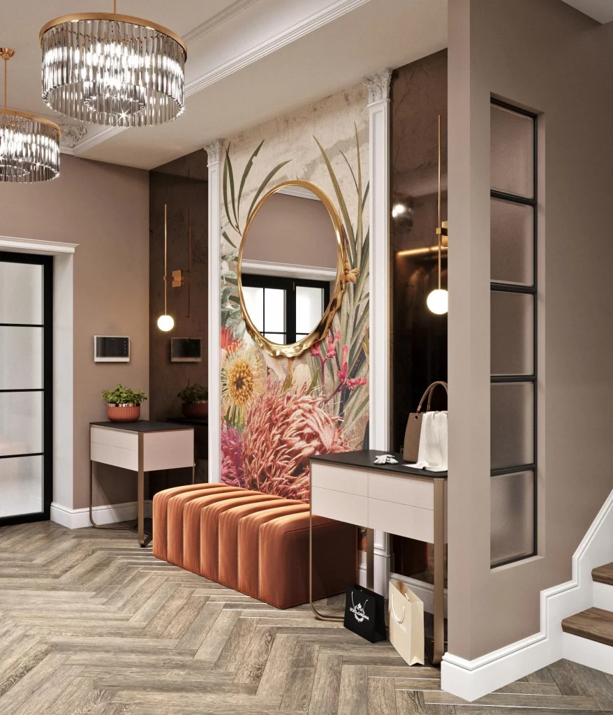
What I find especially successful here is the symmetry created by the artwork, mirror, bench, and two side tables. The hallway has plenty of decorative detail, yet the composition feels organized because the major elements are balanced across the wall. The bench also adds a practical function to the space, giving the hallway a place to sit while reinforcing the visual arrangement.
I would approach a hallway like this by establishing the main focal point first and then arranging the surrounding elements around it. The oval mirror introduces a curved shape against the more structured architectural molding, while the bench adds a soft horizontal line. The warm upholstery also connects naturally with the tones visible in the artwork and flooring, creating a cohesive palette.
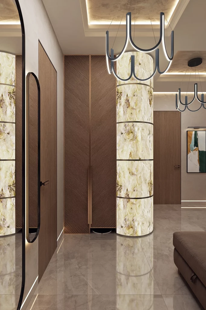
Modern Hallway With Backlit Stone Columns And Sculptural Lighting
This interior presents a sleek, highly architectural hallway where illuminated stone-like columns become the main feature. Tall curved surfaces with translucent veining are positioned between darker wood-toned wall panels, creating a strong contrast of light and shadow. Large reflective floor tiles extend across the space, amplifying the illumination from the columns. Overhead, sculptural black pendant fixtures repeat the curved forms of the architecture, while a tall dark-framed mirror appears along the left wall.
I like the way every major element contributes to the same visual language. The illuminated columns provide vertical emphasis, the wood-toned panels add warmth, and the dark lighting fixtures create a strong outline against the lighter ceiling. The reflective floor also helps distribute the light throughout the corridor, making the hallway feel more visually expansive.
From a design perspective, this is an excellent example of using lighting as part of the architecture rather than treating it as an afterthought. The illuminated surfaces act almost like artwork themselves, while the repeated curved pendant forms reinforce that idea from above. I would keep the number of competing decorative elements low in a hallway with this much built-in visual interest.
Botanical Wardrobe Wall With Integrated Lighting And Ottoman
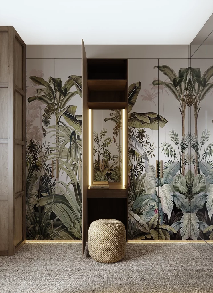
The seventh image transforms storage into a major decorative element. A full wall of wardrobe doors is covered with a large botanical image featuring broad leaves and layered greenery. At the center, an open wood-toned niche provides shelving and integrated lighting, while a round woven ottoman sits directly below it. Additional wood cabinetry is visible at the sides, creating a balanced combination of storage and display.
I particularly like how the wardrobe surface becomes part of the artistic composition instead of disappearing into the background. The repeated botanical imagery creates continuity across the doors, while the central open niche breaks up the large surface and introduces useful storage or display space. The illuminated niche also draws attention to the center of the arrangement and makes the wall feel intentionally designed.
This is the kind of hallway solution I find especially practical because it combines visual impact with storage. When cabinetry occupies a large portion of a corridor, giving the doors a strong decorative treatment can prevent the space from feeling purely utilitarian. The woven ottoman also provides a practical seating element without interrupting the clean front of the storage wall.
Soft Neutral Entry With Sculptural Metallic Wall Flowers
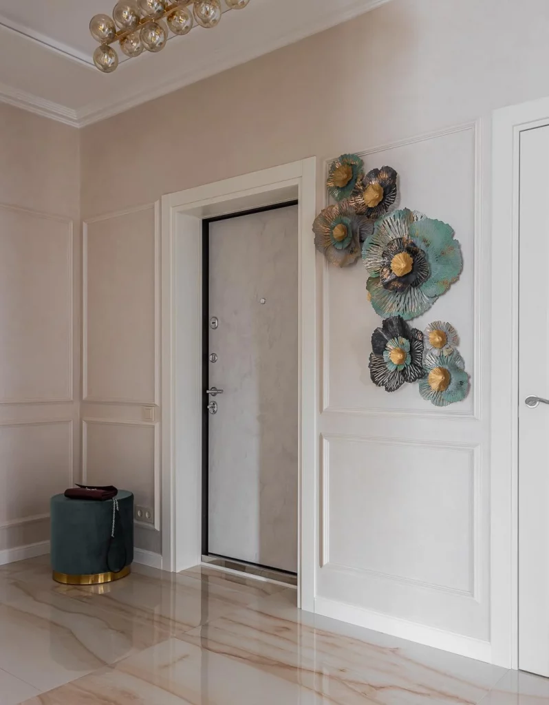
The eighth hallway has a calm neutral palette built around pale beige walls, white panel molding, and a glossy light floor with subtle warm veining. A gray entry door sits within the paneled wall, while a large sculptural arrangement of metallic flower-like forms decorates the wall beside it. The pieces combine muted teal, gray, and gold tones. A small rounded teal stool with a gold base occupies the opposite corner, while a contemporary ceiling fixture adds another decorative detail overhead.
I like the restrained background because it allows the sculptural wall installation to stand out without making the entry feel crowded. The paneled walls provide a regular framework, while the metallic forms introduce texture and variation. The small stool is also useful because it adds a compact seating option without taking over the floor area.
For me, this image shows how a neutral hallway can still feel artistic when the decoration has enough scale and dimensionality. Instead of covering the entire wall, the sculptural arrangement occupies one defined area and creates a visual moment beside the door. I would preserve plenty of empty wall around a feature like this so its individual shapes remain easy to appreciate.
Warm Beige Hallway With Abstract Floral Artwork
The ninth hallway is quieter and more intimate, with warm beige walls, white trim, and a pale herringbone floor. A single framed artwork hangs at the end of the corridor, featuring abstract floral and organic shapes in cream, taupe, brown, and muted gold. A large glass-paneled door appears on the left, while a small wall-mounted control panel is visible on the right. The simple ceiling and clean architectural lines keep attention focused on the artwork.
I appreciate how effectively one artwork defines the end of this narrow passage. Because the corridor is relatively restrained, the framed piece becomes an intentional destination rather than one decoration among many. The herringbone floor also adds subtle movement beneath the otherwise calm palette, giving the hallway enough texture without competing with the artwork.
I would use this approach when I want a hallway to feel artistic but not overly decorated. A single well-positioned composition can be enough to establish personality, particularly when the architecture already includes attractive trim and a patterned floor. The neutral colors shown here also make the artwork feel integrated into the room rather than visually isolated.
Light Hallway With Large Abstract Floral Print And Chevron Floor
The final hallway uses a soft beige and cream palette with a large framed abstract artwork positioned on the far wall. The artwork combines organic flower-like shapes with curved and irregular forms in neutral brown, cream, and muted yellow tones. A glass-panel door with geometric divisions stands to the left, while a white paneled door and wall-mounted control are visible on the right. Underfoot, the pale flooring forms a pronounced chevron pattern that leads directly toward the artwork.
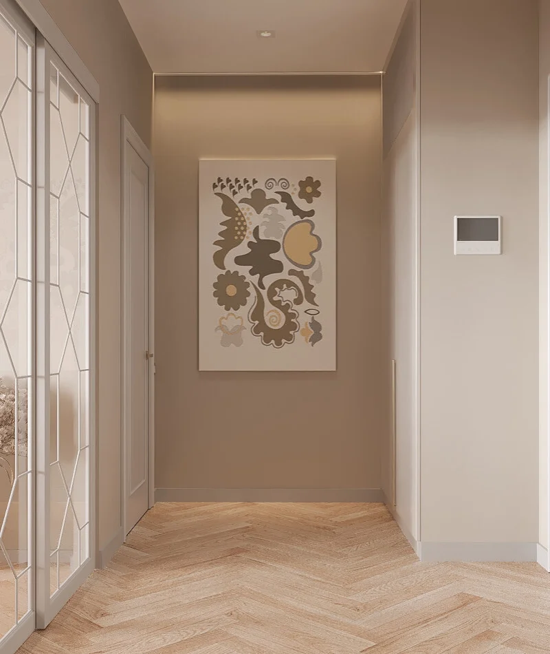
I like the way the floor pattern and artwork work together to guide the eye through the corridor. The chevron arrangement creates directional movement, while the artwork provides a visual endpoint. Because the walls remain relatively simple, the combination feels balanced rather than busy, and the glass-panel door adds another geometric layer without overwhelming the composition.
From my perspective, this is a useful reminder that artistic hallways do not always need bold colors or elaborate decoration. Here, the visual interest comes from the relationship between the floor pattern, framed artwork, architectural trim, and geometric glass door. For a similar result, I would allow those existing features to remain the focus and avoid adding unnecessary accessories that could interrupt the clean flow of the hallway.
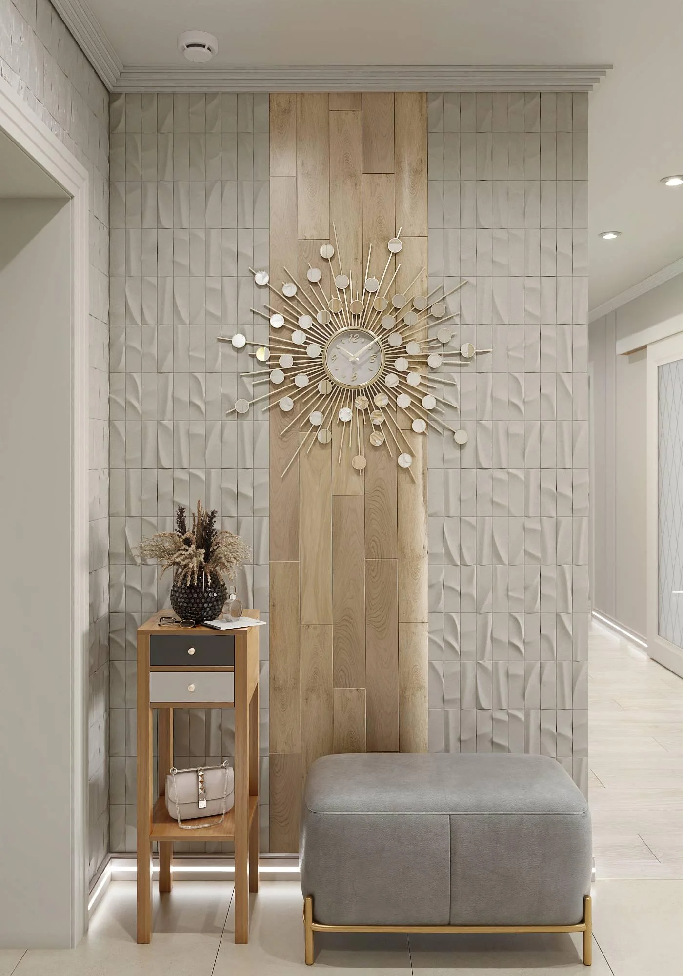
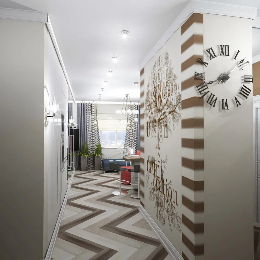
Textured Neutral Hallway With a Sculptural Sunburst Clock
I immediately notice the sophisticated neutral palette in this hallway, where a textured white wall is divided by a central vertical panel of warm wood-look material. The wall texture creates subtle geometric movement without overwhelming the space, while the large sunburst clock becomes the clear focal point. A narrow console table sits to the left with a dark textured vase, dried decorative stems, and a small handbag, while a compact upholstered bench with a gold-toned base anchors the lower part of the composition. Recessed lighting and concealed illumination along the lower wall keep everything soft and polished.
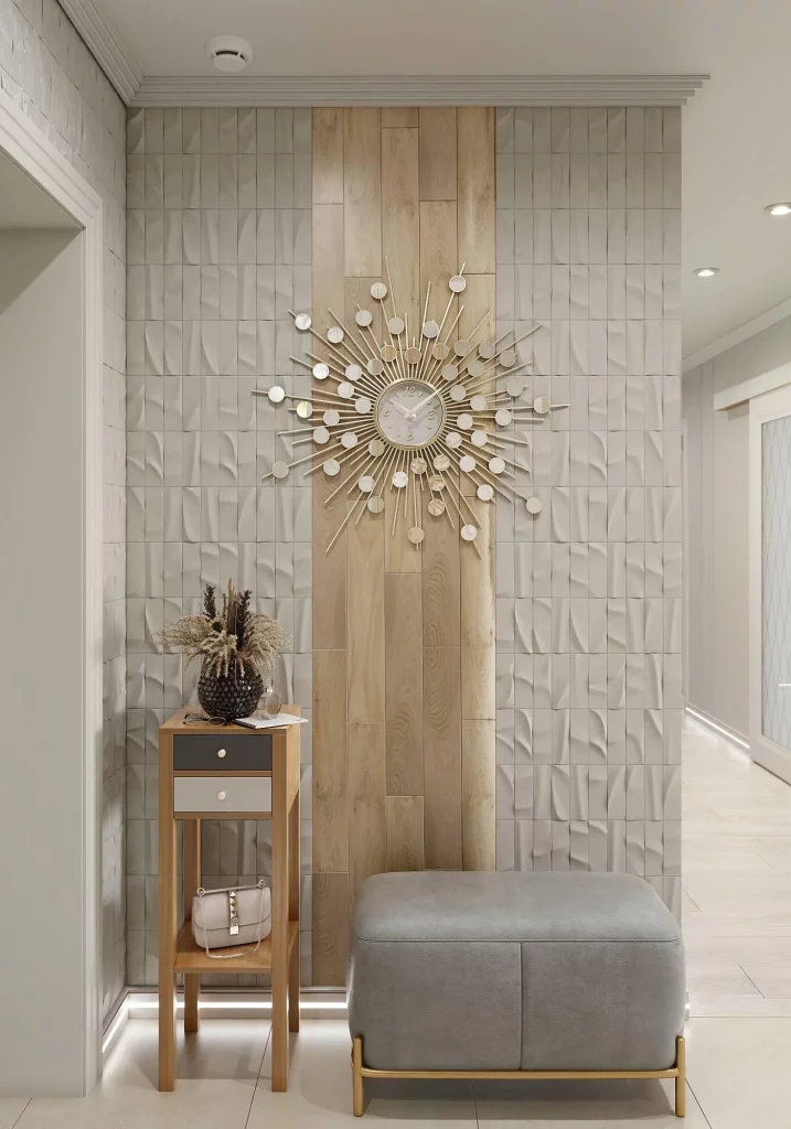
For me, the strongest feature is the way the hallway balances visual interest with restraint. The textured wall provides depth, but the central wood panel gives the eye a calmer vertical line to follow. The bench is particularly practical because it offers a comfortable place to sit without taking up excessive floor space, and the slim console provides a useful surface for everyday essentials. I also like how the oversized clock fills the wall vertically and horizontally, eliminating the need for several smaller decorative pieces.
If I were recreating this look, I would concentrate on the relationship between texture, proportion, and repetition. A large statement clock can be much more effective than a crowded gallery arrangement when the hallway already has a strong architectural wall treatment. I would also keep the supporting accessories deliberately limited so that the central artwork remains the first thing I notice.
Dark Wood Hallway With Abstract Art
This hallway takes a completely different direction, using deep brown wood finishes around a central door and along both sides of the corridor. The darker architectural elements create a strong frame around the lighter wall surfaces, while two narrow abstract artworks introduce color through painterly marks of white, pink, green, blue, and yellow. The floor is finished in white marble-look tile with gray veining, creating a noticeable contrast with the dark wood. Recessed ceiling lights provide clean, focused illumination.
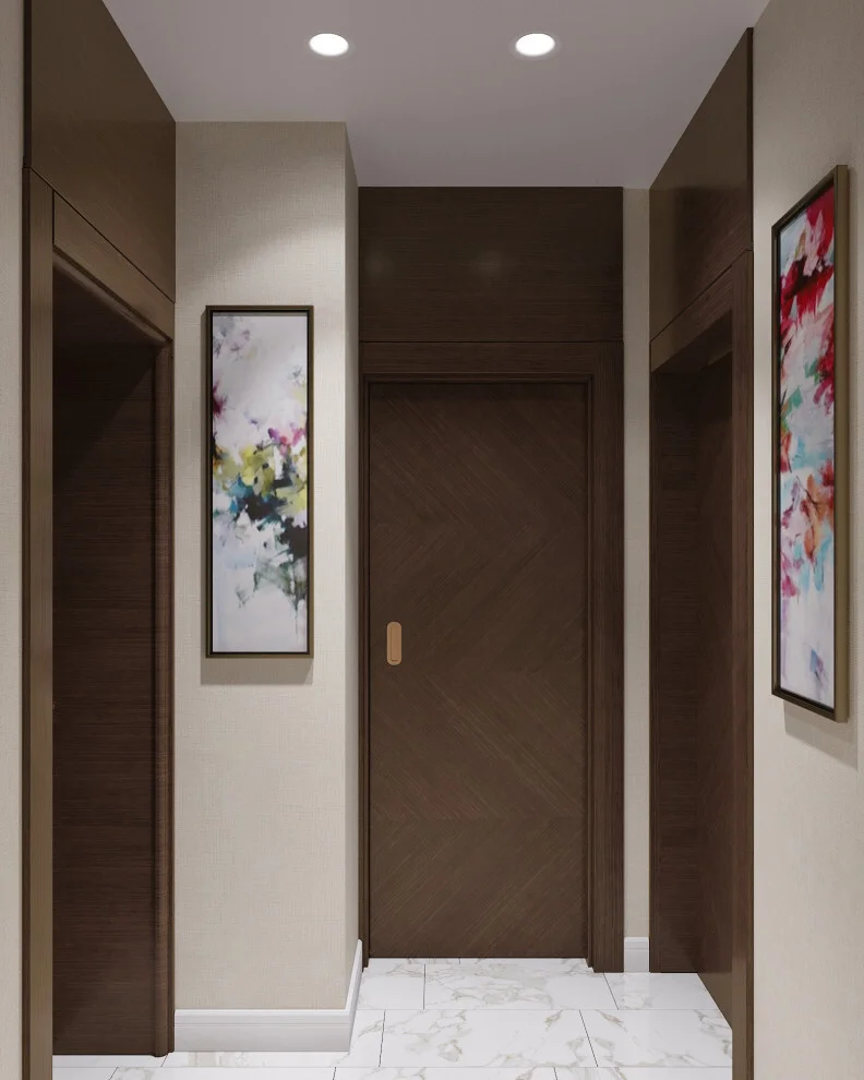
I find the contrast especially successful because the artwork prevents the dark wood from making the hallway feel visually heavy. The narrow proportions of the paintings work well on the slim wall sections, where wider artwork could have competed with the surrounding door and cabinetry-like surfaces. The marble-look floor also helps reflect light and visually separates the darker vertical elements from the walking area.
From my perspective, this is a useful example of how a hallway can become more expressive without adding a lot of furniture. The architectural surfaces do most of the work, while the artwork adds personality in a controlled way. If I wanted to achieve something similar, I would first establish the relationship between the darkest and lightest finishes and then choose artwork that introduces a few contrasting colors already compatible with the room.
Geometric Hallway With a Slatted Ceiling and Portrait Artwork
Here I see a warm, contemporary hallway organized around strong linear details. A ceiling of closely spaced wood-toned slats runs across the passage, with slim illuminated gaps between the slats that create a rhythmic overhead pattern. The walls combine a small geometric surface pattern with a large framed portrait-style artwork, while a low dark upholstered bench sits beneath it. A simple black freestanding coat rack stands nearby, and a glass-paneled opening reveals another room beyond the hallway.
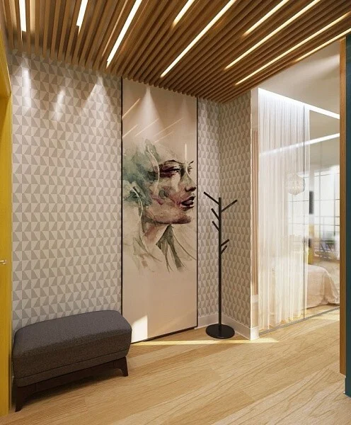
The composition works because nearly every element reinforces the same sense of rhythm. The ceiling slats create horizontal repetition, the wall pattern adds smaller geometric repetition, and the artwork provides a softer human focal point. The bench is low and visually unobtrusive, making the hallway practical without blocking circulation. I also appreciate the open view toward the adjacent room because it gives the corridor a greater sense of depth.
I would approach a design like this by choosing one major architectural feature and allowing the other details to support it. In this case, the ceiling treatment is strong enough to define the atmosphere, so the furniture remains simple. For a similar result, I would pay close attention to lighting because the illuminated gaps between the slats are an important part of what makes the ceiling feel dimensional.
Patterned Hallway With a Curved Wood Cabinet
This hallway makes an immediate statement with a richly patterned wall covering filled with repeated fan-like and botanical-inspired shapes in warm brown, rust, cream, blue, and muted green tones. In front of this expressive background is a tall light wood cabinet with rounded upper corners and a matching curved frame. A small floating shelf sits beside it, while the adjacent room is visible through a wide opening. The flooring is a pale stone-like surface that allows the wall pattern to remain the dominant visual feature.
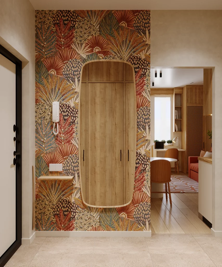
I like the decision to keep the cabinet relatively simple against such an elaborate background. Its natural wood tone connects with the warmer shades in the wall covering, while the curved upper profile softens the otherwise rectangular composition. The shallow shelf is another practical touch, providing a place for a few small items without adding bulky furniture to the circulation zone.
For me, this image demonstrates how an artistic hallway can work when the wall itself becomes the main decorative element. I would avoid competing with a pattern this strong by introducing too many additional accessories. Instead, I would repeat one or two of its existing tones through the furniture or small details, just as the wood cabinet naturally echoes the warmer colors already present.
Blue Accent Hallway With Graphic Black-and-White Artwork
The deep blue wall immediately gives this hallway a rich, atmospheric character. Centered above a slim black console is a large rectangular artwork composed of overlapping black, white, and geometric forms. The console has a white top and an open lower shelf with curved black supports, while a tall potted tree stands to the left in a simple white planter. Small sculptural objects and a glass vessel decorate the console. On the right, a white marble-look architectural opening leads into another room.
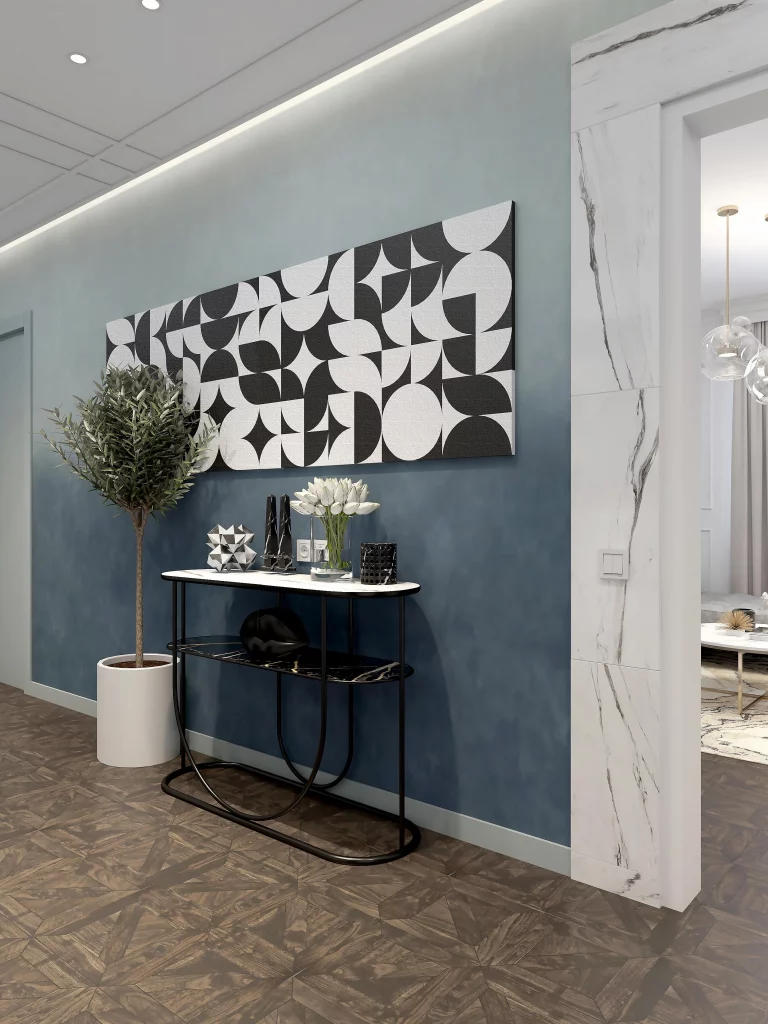
I think the success of this hallway comes from its clear visual hierarchy. The dark blue wall creates a strong backdrop, the monochrome artwork provides a crisp graphic contrast, and the black console repeats the darker tones without competing with the artwork. The white planter and marble-look opening introduce lighter surfaces that keep the composition from becoming too dense. The console also provides useful display space while remaining relatively narrow.
When I study a hallway like this, I am reminded that color can be just as effective as furniture in defining a space. If I were recreating it, I would start with one saturated wall color and then build the rest of the palette around black, white, and a few restrained decorative accents. The key is to preserve the strong contrast rather than introducing too many competing colors.
Gallery-Style Hallway With a Large Abstract Floral Painting
This hallway feels more decorative and softly glamorous, centered around an oversized abstract painting framed in a warm metallic finish. The artwork combines creamy white, gray, muted green, dusty rose, and deeper brown tones in broad expressive brushstrokes. A narrow console table with a delicate metallic frame sits directly below it, while warm concealed lighting outlines the artwork and gives it additional depth. On the right wall, two tall rounded mirrors repeat the vertical proportions of the artwork.
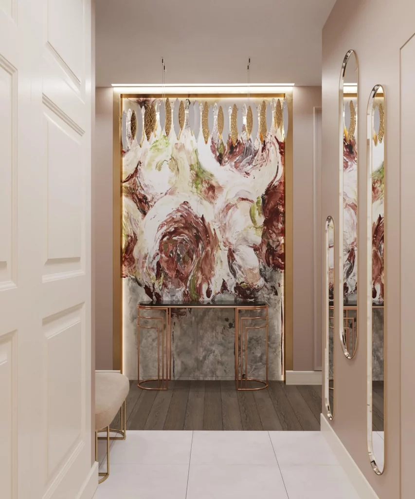
I especially like the relationship between the large painting and the slim console. The furniture does not compete with the artwork; instead, it acts almost like a pedestal. The illuminated frame draws attention to the painting even when the surrounding hallway is relatively simple, while the elongated mirrors help extend the visual rhythm along the side wall. The neutral architectural envelope also gives the artwork room to breathe.
For my own approach to this kind of hallway, I would treat a large artwork as an architectural feature rather than simply wall decoration. The integrated lighting is particularly effective because it turns the painting into a destination point at the end of the passage. I would keep the furniture below it minimal and refined so the painting remains the visual center.
Monochromatic Floral Wall Panel in a Classic Hallway
This hallway uses a quieter interpretation of artistic decoration, with a large white floral composition displayed inside a broad framed wall panel. The surrounding wall is a soft taupe-gray, while the doors and architectural moldings are painted white. Slim wall sconces with warm illumination flank the artwork, creating a subtle glow against the neutral surfaces. The pale tiled floor continues the restrained palette and gives the corridor a clean, spacious appearance.
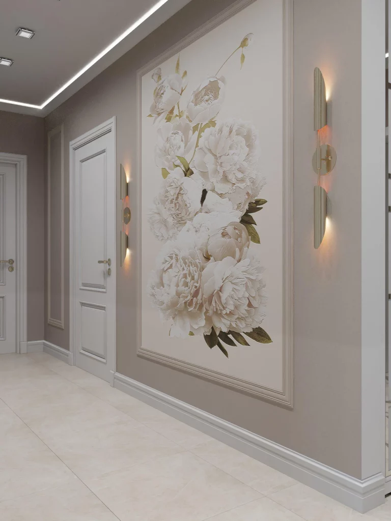
What I find particularly appealing is the almost monochromatic treatment of the artwork. The flowers are rendered primarily in white, with only gentle touches of green and muted color, so the piece feels integrated into the wall rather than pasted onto it. The framed panel also echoes the classical molding around the doors, creating continuity throughout the hallway. The sconces add practical lighting while reinforcing the decorative composition.
I would recommend this approach when someone wants an artistic hallway but prefers a calm atmosphere. Instead of relying on strong color, the visual interest comes from layering different whites, taupes, raised molding, framed artwork, and warm light. To reproduce the effect, I would focus on proportion first: the artwork should have enough scale to occupy the wall confidently while still leaving generous space around it.
Soft Floral Wallpaper Hallway With Decorative Lighting
This corridor is wrapped in a delicate, full-height floral wallpaper in soft cream, blush, muted green, and beige tones. The pattern continues along the long wall toward a paneled white door at the far end, creating a strong sense of continuity. Decorative spherical pendant lights hang from the ceiling, while the floor features a long patterned runner with intricate ornamental detailing. The overall palette is light and layered, with the wallpaper providing most of the visual character.
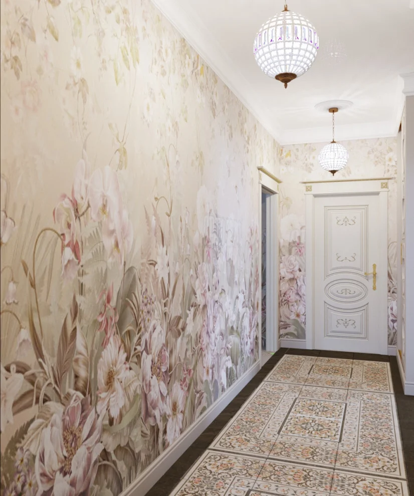
I like how the long wall turns the hallway into a complete visual experience rather than treating the corridor as a collection of separate elements. Because the wallpaper continues along the entire passage, the space feels cohesive, while the patterned runner reinforces the same decorative mood at floor level. The pendant lights add another layer of ornament without requiring additional wall furniture.
In my view, this is a good example of how repetition can make a narrow hallway feel intentional. If I wanted to create a similar effect, I would select one dominant pattern and allow the flooring and lighting to complement it rather than compete with it. The result can feel especially welcoming when the colors remain soft and the decorative details are distributed consistently from one end of the hallway to the other.
Dark Modern Hallway With Crane Artwork and a Walnut Console
This hallway has a distinctly darker, more dramatic character. A large framed artwork depicting two white cranes surrounded by dark foliage and muted red accents hangs against a charcoal wall. Beneath it is a low walnut-toned console with drawers and tapered legs, styled with several sculptural vessels, books, and small decorative objects. To the right, vertical dark wood slats create another strong architectural element, while tall black-framed glazing on the left brings daylight into the corridor.
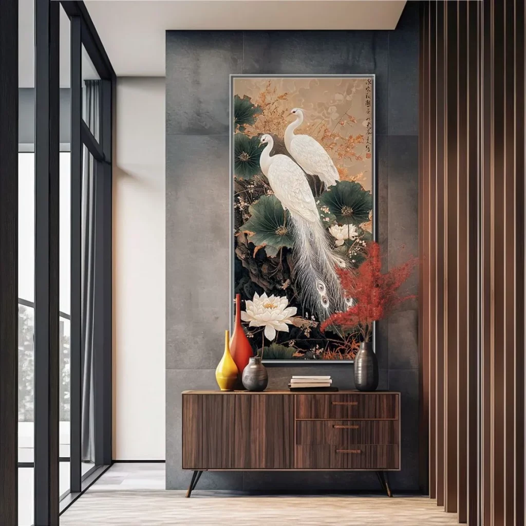
For me, the artwork is the perfect focal point for this setting because its pale figures stand out strongly against the dark background. The walnut console reinforces the warm brown tones within the painting, creating a connection between the furniture and artwork. The vertical slats add architectural texture without requiring another decorative display, while the large windows prevent the darker palette from feeling completely enclosed.
I would use this image as inspiration for anyone who wants a hallway with more depth and visual drama. The important lesson is balance: the walls and architectural elements are dark, but the artwork provides a lighter focal point and the glazing introduces natural illumination. I would also keep the console styling edited, because a darker hallway benefits from clear focal points rather than a crowded collection of accessories.
Golden Tree Artwork With Warm Wood Console
The final hallway in this collection takes a warm, artistic approach centered around a large painting of a tree with abundant golden circular forms. The artwork is mounted against a gray textured wall and framed in dark trim, creating a vivid contrast. Below it, a long warm wood console provides a substantial horizontal base, while a tall rounded brown vessel stands to the right and a smaller natural-toned vessel sits nearby. Vertical wood screening appears on the left, and daylight enters from the right side of the space.
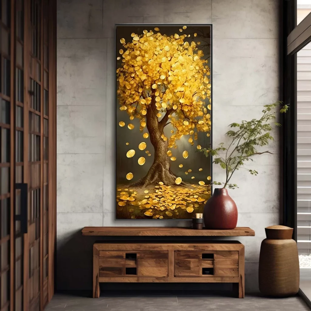
I find the golden artwork especially effective because it immediately establishes the palette for the entire composition. The warm wood console and brown vessels echo the painting’s earthy tones, while the gray wall provides enough contrast to make the gold details stand out. The generous console surface also gives the artwork a visual foundation and offers practical display space without interrupting the open circulation of the hallway.
For a similar arrangement, I would begin with the artwork and let it determine the supporting palette rather than choosing furniture independently. In this image, the warm browns and golden tones feel connected from one element to the next, which makes the hallway look deliberately styled. I also like the restraint of the accessories: the painting remains the main event, while the console and vessels quietly reinforce its colors and character.
Statement Floral Artwork With Sculptural Stone Seating
The first hallway makes a strong impression with a large framed floral artwork in warm beige, cream, brown, and muted gold tones. I like how the painting becomes the central focus against the pale wall, while a long dark console table sits directly beneath it. Three rounded stone-like stools are arranged along the front of the console, giving the composition an unusual sculptural quality. A dark oval decorative object and a slender candleholder sit on the console, while a tall dark textured vase with a delicate branch arrangement balances the opposite side. Floor-to-ceiling glazing on the left brings in natural light and gives the entrance a spacious, open feeling.
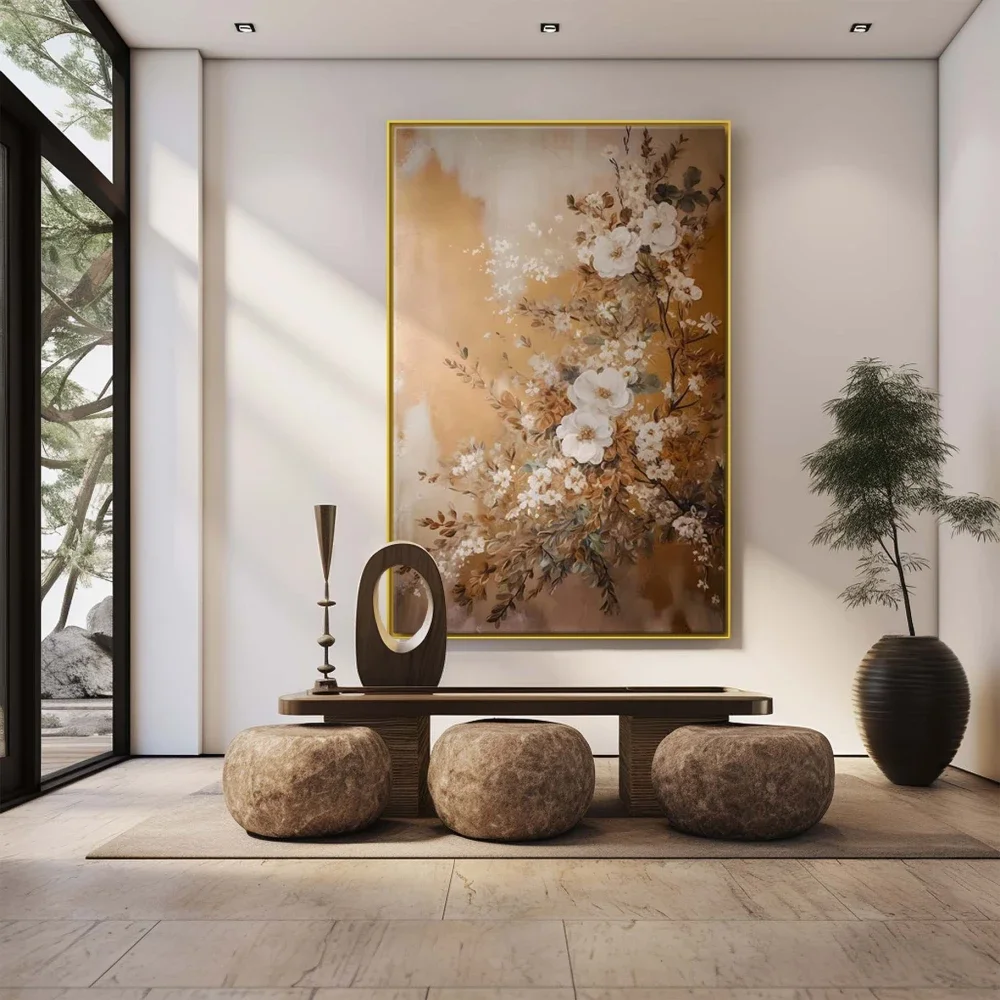
The arrangement works especially well because the furniture stays visually low while the artwork provides height. I find the three rounded stools particularly effective because they soften the straight lines of the console and add texture without making the hallway feel crowded. The large rug underneath visually defines the entry zone, while the pale flooring and walls keep the overall composition calm. The placement also leaves generous circulation space, which is important in a hallway where decorative elements should never interfere with movement.
For a similar look, I would begin with one oversized artwork rather than filling the wall with multiple smaller pieces. I would then choose a slim console with a simple horizontal profile and introduce one or two sculptural accessories with contrasting shapes. What makes this photograph feel sophisticated to me is the restrained palette, so I would keep the supporting pieces within warm neutrals and earthy tones rather than competing with the artwork.
Vertical Asian-Inspired Scroll Art With Natural Branch Arrangements
This hallway takes a completely different artistic direction with a tall hanging scroll positioned centrally on a light wall. The artwork features a tree, birds, rocks, delicate branches, and calligraphic details against a warm ochre background. On either side, narrow tables and tall dark vases hold delicate branch arrangements, creating a symmetrical frame around the artwork. I like the simplicity of the surrounding furniture because it allows the vertical artwork to remain the obvious focal point.
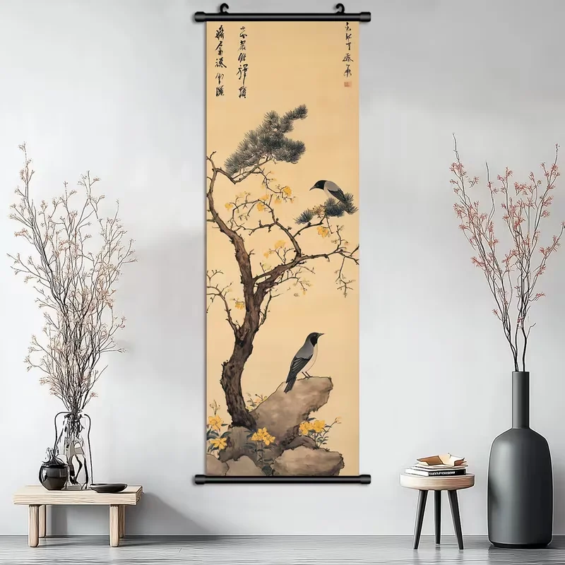
The narrow proportions of the scroll are particularly suitable for a hallway because they use vertical wall space without requiring a wide installation area. I also like the repetition of slender branches on both sides, which visually connects the artwork with the surrounding décor. The pale wall and floor provide a quiet backdrop, while the dark vessels introduce enough contrast to make the composition feel grounded. This is a good example of how a small amount of carefully positioned decoration can make a corridor feel intentional.
If I were recreating this atmosphere, I would give the artwork plenty of breathing room and resist the temptation to fill every available section of wall. A tall piece can make a narrow hallway feel more visually interesting while maintaining an uncluttered appearance. I would also keep the furniture simple and low so that the artwork remains the main feature rather than becoming one element among many competing details.
Warm Contemporary Hallway With Abstract Figurative Artwork
The third image presents a warm, intimate hallway centered around a rectangular abstract artwork depicting two stylized figures. The painting combines black, white, brown, and muted golden tones, which stand out beautifully against the deeper beige walls. A dark console occupies the left side, topped with a small arrangement of delicate branches and a rounded decorative vessel. On the right, vertical wall paneling adds texture and rhythm, while recessed ceiling lighting creates a soft glow throughout the corridor.
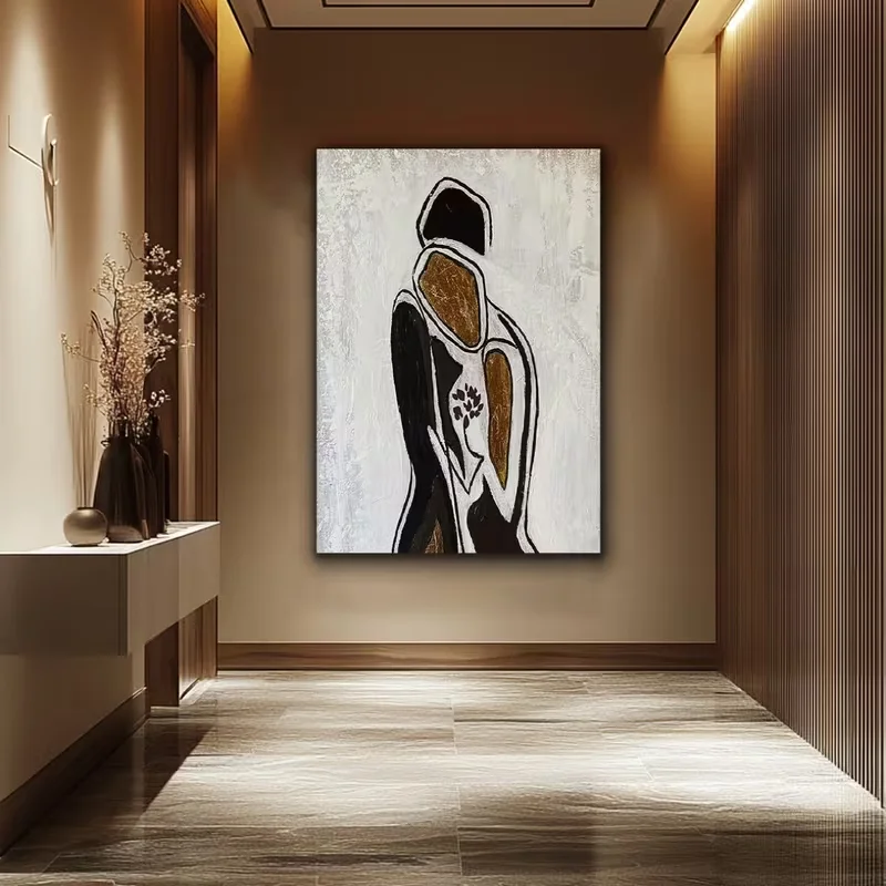
I think the success of this hallway comes from its controlled contrast. The artwork is expressive, but the rest of the space remains quiet enough to support it. The console provides a practical surface without becoming visually dominant, and the vertical wall treatment adds architectural interest without requiring additional decoration. The warm lighting is also important because it emphasizes the brown and golden details in the artwork and gives the hallway a welcoming character.
For me, this is a good reminder that an artistic hallway does not need a large collection of objects. One distinctive painting can be enough when it is supported by appropriate lighting and a restrained background. If I were working with a similar corridor, I would position the artwork where it can be seen immediately from the entrance and use warm illumination to make its textures and colors more noticeable in the evening.
Soft Gray Hallway With Portrait Art And Sculptural Branches
This hallway uses a pale gray wall as the backdrop for a framed portrait in muted blush, black, gray, and cream tones. Beneath it, a large rounded ceramic vessel holds an unusual branching arrangement that extends upward and outward across the wall. The vessel itself has a graphic pattern of black geometric shapes, creating an interesting connection with the darker details in the artwork. A simple console is absent here, leaving the wall and floor arrangement to carry the visual weight, while a doorway and soft curtains are visible nearby.
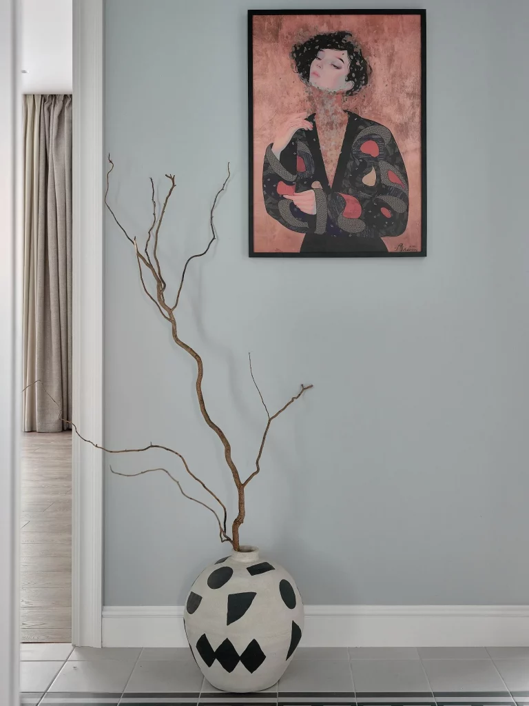
I like the way the tall branches create a natural vertical line that visually connects the floor with the portrait above. The arrangement feels intentionally asymmetrical, which keeps the composition from becoming too formal. At the same time, the rounded shape of the vessel contrasts with the angular black markings on its surface and the rectangular frame of the artwork. The result is a hallway that feels artistic without depending on a large amount of furniture.
This idea would work particularly well when the hallway has an open floor area that can accommodate one substantial decorative vessel. I would choose the artwork first and then look for a vessel that echoes one or two of its colors or shapes. In my view, the most important lesson from this photograph is to allow negative space to remain visible; the empty wall around the arrangement is part of what makes the artwork and branches stand out.
Decorative Mirror Screen With Organic Branch-Like Geometry
The fifth hallway introduces art through a functional architectural element: a tall mirrored screen with an irregular branch-like pattern running across its surface. The screen stands between spaces and reflects the interior behind it, creating depth while maintaining a strong sculptural presence. A narrow vertical mirror appears on the adjacent wall, and the surrounding finishes combine warm beige surfaces with darker trim. I find the screen especially interesting because it functions as both decoration and a visual divider.
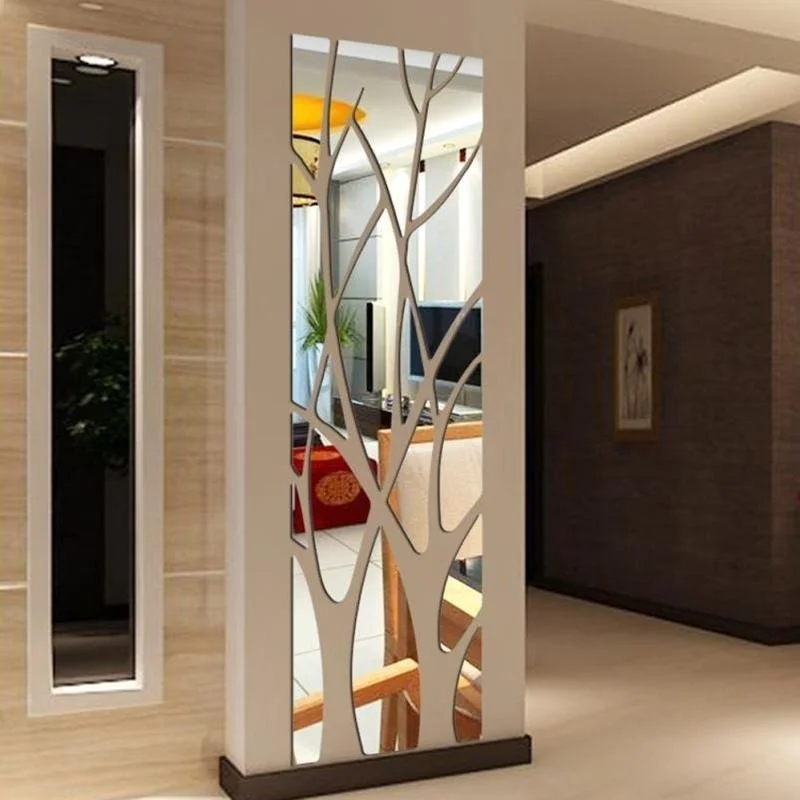
The mirrored surface helps prevent the divider from feeling heavy, while the organic pattern gives it a distinctive artistic character. I like how the irregular shapes interrupt the reflection and create a layered effect rather than producing one uninterrupted mirror surface. Because the piece is freestanding and vertical, it also takes advantage of the hallway’s height while leaving the floor around it relatively open.
If I wanted to achieve a similar effect, I would consider a decorative mirrored divider when a hallway needs a visual transition between two areas. The key is choosing a pattern with enough open space to preserve light and reflections. I would also keep the surrounding décor relatively restrained, as this type of architectural feature already provides considerable visual interest.
Ornate Console Hallway With Decorative Mirror And Bench
This hallway has a more decorative character, with a dark ornate console table positioned beneath a rectangular mirror framed by intricate scrolling details. The wall behind the console has a textured stone-like appearance framed by lighter molding, while matching decorative sconces appear on either side. To the right, a coordinating bench with a dark metal-style base and upholstered seat provides additional seating. A small arrangement of white blooms sits on the console, completing the traditional composition.
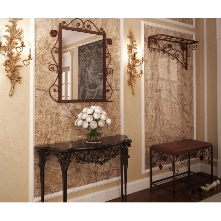
The furniture arrangement is practical because it combines a landing surface, mirror, lighting, and seating in one clearly defined area. I especially like the relationship between the console and bench because they create a balanced visual rhythm without occupying the entire hallway. The mirror also serves a useful purpose near an entrance, while the decorative framing echoes the ornate details of the console and wall sconces.
When working with an ornate hallway like this, I would focus on repetition rather than adding more unrelated decoration. The photograph shows how matching curves, metal details, and framed wall elements can create cohesion. I would also keep the central surface relatively uncluttered so the intricate furniture remains visible and the hallway does not become visually overwhelming.
Black Console With Gallery Artwork And Mirrored Wall Details
The seventh image combines a dark console with a large textured artwork in soft neutral and muted blue-green tones. Two wall-mounted lamps flank the artwork, giving the arrangement symmetry and additional illumination. Mirrored panels with geometric lines appear on the surrounding walls, while blue upholstered stools or chairs frame the foreground. The console itself provides drawers and lower storage, with books, framed photographs, and decorative objects arranged across its surface.
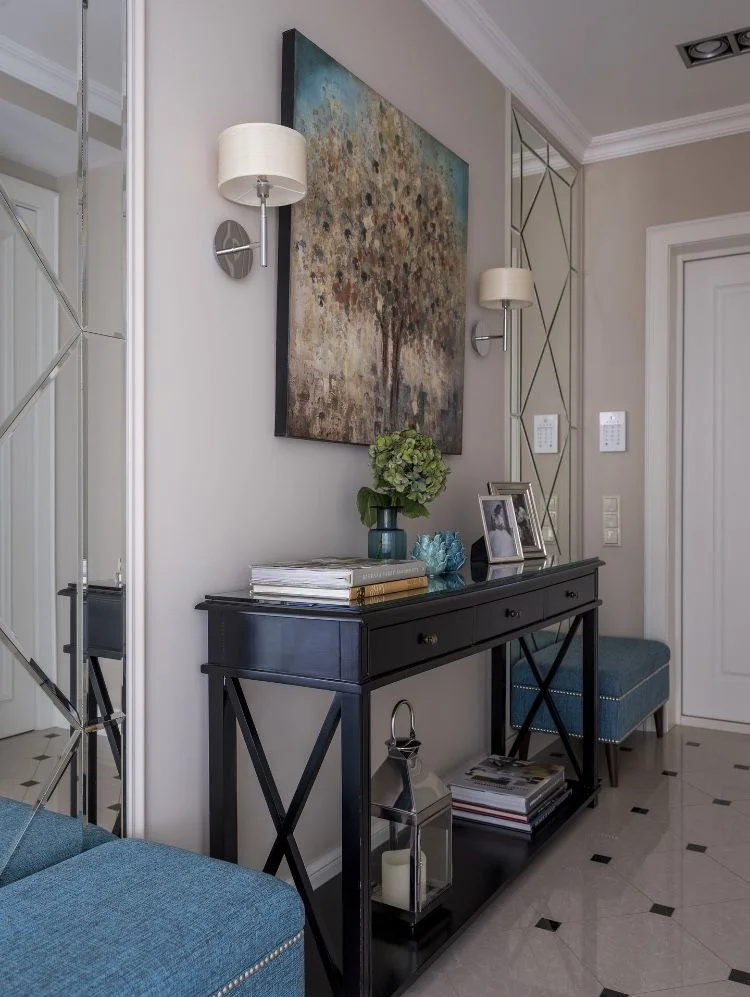
I find this composition especially effective because it combines several different textures without making the hallway chaotic. The dark console creates a strong foundation, while the artwork introduces softer colors above it. The mirrored panels visually expand the space and reflect light from the lamps, and the blue seating introduces a subtle color accent that connects with details visible in the artwork. The arrangement also demonstrates how a hallway can provide useful storage while still functioning as a decorative focal point.
For a similar design, I would treat the console as the anchor and build the wall around it. A large artwork can establish the color direction, while matching or complementary accessories can be added afterward. I would also use lighting strategically because artwork and mirrored surfaces become much more effective when they are properly illuminated.
Round Landscape Artwork Above A Ribbed Hallway Sideboard
This hallway feels calm and contemporary, centered on a large circular landscape artwork framed in a thin gold-toned edge. The painting depicts layered mountains, water, and a pale sky in soft gray, cream, brown, and muted gold shades. Beneath it is a long light-colored sideboard with vertically ribbed doors and a dark top. A small arrangement of books and a decorative object sits on one side, while a dark vase with greenery appears on the other. A rounded upholstered stool completes the arrangement in the foreground.
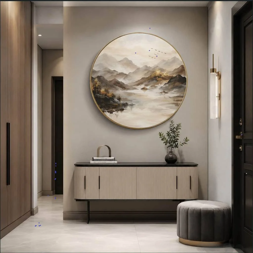
The circular artwork immediately breaks up the many straight architectural lines in the hallway, and I think that contrast is one of the strongest details in the photograph. The ribbed texture of the sideboard adds subtle depth without introducing a busy pattern, while the dark top visually connects with the darker door and surrounding architectural details. The stool adds another rounded shape, reinforcing the softer geometry of the artwork.
I would use this approach when a hallway has a broad uninterrupted wall that can support one substantial focal piece. A circular artwork is especially useful when the surrounding furniture is predominantly rectangular because it introduces visual variety without requiring a complicated gallery wall. I would also keep the tabletop styling limited to a few carefully selected objects, as shown here, so the sideboard remains elegant and functional.
Graphic Gallery Hallway With Dark Door And Patterned Runner
The ninth hallway takes a more energetic approach with gray walls covered by a collection of framed graphic artworks. A black entrance door anchors the far end, while a warm-toned console with drawers sits along the right wall. Several framed pieces in yellow, black, blue, white, and multicolored designs create a gallery-like arrangement. A patterned black-and-white runner stretches down the center of the wood floor, while potted greenery and colorful decorative objects add further visual accents.
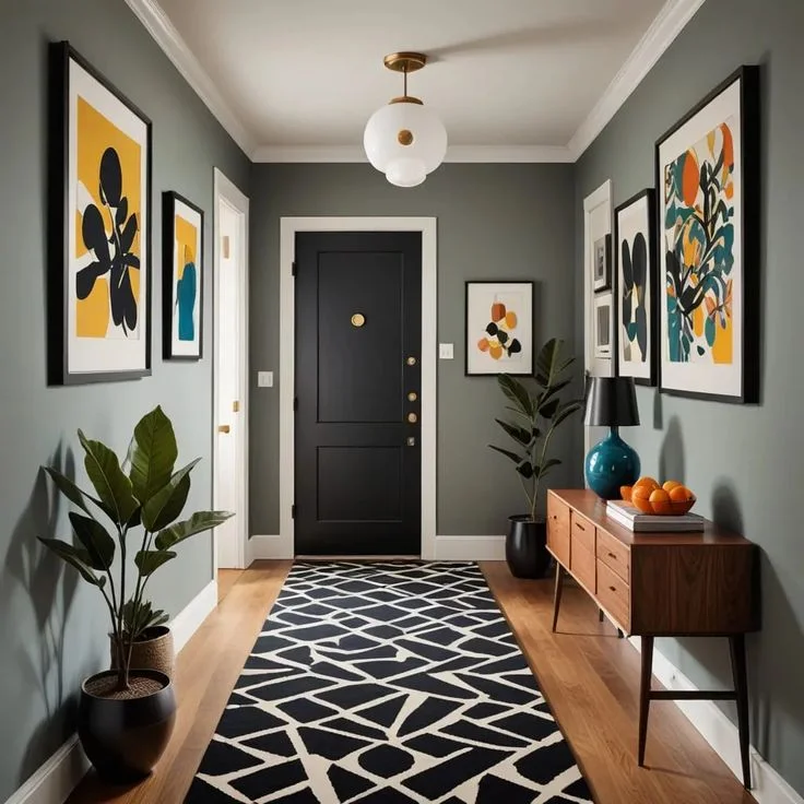
I like how the artwork is distributed across both sides of the hallway rather than concentrated in one location. This makes the entire corridor feel connected and gives the eye something to discover while moving through the space. The runner also plays an important role because its geometric pattern adds movement along the length of the hallway, while the console provides practical storage and a place for decorative objects.
For me, the lesson here is that a hallway can handle stronger patterns when the palette is repeated thoughtfully. The black door, black frames, patterned runner, and darker furniture details create continuity, while yellow and blue accents prevent the space from feeling flat. If I were creating a similar gallery hallway, I would establish the dominant frame color first and then select artwork that repeats a few colors already present in the room.
Natural Wood Console With Floral Artwork And Oversized Mirror
The final hallway feels warm and understated, with a natural wood console positioned beneath a tall black-framed mirror. Beside the mirror hangs a large botanical-style artwork in soft beige and muted brown tones. A sculptural white vase with dark branches sits on the console, accompanied by a shallow decorative tray. A woven basket occupies the floor in front, while a small wall-mounted hook arrangement holds a scarf and bag near the dark entry door. The combination creates a welcoming entrance without filling the space with unnecessary furniture.
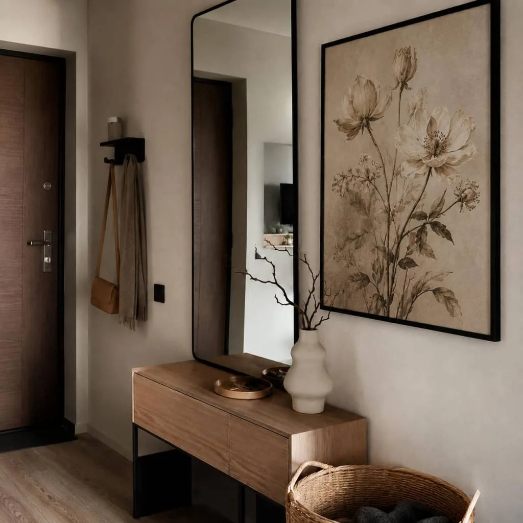
The layout works because every visible element has either a practical or visual purpose. The mirror is useful near the entrance and also reflects the space, while the console offers a convenient surface for everyday items. The basket provides floor-level storage, and the wall hooks keep accessories close to the door. I particularly like the way the floral artwork and branches echo one another without matching exactly, creating a subtle connection between the wall and console styling.
If I were recreating this hallway, I would keep the palette just as restrained and let the natural wood, cream tones, dark frames, and soft artwork establish the character. I would also avoid overloading the console because the simplicity of the arrangement is what makes it feel polished. For a fall-inspired update, this kind of neutral foundation would be especially easy to style with small seasonal accents while keeping the main design intact.
Serene Neutral Hallway With Landscape Artwork
I see a long, narrow hallway finished almost entirely in soft neutral tones, with pale flooring, smooth walls, several white doors, and dark door trim creating subtle contrast. At the far end, a tall framed landscape painting becomes the clear focal point, showing a quiet waterside scene with a tree in muted autumnal tones. Recessed ceiling lights provide even illumination, while the uncluttered floor keeps the corridor feeling open and calm.
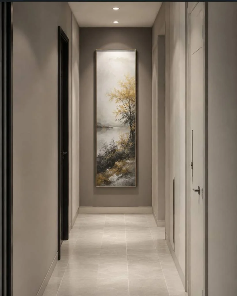
What I find especially successful here is the decision to use one strong vertical artwork rather than filling every available wall. The painting gives the eye somewhere to travel as I move through the hallway, while its restrained palette blends naturally with the surrounding beige and gray tones. The simple floor also reinforces the sense of continuity, making this narrow passage feel more spacious and visually organized.
For a similar look, I would start with a quiet neutral backdrop and let one vertically oriented artwork carry the personality of the space. I like how the painting introduces an autumn feeling without relying on obvious seasonal decoration. If the hallway is narrow, keeping the floor and surrounding walls visually simple can make the artwork feel more intentional while allowing the architecture and proportions of the corridor to remain visible.
Elegant Hallway With Botanical Artwork and Console Table
This hallway feels much more decorative, with paneled cream-colored walls, a narrow dark wood console table, framed botanical artwork, a patterned runner, and a large green-leafed plant in a woven container. A hanging cylindrical light fixture adds warmth overhead, while the dark doorway on the right gives the pale room a stronger architectural edge. The combination of natural imagery, wood, woven texture, and soft neutral walls creates a welcoming atmosphere.
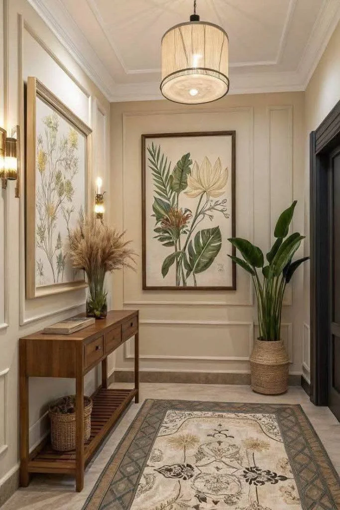
I particularly like the way the console table gives the hallway a practical stopping point without obstructing the passage. Its drawers provide concealed storage, while the lower shelf adds another visible layer for small baskets and books. The runner defines the walking area and introduces pattern, and the artwork above the console creates a vertical relationship between the furniture and the wall. Everything feels connected rather than randomly placed.
When I look at this arrangement, I would use the same principle of combining one slim piece of furniture with artwork above it. The key is proportion: the console is narrow enough for the corridor, while the large framed pieces give the wall enough visual weight. The warm wood and muted botanical tones also make the space feel especially appropriate for fall, when I naturally gravitate toward richer textures and earthy accents.
Classic Paneled Hallway With Framed Landscape Painting
Here I see a more formal hallway defined by cream wall paneling, decorative molding, dark wood doors, and a polished light floor outlined by a darker border. A framed landscape painting hangs centrally above an ornate console table, while a small vase of pale flowers and a few stacked books complete the arrangement. A table lamp and wall sconces provide layered illumination, giving the corridor a warm, softly lit character.
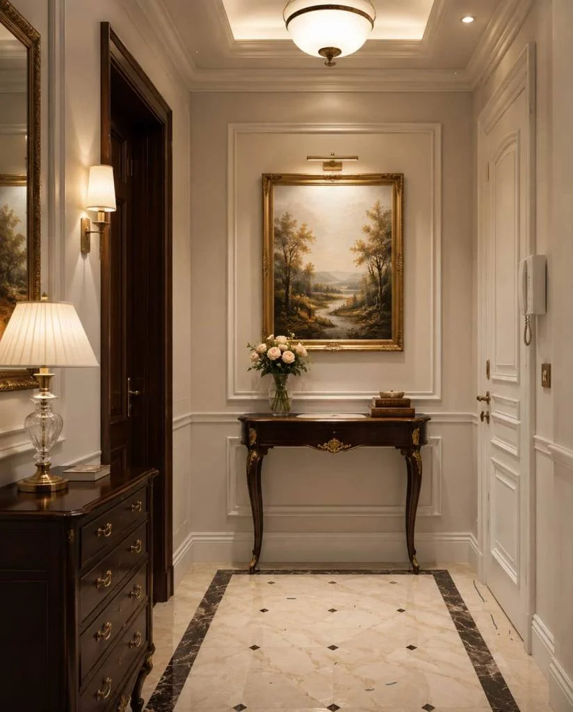
The symmetry is what immediately works for me. The artwork, console, and decorative wall frame establish a clear center, while the surrounding doors and furniture create visual balance. The console itself is compact but decorative, so it contributes elegance without overwhelming the passage. I also like the way the darker furniture and door frames anchor the predominantly pale palette and prevent the hallway from feeling flat.
For a similar effect, I would pay close attention to the relationship between the artwork and the wall molding. The picture is not simply hung on an empty wall; it sits inside a carefully framed architectural composition. I think that approach works particularly well when the hallway already has decorative trim because it makes the artwork feel like an intentional part of the architecture rather than an afterthought.
Large Floral Artwork Framed by Decorative Panels
This hallway takes a much more expressive approach, with a large vertical floral artwork positioned between two intricate decorative white panels. The artwork features oversized pale blue flowers with warm yellow and brown details, while the surrounding walls remain light and neutral. The arrangement creates a dramatic central panel without requiring additional furniture, allowing the artwork itself to dominate the narrow passage.
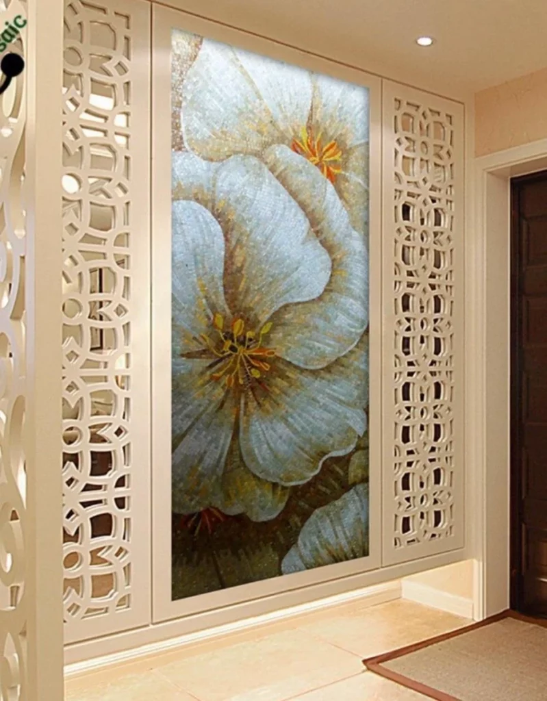
I like this solution because it turns a plain circulation space into a visual feature. The decorative panels frame the artwork almost like architectural borders, giving the wall depth and structure. At the same time, the relatively simple floor and surrounding surfaces keep the composition from becoming too crowded. The vertical format is also particularly effective in a hallway because it emphasizes the height of the wall.
If I were recreating this idea, I would make the artwork the starting point and keep the surrounding finishes visually restrained. The image shows how an artistic hallway does not necessarily need furniture to feel finished. In a narrow corridor, concentrating the decorative effort on one wall can actually be more practical than trying to furnish every section.
White Sculptural Floral Relief Wall
This image presents an almost monochromatic hallway centered around a white sculptural wall treatment. Raised floral forms, leaves, and curved botanical shapes project from a textured white background, creating shadows and dimension without relying on strong color. The surrounding walls, trim, and flooring are also pale, while a dark-framed picture on the adjacent wall provides a small but noticeable contrast.
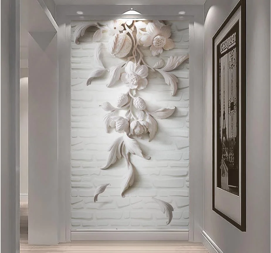
What I find compelling is the use of texture instead of color as the main decorative element. From a distance, the wall appears simple, but closer inspection reveals the layered relief and delicate shadows created by the sculptural forms. This makes the hallway feel artistic while preserving a clean visual palette. I also like that the decoration occupies a defined vertical area, leaving the rest of the corridor relatively uncluttered.
For me, this is a useful example of how to create interest in a small hallway without adding furniture. I would choose a relief treatment with enough dimension to respond to the existing lighting, because the shadows are an important part of what makes this wall effective. Keeping the surrounding surfaces light would help the sculptural detail remain the main focus.
Hand-Painted Architectural Scene With Textured Stone Border
This hallway uses an elaborate painted architectural scene as its central feature. The artwork depicts an outdoor-style passage with an arched doorway, a balcony, a path, surrounding trees, and distant scenery. Sections of textured stone-like material frame parts of the composition, creating a layered transition between the painted image and the surrounding wall. The overall palette is soft beige, cream, brown, and muted gray.
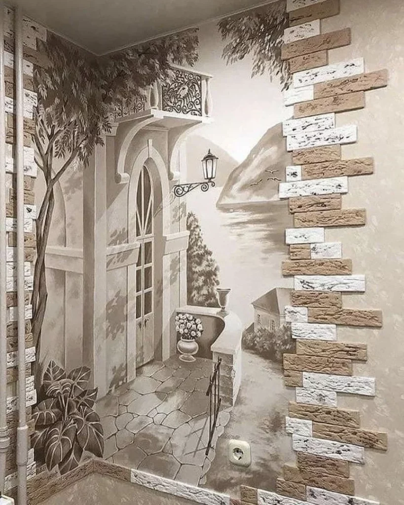
I see this as a particularly immersive way to decorate a hallway because the artwork visually extends the space beyond the physical wall. The painted path and architectural perspective give the impression of looking into another setting, which can make a relatively confined corridor feel more visually expansive. The textured borders also help define the artwork and prevent it from appearing like an isolated flat image.
To achieve a similar effect, I would first consider the proportions of the hallway and choose artwork that works with its existing perspective. I would also keep the surrounding finishes close to the tones already visible here so the artwork feels integrated. What makes this example successful for me is its commitment to one artistic idea rather than combining several unrelated decorative treatments.
Golden Floral Wall Art With Decorative Geometric Framing
This hallway features a large vertical artwork filled with pale golden flowers against a deep warm background. The central image is framed by dark reddish-brown borders and decorative geometric panels on both sides. Matching patterned floor details and large decorative ceramic vessels visible near the edges reinforce the more ornate character of the setting. Warm ceiling lighting adds to the golden atmosphere.
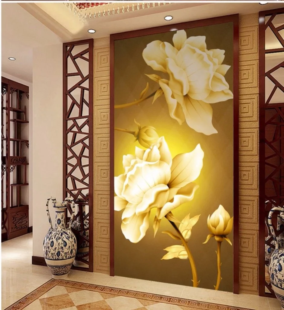
The composition works because the artwork is given plenty of surrounding structure. The darker frame separates the floral image from the pale wall, while the geometric panels add rhythm without competing directly with the flowers. I also notice how the floor pattern echoes the decorative quality of the wall, helping the hallway feel deliberately coordinated from top to bottom.
I would approach a design like this by selecting one dominant artwork and then repeating only a few of its visual cues elsewhere. Here, the warm gold tones and geometric details appear across different elements, creating continuity. For a fall-inspired hallway, I find this kind of deeper palette particularly appealing because it brings warmth and richness into a transitional space.
Nature-Inspired Mural With Layered Garden Imagery
In this hallway, a large mural covers much of one wall, showing an atmospheric garden-like scene with tall foliage, trees, flowers, and a central arched view leading toward distant architecture. The image is highly detailed and extends almost from floor to ceiling. Opposite it, the hallway remains relatively simple, with pale walls, a modest ceiling light, and a stone-textured border surrounding a doorway.
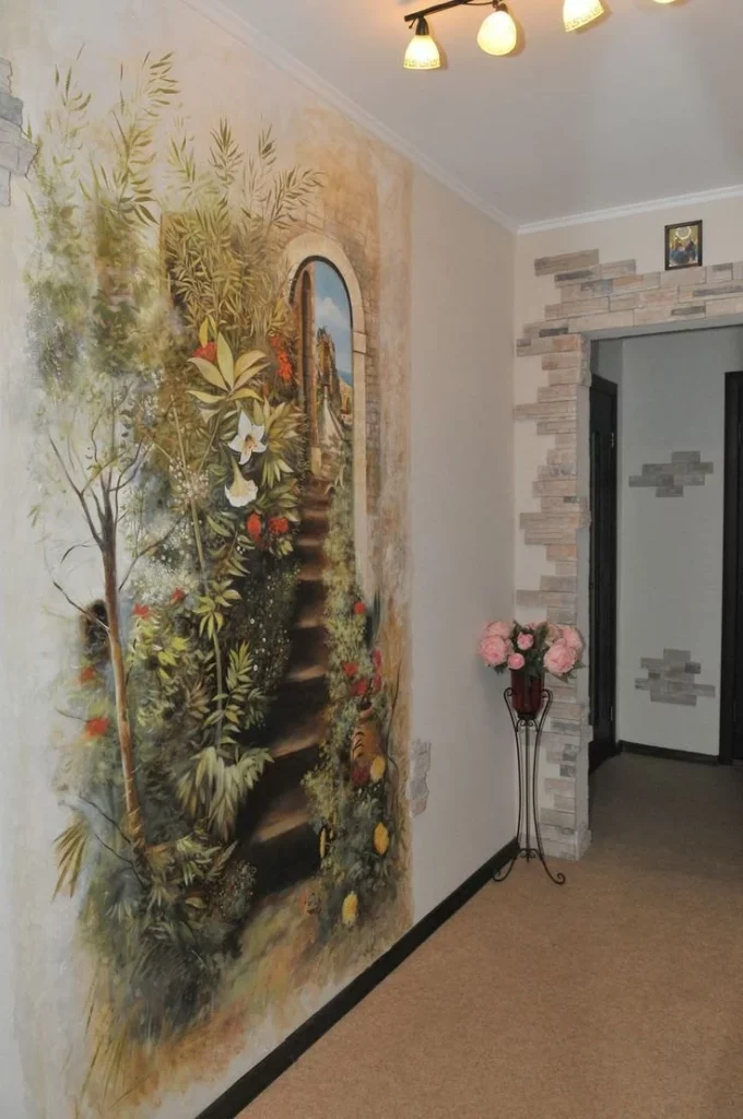
I like the way the mural becomes the entire identity of the corridor. Instead of adding several separate decorative pieces, the design concentrates visual interest on one expansive surface. This can be especially effective in a hallway because the long wall provides enough space for a scene to unfold as you move past it. The limited furniture also allows the artwork to remain visible without interruption.
If I wanted to achieve a similar atmosphere, I would treat the mural as the primary finish rather than trying to decorate over it. The image shows me that a highly detailed artistic wall can provide both character and depth on its own. Keeping the nearby doorway and ceiling relatively understated would help preserve the visual hierarchy and prevent the mural from feeling overwhelmed.
Contemporary Hallway With Three-Panel Floral Artwork
This bright hallway uses three vertically arranged panels of artwork to depict delicate pink flowers emerging from a rounded black vase. The artwork sits on a pale wall, while the corridor itself is finished with glossy light flooring and simple white surfaces. At the far end, a yellow-lit wall becomes a strong secondary focal point, with a narrow shelf and small decorative arrangement positioned against it.
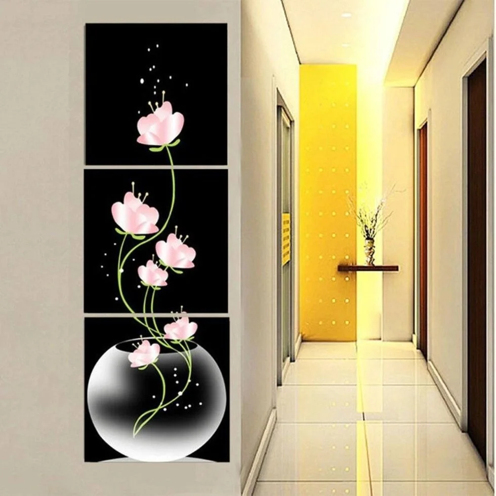
The three-panel composition gives the wall a strong vertical rhythm that suits the narrow hallway. I like how the black background of the artwork creates contrast against the pale surroundings, while the pink flowers introduce a softer accent. The bright yellow area at the end of the corridor also creates depth, drawing my eye forward and making the hallway feel longer.
For a similar look, I would use artwork that can be divided into several panels while maintaining one continuous visual story. I think this is a practical way to decorate a long wall because the individual pieces can fill vertical space without requiring bulky furniture. The image also reminds me that lighting at the far end of a corridor can become part of the artistic composition rather than being treated as purely functional.
Decorative Wall Clock With Branch and Leaf Motif
This hallway combines a large decorative wall clock with sweeping black branch-like lines, small leaf forms, circular accents, and delicate hanging details. The clock itself sits near the center of the composition, while the decorative lines extend outward across the pale wall. A framed doorway is positioned nearby, and the long corridor beyond is softly illuminated by recessed ceiling lights.
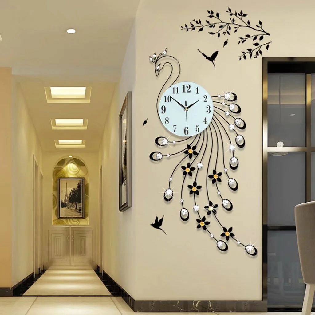
I find this arrangement interesting because the clock functions as both artwork and a useful object. The radiating lines visually occupy a much larger wall area than the clock face alone would, giving the piece enough scale for the hallway. The pale wall provides a quiet background for the black details, while the repeated circular accents create a sense of movement around the central clock.
For me, this is a good example of using one functional object as the artistic anchor of a hallway. I would make sure a decorative clock has enough surrounding wall space so its silhouette can be appreciated rather than squeezed between doors or furniture. The image also shows how black details can provide definition in a pale hallway without requiring a darker overall color scheme.
Textured Floral Painting Above a Contemporary Console
This sophisticated hallway vignette features a large textured painting of a white flower against a layered neutral background. The artwork hangs above a sleek console with a dark top and black lower section, while a small amber-toned vessel, a rounded pink object, and a tall white vase with dried foliage decorate the surface. The wall behind the console has a warm earthy finish, and darker vertical surfaces frame the composition.
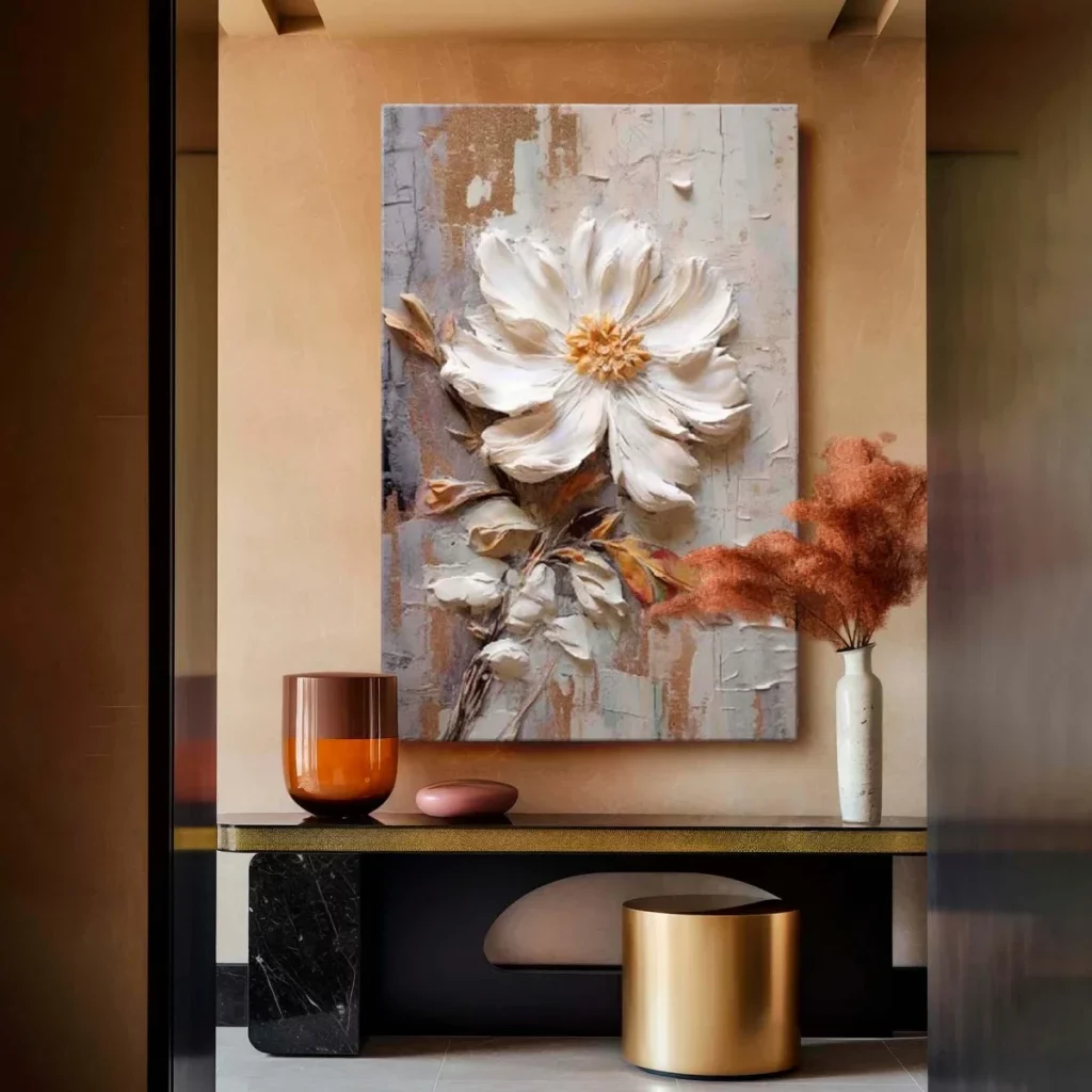
I especially like the contrast between the soft, sculptural appearance of the flower and the sharper lines of the console. The artwork provides a pale focal point against the warm wall, while the small decorative objects introduce different shapes and heights. The arrangement feels balanced because the accessories remain relatively restrained and the large painting carries most of the visual weight.
When I study this image, I would focus on layering rather than quantity. A large piece of art, a slim console, and a few carefully positioned objects can create a finished hallway without making the passage feel crowded. The combination of warm wall color, dark furniture, and pale artwork also feels naturally suited to the richer atmosphere I associate with fall interiors.
Black-and-White Floral Portrait in a Modern Entry Hall
This contemporary entry hallway features a striking black-and-white artwork showing a close-up portrait partially obscured by a large flower. The piece is mounted above a compact white and wood-toned cabinet, with small decorative objects arranged along its top. Wood cabinetry surrounds the scene, while a mirrored or reflective surface on the right extends the visual depth of the space. A small round upholstered stool sits nearby.
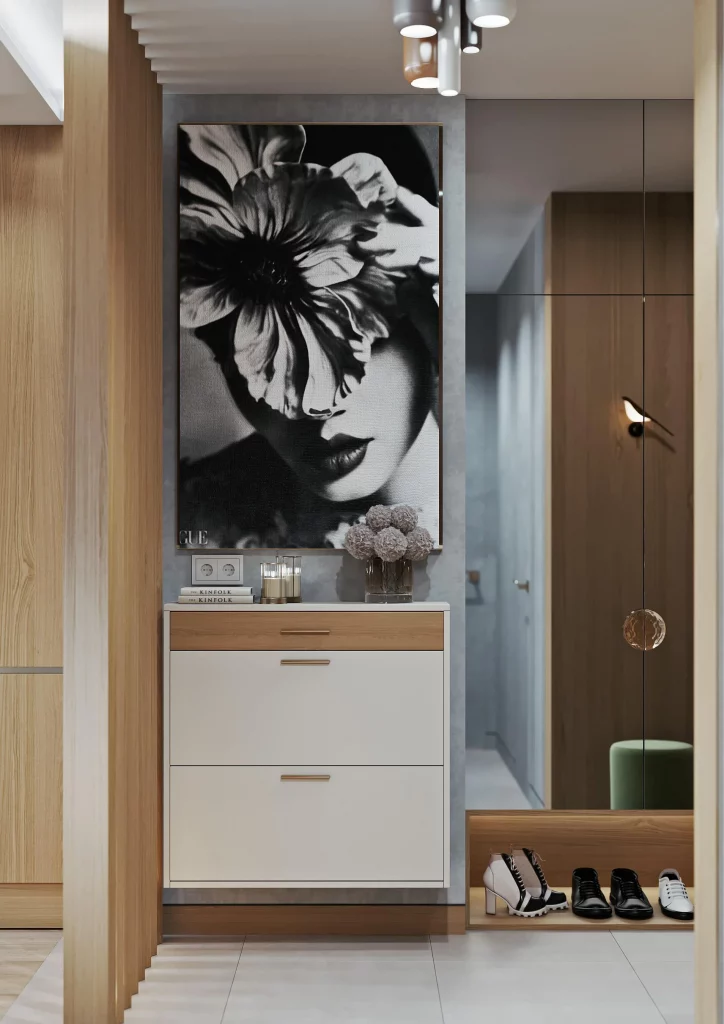
I like how the artwork immediately establishes personality in an otherwise restrained hallway. Its monochromatic palette works naturally with the white cabinet, gray wall, and warm wood surfaces, while the oversized floral form gives the composition a strong focal point. The cabinet also provides practical enclosed storage, which is especially valuable near an entrance where everyday items can easily accumulate.
For a similar design, I would begin with the artwork and repeat its neutral tones through the furniture and surrounding finishes. The image demonstrates how a hallway can feel contemporary without becoming visually cold when wood is introduced alongside white and gray. I would also preserve enough open floor area around the cabinet and stool to maintain comfortable movement through the entry.
Bright White Hallway With Patterned Walls and Reflective Console
This long hallway is finished in pale patterned wall coverings, white doors, decorative ceiling molding, and a polished floor with a geometric runner-like design. On the right, a narrow reflective console table supports a metallic deer sculpture, while a large mirror extends along the wall behind it. A small bench with colorful textiles sits farther down the corridor, adding a touch of visual variety.
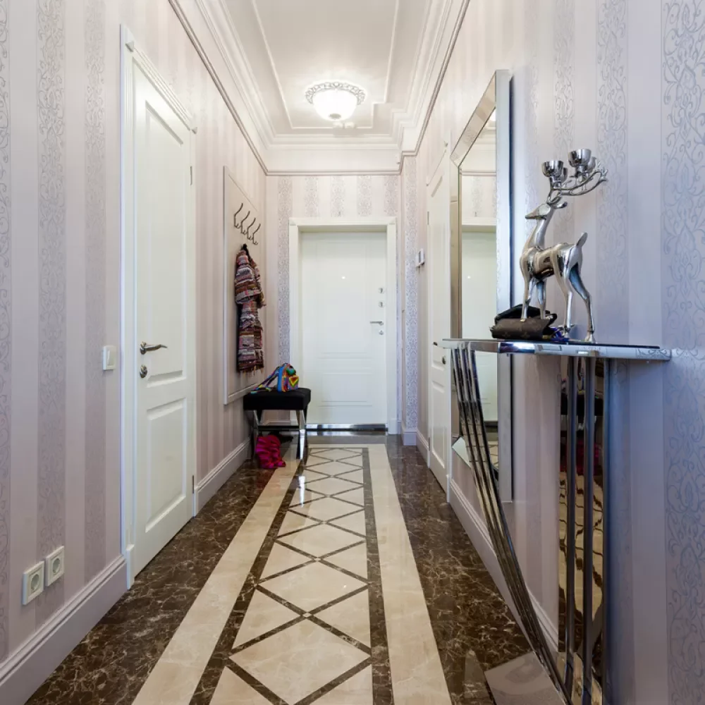
What stands out to me is the combination of repetition and reflection. The patterned walls and geometric floor create a consistent rhythm along the length of the hallway, while the mirror visually expands the right side. The slim console takes up very little floor space, yet it provides a dedicated display surface for the sculptural object. The bench also introduces a practical stopping point without blocking the passage.
I would use this image as inspiration for a hallway where storage and decoration need to coexist within limited dimensions. A narrow console can provide useful surface area while keeping circulation open, and a mirror can make the corridor feel more visually generous. I would be careful to keep the decorative objects on such a console selectively edited, because the patterned surroundings already provide plenty of visual information.
Minimal White Hallway With Fashion Illustration
The final hallway in the collection takes a clean contemporary approach, with white walls, pale flooring, recessed ceiling lighting, and a large framed fashion illustration positioned above a slim console. The artwork shows a figure wearing a dark cap, with flowing hair and a cropped outfit rendered in expressive lines and soft neutral tones. Beyond the entry area, a muted seating space is visible, separated by tall gray curtains.
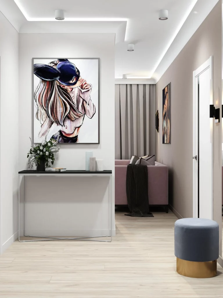
I like how the artwork gives this otherwise minimal hallway a strong sense of personality without changing its calm architectural palette. The slim console offers a small display area while preserving generous open floor space, and the large framed illustration establishes an immediate focal point. The gray curtains and muted seating visible beyond the hallway also help connect the artwork to the softer tones used deeper inside the home.
For a similar look, I would keep the architecture simple and allow one large piece of art to do most of the expressive work. This image shows me that an artistic hallway does not need elaborate decoration to feel memorable. In fact, the restraint makes the artwork more noticeable and creates a polished transition between the entry corridor and the adjoining living space.
Artistic hallways can transform an overlooked passage into one of the most memorable areas of a home. From statement artwork and patterned walls to sculptural lighting, mirrors, and practical seating, these ideas show how creativity can work beautifully alongside everyday function. I hope this collection inspires you to give your hallway the same attention as any other room and create a space that reflects your personal style. Which artistic hallway idea was your favorite? Leave a comment and share the design you would most love to bring into your home for Fall 2026.