
A backsplash does more than protect the wall behind your stove. It sets the tone for the whole kitchen, and tile is the material that makes that possible. These 27 looks prove there is a tile for every taste, from glossy subway to hand-painted geometric.
Whether you lean toward earthy textures, bold colors, or classic neutrals, each option keeps the backsplash front and center. The space around it stays simple so the tile can do the talking. This roundup helps you see the range without the noise of full-room staging.
Textured Geometric Tile Creates an Earthy Focal Point
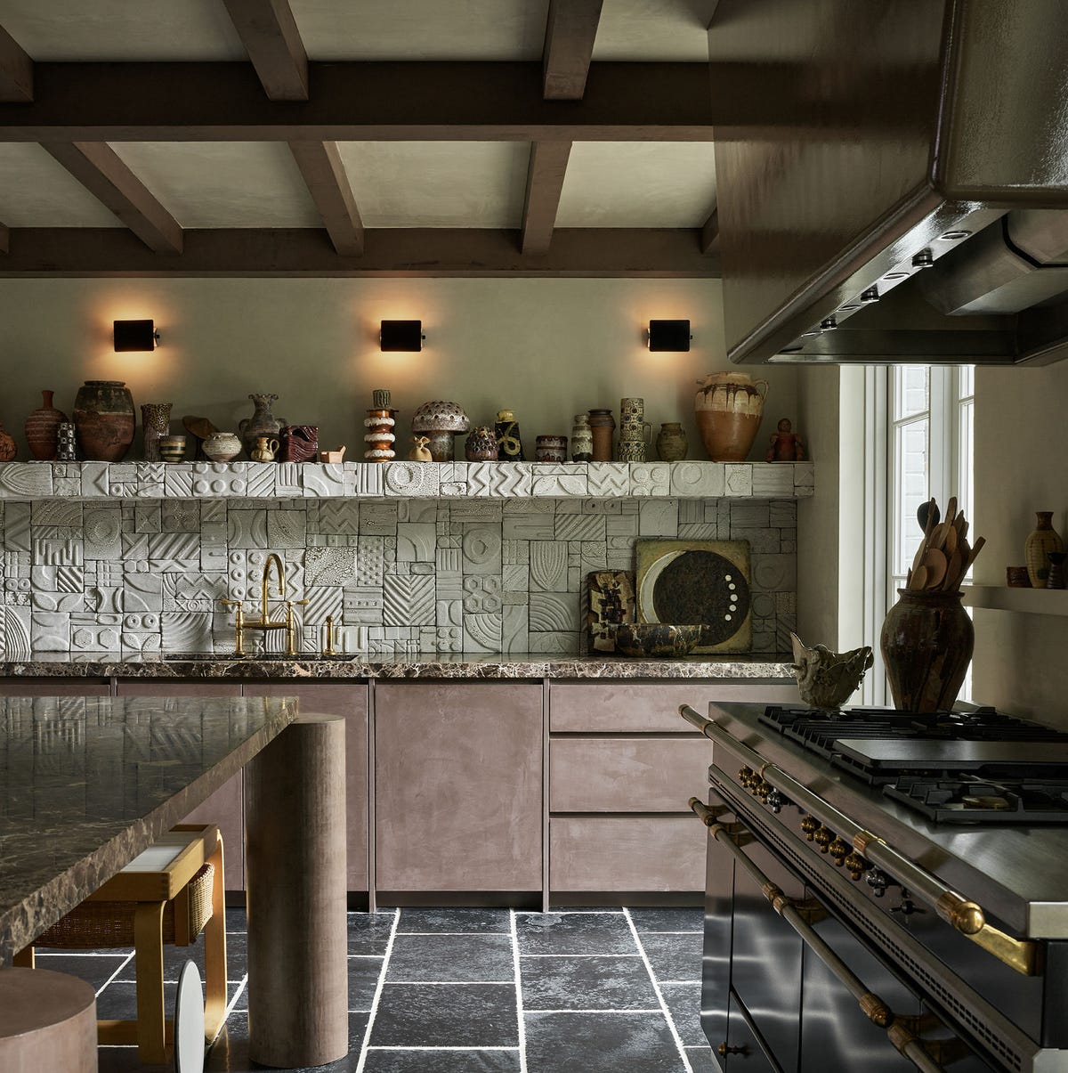
A full wall of textured geometric tile anchors this kitchen with a tactile, earthy presence that flat subway tile just can’t match. The raised pattern catches light from the wall sconces and the window, throwing subtle shadows that change across the day. Open shelving and a stone counter keep the backdrop simple so the backsplash stays the main event. If your kitchen has wood beams or natural stone, a heavily textured tile in neutral earth tones is a fitting companion, not a competitor.
Dark Copper Metal Tiles for a Modern Kitchen Edge
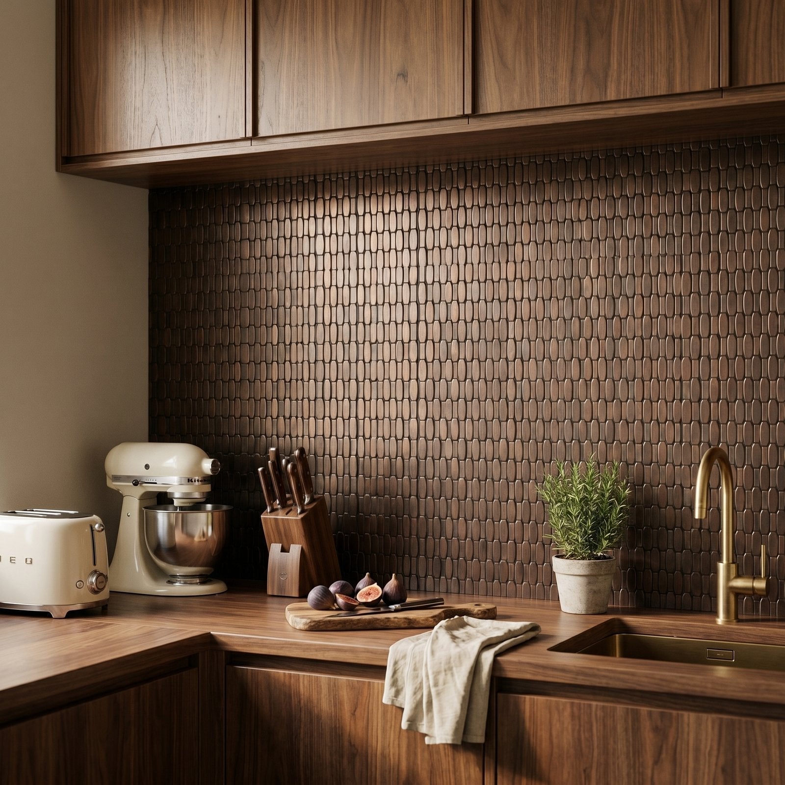
A dark copper metal tile backsplash gives this modern kitchen a look that is both warm and industrial. The brown and copper tones tie together the wood cabinetry and the stainless appliances without matching either one exactly. The geometric metal surface reflects ambient and natural light, which prevents the room from feeling dark despite the deep finish. A dark copper metal tile backsplash in a modern kitchen works best when the counter and cabinets stay neutral, letting the tile carry the color story on its own.
Handmade Blush Pink Tiles Add Rustic Charm
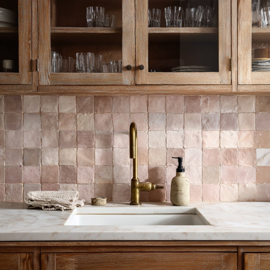
Can a pink backsplash feel rustic instead of frilly? It can when the tile is a handmade square with visible texture and a soft blush tone. Behind the sink, these blush pink square tiles sit below a brass faucet and next to wood cabinets, which pulls the pink into the warm beige and white palette without reading as too sweet. The marble counter and brass details pick up the same warm undertones.
The slight variation in each tile, a hallmark of handmade ceramic, gives the wall a hand-applied feel that suits a rustic kitchen. Under cabinet lighting makes the texture readable without washing out the color. If you want pink but worry about commitment, this is a good place to start.
Deep Teal Glossy Tiles for an Eclectic Statement
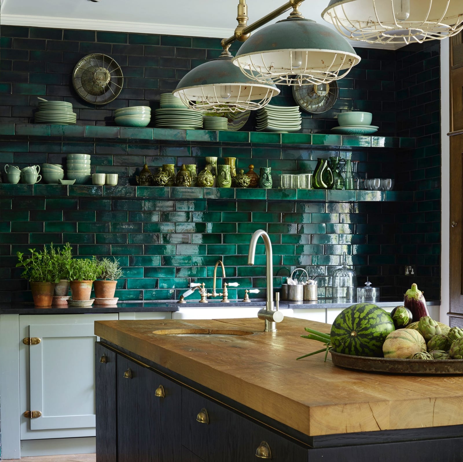
Glossy tile in a deep teal shade turns the backsplash into a reflective surface that bounces light across the kitchen. The high-shine finish makes the dark color feel lively instead of heavy, especially when natural light hits it from a nearby window. White cabinetry and wood accents on the island keep the eclectic palette grounded, so the teal reads as a considered choice rather than a random splash. If you are building an eclectic kitchen, a deep teal glossy tile backsplash is a low-risk way to introduce a bold color that still feels collected.
Geometric Gold and White Tiles for Glamorous Appeal
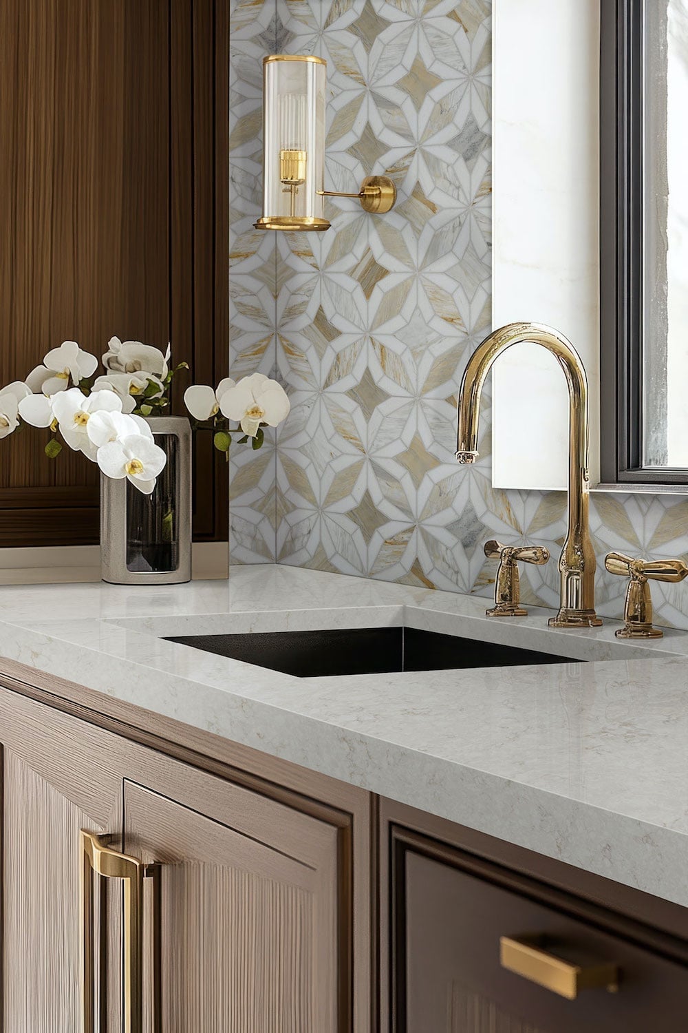
In a glam kitchen, the backsplash can do the talking while the counter stays clear. This geometric gold and white tile, paired with a marble surface and a brass faucet, creates a compact vignette that feels curated rather than cluttered. The gold in the pattern echoes the brass wall sconce above the sink, which pulls the look together without adding another metal. White tile keeps the backdrop bright, while the gold geometric lines add the glam factor. In a compact kitchen, this approach lets one detail carry the whole style.
Vertical Wood-Look Tiles for a Modern, Natural Feel
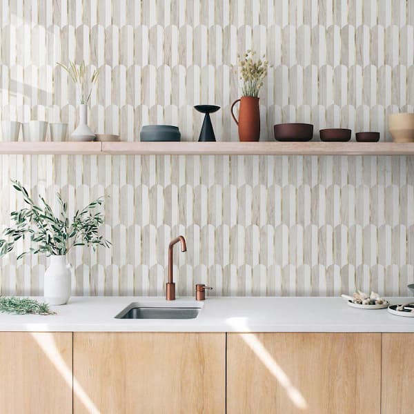
If you love the warmth of wood but worry about a real plank backsplash near the sink, vertical wood-look tile is the practical substitute. The narrow planks run floor to ceiling along the wall behind the sink, with a floating shelf and a few vases breaking up the height. Beige wood tones and white cabinetry keep the palette grounded, while the metal faucet adds a crisp note. The vertical layout draws the eye upward, making a standard counter feel taller. The trick is to pick a tile with enough grain variation so it reads as organic, not like a printed repeat. Stick to matte or satin finishes, high gloss on a wood grain can look more plastic than plank.
Glossy White Subway Tiles for a Farmhouse Kitchen
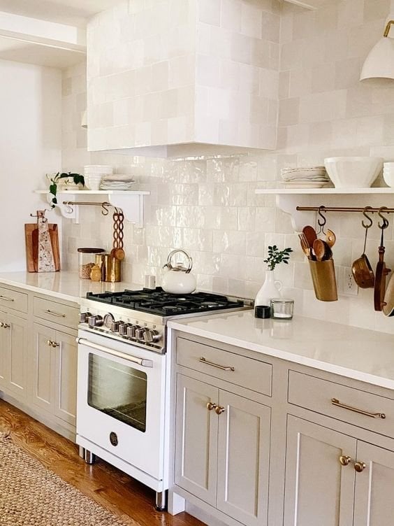
A glossy white subway tile backsplash next to gray cabinetry and a white range gives a farmhouse kitchen its clean, bright backbone. The reflective surface catches light from the window and the task lamps, so the space feels open even if the square footage is modest. For renters, this is the safest swap you can make: standard-size subway tile is easy for a landlord to approve and simple to reverse when you move out, since it follows a classic grid that blends into almost any wall.
Textured Cream Square Tiles for a Clean Modern Aesthetic
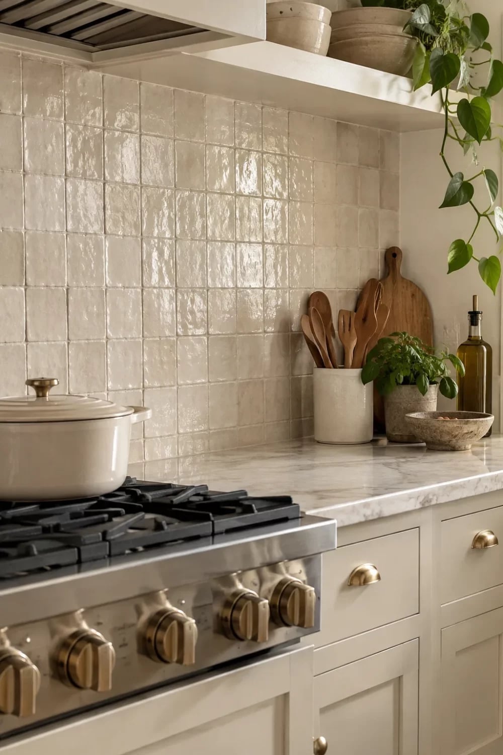
Textured cream square tiles do exactly what a clean modern kitchen needs. They add depth without adding color. The subtle surface catches soft overhead light and daylight, so the wall never falls flat even when the surrounding palette stays neutral. Paired with wood cabinetry and a marble countertop, the cream tone bridges the warm wood and cool stone. A potted plant on the counter is all the ornament the vignette needs. The texture also hides everyday splashes better than a smooth glossy tile, which means less wiping between deep cleans.
Gray Subway Tiles for a Classic Traditional Kitchen
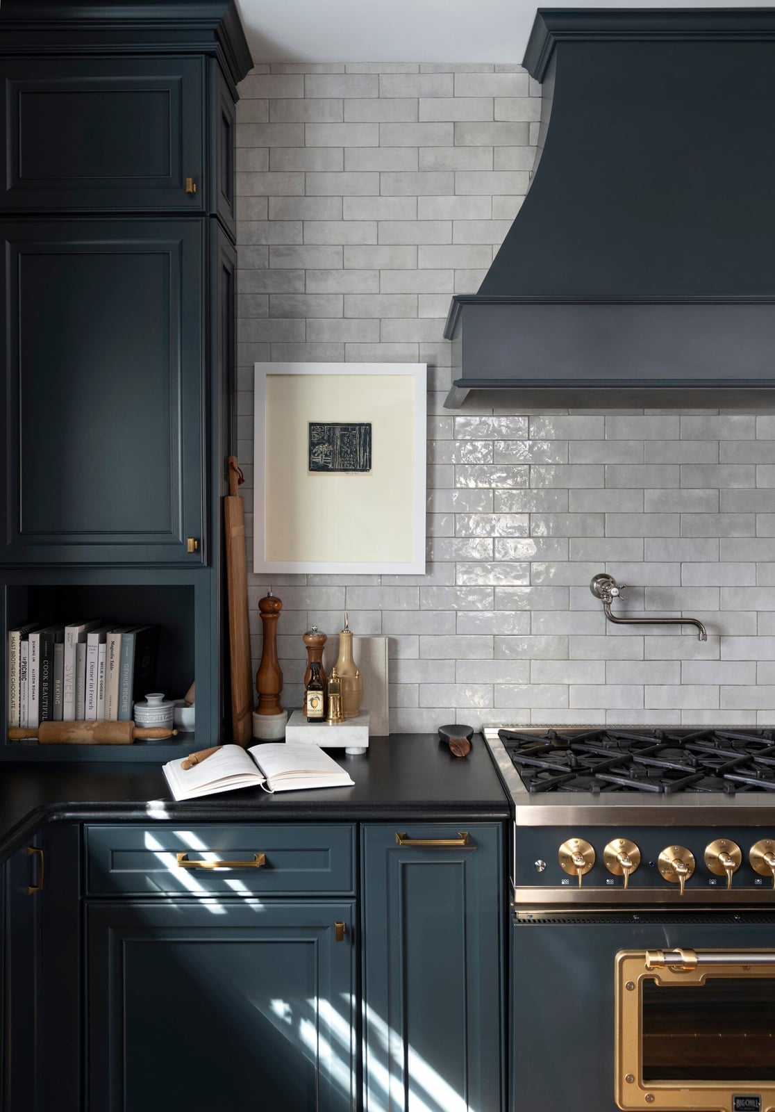
Can a gray tile still feel traditional when so many kitchens lean toward white? Yes, as long as the shape stays classic. Standard subway tile in a soft gray keeps the familiar brick-layout rhythm that defines a traditional kitchen, but the muted tone adds a layer of depth that white alone doesn’t offer. In a compact range area with cabinetry and a hood, the gray reads as a neutral backdrop rather than a competing feature. The palette stays within gray and white, so the eye rests on the range and hardware instead. A warm-toned grout, off-white or beige, stops the gray from turning cold and keeps the look grounded in the traditional lane.
Stacked Green Tiles for a Modern Kitchen Accent
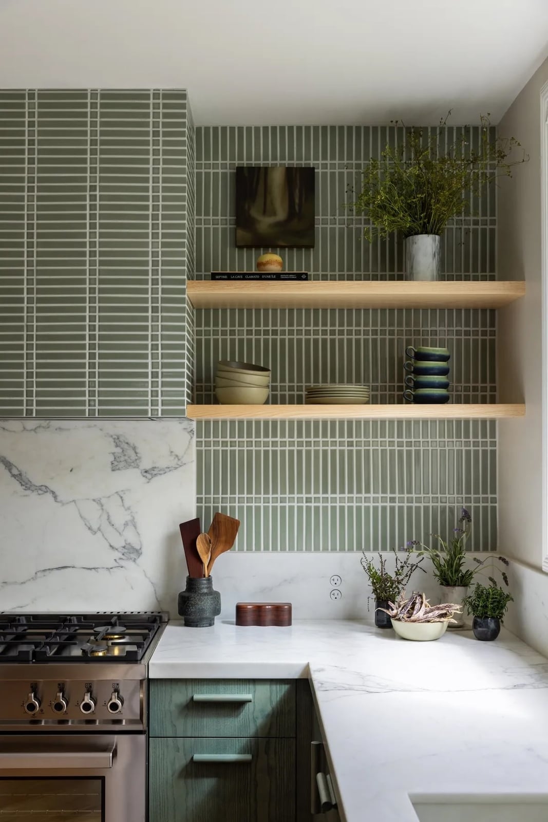
Stacked green tiles arranged in a straight grid rather than a staggered pattern give a modern kitchen a clean, deliberate line. In a compact corner with shelving and a range, the green reads as an accent wall rather than a full treatment. The color pairs naturally with white marble countertops and light wood cabinetry, so the palette stays fresh without going cool. The stacked layout also means fewer cut tiles at the edges, which makes for a simpler install and a sharper finish around outlets and shelf brackets.
Glossy Dark Green Subway Tiles for a Sleek Look
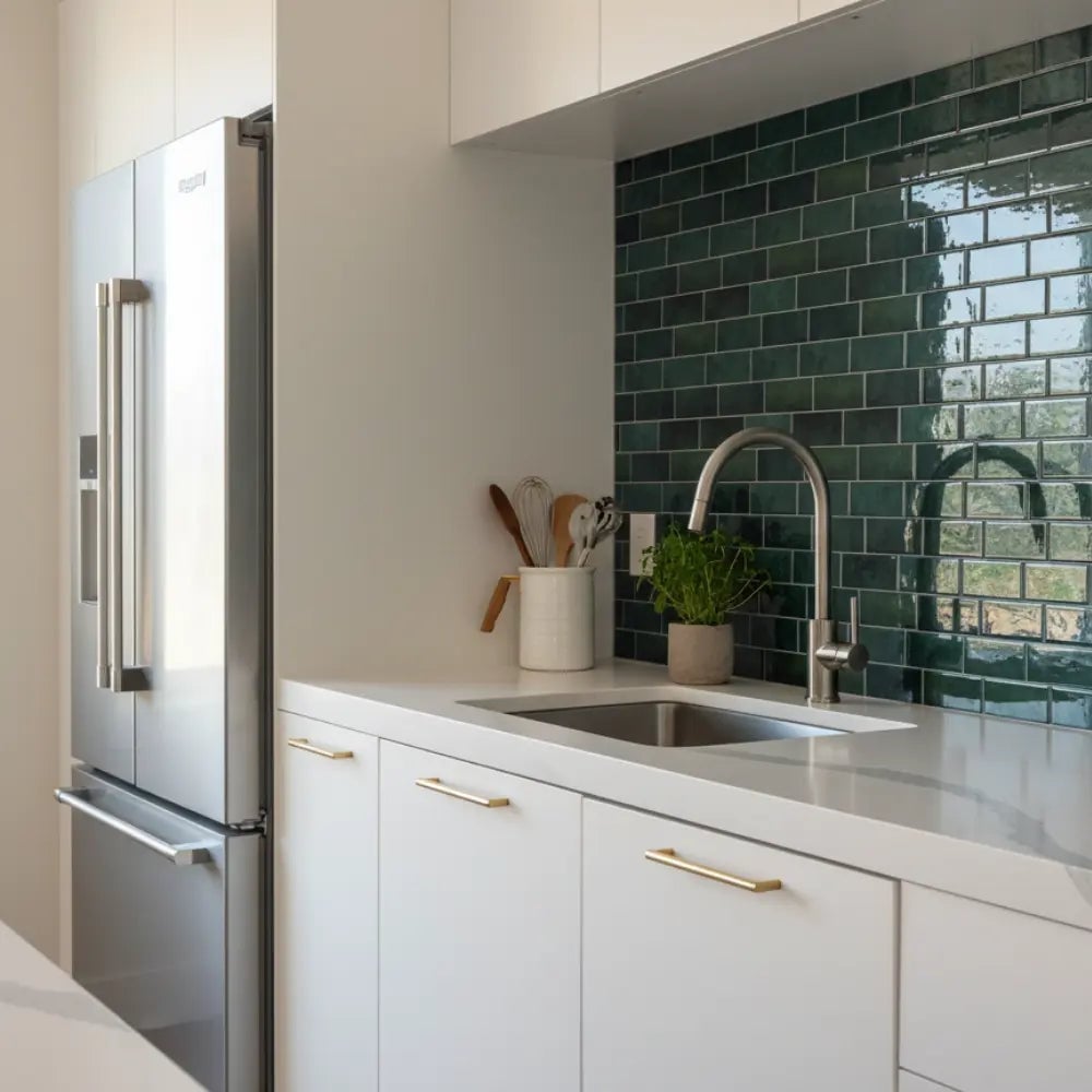
A practical rule for glossy tile is to let the shine carry the color, so the finish does the talking. Here the dark green subway tile runs behind a white counter and chrome fixtures, and the glossy surface picks up both the natural light and the overhead lighting. The white cabinetry and stainless steel refrigerator keep the compact kitchen from feeling heavy, while the green adds depth without darkening the whole room. Because the tile is the hero element, the surrounding palette stays simple. The laminate counter and metal sink recede, letting the backsplash define the modern edge. If you want a sleek look that still feels warm, this kind of glossy subway tile is a strong candidate.
Yellow and White Patterned Tiles for a Boho Vibe
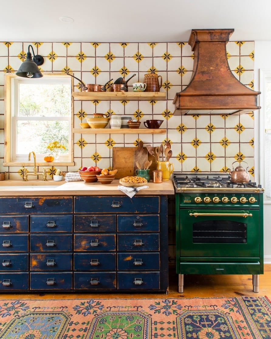
Set against plain white or beige tile, a yellow and white patterned backsplash becomes the room’s main event. The kitchen here pairs that tile with wood cabinetry and a copper range hood, so the warmth of the pattern is echoed by the natural materials around it. The blue accents scattered through the tile keep the yellow from feeling too sweet, and the white base lets the pattern breathe. With a pendant light overhead and natural light coming in, the colors stay bright. The roomy layout around the range and counter gives the tile room to spread, which helps the boho style feel intentional. A busy pattern like this pairs best with neutral kitchen finishes, letting the backsplash carry the personality.
Two-Tone Pink and Cream Tiles for Farmhouse Warmth
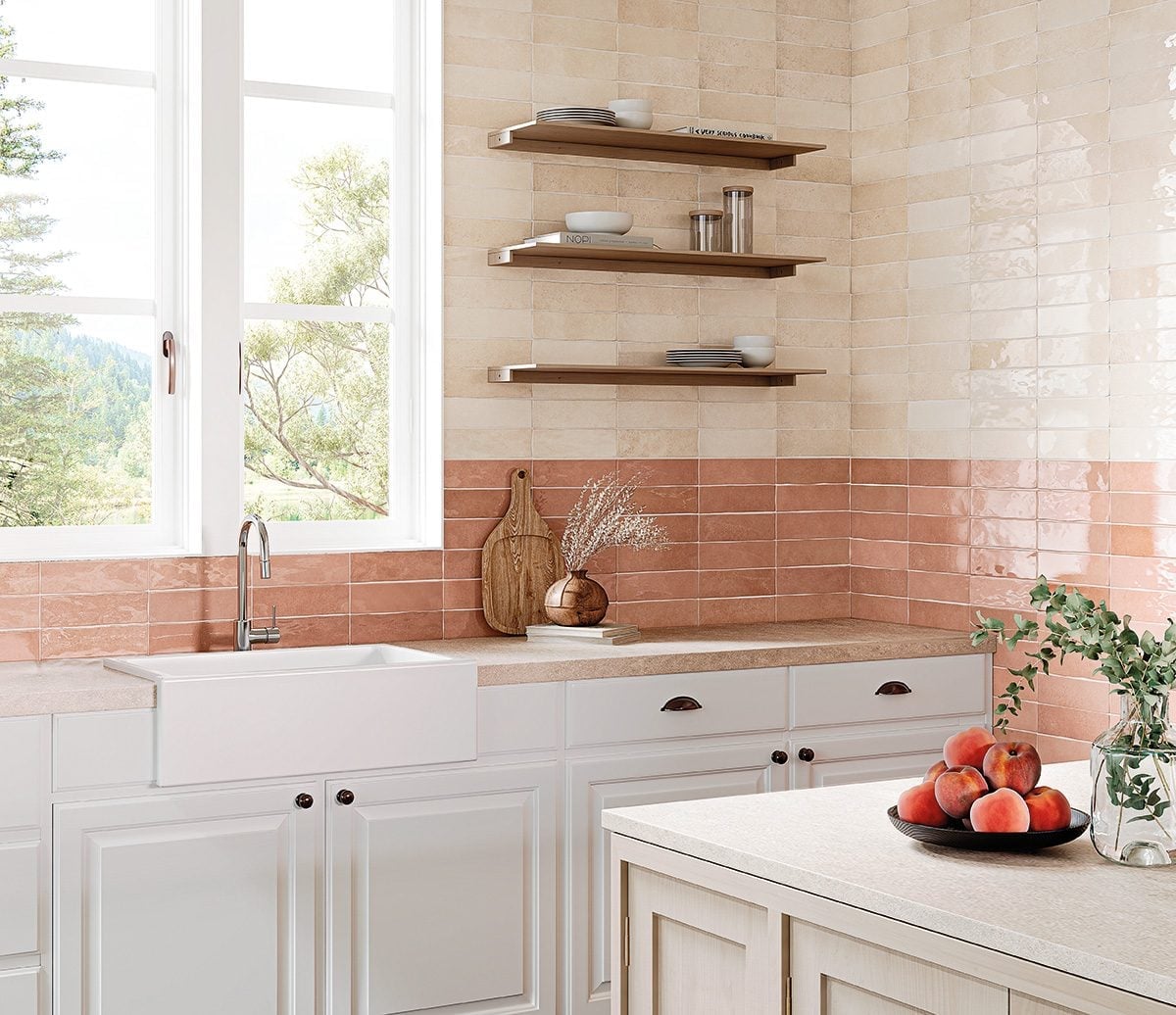
The two-tone design here pairs soft pink with cream, and the mix appears as a deliberate choice. The tile sits above a farmhouse sink with open shelves nearby, and the cabinetry and shelving warm up the palette. Because the pink is muted and the cream is neutral, the backsplash feels at home in a farmhouse kitchen without going pastel. Natural light keeps the colors soft. This kind of two-tone tile adds interest without demanding a full redesign, and it works well with ceramic accessories and wood cutting boards.
Geometric Mosaic Tiles for a Modern Blue Kitchen
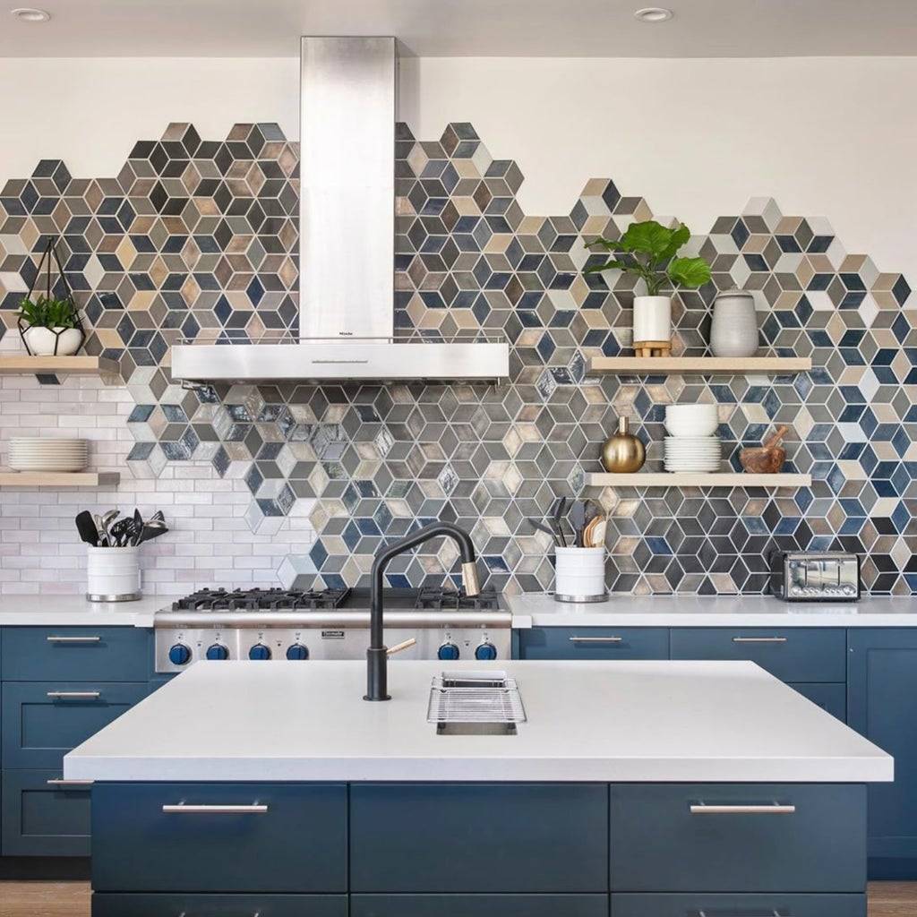
The geometric mosaic tile backsplash is a clear win for a modern kitchen because it gives the eye a pattern to follow without overwhelming the space. The blue, gray, and beige tones in the tile pick up the blue cabinetry and the stainless steel range, creating a cohesive palette. The wooden shelves add warmth and break up the hard surfaces. Ambient and task lighting both matter here: the ambient light softens the mosaic, while the task light over the range makes the pattern pop where you need it. This is the kind of backsplash that rewards a simple layout, since the tile itself is the main event.
Simple Square Gray Tiles for a Clean Counter Display
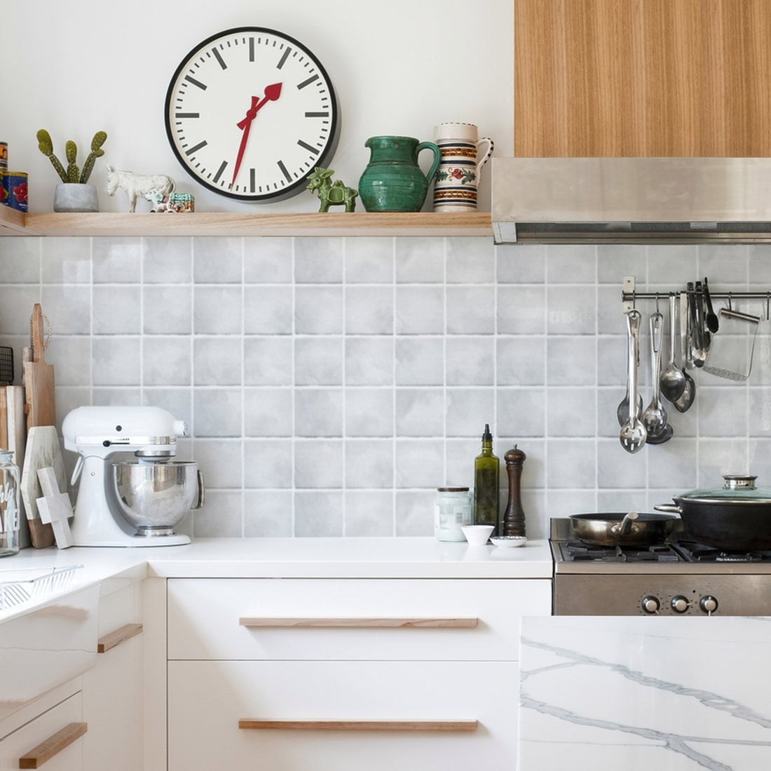
In a compact kitchen, a quiet backsplash lets the counter display take center stage. Square gray tiles sit behind a stand mixer, a clock, and utensils, providing a neutral backdrop. The gray recedes, but the square shape adds a subtle grid that gives the wall texture. Wood tones in the cutting board and utensil handles warm up the scheme, and natural light keeps the gray from feeling cold. Because the backsplash does not compete with the counter display, the whole vignette feels clean and deliberate. If you like to keep tools and gadgets out, a simple square tile is a forgiving backdrop.
Beige Tiles Create Contrast with Blue Cabinetry
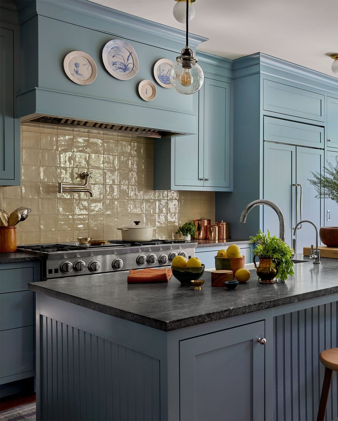
A beige tile backsplash next to blue cabinetry creates contrast without drama. The warm neutral tone of the tile softens the cool blue so the kitchen feels balanced. A stone countertop in a similar gray beige family bridges the two, making the transition from cabinet to counter to backsplash feel like one palette. This transitional kitchen uses the backsplash to support the overall design.
Hexagonal Tiles with Gold Accents for Glamorous Style
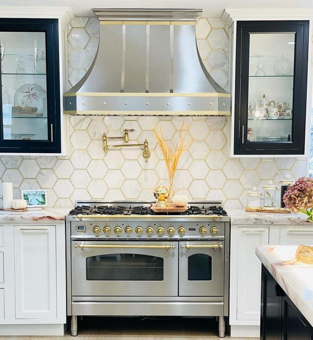
A glam kitchen benefits from letting one material do the talking. Here, hexagonal tiles with gold accents set against white marble and cabinetry create a focal point that feels luxurious without extra decoration. The gold in the tile picks up the light from the range area and the natural light coming in, making the backsplash the hero element. For renters, a peel-and-stick hexagonal tile in a metallic finish offers a similar look without permanent installation, though the real thing has a depth that adhesive versions cannot quite match. Pair it with a simple white or marble countertop to keep the focus on the backsplash.
Dark Blue Herringbone Tiles for a Modern Statement
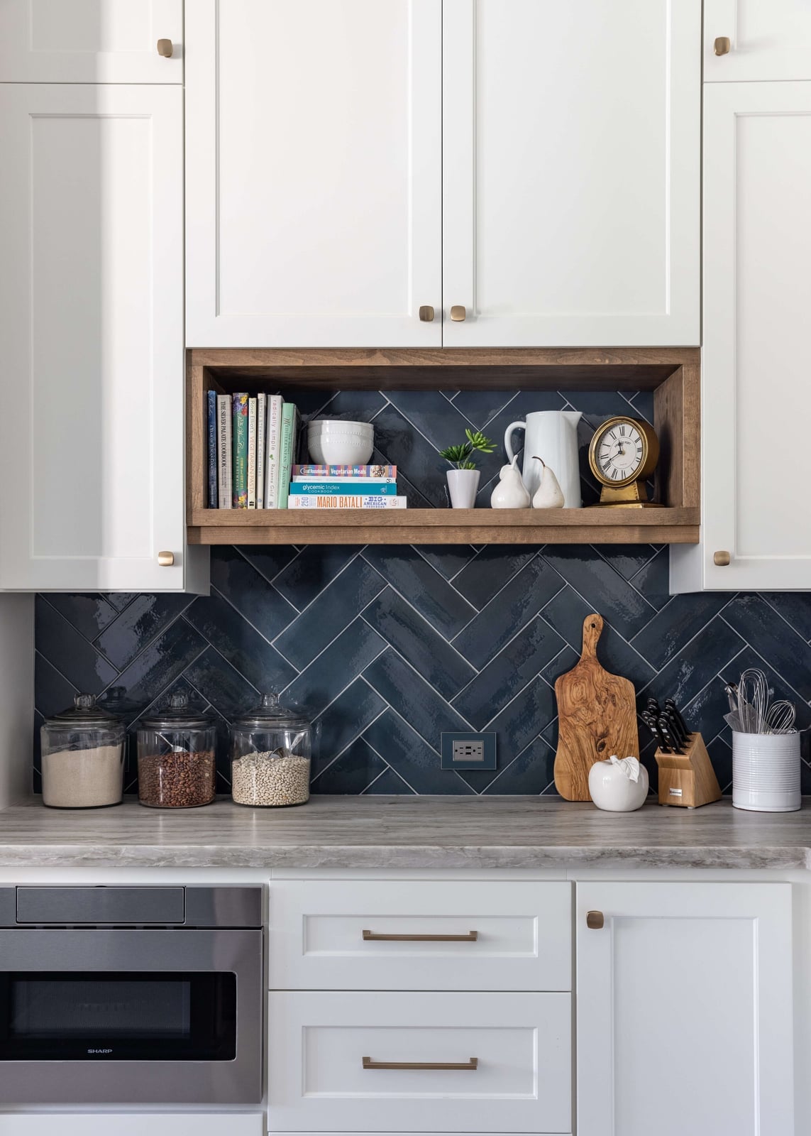
A dark blue herringbone backsplash lands somewhere between classic subway tile and a full-on pattern statement. The herringbone layout adds movement and texture, while the deep blue keeps the look grounded and not busy. In a compact kitchen with white cabinetry and open shelving, this tile works as the primary visual anchor.
Wood tones in the countertop or shelving soften the cool blue, so the space does not feel like a navy box. For a similar effect with less commitment, consider a dark blue peel-and-stick tile in a straight stack pattern. The herringbone layout takes more patience to install, but the backsplash looks tailored and custom.
Vibrant Pink Picket Tiles for a Modern Pop
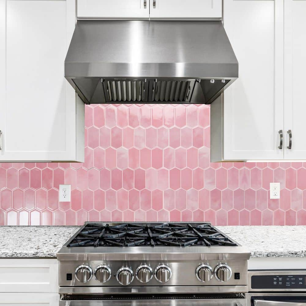
A vibrant pink picket tile behind a stove makes a bold statement. The elongated shape of the picket tile adds visual length to the backsplash area, while the bold color ensures it stands out as a feature. The key to making this work is keeping everything else simple. White or neutral cabinetry and a light countertop let the pink tile take center stage. For a modern kitchen that needs a single punch of personality, this is it.
Teal Tiles for a Bold Outdoor Kitchen
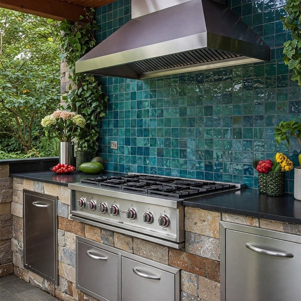
This outdoor kitchen uses teal tile as its main color move, and it works because the rest of the setup stays neutral. The stainless steel range and hood, the stone countertops, and the dark cabinetry all recede, letting the backsplash carry the personality. Teal is a strong choice for an outdoor space because it reads as fresh against stone and metal. It also holds up visually in full sun, where lighter colors can wash out. Check your USDA zone for freeze-thaw rated tile if you live where temperatures drop below freezing. Grout color matters here too. A lighter grout keeps the tile from feeling too heavy.
Elongated Textured White Tiles with Metallic Accents
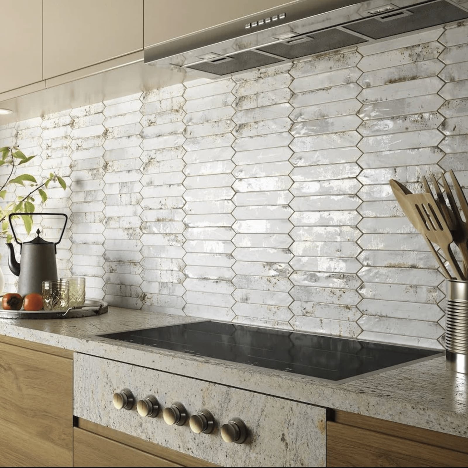
A backsplash with elongated tiles draws the eye across the wall, so the countertop and cabinetry should stay simple. Here the textured white tiles carry thin gold accents that catch the ambient light, adding a vintage feel without overwhelming the space. The stone countertop grounds the look, while the range becomes a natural focal point against the patterned wall.
For a vintage kitchen, keep the metallic detailing and keep the rest of the palette muted. This approach suits a subtle nod to old-world charm without a full period redo. The textured surface also hides fingerprints better than a glossy finish, which helps in a busy cooking area.
Dark Gray Tiles for a Rustic Kitchen Foundation
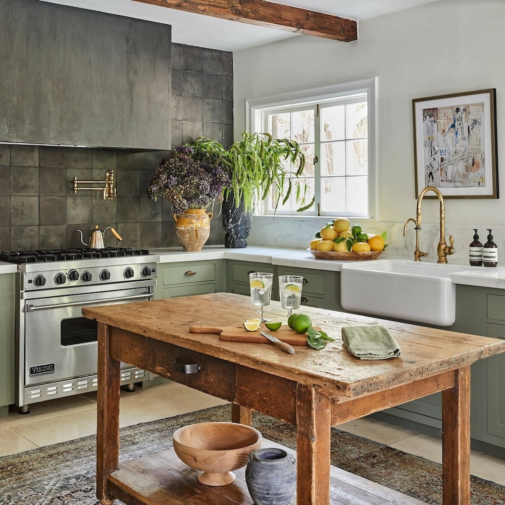
The dark gray tiled backsplash sets a grounded tone against the green cabinetry and wooden island, with natural light and task lighting keeping the room from feeling heavy. This palette anchors the rustic style, letting the stainless steel range and gold details stand out. The L-shaped layout with island gives the space a roomy feel, and the dark tiles make the wood tones appear warmer by contrast.
Gray Marble Tiles for a Modern, Bold Kitchen
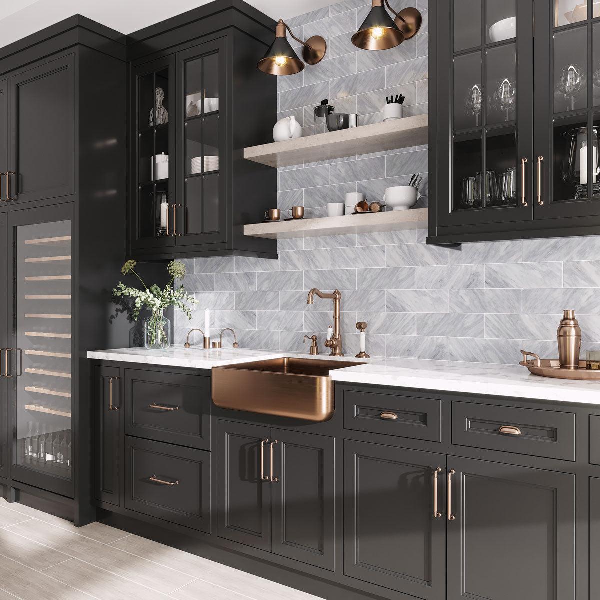
A practical rule for marble tile is to let it be the main texture, then pair it with simpler finishes so the veining stays the focus. Here the gray marble backsplash runs across a roomy kitchen with dark cabinetry, a copper sink, and pendant lights, mixing cool stone with warm metal. The natural light and task lighting bring out the subtle movement in the marble, while the wood elements add a soft counterpoint. This combination suits a modern kitchen that wants a bold surface without competing with the cabinetry.
Talavera Ceramic Tiles for a Vibrant Mexican Kitchen
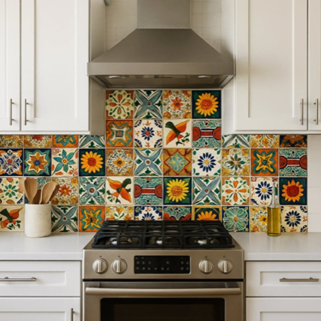
Unlike a single-color tile, a Talavera mix brings a hand-painted quality that changes with the light, so under cabinet lights become essential to show off the pattern. The vibrant multi-color tiles sit behind the stove, framing the gas range and white cabinets. The detail vignette framing means the pattern reads up close, so the lighting needs to be direct rather than ambient to catch every hue. This backsplash works best when the surrounding surfaces stay neutral, letting the ceramic tile carry the color.
For a kitchen that wants character, the Talavera pattern adds a lively focal point without requiring a full remodel. The glazed finish reflects light nicely, but it also means the pattern pops more in the evening when the under cabinet lights are on. Keep the counter and cabinet colors simple, and the tile will do the talking.
Shimmering Herringbone Tiles for Sophisticated Style
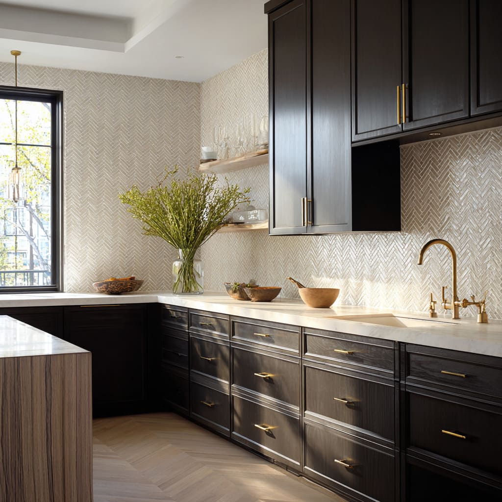
The herringbone pattern with its shimmering finish draws the eye along the counter, while the dark wood cabinetry and brass hardware add a warm contrast. In a roomy kitchen with natural light and pendant lights, the tile catches the light and gives the wall a subtle glow. The neutral beige and gold palette keeps the look sophisticated, and the open shelving above the counter offers a place to display everyday dishes, reducing the need for closed storage. This backsplash suits a modern kitchen that wants a refined texture without a loud color.
Vibrant Green Glass Tiles for a Fresh Modern Kitchen
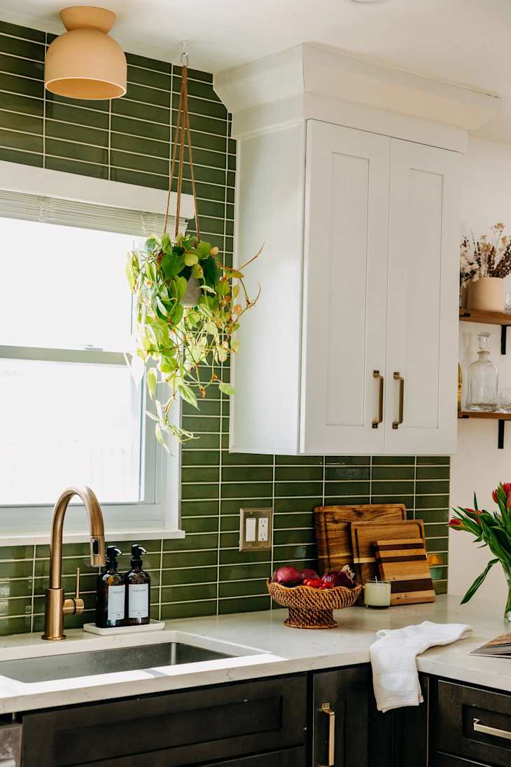
For a kitchen that leans modern but doesn’t want to feel cold, a vibrant green glass tile backsplash is a smart palette choice. The glossy finish of the subway tile catches natural light and bounces it around the room, making the green read as lively rather than heavy. Paired with white cabinets and a quartz countertop, the tile becomes the focal point without needing a busy pattern or competing materials. The wood cutting board and open shelving introduce warmth, keeping the space grounded. One useful principle here: when you choose a high-gloss material like glass, let it be the shiniest thing in the room. Matte countertops and soft wood tones prevent the kitchen from feeling like a mirrored box, and they let the green tile do its job.
Busy Multi-Colored Tiles for an Eclectic Statement
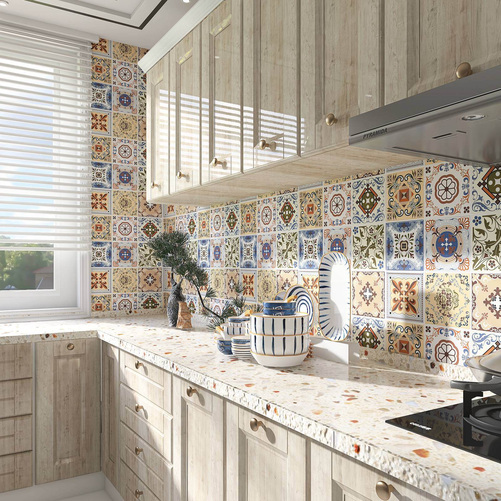
A solid-color backsplash is safe, but a busy multi-colored tile pattern offers something closer to art for your kitchen wall. The square tiles here mix several shades together in a dense, colorful layout that feels energetic. The window helps the pattern breathe, keeping it from overwhelming the room despite its visual weight. The wood cabinets ground the whole setup, offering a neutral anchor for the bright palette to play against.
If you rent, this look is surprisingly achievable without a permanent commitment. A peel-and-stick option in a multi-color tile pattern can mimic the effect for a fraction of the hassle. You get the same eclectic statement, and when you move, the wall goes back to plain. Just check your lease rules first, and test a small patch to make sure the adhesive comes off cleanly in your climate.
Final Thoughts
A backsplash is the one surface that can change a kitchen without changing anything else. The tile you choose sets the tone, whether that is calm, colorful, or somewhere in between. Keep grout lines clean with a sealed finish, and wipe spills quickly to avoid staining. Textured tiles need a soft brush now and then. Glossy tiles show smudges but wipe down fast. The best choice is the one that fits how you actually live.