
Color drenching is the art of saturating a room in a single hue, from the walls to the trim and often the ceiling. It is a bold move that can make a small space feel intentional and a large one feel intimate. This approach goes beyond an accent wall to create a cohesive, immersive look.
In this article, we explore 33 ways to pull off color drenching in 2027, from serene sage bathrooms to vibrant orange living rooms. You will see how different palettes and finishes can transform any room into a personal, dramatic statement.
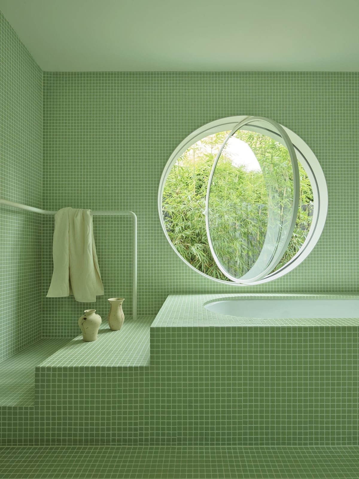
Modern Bathroom Drenched in Serene Sage Green Tiles
A roomy bathroom goes all in on sage green tile, wrapping the walls and floor in one calm color. A soaking tub sits under a circular window that pours in natural light, and the glass shower enclosure keeps the line clean. The style here is modern but not cold, with the tile doing the work so the layout can stay simple. The trick is letting the material lead: one tile finish across surfaces creates a seamless look that feels bigger than it is.
Glamorous Plum Bar Area with Velvet and Marble Accents
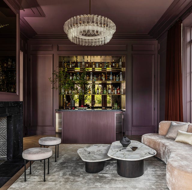
This bar area commits to deep plum from ceiling to bar front, then breaks the saturation with blush pink velvet seating and gold metal details. The palette splits into two parts: a dark dominant color and a lighter accent that keeps the room from going flat. Marble on the coffee tables and a chandelier overhead add the reflective surfaces a dark room needs. What makes it work is the ratio of dark to light stays intentional, with the lighter pieces placed at eye level and below so the ceiling reads as a canopy.
Traditional Study Enveloped in Glossy Deep Red
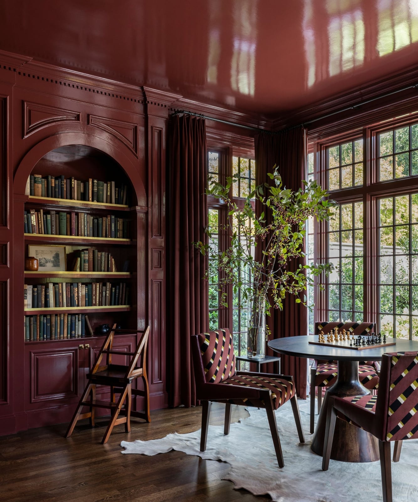
Can you drench a room in a color this strong without it reading as a cave? This traditional study proves yes, as long as you pick a finish with some shine. The deep red paint has a glossy sheen on the walls, ceiling, and trim, and the built-in bookshelves add wood tones that keep the red from being the only thing you see. A round table with chairs sits in the center under natural light from windows, and a library ladder adds function to the tall shelves.
The material mix is what saves the scheme. Glossy paint reflects light better than matte, so the red stays vibrant instead of heavy. The wood on the shelves and furniture adds a natural element that breaks up the color without competing with it. A fabric chair and metal lamp hardware round out the textures so the room feels layered, not painted into a corner.
Pink Paneled Bathroom with Traditional Charm
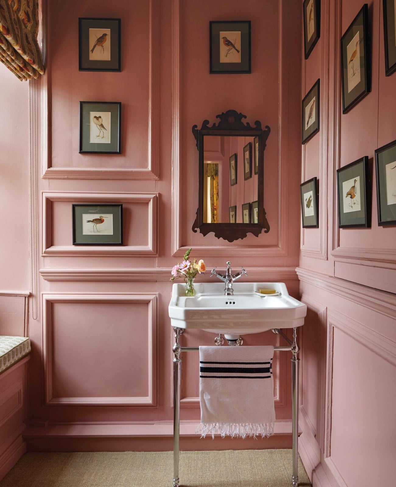
A compact bathroom uses pink paneled walls to create a traditional look that feels finished rather than cute. The wood paneling runs from floor to ceiling in a soft pink, and the pedestal sink and mirror stay simple so the color leads. Natural light from a small window and an overhead light keep the pink from reading as too dark in a room with no square footage to spare.
Modern Living Room in Monochromatic Deep Pink
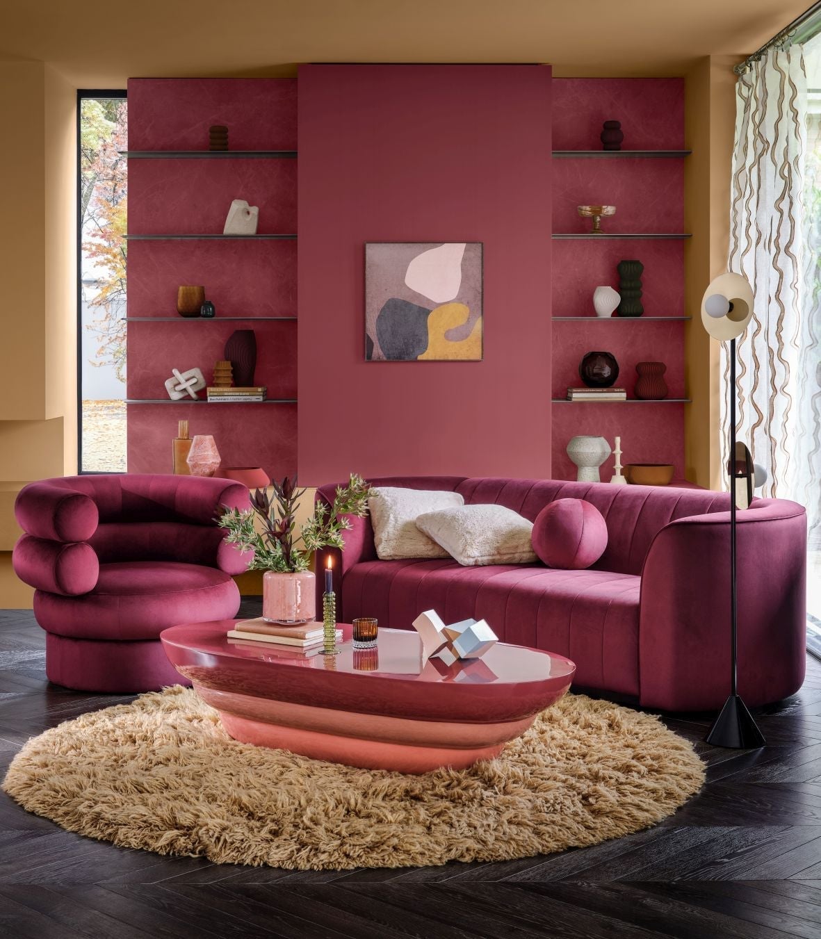
A monochromatic palette works best when you let one color fill the room at different intensities. This modern living room uses deep pink on the walls, a velvet sofa, and even the coffee table, then adds soft yellow and gold accents through a rug and lamp. The sofa and walls match closely enough to feel continuous, but the yellow stops the scheme from being a single note. The practical rule is to choose a neutral or metallic accent that sits opposite your main color on the wheel, so the room has a natural break without needing a second wall color.
Bohemian Bedroom Drenched in Rich Deep Red
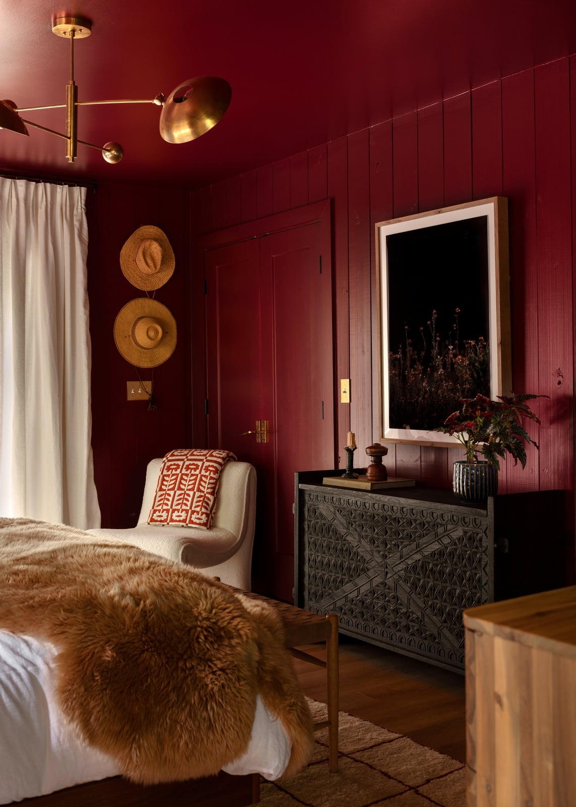
Forget the dark-and-dramatic library look. This bohemian bedroom takes deep red walls and a matching ceiling into a softer, layered territory. The palette adds cream and brown through a wooden dresser, fabric on the armchair, and a fur throw, which keeps the room from feeling closed in. The bed stays the focal point, with the dresser set against one wall. The style here is defined by that full saturation on every plaster surface, and what breaks it is the mix of natural textures. A single ceiling light provides ambient glow, but the real trick is the ratio of red to warm neutrals. Keep it roughly two-thirds red to one-third cream and brown, and the room stays enveloping rather than overwhelming.
Transitional Living Room Corner with Patterned Armchair
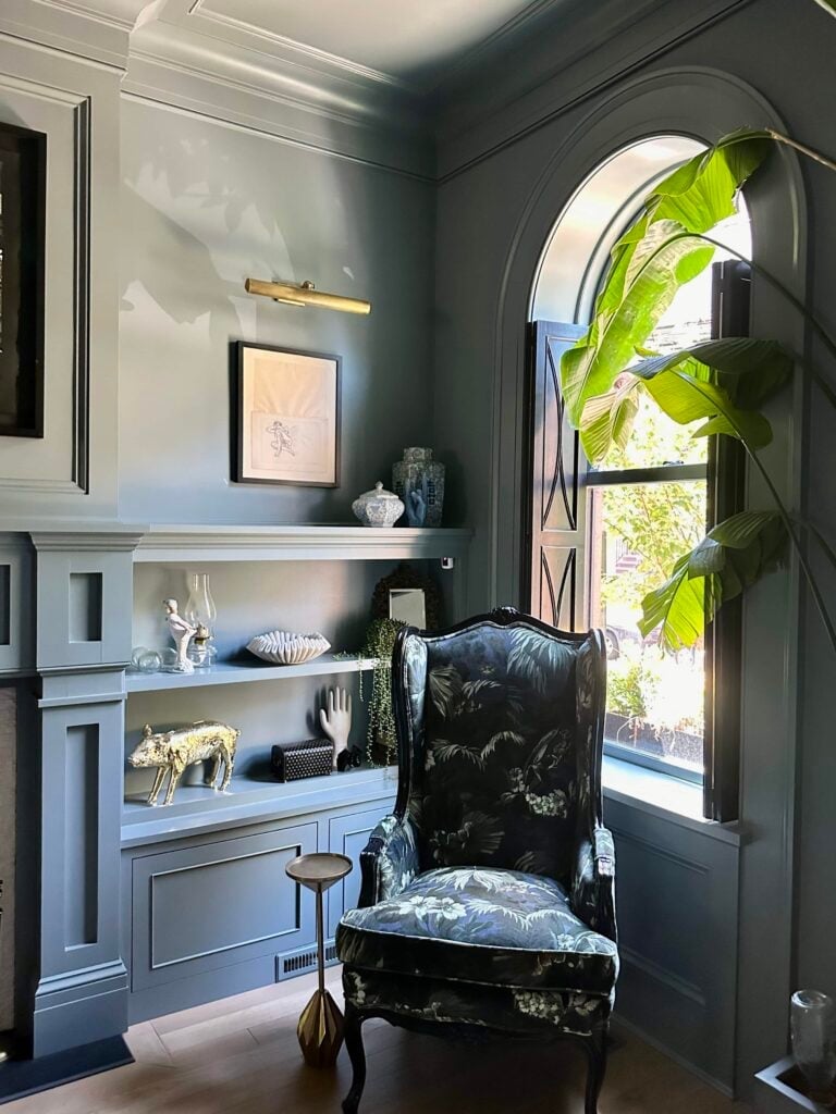
The patterned armchair in gray-blue and dark green pulls this corner together without needing a full room makeover. Built-in shelving and a side table frame it, while a wall sconce and natural light keep the vignette from feeling dark. For a renter, this is the move: one strong piece in a compact spot looks planned, not temporary. The brass and wood in the side table echo the dark green in the fabric, so the palette stays connected even when the walls stay neutral.
Modern Organic Bedroom in Full Sage Green Saturation
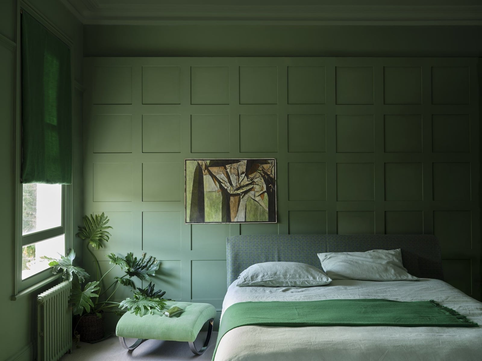
This is sage green done wall to wall, ceiling to paneling, and it works because the saturation stays even. The bed sits centered against paneled walls, with a large plant and an ottoman adding natural wood and cream linen. The palette here is straightforward: sage green as the dominant, cream and natural wood as the supports. What defines the modern organic style is that the green never fights the materials. The plant leaves echo the green, and the metal bed frame provides a slight cool contrast. A window brings in natural light, and an overhead light fills the room evenly. The ratio is about 70 percent green to 30 percent cream and wood, which keeps the room calm without feeling flat.
Maximalist Living Room in Shades of Blue
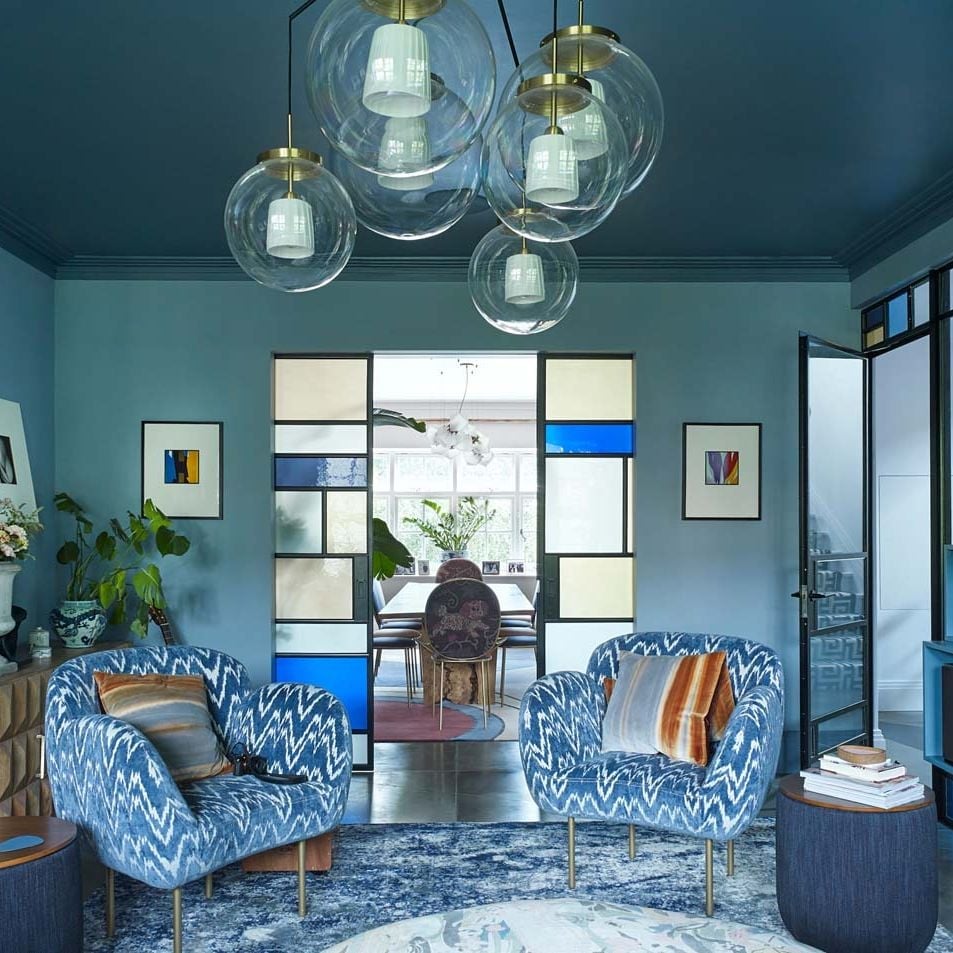
Can blue on blue on blue actually feel spacious instead of suffocating? In this maximalist living room, it does. The walls and ceiling are a single monochromatic blue, and the velvet on the patterned armchairs picks up the same hue. The palette uses shades of blue only, with no competing accent color, so the eye travels smoothly across the room. Two glass pendant lights hang overhead, and natural light from windows keeps the saturation from turning heavy. The symmetrical seating arrangement with the armchairs gives the room a formal rhythm that the blue color drenching softens. The key principle here is that a single color family, when applied to every surface including the ceiling, actually makes the boundaries of the room less distinct. That tricks the eye into reading the space as larger than it is.
Coastal Bedroom Nook in Muted Blue
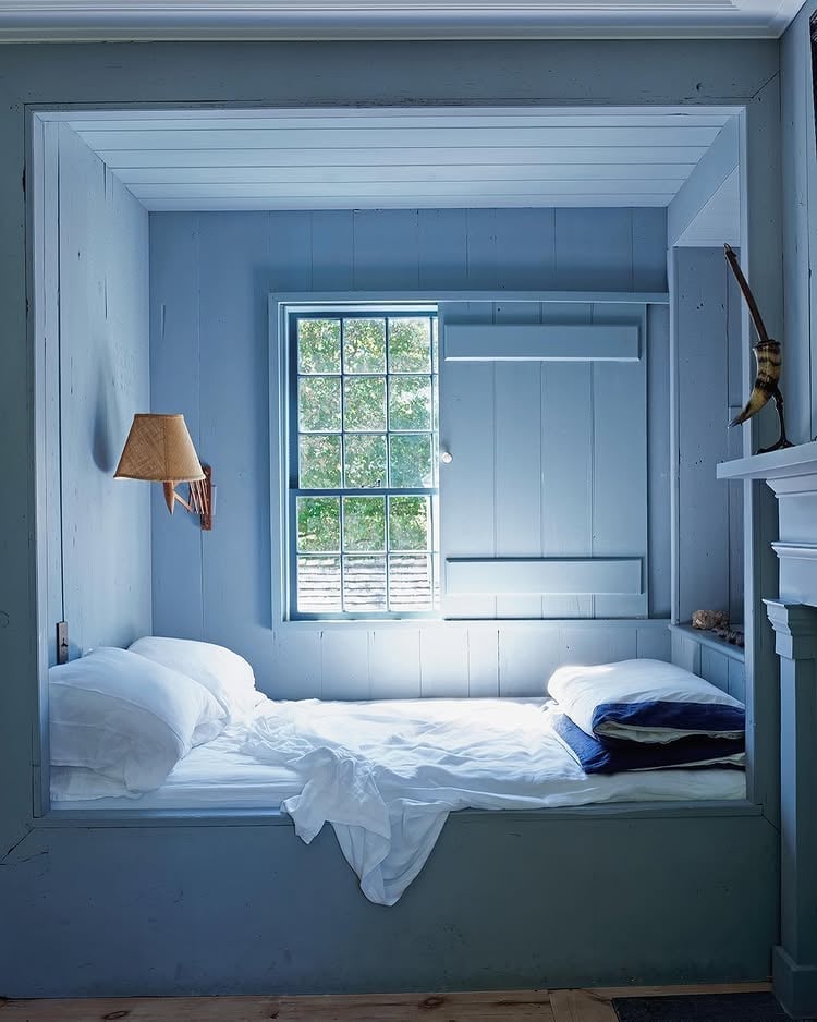
A built-in bed tucked into a compact corner gets a full coat of muted blue on the surrounding walls. The wood frame of the nook stays visible, which gives the color drenching a natural boundary. A wall sconce provides task light, and a window brings in daylight. For a small nook, keeping the color consistent on all three visible walls helps the bed feel like a destination rather than an alcove. The layout works because the blue stops at the wood trim, so the saturation has a clear edge.
Vibrant Green Cottagecore Kitchen with Glossy Tile
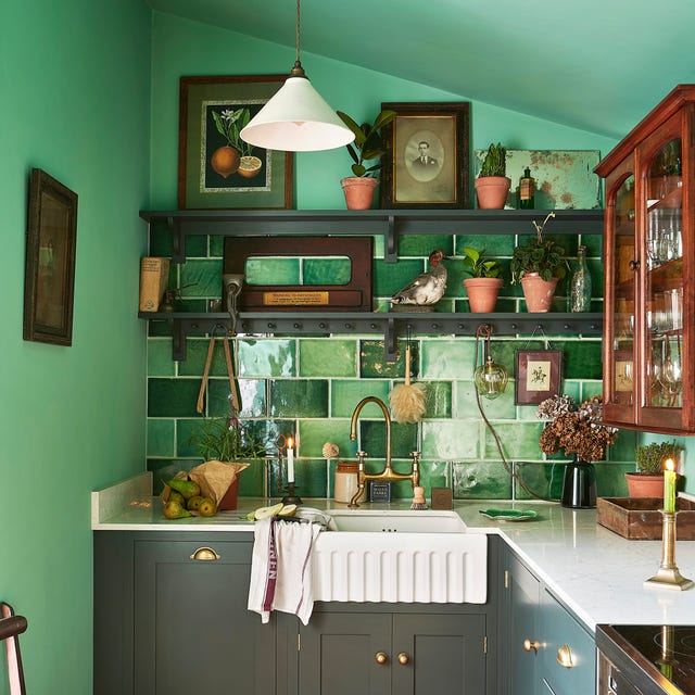
A full drench works best when you pick one finish for the walls and a different one for the backsplash, even if the color stays the same. In this compact green cottagecore kitchen, matte paint on the upper walls and ceiling meets glossy tile behind the farmhouse sink. The sheen shift prevents the room from looking like a single flat surface. Wood open shelving and a brass faucet add warmth against the dark gray cabinetry below. The window light hits the tile first, so the gloss appears deliberate.
Glamorous Pink Dining Room with Marble and Gold
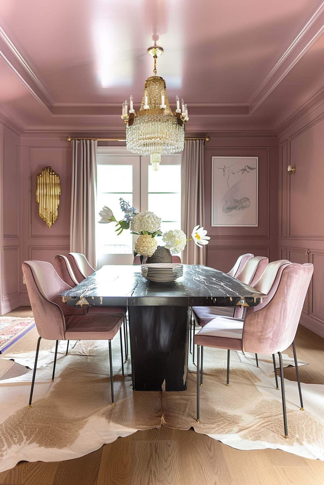
A monochromatic pink dining room could read as one-note, but this one avoids that by layering texture and contrast. The walls and ceiling are the same shade of pink, which makes the room feel taller and more enveloping. Against that uniform backdrop, a large marble tabletop introduces cool white veining, while black velvet dining chairs add a darker anchor. Brass legs on the table and a crystal chandelier above catch the natural light from the windows, breaking up the pink without introducing a second wall color.
Black and gold are the supporting cast here. The brass and crystal bring a formal, reflective quality that suits a glamorous style, while the black velvet keeps the eye grounded. A room this saturated in one hue needs those moments of contrast to feel intentional. The palette works because it leans into the pink instead of fighting it, using metal and marble to create visual breathing room.
Traditional Hallway with Mauve Arched Door
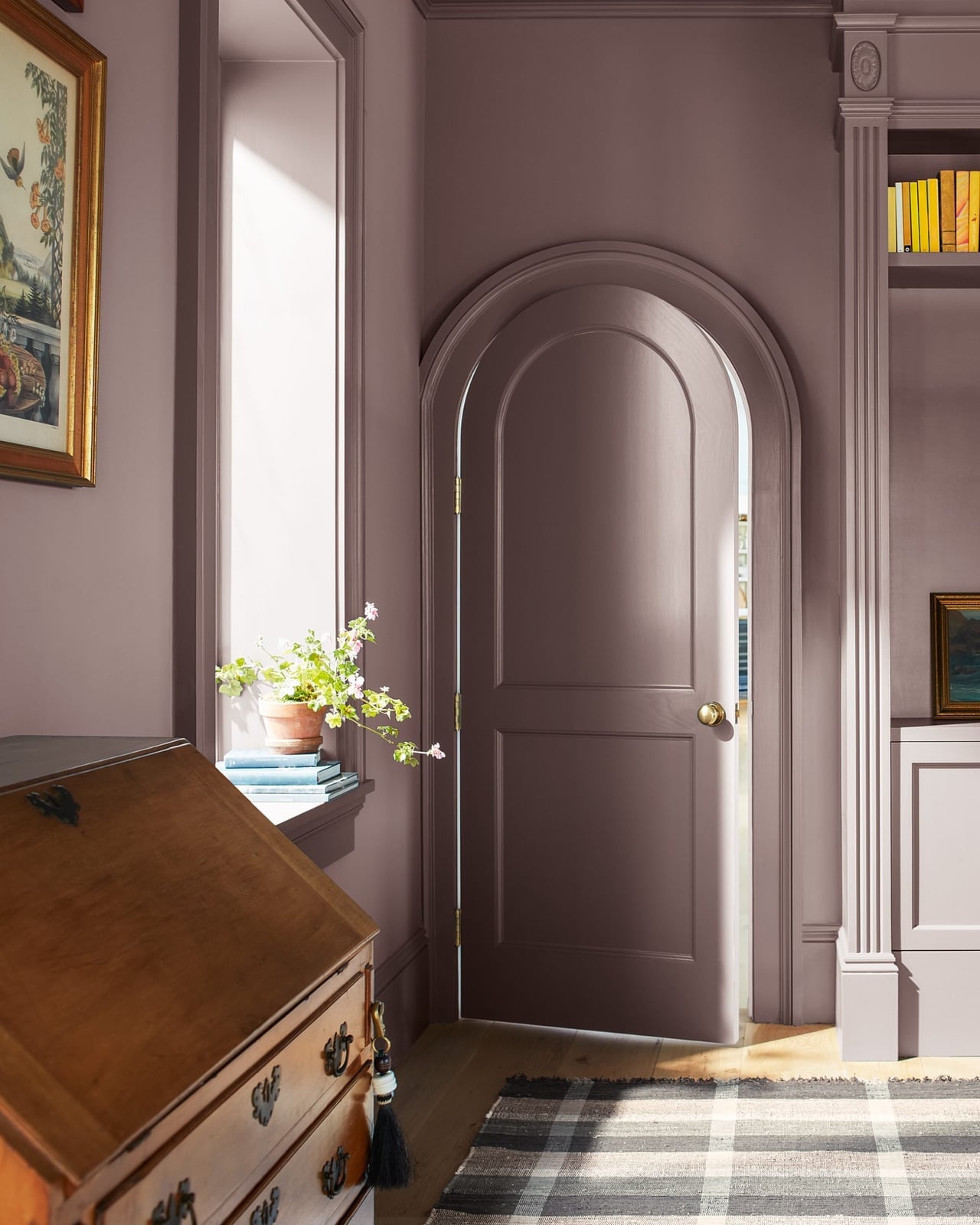
An arched door painted in mauve draws the eye immediately in this traditional hallway corner. The soft cream walls around it let the door take center stage without competing. A small wooden desk and framed artwork sit beside it, creating a vignette that feels intentional rather than accidental. The mauve is warm enough to complement the cream, so the color drench stays contained to the door itself. This is a renter-safe approach to color drenching: paint a single architectural feature instead of the whole room.
Eclectic Living Room Drenched in Vibrant Orange
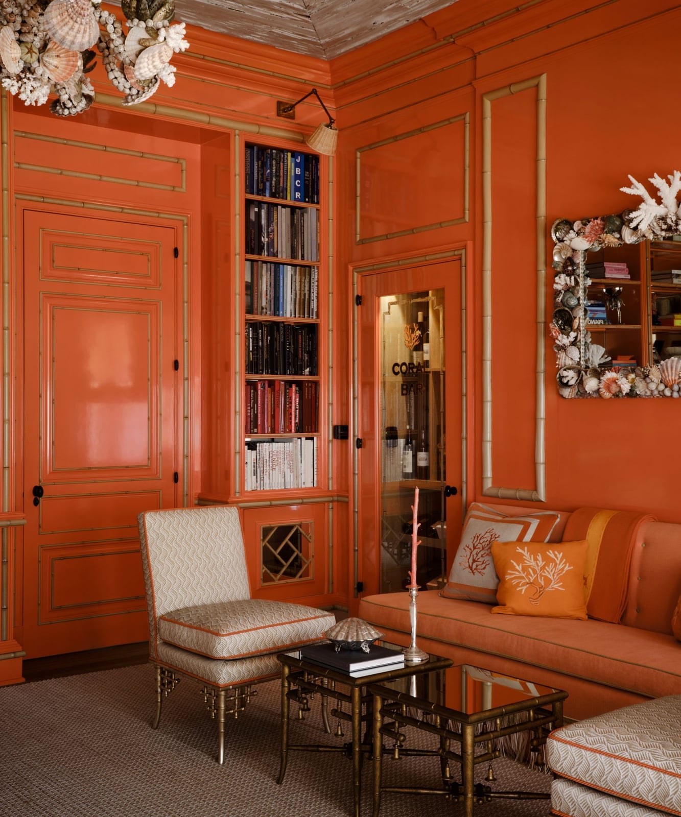
This room goes all in on orange, and it works because the saturation is consistent across every surface. The walls, ceiling, and built-in cabinetry are all the same vibrant shade, which makes the space feel cohesive rather than chaotic. Against that bold backdrop, a neutral sofa and armchair in cream and beige tones provide a visual pause. A bamboo coffee table and a metal bookshelf add texture without competing with the wall color. The overhead light and wall sconce keep the room bright enough that the orange stays warm instead of overwhelming.
Mid-Century Modern Teal Living Room with Curved Sofa
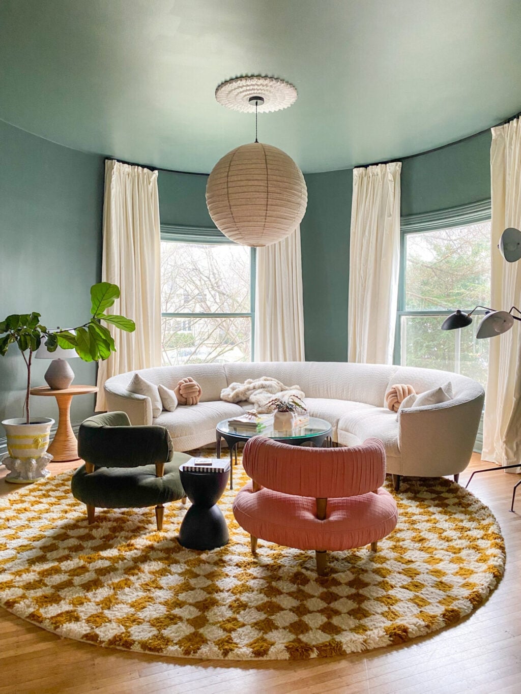
Color drenching a whole room means every surface gets the same treatment, so the eye has nowhere to rest but on the furniture. In this teal mid-century modern living room, a single shade is used, which makes the curved sofa in cream stand out clearly. Two armchairs in yellow and pink add contrast without breaking the monochromatic feel. A round rug anchors the seating arrangement, and a pendant light hangs low to define the zone.
This layout works because the circular seating arrangement echoes the curved sofa and prevents a boxy feel. The teal plaster walls absorb some light, so the pendant light and natural light are essential for keeping the space from reading as dark. The pink and yellow chairs are small in scale, so they add energy without overwhelming the palette. A mid-century modern room like this one relies on strong furniture silhouettes to carry the look when the walls are this saturated.
Modern Kitchen in Deep Dark Green with Wood Accents
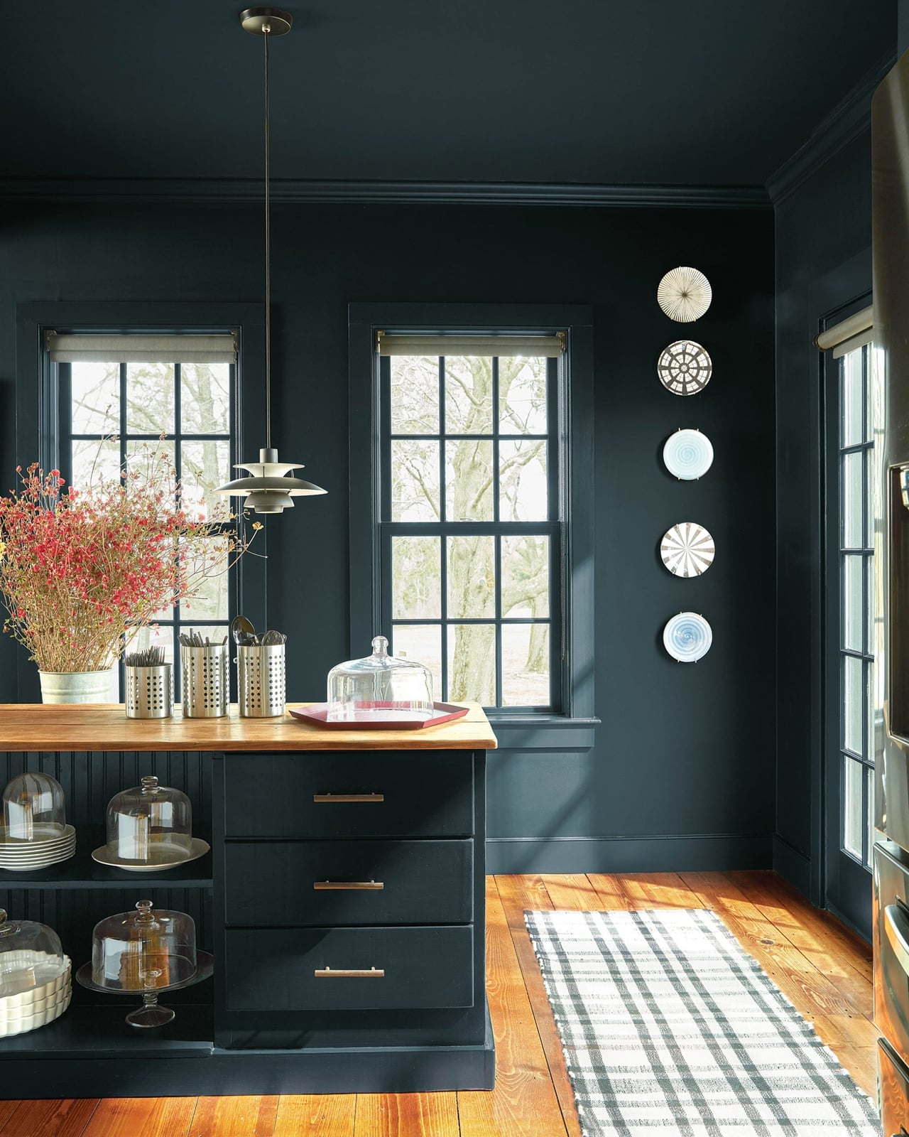
Dark green cabinets wrap the room, and the matching wall color carries the drenching from counter to ceiling. A wooden island top in a lighter tone keeps the kitchen from reading as one solid block, and the brass pulls and pendant light add small points of contrast. The deep green reads as a neutral here, grounding the brass and wood rather than competing with them. What breaks the monochrome is the material mix: glossy cabinet fronts, matte wood, and the stone countertops each catch light differently, so the room has depth without adding another color.
Eclectic Teal Living Room with High-Gloss Finish
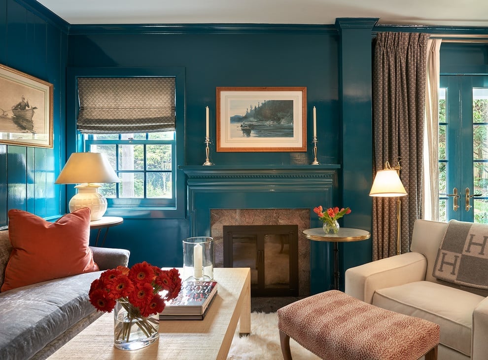
A practical rule for renting is to limit permanent changes to one surface, and this room shows how far that can go. The deep teal paint has a high-gloss finish on both walls and trim, which makes the color feel more like a lacquered piece of furniture than a wall treatment. An orange armchair and a patterned ottoman sit across from a fireplace, and the glossy walls reflect enough light to keep the room from feeling closed in. The finish defines the look: high-gloss teal is bold on its own, but the reflective surface breaks up the color by bouncing light around. A renter could do the same with a single glossy accent wall or a painted bookcase in the same finish, leaving the rest of the room neutral.
Eclectic Living Room in Warm Peach with Stone Fireplace
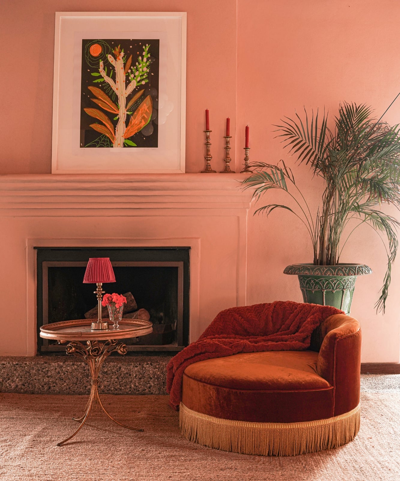
Peach reads as a friendly color, but in this room it is not soft or pastel. The walls and the fireplace surround are a warm, saturated peach that leans almost orange. A deep green potted palm and a cream chaise lounge with curved lines keep the palette from feeling one-note, while the stone fireplace surround adds a natural texture that the paint cannot replicate.
The difference between peach and a true orange or pink is the undertone: peach has enough yellow to feel warm without shouting. A room like this works when the furniture stays neutral or earthy, because the walls already supply the energy. What breaks the drenching is the stone, which is cool and matte against the glossy paint, and the green foliage, which provides a complementary contrast that keeps the eye moving.
Farmhouse Bedroom with Soft Pink Walls and Arched Headboard
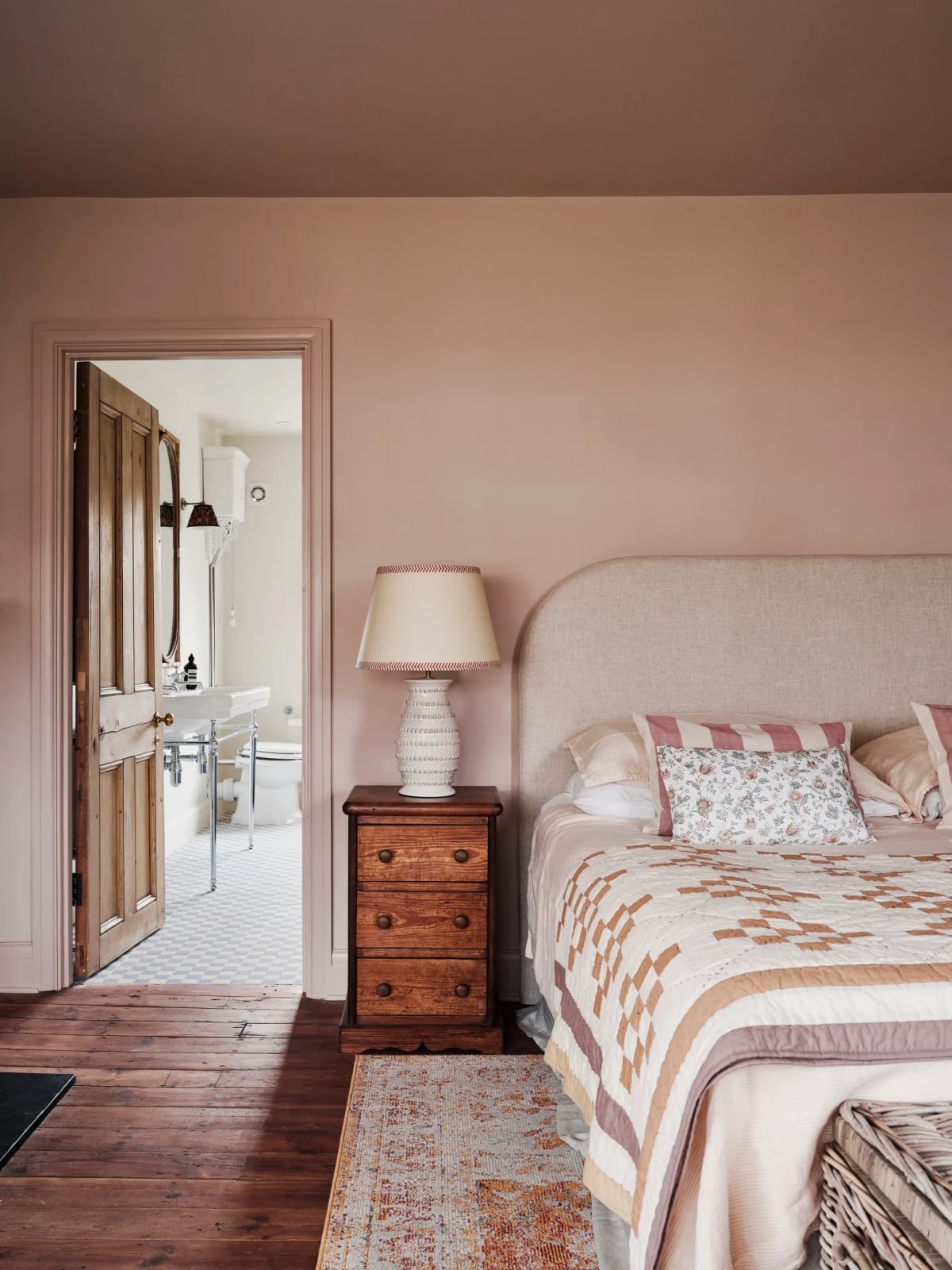
The pink here is soft and muted, closer to blush than to pastel, and it covers the walls and the doorway trim. An arched headboard in a darker wood tone rises behind the bed, and the quilted bedspread in a cream shade keeps the room from feeling like a pink box. The palette works because the pink is desaturated enough to sit alongside beige and wood without clashing. What defines the look is the ratio: about two-thirds of the visible color is this soft pink, and the rest is wood and cream, which gives the room a gentle drenching rather than a full saturation.
Traditional Living Room Drenched in Deep Green with Marble
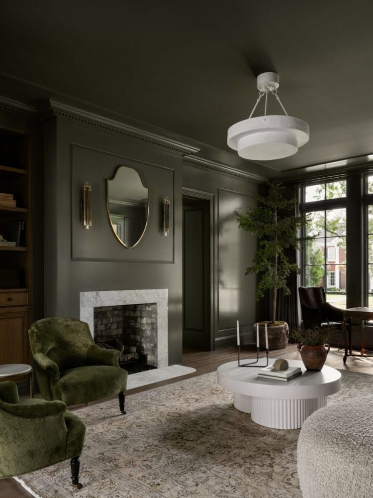
This is a full drenching done right. The walls, the fireplace surround, and the trim are all a deep green, and the ceiling is painted in the same shade. Two cream velvet armchairs and a marble fireplace provide the only light points, and an ornate mirror above the fireplace reflects the chandelier and the windows. The green feels like a cocoon, not a cave, because the marble has enough white veining to break up the surface, and the chandelier and sconces add warm light that plays against the cool green. What defines the palette is the balance: deep green covers about 80 percent of the visual field, and the cream and marble cover the rest.
Maximalist Deep Red Living Room with Built-in Shelving
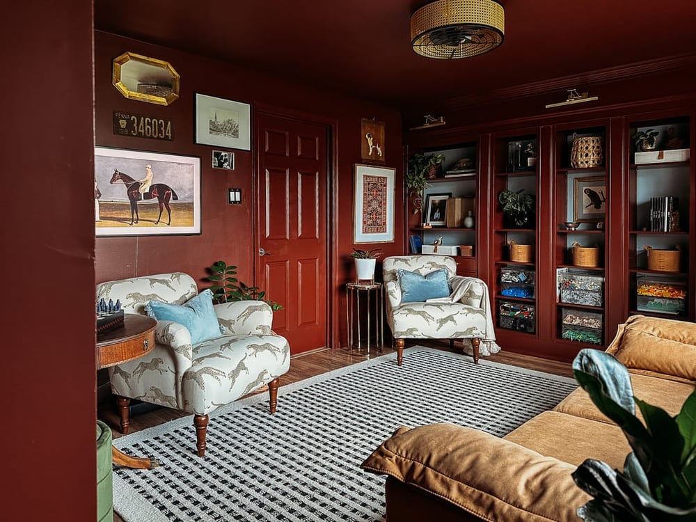
When a room is painted from wall to wall and floor to ceiling in a single shade, the trick is to let the furnishings do the work of breaking it up. In this maximalist living room, deep red covers the walls, the ceiling, and even the door, creating a contained, jewel-box feel. The color is so consistent that the eye travels freely around the room without a single white corner to stop it. Tan and cream upholstery on the armchairs and sofa offers a visual rest, while the built-in shelving reads as part of the architecture rather than an add-on. The ceiling fan light provides the ambient glow, and the rug anchors the seating area. This palette works because the red is treated as a constant, not a surprise. The room feels roomy not from empty space, but from the way the single color makes the boundaries recede.
Boho Living Area with Earthy Tones and Orange Accents
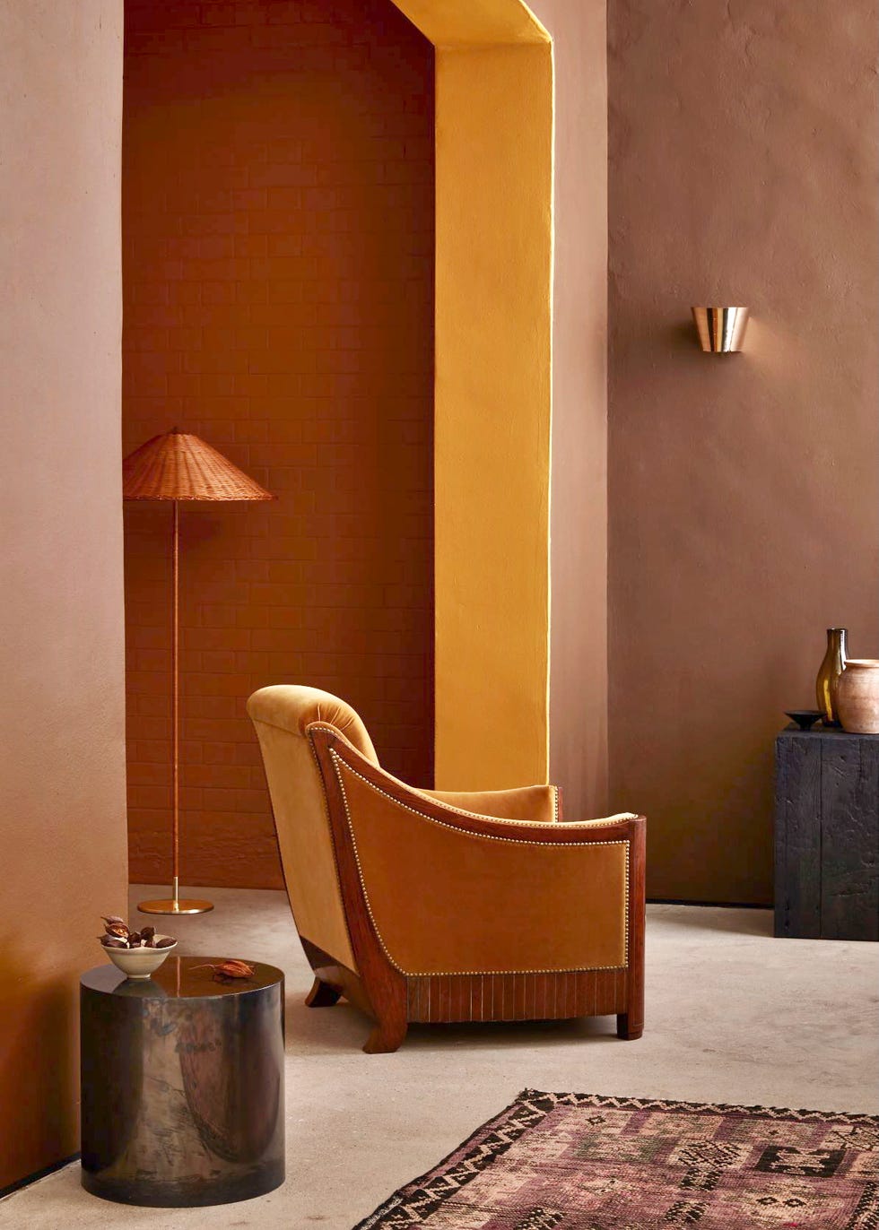
The armchair here is the anchor, but the walls are the event. Vibrant orange and yellow cover the surfaces, turning a simple corner vignette into a bold statement. The brown, orange, and yellow palette feels warm and collected, and the rattan side table and floor lamp add natural texture. The wall sconce provides a soft layer of light that the floor lamp cannot reach. What defines this style is that the color ratio leans heavily on the walls, with the furniture acting as a tonal bridge. The one thing that breaks it is the rug: its pattern introduces a different rhythm, keeping the room dynamic.
Boho Living Room with Terracotta Brick Fireplace
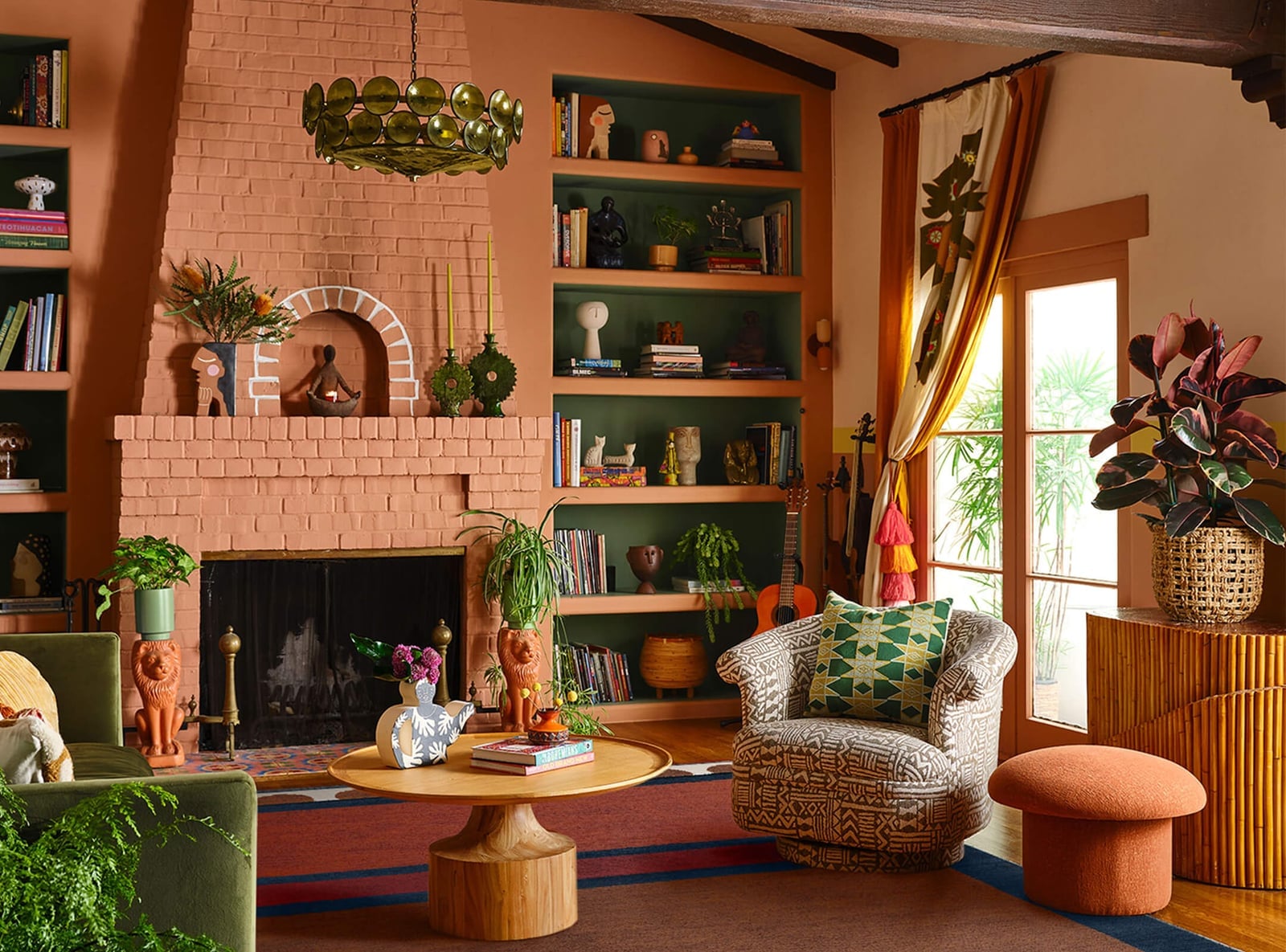
When mixing materials in a color-drenched room, let one surface anchor the space and build everything else around its texture. Here the terracotta brick fireplace anchors the room, with the deep red of the walls picking up the same warm undertone. The green sofa and the patterned armchair introduce contrast without competing, because the brick and the paint share a similar depth. The wooden coffee table and rattan accents add a natural, handcrafted feel that fits the boho style. The chandelier and window light prevent the room from feeling too heavy. The key is that the brick is not painted over; its raw texture provides the variation that a single painted wall cannot.
Dramatic Bedroom Drenched in Deep Olive Green
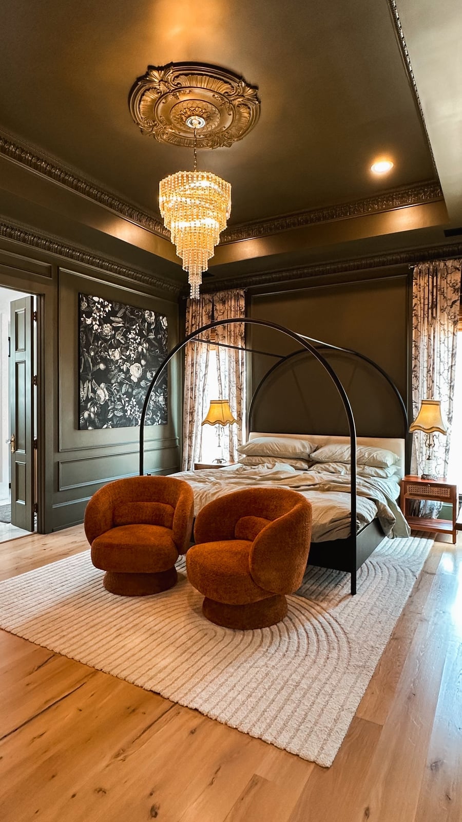
A deep olive green on the walls and ceiling might sound like a recipe for a cave, but this bedroom proves otherwise. The trick is that the green is not flat: the natural daylight from the windows catches the paint finish, and the chandelier and lamps add warm points of light that prevent the room from reading as dark. The canopy bed is the centerpiece, and its fabric and metal frame stand out against the painted background. The beige and orange accents in the swivel chairs and the bedding provide the necessary lift. The ornate ceiling medallion is a detail that would be lost in a white room, but here it registers as a deliberate feature. The room feels roomy because the continuous color on the walls and ceiling creates a seamless enclosure, with the seating area tucked in without breaking the flow.
Eclectic Living Room with Vibrant Orange Walls and Marble Fireplace
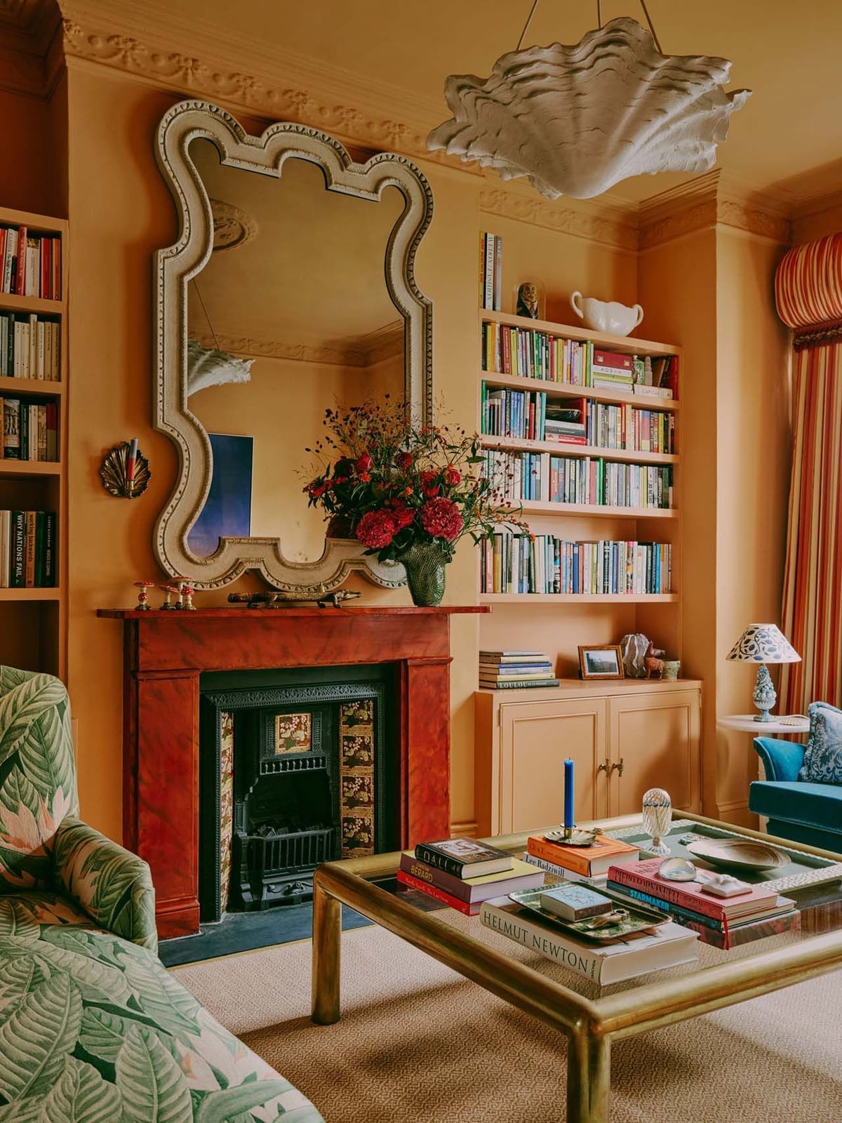
The fireplace is the natural focal point, and the vibrant orange walls push it forward rather than compete with it. The marble surround reads as cool and clean against the warm paint, and the ornate mirror above catches the natural daylight. The bookshelves on either side are painted the same orange, so they blend into the wall instead of creating visual clutter. The cream armchair and green accents keep the palette from feeling one-note. What makes this work is that the orange is not just on one wall; it wraps the entire room, so the fireplace feels like it belongs rather than being an isolated feature. The ceiling light provides the general illumination, and the layout stays balanced and symmetrical around the hearth.
Traditional Library with Calming Blue Walls and Orange Chairs
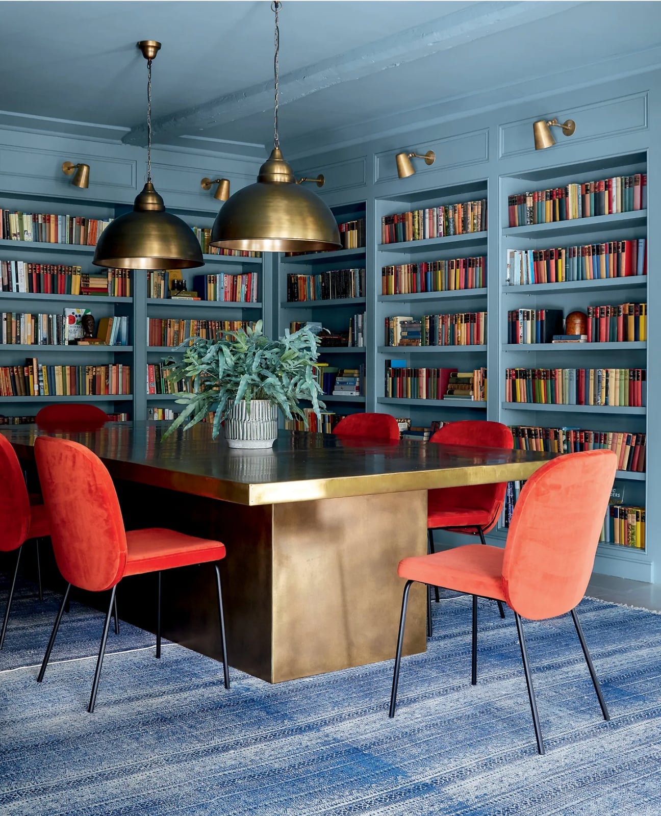
This traditional library drenched in blue and orange makes a strong case for pairing a cool wall with a warm seat. The floor-to-ceiling bookshelves are painted the same muted blue as the walls, so the room is wrapped in one color without competing with the books. Against that backdrop, the orange velvet chairs and a large brass table bring the heat. The blue is soft enough to let the orange take center stage. The brass table and wall sconces pick up the warm side of the orange, while the natural light keeps the blue from turning flat. What breaks the monochrome here is the wood tabletop and the books themselves, which add texture without breaking the color story.
Eclectic Living Room with Dark Green Walls and Red Sofa
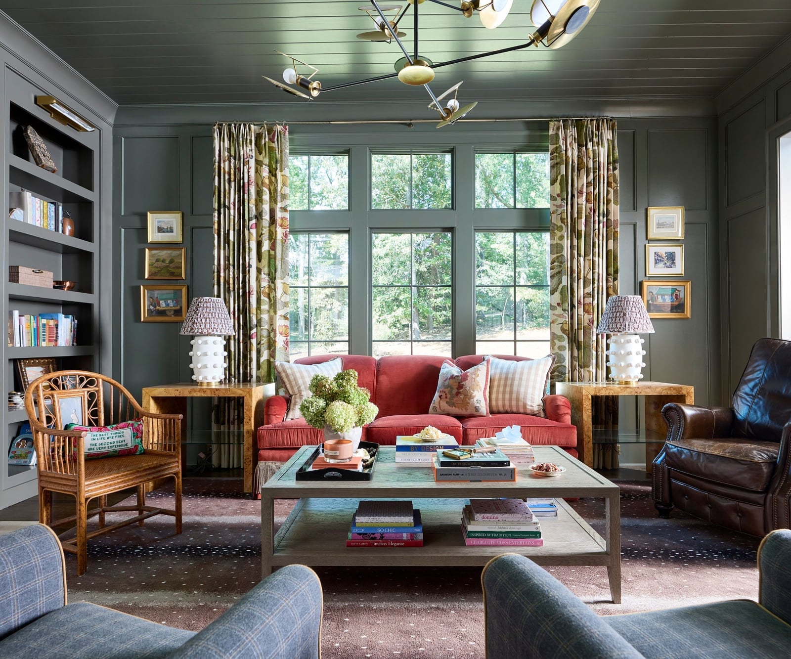
A practical rule for this look: when you drench walls in a deep green, keep the floor and ceiling neutral so the room stays grounded. The dark green walls and matching curtains make the space feel enveloping, but the red sofa stops it from reading as one flat note. The floral curtains echo the green while introducing a pattern that keeps the eye moving. A leather armchair and a rattan chair add different textures without pulling focus from the sofa. The ceiling fixture and table lamps provide warm light, which helps the red sofa feel rich rather than harsh. For renters, this color drenching approach works well because the walls do all the heavy lifting. You can swap out the sofa or chairs later without repainting, since the green is the constant and the furniture is the variable.
Traditional Living Room in Dark Green with Gold Accents
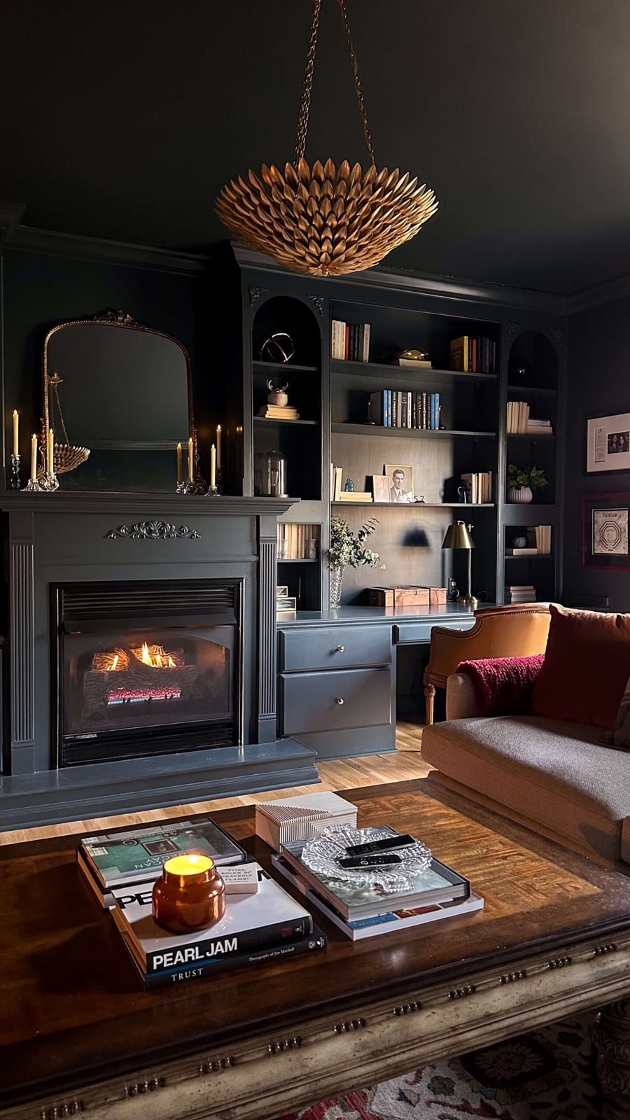
The dark green paint wraps the built-in bookshelf and the walls as one continuous surface, making the room feel taller and more grounded. Gold accents come through the chandelier, lamp bases, and picture frames, adding a metallic lift against the matte green. The fireplace and sofa stay in a similar brown and wood tone so they blend without competing. Natural light and the warm glow from the fireplace keep the dark green from feeling heavy. The ratio of green to gold defines this look: the green takes up about eighty percent of the visible surfaces, with gold used sparingly as punctuation.
Modern Pink Living Room with Contrasting Sofa Colors
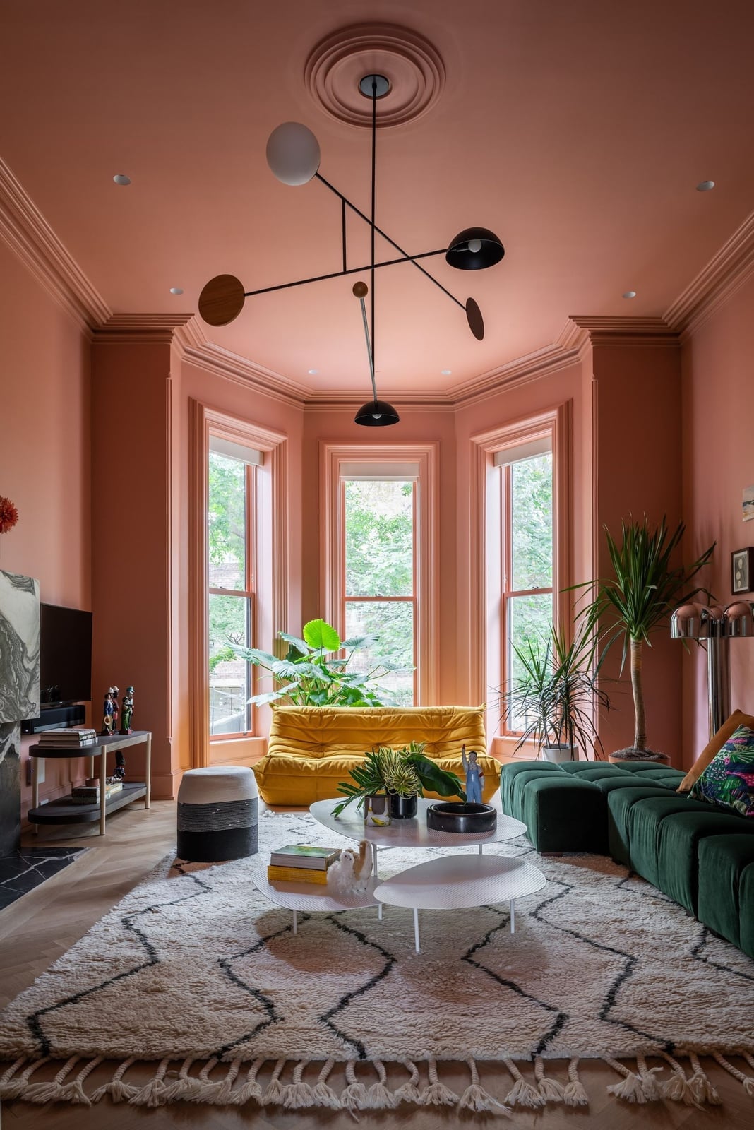
Monochromatic pink walls and ceiling create a closed box of color. Against that shell, a curved green sofa and a yellow sofa sit side by side, creating a deliberate clash. The pink is soft enough that the green and yellow function as accents. A modern chandelier hangs low, adding a metallic note that breaks up the pink without leaving the color story. Natural daylight from the open plan keeps the pink from turning too sweet. The layout works because the sofas face each other, making the contrast the main event.
Eclectic Living Room with Dark Green Walls, Office-Safe Version
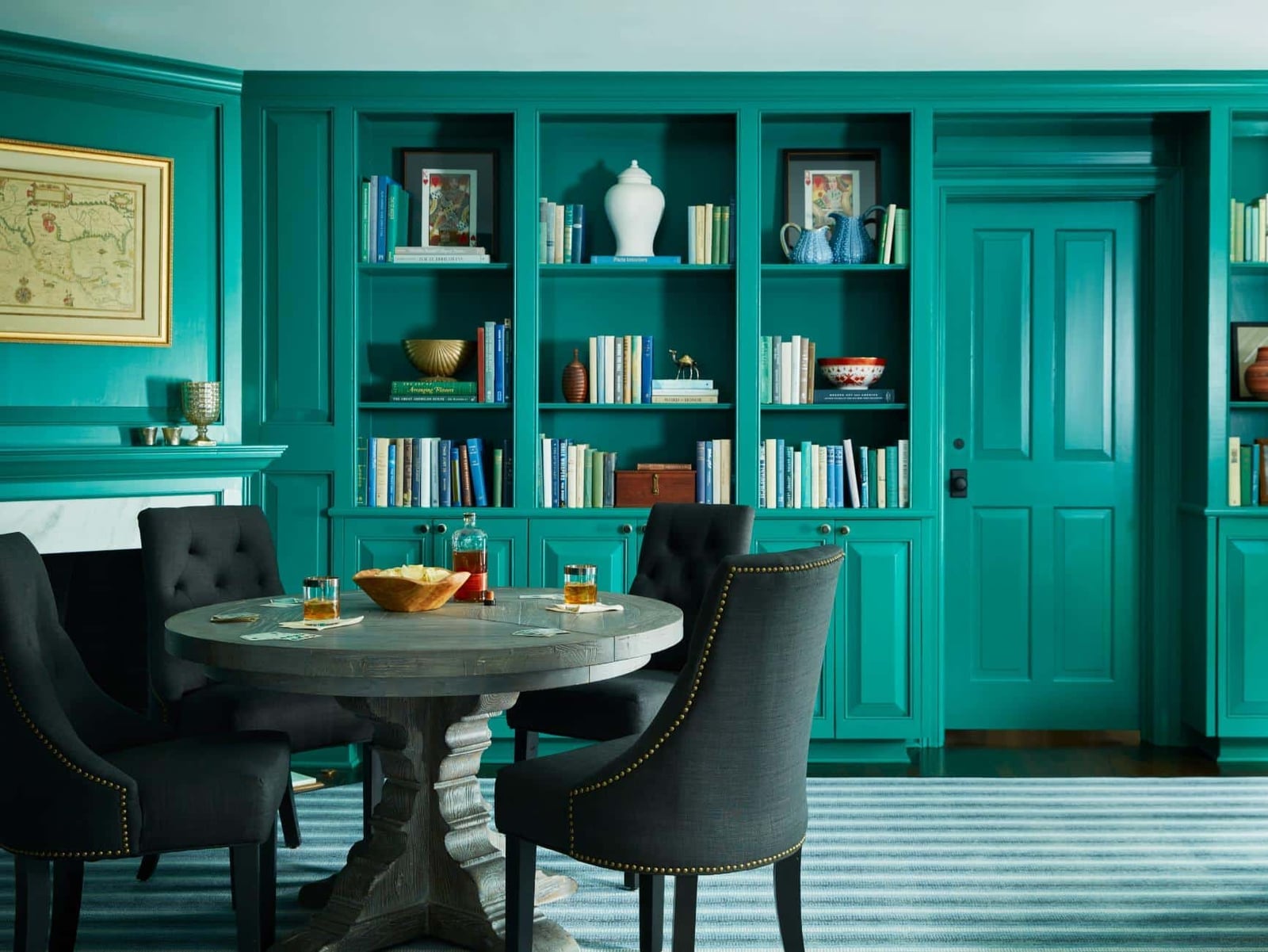
This room feels like a cousin to the deep green drenched living room, but it takes a softer turn toward teal. The built-in shelving is painted the same teal as the walls, so the whole wall reads as one piece. A round dining table with upholstered chairs sits in the center, keeping the layout open. The overhead chandelier adds a traditional note that balances the eclectic mix of furniture. The teal finish typically maintains its depth in natural light. The ratio of teal to the warm wood in the table and chairs defines this look. The wood breaks the monochrome just enough to keep the room from feeling like a box. For renters, this color drenching approach works well because the built-ins are the constant and the furniture is the variable.
Traditional Living Room in Dark Green with Gold Accents, Close-Up Take
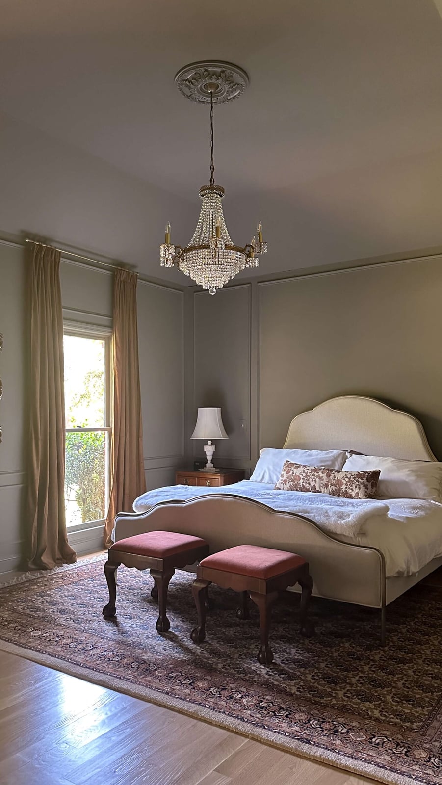
A monochromatic gray palette across walls and trim wraps this bedroom in a quiet, cohesive envelope that feels restful without being flat. The chandelier introduces metal and glass without breaking the calm, while the bed and stools stay neutral in fabric and wood. One color dominates, and every other piece belongs to the same tonal family. A bright accent or a dark wood that pulls warm instead of cool would break the effect. For renters, a peel-and-stick wallpaper in a solid tone can mimic the effect without painting the trim.
Boho Bedroom with Textured Beige Plaster Walls and Ceiling
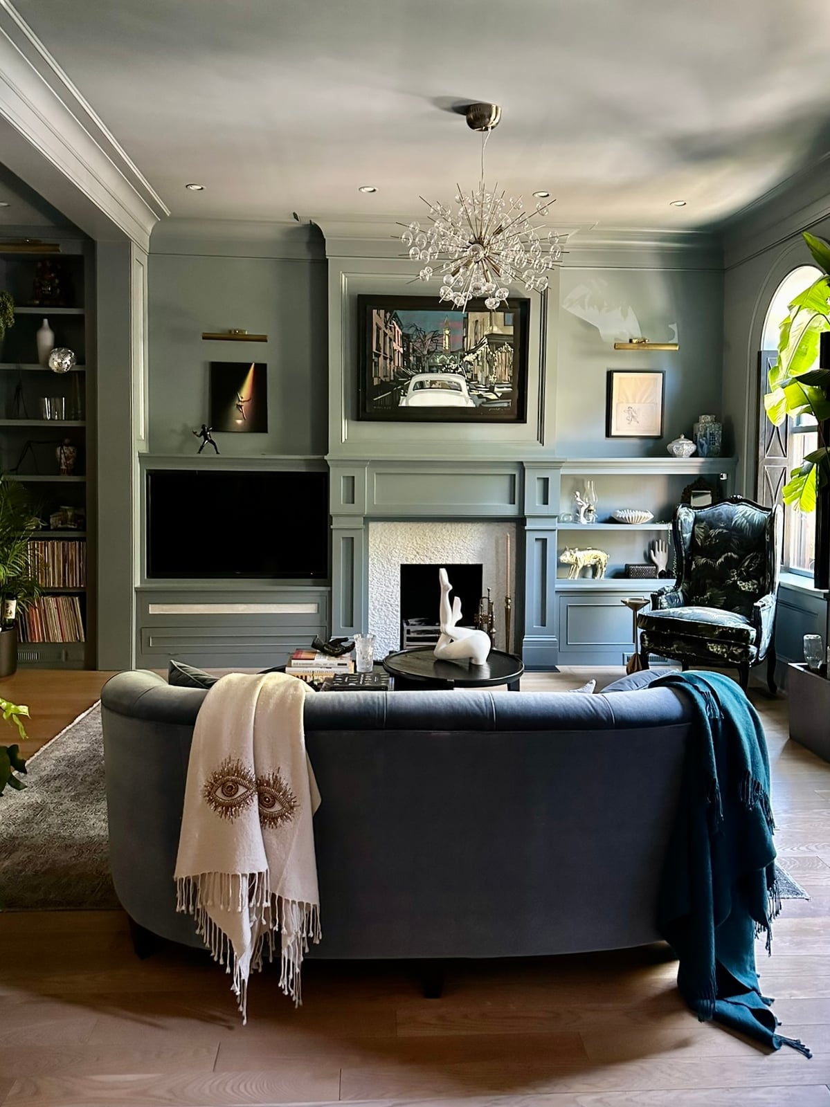
This transitional living room uses a single gray-green shade on walls, built-ins, and the fireplace surround, which makes the ornate mantel stand out. A curved sofa in a lighter neutral and the black armchair add contrast. A chandelier and wall sconces provide lighting. The palette is restrained: one hue with two neutrals and one dark anchor. The ratio is roughly 70 percent gray-green, 20 percent white and cream, and 10 percent black. A warm wood or yellow-toned beige would clash with the cool undertone.
Boho Bedroom with Textured Beige Plaster Walls, Close-Up Take
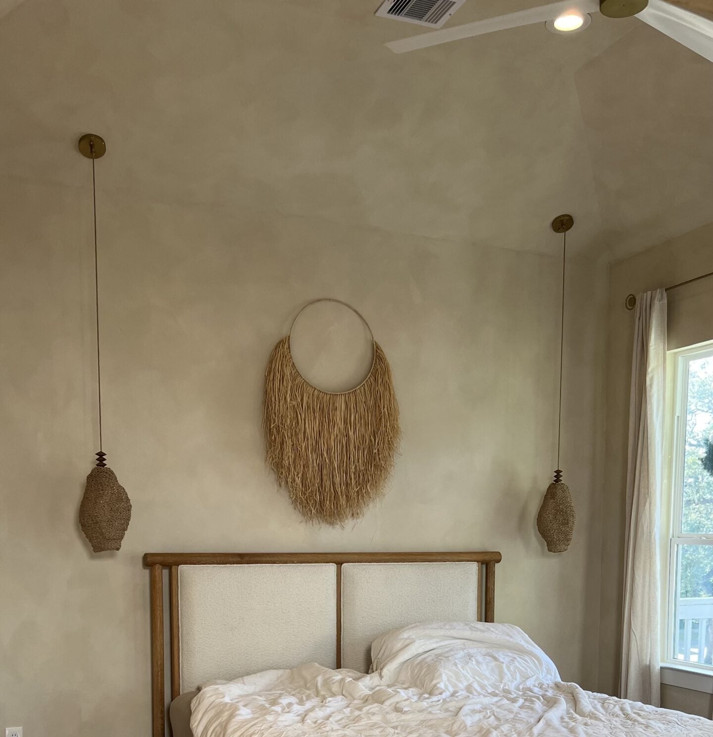
This bedroom could have been a standard beige box, but the textured plaster on walls and ceiling gives it depth that a flat paint job cannot match. The straw wall hanging and linen upholstery reinforce the natural material story, while the wood floor and pendant lights add warmth without competing.
Plaster reads as permanent, but a limewash paint or a textured roller finish on drywall can approximate the look for renters or anyone who wants the effect without the commitment. The ceiling fan keeps the room practical, and the symmetrical pendant lights frame the bed without breaking the organic feel. What defines the material palette is its refusal to introduce glossy or synthetic surfaces. What breaks it is a shiny metal or a plastic shade that would contradict the handcrafted tone.
Final Thoughts
Color drenching works because it removes visual breaks, letting the eye travel smoothly around the room. The trick is to vary finishes and sheen within the same color family. Matte walls with a gloss ceiling or velvet upholstery against flat paint keep the space from feeling flat. A coat of paint on the ceiling and trim is a weekend project with a high payoff. For lasting results, use quality paint and primer, especially on dark colors that need more coats. The takeaway: pick a color you love, commit to it fully, and let the texture of your furnishings do the rest.