
Picking an exterior color scheme for your home feels like a big decision, and it is. The right combination sets the tone for your whole property and can make a simple facade feel intentional and finished. I have gathered 33 exterior color ideas that cover a range of styles, from modern farmhouse to coastal cottages and classic colonials.
You will find bold dark grays, soft creams, deep greens, and unexpected pops of turquoise or lime. Each look focuses on the main color and how it pairs with trim, accents, and natural materials. This guide will help you see how different palettes work on real homes, so you can narrow down what fits your taste and your house’s architecture.
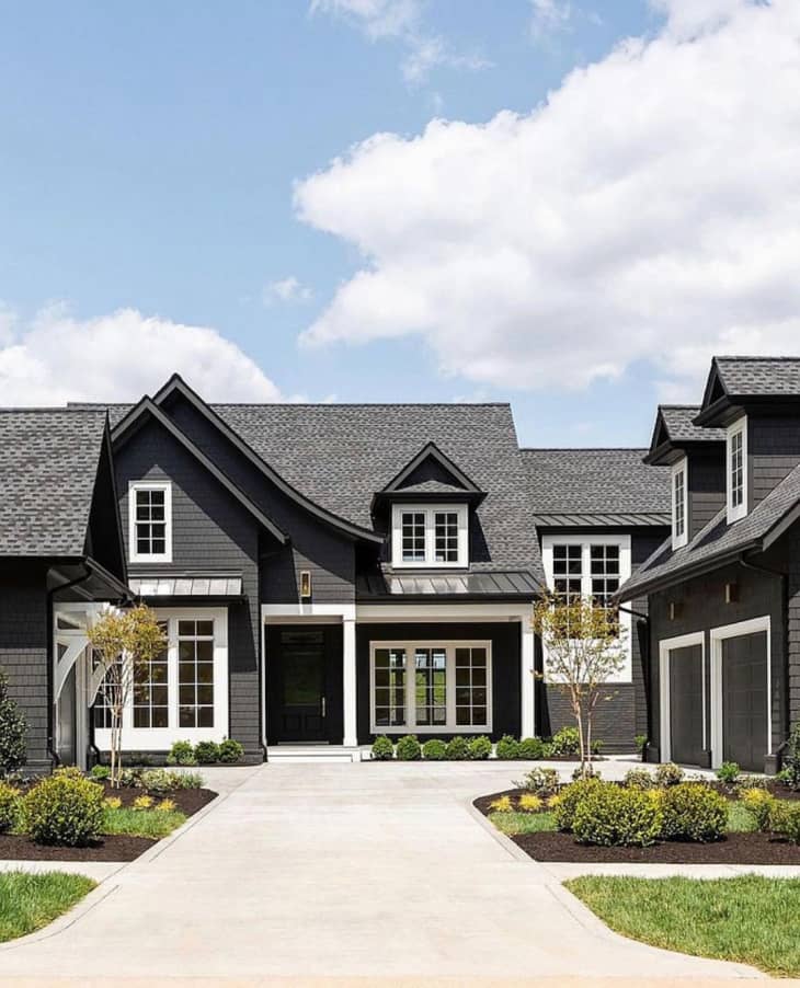
Modern Farmhouse Exterior in Bold Dark Gray and Crisp White
A modern farmhouse in dark gray and white is a study in contrast. The dark shingle siding anchors the house against the bright sky, while crisp white trim and a metal roof keep it from feeling too heavy. Black window frames and garage doors add a final layer of definition. The palette works because the ratio of dark to light is nearly even, with white breaking up the gray across the facade. That balance keeps the look bold without being somber.
Charming English Cottage with Sage Green Stucco
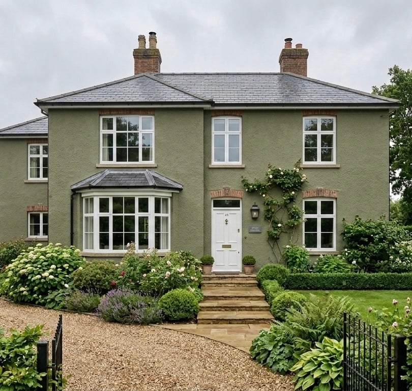
Sage green stucco gives this English cottage a quiet presence. The soft green is the defining color, covering most of the facade, while brick red chimney tones and grey roof tiles add warmth without competing. A white door and bay window break the green at key points. The ratio is about three parts green to one part accent. What keeps the palette from feeling flat is the texture of the stucco itself, which catches the overcast light differently across the surface.
Grand Traditional Residence in Deep Grey with Copper Accents
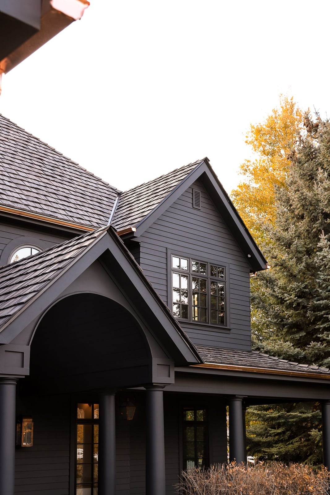
How do you add warmth to a dark gray house without going light? Copper accents. This traditional residence uses deep gray wood siding and shingles as the main material, then lets copper gutters and downspouts do the work. The copper adds a warm, metallic note that shifts with the overcast light. The yellow tones in the stone entryway and surrounding trees echo that warmth, so the copper doesn’t feel isolated.
On a large facade like this, the copper reads as a deliberate material choice rather than a small detail. It breaks the gray at the roofline and corners, drawing the eye along the architecture. The trick is keeping the copper finish natural so it patinas over time instead of competing with the dark siding.
Dramatic Traditional Black House with Intricate White Trim
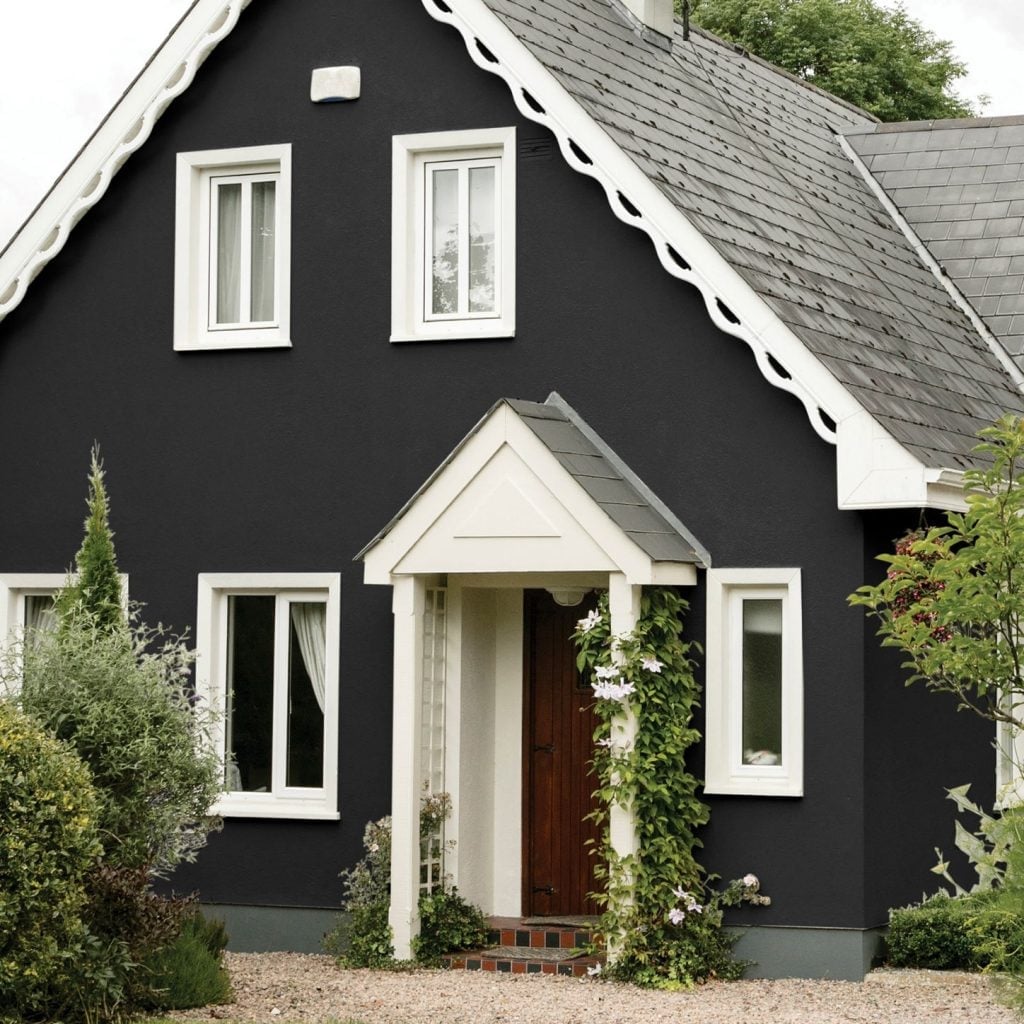
A black house with white trim is a classic move, but the trim detail changes everything. Here, scalloped white trim runs along the roofline and around the arched entryway, creating a pattern that stands out against the dark stucco. The wooden door and tile roof add natural texture so the black doesn’t read as flat. On a compact house, the white trim defines the shape and keeps the dark color from shrinking the facade.
Neoclassical Facade in Sophisticated Neutral Beige
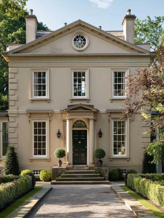
A neutral beige facade works best when the architecture provides the interest. Here, stone columns, tall windows, and a centered door give the front elevation a formal rhythm. The beige stucco and stone blend together, so the eye moves to the white trim and dark green landscaping instead. The palette stays in a narrow range of warm neutrals, with the greenery providing the only real contrast. That restraint is what makes the neoclassical style feel cohesive rather than busy.
Modern Monochromatic Black Wood Siding Exterior
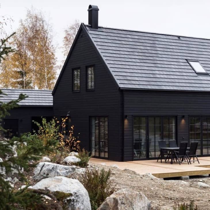
A black house risks feeling flat, but this one reads as architectural rather than stark. The monochromatic palette uses black wood siding, dark windows, and a grey metal roof to create a single continuous surface, so the eye moves across the facade without stopping at individual details. A wooden deck in a similar dark tone keeps the ground plane connected. The trick is texture: the siding has visible grain and shadow lines that the all-black palette would otherwise erase. Without that variation, the facade would look like a solid block. Here the material does the work that color usually does.
Farmhouse Charm with Cream Siding and Stone Base
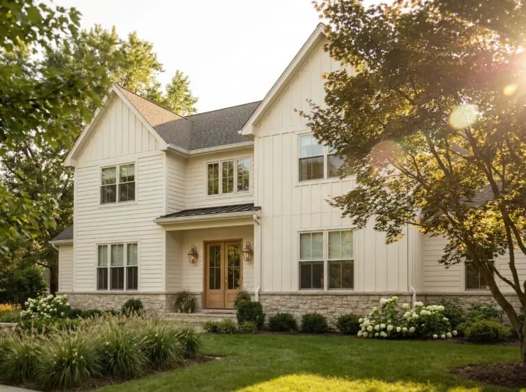
Cream siding with white trim is a farmhouse staple, but what makes this version hold together is the stone base running the full width of the facade. The warm grey stone anchors the cream above it, so the house does not float visually. Wooden double doors in a natural finish add a third texture that keeps the palette from feeling like a two-color formula. For renters, the takeaway is smaller: a stone-colored planter or a row of grey river rocks along the foundation can mimic the same grounding effect without touching the siding.
Traditional Porch with Textured Grey Siding and Yellow Accents
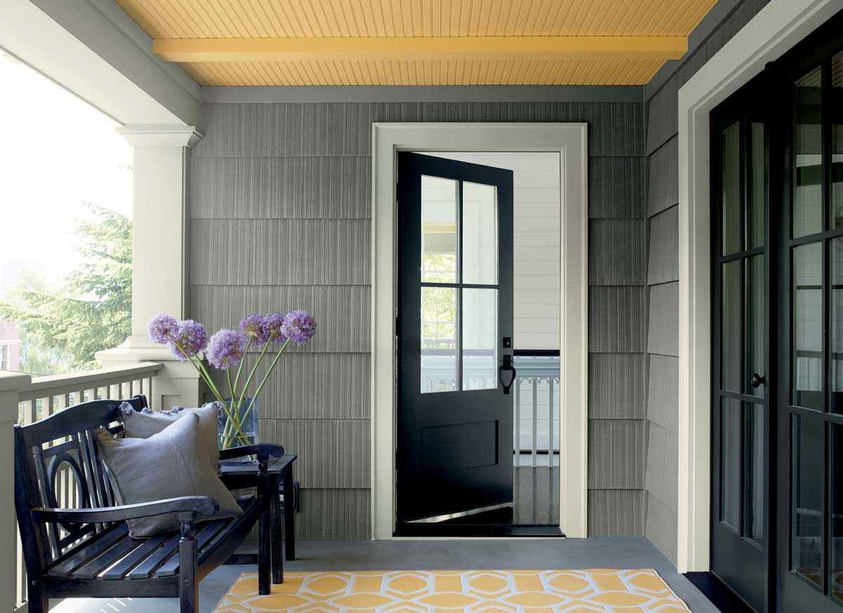
Grey siding can lean cool, but this porch warms it with one deliberate move: a yellow rug laid across the entry floor. The rug sits between a black bench and the grey wall, so the yellow becomes a planned accent. The siding itself has visible texture, which keeps the grey from looking like a flat expanse. A black door and black bench frame the yellow as the single focal point. For a styling variation, swap the rug color seasonally while keeping other porch items neutral.
Rustic Cabin Exterior in Dark Brown Stained Wood
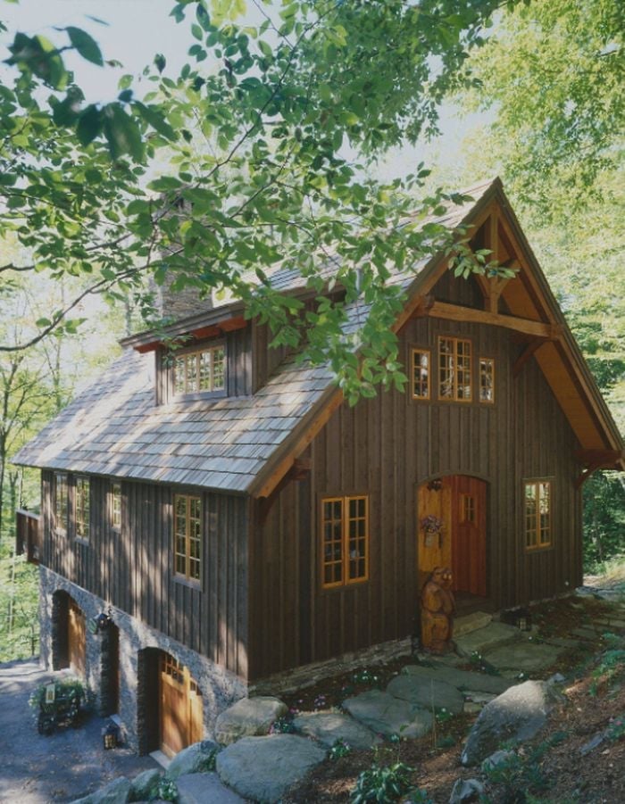
Can a dark cabin look inviting rather than heavy? This one does by pairing dark brown stained wood siding with a stone base and letting natural light break up the mass. The wood shingles above the main siding add a second scale of texture, so the facade has rhythm, not just darkness. Dappled light through the surrounding trees softens the dark brown further, creating highlights on the grain. The stone base in grey prevents the brown from dominating the whole elevation. What makes this work is that the dark color is not uniform: the mix of wood shingles, siding, and stone gives the eye multiple places to land.
Spacious Farmhouse Exterior in Cream with Natural Wood Trim
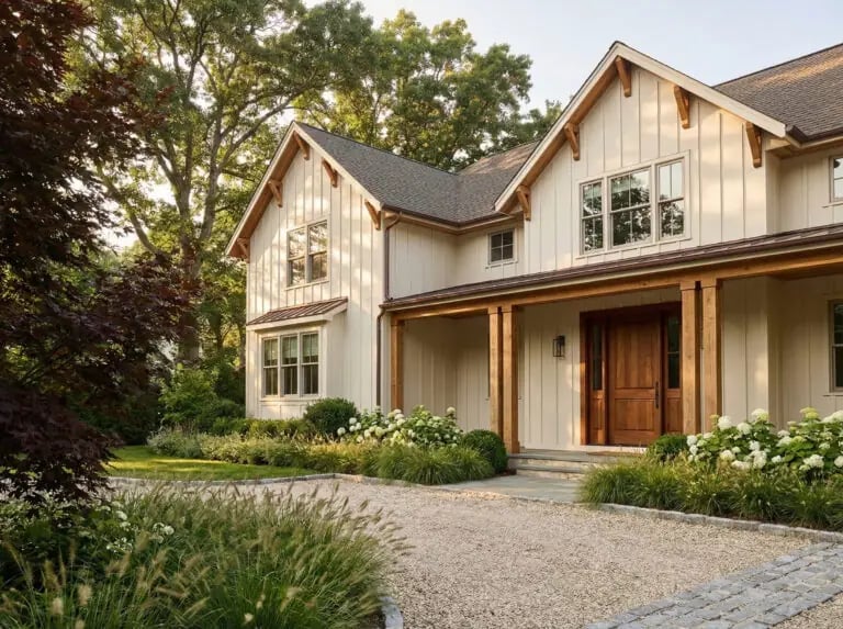
This farmhouse uses cream siding across a broad facade, but the scale does not overwhelm because the natural wood trim breaks the width into readable sections. The wood appears on the porch columns, the front door, and the window casings, creating a warm horizontal line that stops the cream from stretching unbroken. A stone accent at the base adds weight. For a spacious house, the trick is proportion: the cream reads as the field, the wood as the frame, and neither fights for attention.
Modern Grey Brick Facade with White Trim and Black Accents
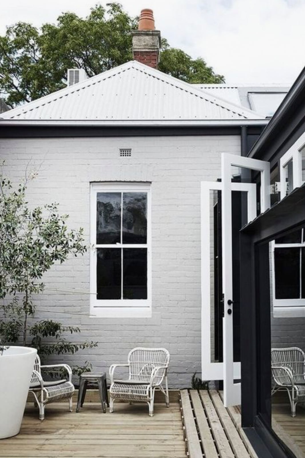
A grey brick facade with white trim and black accents defines a clean palette. The soft daylight falls across the backyard patio, where metal-framed glass windows and doors repeat the black line. Wood elements warm the grey and white, keeping the modern style from feeling cold. The palette ratio is roughly sixty percent grey, thirty percent white, and ten percent black. What breaks it: the black accents are concentrated on the windows and doors, so the eye has a clear anchor. To recreate it, look for dark trim on openings only and let the white trim frame the roofline.
Grand Colonial White House with Black Shutters and Blue Hydrangeas
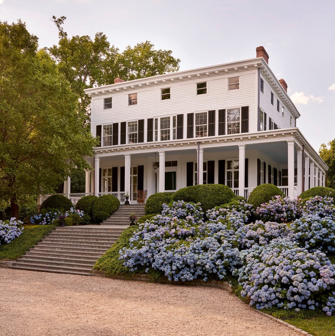
A white colonial with black shutters is a classic. What sets this one apart is the blue hydrangeas planted along the foundation. The symmetrical facade and wrap-around porch already carry the grand scale. The blue flowers break the high-contrast white and black, softening the formality without losing the colonial character. The palette stays in a tight range: white siding, black shutters and trim, green foliage, and blue blooms. The hydrangeas add color without painting a single surface. To recreate it, look for a single flowering shrub in a clear blue tone and repeat it along the front beds.
Modern Cream Stucco Exterior with Green Accents
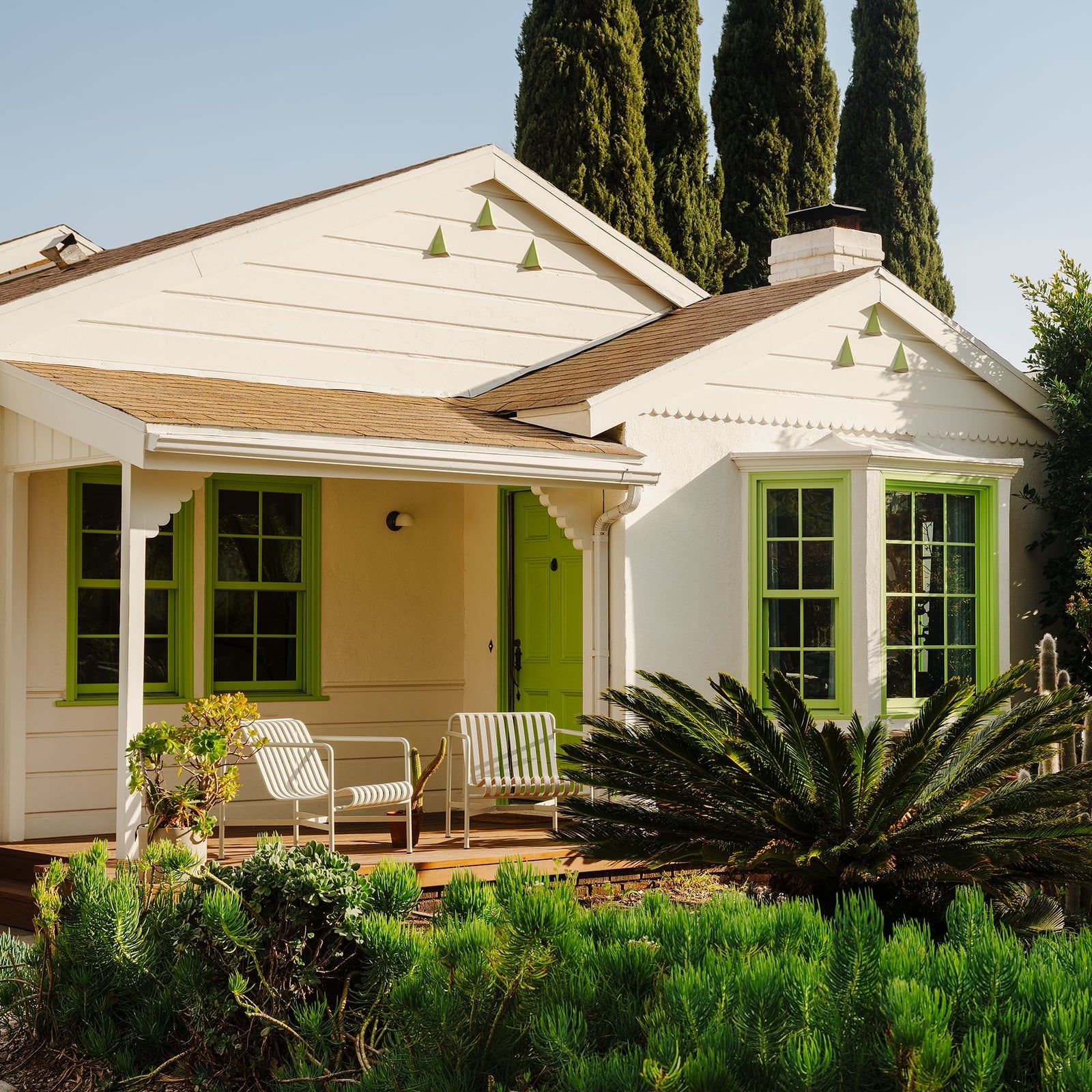
The cream stucco exterior gets its contrast from green accents placed at the entrance and windows. The centered layout keeps the facade balanced, with the door and porch drawing the eye. Wood and tile details add texture to the smooth stucco. The green appears only on the door and window surrounds, so it never competes with the cream.
Craftsman Dark Green Shingle Siding with Stone Base
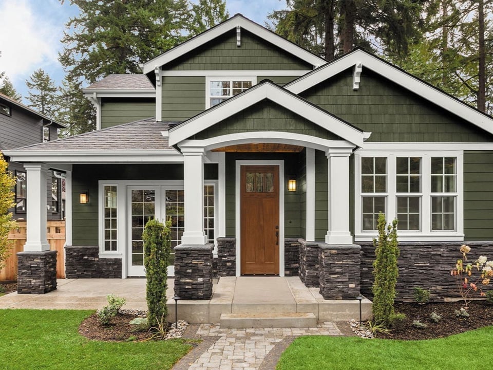
The soft daylight highlights the texture of the shingles and the natural variation in the stone. A wooden door repeats the warm tones found in the stone, tying the materials together. The palette stays in a tight range: dark green, white trim, and stone gray. The white trim outlines the roofline and windows, preventing the dark green from feeling heavy. Use a stone base in warm gray tones to anchor the darker siding above.
Mediterranean Garden with Cream Stucco and Terracotta Accents
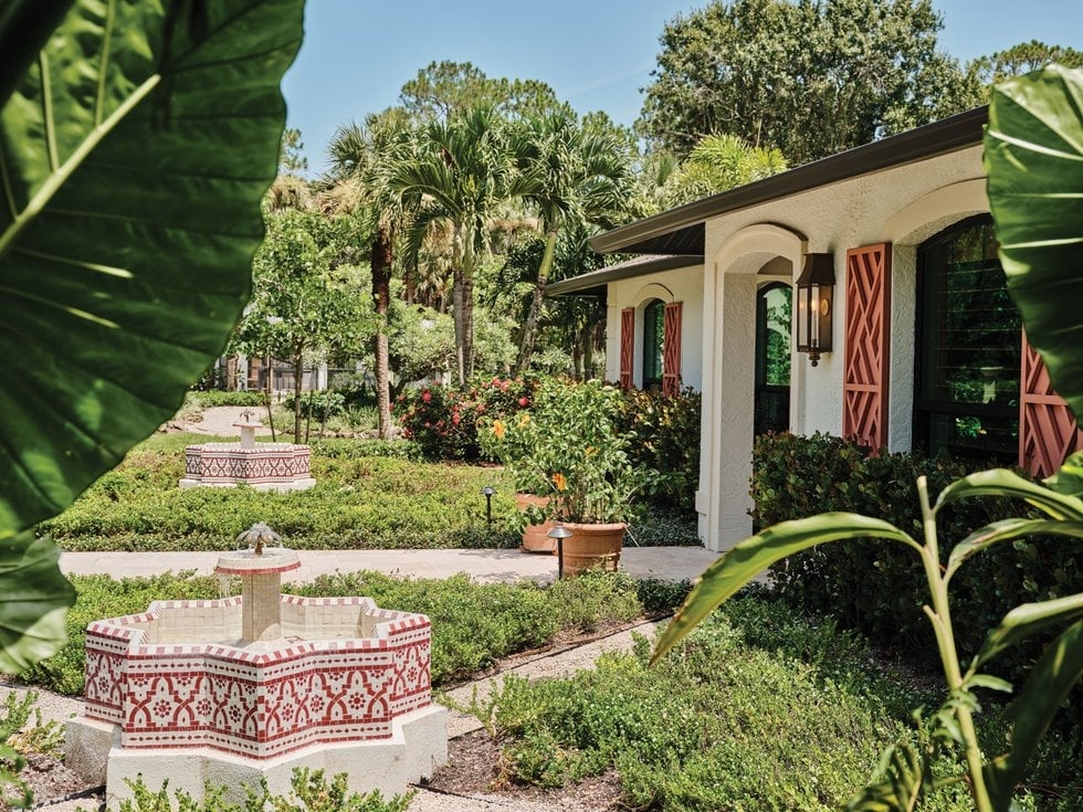
In a Mediterranean garden, let the hardscape carry the color. Cream stucco walls and terracotta tiles set the palette, while decorative fountains and potted plants add green. The pathway through the garden guides the eye from one terracotta accent to the next. The palette is roughly sixty percent cream, twenty percent terracotta, and twenty percent green. The green comes from foliage only, never from painted surfaces, so the garden feels natural. To recreate it, look for terracotta planters or tiles in a single warm tone and repeat them along the path.
Classic Farmhouse Cream Siding with Vibrant Green Door
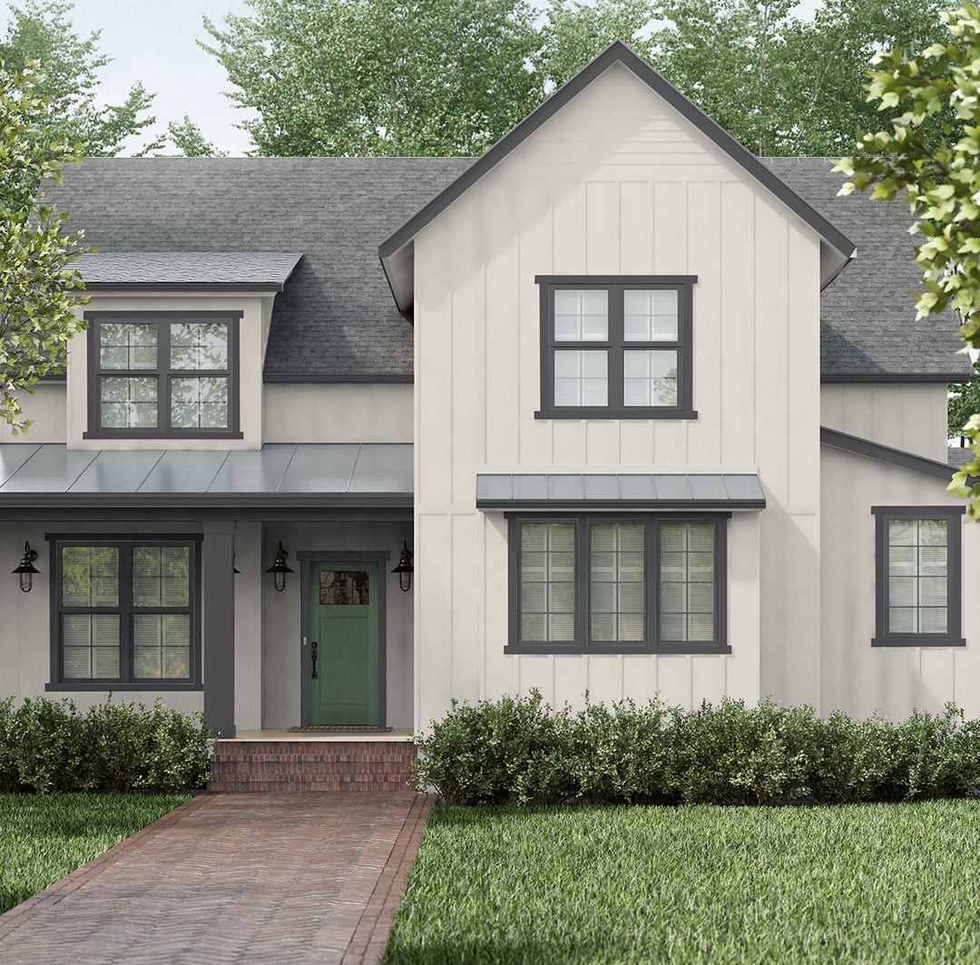
A cream board and batten farmhouse exterior reads as clean and classic, but the green front door is what gives it character. The warm cream siding sits against a grey metal roof and grey window trim, so the door pulls the eye straight to the entrance. Brick steps and a simple walkway keep the layout grounded. The ratio here is roughly 70 percent cream to 20 percent grey and 10 percent green, which means the accent color has enough contrast to matter without fighting the main palette.
Coastal Tan Siding with Striking Turquoise Accents
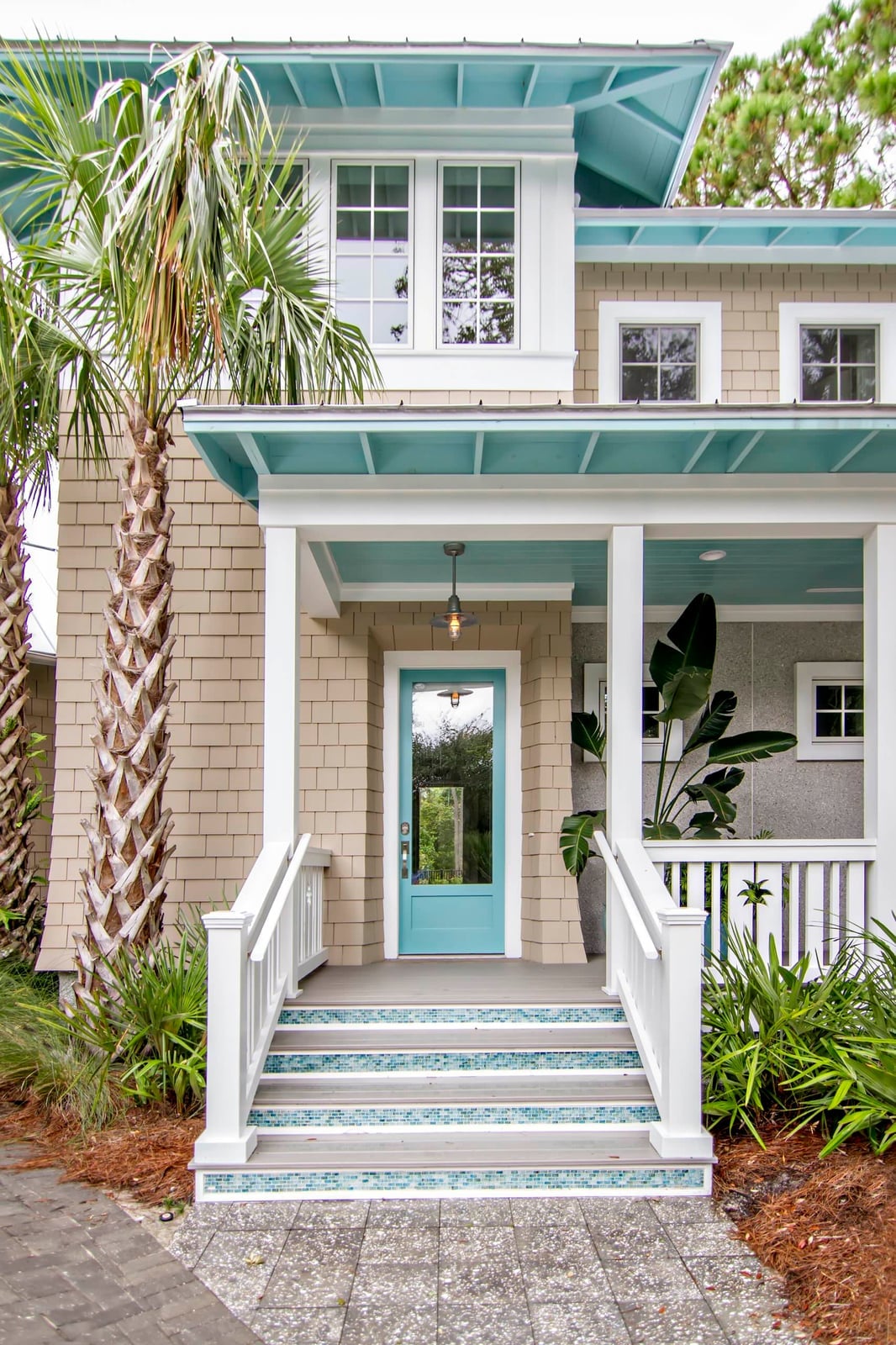
A practical rule for coastal exteriors: pick one cool accent to balance warm siding. Here, tan shingles cover the main facade, and turquoise trim around the porch, door and stairs gives the house a crisp edge. White railings and window frames keep the palette from feeling heavy. For renters who cannot paint siding, swap in turquoise outdoor cushions, a doormat or potted planters near the entrance. The same color temperature shift works without touching the house itself, and it comes off when you move.
Modern White Brick Facade with Beige and Grey Tones
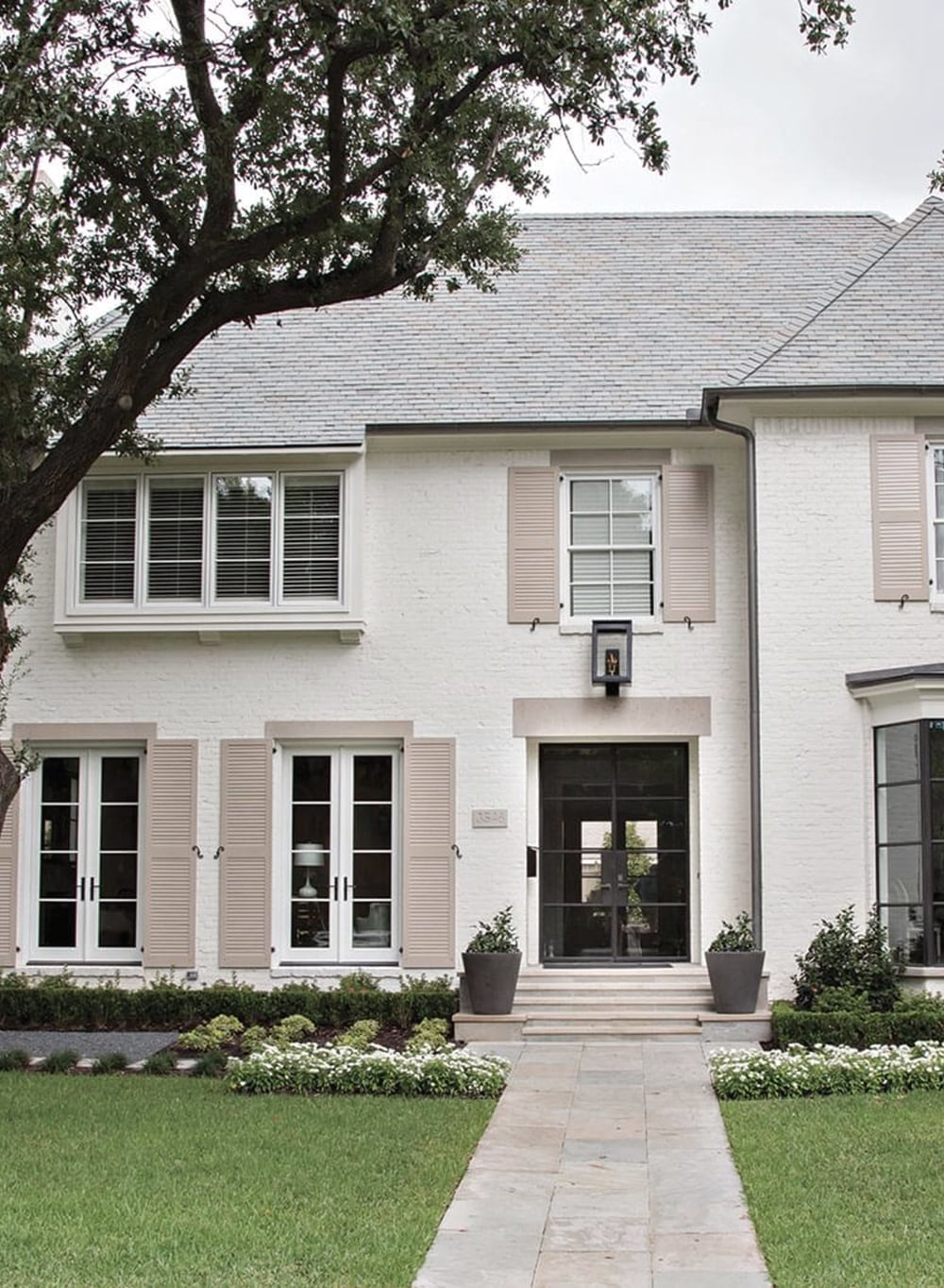
White brick can look stark if nothing softens it. This facade avoids that by mixing beige stone at the base and grey wood accents around the windows and door. The white brick becomes the backdrop, and the beige and grey give the house depth without adding a third strong color.
The shutters are a muted grey, not black, which keeps the look modern instead of colonial. A warm wood front door breaks the cool palette just enough to feel planned. If you are choosing brick for a new build or re-siding, ask for a white brick with slight variation in the mortar or individual bricks. Flat white can look flat; subtle texture adds visual interest.
Traditional White House with Light Blue Shutters and Door
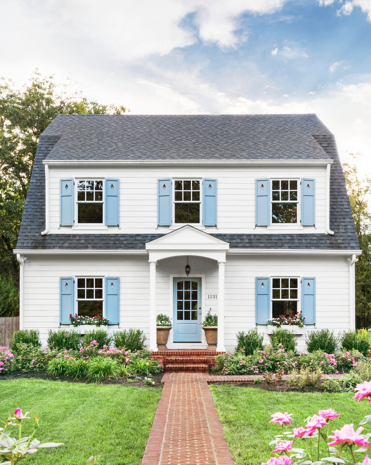
White siding with light blue shutters and a matching front door is a classic combination for a reason: the blue reads as soft against the white, not heavy like black or navy would. Green landscaping and a brown brick walkway add natural warmth around the base. The blue stays in the same value range as the white, so the facade feels unified rather than chopped into separate blocks. This palette works best on houses with symmetrical windows, because the shutters frame each opening evenly.
Modern Grey Exterior with Lime Green and Orange Accents
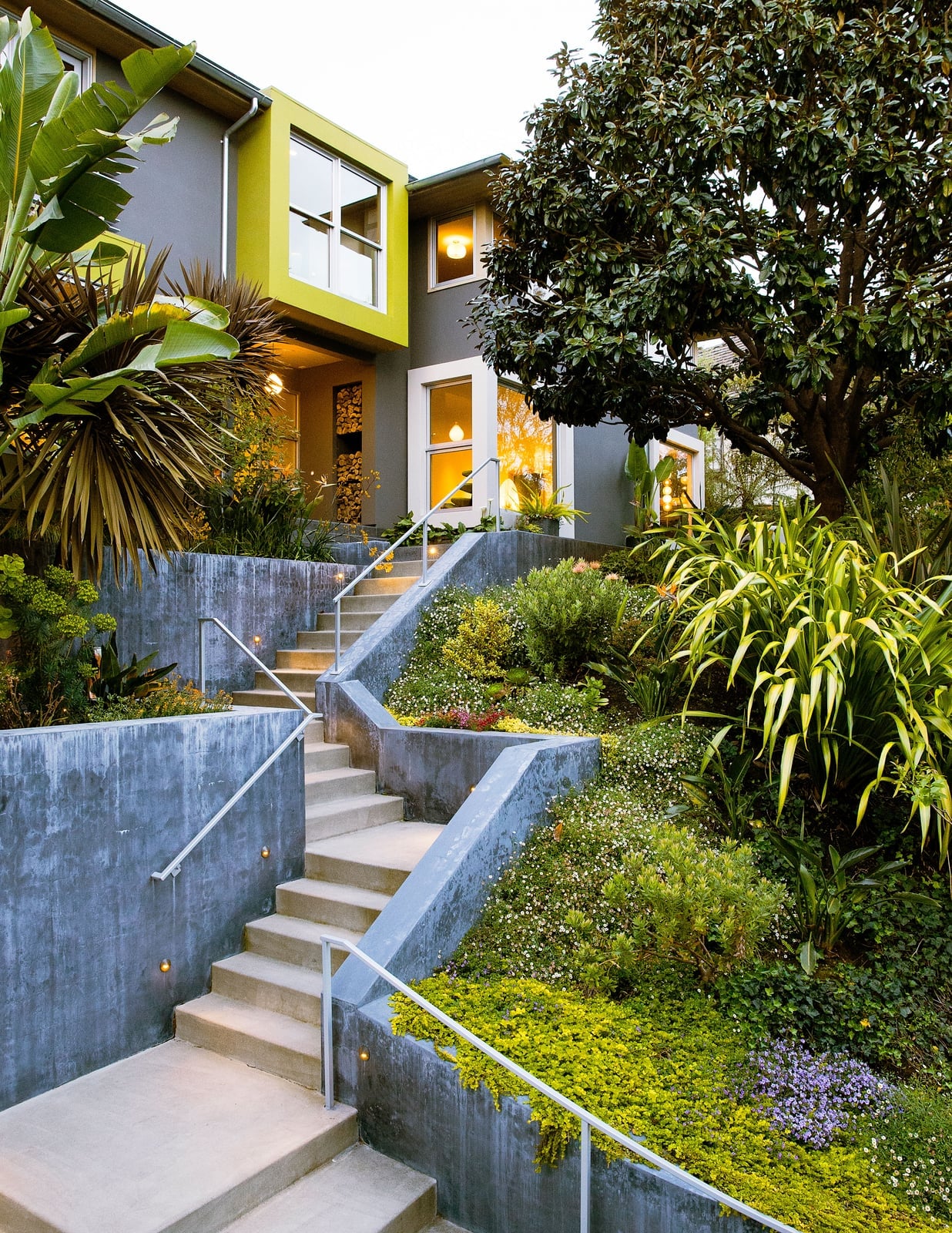
This is a grey house that does not play it safe. The main body is a cool grey with white trim, but a lime green architectural detail runs across the front, and orange accents appear in the tiered landscaping and a few exterior elements. The ratio is roughly 60 percent grey, 20 percent white, 10 percent lime green and 10 percent orange. That keeps the bold colors from overwhelming the facade. The house is lit from inside in the evening, which makes the grey read warmer and the green and orange pop against the dusk sky. If you want to try this on a neutral house, start with one accent color in a small area, like a door or a trellis, before committing to a full panel.
Modern Geometric Facade in Cream, Grey, and Wood
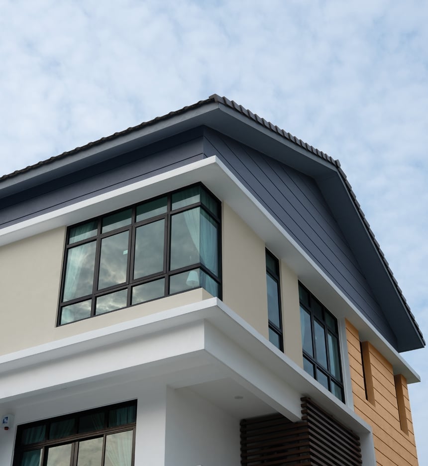
A facade with multiple materials works best when the palette stays tight and the textures do the talking. This modern house uses cream painted stucco as the main volume, then adds grey wood paneling on a projecting upper level and a warm wood section near the entry. The large windows are set in dark metal frames that read as lines rather than blocks. The cloudy sky softens the contrast, so the cream and grey sit close in value while the wood offers a natural break. Layered planes keep the mass from feeling flat without needing extra color. The ratio is roughly two-thirds light neutral to one-third darker accent, with wood as the smallest share.
Traditional Dark Teal Siding with Black Shutters
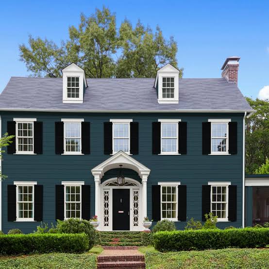
The dark teal siding covers the main body of the house, with white windows set into it and black shutters flanking each one. The stone foundation in mottled greys anchors the deep color without competing. This palette works because the white windows create a regular rhythm across the facade, and the black shutters are narrow enough to read as frames rather than heavy blocks. The dark teal reads as a neutral from a distance and only reveals its green-blue character up close.
Traditional Cream Stucco with Grey Stone and Blue Door
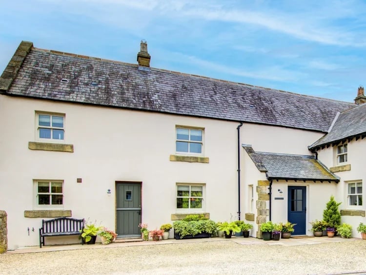
A traditional facade keeps the main body neutral and saves strong color for the entry. This house uses cream stucco across the front, with grey stone cladding the lower portion and a matching grey slate roof above. The two front doors sit in a recessed porch area, and both are painted a clear blue that stands out against the cream. Dormer windows break up the roofline and repeat the cream and white palette. The stone adds weight at the base, so the house does not look top-heavy even with the dormers. A small bench on the porch makes the entry feel usable and not purely decorative.
Charming Cottage in Brown Wood Siding with White Trim
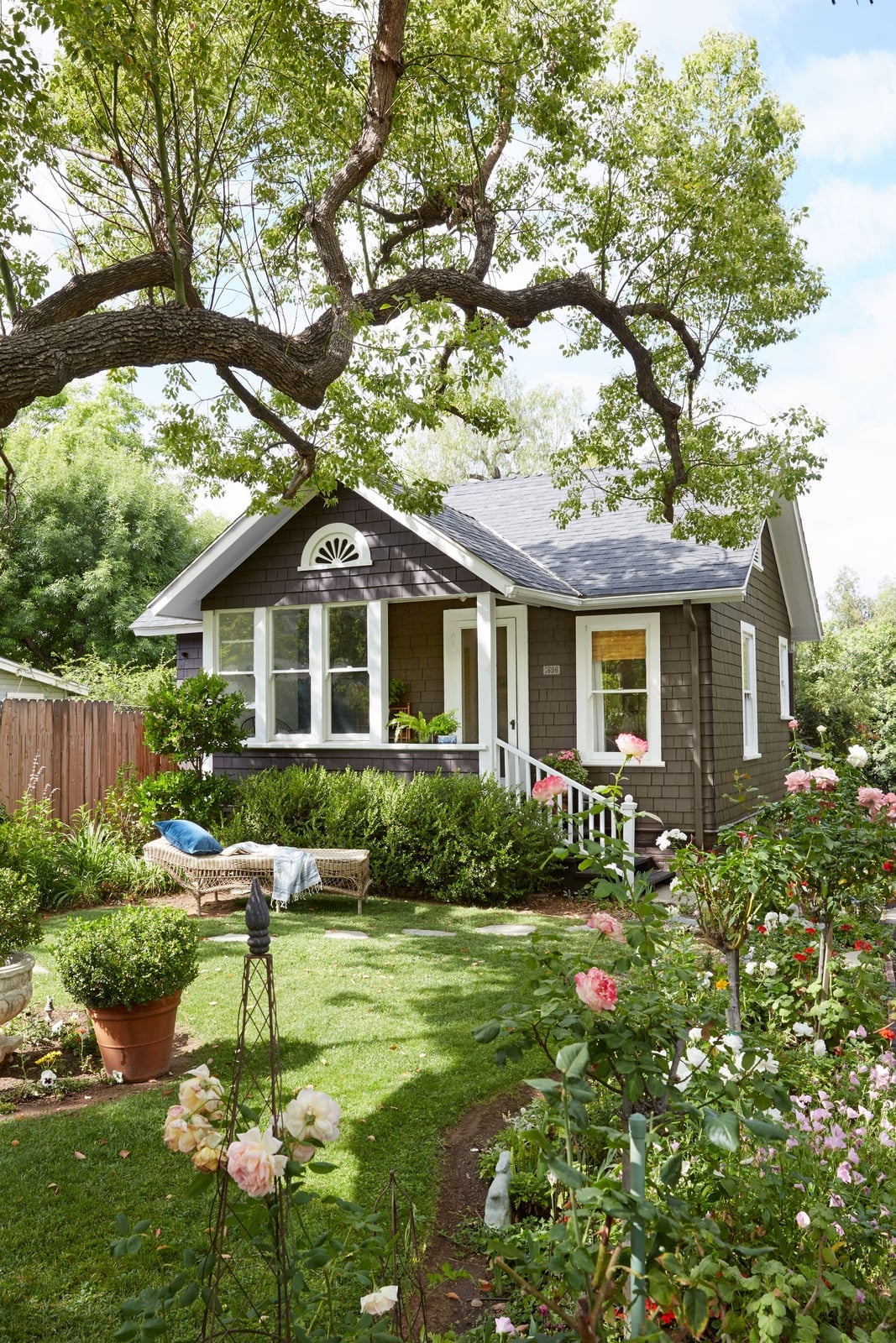
A cottage in brown siding could feel dark or heavy, but this one keeps things light with crisp white trim around every window and door. The brown wood siding covers the main body, while white shingles fill the upper gable and the porch ceiling reflects the same bright tone. A brick foundation and stone path add natural texture without introducing new colors. The front garden brings in green foliage and a few pink blooms, which soften the brown and white scheme. A simple lounge chair on the porch confirms this is a house meant for sitting outside, not just looking at it. The white trim is the key: without it, the brown siding would dominate and the charm would fade.
Craftsman Two-Tone Exterior in Red and Blue
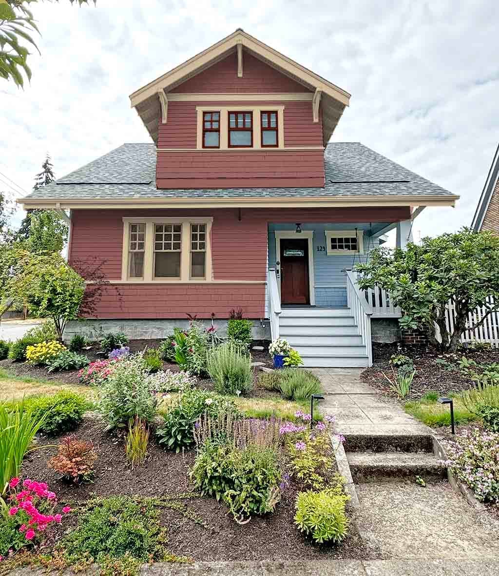
The facade uses a deep red on the main wood siding and a navy blue on the shingles filling the upper gable and the dormer window. A tan stone porch and green foundation planting keep the two strong colors from feeling disconnected. The red and blue are both muted, so they read as natural companions rather than opposites. The porch roof and white window frames provide enough visual rest that the eye moves across the facade without getting stuck on any one color.
Modern Farmhouse Deep Blue Siding with Grey Stone
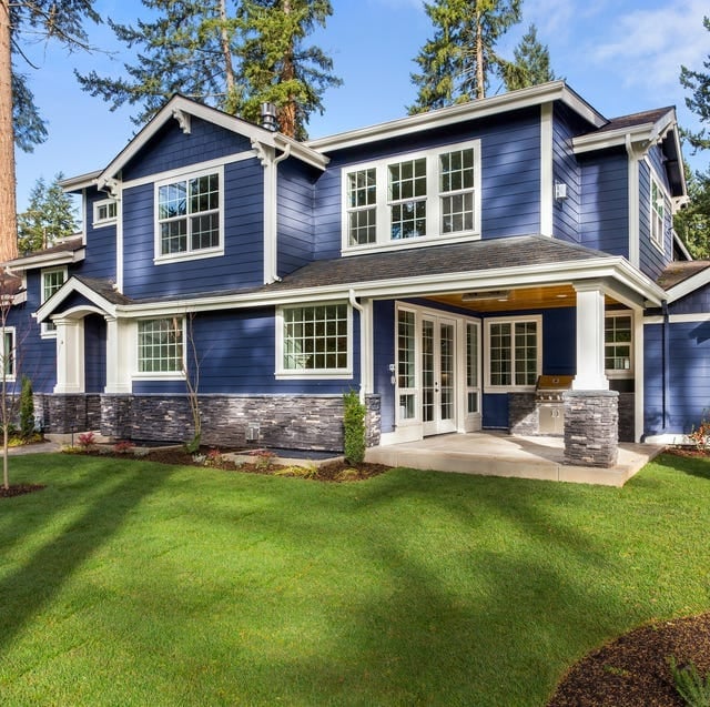
Deep blue siding reads as a grounded alternative to black or navy for a modern farmhouse exterior. The shade holds its own against the grey stone veneer base and white trim without competing, so the facade stays cohesive rather than busy. A covered porch and large windows break up the color mass, keeping the house from feeling too heavy. The palette works because the ratio leans heavily on the blue, with stone and white acting as quiet borders. What breaks it would be adding a third saturated color anywhere on the front elevation.
Coastal Porch Dining in Aqua, Black, White, and Red
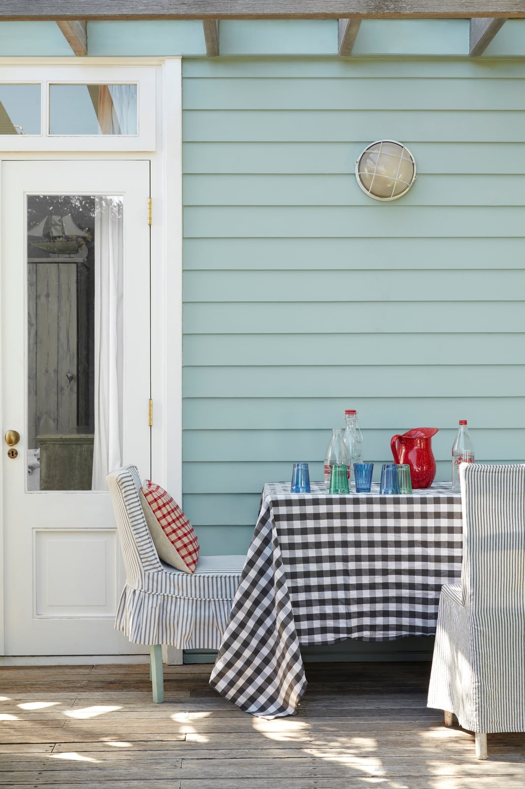
A practical rule for an outdoor dining setup is to anchor a bold porch color with neutral table linens and one accent piece. Here the aqua siding provides the backdrop, while a white gingham tablecloth and black striped chairs keep the look crisp rather than chaotic. A red pitcher pulls the eye to the table surface without fighting the aqua.
The ratio works because the color blocks are separated by surface area: the siding covers the largest field, the table setting occupies the middle ground, and the red sits on a small object. What would break the balance is adding another primary color to the table or introducing a patterned rug underfoot.
Farmhouse Dark Grey Siding with White Trim
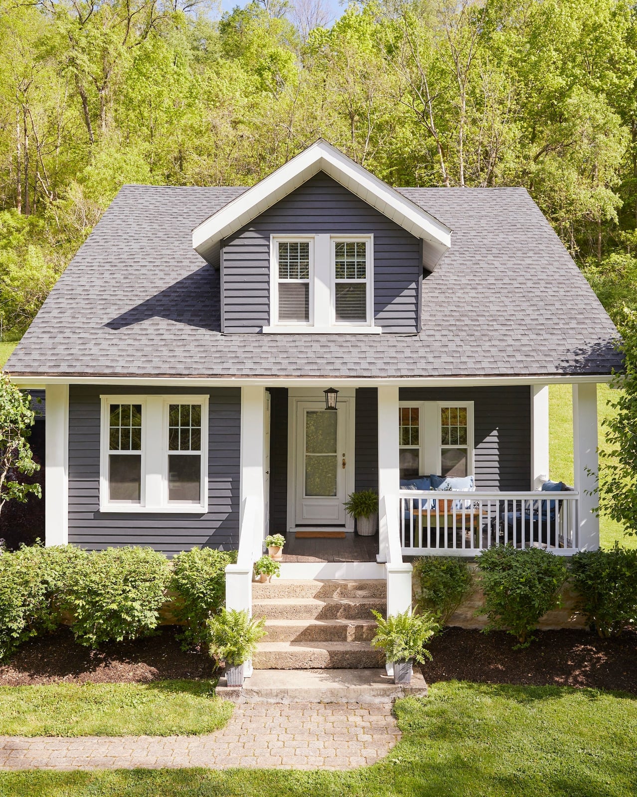
Dark grey siding paired with white trim creates a clean silhouette. The centered entrance and porch help the facade feel balanced, while green landscaping softens the high contrast. The palette stays neutral, so the house can take a seasonal wreath or a painted front door without clashing. What would break it is introducing a third trim color on the windows or gutters.
Eclectic Pink Facade with Dark Green Shutters
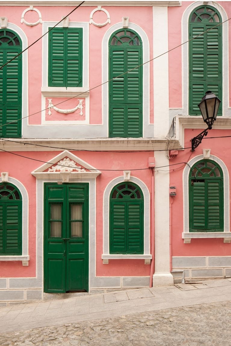
A pink stucco facade with dark green shutters is a deliberate risk that pays off when the surrounding details stay restrained. The white trim and metal lamp keep the exterior from reading as playful or temporary, while the green shutters ground the pink rather than compete with it. The ratio of pink to green is roughly three to one, which prevents the facade from looking like a color block experiment. What breaks it is adding a third bright hue on the door or introducing patterned shutters.
Colonial White House with Bright Red Front Door
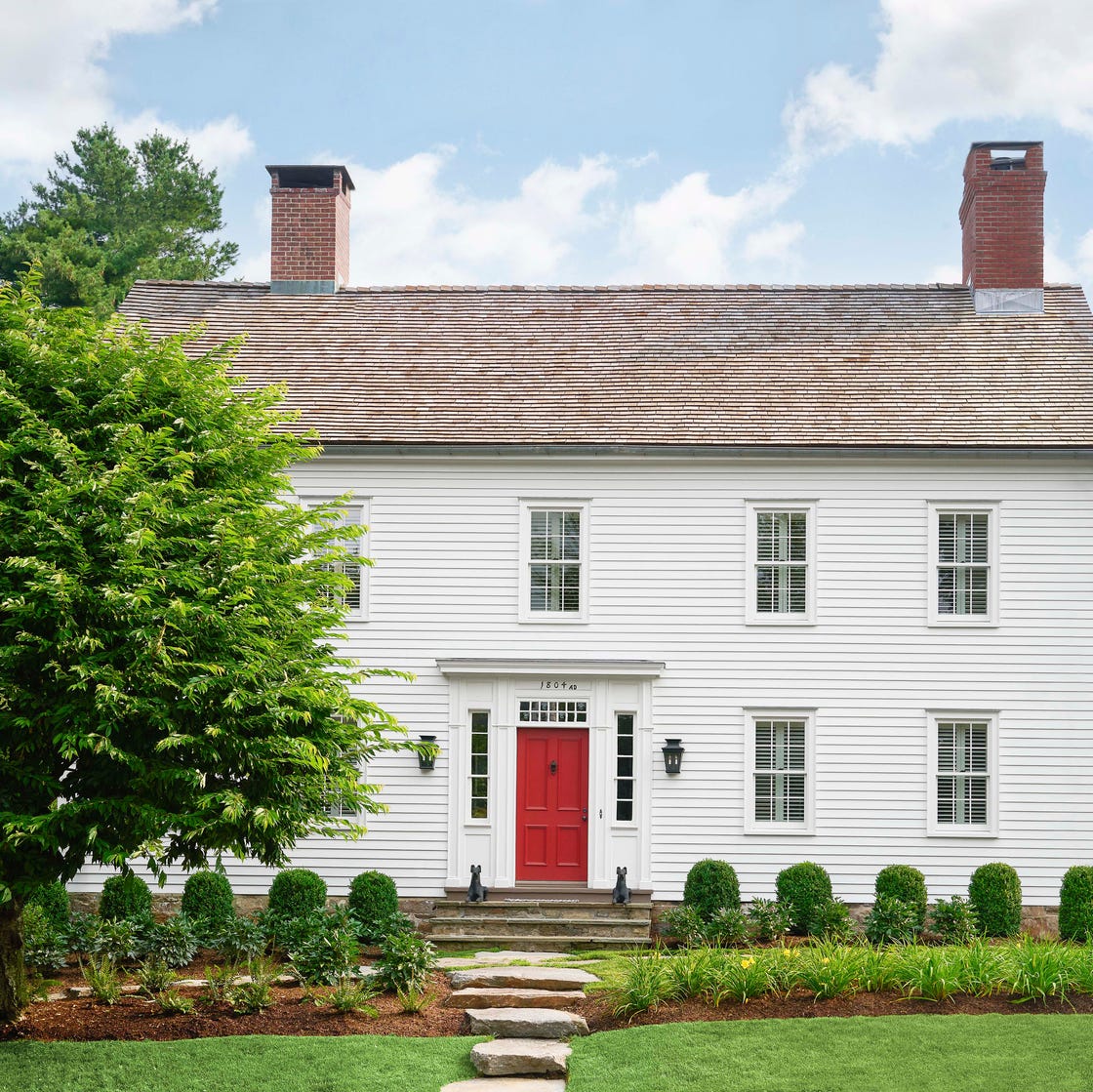
A white colonial exterior with a bright red front door is a classic combination, but the difference between charming and garish comes down to the shade of red and the amount of white surrounding it. Here the white siding and brick keep the facade neutral, so the red door reads as a focal point rather than a disruption. Black shutters and a stone path add enough contrast to keep the house from feeling flat.
The palette works because the red is confined to the door alone, not echoed on the shutters or trim. What would break the look is painting the shutters red or adding a second saturated color to the facade.
Mediterranean Terracotta House with White Trim and Black Wall Sconces
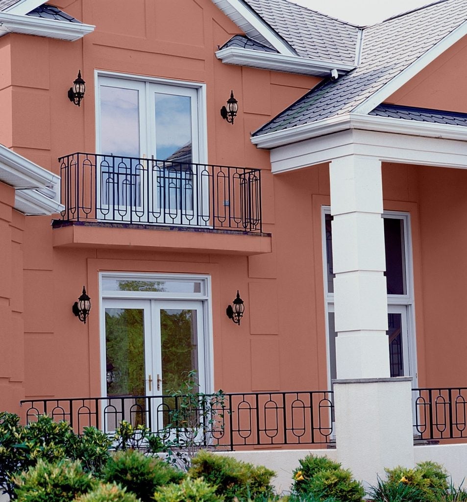
A terracotta house with white trim defines Mediterranean curb appeal through heat and contrast. The warm orange-red stucco covers the main facade, catching the daylight across its textured surface. White trim frames the windows, balconies and roofline, creating crisp lines that keep the bold color from overwhelming. Black metal sconces and window grilles add a third layer without competing. The finish is roughly 70 percent terracotta, 20 percent white, and 10 percent black. Swapping the white trim for cream would muddy the contrast instead of sharpening it.
Rustic Cottage Patio with Burgundy Accents and Materials Include Brick
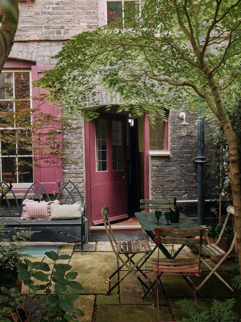
Burgundy reads as a natural accent for a cottage patio because it echoes brick and autumn foliage without feeling heavy. Here, a burgundy door and matching shutters sit against grey siding, while a metal bistro table and chairs in dark grey hold the center of the space. A wooden bench along the wall repeats the warm undertone of the red, and green potted plants break up the earth tones at regular intervals. The palette stays in a warm range: burgundy, grey, and deep green. What defines the look is the ratio, roughly 60 percent grey, 25 percent burgundy, and 15 percent green. What would break it is adding a cool blue or a saturated yellow, which would shift the mood from cozy to disjointed.
Coastal Light Blue Siding with Grey Foundation, Close-Up Take
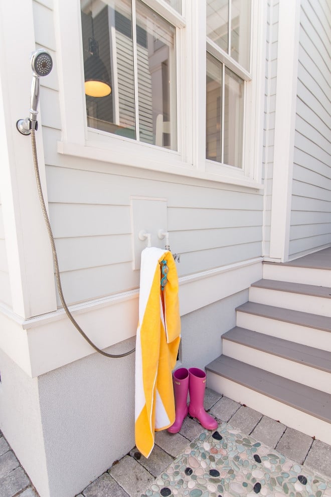
Light blue siding can look sweet but not sophisticated. This version avoids that by pairing it with a grey stone foundation and white trim, so the blue stays fresh without tipping into pastel. The siding covers the main body of the house, while the stone base anchors it against the ground. A white outdoor shower and grey steps continue the restrained palette.
The style is coastal but not nautical because the blue is muted and the grey keeps the palette grounded. A colorful towel draped over the shower rail adds a small, temporary accent without changing the permanent palette. Painting the foundation white or adding navy shutters would push the exterior from coastal into literal beach decor.
Final Thoughts
Choosing an exterior color is about finding the balance between what you love and what suits your home’s style and setting. A deep gray modern farmhouse feels completely different from a cream cottage with a green door, and both can be right for the right house. Pay attention to how light hits your siding at different times of day, and test samples on a large section of wall before committing. The best exterior colors hold up to weather, complement the roof and landscaping, and make you smile every time you pull into the driveway. Take your time, look at these 33 examples again, and trust your instincts.