
I love how much personality the right kitchen colors can bring to a space, especially when two or more shades work together in a thoughtful way. Today’s kitchen color combinations go far beyond classic neutrals, mixing warm, moody, soft, and unexpected tones to create a more personal look. I’m seeing beautiful pairings that balance cabinetry, walls, countertops, backsplashes, and small details without making the room feel visually overwhelming. Whether you prefer a calm kitchen with subtle contrast or a richer palette with plenty of character, there are plenty of combinations worth considering. In this article, I’m sharing trending kitchen color ideas that can make the space feel fresh, stylish, and easy to live with. From timeless pairings to newer color combinations, these ideas can help inspire your next kitchen update.
Deep Blue Cabinets With Soft Yellow Seating
The first kitchen makes a strong impression with deep blue cabinetry covering the main cooking area from floor to ceiling. I like the way the rich blue appears across the tall cabinet, lower drawers, and upper glass-front cabinets, creating a visually continuous backdrop. A white oven, light countertop, pale walls, and white plank-style flooring keep the darker cabinetry from making the compact room feel too heavy. The yellow cushioned seating along the large window adds a warm contrast, while the black track lighting and black chair introduce another crisp accent.
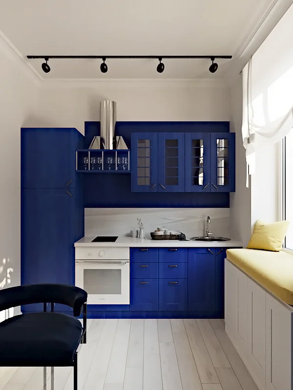
For me, this combination works because the blue provides a clear visual anchor while the white surfaces create breathing room around it. The yellow seating is especially effective because it appears only in one defined area rather than competing with the cabinetry. The window also brings in abundant natural light, which helps balance the depth of the blue. I would consider this a practical approach for a small kitchen because the color is concentrated on the cabinetry, leaving the surrounding surfaces relatively light.
If I were recreating this look, I would start with one saturated cabinet shade and build the rest of the palette around it. I would keep the countertop and major surrounding surfaces light, then introduce a small amount of a contrasting warm color through seating or another clearly defined element. I think the key is restraint: the blue and yellow already provide enough personality without requiring additional strong colors.
Mauve Cabinetry With Warm Wood and Soft Pink Accents
This kitchen takes a much softer approach, combining muted mauve cabinetry with warm wood flooring and coordinating upholstered dining chairs. I notice the cabinetry running along the left side and continuing toward the back, with tall storage and integrated appliances helping the compact layout feel organized. A marble-look backsplash introduces pale veining behind the counter, while open shelves display jars and simple kitchen items. In the dining area, a pink table runner and upholstered chairs reinforce the muted mauve palette without making the room feel overly matched.
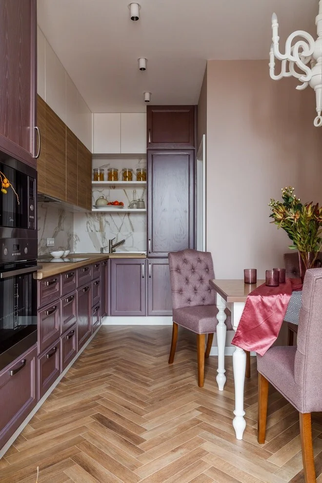
I like how the warm herringbone flooring prevents the mauve cabinetry from feeling too cool or flat. The wood tones give the room visual warmth, while the pale backsplash adds brightness between the upper and lower cabinetry. The dining table is positioned close to the kitchen, which makes the room feel cohesive and practical rather than divided into separate zones. The combination also shows how related shades can be used across cabinetry, upholstery, and textiles without making every surface identical.
From my perspective, this is a particularly useful color idea for anyone who wants a kitchen with personality but does not want a highly saturated palette. I would pair a muted cabinet color with one warm material, such as the flooring shown here, and then repeat the cabinet family subtly in the dining area. Keeping the countertop and backsplash lighter gives the darker cabinetry enough contrast to remain the focus.
Dusty Blue and Pink for a Refined Two-Tone Kitchen
The third kitchen uses a distinctly two-tone color scheme, with dusty blue-gray upper cabinets and muted pink lower cabinets. I love the contrast between these two sections because both colors are softened rather than intensely saturated. A large stone-look backsplash stretches across the wall behind the counter and adds natural variation through gray, beige, and pale tones. The warm wood herringbone floor brings another layer of warmth, while the round dining table and dark wood chairs create a comfortable eating area directly within the kitchen.
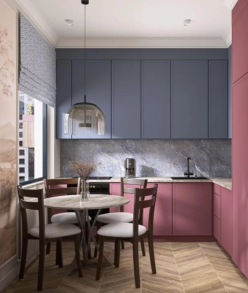
The two-tone cabinetry is effective because the darker blue-gray visually grounds the upper part of the room while the pink cabinetry adds warmth below. The stone-look backsplash acts as a bridge between the colors, preventing the combination from appearing disconnected. I also like the simple cabinet fronts because they allow the palette to remain the main decorative feature. The dining area feels integrated into the composition rather than treated as a separate room.
If I were using this combination at home, I would let one color occupy the upper cabinetry and another occupy the lower cabinetry, just as shown. I would then choose a backsplash with several quiet neutral tones that can visually connect both shades. For me, this is one of the most approachable ways to experiment with color because the cabinetry creates the contrast while the rest of the room remains relatively controlled.
Glossy Orange Cabinets Against a Black and White Backdrop
This kitchen takes a much bolder direction with glossy orange cabinetry set against black walls and white cabinet fronts. The orange appears across the main run of cabinets and immediately becomes the strongest visual element in the room. Stainless-steel appliances, a reflective chrome pendant light, and a glass dining table add sleek surfaces that reinforce the contemporary character. The floor continues the black, white, and orange palette in a geometric tile arrangement, making the color combination feel deliberate throughout the entire space.
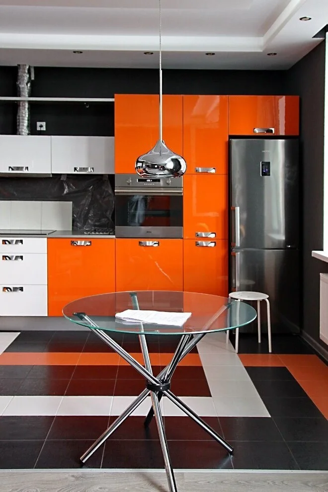
What works especially well here is the repetition of the three dominant colors. The orange cabinetry is balanced by black around it, while white sections prevent the palette from becoming too dark. The flooring repeats those same tones, which gives the room a stronger sense of cohesion. I also like the transparent dining table because it adds a dining surface without visually blocking the cabinetry or the striking floor pattern.
For me, this is an example of how a very strong cabinet color can work when the surrounding palette is disciplined. If I wanted to achieve something similar, I would choose one saturated color for the cabinetry and limit the supporting colors to two neutrals. Glossy finishes can already attract plenty of attention, so I would avoid adding many competing decorative elements. The image shows that a bold kitchen can still look organized when the color story is repeated consistently.
Warm Wood Cabinetry With Cream and Natural Brown Tones
The fifth kitchen shifts into a warm and understated palette built around wood cabinetry, cream walls, white surfaces, and medium-brown furnishings. The cabinetry follows an L-shaped layout, with tall storage and integrated appliances on the left and a compact cooking area at the back. A large wood dining table occupies the foreground, visually connecting the kitchen cabinetry and the herringbone-like warmth of the surrounding surfaces. Two woven pendant lights hang above the kitchen and dining area, adding texture and a warm glow.
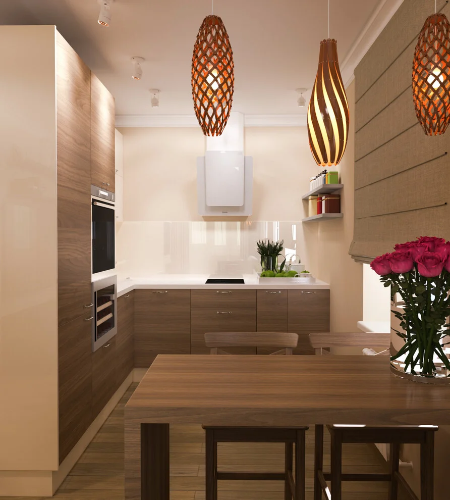
I find this combination particularly successful because the wood tones are repeated without making the space feel visually crowded. The light backsplash and countertop provide a clean break between the cabinetry, while the cream-colored walls keep the overall palette soft. The large dining table gives the room a practical center and makes the kitchen feel like a place designed for both cooking and gathering. The warm pendant lights also complement the cabinetry rather than introducing an unrelated color.
This is the type of color combination I would recommend when the goal is warmth without relying on a strong cabinet color. I would choose one dominant wood tone, surround it with light neutral surfaces, and then repeat the wood through a substantial piece of furniture. The image also reminds me that texture can be just as important as color: the woven lighting and wood grain give the restrained palette plenty of visual interest.
White Cabinetry With a Fresh Aqua Accent
This kitchen uses white cabinetry as the main backdrop and introduces a soft aqua tone through the curved range hood surround and dining chairs. I immediately notice the sculptural shape of the hood area, which creates a focal point above the cooktop while breaking up the straight lines of the surrounding cabinets. The large white dining table keeps the room light, and the aqua upholstery appears again on the chairs and nearby seating. A dark, elongated pendant light adds contrast above the table without disturbing the airy palette.
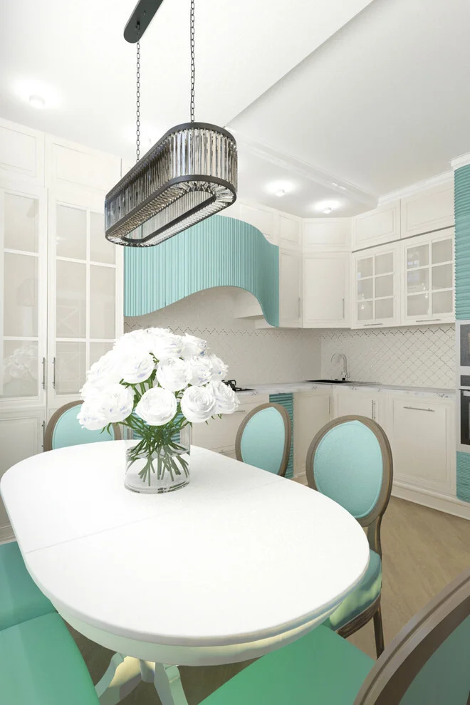
I like the way the aqua is repeated in several places rather than being confined to one isolated feature. The white cabinetry gives the color plenty of space to stand out, while the pale wood floor adds subtle warmth beneath the predominantly cool palette. The glass-front cabinet doors also contribute to the light appearance of the room. Together, these choices create a kitchen that feels coordinated without depending on a complicated color scheme.
If I were taking inspiration from this image, I would use white as the foundation and select one gentle accent shade for both cabinetry details and upholstery. I think repeating the same color in at least two visible areas makes an accent feel intentional. The curved hood is also a useful lesson in using shape alongside color: even a relatively simple palette can feel distinctive when one architectural or built-in feature has a strong silhouette.
Teal Cabinetry With Wood and Stone-Look Surfaces
The seventh kitchen combines deep teal lower cabinetry with pale gray upper cabinets and warm wood-toned cabinet fronts in the middle. A light stone-look backsplash stretches across the work area, creating a neutral transition between the different cabinet colors. The countertop follows the same restrained light palette, while the wood floor adds warmth underfoot. In the foreground, dark furniture and green upholstered chairs continue the room’s deeper color story.
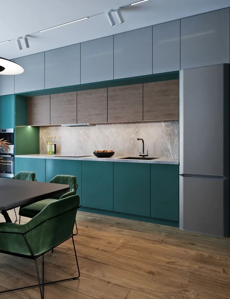
For me, the success of this kitchen comes from the way the colors are arranged in horizontal layers. The teal gives the lower section a strong identity, the wood adds warmth through the center, and the pale upper cabinets visually lighten the composition. The large refrigerator at the right is kept in a neutral gray tone, so it does not compete with the cabinetry. This creates a balanced palette even though several different finishes are visible.
I would approach a similar combination by selecting a deep blue-green as the primary statement color and using natural-looking wood as its warm counterpart. A pale neutral can then be used on the upper cabinets or backsplash to keep the room open visually. I particularly like this strategy for a modern kitchen because it allows several materials to coexist while giving each one a clear role in the color composition.
Soft Sage Green With Black, White, and Warm Wood
This compact kitchen uses a calm sage-green palette across the cabinetry and surrounding built-in surfaces. A white tiled backsplash occupies the central wall, while the black range hood, countertop, and built-in oven introduce strong contrast. The patterned floor brings together white, gray, and warm brown circular and floral-like motifs, while the round wooden dining table and green upholstered chairs add warmth and reinforce the palette. The result is a small kitchen with a surprisingly layered color scheme.
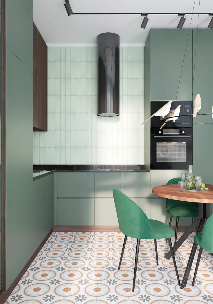
I think this room works because the sage green is soft enough to function almost like a neutral, allowing the black appliances and countertop to stand out without overwhelming the space. The white backsplash reflects light and gives the compact cooking area a clean visual break. Meanwhile, the patterned floor adds personality at the lowest level of the room, where it does not interfere with the cabinetry. The round table also fits naturally into the dining corner and contrasts with the predominantly straight cabinet lines.
From my experience following kitchen trends, muted green is one of the easiest statement colors to work with because it can sit comfortably beside both warm and cool neutrals. I would keep the walls and backsplash light, use black selectively for definition, and introduce wood through a table or another visible surface. This image shows how a small kitchen can handle several visual elements when the colors remain connected.
Slate Gray Cabinets With Warm Wood and Brass-Like Details
The ninth kitchen combines slate gray cabinetry with warm wood, pale surfaces, and subtle metallic accents. The cabinetry forms an L-shaped working area, with tall black appliances integrated along the left side and a large gray cabinet wall at the back. Open illuminated shelving displays glassware and adds warmth to the darker cabinetry. A large white island with a vertically textured front occupies the center, while the warm wood flooring and leather-toned seating soften the cooler gray palette.
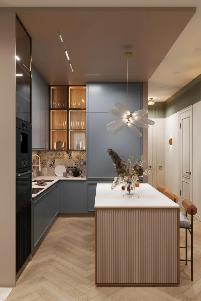
I particularly like the contrast between the restrained gray cabinetry and the warmer details around it. The illuminated shelves create a focal point without needing a bright cabinet color, while the patterned backsplash adds visual interest behind the work area. The large island provides both a practical work surface and a strong centerpiece for the room. Its white top also creates a clear contrast against the darker cabinetry and helps separate the island from the surrounding kitchen.
If I were recreating this palette, I would use a deep gray as the grounding color and add warmth through wood flooring, shelving, or furniture. I would keep the largest countertop surface light so the room does not become too visually dense. The warm metallic-looking accents and softly lit shelving shown here are also a good reminder that lighting can influence how a cabinet color reads throughout the day.
Terracotta and White With a Speckled Gray Finish
The final kitchen uses a striking combination of terracotta-brown cabinetry and crisp white tall cabinets. The lower and upper cabinets on the left share the warm earthy tone, while the tall storage and appliance wall remain white. A gray countertop and matching speckled gray backsplash introduce a cooler neutral between the two cabinet colors. The same speckled pattern continues across the floor, creating a strong visual connection between the horizontal surfaces.
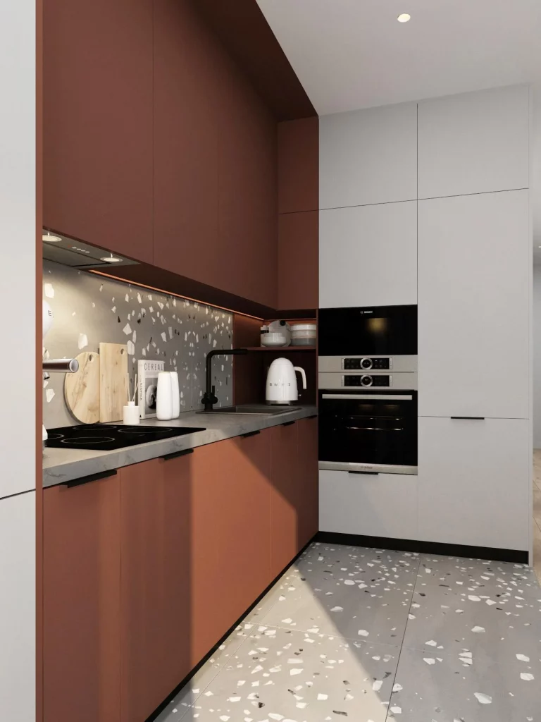
I like the clarity of this palette because each color has a defined position. The terracotta cabinetry gives the working area warmth and personality, the white cabinets visually lighten the tall storage section, and the gray surfaces create a neutral transition. The black cooktop, faucet, and appliances add small points of contrast that keep the composition crisp. Even though the kitchen is compact, the limited palette prevents it from feeling visually chaotic.
For me, this is a strong example of how an earthy cabinet color can look contemporary when paired with clean white cabinetry and a restrained gray background. If I wanted to recreate the idea, I would choose a muted terracotta rather than an overly intense orange, then balance it with white vertical storage and a practical gray countertop. I would also consider carrying the countertop or backsplash pattern onto another surface, as shown here, because repetition makes a compact kitchen feel more cohesive.
Soft Blue and Cream for a Light Everyday Kitchen
The first kitchen uses a gentle blue-and-cream palette that immediately makes the narrow space feel fresh and inviting. The lower cabinets are painted a soft blue, while the upper cabinetry combines the same blue with warm creamy-white doors. I can also see a small patterned backsplash in muted neutral tones, a pale countertop, and light flooring that continues the airy feeling. At the far end, the kitchen opens toward a dining area with blue seating and a large window, allowing plenty of natural light to reach the cabinetry.
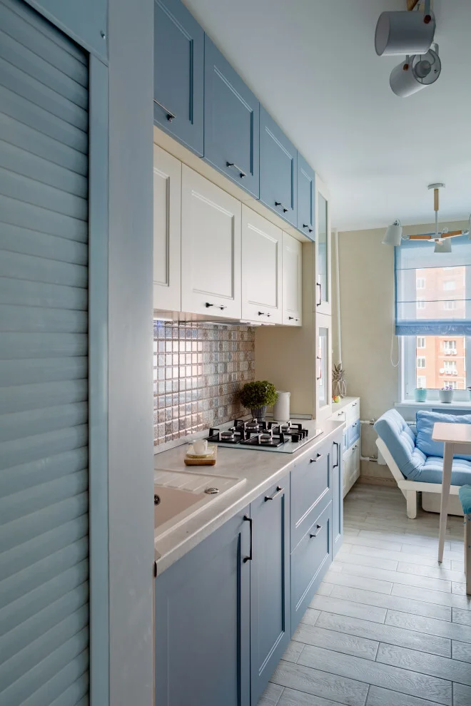
I think this combination works particularly well because the colors are repeated beyond the cabinets without becoming overly coordinated. The blue appears again in the dining area and window treatment, which visually connects the kitchen with the adjoining space. The lighter upper cabinets prevent the long run of cabinetry from feeling too heavy, while the pale counter and floor reflect the available daylight. The black cabinet handles and cooktop add just enough contrast to keep the soft palette from looking flat.
From my perspective, this is a great example of how a restrained color combination can make a compact kitchen feel more spacious. If I were recreating the look, I would keep the blue slightly muted rather than choosing an intensely saturated shade, then balance it with warm white or cream on the upper cabinetry. I would also repeat the blue in just one or two nearby details, as shown here, instead of introducing several unrelated accent colors.
Deep Green Cabinets With a Moody Tiled Backsplash
The second kitchen takes a much moodier direction with deep green cabinetry, dark countertops, and a wall of glossy green rectangular tiles. The cabinets have a simple, streamlined appearance, while open shelves on the right display plates and bowls. A tall dark range hood becomes a strong focal point against the tiled wall, and the wood-toned floor introduces warmth beneath the darker palette. The overall effect is intimate, dramatic, and surprisingly cozy.
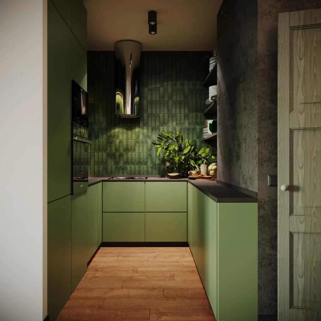
What I like about this color combination is the way several shades of green are allowed to work together. The cabinetry is a softer olive-green, while the backsplash has deeper and more varied green tones that catch the light. The dark countertop gives the cabinets definition and creates a practical surface that visually connects with the darker elements around the room. The open shelving also breaks up the solid cabinetry and provides convenient access to everyday dishes.
For me, this is a useful reminder that a small kitchen can handle a darker color when the palette has enough variation and warmth. I would use the backsplash as the main source of visual texture and let the cabinets remain relatively simple. The wood floor shown here is also important because it prevents the green-and-black combination from becoming too cold. If I wanted a similar atmosphere, I would concentrate on layering related greens rather than trying to match every surface exactly.
Royal Blue Cabinetry With a Crisp White Backdrop
The third kitchen creates a striking contrast between vivid blue cabinetry and an almost entirely white setting. The lower cabinets and tall storage units are a strong royal blue, while the walls, ceiling, countertop, and backsplash remain white. A round wooden dining table sits in front of the kitchen with several upholstered chairs, and a patterned geometric floor adds another layer of visual interest. Above it all hangs an ornate crystal chandelier that gives the room a more decorative character.
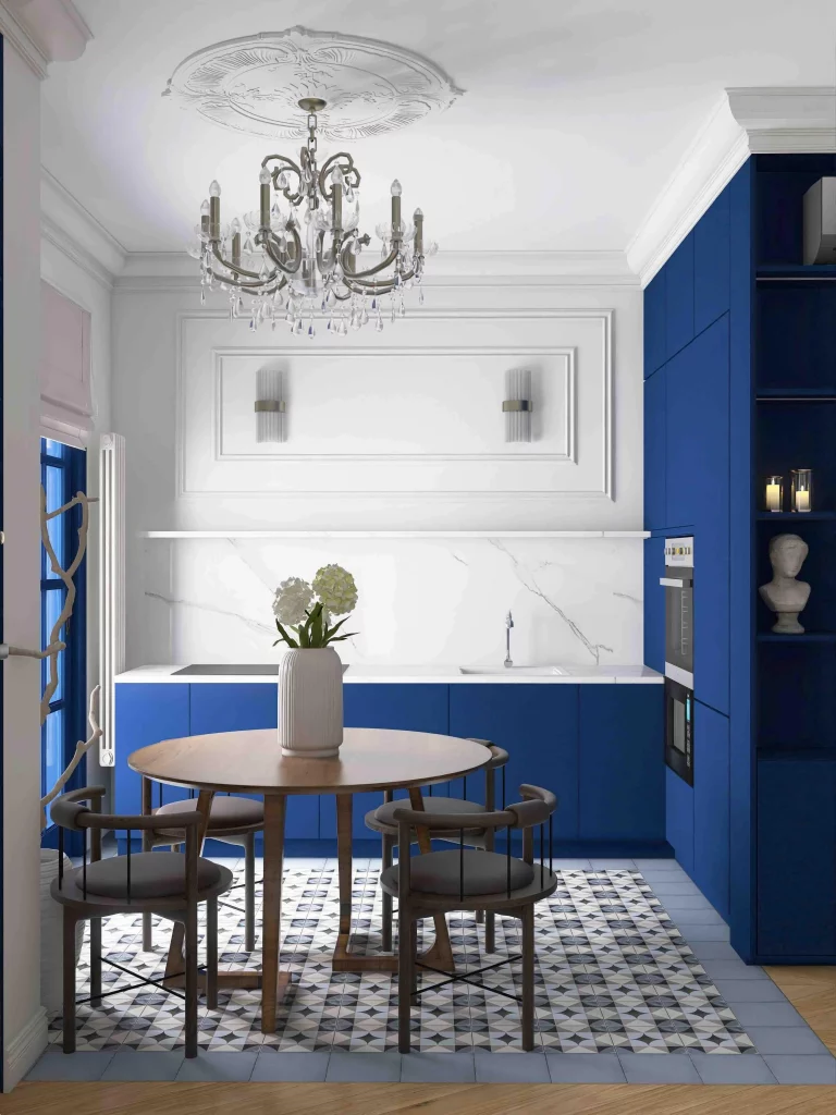
I find the balance here particularly successful because the blue has plenty of white space around it. Rather than covering the entire room in color, the design uses blue to define the kitchen zone and create a clear focal point. The patterned floor introduces blue and gray tones without competing with the cabinetry, while the natural wood table softens the strong contrast. The built-in appliances are also integrated into the blue cabinetry, making the storage wall look cohesive.
If I were using this idea at home, I would treat a saturated blue as the main statement and keep the surrounding surfaces relatively quiet. This approach gives the color room to stand out while preventing the kitchen from feeling visually crowded. I also like the idea of adding a natural wood element, as the table does here, because it brings warmth and makes a strong blue palette feel more approachable.
Rich Red Cabinets With Warm Beige Tile
The fourth kitchen takes a completely different approach with rich red cabinetry covering the main wall and extending around the corner. The cabinet doors have raised detailing, and several glass-front sections display dishes and glassware. A warm beige backsplash made from glossy rectangular tiles sits between the cabinets and white countertops. In front of the main work area is a compact white table with stools, while an open shelving unit on the left provides space for decorative and dining pieces.
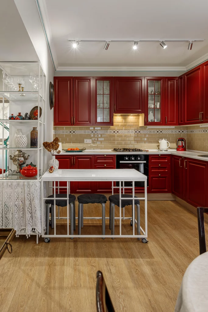
I think the warm beige tile is the key to making this bold red cabinetry feel balanced. The backsplash introduces a softer neutral transition between the saturated cabinets and the light countertops, while the wood-toned floor adds another warm layer. The white table and shelving unit also give the room visual breathing space. Instead of competing with the red, these lighter elements help frame it and make the cabinet color feel intentional.
This is the kind of palette I would recommend to someone who wants a kitchen with a strong personality. I would keep the secondary colors warm and relatively simple, as they are here, so the red remains the dominant feature. The glass-front cabinets are another detail I would consider because they break up a large run of solid red doors while allowing selected pieces to become part of the room’s styling.
Black and White Minimalism With a Touch of Purple
The fifth kitchen is much quieter, built around white cabinetry, a black backsplash and countertop, and black dining furniture. The kitchen cabinets have flat, clean fronts, while a white sculptural pendant hangs over the small round dining table. Four black chairs create a strong graphic contrast, and a large vase of vivid purple flowers sits on a white surface in the foreground. A dark wall and framed artwork further define the transition between the spaces.
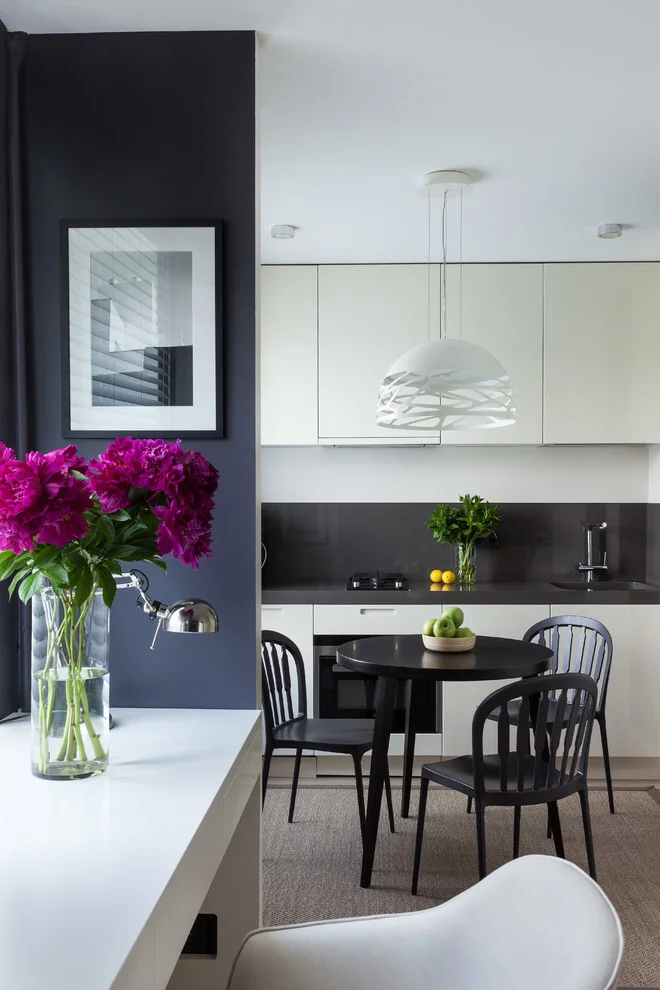
What works especially well here is the simple black-and-white foundation. The two dominant colors create a clean visual structure, while the purple flowers provide a small but noticeable burst of color. I also like the way the round black table and chairs echo the darker kitchen surfaces without making the dining area feel disconnected. The uncluttered cabinet fronts keep the room looking organized and contemporary.
In my experience, black and white is one of the easiest kitchen combinations to personalize because it creates such a flexible base. In this photograph, the purple accent could easily be replaced with another color without changing the basic design. I would follow the same principle and choose one temporary accent color through flowers, fruit, textiles, or artwork while keeping the permanent finishes more restrained.
Cool Navy Blue With a Bright White Dining Area
The sixth kitchen combines dark navy-blue cabinetry with white walls, a white dining table, and a mostly white floor. The tall blue cabinets contain two stacked ovens and continue into the lower cabinetry, creating a substantial block of color on one side of the room. The dining area is positioned beside a large window covered with sheer white curtains, while black decorative chairs and deep burgundy flowers add contrast.
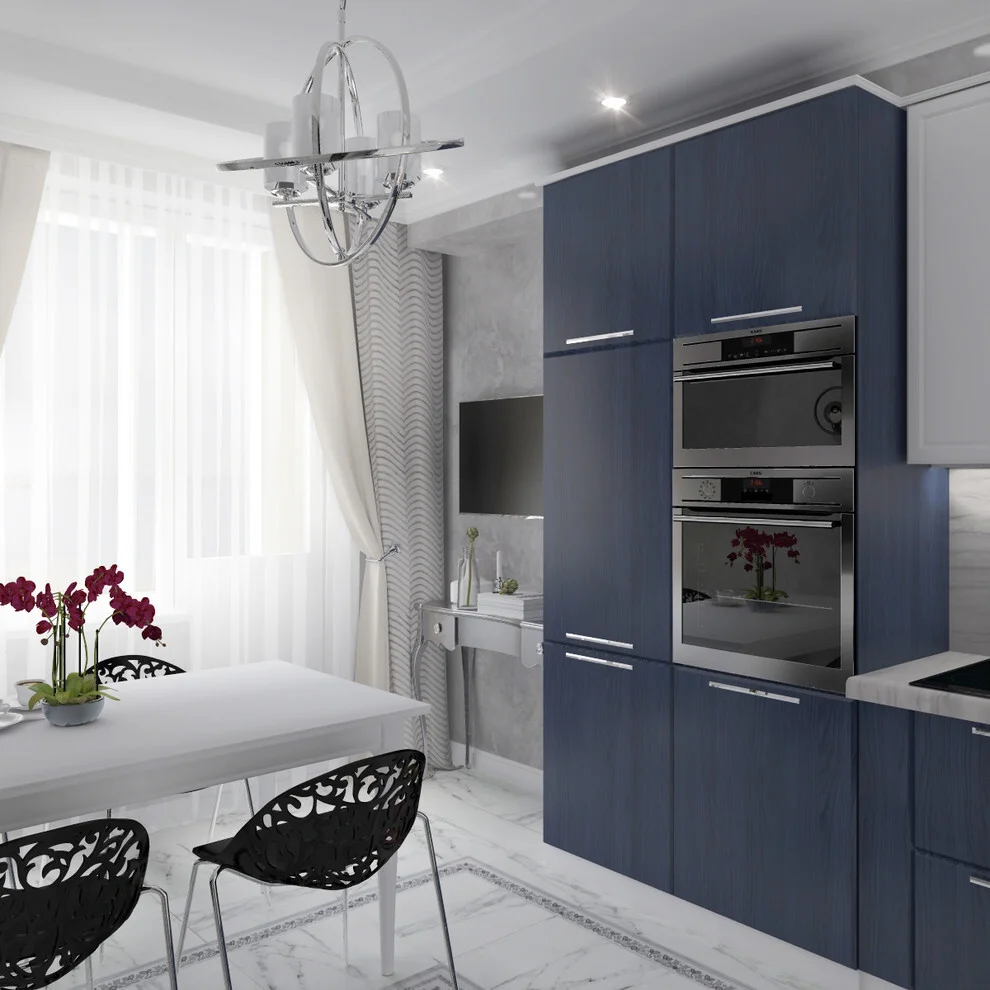
I like how the navy cabinetry creates definition without making the entire room dark. The surrounding white surfaces reflect the daylight coming through the window and provide a clean contrast against the blue. The white dining table continues that brightness, while the black chairs add structure and connect visually with the dark appliances and cabinet details. The combination feels polished but still practical.
For me, navy is one of the easiest darker kitchen colors to work with because it can feel both sophisticated and approachable. I would pair it with generous amounts of white, especially in a room that receives strong natural light. The burgundy flowers shown here are also a good example of using a small warm accent to keep a cool palette from becoming too uniform.
Contemporary Blue and Charcoal With Integrated Lighting
The seventh kitchen moves into a more contemporary palette of muted blue, charcoal, and cool gray. The lower cabinets are blue, while the upper cabinetry is a dark gray with extremely simple fronts. A black countertop and glossy dark backsplash create a continuous visual band across the work area. Under-cabinet lighting and a strip of cool illumination around the ceiling add a modern glow, while black pendant lights hang above the adjacent seating area.
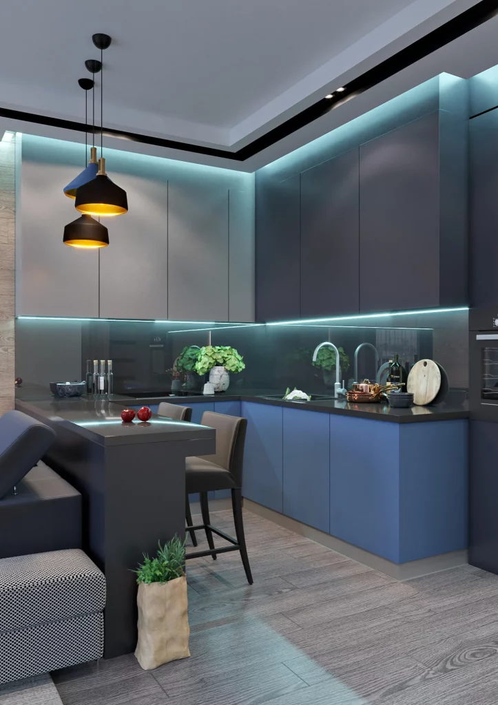
This combination works because the colors are close enough in intensity to feel cohesive, yet different enough to create clear layers. The blue cabinetry gives the lower part of the kitchen a subtle color identity, while the dark upper section makes the room feel grounded. The reflective backsplash catches the integrated lighting and adds depth without requiring a busy pattern. I also notice how the gray floor and upholstered seating continue the cool palette while keeping the room visually connected.
If I were recreating this look, I would pay close attention to lighting because it is a major part of the atmosphere shown here. Darker colors can look completely different under daylight and artificial light, so I would test cabinet samples in the actual kitchen before committing. I also like the combination of matte-looking cabinetry with reflective surfaces because the contrast between finishes gives a restrained palette much more dimension.
Dusty Pink Cabinets With Soft Blue Seating
The eighth kitchen pairs dusty pink cabinetry with pale blue dining chairs, creating one of the softer color combinations in the collection. The cabinets feature traditional raised panels and glass-front doors, while the backsplash and floor are light gray with subtle stone-like variation. A round black dining table sits centrally beneath an elaborate chandelier, and the large window brings daylight into the room. The blue chairs provide a cool counterpoint to the warm pink cabinetry.
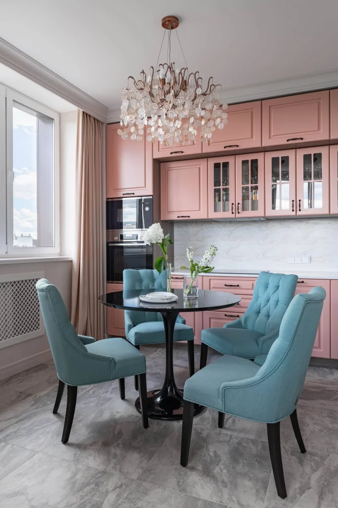
I think the most successful element here is the balance between warm and cool pastel tones. The pink cabinets create warmth across the kitchen wall, while the blue chairs introduce a fresh contrast around the dining table. The black table and chair legs give both colors a stronger visual anchor, preventing the room from becoming overly delicate. The gray flooring and pale backsplash then act as neutral elements that allow the pink and blue to remain the focus.
This is a color combination I would consider when I wanted something distinctive without using highly saturated shades. The trick, in my view, is choosing softened versions of both colors so they share a similar visual weight. I would also keep the permanent finishes neutral, as shown here, because it makes the pastel combination easier to live with and update over time.
Soft Green Cabinetry With Warm Pink Walls
The ninth kitchen uses a pale green cabinetry color against warm pink walls, creating a gentle contrast that feels distinctly characterful. The cabinetry includes raised panels, glass-front display doors, crown molding, and brass-toned handles. A white marble-look backsplash and countertop brighten the work area, while the integrated microwave sits neatly within the cabinet run. The floor changes from a warm herringbone-like wood surface to a lighter patterned section near the work zone.
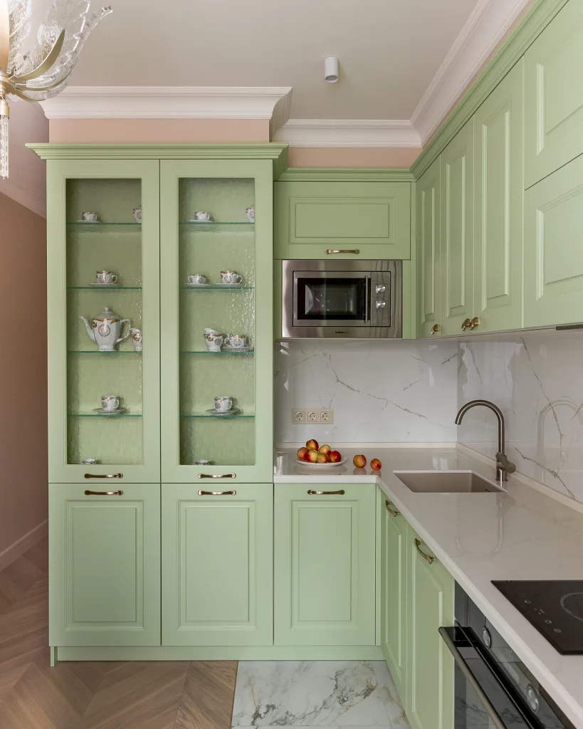
What I find interesting is how the green and pink are balanced rather than treated as competing statement colors. The green cabinetry occupies most of the kitchen, but the soft pink wall color remains visible above and around it, giving the room warmth. The glass doors add another visual layer by allowing the displayed cups and teapots to become part of the color story. Meanwhile, the white stone-look surfaces keep the working area bright and visually clean.
For me, this photograph demonstrates how a pastel palette can still feel substantial when the cabinetry has architectural detailing. If I were working with similar colors, I would choose one as the primary cabinet color and use the second more selectively on surrounding walls. The brass-toned hardware shown here also works because its warmth sits comfortably between the green cabinetry and pink wall rather than introducing a sharp metallic contrast.
Deep Green and Walnut for a Refined Dining Kitchen
The final kitchen combines deep green cabinetry with rich brown wood, black countertops, and charcoal upholstered dining chairs. The cabinetry stretches across the back wall in a clean, highly organized arrangement, with one central glass-front section breaking up the solid upper storage. A wood backsplash sits between the upper and lower cabinets, while the dining area features a large round black table and several dark upholstered chairs. The wood flooring brings additional warmth into the lower part of the room.
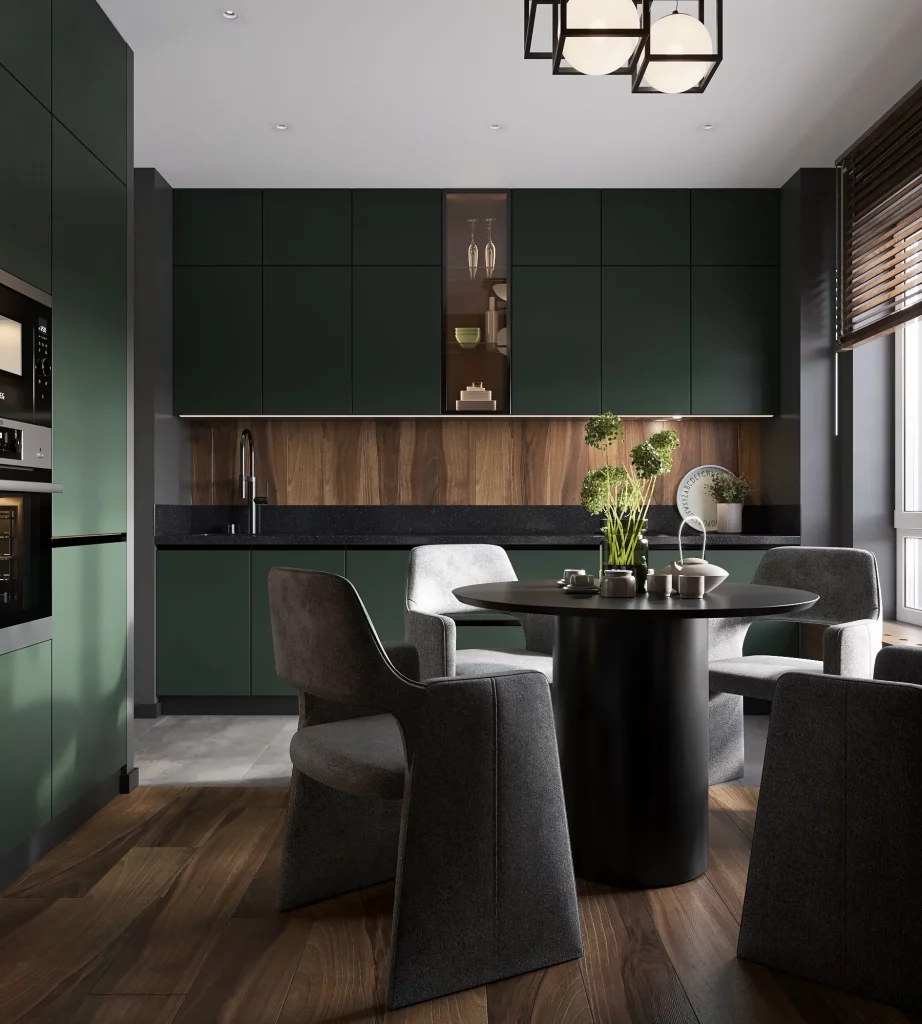
I particularly like the way the green and wood work together because neither one overwhelms the other. The deep green establishes a strong, sophisticated base, while the wood backsplash and flooring add natural warmth and visible texture. The black countertop and dining table create continuity between the kitchen and eating area, and the lighter upholstery on some of the chairs prevents the dining zone from becoming too visually heavy.
From my perspective, this is one of the most versatile darker combinations in the collection. I would use a deep green on cabinetry when I wanted more character than a neutral kitchen could provide, then introduce wood through one or two substantial surfaces rather than scattering many small accents throughout the room. The result shown here feels composed because the colors are repeated across the kitchen and dining area without becoming overly matchy.
Deep Green Cabinets With Warm Wood Accents
The first kitchen combines deep green cabinetry with warm brown wood across the upper cabinets and wall surfaces. I like how the green cabinetry creates a strong focal point while the wood adds warmth and natural variation. A white marble-look backsplash and countertop brighten the composition, while the adjoining dining area introduces beige upholstered chairs, a round white table, and a large pale botanical wall image.
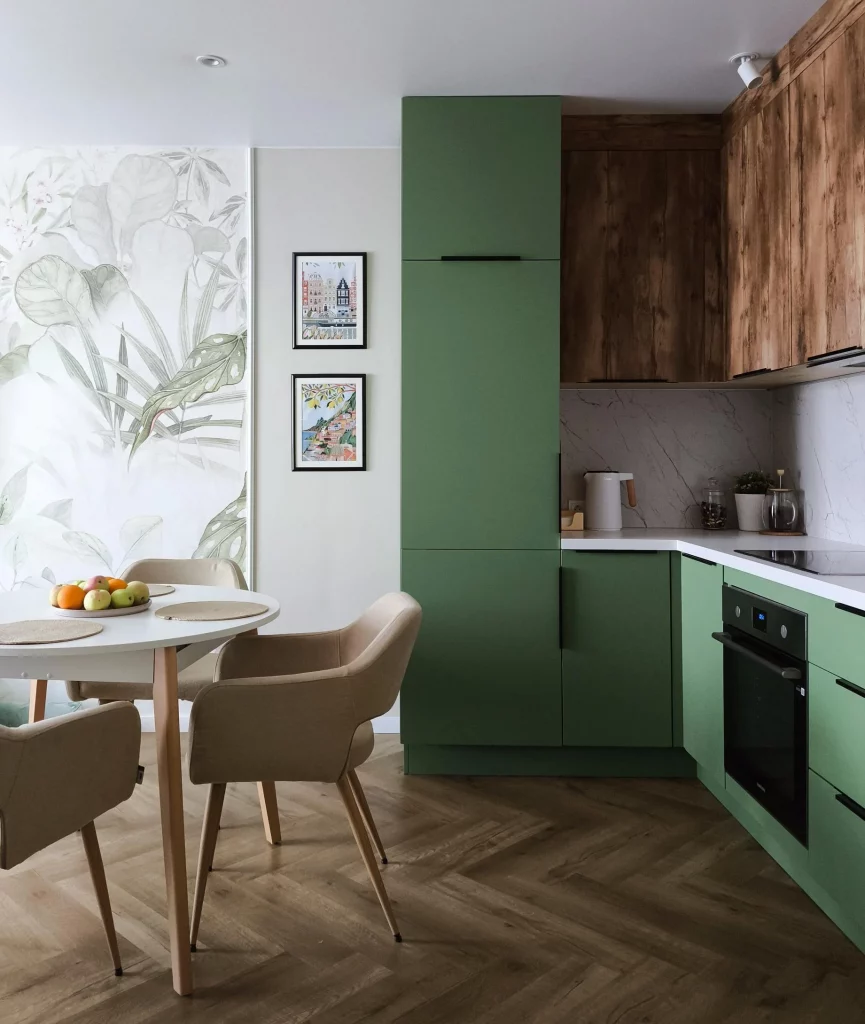
What works especially well here is the balance between the darker cabinet color and the lighter surfaces around it. The tall green storage keeps the kitchen visually cohesive, while the wood above the counter prevents the darker green from feeling too heavy. I also like the way the dining area softens the stronger kitchen palette with creamy upholstery and light finishes.
From my perspective, this is a great example of how to use a saturated cabinet color without making the entire room feel dark. I would keep surrounding surfaces relatively quiet, just as shown here, and let the green cabinetry remain the main color statement. The combination of green, natural brown, white, and soft beige feels considered without looking overly coordinated.
Rich Red Cabinetry With Refined Traditional Details
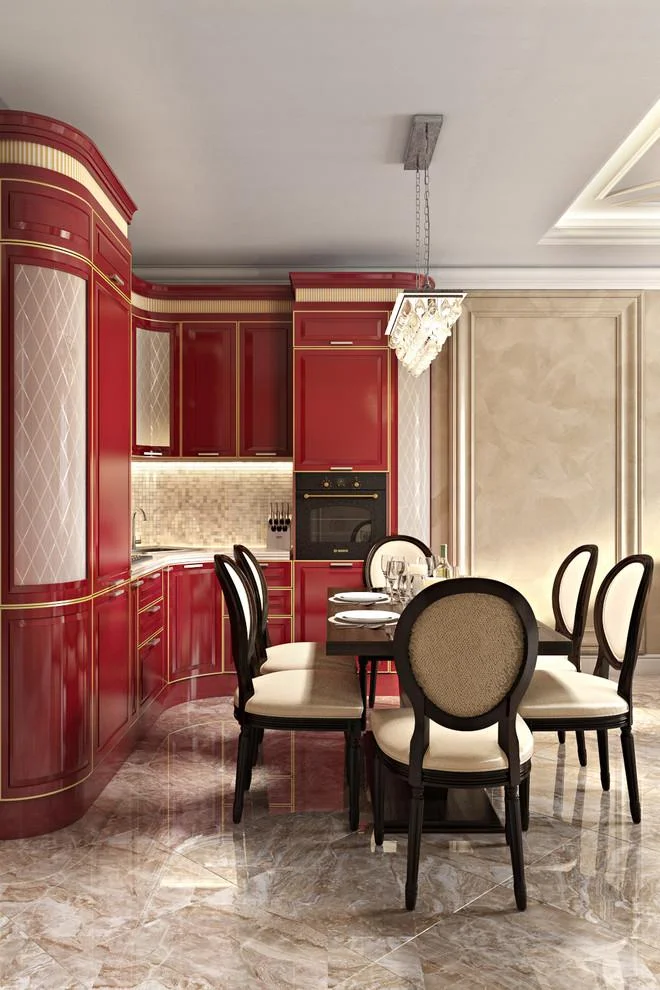
This kitchen takes a much more decorative approach, using rich red cabinetry with raised panels, curved corners, gold-colored trim, and glass-front doors with a diamond pattern. I can see a compact kitchen fitted into a larger dining area, with black-framed chairs, cream upholstery, a dark dining table, and a highly patterned stone-look floor. A small mosaic backsplash adds another layer of texture behind the cooking area.
I find the color combination successful because the red cabinetry carries most of the visual weight while the cream walls, pale chairs, and reflective floor provide contrast. The black furniture frames also help ground the room and connect naturally with the dark appliances and cabinet details. Instead of spreading the red throughout the entire space, the design concentrates it around the cabinetry.
For me, this image shows that a strong cabinet color can work particularly well when the surrounding finishes are allowed to remain elegant and restrained. The gold detailing is repeated enough to feel intentional, while the pale dining furniture keeps the composition from becoming too visually dense. If I wanted to recreate this look, I would focus on the relationship between one dominant cabinet color and a small number of supporting neutral tones.
Soft Beige Cabinets With a Moody Blue Backsplash
The third kitchen pairs streamlined beige cabinetry with a dark blue tiled backsplash and a black countertop. I immediately notice the clean, handleless cabinet fronts and the way the upper cabinets extend across the corner. Black appliances are integrated into the tall cabinet section, while a simple black faucet and a few cutting boards provide small accents against the blue backsplash.
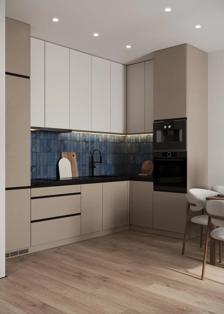
I like this combination because the beige cabinetry keeps the kitchen feeling light while the blue backsplash introduces depth and personality. The black countertop creates a crisp horizontal line between the cabinetry and wall, and the dark appliances look integrated rather than visually distracting. The arrangement also makes efficient use of the corner, with storage and appliances concentrated into a compact footprint.
In my experience, this kind of palette is particularly easy to live with because it has contrast without relying on extremely bright colors. I would use the same principle when choosing a color combination for a modern kitchen: start with a quiet cabinet tone, then use the backsplash to introduce the stronger color. The result feels contemporary but still comfortable enough for everyday use.
Cool Gray Kitchen With Layered Neutral Surfaces
This kitchen uses several shades of gray across the cabinetry, creating a calm and cohesive monochromatic effect. The lower cabinets are a medium cool gray, while the upper cabinetry is lighter and more neutral. A pale marble-look backsplash and warm wood countertop introduce subtle variation, and the black built-in microwave and oven create a strong vertical accent at one end.
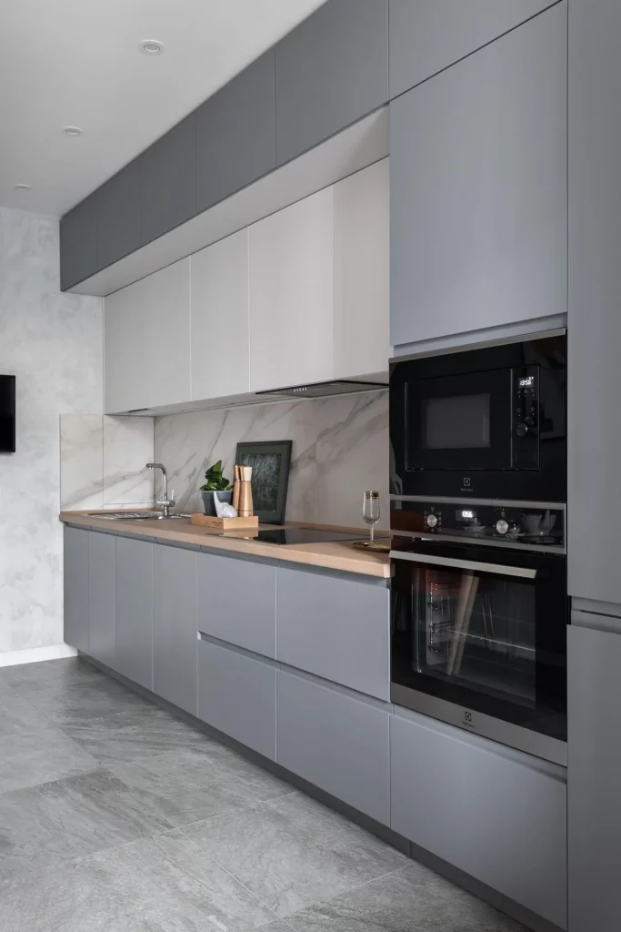
What I appreciate most is the layering of similar tones instead of relying on one flat gray shade. The darker lower cabinets visually anchor the room, while the lighter upper doors keep the wall from feeling too dense. The warm countertop also gives the otherwise cool palette a little softness, and the large-format gray floor continues the understated color story.
I would recommend this approach to anyone who likes neutral kitchens but wants more dimension than an all-white scheme provides. Different gray values can define individual zones while still keeping the whole kitchen visually connected. Here, even the small decorative items on the counter stay restrained, which allows the cabinetry and material combinations to remain the focus.
Blue Cabinetry With Soft White and Wood Tones
The fifth kitchen makes muted blue the main color, using it across the lower cabinetry and tall storage units. The upper cabinets are white with translucent-looking panels, while the backsplash and countertop remain very light. A black faucet, dark handles, and black oven provide contrast, and the wood flooring adds warmth beneath the cool blue cabinetry.
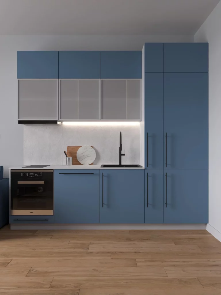
I like the proportion of colors in this kitchen because the blue feels substantial without taking over the room. The tall blue storage visually frames the kitchen, while the white upper cabinets create a lighter transition toward the ceiling. The wood floor is especially useful here because it prevents the blue-and-white combination from feeling too cold.
For me, this is one of the easiest palettes in the collection to adapt to a real home. A muted blue can provide personality while still behaving almost like a neutral, especially when it is combined with white and natural wood tones. I would also keep the hardware and appliances visually simple, as shown here, so the cabinet color remains the defining feature.
Dusty Rose And Burgundy With Graphic Contrast
This kitchen takes a more adventurous direction with dusty rose and burgundy cabinetry set against a deep burgundy wall. The backsplash features a bold black-and-white diagonal pattern, while the lower cabinets combine pale gray fronts with pink drawers. A large dark refrigerator and sculptural contemporary lighting reinforce the dramatic contrast.
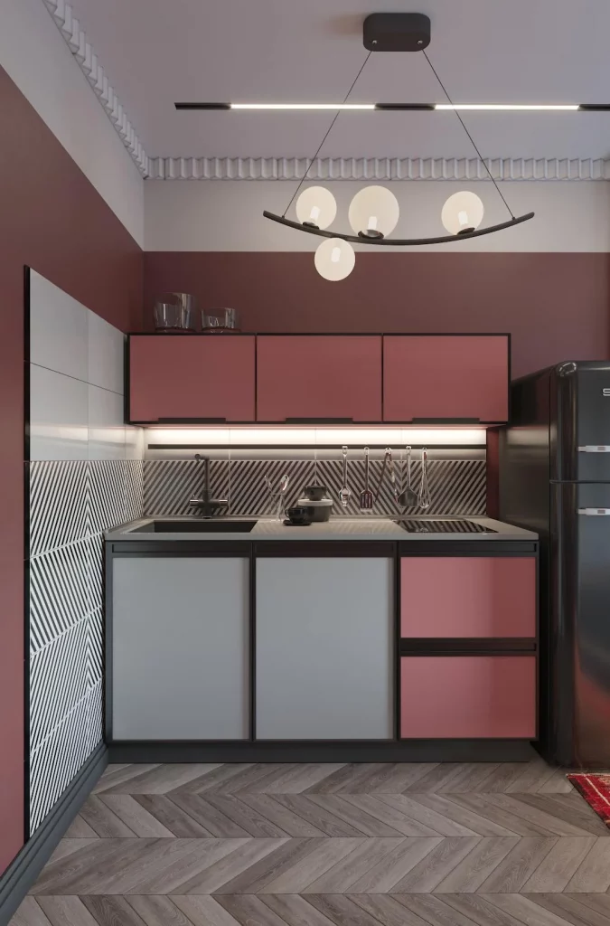
I find the color balance particularly interesting because the kitchen does not depend on a single shade of pink. Several related tones create depth, while the gray lower doors give the eye a place to rest. The graphic backsplash adds movement and makes the otherwise block-like cabinetry feel more dynamic.
I would approach a palette like this with confidence but keep the number of competing finishes under control. The image works because the strongest colors are concentrated around the cabinetry and walls, while the black-and-white backsplash provides a defined graphic counterpoint. For someone who wants a kitchen with real personality, this is a good reminder that color can be treated almost like architectural structure.
Earthy Wood And Charcoal For A Contemporary Kitchen
This kitchen combines light wood cabinetry with charcoal and dark gray surfaces for a distinctly grounded look. Vertical dark paneling covers much of the wall behind the counter, while the wood cabinets introduce a warmer, lighter element. A dark stone-look backsplash and countertop continue the deeper tones, and a compact gray island creates a practical separation between the kitchen and adjoining living area.
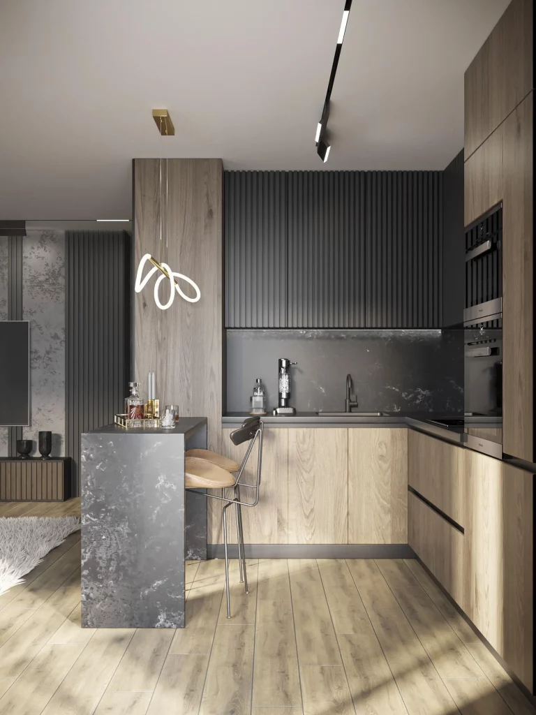
The combination works because the warm wood and charcoal tones balance each other rather than competing. The wood softens the darker wall treatment, while the charcoal surfaces add definition around the sink and work area. I also like the way the island uses the same dark material while providing a small seating area with a simple stool.
From my perspective, this is a strong example of an earthy kitchen palette that still feels modern. I would use the darker material selectively, concentrating it on walls, counters, or architectural features while allowing wood to carry warmth across the cabinetry and floor. The result shown here feels intimate and sophisticated without needing many decorative accessories.
Warm Taupe Kitchen With Subtle Green Seating
The eighth kitchen is built around a warm taupe and beige palette, with full-height cabinetry and simple flat-front doors extending along two walls. The countertop and backsplash are pale and understated, while black appliance details and slim dark lines add definition. At the dining edge, a wooden table and muted green upholstered chairs introduce the only noticeable color accent.
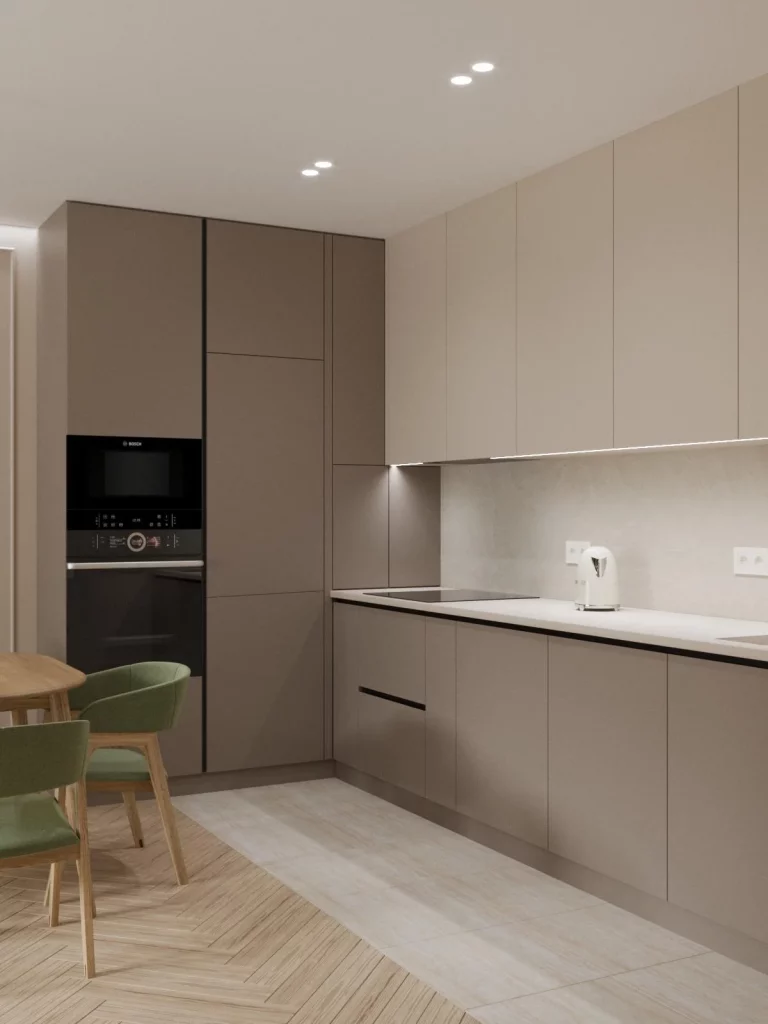
I like how quietly the colors work together here. The taupe cabinetry blends into the surrounding architecture, which makes the room feel visually spacious, while the black lines around the countertop and appliances prevent everything from becoming too soft. The wood table and green chairs bring just enough variation to distinguish the dining zone.
For me, this is a useful example of how a kitchen can feel warm without relying on strong cabinet colors. If the goal is a calm and timeless atmosphere, I would start with a warm neutral cabinet finish and then introduce color through furniture or smaller elements. The muted green shown here is especially effective because it adds personality without disrupting the restrained palette.
Bold Magenta Cabinets With Black And Turquoise Details
This kitchen is the most expressive color combination in the collection, with intense magenta cabinetry covering the upper and lower storage. Black small-format tiles create a dark backsplash, while turquoise decorative graphics appear across several cabinet fronts. A vivid blue and orange storage element on the right adds another burst of color, and the dark floor gives the room a strong base.
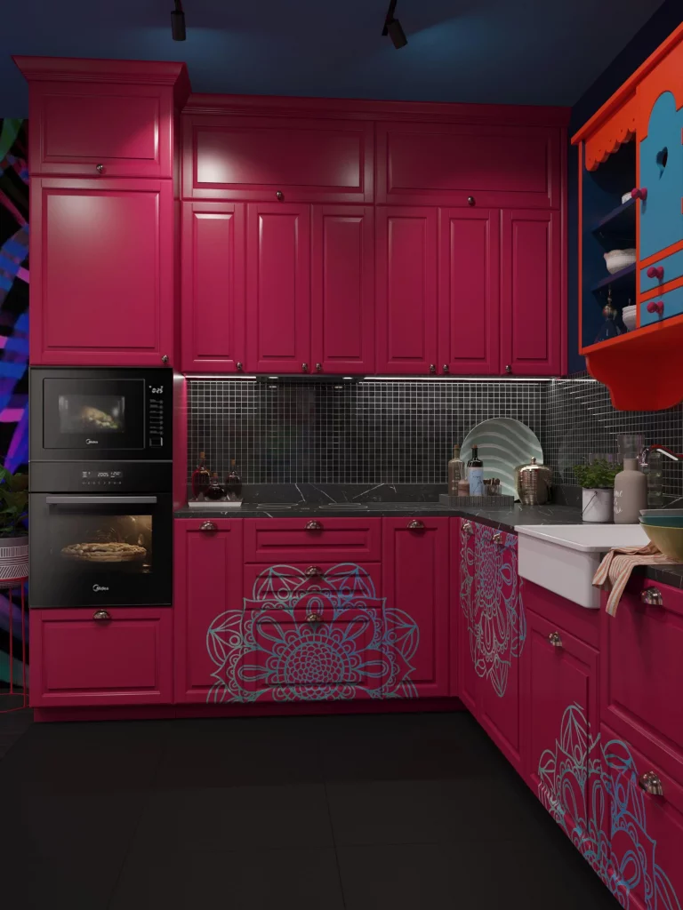
What makes this design work for me is that the color is intentional from floor to ceiling. The dark backsplash and floor give the bright cabinetry some visual boundaries, while the turquoise patterns create repeated accents across the room. Even the decorative storage on the right continues the playful, highly saturated approach instead of introducing a completely unrelated finish.
I would treat a kitchen like this as an opportunity for self-expression rather than trying to make every surface neutral. The important lesson I take from this image is that bold color works best when it is repeated deliberately. If I were adapting the idea to a smaller space, I would probably choose one dominant vivid cabinet color and one secondary accent rather than trying to reproduce every color visible here.
Sunny Yellow Cabinets With Patterned Tile
The final kitchen brings together warm yellow cabinetry, white upper cabinets, and a patterned backsplash with repeating ornamental motifs. The yellow appears across the main storage units and tall cabinet sections, while the white cabinetry lightens the upper portion of the room. Black appliances provide contrast, and the adjoining dining area continues the warm palette with a mustard-colored upholstered chair and a wood-toned table.
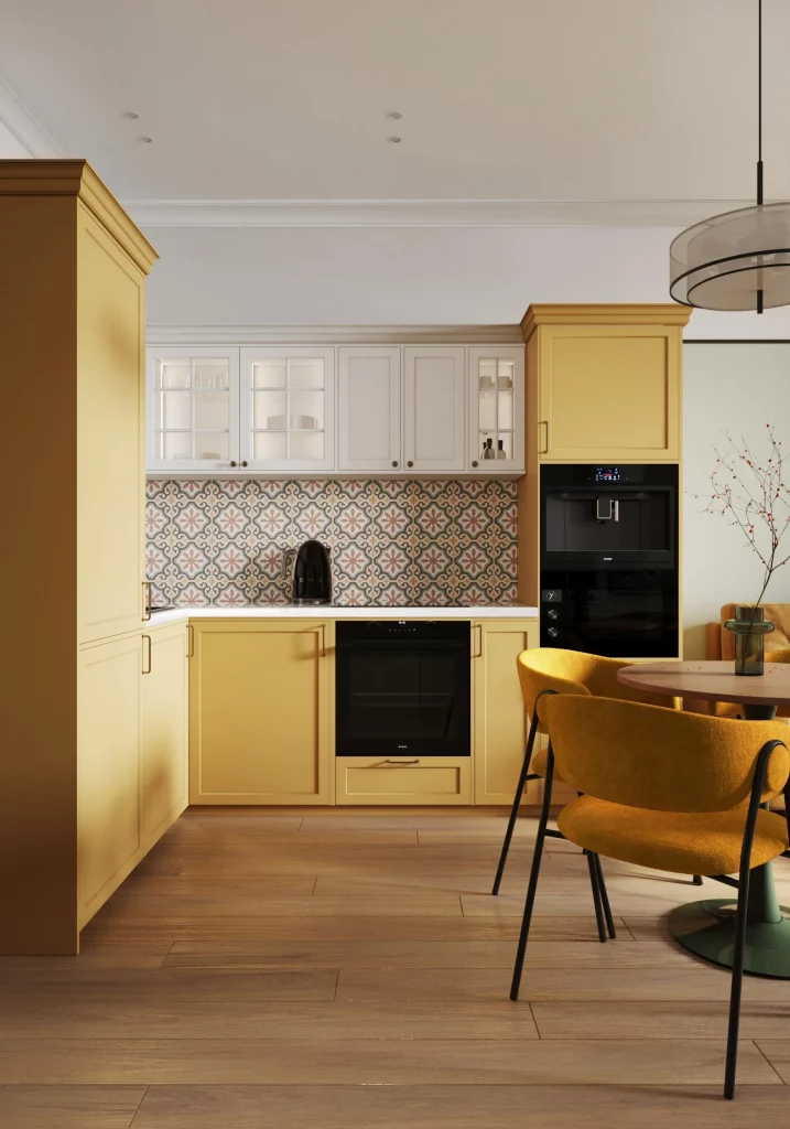
I think the strength of this kitchen comes from the way the yellow is balanced by white rather than surrounded by more intense colors. The patterned backsplash adds visual interest between the two cabinet colors, while the wood floor and dining furniture reinforce the warmth of the yellow. The black appliances also provide a practical contrast that helps the lighter colors look more defined.
For me, this is a great reminder that yellow can feel sophisticated when its surroundings are carefully controlled. I would pair a warm cabinet yellow with soft white surfaces and natural wood, then use patterned tile selectively as shown here. That approach keeps the color cheerful and distinctive while giving the kitchen enough visual structure for everyday living.
Soft Green and Cream Kitchen With a Geometric Backsplash
This compact kitchen pairs muted sage-green lower cabinetry with tall matching storage on the left, while the upper cabinets are finished in a warm creamy beige. A light wood countertop introduces a natural contrast, and the white backsplash features a subtle geometric chevron-like pattern. I also notice integrated black appliances, a sculptural faucet, warm under-cabinet lighting, and a gray wood-look floor laid in a herringbone pattern. The result feels calm, contemporary, and carefully balanced.
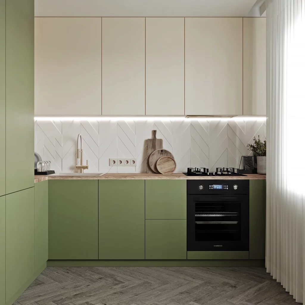
I think the two-tone cabinetry works particularly well because the darker green is concentrated below eye level, while the lighter upper cabinets keep the room visually open. The uninterrupted cabinet fronts also make the compact layout feel more organized. The wood countertop adds just enough warmth to prevent the green-and-cream combination from feeling flat, while the patterned backsplash gives the otherwise simple cabinetry a subtle focal point.
For a similar look, I would keep the main cabinetry fairly simple and let the color combination do most of the decorating work. A muted green is especially easy to pair with cream because both shades have a softened, natural quality. I also like the idea of using warm under-cabinet lighting with this palette, as shown here, because it brings out the warmth of the countertop and makes the backsplash pattern more noticeable.
Taupe Kitchen With Elegant Dining Seating
This kitchen uses several closely related taupe and beige shades across the cabinetry, creating a soft monochromatic background. The lower cabinets have framed fronts and metallic handles, while the upper cabinets are smoother and more streamlined. A pale stone-look backsplash runs behind the countertop, and a round light wood dining table sits in front of the kitchen with four upholstered chairs. The standout detail is the large sculptural pendant light above the table, which gives the neutral room a strong decorative focal point.
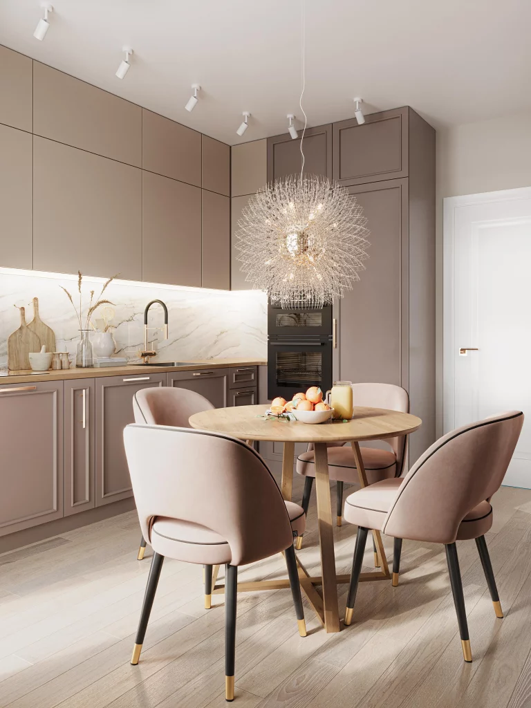
I like how the dining area becomes part of the kitchen rather than feeling like a separate zone. The round table softens all the straight cabinet lines, while the upholstered chairs add comfort and another layer of texture. Because the cabinetry stays within a narrow neutral color range, the dramatic light fixture can make an impression without competing with several other strong colors.
When I’m looking at neutral kitchens like this, I find that variation in finish is more important than adding lots of color. Here, the matte-looking cabinet surfaces, pale backsplash, wood table, upholstered seating, and reflective lighting fixture create enough visual contrast. If I were recreating this palette, I would choose several taupe shades with slightly different undertones rather than trying to match everything perfectly.
White and Deep Burgundy Two-Tone Kitchen
This compact kitchen makes a much stronger color statement with deep burgundy lower cabinets contrasted against large white upper cabinets. The cabinetry has simple recessed detailing and slim metallic handles, while the backsplash and countertop are both light, creating a clean transition between the two cabinet colors. A stainless-steel sink and faucet sit centrally below the upper cabinets, and a decorative round piece with dark brown and burgundy tones adds personality to the backsplash area. The warm wood floor completes the palette.
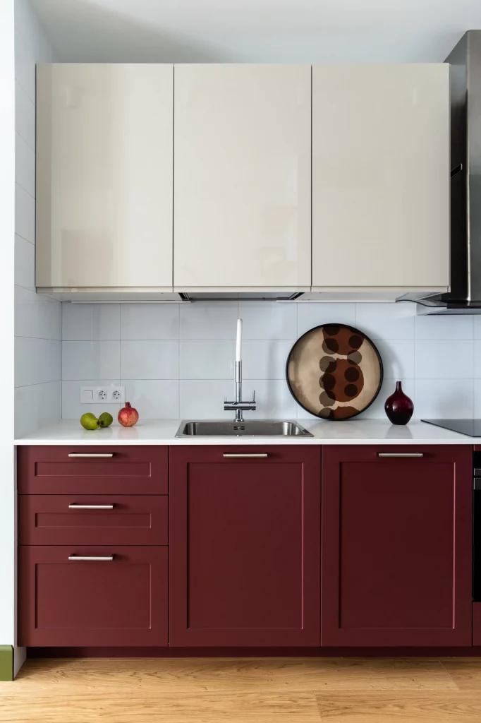
The burgundy cabinetry gives the kitchen depth without making the entire room dark. I particularly like the decision to keep the upper half white because it visually lifts the space and provides a quiet background for the richer lower color. The warm flooring also helps connect the burgundy with the decorative accents, making the combination feel intentional rather than abrupt.
For anyone interested in a deeper kitchen color but worried about overwhelming a small room, this is a useful approach. I would concentrate the strongest shade on the lower cabinets and keep the countertop and backsplash light. The restrained hardware and uncomplicated cabinet design shown here also help the burgundy remain the star of the room without creating visual clutter.
Charcoal and White Kitchen With Burgundy Dining Chairs
This kitchen takes a much darker direction, combining charcoal-gray lower cabinetry and tall storage with creamy white upper cabinets. A dramatic dark stone-look backsplash extends around the corner and creates a strong backdrop for the black cabinetry. In front of the kitchen is a round wood dining table surrounded by burgundy upholstered chairs, while a large layered pendant light hangs above. The flooring is a large neutral gray tile, which reinforces the contemporary character of the room.
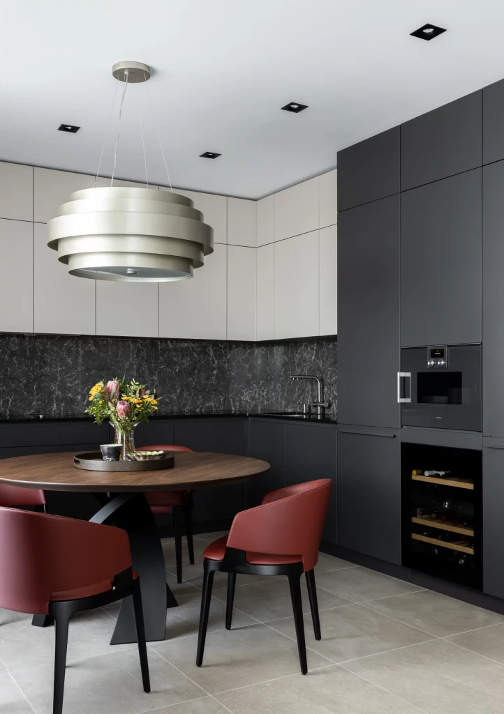
I think the color balance is particularly successful because the room does not rely on one dark tone alone. The white upper cabinetry keeps the walls from becoming visually heavy, while the burgundy chairs introduce warmth against the charcoal surfaces. The wood table acts as another transition point between the cooler dark cabinetry and the warmer seating, making the palette feel more layered.
If I were working with this combination, I would use charcoal as the architectural-looking foundation and add only a few warmer accents. Burgundy is especially effective here because it is deep enough to feel sophisticated while still breaking up the black-and-gray palette. I would also keep the lighting purposeful, since darker cabinetry and backsplash materials benefit from well-placed illumination like the recessed ceiling lights and pendant shown here.
Sage Green Kitchen With Light Wood Details
This kitchen returns to a soft sage-green palette, using the color across the lower cabinets and a tall bank of storage on the left. Creamy upper cabinets create a lighter upper zone, while a pale wood countertop runs along the work surface. The white geometric backsplash echoes the pattern seen in the cabinetry-free wall area, and warm under-cabinet lighting highlights the transition between the upper and lower sections. A simple upholstered chair with a natural wood frame is visible in the foreground.
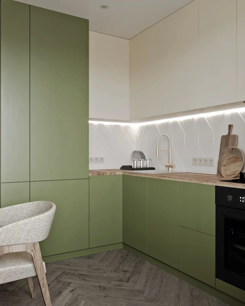
The strength of this design is its consistency. The sage cabinetry provides the main color identity, while cream, white, and pale wood keep the room airy. I particularly like how the tall green storage visually connects with the lower cabinets, giving the kitchen a unified appearance even though the upper cabinetry is a different color.
This is one of the combinations I would consider when someone wants color but does not want an intense kitchen. Sage green has enough presence to make the cabinetry interesting while remaining easy to live with. I would repeat the same basic formula of muted green, warm cream, light wood, and white if I wanted a similar atmosphere, especially in a compact kitchen where too many contrasting colors could quickly become distracting.
Green and Orange Kitchen With a Bright Breakfast Area
This kitchen uses a much more energetic combination of green and orange. The lower cabinets are a medium green, while the upper cabinetry is a saturated orange that continues across the tall storage area. Light wood countertops and flooring soften the stronger cabinet colors. A compact breakfast table extends from the work area near the window, with stools and chairs creating a casual dining zone. A green textured window shade also ties the color palette together.
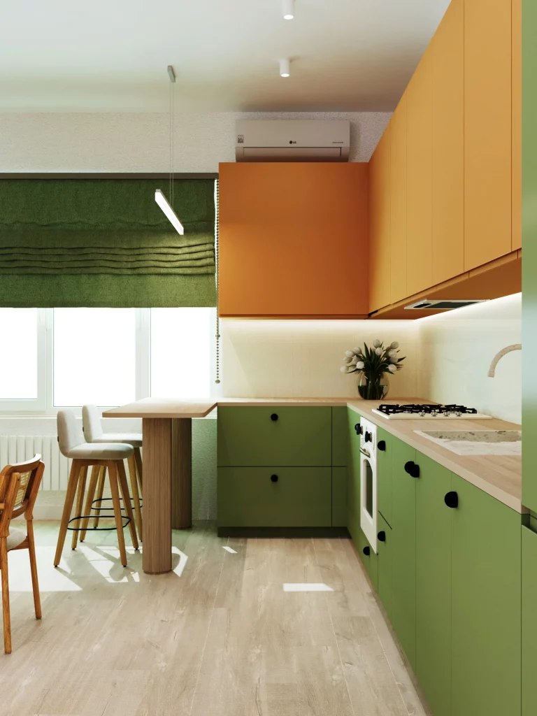
I like how the room uses color to define different visual zones without needing a complicated layout. The green anchors the lower part of the kitchen, while orange gives the upper cabinets a strong presence. The wood surfaces create a neutral bridge between them, which is important because using two saturated colors without a connecting material could easily feel too busy.
For me, this image is a reminder that trending kitchen color combinations do not always have to be subtle. If I wanted to recreate this idea, I would choose one color for the lower cabinetry and another for the upper section, then use wood and simple neutral surfaces to balance them. The large window also helps this palette work because natural light keeps the stronger colors feeling lively rather than visually heavy.
Minimal Charcoal Kitchen With White Dining Chairs
This kitchen is built around a restrained charcoal-gray palette, with tall flat-front cabinetry extending across the back wall and matching dark lower cabinetry visible on the left. The integrated oven is set neatly into the tall cabinet bank, keeping the appliance visually contained. A black dining table sits beside the kitchen and is paired with curved white chairs with slim black legs. The floor shifts to a lighter gray finish, creating contrast against the dark cabinetry.
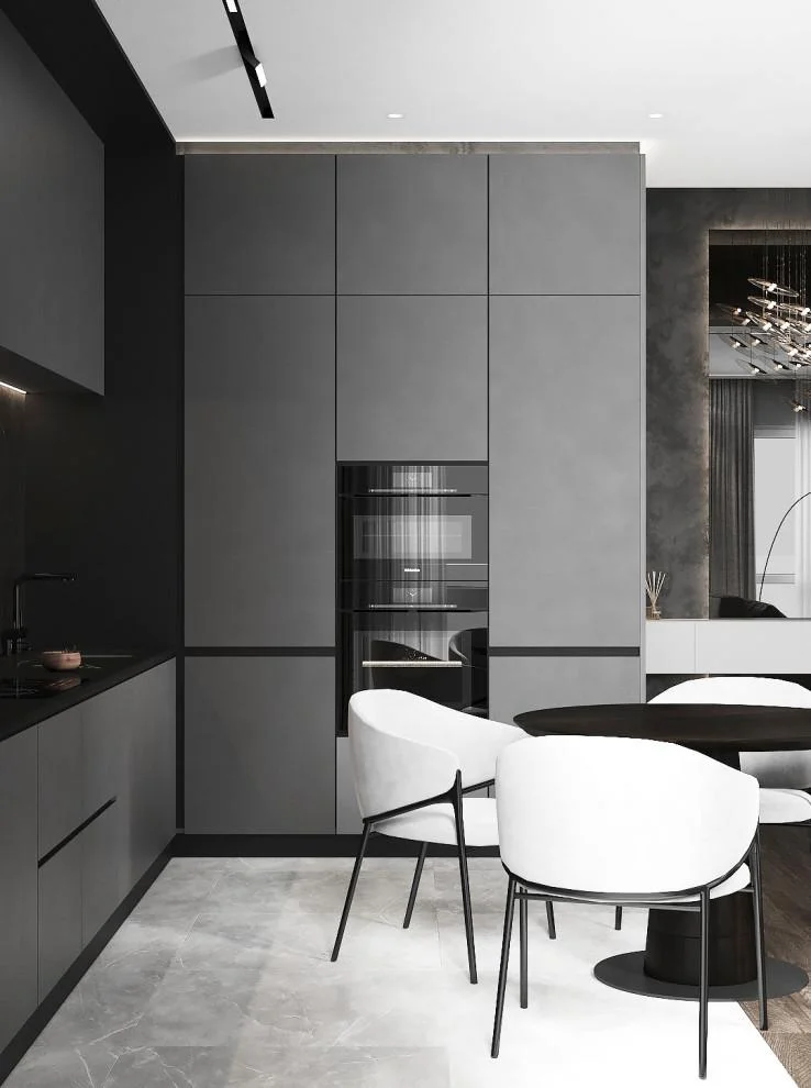
The simplicity of this combination is what makes it effective. The charcoal cabinetry creates a continuous architectural backdrop, while the white chairs introduce a crisp visual break. I also like the way the lighter flooring prevents the room from becoming one large dark block. The concealed or integrated appearance of the appliances further supports the clean, uncluttered aesthetic.
When I see a kitchen like this, I think about the importance of contrast rather than adding decoration. A charcoal-and-white palette can feel sophisticated when the shapes are simple and the surfaces remain visually quiet. I would keep the hardware minimal and use furniture with clean silhouettes, as shown here, so the strong cabinet color remains the defining feature.
White and Mustard Yellow Kitchen With Geometric Cabinet Details
This kitchen combines bright mustard-yellow lower cabinetry with crisp white upper cabinets. The lower cabinet doors feature geometric recessed detailing that gives the color an additional layer of visual interest. A light countertop and pale backsplash create a neutral backdrop, while the black oven and cooktop provide a practical dark accent. Warm wood flooring runs throughout the space and adds softness to the vivid yellow cabinetry.
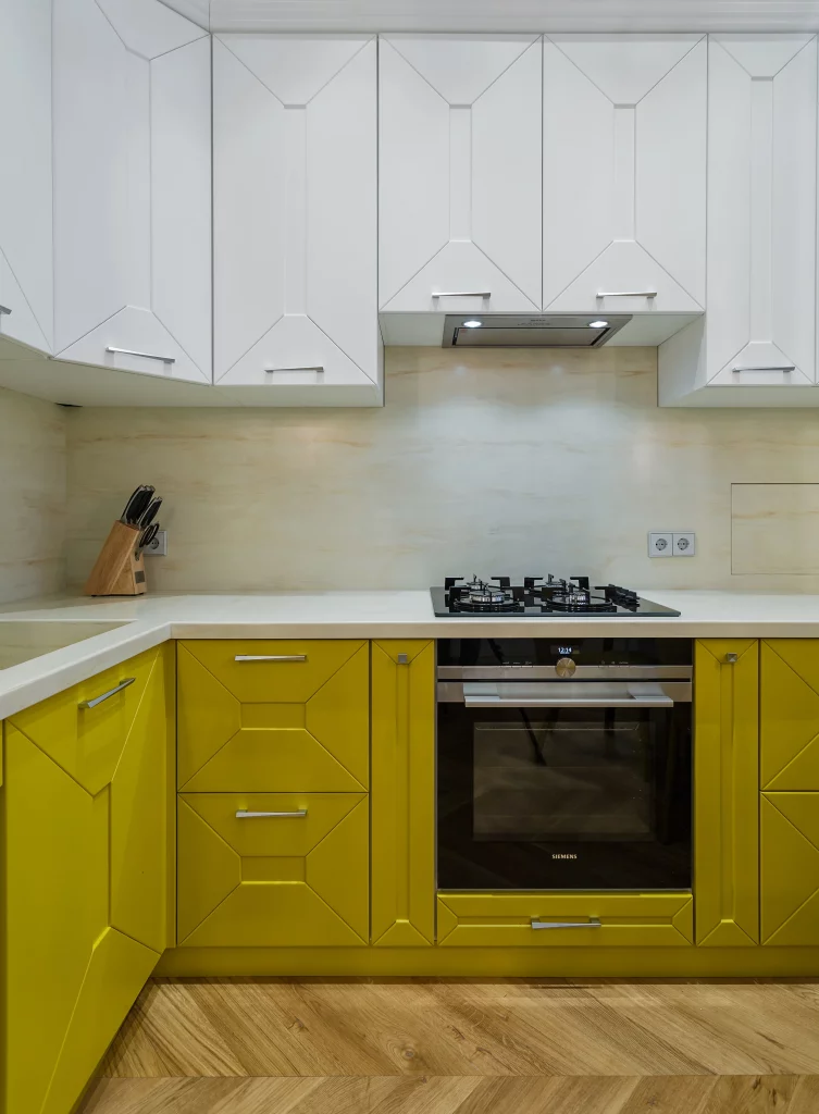
I find this combination particularly effective because the yellow is concentrated in one clearly defined area. The white upper cabinets prevent the saturated color from taking over the entire room, while the wood floor adds a warmer transition underneath. The geometric cabinet fronts also give the yellow more structure, so the color feels connected to the architecture rather than simply painted onto plain surfaces.
If I wanted to bring a similar color into a kitchen, I would use it selectively and let the surrounding finishes remain quiet. Mustard yellow can become visually intense when paired with too many competing shades, but the white, light countertop, and wood flooring shown here give it plenty of breathing room. I also like the dark appliance accents because they provide a small amount of contrast without introducing another dominant color.
Warm Taupe Kitchen With Marble-Look Surfaces and Soft Upholstery
This kitchen combines warm taupe cabinetry with a pale marble-look backsplash and countertop. The upper cabinets are simple and streamlined, while the lower section includes warm wood-toned surfaces. A white rectangular dining table extends into the room and is surrounded by upholstered chairs in a soft blush-beige tone with button detailing and metallic trim. Above the table, a linear black-and-gold light fixture adds a refined contrast to the otherwise warm palette.
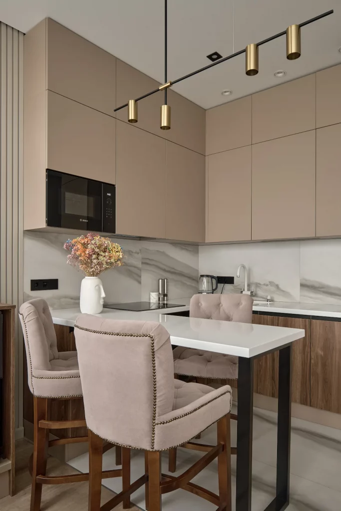
The color combination works because the taupe cabinetry creates a calm foundation while the marble-look surface introduces movement without adding a separate strong color. The upholstered chairs make the dining area feel softer and more comfortable, and their pale tone blends naturally with the kitchen rather than interrupting it. The black-and-gold fixture then provides a sharper accent that gives the neutral scheme some definition.
For a similar look, I would build the palette around warm taupe first and then add one light stone surface and one darker lighting accent. I think this is a useful strategy when I want a kitchen to feel polished without relying on several unrelated colors. Keeping the largest surfaces within the same warm family makes the room easier to style and allows details such as the dining chairs and lighting to stand out naturally.
Moody Taupe Kitchen With Wood Slat Accent Wall
This final kitchen uses a sophisticated combination of taupe cabinetry, dark brown upper storage, creamy white surfaces, and natural wood. A vertical wood slat wall defines the dining area on the left, where a small round table is paired with dark green upholstered chairs. The kitchen itself features integrated black appliances and a dramatic marble-look backsplash with pronounced veining. Warm wood flooring continues the earthy character of the space.
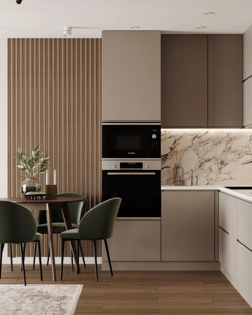
I like the way this room combines several neutral colors without making them look monotonous. The taupe cabinetry forms the main backdrop, the darker upper cabinets add depth, and the wood slat wall introduces a strong vertical texture. The dark green chairs are a subtle color accent that works beautifully with the brown and taupe tones, while the pale countertop and backsplash keep the work area visually open.
From my perspective, this is a great example of how a neutral kitchen can still have plenty of personality. Instead of adding many bright colors, I would work with differences in warmth, depth, and texture, just as this room does. The combination of taupe, dark brown, muted green, pale stone, and wood feels especially adaptable because each shade supports the others rather than competing for attention.
Warm Taupe Kitchen With Brown Accents and Soft Blush Seating
This kitchen combines tall, smooth taupe-gray cabinetry with a warm brown backsplash and matching countertop, creating a calm but inviting color scheme. I especially like the way the cabinetry wraps around the corner while the open wood-toned shelving introduces a deeper accent near the microwave. The black-framed glass partition, black lighting fixtures, and round black table add definition, while the muted peach-toned upholstered chairs soften the darker elements. Warm under-cabinet lighting brings out the richness of the brown backsplash and makes the entire kitchen feel cozy.
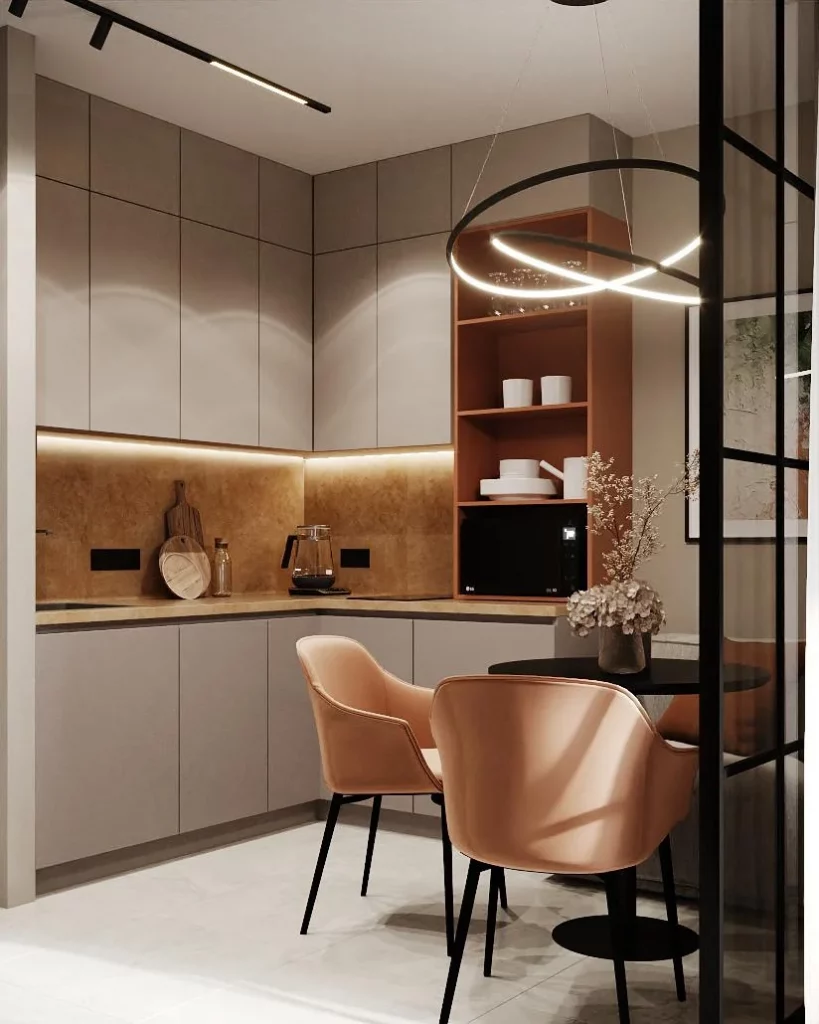
For me, the strength of this combination is the balance between restrained cabinetry and warmer accent colors. The taupe fronts provide a quiet backdrop, while the brown backsplash gives the working area visual depth without competing with the rest of the room. The open shelving also breaks up the continuous cabinetry and keeps frequently visible pieces within easy reach. The rounded chairs and circular pendant create softer shapes against the clean cabinet lines, making the compact dining area feel more comfortable.
If I were recreating this look, I would start with a muted taupe cabinet color and then choose one warm brown finish for the backsplash and worktop. I would keep the lighting warm rather than overly cool because the image shows how much warmth it adds to the neutral palette. The black accents are also important in my view because they give the soft colors enough contrast to feel intentional rather than washed out.
Minimal Beige Corner Kitchen With Marble and Sculptural Flooring
This kitchen takes a much quieter approach, using beige cabinetry across both walls with very discreet seams and integrated appliances. I notice the pale marble-like surface along the left wall, a softly toned backsplash, and a dramatic gray marble-effect floor with large angular pieces. The ceiling has a rounded transition at the corner, which gives the otherwise geometric room a more fluid appearance. Small gold-toned cylindrical ceiling lights add a restrained metallic accent without disturbing the neutral palette.
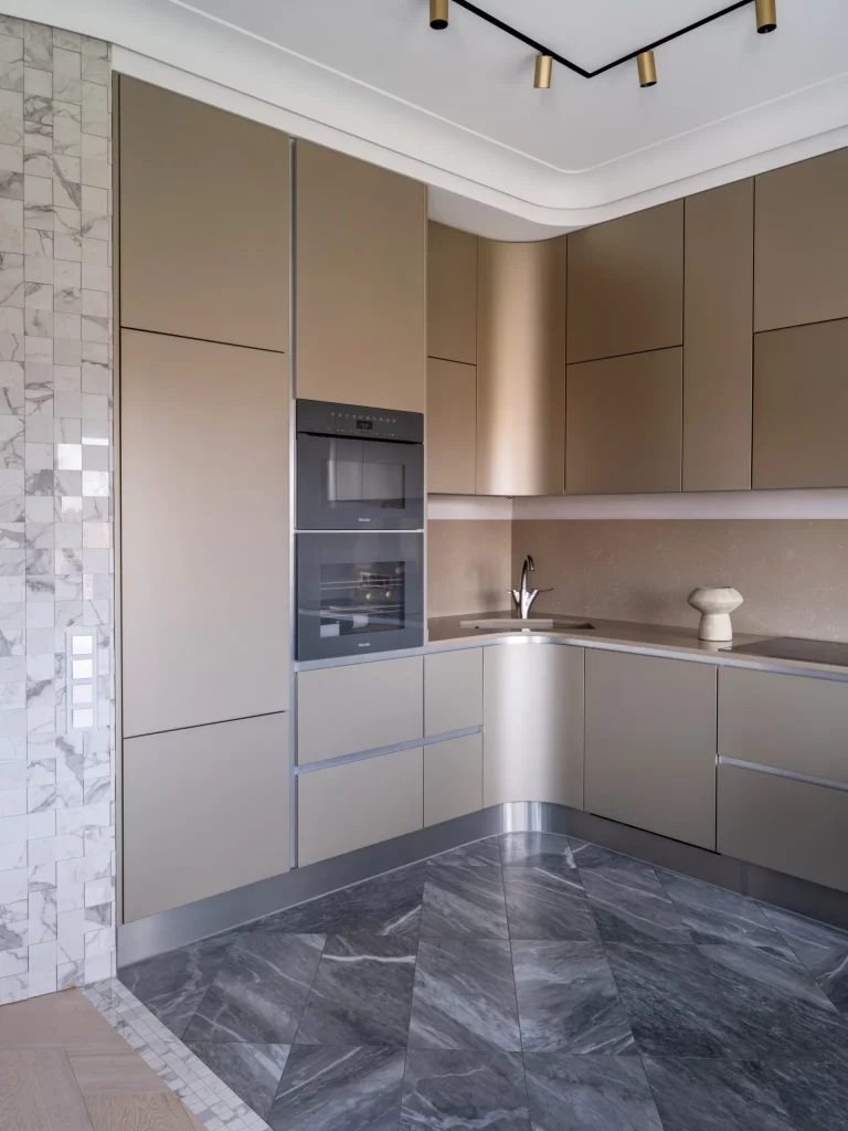
I think this combination works particularly well because the cabinetry stays visually calm while the floor provides most of the room’s pattern and contrast. The L-shaped layout uses the available corner efficiently, and the built-in oven and microwave keep the appliances visually integrated into the tall cabinet wall. The simple countertop and backsplash allow the unusual floor to remain the main visual feature, which helps the room feel sophisticated without requiring lots of decoration.
Personally, I would use this image as inspiration for anyone who wants a neutral kitchen but does not want it to feel completely flat. The trick is to vary texture and scale rather than adding many different colors. Here, the subtle beige cabinetry, pale wall surface, metallic details, and expressive gray flooring create enough variation while staying within a controlled palette. I would keep the accessories equally restrained so the architectural details remain visible.
Burgundy and White Kitchen With a Refined Contrast
This kitchen creates a strong color statement by pairing crisp white upper cabinetry with deep burgundy lower cabinets. I can see the burgundy continuing into the upholstered dining chairs, giving the room a cohesive lower layer of color. A gray speckled backsplash and countertop bridge the two cabinet colors, while the dark round dining table adds another grounded element. The light wood flooring and white walls keep the darker burgundy from making the room feel visually heavy.
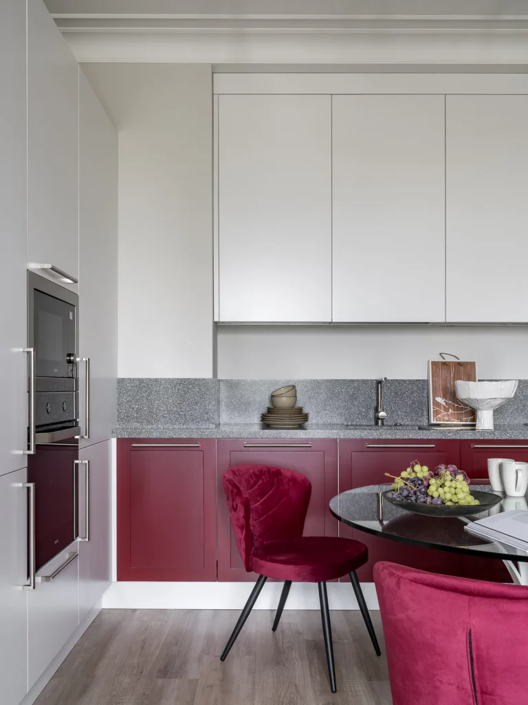
What I like most is the repetition of burgundy at different heights. The lower cabinets establish the main color, while the chairs bring that same shade into the dining area, making the two functions feel connected. The gray worktop is also a practical visual transition between the white and burgundy surfaces. The tall integrated appliances on the left maintain the clean vertical lines of the cabinetry instead of interrupting the color-blocked effect.
If I were using this palette in my own kitchen, I would take the same approach of letting one deeper color dominate a specific zone and repeating it selectively elsewhere. Burgundy can feel very rich, so I think pairing it with white is an effective way to keep the overall room balanced. The image also reminds me that upholstery can be just as useful as cabinetry when introducing a strong kitchen color, especially when the furniture is positioned directly beside the cabinets.
Blush Pink Kitchen Against a Dramatic Dark Backdrop
This kitchen shows a much bolder interpretation of pink, with soft blush-pink lower cabinetry set against very dark walls and black upper display cabinets. The black countertop creates a strong horizontal line across the room, while the glass-front upper storage allows dishes and glassware to remain visible. A large white pendant light provides a striking contrast above the work area, and the pale herringbone wood flooring brings warmth underneath the darker palette. The pink cabinetry feels especially noticeable because the rest of the room is intentionally restrained.
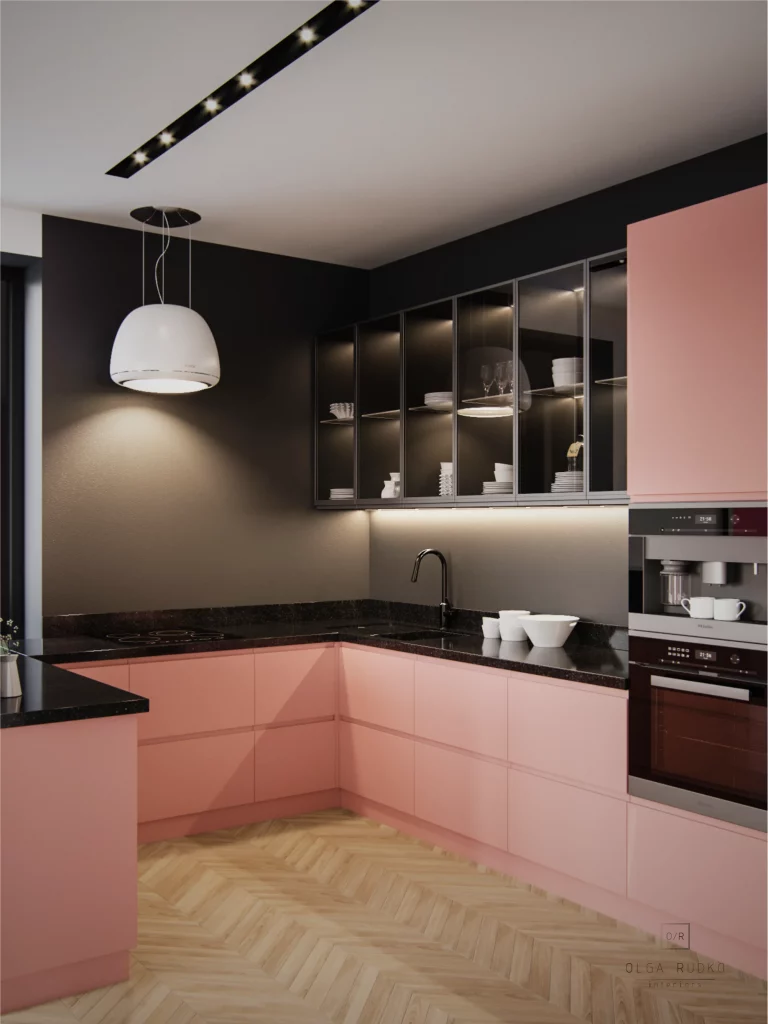
I find this combination effective because the pink is given enough contrast to look sophisticated rather than overly sweet. The dark cabinetry and countertop visually anchor the lower cabinets, while the glass doors add some lightness to the upper section. The illuminated display shelves also provide depth against the dark background. From a practical perspective, the U-shaped arrangement keeps the main work surfaces concentrated around the corner while the tall appliance section remains neatly integrated on the right.
I would approach a palette like this by treating blush pink as the primary statement color and using black or charcoal around it for definition. The image shows that you do not need many decorative colors when the cabinetry itself provides such a clear focal point. I also like the contrast between the sleek cabinetry and the herringbone floor, because the flooring introduces a warmer, more tactile layer without competing with the pink and black combination.
Cream Kitchen With Ribbed Cabinetry and Warm Wood Dining Furniture
This kitchen is built around a soft cream palette, with pale cabinetry extending across the walls and a matching light backsplash. The upper cabinet doors on the left have a fine vertical ribbed texture, adding subtle visual interest without introducing another color. Gold-toned hardware and faucet details add warmth, while the black built-in appliances create controlled contrast. In the dining area, a round wood table and four curved cream upholstered chairs introduce a natural-looking warm tone that complements the cabinetry beautifully.
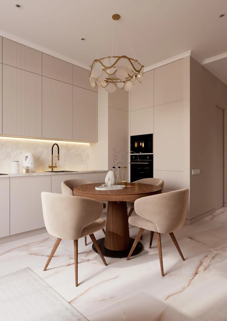
For me, the success of this room comes from using texture and furniture shape instead of relying on strong color contrasts. The vertical cabinet detailing gives the upper storage wall character, while the round table breaks up the many straight lines of the kitchen. The upholstered chairs look comfortable and visually connect with the cream cabinetry, and the wood table adds enough depth to prevent the palette from becoming too monochromatic. The large decorative chandelier also becomes a focal point above the dining table without overwhelming the space.
I would recommend this type of combination when the goal is a soft, elegant kitchen that still has enough detail to feel considered. Rather than introducing several accent colors, I would repeat variations of cream, warm wood, gold, and black in carefully chosen areas. This image also shows why lighting matters so much with pale kitchens: the warm pendant fixture and subtle gold details help the neutral surfaces feel welcoming rather than stark.
Deep Green and Coral Kitchen With Graphic Tile Details
This final kitchen makes the strongest use of color in the collection, combining deep green upper cabinetry with coral-pink lower cabinets. The two colors are separated by a light geometric backsplash featuring repeating interlocking shapes in soft neutral and warm tones. A white countertop keeps the transition clean, while the black range hood and appliances provide contrast. The palette continues into the dining area through dark green upholstered chairs, a light wood round table, and a patterned floor that adds another graphic element to the room.
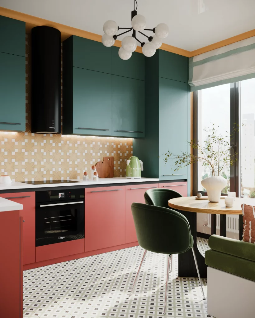
I love how deliberately the colors are distributed here. The deep green cabinetry creates a strong upper frame, while the coral cabinets make the lower portion feel energetic and distinctive. Repeating green in the dining chairs visually connects the seating area to the kitchen, and the wood table introduces a warmer natural-looking element between the two bold cabinet colors. The geometric backsplash and patterned floor add personality while staying within the same general palette.
If I were recreating this combination, I would keep the relationship between the green and coral just as clear rather than adding several unrelated shades. The image demonstrates how a bold kitchen can still feel organized when the colors are repeated in different parts of the room. I would also pay close attention to the amount of pattern introduced through tile and flooring, because the cabinetry already carries a lot of visual weight. The result works because every major element has a defined role within the color story.
Looking across these kitchens, I’m reminded that there is no single formula for choosing the right kitchen colors. Warm taupe can create a calm atmosphere, burgundy can add richness, blush pink can become unexpectedly sophisticated, and deeper green with coral can transform the room into something much more expressive. The most successful combinations in this collection balance color with cabinetry, surfaces, lighting, and furniture rather than treating paint or cabinet color as an isolated choice. Which kitchen color combination did you like the most? I’d love to hear which design inspired you in the comments, and feel free to share your favorite idea with someone planning a kitchen update.
The right kitchen color combination can completely change how the space feels, from soft and welcoming to bold and sophisticated. I think the best palettes are the ones that reflect your personality while still creating a balanced look throughout the room. Whether you choose timeless neutrals, earthy tones, or a more unexpected pairing, thoughtful color choices can make your kitchen feel fresh for years to come. Use these trending combinations as inspiration, then make them your own.