
A small kitchen can be both highly functional and beautifully designed when every inch is used with intention. I love how modern kitchen layouts can combine smart storage, streamlined cabinetry, and practical work zones without making the room feel cramped. From built-in solutions and open shelving to multifunctional islands and clever use of vertical space, there are plenty of ways to make a compact kitchen work harder. The right combination of colors, materials, lighting, and proportions can also create a stronger sense of openness. In this collection, I’m exploring modern small kitchen design ideas that balance everyday practicality with a polished, contemporary look. Whether you are planning a complete remodel or simply looking for ways to improve an existing kitchen, these ideas can offer plenty of inspiration.
Elegant White Kitchen Nook With Integrated Storage
I love how this compact kitchen area uses a continuous run of white cabinetry to make the space feel calm and visually expansive. A tall paneled cabinet sits beside a smaller built-in cabinet with glass doors, while the lower section creates a practical work area with a sink and countertop. The white finish extends across the cabinetry, trim, walls, and surrounding surfaces, creating a seamless appearance. Glass-front doors add a lighter note by displaying neatly arranged stemware, bowls, and serving pieces, while the small countertop keeps a few everyday items within reach.
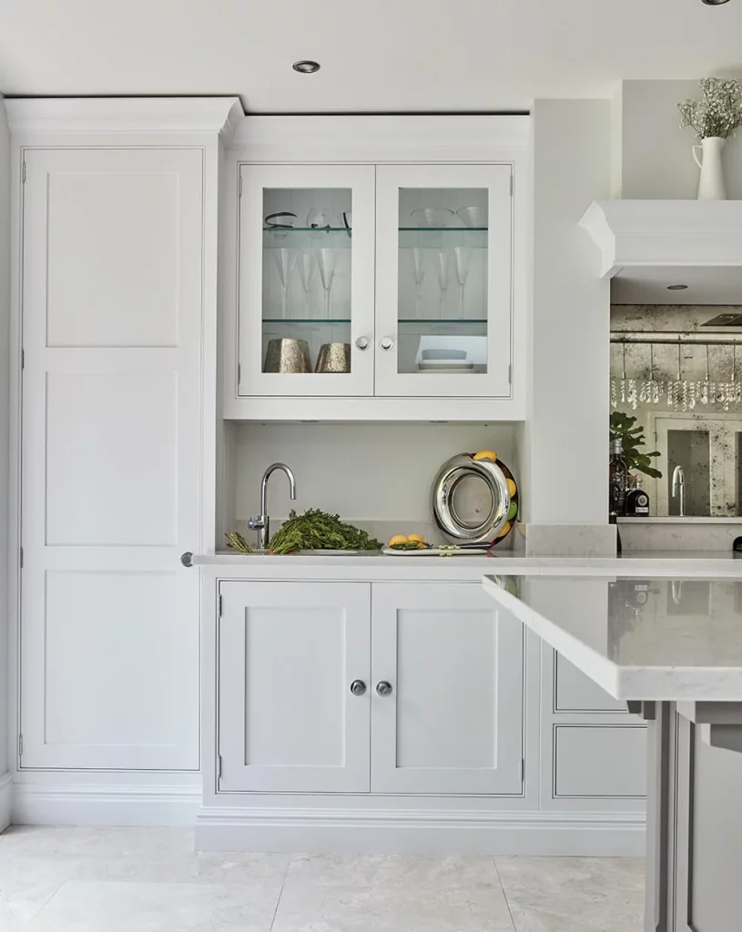
For me, the strongest space-saving idea here is the way storage is built vertically rather than spreading across the floor. The tall cabinet takes advantage of otherwise unused wall height, while the upper glass-front cabinet provides accessible storage without making the composition feel heavy. The compact sink area is also cleverly contained within the cabinetry, so the work zone remains efficient without dominating the room. Even the countertop styling is restrained enough to preserve useful preparation space.
When I look at a small kitchen like this, I always pay attention to how much visual weight the cabinetry creates. Here, the paneled fronts and predominantly white palette keep a substantial amount of storage from feeling overwhelming. I would use the same principle in a compact kitchen: make the cabinetry do as much of the organizational work as possible, then keep visible shelves and countertops edited to the essentials.
Streamlined Butler Kitchen With Open Shelving
This narrow kitchen has a beautifully linear arrangement, with black built-in appliances at one end and a long white cabinet run extending toward the doorway. The centerpiece is a large farmhouse-style sink set beneath two open shelves. Gold-toned wall sconces, faucets, cabinet hardware, and small containers add warmth against the predominantly white cabinetry and walls. Decorative jars, cutting boards, ceramics, and kitchen accessories are arranged along the shelves and counter, giving the room personality while maintaining a very orderly composition.
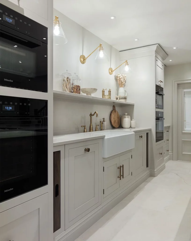
I think this layout demonstrates how a narrow kitchen can gain useful storage without filling every wall with closed cabinetry. The open shelves make the long wall feel more spacious and provide easy access to frequently used or decorative pieces. At the same time, the lower cabinets offer concealed storage for less attractive necessities. The tall appliance housing at both ends also uses vertical space efficiently, allowing the floor area to remain relatively open.
From my perspective, the lighting is one of the smartest details in this image. The wall-mounted fixtures illuminate the shelving and countertop while also adding a decorative layer without consuming valuable counter space. In a small kitchen, I would consider this kind of wall-mounted lighting whenever the work surfaces are limited because it keeps the countertop clear and makes the room feel intentionally designed.
White Corner Kitchen With Built-In Display Shelves
The third kitchen takes a classic white approach but introduces a particularly useful built-in shelving arrangement. Three long recessed shelves sit between framed cabinet sections, displaying ceramics, books, small vessels, and greenery. Below them, a deep sink occupies the main work area, while the countertop turns into a corner beneath additional cabinetry. The pale surfaces throughout the kitchen create a bright, cohesive setting, and the subtle framed cabinet fronts add definition without visually breaking up the room.
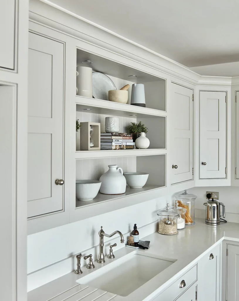
What works especially well for maximizing space is the combination of enclosed and open storage. The cabinets hide everyday kitchen equipment, while the recessed shelves use the wall cavity as display and storage space. Because the shelves are integrated into the cabinetry rather than projecting significantly into the room, they provide useful capacity without making the work area feel narrower. I also like the way the corner countertop remains continuous, creating a practical surface around the sink.
If I were adapting this idea to a small kitchen, I would think carefully about which items deserve open-shelf space. The image shows a controlled mixture of bowls, pitchers, books, and small decorative objects rather than an overcrowded collection. That balance is important because open shelving can either make a compact kitchen feel wonderfully airy or make it look busy very quickly.
Dark Kitchen With Central Island And Garden View
This kitchen makes a completely different statement with dark cabinetry covering almost the entire back wall and continuing onto the central island. A large window brings daylight into the space and provides a view toward greenery outside, while a sculptural white pendant hangs above the island. The island includes a light countertop and seating area, with two upholstered green stools tucked beneath it. A fireplace is visible along the side, adding another architectural feature to the room.
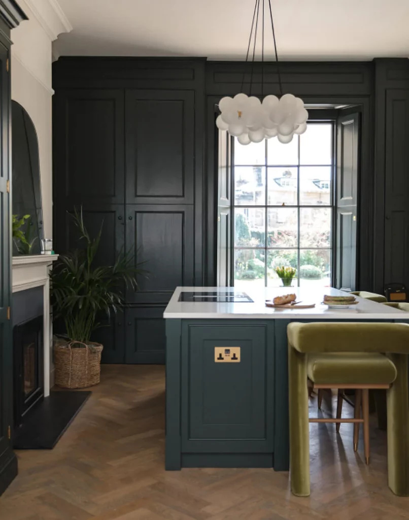
I find the contrast between the dark cabinetry and the bright window particularly effective in a compact kitchen. Instead of making the cabinetry feel visually dominant, the window creates a natural focal point and gives the room depth. The island also performs several functions in one footprint, combining preparation space with casual seating. That kind of multifunctional furniture is extremely valuable when there simply is not enough room for separate zones.
My main takeaway from this image is that a small kitchen does not automatically need to be white. I would happily use a deeper cabinet color in a compact space if the room has enough natural light or another strong source of visual openness. The key is to balance the darker surfaces with lighter countertops, daylight, and carefully chosen furnishings, as this kitchen demonstrates.
Compact Dark Cabinet Kitchen With Decorative Contrast
Here, a small kitchen is integrated into a larger dining area, making the relationship between the two spaces especially important. The lower cabinetry is dark and sleek, with slim metallic hardware, while matching upper cabinets have reflective glass fronts. A pale textured backsplash runs across the work area, and a light marble-look surface creates contrast beneath the cabinets. Gold-toned lighting and hardware introduce warmth, while colorful artwork, flowers, and decorative objects connect the kitchen visually with the adjoining dining space.
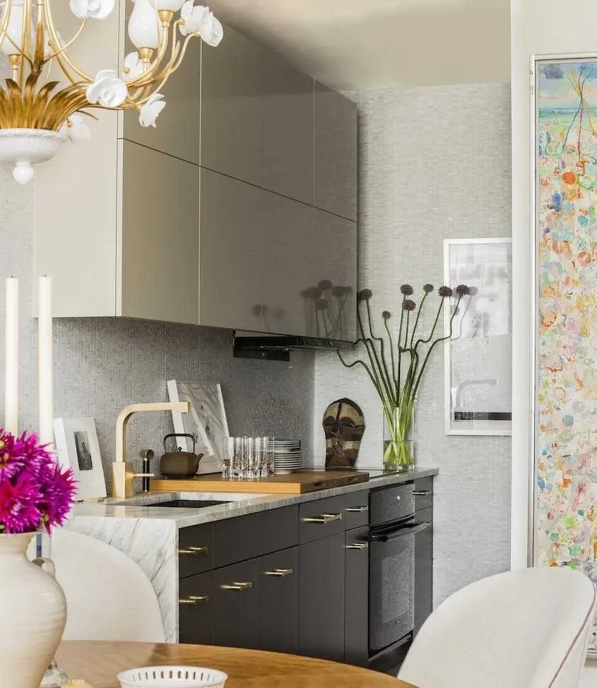
I like how this kitchen keeps its footprint compact without making the cooking area disappear. The cabinetry provides substantial storage along a single wall, while the reflective upper doors help keep the composition from feeling too dense. The counter remains relatively streamlined, leaving enough room for the essentials without creating a crowded work surface. Because the kitchen opens directly toward the dining area, the decorative styling also helps it feel like part of the overall room rather than an isolated utility zone.
For a small kitchen connected to another living or dining space, I would take inspiration from this approach and think about the transition between areas. The kitchen does not have to match every detail of the neighboring room, but repeating finishes such as metallic accents or related colors can make the compact space feel more cohesive. In my experience, that visual continuity can make a small kitchen seem considerably larger.
White Small Kitchen With A Bold Red Window Accent
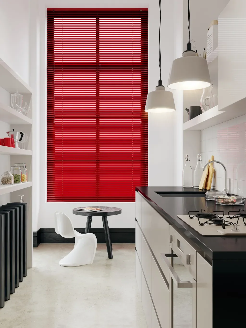
This bright kitchen uses a strong red window blind as its defining feature. The window is framed by white walls and open shelving, while the cabinetry and countertops continue the clean white-and-black palette. Two simple pendant lights hang over the counter, and the kitchen includes a compact dining spot with a small round table and a sculptural white chair. Open shelves display glassware and containers, keeping the narrow room visually open rather than enclosing it with cabinetry on every wall.
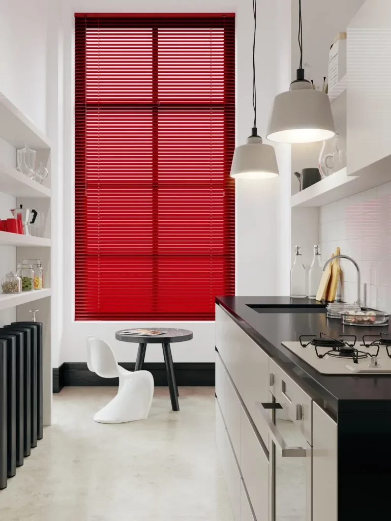
The window treatment is a great example of how one strong feature can give a small kitchen character without taking up any floor space. I also like the way the open shelving maintains a sense of depth around the window. Instead of blocking the light with bulky upper cabinets, the design keeps the central wall visually accessible. The small table creates an additional eating area without requiring a full-size dining table, which is another practical choice for a limited footprint.
I would use this principle whenever a small kitchen needs more personality but cannot accommodate additional furniture or accessories. A distinctive window treatment, for example, can become the focal point while leaving the counters and circulation areas completely functional. The important thing is to let the statement remain focused rather than competing with too many other visual elements.
Moody Kitchen With Fluted Glass Cabinets And Marble Surface
The seventh kitchen feels intimate and richly layered, with deep mauve walls, dark cabinetry, and gold-toned hardware. The upper cabinets feature textured glass doors that partially reveal dishes and serveware, while open shelving on the opposite side holds small containers and decorative pieces. A dramatic marble-look backsplash and countertop run across the sink wall, creating a strong visual connection between the upper and lower portions of the kitchen. The farmhouse-style sink sits beneath a distinctive brass-toned faucet, adding another traditional detail to the compact composition.
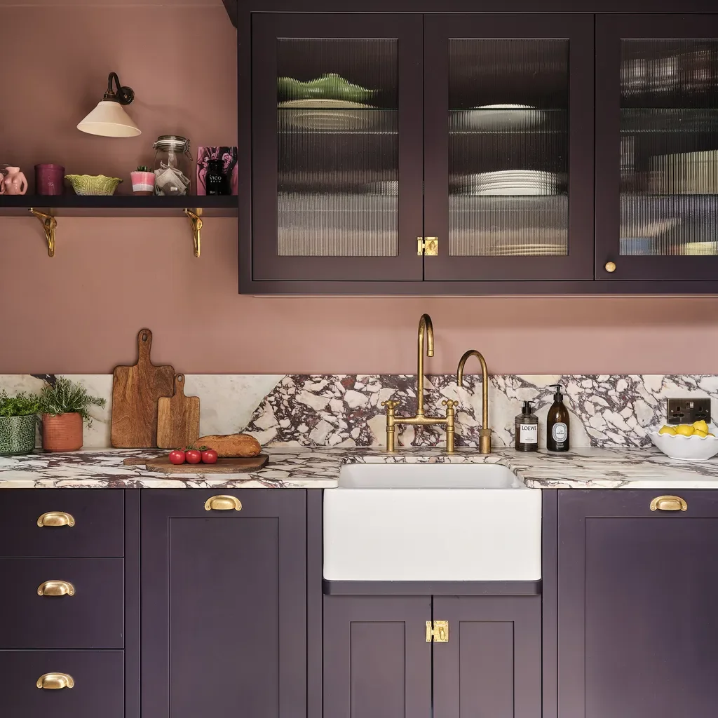
What I find particularly useful here is the balance between concealed and visible storage. The textured glass provides some transparency while still visually softening what is stored behind the doors. The open shelf offers immediate access to smaller objects, while the lower drawers and cabinets provide enclosed storage for everyday kitchen supplies. This allows the room to feel decorated without relying on a large amount of floor space.
Personally, I think this image is a good reminder that maximizing space is not only about making a kitchen look bigger. It is also about making every available surface work harder. The countertop becomes both a functional work zone and part of the room’s visual identity, while the upper cabinets turn storage into a decorative feature. I would keep that dual-purpose thinking in mind when planning a small kitchen.
Modern Blue Kitchen With Graphic Pink Backsplash
This kitchen combines dark blue-gray cabinetry with a soft pink backsplash covered in a geometric linear pattern. Warm wood shelving occupies the upper corner, providing storage for jars and small objects, while a trailing plant adds softness to the open section. The lower cabinets are sleek and handle-free, creating a continuous visual line beneath the countertop. A black faucet, toaster, and other small appliances reinforce the darker elements, while rounded decorative objects add a playful contrast to the angular cabinetry.
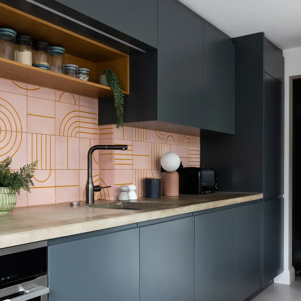
The layout works well because most of the storage remains behind streamlined cabinet fronts. That keeps the long countertop visually uninterrupted while allowing the patterned backsplash to become the main decorative element. The open wood shelf is limited to one section, so it provides convenient display storage without turning the entire kitchen into an exposed storage area. For a small room, I think that selective openness is much easier to keep organized.
If I were recreating this feeling, I would start with the cabinet layout rather than the decoration. Once the storage capacity is established, I would choose one wall surface for a distinctive treatment and keep the remaining elements relatively controlled. This image shows how color and pattern can create a memorable kitchen without requiring additional furniture, which is exactly the kind of strategy I like for compact interiors.
Bright Small Kitchen With Exposed Brick And Skylight
This kitchen has a completely different character, pairing blue lower cabinets with a warm wood countertop and an exposed brick wall above. A skylight brings daylight directly into the room, while open shelving runs across the brick surface and holds a small collection of kitchen and decorative objects. A white refrigerator occupies the right side, and a compact table with a lower slatted shelf sits in the foreground. The light floor and walls help balance the stronger brick and blue tones.
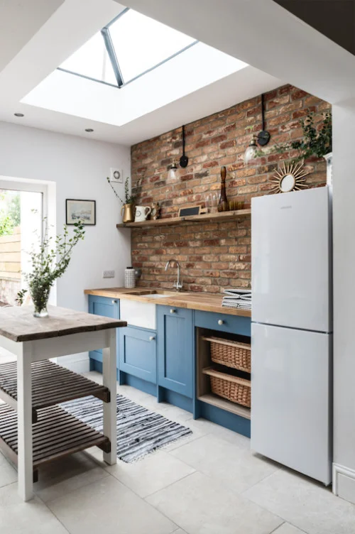
I particularly like the way the design uses the brick wall as both a visual backdrop and a storage surface. The shelves add useful capacity without covering the entire wall, allowing the texture of the brick to remain visible. The table also provides a practical surface while its lower shelf creates another place to store items. In a small kitchen, these modest additions can make a meaningful difference because they introduce storage without requiring a larger footprint.
The skylight is another important feature because natural light helps prevent the darker materials from making the kitchen feel enclosed. If I were working with a similarly compact room, I would preserve any existing source of overhead or natural light rather than filling every available wall with cabinetry. Sometimes leaving a little visual breathing room is just as valuable as adding another storage compartment.
Minimal White Kitchen With Warm Wood Island
The final kitchen takes a very clean, contemporary approach, with tall white cabinetry forming an uninterrupted backdrop around the room. A central island is finished in warm natural wood and topped with a pale stone-like surface, creating a distinct contrast against the surrounding white cabinets. Two simple black stools fit neatly beneath the island, while a large glass vase filled with leafy branches provides the main decorative feature. Black hardware and a dark faucet add small points of contrast without disrupting the restrained palette.
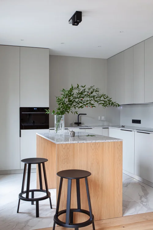
For maximizing space, the island is particularly effective because it combines workspace and seating in one compact element. The stools slide completely beneath the overhang, keeping the circulation area clear when they are not being used. The tall cabinetry also makes excellent use of vertical wall space, while the minimalist fronts reduce visual interruptions and help the kitchen feel more expansive.
This is probably the approach I would borrow most readily for a small modern kitchen: keep the main cabinetry visually quiet, introduce warmth through one substantial contrasting element, and make furniture serve more than one purpose. I also appreciate how little is placed on the countertops. With fewer objects competing for attention, the generous work surfaces remain practical and the room feels calm rather than crowded.
Compact Black Island Kitchen With Vertical Texture
I see a streamlined small kitchen built around a compact black island with two black bar stools, matte gray cabinetry, and a narrow vertically patterned backsplash. A large cylindrical black range hood becomes the main focal point above the island, while the pale cabinetry keeps the overall composition light. On the right, a wall of narrow vertical wood slats introduces warmth and texture without overwhelming the room. The pale wood flooring continues that warmth across the space and softens the stronger black elements.
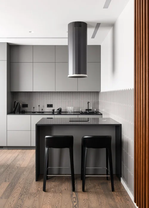
What works particularly well for me is the disciplined use of contrast. The island provides a defined work and seating zone without appearing oversized, while the full-height-looking gray cabinetry makes practical use of the available wall area. The backsplash has a subtle linear effect that visually stretches the kitchen upward, and the dark hood echoes the island and stools to create a cohesive rhythm. In a small kitchen, repeating a few finishes like this can make the room feel much more organized.
I would take inspiration from the way this kitchen limits its palette instead of filling every surface with competing details. The combination of gray, black, pale wood, and white gives the room a polished contemporary character while allowing the architecture to remain visually calm. For a similar result, I would prioritize one compact central element, such as this island, and make sure the cabinetry and major fixtures visually relate to it.
Bright L-Shaped Kitchen With Window-Focused Workspace
This kitchen uses a bright L-shaped arrangement with white cabinetry, a large window above the sink, and a pale countertop edged with warm wood. The generous window brings daylight directly into the working area, while the white cabinet fronts keep the compact room visually open. I also notice a slim rolling cart on the left with several shelves for glasses, dishes, and decorative objects. A large woven floor rug adds texture in the foreground, while small potted plants and a vase of greenery bring life to the window area.
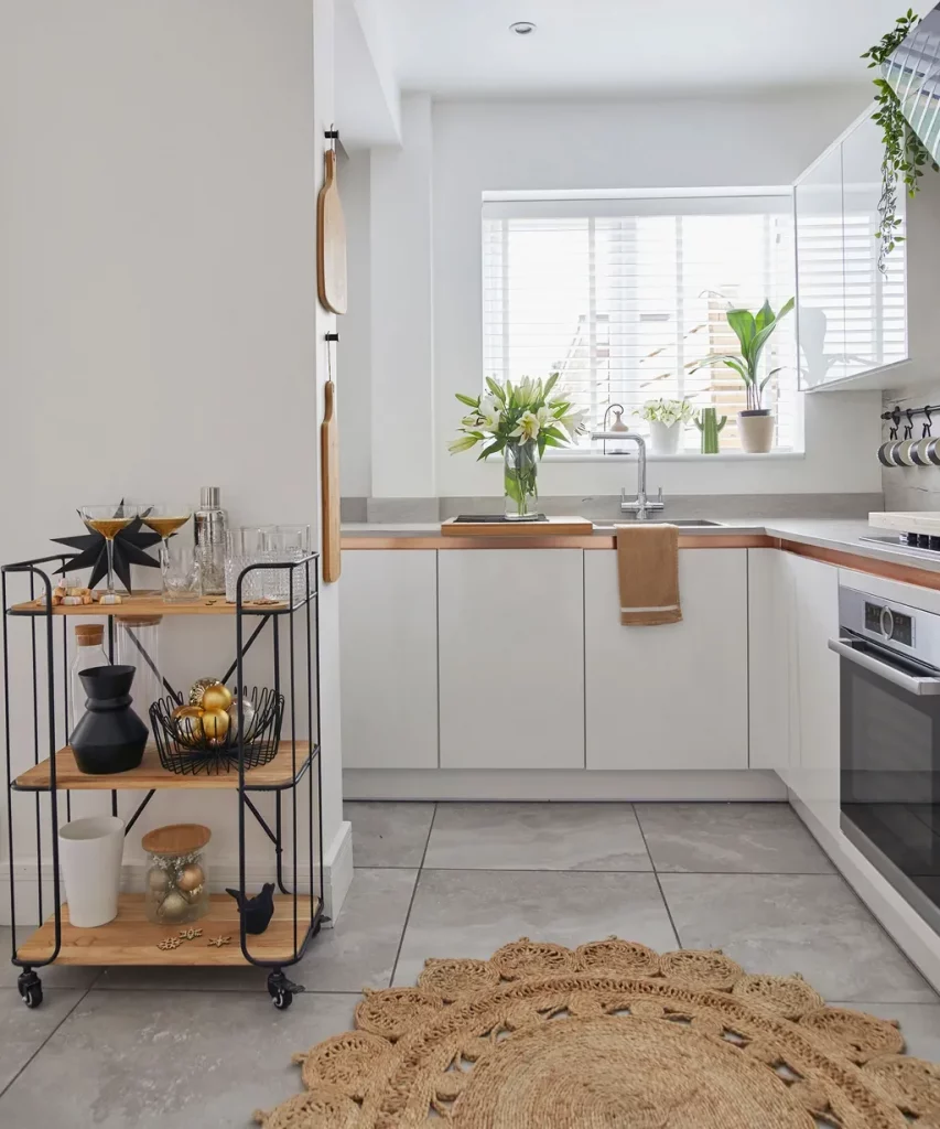
I like how the layout concentrates the main kitchen functions along two walls, leaving the center open for movement. The rolling cart is particularly clever because it provides flexible storage without requiring permanent cabinetry. It can hold entertaining pieces or everyday items while remaining easy to reposition. The open view through the window also gives the room a sense of depth, which is especially valuable when the kitchen itself is relatively compact.
For me, the strongest lesson here is to use daylight and movable storage strategically. Instead of visually filling every wall, I would keep the cabinetry simple and let the window become an important part of the composition. A narrow cart can also be an excellent solution when additional storage is needed but there is not enough room for another fixed cabinet.
Contemporary White Kitchen With Dramatic Ceiling Contrast
The third kitchen takes a much more graphic approach, combining white cabinetry with a black ceiling section, a black backsplash, and a black island countertop. A warm terracotta-colored horizontal area appears above the upper cabinets, creating a striking transition between the pale and dark surfaces. The island includes seating for several people with simple black folding-style stools. Track lighting and suspended fixtures add another layer of contemporary detail without visually crowding the room.
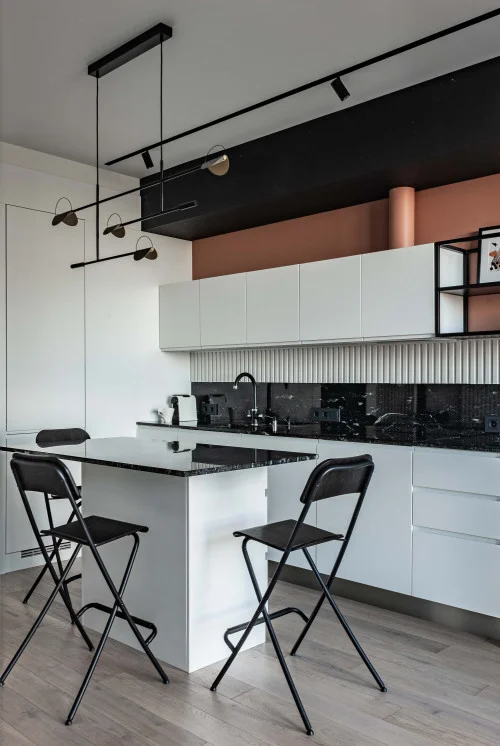
I find the island especially effective because it performs several roles in a relatively limited footprint. It provides a work surface, a place for casual seating, and a strong visual anchor while remaining relatively narrow. The folding-style stools also appear easy to move when the kitchen needs more open floor space. Meanwhile, the white cabinetry reflects light and prevents the darker ceiling and backsplash from making the kitchen feel enclosed.
This image reminds me that a small kitchen does not have to rely exclusively on pale colors to feel spacious. I would use a strong dark element selectively, just as this design does, and repeat it in several places so the contrast feels intentional. Keeping the cabinetry simple is important when introducing bolder architectural color and lighting because it prevents the room from becoming visually overloaded.
White Utility Kitchen With Open Shelving And Patterned Tile
Here I see a bright, hardworking kitchen with white paneled cabinetry, long open shelves, a deep white farmhouse-style sink, and a colorful patterned backsplash. A skylight and several windows fill the room with natural light, while the shelves display plates, bowls, glasses, mugs, and containers. The countertop is kept relatively clear, with only a few useful and decorative items visible. A woven floor mat occupies part of the gray floor, adding softness beneath the cabinetry.
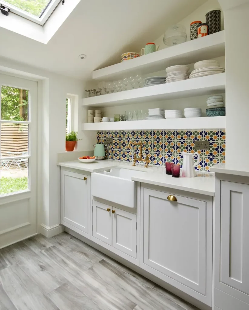
The open shelving is the standout space-maximizing feature for me. Instead of relying entirely on closed upper storage, the shelves make frequently used dishes immediately accessible and keep the wall visually active. Because the cabinetry and shelves are predominantly white, the patterned backsplash can become the decorative centerpiece without making the compact kitchen feel excessively busy. The generous natural light also helps the shelving and tile details remain crisp rather than heavy.
If I were adapting this idea, I would be selective about what goes on open shelves. This photograph works because the dishes and glassware are arranged in a relatively orderly way, creating a sense of rhythm. I also like the decision to concentrate the stronger pattern behind the work area while leaving the surrounding cabinetry restrained.
Warm Wood Kitchen With Geometric Backsplash
This compact kitchen combines warm wood cabinetry with a dark wall, a large black cylindrical hood, and a geometric backsplash in shades of white and gray. The countertop is pale and extends into a small seating area with two simple black stools. A textured white wall occupies the right side, while warm wood flooring continues the cabinetry color through the room. The result feels contemporary but considerably warmer than an all-white kitchen.
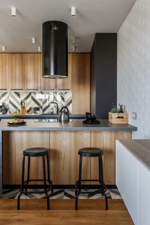
For me, the smartest element is the compact counter seating. The two stools create a casual dining spot without requiring a separate dining table, which preserves valuable floor space. The cabinetry also gives the room a strong continuous visual structure, while the geometric backsplash adds interest behind the cooking area. The black hood and stools connect naturally with the dark wall and keep the palette balanced.
I would borrow the principle of using cabinetry color to create warmth rather than adding numerous decorative objects. The wood finish already gives the kitchen visual character, so the rest of the room can remain relatively controlled. In a small space, I find that this kind of consistency can make a kitchen appear more substantial and carefully designed without making it feel crowded.
Blush Kitchen With Built-In Breakfast Nook
This kitchen takes a softer and more intimate direction with dusty pink walls, dark cabinetry, a large central window, and a built-in seating nook. Two cushioned benches meet around a small round wooden table, creating a dedicated breakfast or dining area in the corner. Wall sconces with warm shades frame the window, while a pendant-like table lamp and simple decorative pieces reinforce the cozy atmosphere. The kitchen cabinetry and appliances occupy the left side, allowing the seating zone to remain distinct.
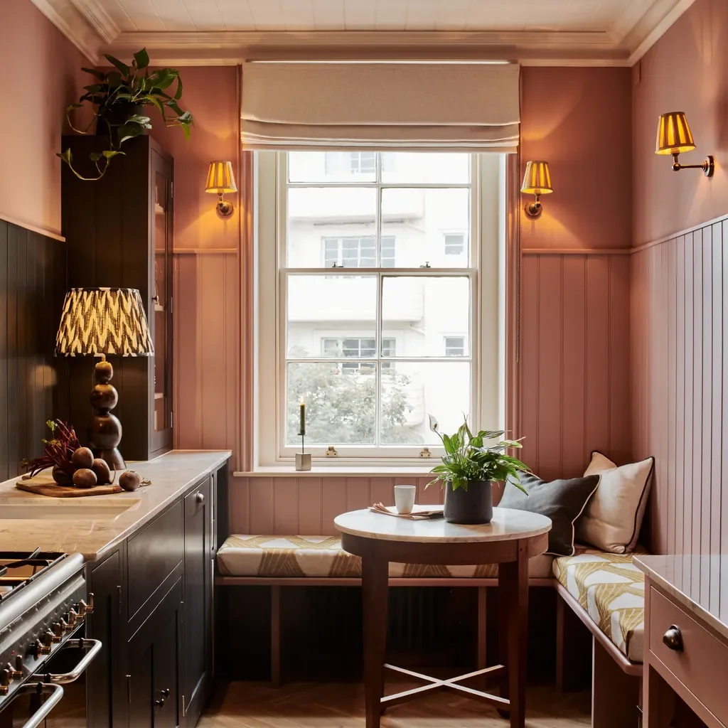
I think the built-in banquette is an excellent solution for a small kitchen because it uses the perimeter of the room rather than requiring multiple freestanding chairs. The round table also makes circulation around the seating area feel easier than a large rectangular table would. The window gives the nook natural light, while the warm wall color makes the dining corner feel like a purposeful destination rather than leftover space.
This is the kind of layout I would consider when a small kitchen needs to accommodate dining without adding another room. I would keep the table proportionate to the seating, as shown here, and let the built-in arrangement do most of the space-saving work. The restrained number of furnishings is important because the room already has strong color and architectural character.
Minimal White Kitchen With Green View And Picture Window
The seventh kitchen is exceptionally clean and compact, with white cabinets, black vertical handles, a white sink and faucet, and a small tiled backsplash. Above the sink is a wide horizontal opening filled with a leafy green view, creating the impression of a large visual window into nature. A narrow wooden shelf runs above it and holds books and a few sculptural objects. The countertop remains mostly uncluttered, with only a drying rack, soap dispenser, and kettle visible.

What I like most is how the horizontal opening adds visual depth without requiring more physical floor area. The dark green foliage becomes an almost picture-like backdrop, contrasting beautifully with the white cabinetry. The shelf above provides storage and display space without interfering with the work surface. Black cabinet pulls add definition to the otherwise very pale kitchen and give the room a sharper contemporary edge.
For a small kitchen, I would take the idea of creating visual depth very seriously. Even when a room cannot physically become larger, a well-positioned view, opening, or reflective surface can change how spacious it feels. I also appreciate the limited countertop clutter here; keeping working surfaces open makes a compact kitchen feel much easier to use.
White Tile Kitchen With Graphic Floor Pattern
This kitchen pairs white shaker-style cabinetry with a white subway-tile backsplash interrupted by a single horizontal band of dark gray tiles. A warm wood countertop surrounds a deep white farmhouse sink, while two clear pendant lights hang above the work area. The floor introduces the strongest decorative element: a repeating black-and-white pattern that immediately defines the lower portion of the room. Small appliances and everyday kitchen accessories are arranged along the countertop without taking over the space.
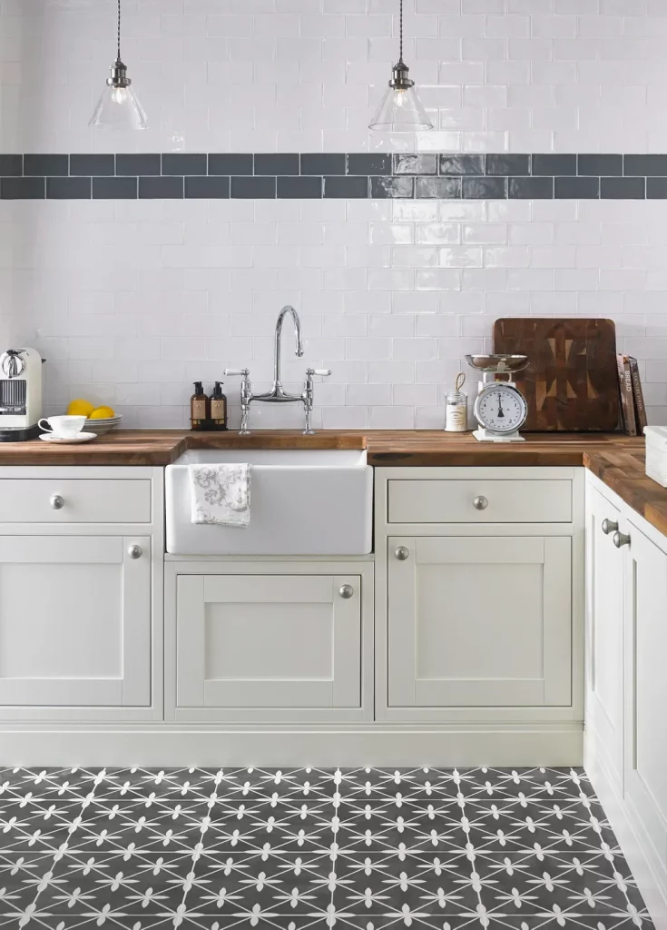
I find the contrast between the quiet upper half and patterned floor particularly successful. Because the walls and cabinets remain predominantly white, the bold flooring has room to stand out without making the kitchen feel visually compressed. The wood countertop also provides warmth against the monochrome surfaces, while the farmhouse sink is integrated naturally into the cabinet run.
If I were working with a small kitchen, I would use this image as an example of how one strong pattern can be enough. Rather than decorating every wall, I would choose one surface for visual impact and allow the remaining finishes to support it. The horizontal dark tile band also demonstrates how a simple line can add definition while maintaining the overall lightness of the room.
Black Cabinet Kitchen With Diamond Floor And Open Shelves
This kitchen creates a bold black-and-white composition with dark lower cabinetry, white subway-tile walls, and black-framed windows. Warm wood open shelves sit beside the sink and hold glasses, bottles, and small decorative pieces. The floor features large alternating black and white diamonds, while a narrow patterned runner introduces additional texture through the center. Brass-toned cabinet hardware and shelf details provide small warm accents against the darker cabinetry.
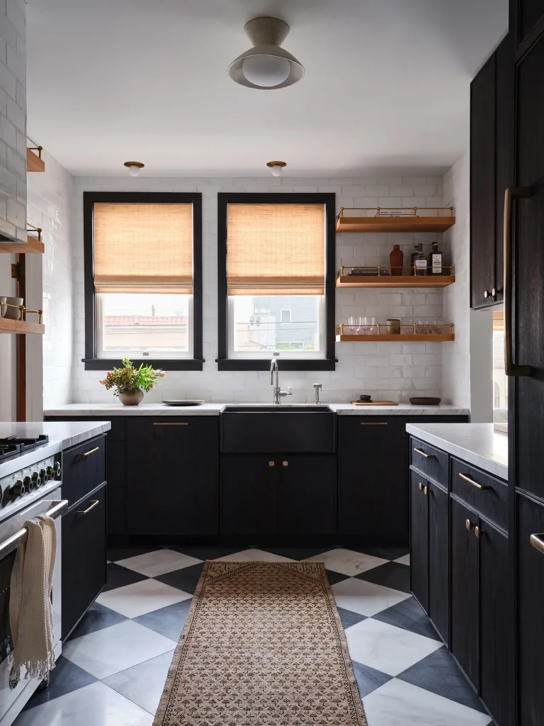
The layout feels particularly efficient because the main cabinetry remains concentrated around the perimeter, leaving a clear central walkway. The open shelves add accessible storage without filling the entire wall with upper cabinets. I also like the way the two windows bring natural light into the dark cabinetry, preventing the room from feeling too enclosed. The strong floor pattern visually defines the circulation area without taking up any additional physical space.
For me, this kitchen is a reminder that dark cabinetry can work beautifully in a small room when there is enough contrast around it. I would balance deep cabinet finishes with light walls and generous daylight, as shown here. Keeping the shelving relatively shallow and organized also helps preserve the feeling of openness while still providing useful storage.
Small White Kitchen With Colorful Pendant Lights
The final kitchen is bright and playful, with white cabinetry, a compact peninsula, and a geometric backsplash made from white, blue, and mustard-colored shapes. Three glass pendant lights hang at different heights and feature pink, yellow, and turquoise tones. Two stools with yellow legs tuck neatly beneath the peninsula, while a large window provides abundant daylight from the right side. The warm wood flooring gives the predominantly white room a softer foundation.
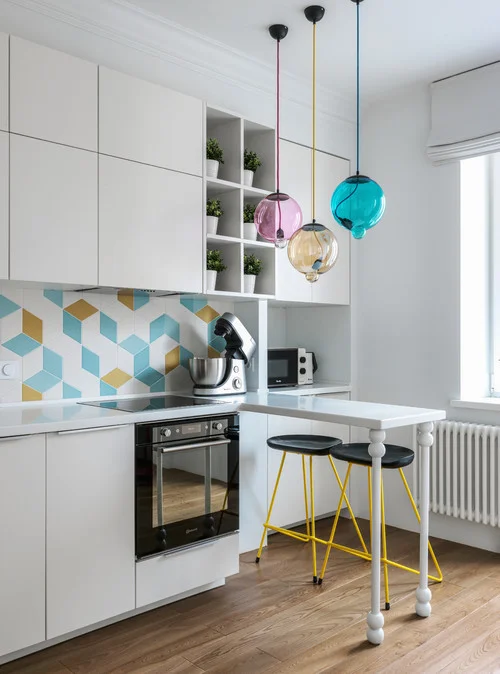
I especially like the peninsula because it combines preparation space with a practical place for two people to sit without requiring a separate dining table. The stools can be positioned underneath the counter when they are not being used, keeping the floor visually open. Meanwhile, the colorful backsplash and pendant lights give the kitchen personality while the white cabinetry maintains a spacious appearance.
This image shows me that maximizing a small kitchen does not mean keeping everything neutral. I would let one compact feature, such as the peninsula, solve a practical problem and then use a few coordinated colors to give the room identity. The key is keeping the larger surfaces simple so the decorative elements remain accents rather than competing with the layout.
Terracotta Kitchen With Open Shelf Styling
This compact kitchen immediately catches my attention with its warm terracotta-red backsplash and countertop paired with pale cream cabinetry. I like the way the long open shelf above the work surface provides a generous display area without adding bulky upper cabinets. The shelf holds plants, colorful candles, small vases, bottles, and decorative objects, while the counter remains relatively open around the sink. A black faucet and stainless-steel sink add a crisp contrast to the warmer palette.
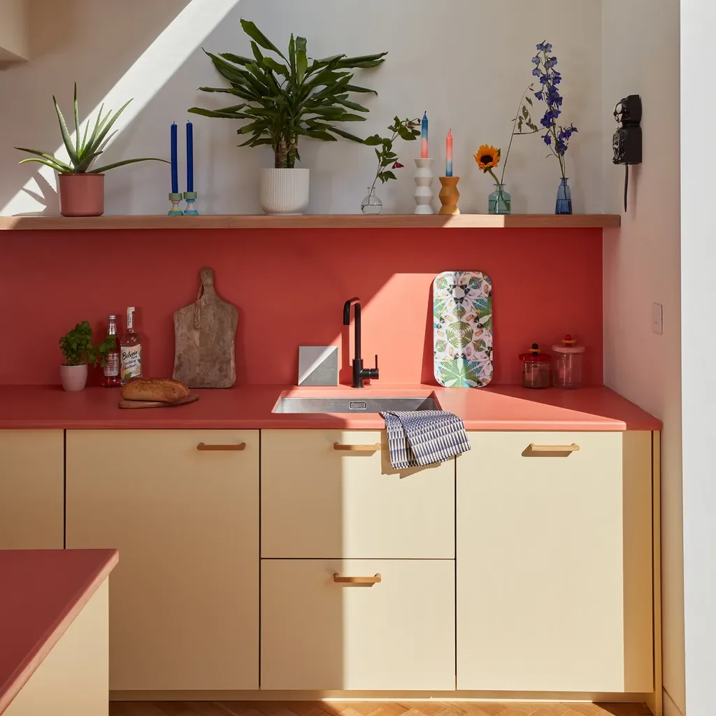
For me, the strongest space-maximizing feature here is the combination of practical cabinetry below and open storage above. The lower cabinets provide concealed storage, while the shelf keeps frequently visible objects accessible and turns otherwise unused wall space into part of the kitchen design. Because the shelving is open, the upper portion of the room remains visually light rather than feeling enclosed.
I would take inspiration from this arrangement when working with a small kitchen that needs personality without adding visual bulk. The key is to keep the open shelf intentional, as this image does, with objects spaced across its length rather than packed tightly together. I also love the way the warm counter and backsplash create one continuous visual field, making the compact work area feel cohesive.
White U-Shaped Kitchen With Dark Countertops
Here I see a highly efficient U-shaped kitchen built almost entirely around white cabinetry. Tall cabinets occupy the back wall and continue along the sides, while dark countertops and a dark backsplash create a strong horizontal contrast. The cooking area is concentrated at the rear, with the range and microwave positioned within the central cabinet composition. A narrow patterned runner stretches through the floor area, and a black-and-white artwork adds another graphic element.
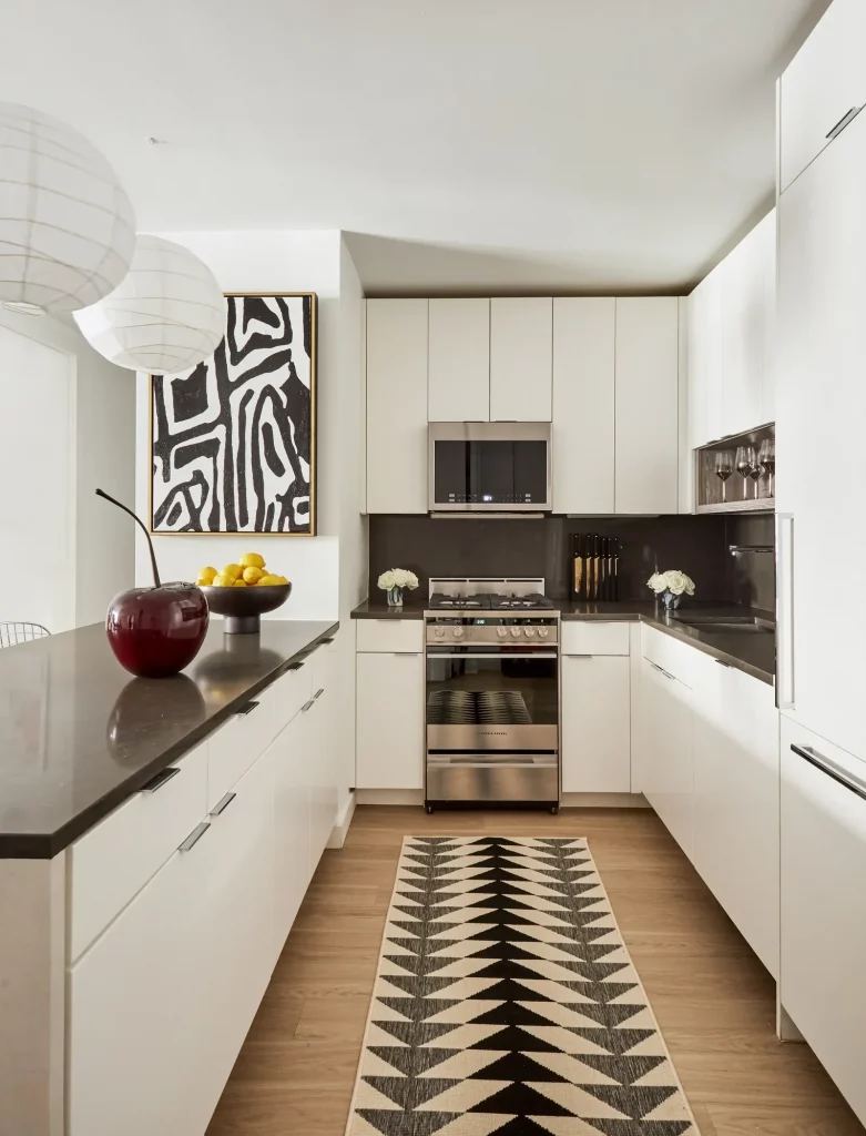
This layout works particularly well for a compact kitchen because the cabinetry uses several walls instead of depending on a large central island. I like how the counters wrap around the room, creating multiple work surfaces while leaving a clear central walkway. The white fronts also give the cabinetry a continuous appearance, which helps the room feel orderly despite the amount of storage.
My favorite detail is the balance between simplicity and contrast. If I were recreating this look, I would pay close attention to keeping the cabinet fronts visually consistent and then use one darker surface to define the work zone. The artwork, fruit bowl, and runner show how a small kitchen can still have decorative character without filling every available surface.
Minimal White Kitchen With Integrated Dining Area
This kitchen takes a much more restrained approach, with flat white cabinetry extending across the walls and a deep black counter and backsplash providing contrast. A black rectangular island or dining table sits in the foreground with black chairs around it, while a geometric black pendant fixture hangs above. The wood-toned floor introduces warmth beneath the otherwise monochromatic kitchen, creating a clean but comfortable atmosphere.
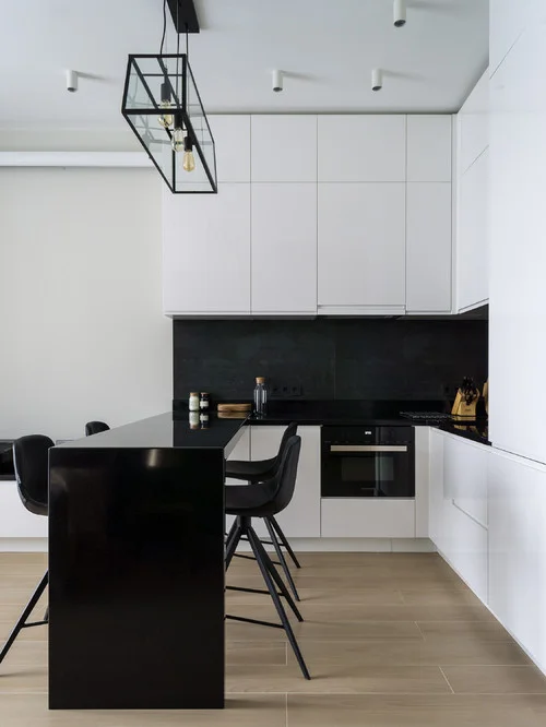
I find this arrangement especially effective because the kitchen and dining area are combined rather than separated by additional furniture. The black table creates a useful surface for eating or everyday tasks while also visually connecting with the dark backsplash and countertops. Meanwhile, the white cabinets blend into the surrounding walls and keep the room from feeling overloaded.
For a small kitchen, I think this is a good reminder that fewer visual transitions can make a space feel more spacious. I would use a restrained palette of light cabinetry, one strong dark element, and a warm floor rather than introducing many competing finishes. The simple cabinet fronts also make the available storage feel like one continuous architectural surface.
Dark Cabinetry With Brass Details And Built-In Niche
This kitchen has a completely different character, combining deep navy cabinetry with pale countertops and a matching light backsplash. Brass hardware and brass details on the range add warmth, while a tall wood-lined niche provides open storage between the cabinetry and the window. The floor is composed of large alternating gray and pale tiles, and the window brings abundant natural light into the corner. I particularly notice the framed artwork and small objects tucked into the recessed areas.
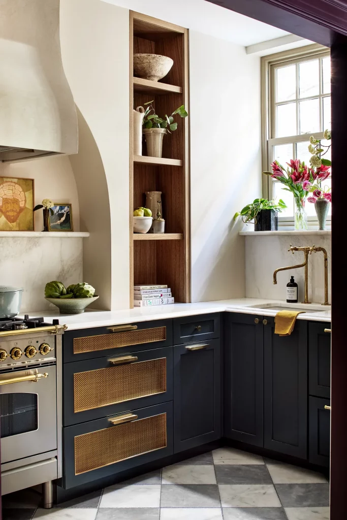
The built-in vertical niche is one of the smartest details in this image. Instead of leaving the narrow wall section unused, the design turns it into several open shelves for bowls, vessels, and small decorative pieces. The cabinetry beneath the counter keeps the main storage concealed, allowing the niche to remain a lighter visual feature.
I would borrow this idea whenever a small kitchen contains an awkward narrow section between larger cabinets or architectural elements. A shallow built-in shelf can give that space a purpose without interfering with the main work surfaces. I also like the combination of dark cabinetry and light stone because it creates definition while preserving brightness around the window.
Blue Kitchen With Marble Backsplash And Compact Range
This kitchen makes a strong impression through its deep blue cabinetry and walls, offset by a dramatic pale marble backsplash and countertop. The range sits centrally beneath a large pale hood, with two small wall-mounted lights framing the cooking zone. Cutting boards rest against the backsplash, while simple jars and a few decorative pieces sit along the counter and shelf. The dark floor reinforces the rich, enclosed feeling of the compact cooking area.
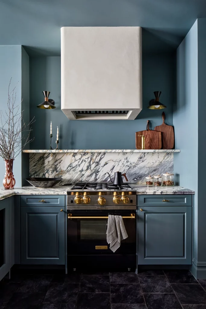
What works for me here is the concentration of visual interest around the range. The cabinetry remains relatively straightforward, while the marble surface creates a focal point across the entire cooking wall. Because the countertop, backsplash, and raised ledge use the same stone appearance, the different surfaces feel connected rather than fragmented.
I would use this approach if I wanted a small kitchen to feel intentional and dramatic without relying on lots of accessories. One distinctive surface can do much of the decorative work. Keeping the surrounding cabinetry simple also allows the hood, stone pattern, and brass-toned range details to remain the strongest features.
Dark Wood Kitchen With Sculptural Range Hood
This kitchen feels warm and architectural, with vertical wood paneling covering the main wall and a large dark range hood positioned prominently above the cooking area. The black cabinetry below contrasts with the gray stone countertop and backsplash, while the wood floor and two light wood counter stools soften the darker finishes. A tall window with a dark frame fills one side of the room with natural light, and the kitchen island creates a compact dining or preparation zone.
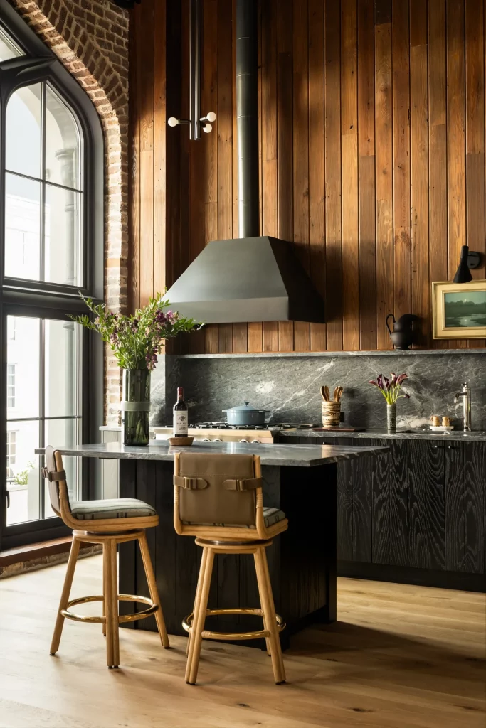
I like how the kitchen uses vertical lines to make the walls feel purposeful without requiring lots of upper cabinetry. The dark lower cabinetry provides substantial visual weight, but the large window and lighter floor keep the composition balanced. The island is also efficiently sized: it provides counter space and seating without overwhelming the walkway around it.
For me, this image demonstrates how material contrast can make a small kitchen feel much more layered. I would combine one dominant wall treatment with a darker work zone rather than introducing many separate finishes. The pair of stools also shows that seating can be integrated directly into the kitchen instead of requiring a separate dining area.
Green Cabinet Kitchen With Vertical Storage Ladder
This narrow kitchen is wrapped in muted green cabinetry, with tall units reaching almost to the ceiling on the right side. A wooden ladder leans against the tall cabinets, adding both character and a practical visual cue for accessing higher storage. On the opposite side, the cooktop and oven are integrated into the cabinetry beneath a light countertop. A glass-paneled wooden door at the end of the room brings additional brightness into the narrow passage.
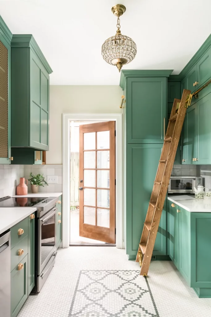
The tall cabinetry is the feature I would focus on here because it makes excellent use of vertical space. Rather than allowing the upper portion of the room to go unused, the cabinets extend upward and create a substantial amount of enclosed storage. The ladder makes sense within the composition because it visually acknowledges the height of the cabinetry while remaining neatly positioned along the side.
I also like how the green cabinetry gives the entire room a unified appearance. If I were adapting this idea, I would consider taking cabinetry as high as the room comfortably allows and keeping its finish consistent from one end to the other. The light floor and walls then provide enough contrast to prevent the compact space from becoming visually heavy.
White Kitchen With Wood Counter And Sculptural Stools
This bright kitchen combines white cabinetry with a warm wood countertop that runs across the central peninsula. The upper cabinets are mostly white, while a smaller group of wood-front cabinets creates contrast around the backsplash. Two sculptural wooden stools sit at the peninsula, giving the kitchen an integrated eating area. A long linear light fixture stretches across the ceiling, and the wood floor continues the warm tone established by the countertop and stools.
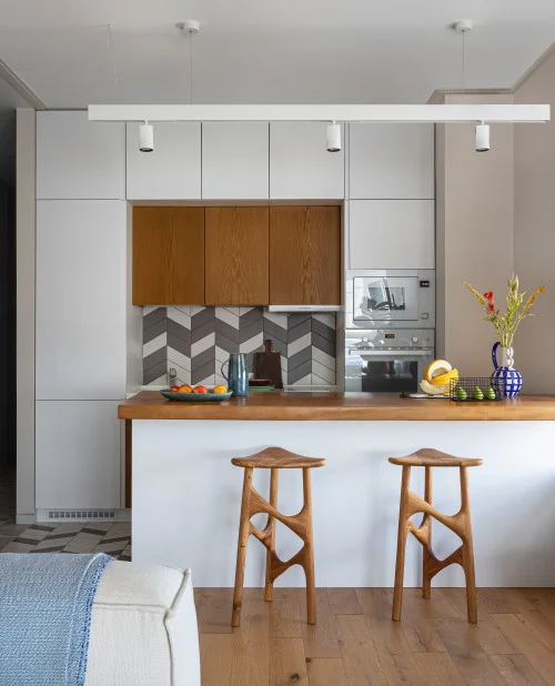
For a small kitchen, I think the peninsula is doing several jobs at once. It provides a work surface, separates the kitchen from the adjacent living area, and creates seating without requiring a separate table. The cabinetry surrounding it remains clean and simple, which helps preserve an uncluttered appearance.
The wood accents are especially effective because they prevent the white kitchen from feeling too uniform. I would repeat this strategy by choosing one warm material and using it selectively on the countertop, a few cabinet fronts, and seating. That creates continuity without making the small room feel overloaded with different textures.
Open Shelving Kitchen With Soft Neutral Cabinetry
This kitchen uses soft neutral cabinetry, pale countertops, and two long open shelves across the main wall. The shelves display bowls, glasses, jars, plates, amber-toned vessels, and a few leafy plants, while the sink sits directly below them. Gold-toned faucet and cabinet hardware add subtle contrast. The arrangement around the corner includes the cooking area and oven, while light wood flooring continues throughout the space.
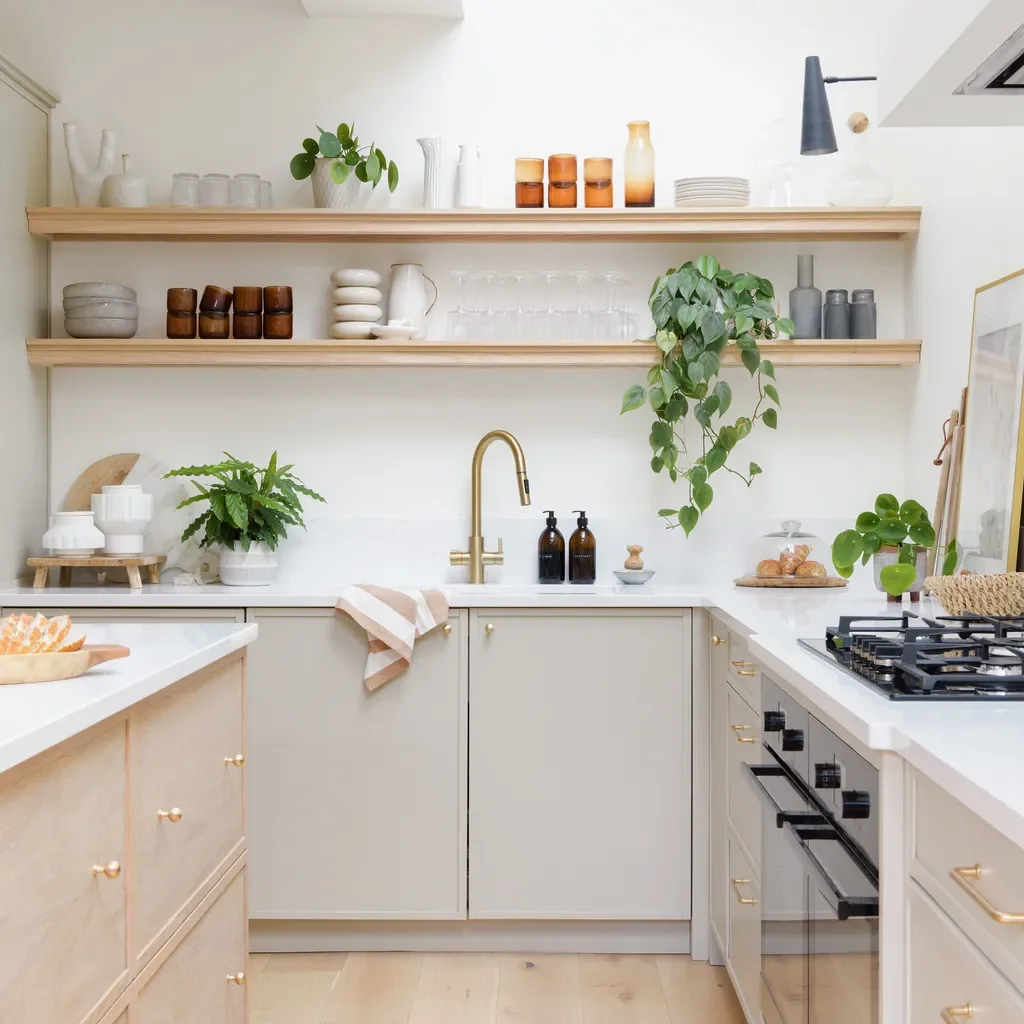
I like the way the open shelves make use of the wall above the sink without visually closing in the kitchen. They also turn everyday objects into part of the room’s styling, particularly because the shelves are arranged with plenty of open space between groups. The lower cabinets maintain concealed storage for less decorative items, giving the kitchen a useful balance between open and closed organization.
If I were working with a similar compact layout, I would treat open shelving as a carefully edited display rather than simply adding more storage. This image shows that the arrangement can remain practical while still feeling polished. Keeping the palette restrained also allows the dishes, glassware, plants, and small colored vessels to provide the visual variation.
White Kitchen With Graphic Backsplash And Patterned Floor
The final kitchen keeps its cabinetry almost entirely white, creating a clean backdrop for a highly graphic backsplash. The backsplash features bold black linework alongside pale blue and yellow-green areas, while the floor introduces another pattern through small white tiles with regularly spaced dark diamond-like accents. Open shelves on the left display neatly arranged cups and glasses, and the counters remain relatively uncluttered.
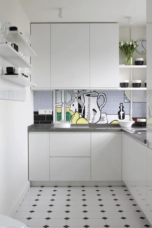
What I find most successful here is the decision to let the backsplash and floor provide the strongest visual personality. The white cabinetry occupies much of the room, but its simple appearance prevents the patterns from becoming overwhelming. Open shelving adds another practical storage layer while keeping frequently used pieces visible and accessible.
For me, this is a great example of how a small kitchen does not have to be visually plain to feel organized. I would keep the cabinetry simple if I wanted to introduce a bold backsplash or patterned floor, because the clean surfaces create the necessary breathing room. The result feels distinctive while still maintaining a clear and functional kitchen layout.
Compact Kitchen With Natural Wood And Black Cabinetry
I see a very compact kitchen organized along a single wall, with pale natural-wood cabinet fronts set against a black countertop and matching dark base. A narrow reddish-brown vertical tile backsplash adds a strong horizontal zone without overwhelming the small footprint. Above it, lightweight white wire shelves keep storage visually open, while the window at the side brings in natural light. The combination of pale wood, white walls, and black surfaces gives this tiny kitchen a crisp, contemporary character.
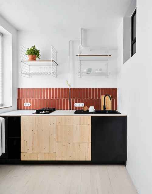
What makes this arrangement work for me is its disciplined use of space. The cabinetry provides closed storage below the worktop, while the wall-mounted shelves take advantage of otherwise unused vertical space. Because the shelving is visually light, it doesn’t create the heavy feeling that a full wall of upper cabinets might produce. I also like the compact placement of the cooktop and sink, which keeps the main work functions close together.
If I were recreating this look, I would pay close attention to the balance between open and closed storage. The open shelves should remain edited, as they are here, with only a few useful or attractive items visible. I think the pale wood is particularly effective in a small room because it introduces warmth without making the cabinetry visually dense. The dark countertop then gives the kitchen enough contrast to feel defined.
White Kitchen With Open Shelves And A Statement Faucet
This kitchen takes a much lighter approach, with white cabinetry, a white countertop, and glossy white rectangular tiles covering the backsplash. A large sculptural faucet with a black-and-gold finish immediately becomes a focal point above the sink. One long open shelf displays ceramics, books, and a trailing plant, while the counter holds a wooden bowl, cutting board, food, and a few everyday pieces. The restrained palette makes the compact kitchen appear exceptionally bright and spacious.
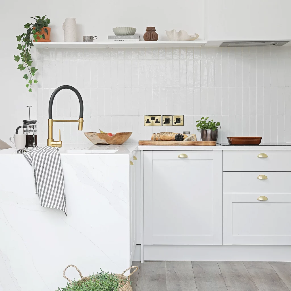
I find the open shelf especially useful here because it provides storage and decoration without closing in the wall. The glossy backsplash also reflects light across the room, helping the limited space feel more expansive. The large sink occupies a substantial portion of the counter, but the surrounding work surface remains clean enough for food preparation. Even the gold details are repeated subtly through the faucet and hardware, creating cohesion.
For me, this photograph is a good reminder that a small kitchen doesn’t need lots of decorative objects to feel finished. I would choose one long shelf rather than filling the wall with multiple storage units, then keep the display intentionally sparse. The white-on-white foundation also makes the few warmer elements, particularly the wood and brass, much more noticeable. It is a simple strategy for creating visual interest without sacrificing openness.
Soft Neutral Kitchen With Layered Wooden Shelving
Here, the kitchen feels calm and softly composed through white walls, pale wood shelves, light cabinetry, and a glossy square-tile backsplash. Two wooden shelves span the wall above the counter, holding ceramics, glassware, books, candles, and a framed artwork. The lower cabinets are a muted taupe-gray, while brass-colored pulls provide small points of contrast. A generous white counter turns toward the right, creating a practical corner workspace.
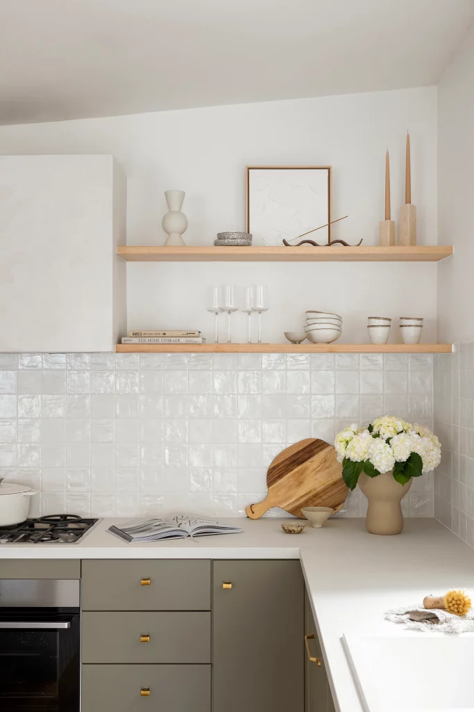
I particularly like how the shelving makes use of vertical wall space while leaving the countertop largely unobstructed. The shelves also give the kitchen somewhere to store frequently used pieces without requiring additional bulky upper cabinets. Because the shelves are relatively shallow and the objects are arranged with plenty of breathing room, the wall doesn’t feel crowded. The glossy backsplash adds another layer of light and texture beneath them.
If I were working with a similarly small kitchen, I would take inspiration from the restrained arrangement rather than trying to copy every accessory. A limited palette of white, pale wood, soft taupe, and brass keeps the room visually continuous. I also like the way the framed artwork and sculptural ceramics turn practical shelving into part of the kitchen’s personality. In a small room, that kind of multifunctional styling can make every inch feel considered.
Patterned Backsplash In A Compact Gray Kitchen
This kitchen uses a completely different visual strategy, with a patterned backsplash composed of repeating geometric motifs in muted gray, taupe, and blue-gray tones. The backsplash extends across the entire visible work area beneath a slim wooden shelf. The lower cabinetry is painted a soft gray and finished with curved metal pulls, while a pale countertop keeps the composition from becoming too dark. A simple wooden dining table and chair appear in the foreground, connecting the kitchen to the eating area.
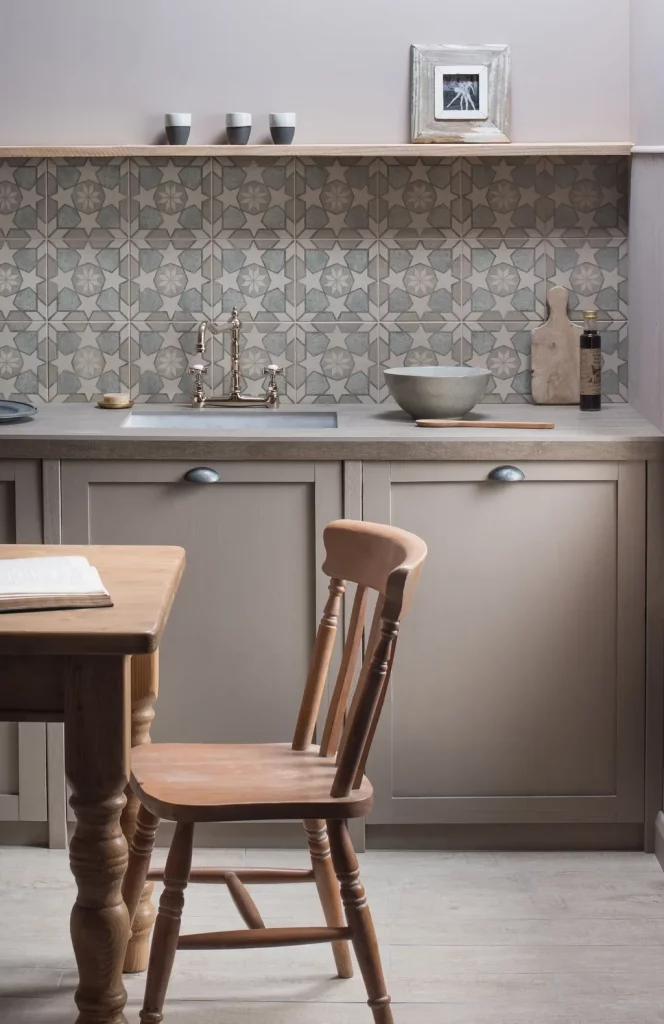
For me, the full backsplash is the strongest space-defining element in this room. Rather than adding numerous separate decorative pieces, the patterned surface gives the kitchen character across one continuous plane. The open shelf above it is kept minimal, which allows the tile to remain the visual focus. The cabinetry provides substantial concealed storage underneath, helping balance the decorative wall.
I would use this idea carefully in a small kitchen because a patterned surface can easily become overwhelming if too many competing details are added. Here, the muted colors keep the pattern controlled, and the simple gray cabinets provide a quiet base. I also like the practical relationship between the kitchen and the small dining table. When space is limited, allowing one area to transition naturally into another can make the entire room feel more connected.
Bright Galley Kitchen With Marble-Effect Surfaces
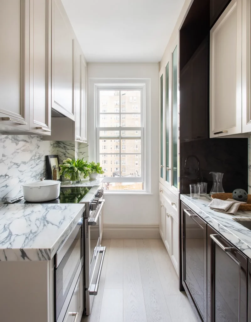
This narrow galley kitchen uses its long proportions efficiently, with cabinetry and appliances arranged along both sides of a slim central walkway. White cabinet fronts dominate one side, while dark glossy cabinetry and matching appliances create contrast opposite them. Marble-effect surfaces continue across the countertops and backsplash, visually tying the two sides together. At the far end, a tall window floods the narrow passage with daylight and gives the room an open visual destination.
I think the strongest feature here is the consistent use of light surfaces. The pale floor, white cabinetry, and bright window prevent the narrow layout from feeling enclosed, while the dark cabinetry gives the room enough contrast to avoid looking flat. The long counters also provide generous work areas for such a compact footprint. Keeping the circulation path completely clear is essential, and this kitchen demonstrates how effective that can be.
For a small galley kitchen, I would focus on maintaining a strong visual line from the entrance toward the window or another light source. In this photograph, that uninterrupted perspective makes the room feel deeper than it might actually be. I would also consider using one consistent surface treatment across connected work areas, as the marble effect here helps visually unite the two sides. The result feels polished without relying on excessive decoration.
Dark Built-In Cabinetry With Open Dish Storage
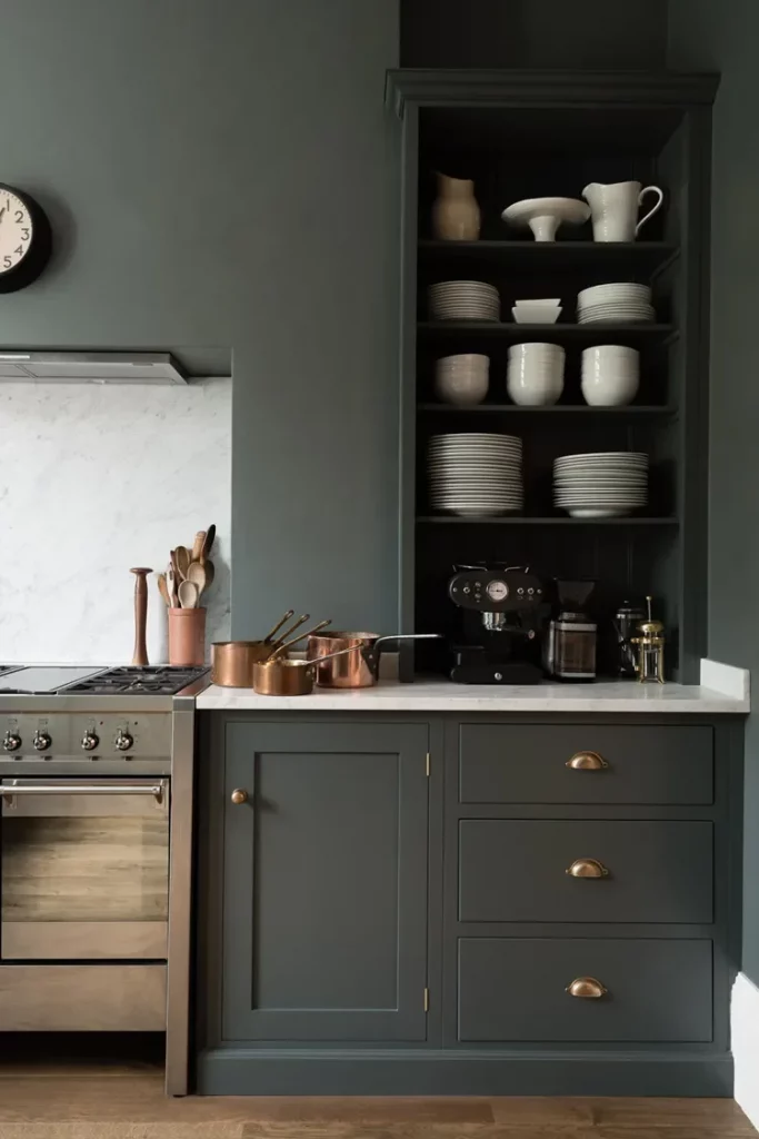
This compact kitchen corner is wrapped in a deep gray-green color, including the lower cabinetry and surrounding walls. A white countertop creates a clear contrast beneath an open recessed shelving unit filled with stacked plates, bowls, cups, and kitchen equipment. Copper cookware sits on the counter near the range, while a white marble-effect backsplash brightens the cooking zone. The darker palette gives the small space a cozy, highly defined appearance.
I like the way the open shelving is integrated directly into the cabinetry instead of projecting into the room. That makes the storage feel architectural while still keeping frequently used dishes accessible. The drawers beneath the counter provide concealed storage, and the open shelves above offer a practical place for everyday tableware. The compact arrangement also keeps the cooking area visually organized without wasting vertical space.
Personally, I think this is an excellent example of how a small kitchen can successfully use a darker palette. The trick is the contrast created by the white counter and backsplash, which prevents the room from becoming visually heavy. If I were adapting the idea, I would reserve the open shelving for items that are used regularly and arrange them in simple stacks. That would preserve both the efficient character and the calm appearance seen here.
Warm Wood Kitchen With A Compact Dining Zone
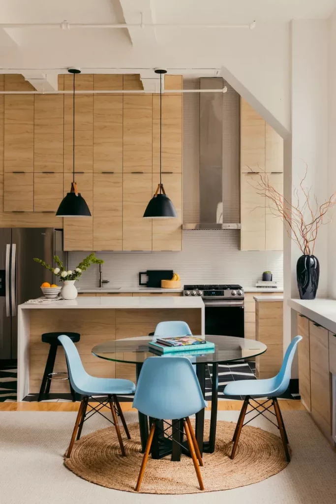
This kitchen combines extensive light wood cabinetry with a small dining area directly in front of it. The cabinetry reaches high toward the ceiling, maximizing vertical storage, while two dark pendant lights hang over the work area. A slim counter separates the kitchen from the round glass dining table, which is surrounded by pale blue chairs. The combination of natural wood, white surfaces, black accents, and blue seating creates a fresh, highly functional composition.
For me, the tall cabinetry is one of the smartest features in this photograph. In a small kitchen, unused space above standard-height cabinets can represent valuable storage, and these full-height units take advantage of it. The compact dining table also fits neatly into the remaining footprint without interrupting the main kitchen work zone. Because the table has a glass top, it remains visually light and doesn’t block the sightline through the room.
I would especially consider this approach when a kitchen needs to accommodate both cooking and dining without a separate dining room. The clear separation between the working counter and the small table makes each zone easy to understand. The pale blue chairs also show how a small amount of color can define the dining area without making the room feel visually busy. To me, it is a very practical example of combining functions rather than trying to give each activity its own room.
Arched Cooking Alcove With Two-Tone Cabinetry
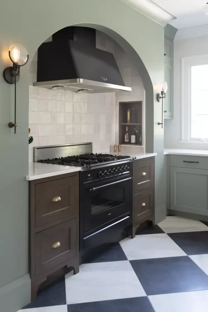
This kitchen places the main cooking area inside a large rounded arch, creating a distinct architectural frame around the range and hood. The upper walls and surrounding cabinetry are painted a soft muted green, while the lower cabinets around the range are dark brown. White glossy backsplash tile surrounds the cooking area, and a black-and-white checkerboard floor adds a strong geometric element. A window on the right brings natural light into the adjacent work area.
I find the arch particularly effective because it gives the compact cooking zone a clear visual boundary without requiring a separate wall. The white countertop continues around the range and provides useful preparation space on both sides. Small recessed shelves beside the range add accessible storage for a few cooking essentials. The lower cabinets also provide closed storage, keeping most kitchen equipment out of sight.
If I were designing a small kitchen around an existing architectural opening, I would consider emphasizing it rather than trying to disguise it. Here, the arch becomes part of the identity of the room while also organizing the cooking zone. The contrasting cabinet colors further strengthen that separation. I would keep the rest of the styling as edited as shown so that the architecture, tile, and flooring can each be appreciated without competing for attention.
Black Kitchen Island With Textured Reflective Backsplash
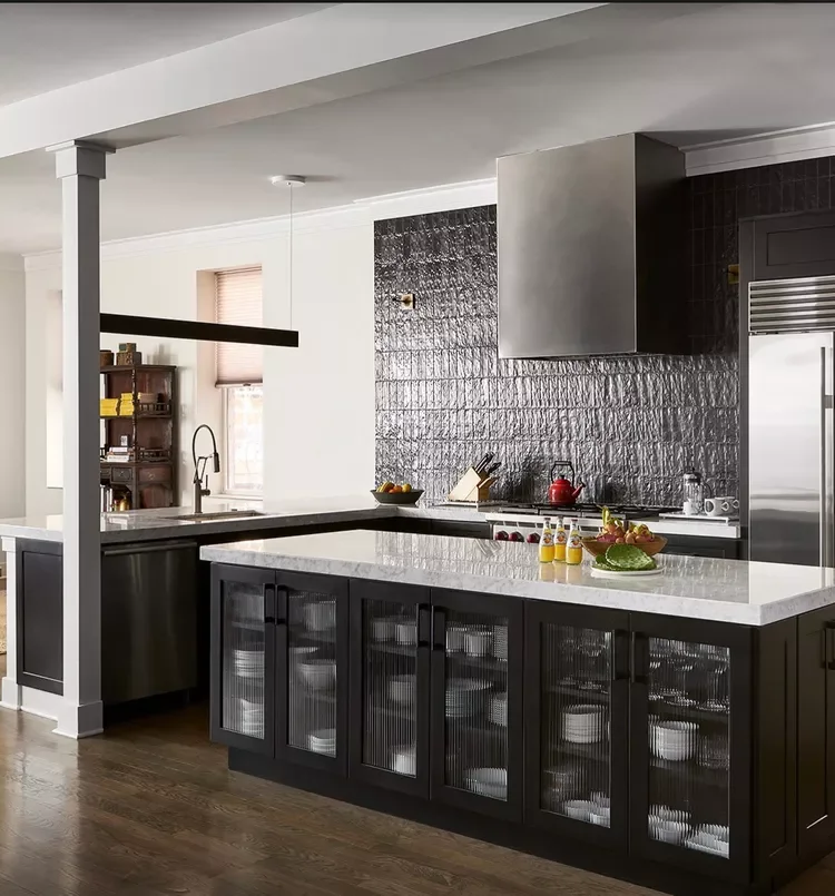
This larger-looking compact kitchen features dark cabinetry throughout the island and perimeter, contrasted with pale countertops. The island includes multiple glass-front doors with textured panels, allowing the contents to remain partially visible while maintaining a defined cabinet appearance. Behind it, a metallic textured backsplash catches the light beneath a substantial stainless-steel hood. The dark wood floor adds another layer of depth to the sophisticated palette.
The island is doing a lot of work in this kitchen. It provides storage, countertop space, and a central working surface while also visually separating the kitchen from the adjoining area. I particularly like the glass-front cabinet doors because they break up the long run of dark cabinetry and introduce a lighter, more dimensional detail. The reflective backsplash similarly helps prevent the darker palette from feeling flat.
For me, the lesson here is that dark finishes can work in a compact kitchen when they are balanced with reflective or light-catching surfaces. I would avoid filling every available surface with accessories because the cabinetry and backsplash already provide substantial visual texture. Instead, I would let a few carefully placed objects on the island create the lived-in feeling. This approach keeps the kitchen functional while giving the limited space a strong design identity.
Dark Wood Kitchen With A Multifunctional Island
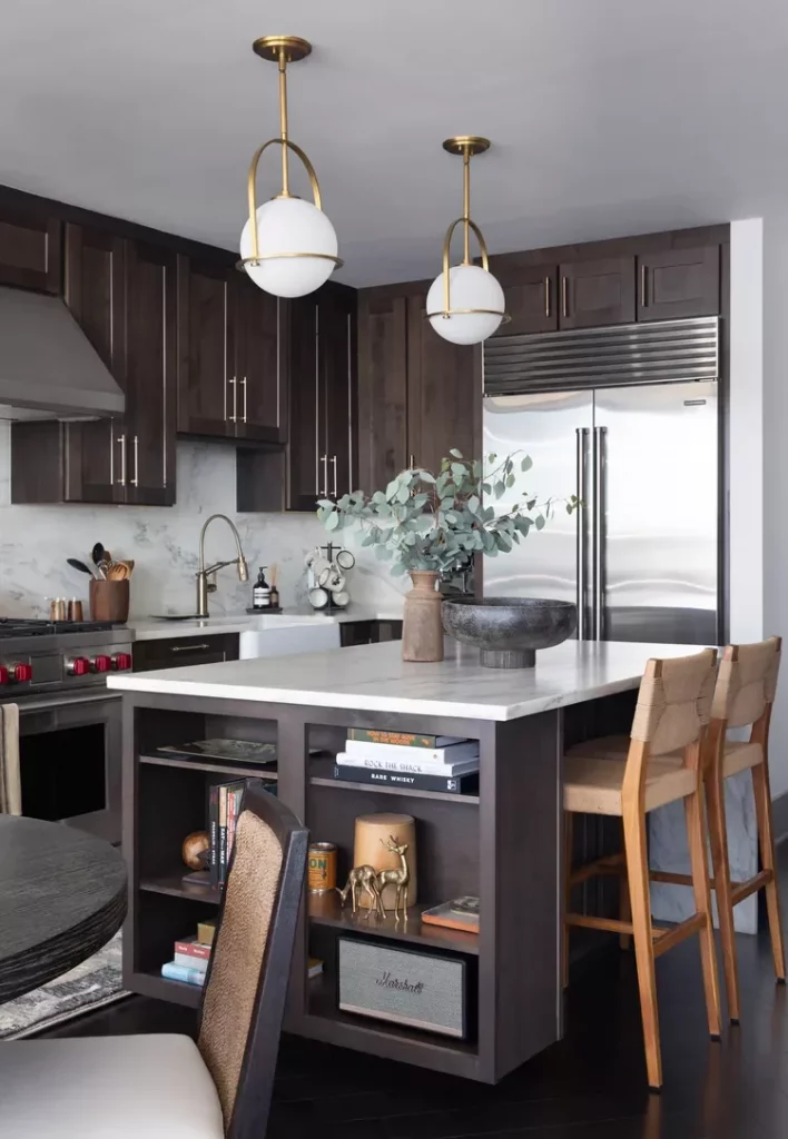
This kitchen uses deep brown cabinetry around the walls and a matching island, paired with a light marble-effect backsplash and countertop. Two rounded pendant fixtures with brass-colored frames hang above the island, while open shelves underneath the island provide space for books and decorative objects. A large refrigerator is integrated into the cabinetry at the back, and stools turn the island into an informal seating area. The room feels rich and layered without abandoning practical storage.
I see the island as the central multifunctional feature here. It combines a generous work surface with open storage and seating, allowing one piece to support several everyday activities. The open shelving is especially useful because it makes the island less visually solid and provides easy access to stored items. Meanwhile, the extensive cabinetry around the perimeter keeps larger kitchen essentials contained.
If I were planning a small kitchen with an island, I would want the island to earn its footprint in exactly this way. Storage alone may not justify the space it occupies, but combining preparation, display, and seating makes the investment much more useful. I also like the way the pale countertop visually separates the island from the dark base. That contrast makes the work surface easy to read and keeps the composition balanced.
Blue Cabinetry With Mesh-Front Upper Storage
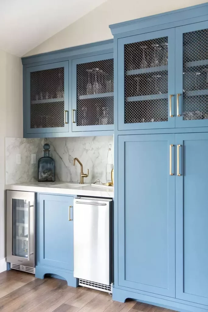
This compact kitchen is defined by blue cabinetry that extends from the lower units into tall storage at the right side. The upper cabinets feature dark mesh-front panels, allowing glassware to be visible while adding texture to the otherwise smooth cabinet fronts. Pale marble-effect backsplash material sits behind the sink, and a brass-colored faucet introduces a warm metallic detail. A small under-counter refrigerator and dishwasher are fitted neatly beneath the worktop.
I like how much storage is packed into this relatively compact wall. The tall cabinet on the right uses vertical space efficiently, while the mesh-front doors provide a visual break from the solid blue surfaces. The lower appliances are integrated into the cabinetry rather than taking over the room visually. Even the small sink area feels organized because the countertop remains largely clear.
For me, this photograph shows how cabinet doors can become an important part of small-kitchen design rather than simply a practical necessity. A distinctive color creates personality, while the mesh fronts add transparency and texture without completely opening the storage. I would use this strategy when I wanted a compact kitchen to feel customized but still highly organized. Keeping the hardware consistent also helps the many cabinet sections read as one coordinated composition.
Light Minimal Kitchen With Sculptural Open Storage
The final kitchen takes a pared-back approach, with pale walls, light wood cabinetry, white countertops, and a white textured backsplash. A long upper cabinet run is broken by open shelving that displays dishes, books, and decorative objects, while the lower cabinets combine drawers and doors. A dark refrigerator provides contrast at the left, and two black pendant lights hang above the central work area. In front, a round glass table and pale blue chairs create a compact dining zone.
What stands out to me is how effectively this kitchen combines storage with visual openness. The tall wood cabinetry provides plenty of concealed space, while the open central shelving prevents the wall from becoming a completely solid block. The glass dining table takes up relatively little visual weight, allowing the kitchen to remain the dominant feature of the room. The pendant lights also define the kitchen area without requiring additional architectural separation.
I would take a particularly practical lesson from this design: in a small kitchen, visual lightness can be just as important as physical storage capacity. Tall cabinets can hold a great deal, but mixing them with open areas gives the eye somewhere to rest. I also like the way the dining furniture is scaled to the room rather than competing with it. For anyone maximizing a compact kitchen, this balance between storage, circulation, and visual openness is one of the most useful ideas in the collection.
A small kitchen does not have to feel limited when the layout, storage, and finishes are thoughtfully planned. I love how these ideas show that smart cabinetry, multifunctional surfaces, and carefully chosen details can make even a compact space feel comfortable and stylish. The best designs balance practicality with personality while keeping the room visually open and easy to use. I hope these modern small kitchen ideas inspire you to make the most of every inch in your own home. Which design was your favorite? Leave a comment and share the idea you would love to try.