
Choosing paint colors can feel like picking a favorite child, except the child is a wall and the consequences involve a roller and a very long weekend. 35 paint colors for 2027 are here to make that decision a little less dramatic, covering everything from deep, moody bedrooms to cheerful kitchens and calm, neutral living rooms.
Whether you are refreshing a rental or finally committing to that bold accent wall, this guide walks through real rooms where the color does the talking. Expect practical notes on texture, trim, and how light changes a shade, so you can walk into a paint store with actual confidence instead of a vague hope and a prayer.
Deep Gray Textured Walls for a Modern Bedroom Sanctuary
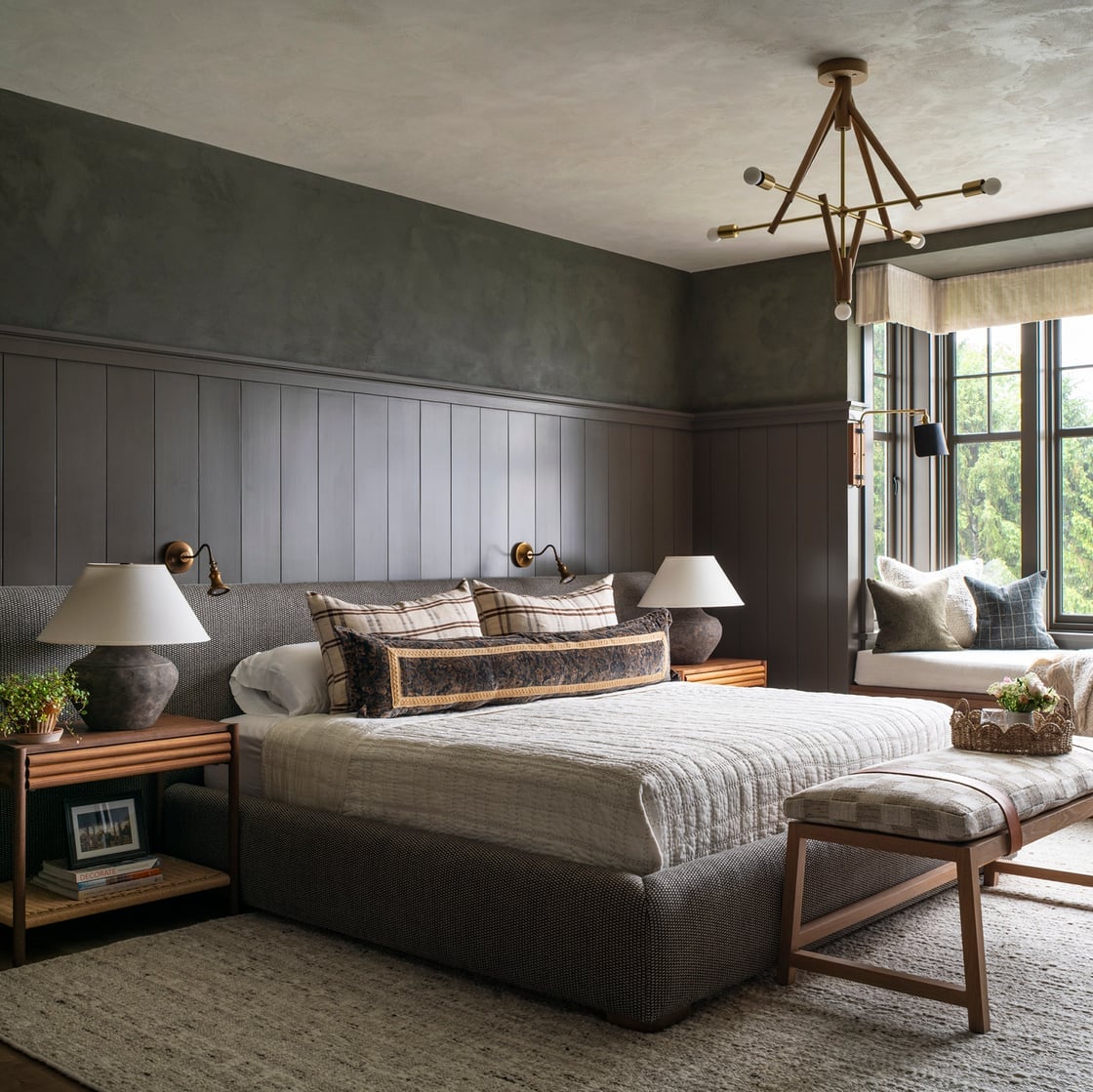
The dark gray textured walls set the whole mood here, giving the room a grounded, cocooning feel that plain flat paint rarely achieves. With the bed centered and a window seat off to the side, the space feels roomy yet intimate, and the beige and wood tones keep it from turning cold. The texture itself softens the deep color, so it reads as fabric-like rather than harsh. For a modern bedroom, this is the kind of finish that makes the wall the quiet anchor while everything else, the bed, the nightstands, the bench, stays simple.
Sage Green Painted Cabinets in a Farmhouse Kitchen
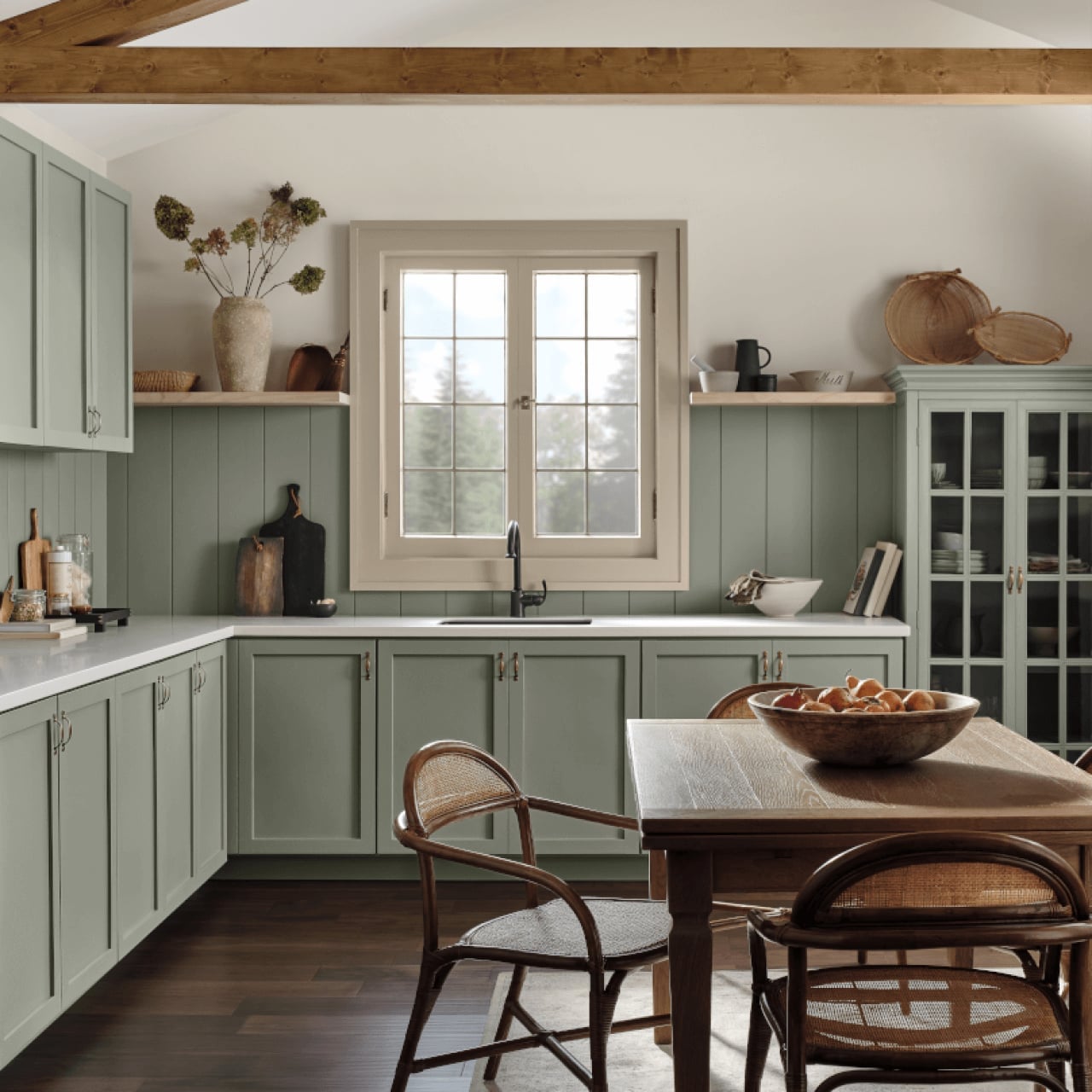
Sage green painted cabinets are a reliable way to bring farmhouse warmth into a kitchen without going full country. Here, the L-shaped layout with an island keeps the room practical, while the sage tone adds a soft, natural contrast to the wood and white surfaces. The stone countertops and the daylight from the window let the green shift through the day, looking muted in the morning and richer by afternoon. This is a palette that works because the green is neither too bright nor too gray, it sits comfortably between the wood tones and the white, so it ties the whole kitchen together rather than competing with it.
Off-White Walls with Green Accents in a Modern Living Room
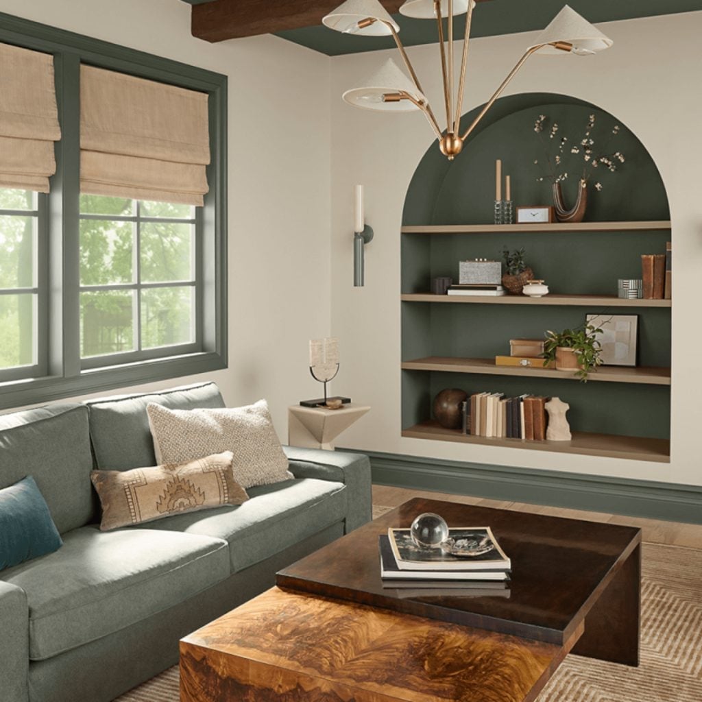
Why does off-white always look right in a modern living room? Because it gives you a blank canvas that still feels warm, especially when you add green accents. In this room, the off-white walls make the space feel open and bright, with natural light bouncing off them and the chandelier adding a soft glow above. The green accents, on the bookshelf and in a few textiles, bring a natural, calm note that prevents the space from feeling sterile.
The sofa faces the bookshelf, which is a smart layout for a room that wants to feel both social and grounded. The coffee table and shelving use wood tones for depth, while the glass pieces reflect light and keep the look airy. The balance here is simple: let the walls stay quiet, and let the green do the talking in small, deliberate doses.
Tan Horizontal Wood Paneling for a Traditional Living Room
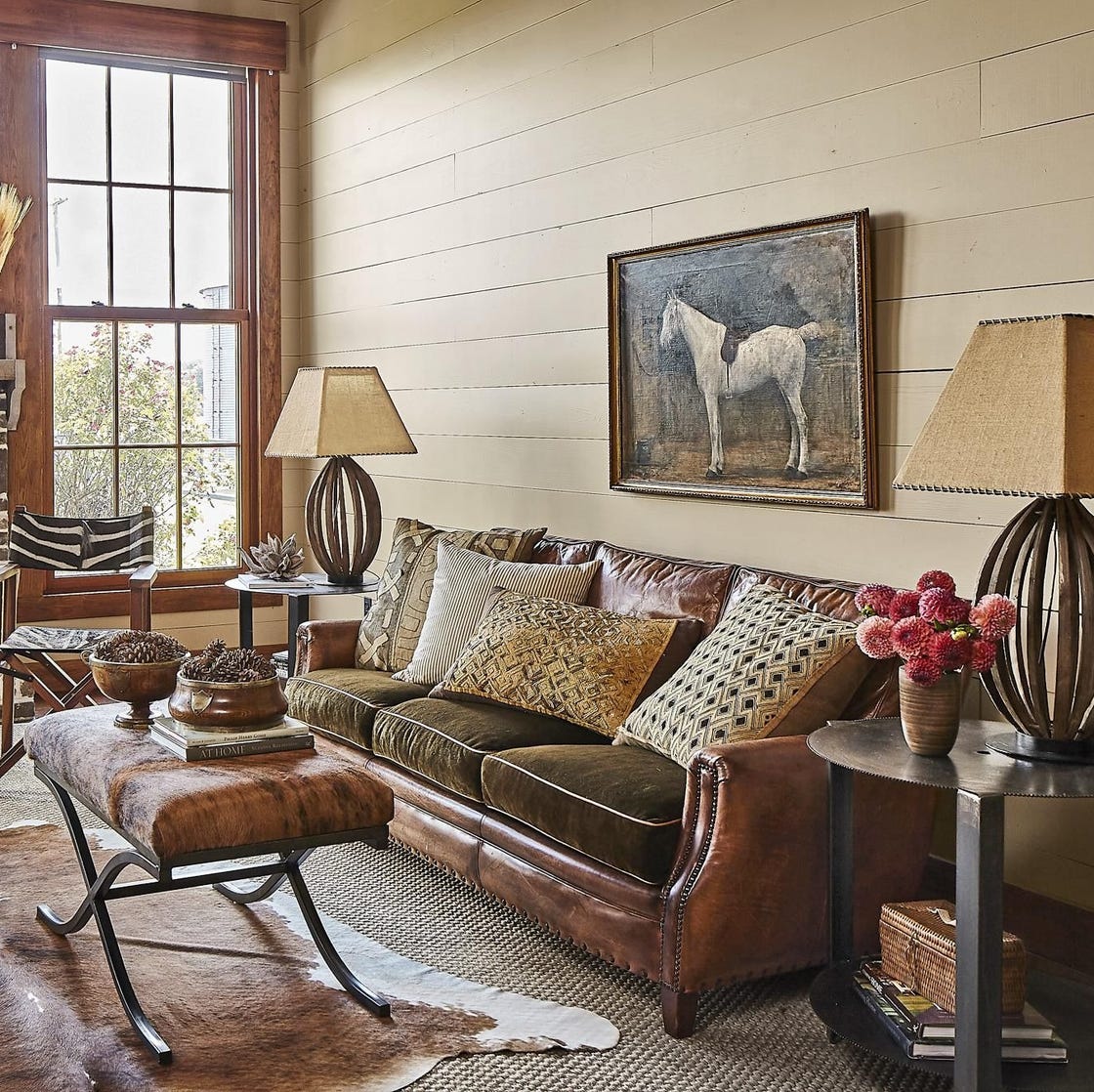
The tan horizontal wood paneling runs across the walls, giving this traditional living room a sense of warmth and structure that paint alone can’t match. Natural light from the window hits the panels at an angle, making the grain visible and adding a layer of depth that changes through the day. The leather sofa and the woven textiles pick up the same earthy tones, so the whole room feels cohesive. Table lamps on the side tables provide a soft, warm glow in the evening, which is exactly what this kind of paneling needs, it flatters the wood and keeps the room cozy without relying on harsh overhead light.
Deep Green Walls and Built-in Shelving in a Modern Office
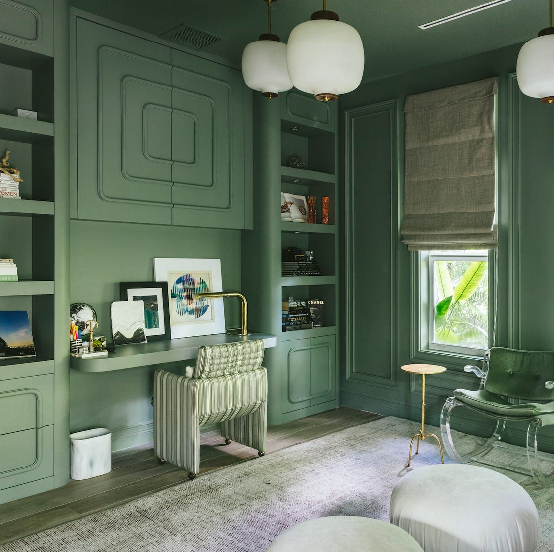
Deep green walls run right into the built-in shelving, so the color and the storage feel like one continuous piece. The desk sits along the same wall, which keeps the layout efficient and leaves the room open. The brass and wood accents break up the green, adding warmth and a bit of light reflection, while the window keeps the space from feeling too dark. This is a room where the paint color and the storage work together, the green makes the shelving recede, so your books and objects stand out, and the built-in design means you never need to add a freestanding unit that would fight the palette.
White Paneled Walls in a Coastal Farmhouse Living Room
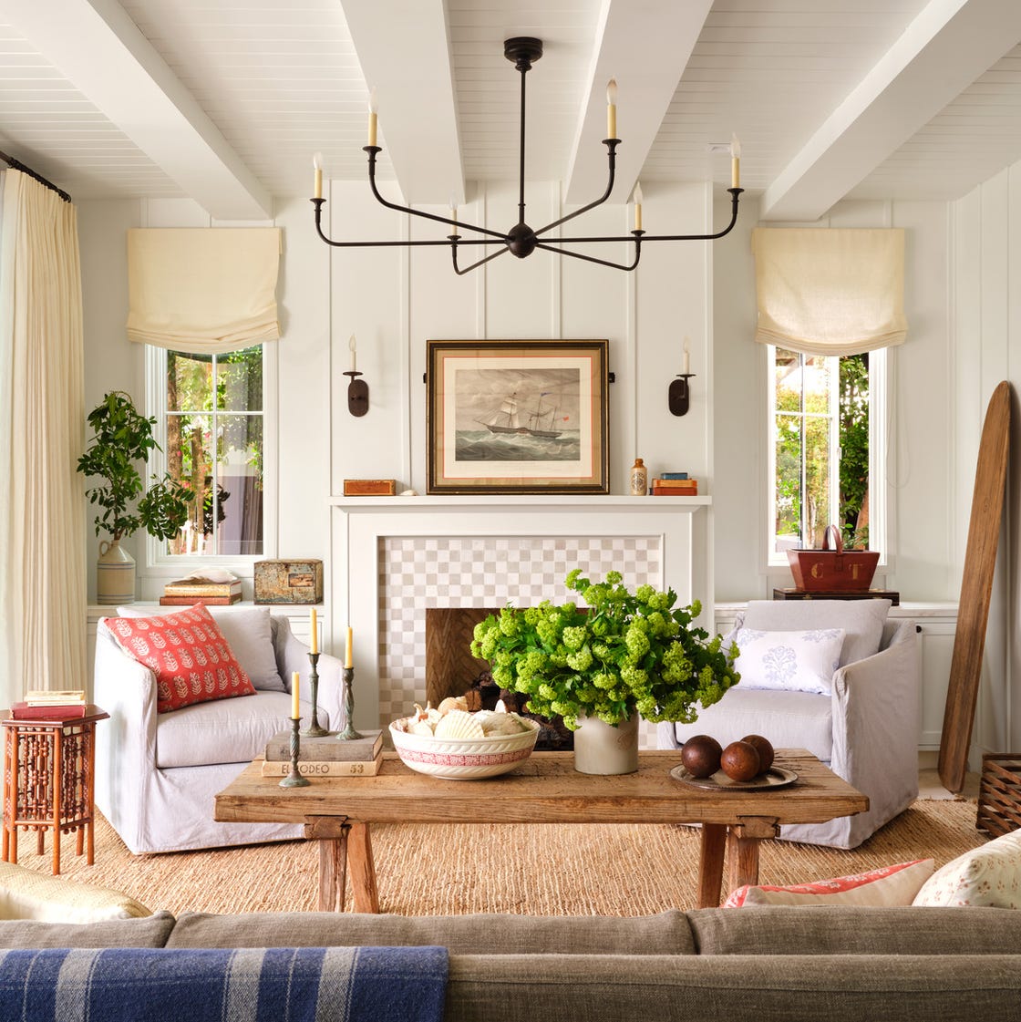
White paneled walls give a coastal farmhouse living room a crisp, airy base that lets the furniture do the talking. The room pairs those white walls with a palette of beige and green, using linen and rattan pieces to keep the texture soft and natural. A chandelier adds a touch of formality while the seating arrangement stays relaxed and open.
The paneling itself reads as classic, so the rest of the room can lean casual without looking unfinished. If you want the look, ask for vertical panels painted in a matte or satin finish; the sheen affects how much light bounces around. Wood and natural fibers warm up the white so the space never feels cold, even on a cloudy day.
Modern Grid Display of Muted Paint Swatches
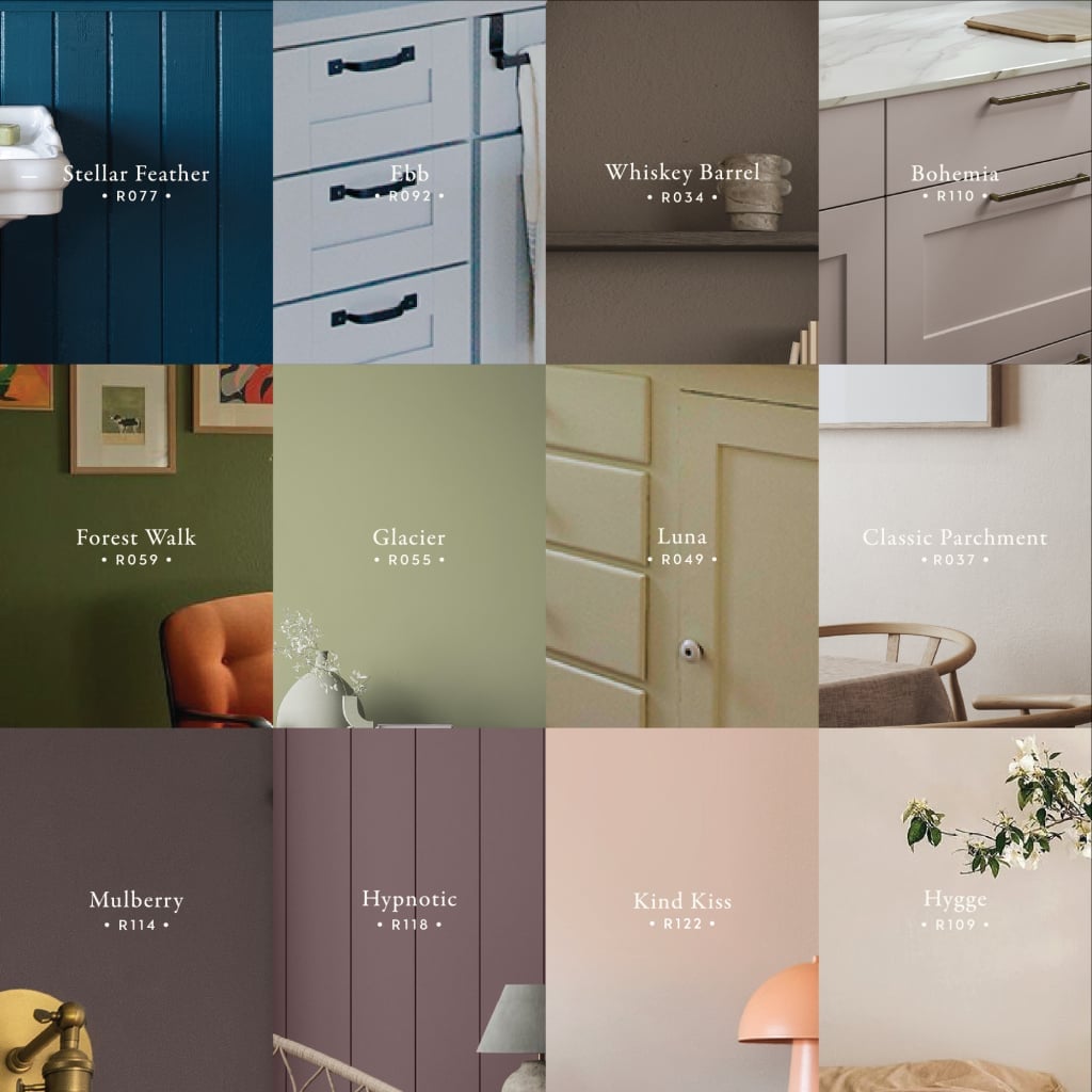
A neat grid of muted paint swatches turns a simple fan deck into a deliberate design statement. Arranged in rows, the paper squares create a rhythm that feels modern rather than cluttered. The range of soft, earthy tones shows how different hues sit side by side, which is a handy way to compare undertones. For renters, this display works as a temporary wall treatment: pin the swatches to a board and lean it against the wall, no painting required. It also makes choosing a final color feel less like a gamble.
Teal Walls with Green Floral Wallpaper in a Traditional Dining Room
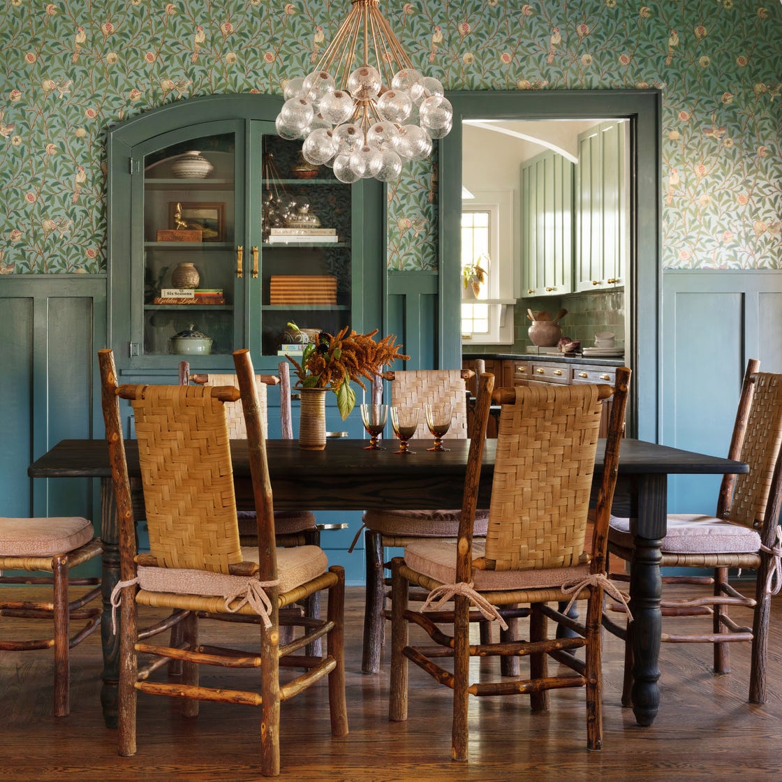
Teal walls paired with green floral wallpaper make a traditional dining room feel rich and collected. The teal paint anchors the space while the wallpaper adds pattern without overwhelming it. Wood tones from the dining table and cabinet ground the scheme, and woven rattan chairs soften the formality. The chandelier casts warm light, and light from the adjacent room keeps the teal from going flat. The wallpaper only covers one wall, which is a smart way to use a bold print: it becomes a feature, not a fight. This palette works because the teal and green share the same family, so the room feels layered, not busy.
Soft Pink Walls in a Traditional Bedroom
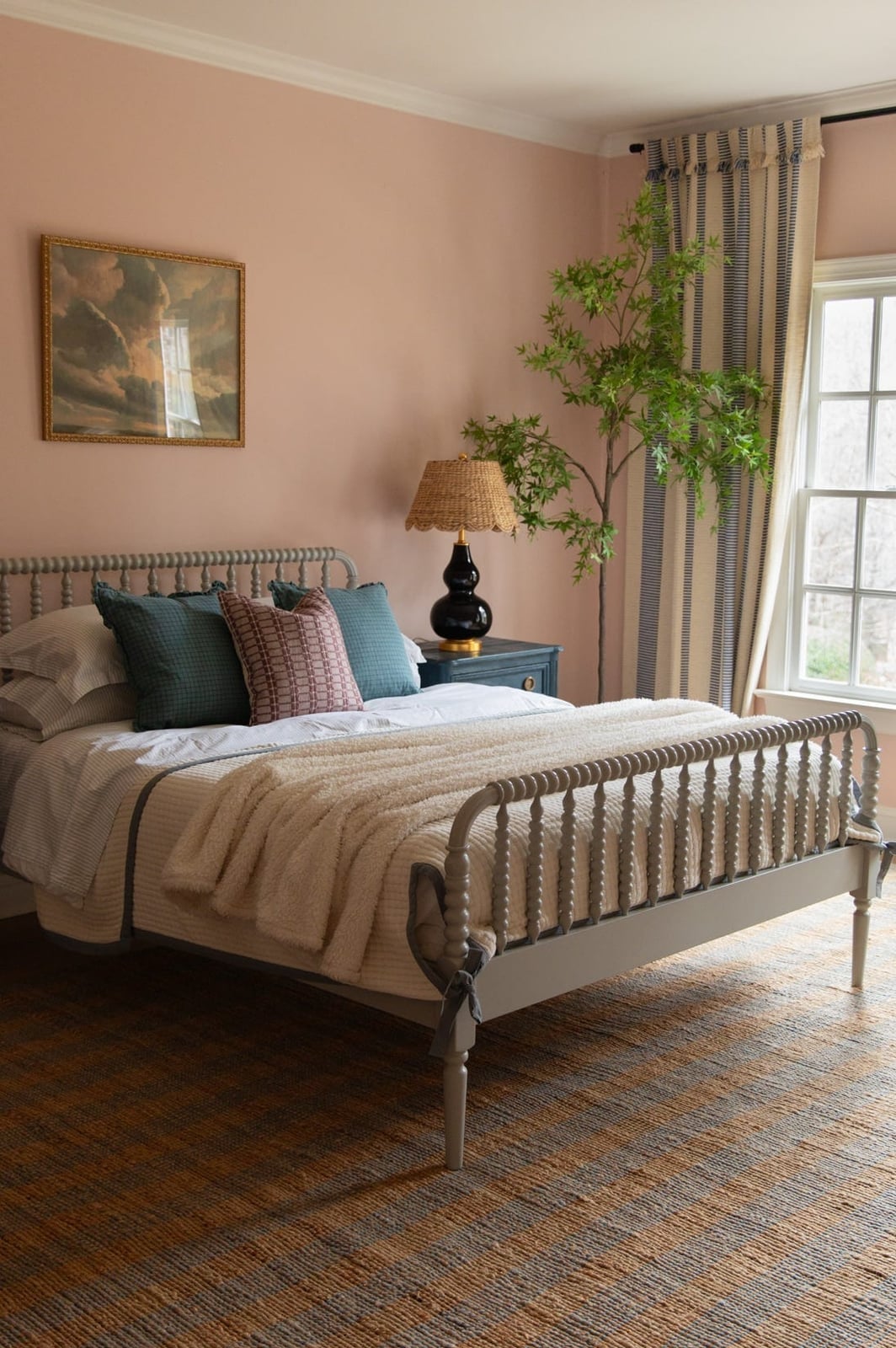
Wondering if soft pink walls will feel too sweet for a traditional bedroom? The color reads more sophisticated than you might expect when it’s paired with the right materials. Here, the pink walls sit next to blue and cream accents, with wood, linen, and metal pieces keeping the look grounded. Natural window light brings out the warmth in the pink without making it feel childish.
The key is the shade: a dusty pink, not a candy tone. That subtlety lets the walls act as a neutral backdrop, so the bed and curtains can carry the room. If you’re worried about commitment, test the color on a large piece of foam board and move it around the room at different times of day. The same pink can look peachy in morning light and mauve by evening.
Yellow Fireplace Surround and Walls in an Eclectic Living Room
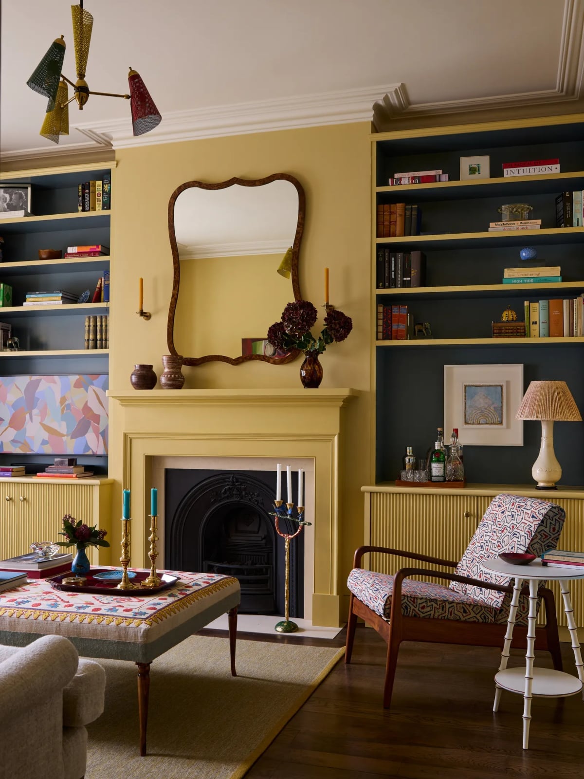
A yellow fireplace surround and matching yellow walls give an eclectic living room a bold, sunlit focal point. Dark blue bookshelves on either side create a strong contrast that keeps the yellow from feeling one-note. The armchair’s patterned fabric and the multi-colored ottoman add layers of texture and color, while the table lamp and chandelier provide warm pools of light. This scheme works because the yellow is repeated in two places, so the eye moves naturally from the walls to the fireplace. The blue shelves break up the yellow and give the room a sense of depth. It’s a confident palette that asks for equally confident furniture.
Two-Tone Walls: Pale Blue and Mint Green in a Cottage Bedroom
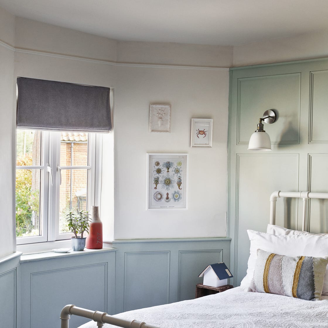
For two-tone walls, the lower color grounds the room and the upper color keeps it open. Here pale blue covers the upper walls and ceiling, while mint green wraps the paneled lower section. The white trim between them acts as a clean break. A metal bed frame with simple lines sits against the wall, and daylight keeps both shades soft. The compact layout makes the most of the division: the darker mint green anchors the bed area, and the pale blue above keeps the ceiling from feeling low.
Soft Pink Walls Complementing an Ornate Marble Fireplace
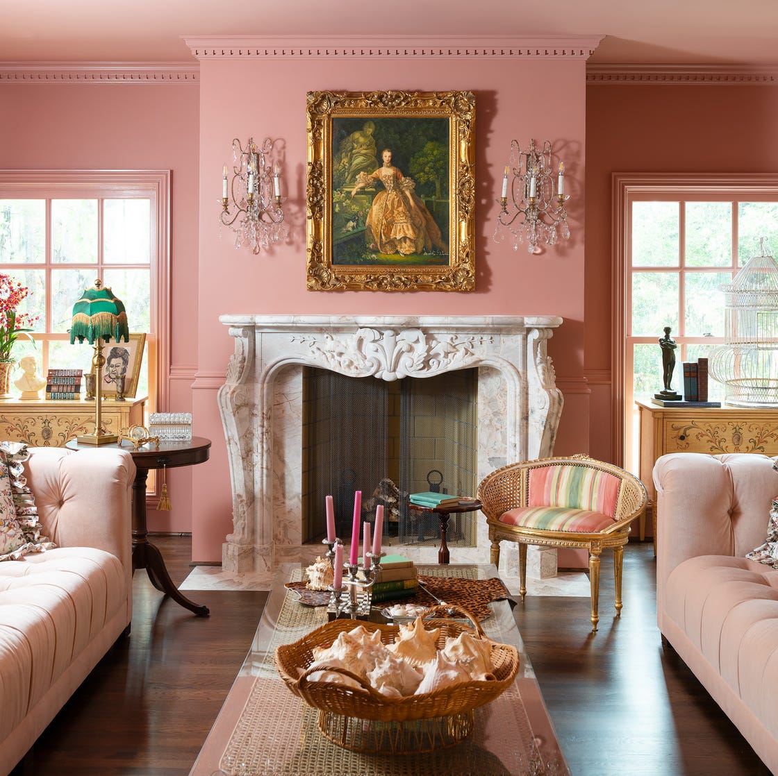
Soft pink walls can read as sweet or sophisticated depending on what they sit next to. Here the pink is muted, almost dusty, so it plays against the ornate marble fireplace rather than competing with it. The marble brings cream and gray veining, the gold mirror frame adds warmth, and the velvet sofa and armchair introduce deeper green and cream tones.
The wall sconces cast a warm glow that softens the pink further. Wicker accents and wood furniture keep the room from leaning too formal. The palette works because the pink is the backdrop, not the star. It lets the marble fireplace hold attention while still adding a gentle color layer that a plain white wall would not.
Expansive Neutral Beige Walls in a Modern Living Room
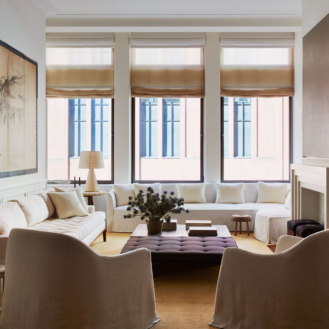
The beige walls here are light enough to read as almost white in bright sun, but they hold a warmth that white often lacks. Large windows bring in generous natural light, and the beige absorbs some of that brightness so the room does not feel washed out. The furniture adds contrast: brown leather, gray fabric, glass and metal. A lamp near the seating area adds a secondary light source. The result is a neutral backdrop that supports multiple seating zones and a large coffee table without feeling crowded.
Light Neutral Walls in a Farmhouse Bedroom with Sloped Ceiling
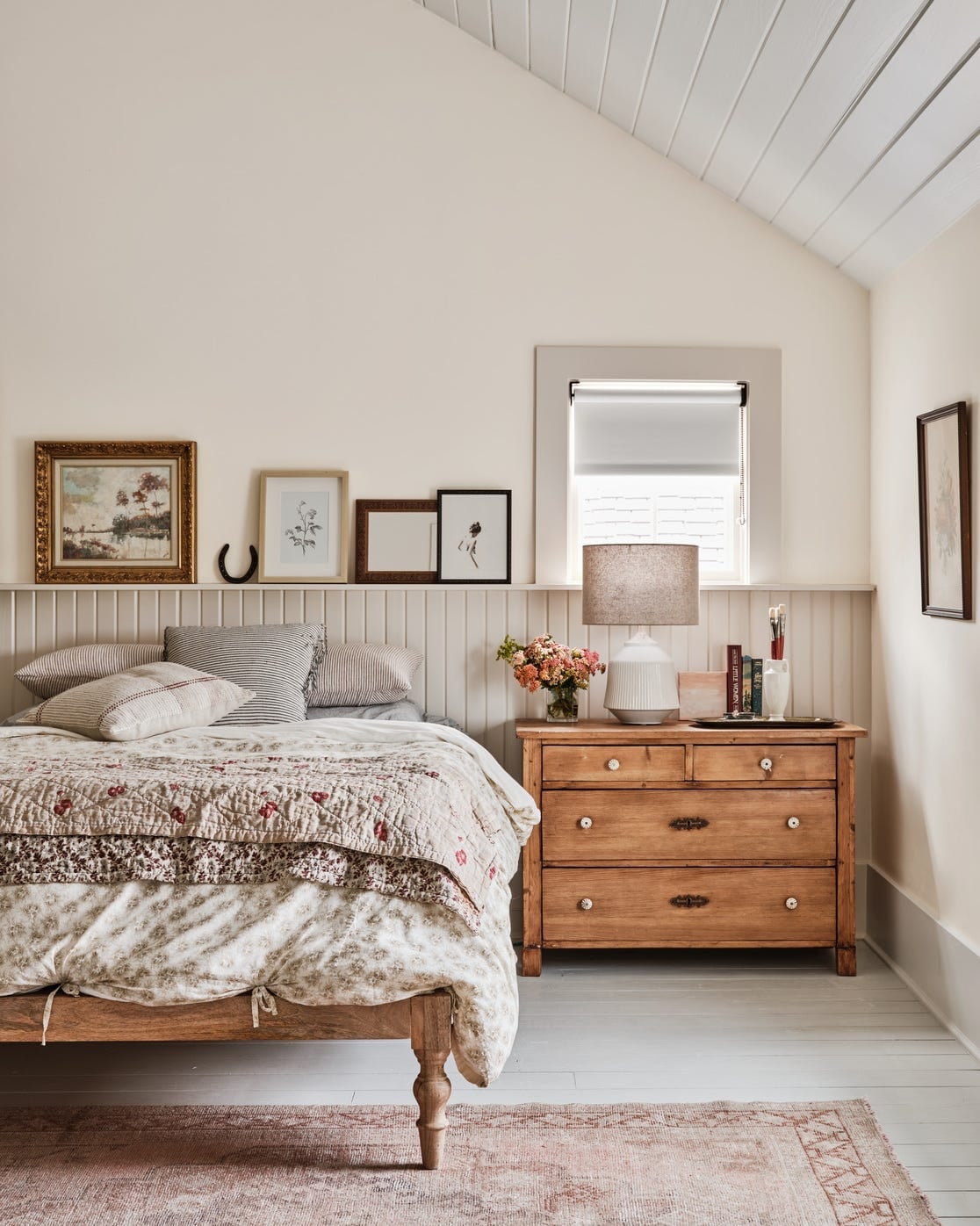
This farmhouse bedroom gets the palette right for a sloped ceiling. The walls are a light neutral, close to cream, which prevents the angled ceiling from feeling like a dark tunnel. A quilted bedspread brings in floral pink, and the wood dresser adds warmth. Natural light and a bedside lamp keep the room bright. The sloped ceiling could make a darker color feel oppressive, but the light neutral paint lets the architecture be a feature rather than a problem.
Vibrant Teal Walls in a Mid-Century Modern Dining Room
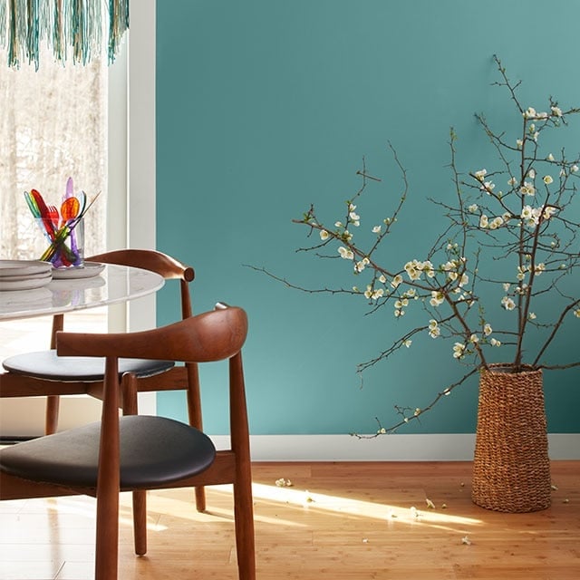
A bold wall color works best when the furniture stays neutral and the paint carries the energy. Here the teal walls are vibrant, almost jewel-toned, but the dining set stays simple: a marble table and wood chairs with clean lines. A woven basket adds texture without introducing another color.
The window lets in natural light that hits the teal directly, making it shift from deep to bright depending on the time of day. The wood tones in the chairs and the white of the marble prevent the room from feeling saturated. The teal is the anchor, and every other piece in the dining room works to support it.
White Walls with Teal Accents on Fireplace and Shelves in a Farmhouse
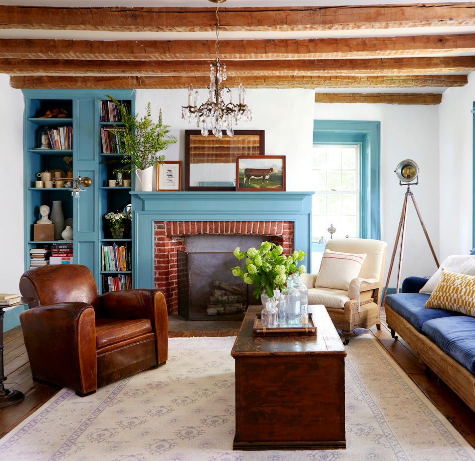
A teal painted fireplace surround and matching built-in bookshelves create a focal point against white walls that keep the farmhouse living room simple. The palette stays restrained: brick red from the fireplace insert, wood tones from the beams, and leather from the armchairs are natural companions to the teal. White walls let those accent colors carry the weight of the room, so the layout with a central fireplace and flanking shelves feels balanced.
Dark Gray Painted Wall in a Modern Living Room
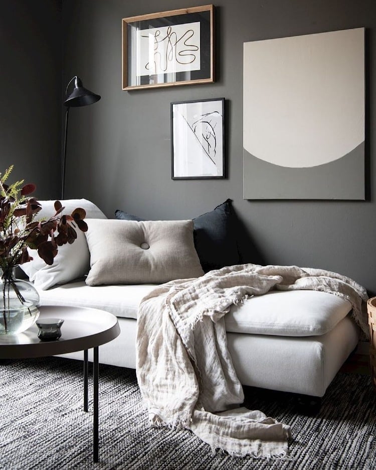
A practical rule for painting a single wall in a modern living room is to treat it as the anchor for the palette. The dark gray wall behind the sofa pulls together beige upholstery, white surfaces, and wood accents without letting any one piece dominate. Layered ambient and lamp lighting softens the contrast so the dark gray reads as depth, not a hole. This approach works for renters who can repaint a single wall before moving out, and the limited surface area makes color commitment feel manageable.
Pale Blue Walls for a Calm Traditional Living Room
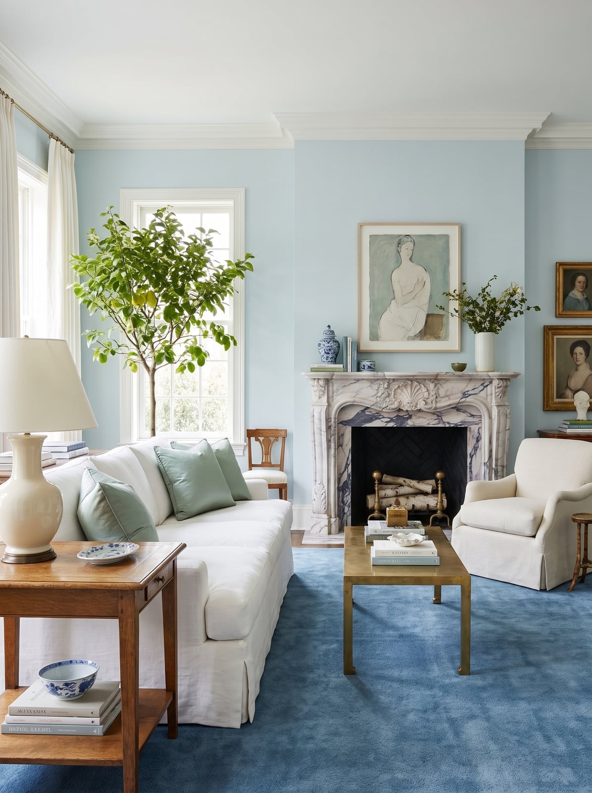
Pale blue walls can lean too cool if paired with stark white trim, but this traditional living room avoids that by bringing in warm wood tones and marble that add weight. The pale blue acts as a quiet backdrop for green upholstery and brass accents, letting the furniture and fireplace hold attention.
The balance comes from the ratio: pale blue covers the largest surface, while white trim keeps the architecture crisp and wood pieces ground the room. A table lamp with a linen shade and natural light from the window keep the blue soft. For anyone considering this shade, the trick is to test it against your existing wood finishes, because pale blue shifts noticeably depending on whether it sits next to oak, walnut, or painted white.
Gray Paneled Walls in a Cozy Farmhouse Bedroom
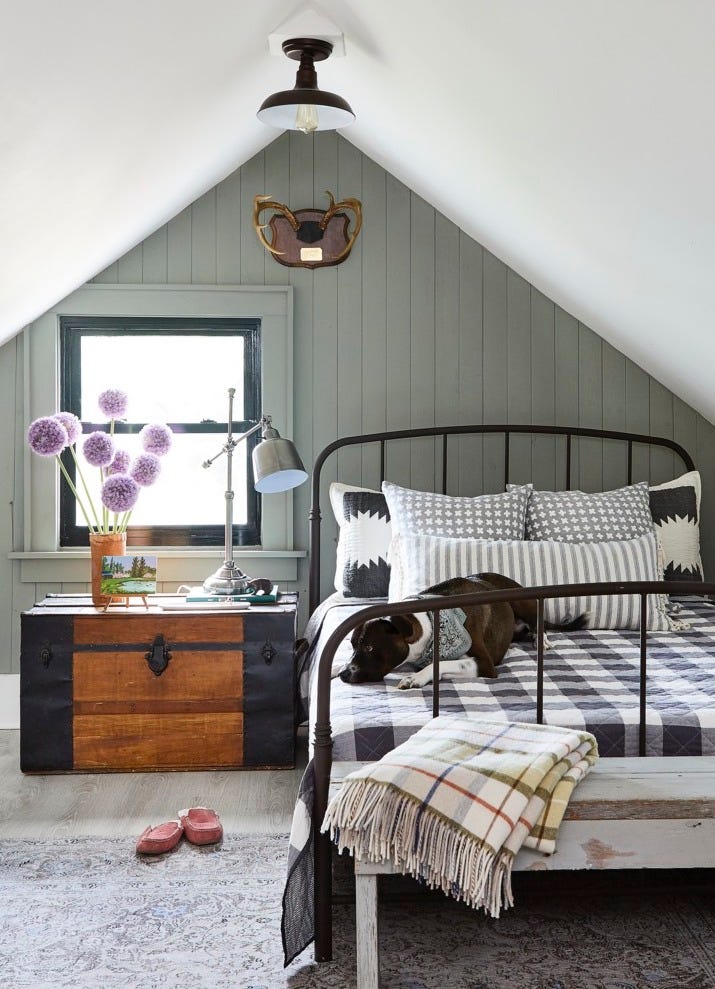
The gray paneled wall in this compact farmhouse bedroom follows the slanted ceiling line, which gives the low pitch a deliberate look. Wood paneling on the slanted section adds texture that flat paint would lack, and the gray prevents a heavy feel. Plaid bedding and a metal lamp introduce contrast against the wall finish. The trunk at the foot of the bed provides storage without blocking the sightline from the door.
Sage Green Walls in a Traditional Living Room
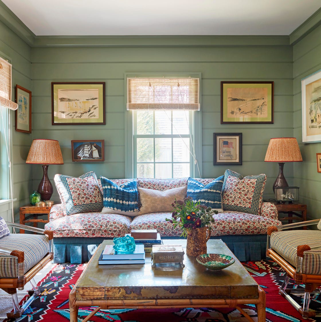
Sage green walls in this traditional living room work because the shade sits low in saturation and middle in value, so it recedes instead of advancing. The palette pairs sage with cream upholstery, blue accents, and red details that add variety. Natural daylight hits the walls evenly, which matters for sage green, because it can pull gray in north-facing rooms or yellow in south-facing ones. The seating arrangement centers on the coffee table, and the wall color holds the space together.
Pale Pink Paneled Walls in a Modern Farmhouse Bedroom
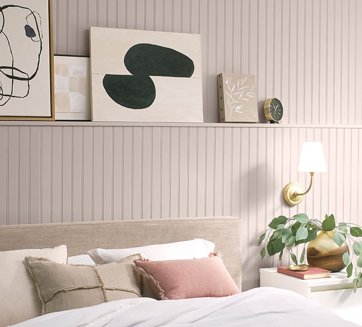
Paneled walls create texture that stays the focus when the rest of the room stays simple. The pale pink on the wall paneling sets a soft backdrop for a modern farmhouse bedroom. A beige linen bed and a wood nightstand add natural warmth. A brass wall sconce and fresh greenery bring in a touch of contrast. The paneling gives the cozy room a finished, tailored feel. This approach lets the paint color and the wood paneling share attention without either one overwhelming the space.
Vibrant Yellow Walls in a Modern Living Room
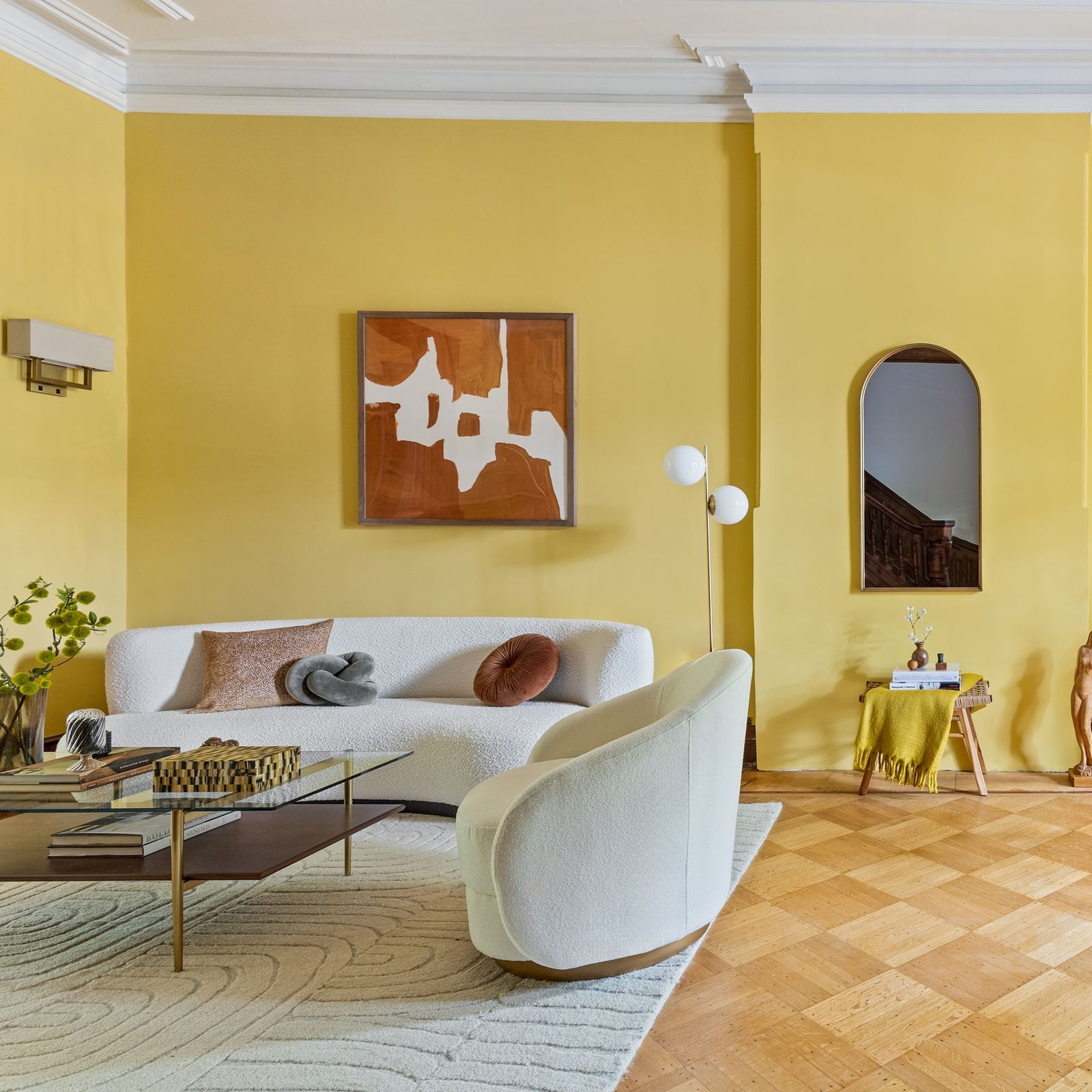
The vibrant yellow walls set an energetic tone for the living room. A white sofa and a brown leather armchair ground the bright backdrop, while a patterned rug ties the seating area together. A floor lamp and a wall sconce add soft illumination that keeps the yellow from reading as harsh. The wood coffee table and glass decor bring in natural texture and a bit of weight. The palette works because the yellow is the clear lead and the other colors support it without competing.
Neutral Beige Walls in a Japandi Living Room
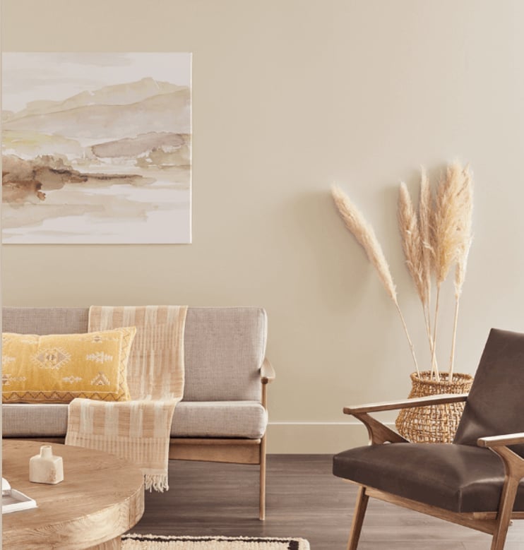
A calm palette starts with the neutral wall color as the baseline, then adds texture through materials. The beige walls in this Japandi living room create a quiet backdrop for a linen sofa and a wood armchair. A woven basket and a round coffee table bring in natural fiber and warmth. Soft natural light keeps the beige from looking flat. The palette stays restrained, relying on wood tones and gray accents for depth instead of a second paint color.
Dark Blue Paneled Walls in a Compact Modern Bedroom
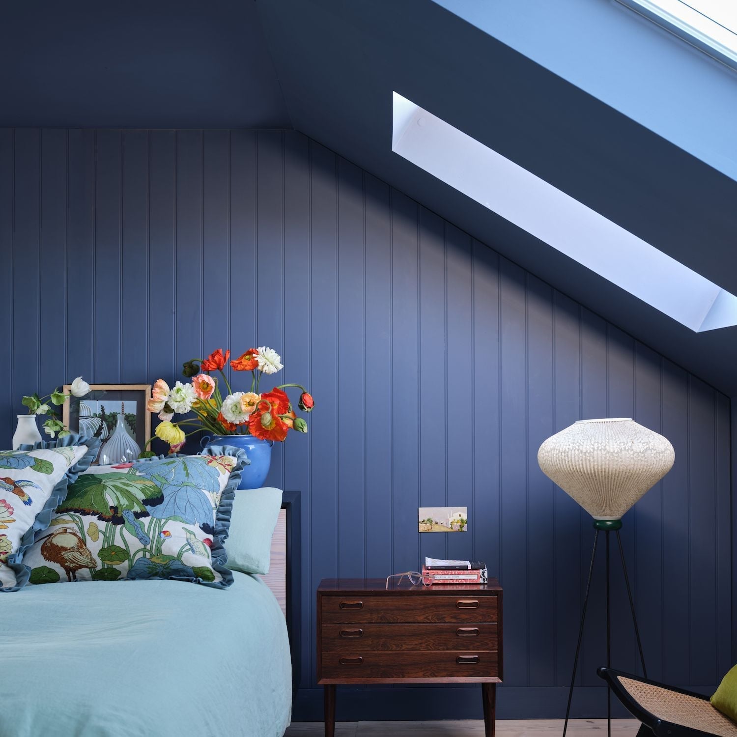
In a compact bedroom, dark blue paneled walls might feel like a risk, but the skylight and a floor lamp balance the mood. The paneling adds vertical texture that draws the eye upward, making the room feel taller. A white bed and an orange pillow keep the palette from turning too heavy. The nightstand and the green plant add natural elements that soften the dark backdrop. The layout works because the bed sits against the paneled wall, giving the dark color a clear anchor. This setup proves that a smaller room can handle a deep wall color when natural light and lighter accents are part of the plan.
Pale Blue Walls and White Trim in a Farmhouse Bedroom
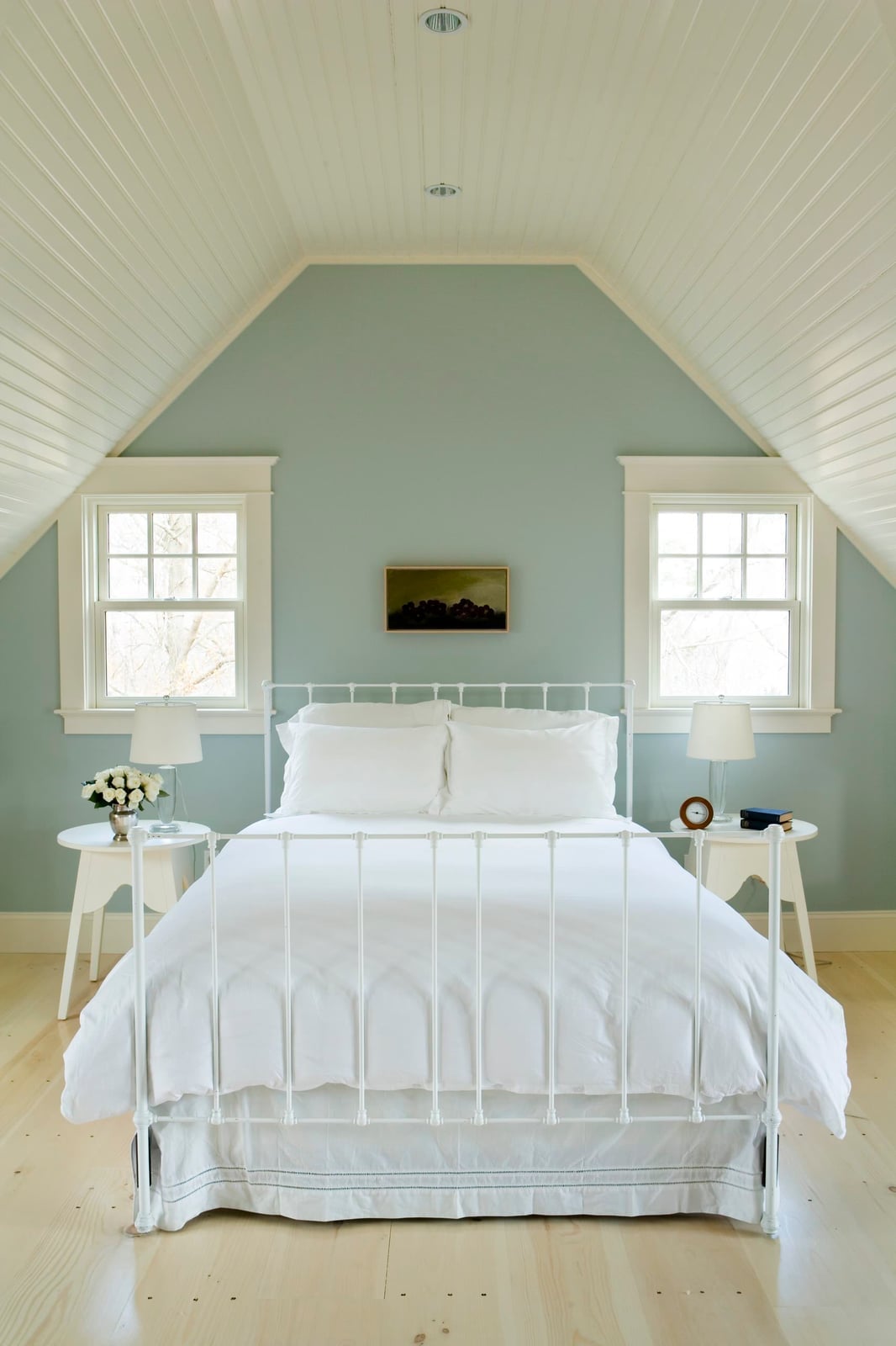
The pale blue walls and white trim create a crisp, airy backdrop for this farmhouse bedroom. Symmetrical windows flank the bed, letting natural light wash the soft blue. Wood nightstands and metal lamps add farmhouse texture without cluttering the palette. The white trim keeps the blue from feeling too cool, while the wood tones bring warmth. The result is a room that feels calm and open, with the wall color doing the work of setting the mood.
Light Blue Walls in an Eclectic Living Room with Gallery Wall
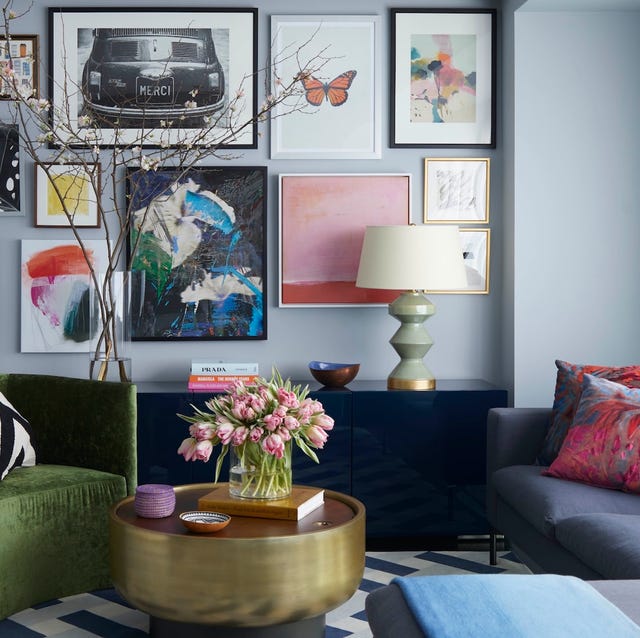
Light blue paint works as a calm backdrop for an eclectic mix of furniture and art. The walls are light blue, and the room also includes a navy cabinet, a green armchair, and a gray sofa. A gallery wall hangs above the cabinet, with art in navy, green, and pink tones. The lacquer, velvet, brass, and glass materials add texture without competing. Ambient lamp light keeps the palette soft. For a renter-safe swap, use removable wallpaper in a similar light blue tone instead of painting. It gives the same effect and peels off cleanly when the lease ends.
Sage Green Shiplap Walls in a Modern Farmhouse Craft Room
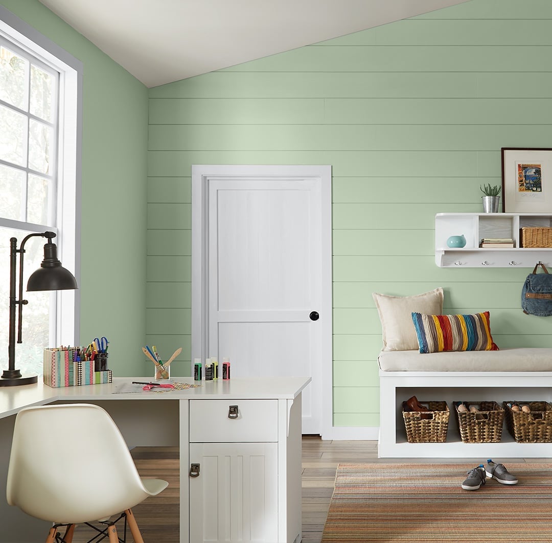
Sage green shiplap walls hide marks and add color without being loud. The wood planks run vertically, and the sage green paint creates a calm backdrop. A desk and a bench with storage sit along the wall, and shelves hold woven baskets. Natural light from a window and a desk lamp keep the space bright. The wood, metal, and woven basket materials reinforce the modern farmhouse style. If you rent, consider peel-and-stick shiplap panels. They install over existing drywall with no permanent damage and come in pre-finished sage green tones. The shiplap texture also hides dust and small scuffs better than flat drywall. For a craft room that sees daily use, that is a real advantage.
Beige Walls with a Large Blue Sectional in a Transitional Living Room
A large blue sectional sofa defines this transitional living room. The beige walls let the sofa take center stage. A brown armchair and a wood coffee table add warmth. Natural window light and a floor lamp provide even illumination. The palette stays simple: beige, blue, and brown. This setup works because the beige walls do not fight the blue fabric. The carpet keeps the sound down in an open plan layout.
Modern Display of Fanned Paint Swatches
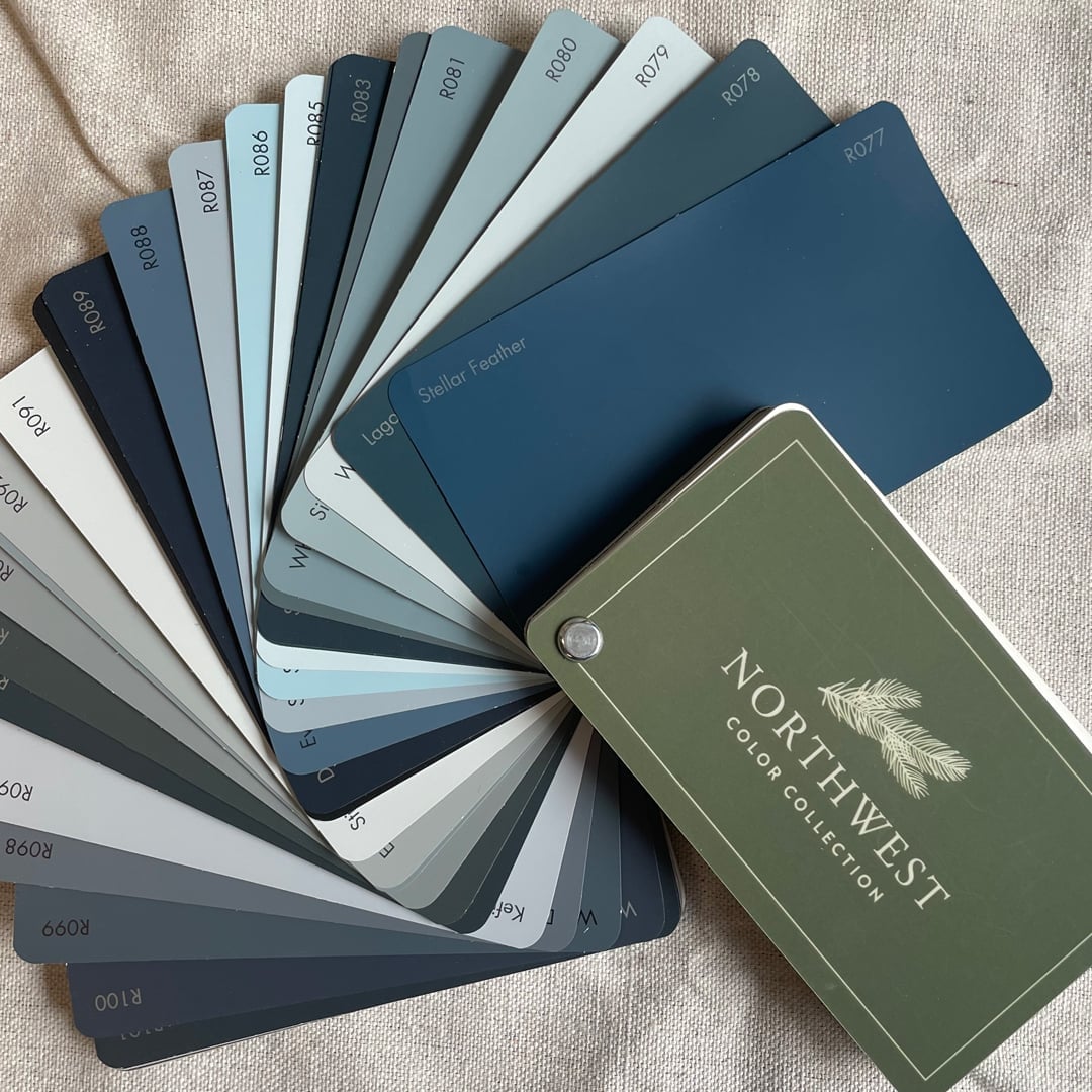
A fan deck of paint swatches shows blues, grays, and greens arranged in a graduated arc. The paper cards fan out from a single point, creating a clean modern vignette. Each swatch sits slightly offset from the next, so the full range of hues is visible at once. Ambient light falls evenly across the paper. This display turns a practical tool into a piece of wall art. For anyone choosing between similar shades, fanning them out like this makes the undertones easier to compare.
Rich Dark Green Walls in a Modern Living Room with Fireplace
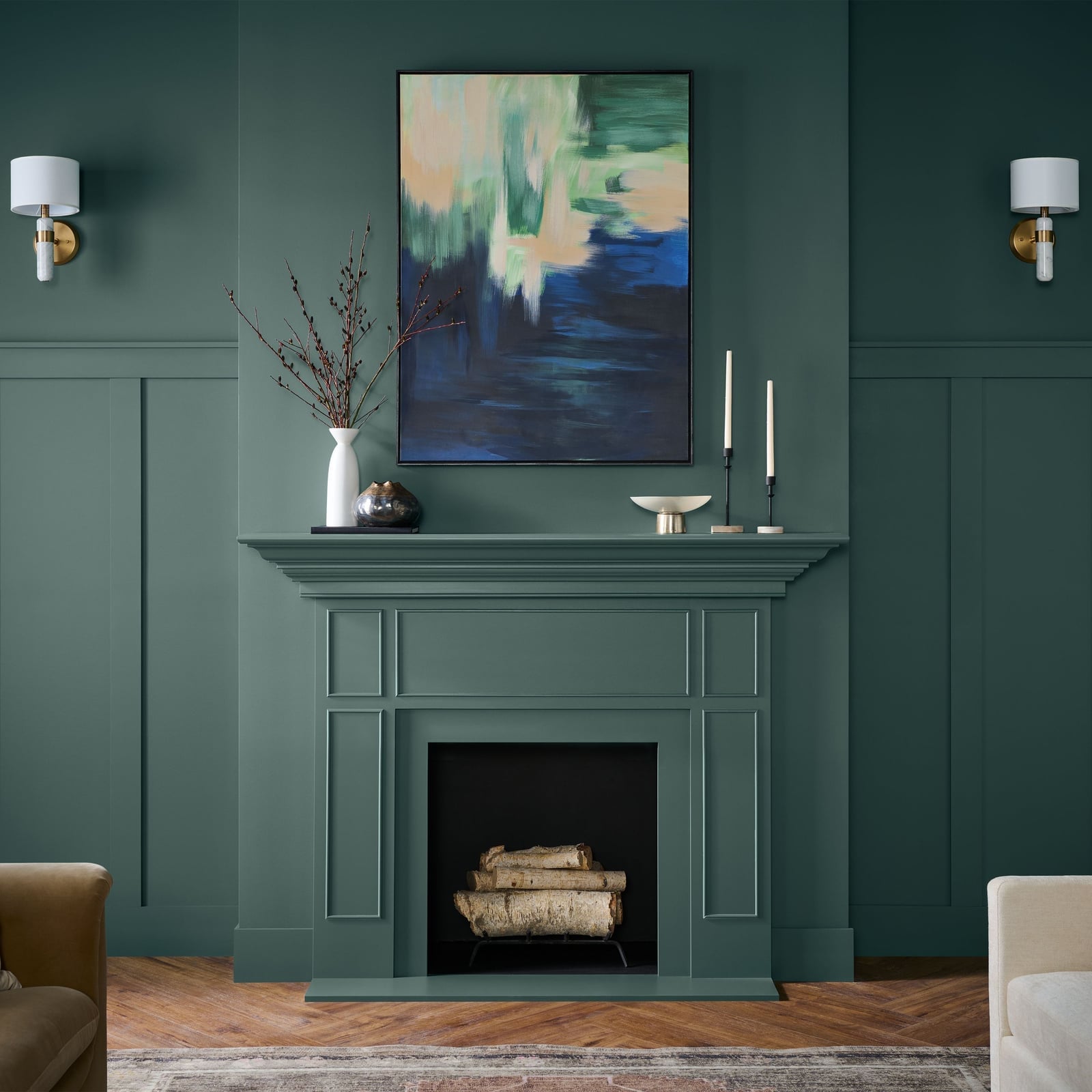
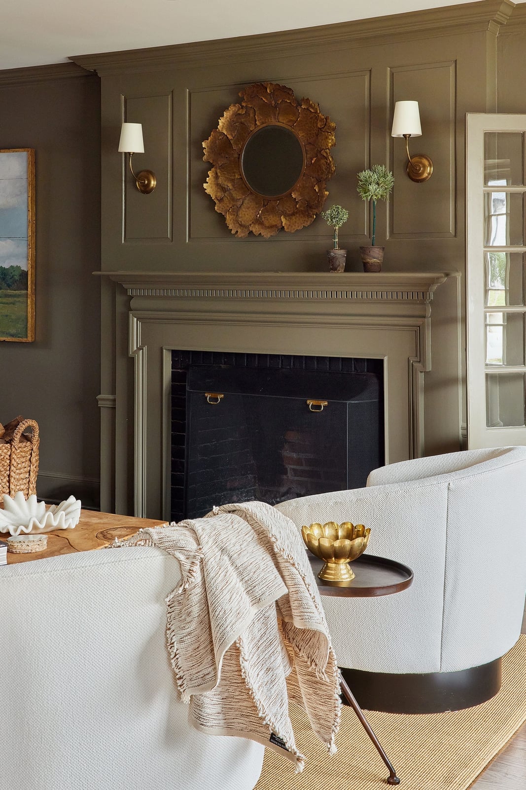
Dark green walls can feel heavy, but here the paneling and natural light keep the room balanced. The walls are painted a deep dark green and feature vertical paneling. A fireplace sits centered on the wall, with a mantel, wall art, and sconces above it. The palette also includes blue, green, and white accents. Wood, metal, glass, and plaster materials mix without clutter. Natural light from a window and wall sconces provide layered illumination. The second paragraph explains how this color works. Dark green reads as neutral enough to pair with both cool and warm tones. The paneling adds vertical lines that draw the eye up, making the room feel taller. For a renter, a dark green removable wallpaper on the fireplace wall creates the same focal point without a permanent paint commitment.
Earthy Muted Paint Color Chart Display
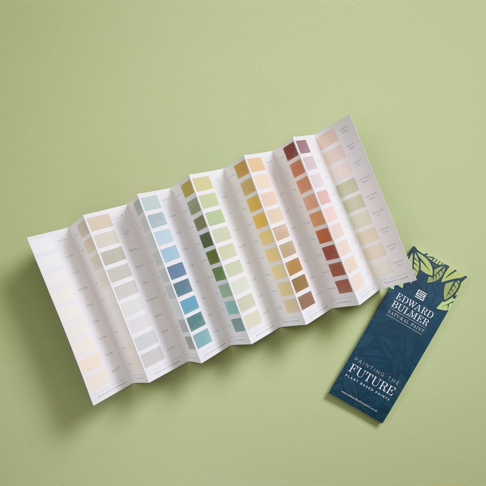
A folded paint chart and brochure set on a flat surface becomes its own still life when the tones lean earthy and muted. The range of greens, blues and warm neutrals on paper reads as a curated palette rather than a random collection, which is the point of a layout like this. Soft studio lighting flattens glare and lets each swatch register as a distinct option. For anyone sampling colors at home, the same trick works: lay out contenders on a neutral surface and step back. The eye picks a favorite faster when nothing else competes.
Warm Terracotta Walls in a Traditional Living Room
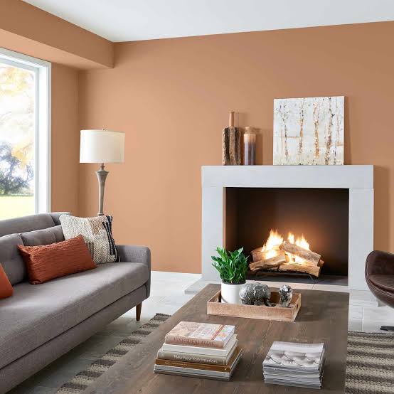
This warm terracotta wall color works because it sits comfortably with gray and cream rather than fighting them. The gray sofa and stone fireplace read as cooler anchors, so the terracotta provides the heat without making the room feel small or cave-like. Wood on the coffee table and fabric on the seating pick up the same earthy undertone, creating a palette that feels gathered rather than forced. Warm lamp light and the glow from the fireplace reinforce the wall color, especially in the evening. The ratio here is roughly one part strong color to three parts neutral, which gives the terracotta presence without overwhelming the traditional bones of the room.
Vibrant Teal Walls in a Maximalist Bedroom
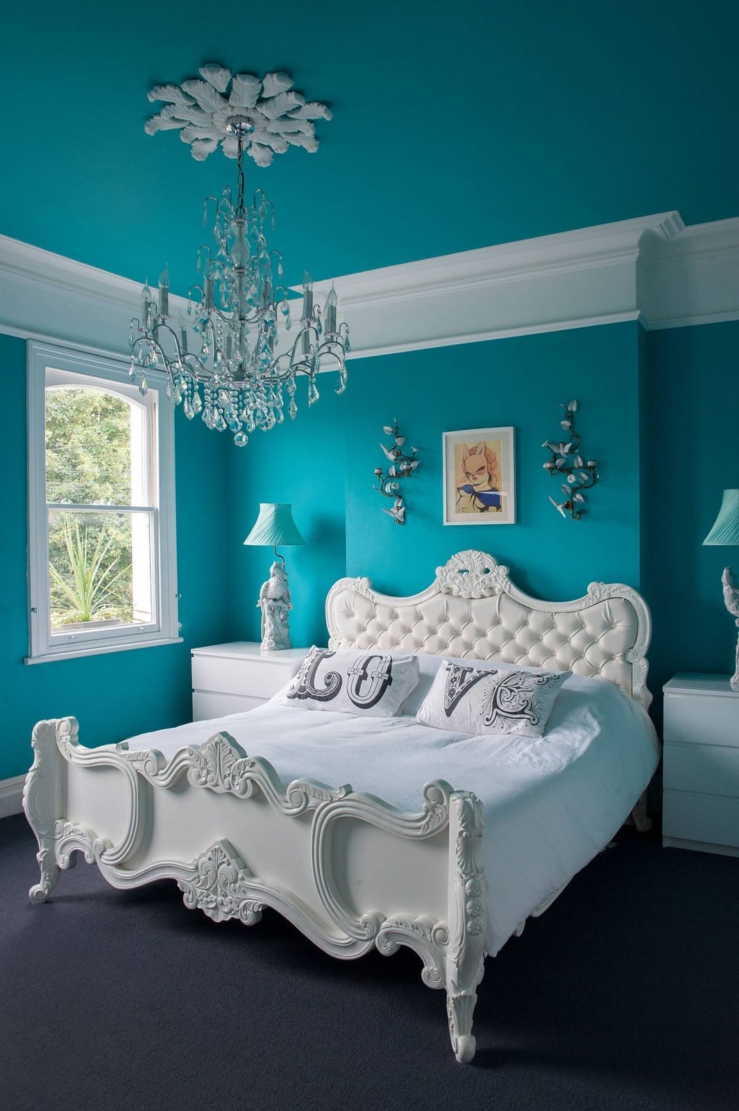
Vibrant teal walls could read as too much in a bedroom, but here the highly ornate white bed frame and crystal chandelier keep the look from tipping into dark or heavy. The white and gray in the palette come through on the dressers and bedding, breaking up the teal so the eye has places to rest. Natural light from windows and the crystal chandelier bounce off the white elements, which balances the saturation.
The baroque style of the bed frame and the crystal fixtures are what make maximalist work with a bold paint color. Without those ornate details, the teal would dominate. With them, the room reads as layered and intentional. The painted wood of the walls becomes the backdrop, not the only show.
Deep Teal Walls in a Modern Compact Space
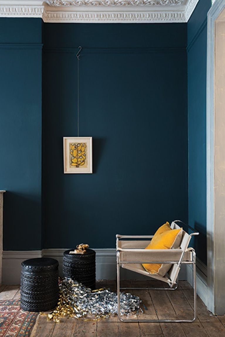
A deep teal wall in a compact living room takes advantage of the fact that dark color can make a small area feel more enclosed, which is fine when the goal is coziness instead of expansion. The corner vignette here includes a modern armchair, side tables and artwork in gray and yellow, which keeps the palette from turning monochromatic. Light from the window lands on the teal and the yellow accents, giving the room a lift that ambient light alone would not provide. The trick is limiting the deep color to one wall or a defined zone so the rest of the space stays airy.
Warm Neutral Paint Swatches in a Room Under Construction
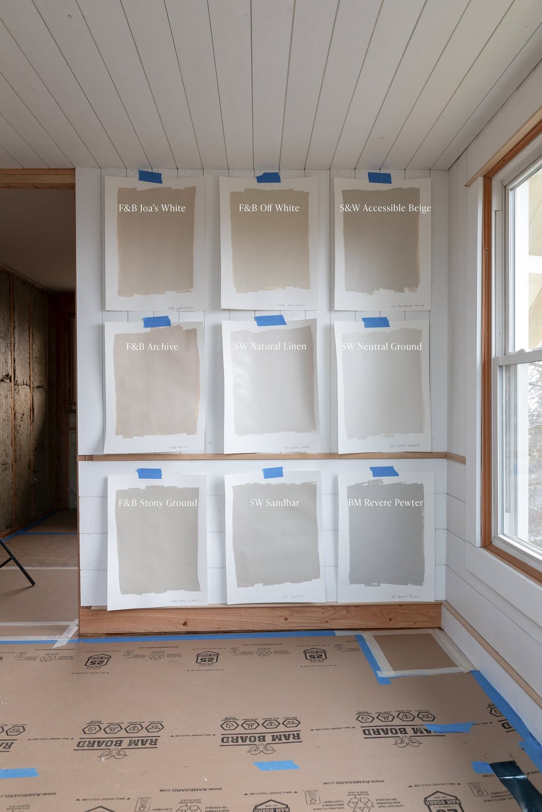
Paint swatches arranged on a wall of a room under construction offer a practical preview of how warm neutrals will look against raw materials like wood trim, plaster and tape. Beige, white and taupe samples set side by side reveal their undertones only when seen in the actual light of the room, which is why taping them up before painting matters. The wooden trim adds a warm reference point that the beige and taupe swatches either echo or contrast. Natural light hitting the wall changes through the day, so leaving the swatches up for a full cycle helps avoid a mismatch between the sample and the finished room.
Final Thoughts
The takeaway from these 35 paint colors is that a single shade can set the whole mood. Deep greens and grays bring drama and weight, while soft pinks and off-whites keep a room airy and calm. Before you pick up a brush, always test a sample on your wall and live with it for a few days, light shifts throughout the day. And remember, finish matters: flat hides imperfections but shows scuffs, while satin or eggshell cleans up easier in high-traffic areas. Keep the space around your chosen color simple, and let the paint do the work.