
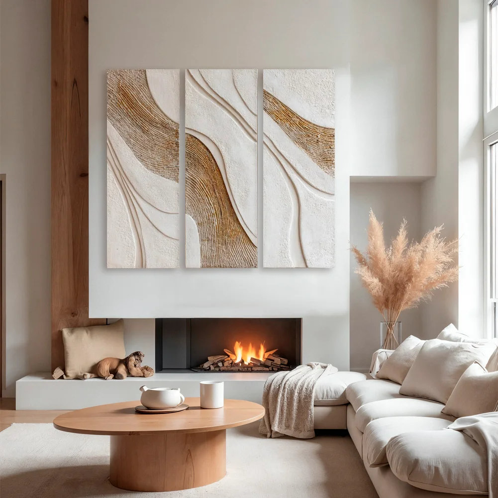
As fall approaches, I find myself drawn to living rooms where art becomes more than decoration and truly shapes the mood of the space. Artistic living room decor for the Fall 2026 season embraces expressive wall art, thoughtful compositions, sculptural details, and color combinations that make a room feel personal. From elegant framed collections to oversized statement pieces, there are many ways to give a living room a creative focal point without making it feel overwhelming. I especially love how artwork can connect with sofas, cushions, lighting, and other details to create a balanced and inviting interior. This season, I am looking beyond simple trends and focusing on decorating ideas that bring character, visual interest, and a sense of individuality into everyday spaces. In this collection, I will explore inspiring artistic living room ideas and the design details that make each look worth considering for fall.
Urban Sketch Triptych Above a Deep Charcoal Sofa
The first living room pairs a deep charcoal sectional sofa with a cool gray wall and three tall framed artworks depicting atmospheric urban street scenes. The artwork is predominantly soft and neutral, with delicate sketch-like lines and small touches of red that stand out against the muted imagery. A pair of yellow cushions and blue cushions echo the stronger accents in the room, while teal curtains add another layer of color at the far side. Above the sofa, directional ceiling lighting emphasizes each framed piece and makes the artwork feel intentionally displayed rather than simply hung on the wall.
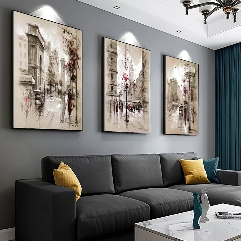
I think the three-panel arrangement works particularly well because it gives the large sofa a strong visual counterpart. The individual pieces are similar enough to read as one collection, yet each image has its own composition. The long sectional provides generous seating, while the rectangular coffee table keeps the center of the room practical and open. I also like how the artwork introduces visual detail without competing with the simple geometry of the furniture.
From my perspective, this is a useful example of how wall art can bring personality to a relatively restrained palette. If I were recreating the look, I would pay close attention to the proportions of the artwork and the spacing between the frames, because the balanced rhythm is one of the strongest features here. The small repeated accents of yellow, blue, and teal also show how cushions and curtains can visually connect artwork to the rest of the room.
Soft Botanical Prints in an Airy White Living Room
This room takes a much softer approach, with three light-framed prints arranged above a white sofa. One artwork shows a small bird among delicate blossoms, the center image depicts a café-like street scene, and the third presents pale tulips in a basket. The room itself is dominated by white and very pale neutral tones, with soft greenish-gray cushions and subtle pink accents appearing in the artwork and nearby arrangement. The generous sofa, layered cushions, woven-looking pieces near the coffee table, and light curtains create an exceptionally gentle atmosphere.
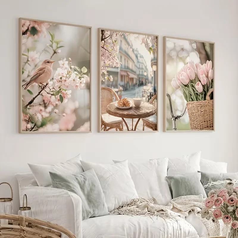
What works for me here is the relationship between the three pictures and the relaxed furniture. The artwork adds interest without introducing a heavy visual weight, which is important in a room where nearly everything is pale. The three frames are aligned at a consistent height, giving the wall a neat structure while allowing the different subjects to create variety. The result feels calm and comfortable rather than overly decorated.
I would use this image as inspiration when I want artwork to soften a living room instead of becoming a bold focal point. Choosing several images with a related lightness is an easy way to create cohesion. I also like the restraint of the styling: the sofa remains the dominant piece for comfort, while the framed artwork quietly establishes the mood. For Fall 2026, this approach could be especially appealing to anyone who prefers seasonal decorating that feels subtle rather than literal.
Monochrome Dandelion Artwork for a Crisp Contemporary Sofa
The third room uses three coordinated artworks featuring delicate dandelion-like forms, droplets, and reflective water imagery in a cool palette of white, silver, gray, and deep blue-gray. The pieces are mounted above a large white sectional sofa with clean, rounded upholstery. Cushions in pale blue, taupe, and patterned blue add softness, while a dark throw and a low coffee table reinforce the cooler visual contrast. Recessed ceiling lights wash the wall from above and make the glossy, detailed artwork particularly noticeable.
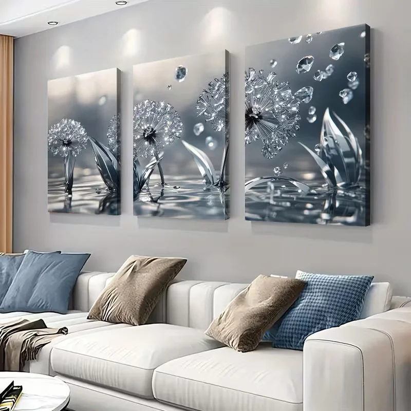
I find the composition successful because the artwork and furniture share the same restrained visual language. The three panels create a horizontal sequence that mirrors the length of the sofa, while the repeated botanical forms give the collection continuity. At the same time, the sofa remains inviting because of its generous proportions and collection of cushions. The artwork supplies detail without making the room feel crowded.
For me, this is a strong example of using one artistic theme in several coordinated panels. Rather than choosing unrelated pictures, I would look for pieces that repeat a subject, color family, or visual texture. The cool palette also gives the room a clean appearance, while the darker cushions and small accessories prevent it from becoming completely washed out. If I wanted to refine the arrangement, I would preserve the existing symmetry and let the artwork remain the main decorative statement.
Layered Gallery Wall With Traditional Framed Artwork
Here, the wall above a pale gray sofa becomes a carefully arranged gallery of multiple framed pictures. The collection includes architectural scenes, city views, landscapes, and smaller artistic studies, with frames in dark, muted, and slightly metallic-looking finishes. Two black wall-mounted lights flank the composition, while exposed ceiling beams add architectural character above. The sofa is simple and softly upholstered, allowing the varied artwork to take center stage without the room feeling visually chaotic.
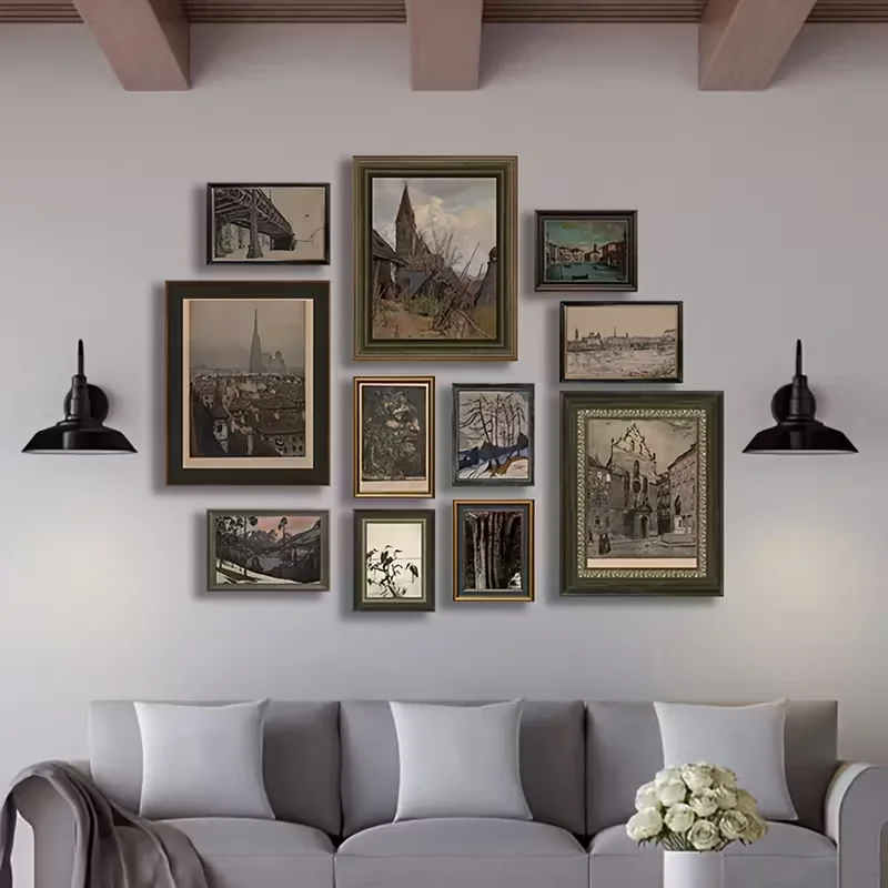
I particularly like the way the gallery wall creates a sense of depth and individuality. Instead of relying on one oversized piece, the designer has built a composition from several different frame sizes. The variation makes the wall feel collected and personal, while the overall arrangement remains controlled because the images share subdued colors. The two wall lights also help frame the display and make the entire wall feel intentional.
When I create a gallery wall, I find that the most important consideration is balance rather than perfect uniformity. This image demonstrates how different dimensions can work together when the visual weight is distributed thoughtfully. I would begin with the largest pieces and then build the smaller works around them, keeping enough breathing room between frames. The muted palette shown here is especially practical because it allows several subjects to coexist without overwhelming the rest of the room.
Textured Geometric Statement Art Over a Neutral Sectional
The fifth living room features one long horizontal artwork made from overlapping circles, vertical ribbed forms, and textured geometric surfaces in cream, beige, brown, and warm metallic-looking tones. The oversized piece stretches almost the full width of the seating area and sits above a neutral sectional. A round coffee table, patterned ottoman, dark cushions, and a small sculptural accessory complete the setting. The artwork’s abstract composition provides the strongest visual statement in an otherwise softly neutral room.
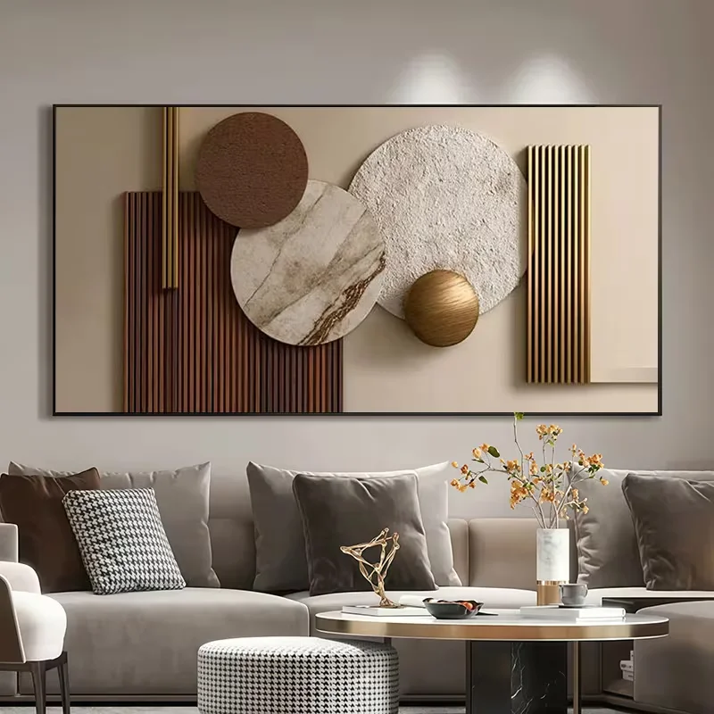
I think the scale is the key to why this arrangement works. Instead of filling the wall with several smaller pieces, one substantial artwork creates a clear focal point that visually anchors the sectional below it. The rounded forms in the artwork also contrast nicely with the straight edges of the wall and sofa, while the smaller round coffee table subtly repeats that softer geometry.
For my own decorating approach, I would consider this kind of oversized abstract artwork when a room needs character but I do not want to add many separate decorative objects. The image also demonstrates the value of texture: the artwork is interesting not only because of its shapes but also because its surfaces appear varied. Keeping the surrounding furnishings relatively restrained allows that central composition to remain the star.
Golden Autumn Forest Panorama Above a Neutral Sofa
This living room uses a long panoramic artwork showing a forest in autumn, with golden-yellow foliage, warm brown ground tones, and sunlight visible between the trees. Below it is a large light-gray sectional decorated with cushions in gray, black, white, and yellow. A yellow throw draped over the arm repeats the warm tones in the artwork, while a pale coffee table and a few small accessories keep the rest of the room understated. The result is a clear connection between the seasonal landscape and the furnishings.
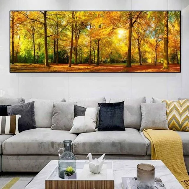
I love how directly the artwork establishes the atmosphere here. The panoramic format suits the long sofa, creating a strong horizontal relationship between the wall and seating. The warm forest scene also gives the otherwise neutral room a seasonal identity without requiring a large collection of decorative pieces. The yellow cushions and throw make the connection even more obvious while remaining simple and practical.
This is one of the easiest ideas in the collection to translate into a Fall 2026 living room because the artwork itself provides the seasonal color story. I would let a single autumnal image guide a few small textile choices rather than trying to repeat every color throughout the room. The key is restraint: the forest already supplies plenty of visual richness, so the surrounding furniture can remain calm and comfortable.
Abstract Wave Panels in Black, White, and Soft Gold
The seventh room features three vertical abstract panels arranged in a row above a light upholstered sofa. Each artwork combines sweeping black, white, gray, and pale gold lines that flow across the compositions like ribbons. The sofa is paired with cushions in black, cream, and muted orange, while a long dark ottoman extends across the front of the seating area. A black coffee table with a ridged edge and a few simple accessories reinforce the artwork’s contemporary character.
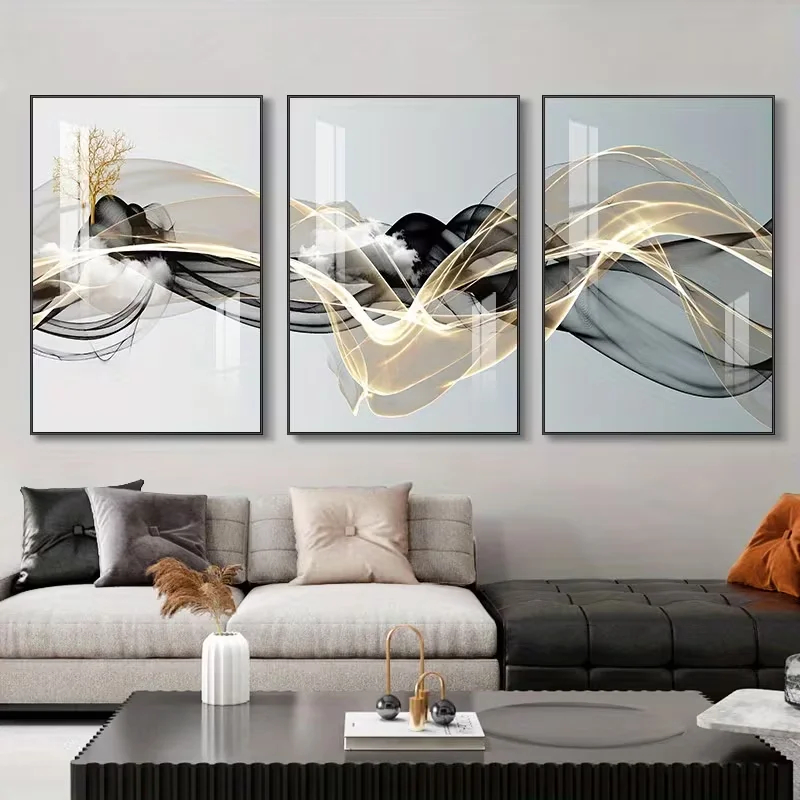
I find the three-panel artwork particularly effective because the flowing lines create movement across the wall while the overall palette remains controlled. The individual panels are different, but together they form one continuous visual idea. That movement contrasts with the straight lines of the sofa and coffee table, giving the room a more dynamic appearance without introducing unnecessary clutter.
If I were recreating this arrangement, I would preserve the spacing and alignment between the panels because the consistency makes the abstract composition feel intentional. I also like the way the room repeats the artwork’s darker tones in the seating and table while using lighter upholstery to keep the overall setting balanced. A small amount of warm color in the cushions is enough to keep the neutral scheme from feeling too cold.
Oversized Floral Artwork in a Soft Pink Dining-Living Space
The eighth image presents three large floral artworks in pale pink, blush, cream, and soft neutral tones above a long white console. Two sculptural upholstered chairs in pale pink sit in front of the arrangement, while a small oval coffee table and delicate decorative pieces complete the space. The artwork is large and expressive, but its gentle palette keeps the room feeling light. The overall composition has a soft, coordinated quality, with the pink artwork visually connecting to the seating.
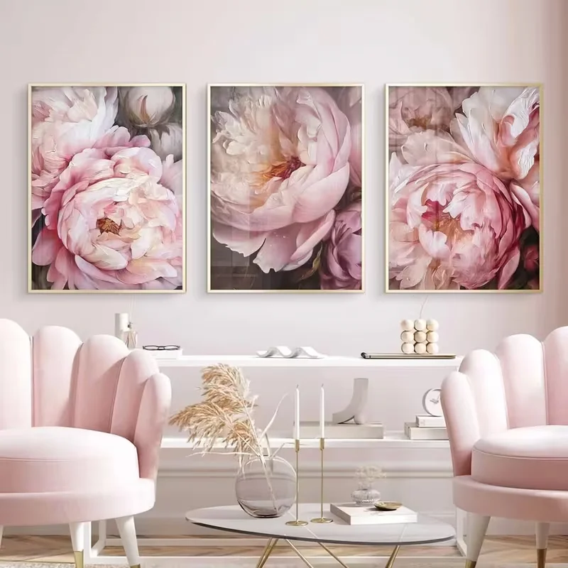
For me, the strongest feature is the repetition of color between the artwork and furniture. The three floral images are close in tone but each has a different arrangement of petals, giving the wall enough variation to remain interesting. The pale chairs provide a comfortable seating moment while also reinforcing the artistic theme. The uncluttered console underneath gives the artwork enough visual space to stand out.
I would use this approach when I want a room to feel artistic and expressive while maintaining a delicate atmosphere. Rather than introducing many unrelated decorative colors, I would choose artwork first and then repeat one or two of its softer tones in upholstery or accessories. The image demonstrates how a coordinated palette can make several decorative elements feel like part of one complete composition.
Arched Botanical Artwork With Dramatic Greenery
The ninth living room uses three tall arched artworks featuring green tropical foliage against softly illuminated neutral backgrounds. Each piece has a dark rounded planter-like form at the bottom of the composition, creating a repeated visual structure across the wall. A pale sofa with dark teal and patterned cushions sits beneath the artwork, while a stack of decorative boxes or books appears on the right. The arched shapes and rich green imagery provide a striking contrast to the otherwise neutral room.
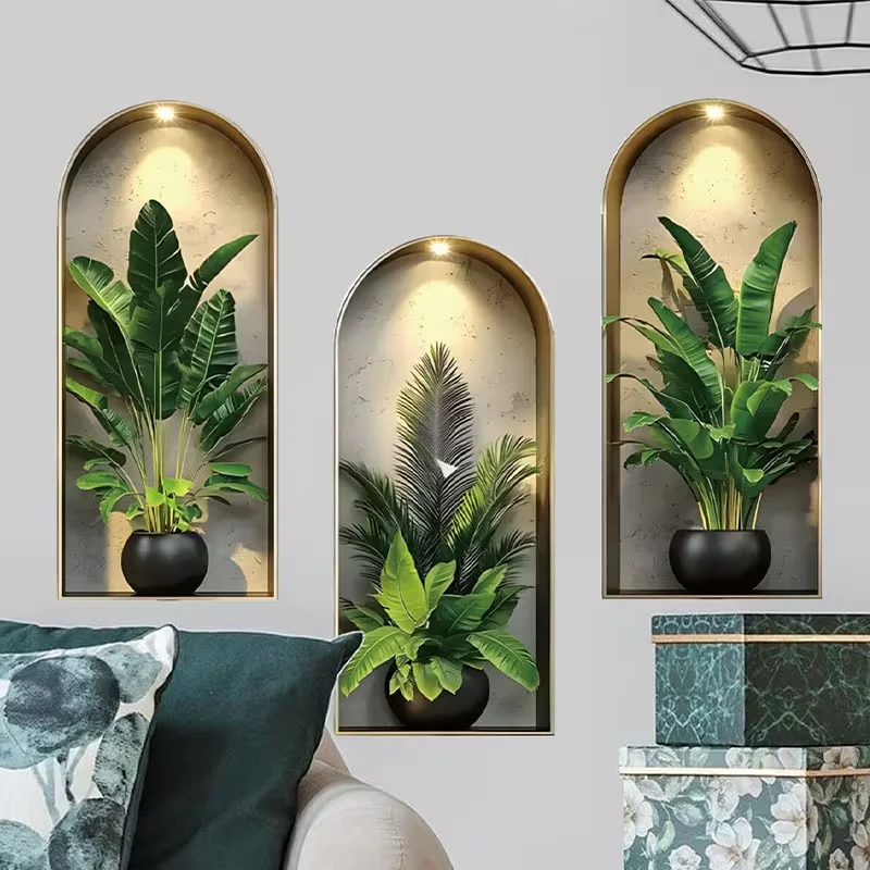
I like how the repeated arches create a strong architectural rhythm even though the wall itself is simple. The three artworks feel related because they use similar framing, proportions, lighting, and subject matter. The dark teal cushion also connects naturally with the deeper tones in the artwork, helping the seating area feel integrated with the wall display.
From my perspective, this is a good example of using repetition to make decorative art feel more substantial. If I wanted to achieve a similar effect, I would look for several pieces that share the same shape and framing rather than mixing unrelated formats. The tall proportions also draw the eye upward, which can make the wall feel more visually structured. I would keep the furniture and accessories comparatively restrained so the repeated arched compositions remain the defining feature.
Classical Ceiling Fresco Inspired Wall Mural Behind a Curved Sofa
The final room makes the most dramatic artistic statement in the collection with an enormous classical-style painted scene covering the entire wall behind a large curved white sectional. The artwork is filled with figures, clouds, flowing forms, and rich tones of blue, cream, red, brown, and gold. Two matching table lamps sit on either side of the sofa, while the warm-toned floor provides a simple foundation beneath the elaborate wall. The contrast between the highly detailed artwork and the clean, modern curved sofa creates a striking visual tension.
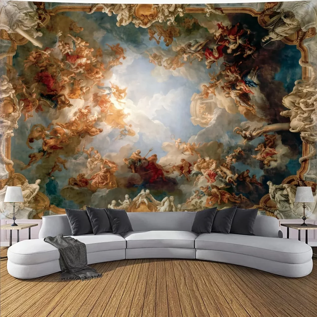
I think the success of this room comes from allowing the mural to occupy almost the entire visual field while keeping the furniture comparatively simple. The curved sectional provides generous seating without introducing a competing pattern, and the dark cushions help visually ground the pale upholstery. The matching lamps also create symmetry at the edges of the composition, giving the elaborate wall a sense of structure.
This image reminds me that artistic living room decor does not always have to be subtle. When one wall already carries an enormous amount of detail, I prefer to let it become the defining element rather than trying to decorate every remaining surface. The curved sofa is particularly effective because its smooth silhouette contrasts with the movement and complexity of the mural. For a similar approach, I would carefully consider scale first and make sure the artwork has enough wall space to be appreciated from a comfortable distance.
Dimensional World Map Above a Contemporary Sofa
The first living room makes the wall itself the artistic focal point with a large dimensional world map assembled from individual geographic pieces. I notice raised green textured areas across several regions, small airplane and sailboat details, compass imagery, and labeled oceans and countries. Below it sits a deep charcoal-gray sofa with a simple contemporary silhouette, accented by black-and-white patterned pillows and rich teal cushions. The warm neutral wall allows the map to remain the dominant visual feature while recessed ceiling lighting highlights its texture.
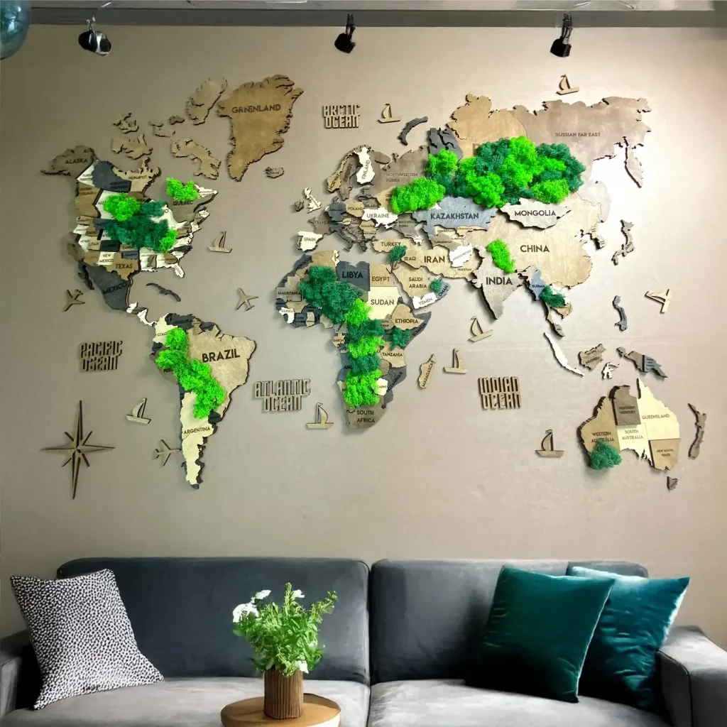
I think this arrangement works particularly well because the artwork combines decoration with a strong sense of scale. The map stretches broadly across the wall, so it feels proportionate to the generous sofa beneath it rather than appearing like a small isolated picture. The three-dimensional construction also gives the wall visual depth, while the teal pillows echo the cooler tones found in the artwork. The result is a comfortable seating area with a clear focal point and an unmistakably personal character.
From my perspective, this is a wonderful approach for anyone who wants art to become part of the architecture of the room. I would keep the surrounding furniture relatively restrained, as shown here, because a highly detailed map already provides plenty of visual information. For Fall, I particularly like the combination of charcoal, neutral beige, deep teal, and natural green because it creates a grounded atmosphere without making the room feel heavy.
Black and Gold World Map Against an Illuminated Brick Wall
Here I see a much moodier interpretation of artistic living room decor. A large black wall artwork features a world map rendered in gold, with a compass detail in the lower-left portion. It is mounted against a pale exposed brick wall that receives focused illumination from ceiling spotlights. A large dark sectional sofa fills the lower portion of the composition, surrounded by numerous neutral cushions, while the darker palette creates an intimate evening atmosphere.
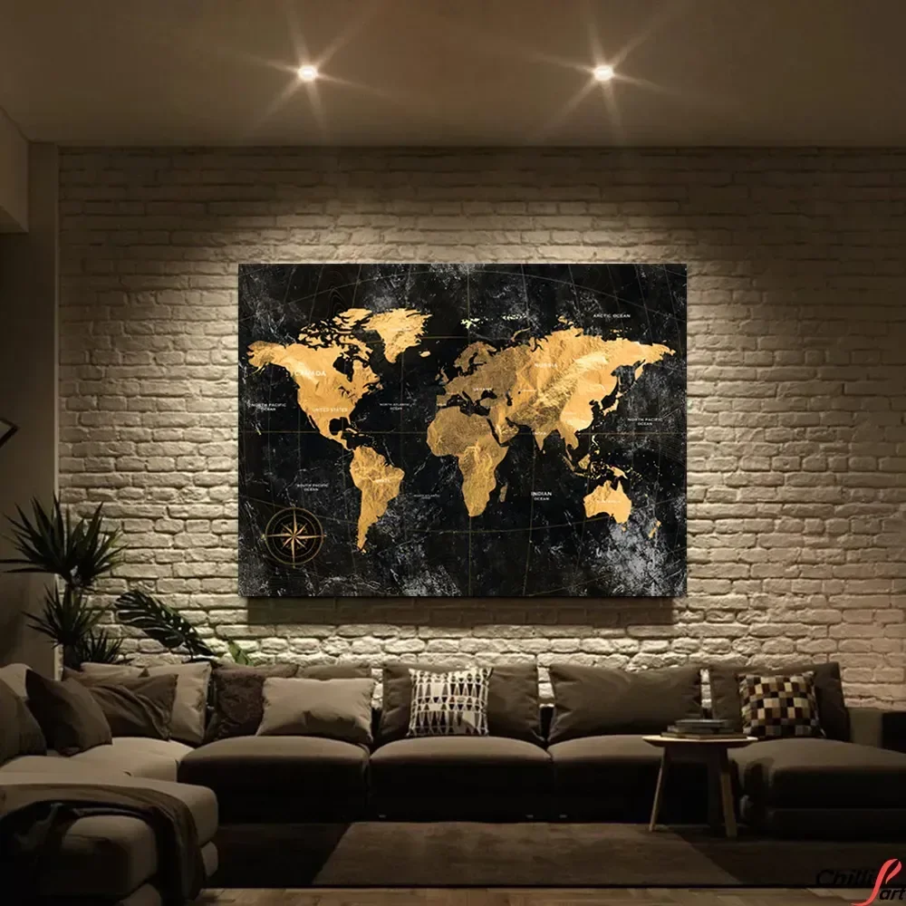
What makes this room successful for me is the contrast between the textured brick background and the smooth, graphic appearance of the map. The gold-and-black artwork becomes particularly effective under the directed lighting because the illuminated brick surrounding it creates a subtle frame without needing a conventional border. The generous sectional also reinforces the relaxed character of the space, giving the artistic wall a comfortable and practical setting rather than making the room feel like a gallery.
I would use this image as inspiration for creating a more dramatic fall mood without relying on excessive decoration. The key is visible in the photograph: one strong artwork, controlled lighting, a restrained neutral sofa, and layered cushions. I would also pay attention to the scale of the artwork. Its width is substantial enough to hold its own above the large seating arrangement, which keeps the composition balanced.
Colorful Reading Scenes in a Three-Piece Art Arrangement
This bright living room takes a completely different artistic direction with three vertical paintings arranged above a white sofa. Each artwork depicts a woman reading, surrounded by colorful interiors and expressive painterly details. Strong turquoise, yellow, orange, coral, green, and pink tones appear throughout the paintings, while the sofa itself remains crisp white. Soft peach cushions and a few darker pillows connect the seating area with the artwork, creating a cheerful but organized composition.
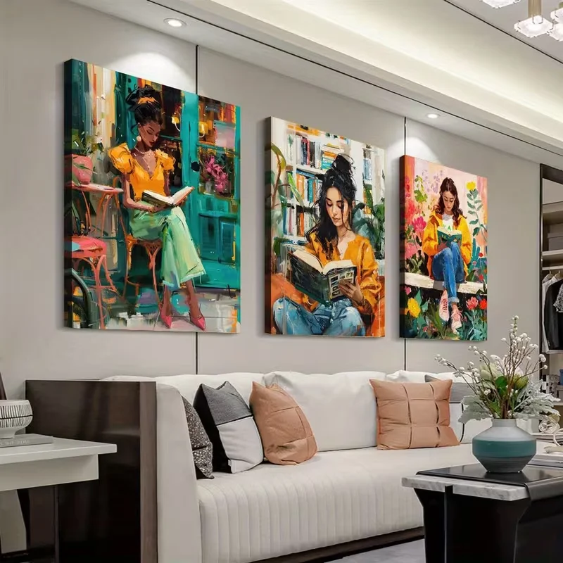
I like the way the three paintings create rhythm across the wall. Rather than choosing one oversized piece, the designer has used three similarly proportioned canvases to form a horizontal sequence. The repetition makes the artwork feel intentional, while the different scenes keep the arrangement interesting. The white sofa provides a quiet visual base, allowing the paintings to carry nearly all of the color and personality in the room.
For me, this is an excellent reminder that colorful art can be introduced without making every element of a living room colorful. I would start with a neutral sofa or similarly quiet large-scale furniture and let the artwork determine the accent shades. The matching vertical orientation also makes the arrangement relatively easy to reproduce, because the eye naturally reads the three pieces as one unified display.
Grand Historical Painting Above a Deep Velvet Sofa
The fourth interior uses a large historical-style painting as its central statement. The artwork depicts an elegant gathering of people in an ornate interior, with figures dressed in elaborate clothing and surrounded by architectural details. Beneath it is a deep charcoal or black sofa with a vertically channeled back, accompanied by a rounded chair in the same dark family. A low circular coffee table with a gold-toned top adds another strong shape, while the textured gray rug keeps the lower part of the room visually soft.
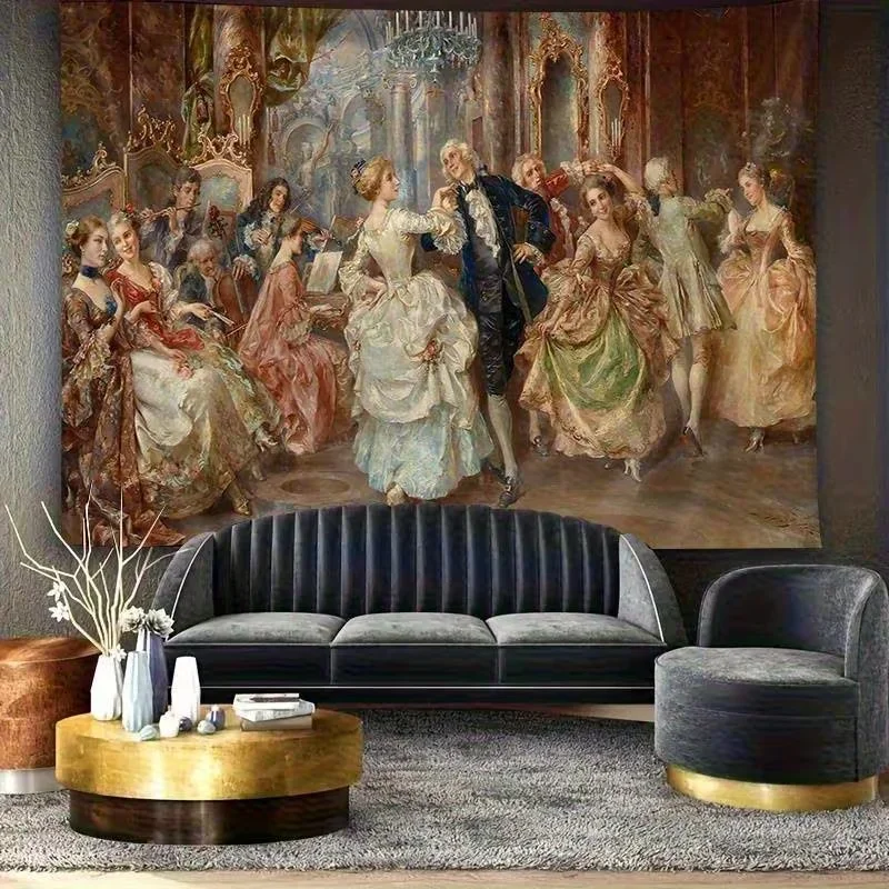
I find the scale especially convincing here. The painting occupies almost the entire width of the sofa, so it feels integrated into the furniture arrangement rather than simply attached to the wall afterward. The dark seating creates a sophisticated background for the lighter historical scene, while the round coffee table introduces a welcome contrast to the strong horizontal line of the sofa. Even the simple white branch arrangement on the table helps create a visual pause against the darker furniture.
In my view, this kind of room works best when the artwork is allowed to remain the star. I would resist adding many smaller decorative pieces around such a large painting because its intricate scene already provides plenty of detail. The photograph shows how a few carefully selected forms—a large painting, sculptural sofa, rounded chair, circular table, and understated rug—can create a complete artistic composition without overcrowding the room.
Urban Sketches With Subtle Red Accents
This living room feels much lighter and more graphic, with three framed urban sketches positioned above a white sofa. The artworks show city streets, buildings, trees, vehicles, and figures in predominantly black, white, and soft gray tones, with small touches of red appearing throughout the scenes. The sofa is decorated with pillows in geometric patterns, soft neutrals, and turquoise, while gold-toned decorative bottles sit on the coffee table in front.
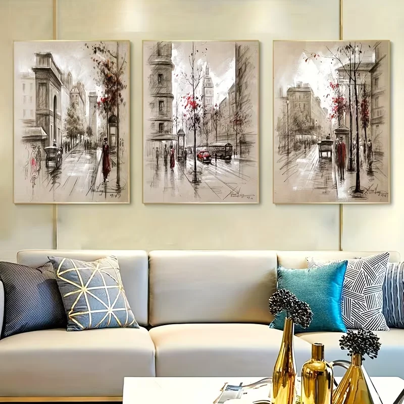
The three-picture arrangement works because the artwork shares a common visual language. Each piece has a similar pale background and architectural subject, creating cohesion even though the scenes differ. I also like the way the tiny red details in the artwork are repeated through the room’s accent styling without becoming overpowering. The turquoise pillow provides another restrained color note, giving the neutral sofa a little more energy.
I would recommend this approach when someone wants an artistic wall that feels sophisticated rather than overwhelming. Matching frames or closely related artwork can make a collection look curated, while a neutral sofa gives the eye somewhere to rest. For Fall, I especially like the restrained palette because it leaves room for texture and small accent colors to change seasonally without requiring a complete redesign.
Soft Coastal Artwork Above a Classic Upholstered Settee
The sixth image presents a calm seating corner centered on a pale blue artwork showing a group of sailboats moving across water. The painting uses soft blue, white, beige, and delicate gold-toned marks, creating an airy maritime scene. Below it is a cream upholstered settee with a gently curved wooden frame, surrounded by white cushions. A metallic floor lamp stands nearby, while a patterned neutral rug and small side table complete the setting.
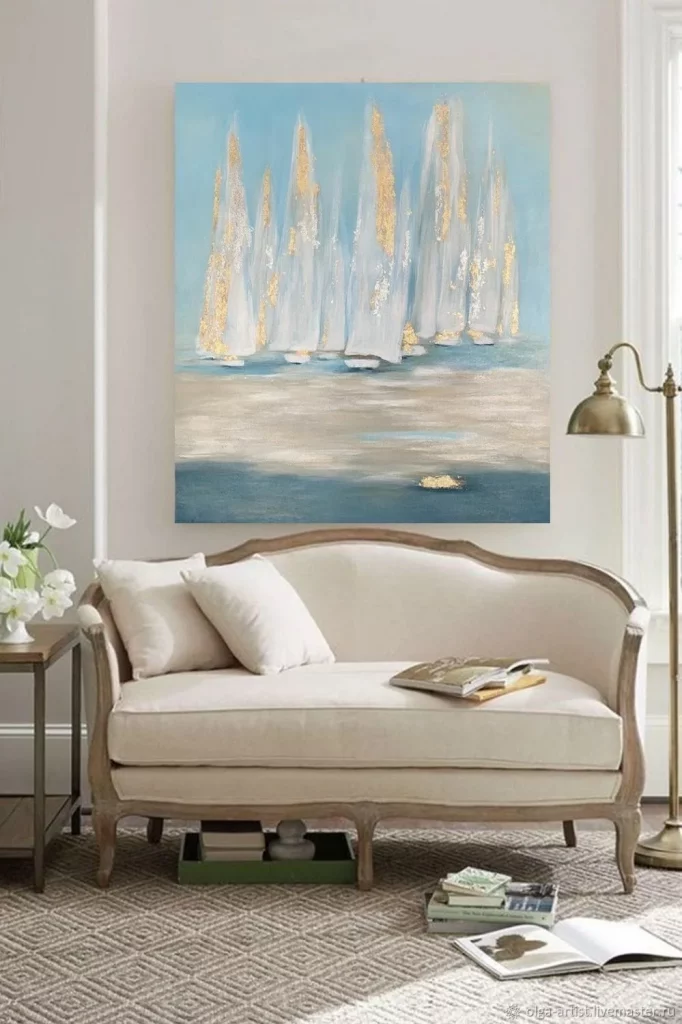
I find the relationship between the artwork and furniture particularly graceful. The curved upper edge of the settee visually softens the horizontal painting above it, while the pale colors in the artwork blend naturally with the cream upholstery. The composition feels intentionally quiet, which makes it suitable for a reading or conversation corner. The floor lamp is also practical because it adds a dedicated light source beside the seating rather than relying entirely on the room’s general illumination.
From my perspective, this photograph shows that artistic decorating can be subtle. A single painting does not need intense contrast or a complicated subject to make an impression. I would focus on matching the softness of the artwork with similarly restrained furniture and textiles, as shown here. The result is an elegant corner that feels peaceful while still having a clear artistic identity.
Classical Relief Panels Framing a Dark Contemporary Seating Area
The seventh living room creates its artistic identity through four tall sculptural relief panels depicting classical female figures. The pale panels stand against a softly textured gray wall, with lighting around them emphasizing their raised forms. Two dark sofas face forward beneath the panels, filled with deep cushions, while polished light-colored coffee tables sit in front. Small floral arrangements in bowls add restrained color to the otherwise monochromatic composition.
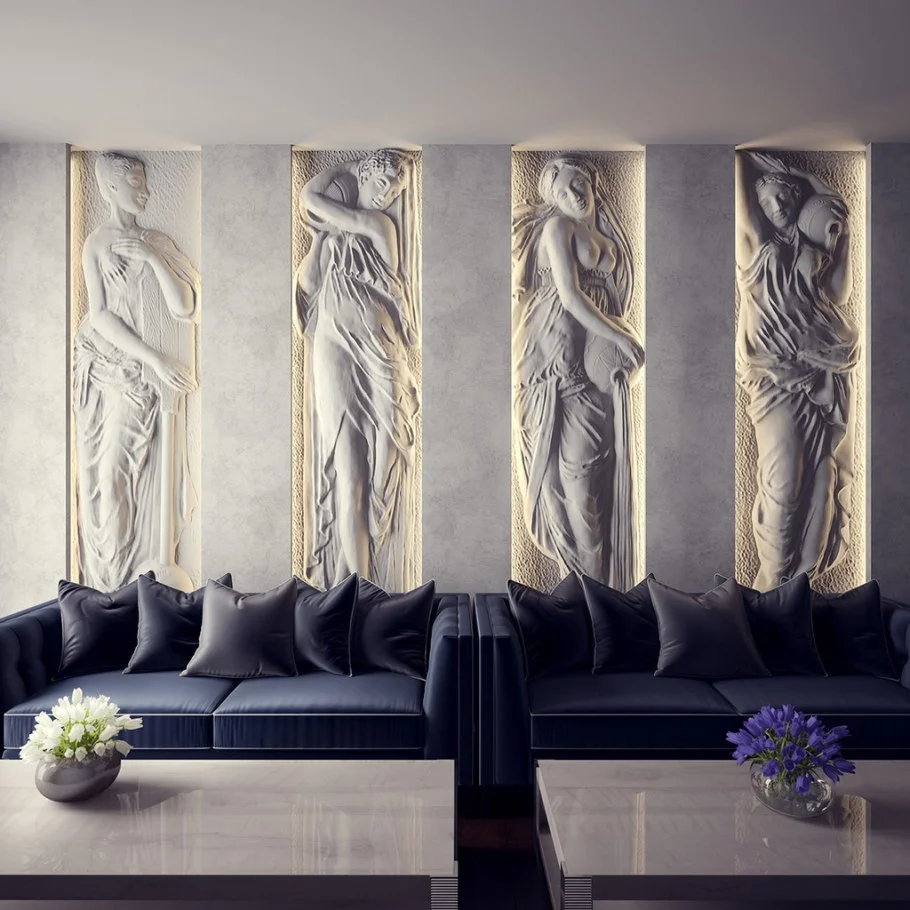
What immediately stands out to me is the vertical rhythm created by the four panels. Their repeated proportions give the wall a strong architectural presence, while the dark sofas below provide dramatic contrast. The arrangement feels symmetrical and orderly, and the matching seating reinforces that sense of balance. At the same time, the relief surfaces introduce tactile interest that a collection of flat framed prints would not provide.
I would take this idea as inspiration for using wall art almost like architectural detailing. When a wall has strong sculptural pieces, I think the furniture can remain relatively simple, allowing the texture and silhouette of the artwork to carry the visual weight. The photograph also demonstrates the importance of lighting: the illumination around the panels makes their relief visible and gives the wall much more depth.
Italian Villa Landscape Painting Above a Traditional Sofa
This room features a framed landscape painting depicting a grand villa surrounded by tall cypress trees, greenery, pathways, and a formal garden. The artwork hangs above a dark brown leather sofa, while warm beige walls and patterned gold-toned curtains create an inviting traditional setting. Decorative pillows repeat the warm neutral and golden shades, and a round dark coffee table sits centrally in front of the sofa with several decorative objects and glasses arranged on top.
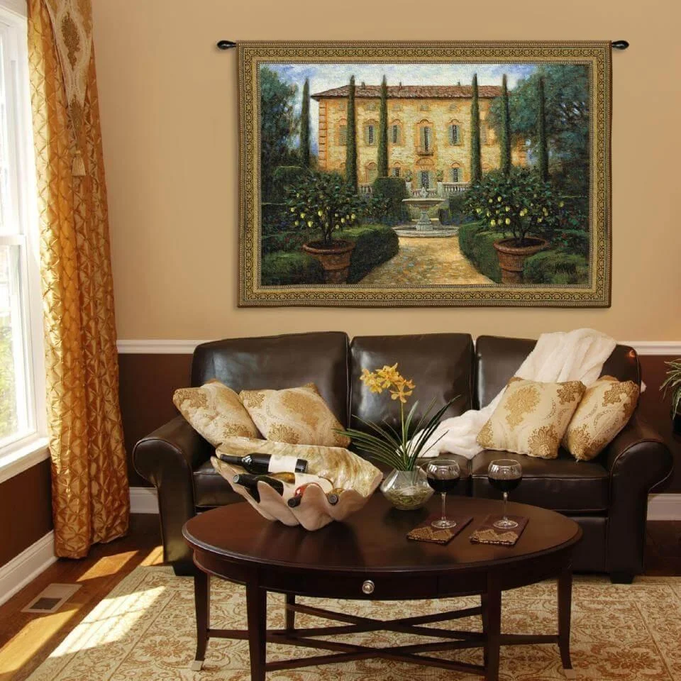
I like how closely the colors of the artwork relate to the surrounding room. The warm landscape is supported by the golden curtains, beige wall, brown leather upholstery, and patterned textiles, so the painting feels like a natural extension of the interior rather than a contrasting object. The broad horizontal shape of the artwork also fits comfortably above the sofa, creating a straightforward and balanced focal point.
For me, this is a strong example of coordinating a room around artwork rather than treating art as an afterthought. I would choose the dominant colors from the painting and repeat them subtly in cushions, curtains, and nearby furnishings, just as this image demonstrates. The approach creates a cohesive look while still allowing the painting to tell its own visual story.
Green-Walled Gallery Arrangement With Architectural Photography
The ninth image shows a white sofa positioned against a muted green wall and topped with three framed photographs or prints of Mediterranean-style architectural scenes. The images feature stone walls, doorways, narrow paths, greenery, and soft natural colors. The sofa is layered with white cushions and several pillows featuring green botanical patterns, while a pale green throw is casually draped across the seating. A light-toned chair appears at the side, reinforcing the relaxed composition.
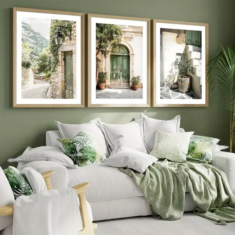
I think the strongest feature here is the color relationship between the wall, artwork, cushions, and throw. The green background gives the white sofa definition, while the green details in the pillows connect visually with the architectural photographs. The three frames create a clean horizontal gallery display without overwhelming the relatively simple seating area. The result feels fresh and comfortable, with the artwork adding a sense of place.
From my perspective, this is an easy artistic concept to adapt because it depends on repetition rather than a large statement piece. I would select three images with a related subject or color palette, then repeat one or two of their tones in the surrounding textiles. The photograph shows how even very simple artwork can feel thoughtfully curated when its colors and subject matter relate to the rest of the room.
Central Figure Artwork Surrounded by a Structured Gallery Wall
The final image combines a large central artwork of a reclining figure with a surrounding arrangement of smaller framed prints. The central piece has a muted sketch-like appearance, while the surrounding works are presented in white mats with slim black frames. A white sofa sits below the display, accompanied by a dark-framed glass coffee table, a woven-front chair, lamps, sculptural busts, and a large arrangement of greenery. The overall palette remains mostly white, black, beige, and soft green.
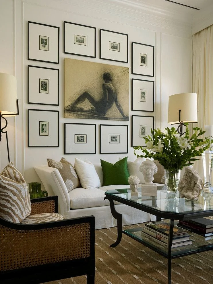
I find the gallery arrangement especially effective because the central artwork clearly establishes the hierarchy. The smaller framed pieces surround it without competing for attention, creating a structured frame around the larger image. The black frames also echo the darker lines of the coffee table and chair, while the white mats relate directly to the sofa and wall. This repetition makes the many individual objects feel like one coordinated composition.
In my experience, a gallery wall like this requires careful attention to spacing and scale, but the visual payoff can be substantial. I would begin with the largest central image and build outward, keeping the smaller pieces visually balanced on both sides. The photograph also shows why neutral surroundings can be useful: the restrained furniture and palette give the artwork enough space to remain the defining feature of the living room.
Forest Panorama Above a Crisp White Sofa
The first living room uses a wide panoramic photograph of a sunlit forest as the main artistic feature above a large white sofa. I immediately notice the contrast between the clean white upholstery and the intense greens, browns, and golden sunlight in the artwork. The sofa is styled with several pillows in white, navy, and black-and-white stripes, while a slim floor lamp stands to one side and a small surface with two rounded decorative objects sits on the other. The overall composition feels simple, fresh, and visually balanced.
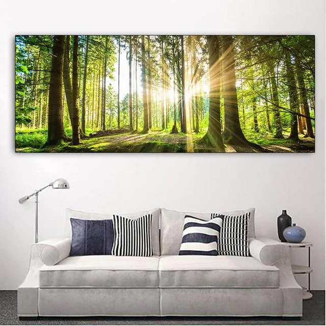
I like how the oversized horizontal artwork gives the sofa a strong focal point without making the room feel crowded. Because the furniture is predominantly white, the forest image supplies most of the visual color and depth. The striped pillows also echo the linear quality of the trees, creating a subtle connection between the artwork and the seating area. This is a practical approach when I want to keep the furniture neutral but still make the room feel distinctive.
For a similar look, I would start with one large landscape image that has enough visual width to relate naturally to the sofa beneath it. I would keep the surrounding accessories restrained, just as they are here, so the artwork remains the star. For fall, I particularly like the way the warm sunlight in the photograph can introduce a seasonal feeling without relying on overtly themed decorations.
Textured Abstract Panels Framing a Contemporary Fireplace
This room takes a much more sculptural approach with three tall abstract panels displayed above a modern fireplace. I can see flowing raised lines and textured areas in soft cream, beige, and natural tan tones, creating an almost tactile appearance even from a distance. A large pale sectional curves around the seating area, while a rounded coffee table sits in front. The fireplace, wood-toned vertical detail, pale upholstery, and tall window combine to create a calm composition filled with soft neutral textures.
What works particularly well for me is the relationship between the artwork and the architecture. The three panels visually fill the wall above the fireplace while leaving enough breathing room around them. Their vertical format also complements the height of the fireplace wall. Meanwhile, the rounded sofa and circular coffee table soften the stronger vertical lines and make the seating arrangement feel comfortable and inviting.
I would use this idea when I want artistic character without introducing strong colors. The key is to look for artwork with visible texture or dimensional-looking patterns rather than relying entirely on color for impact. In a fall living room, this kind of neutral artwork can also work beautifully with the natural warmth already provided by the fireplace and wood-toned surfaces.
Botanical Green Artwork Over a Warm Brown Sectional
Here, three framed artworks create a coordinated gallery above a large brown sectional. The images feature layered green botanical forms and an abstract green composition, while the frames have a pale natural-looking finish. I notice that the earthy brown sofa picks up the warmer tones in the artwork, while numerous striped and patterned pillows add another layer of visual texture. A round coffee table with a slatted sculptural base becomes a strong centerpiece, and the neutral rug keeps everything grounded.

I find the repetition of three framed pieces especially effective because it gives the wall a deliberate rhythm. Rather than relying on one oversized picture, the designer creates a collection that feels connected through its green palette and similar framing. The patterned pillows reinforce the artwork without copying it literally, and the low rounded coffee table balances the more structured rectangular frames above.
For my own version of this arrangement, I would choose three pieces that share at least one color or visual theme. Keeping the frames similar is another easy way to make different artworks feel like one collection. I also like the idea of allowing the seating to remain relatively simple while the wall and coffee table provide most of the artistic expression.
Elegant Sculptural Lighting and Curved Wall Artwork
This dramatic living room combines a very tall ceiling with an elaborate hanging light installation and flowing decorative artwork across the walls. The wall design uses delicate curving forms and repeated illuminated circular details, while the central fireplace creates a clear focal point beneath the artwork. White sectional seating surrounds the room, and a long window with layered coverings brings in daylight. I also notice warm tan seating along the window and a few green decorative accents near the fireplace.
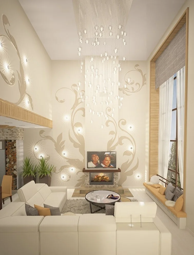
The scale is what makes this room so striking to me. Instead of treating the tall wall as empty space, the design uses artwork and lighting to make the vertical volume feel intentional. The chandelier-like installation draws the eye upward, while the curved wall motifs lead the gaze across the room. The white seating then provides a quiet foundation beneath all of that visual activity.
If I were working with a similarly tall room, I would pay close attention to proportion rather than simply adding more decoration. A large-scale artistic element needs enough wall space to feel purposeful. I would also keep the main furniture visually simple, as this image demonstrates, because the architecture, wall treatment, and lighting already provide plenty of personality.
Blue Tree Artwork Above a Classic Fireplace
This living room centers on a large painting of a tree with an intense blue canopy positioned directly above a dark fireplace mantel. On both sides are tall dark built-in cabinets with glass-front sections and lower enclosed storage. A light upholstered sofa sits in the foreground with pale pillows featuring small green square accents. The contrast between the blue artwork, dark cabinetry, light seating, and warm neutral wall creates a very defined visual hierarchy.
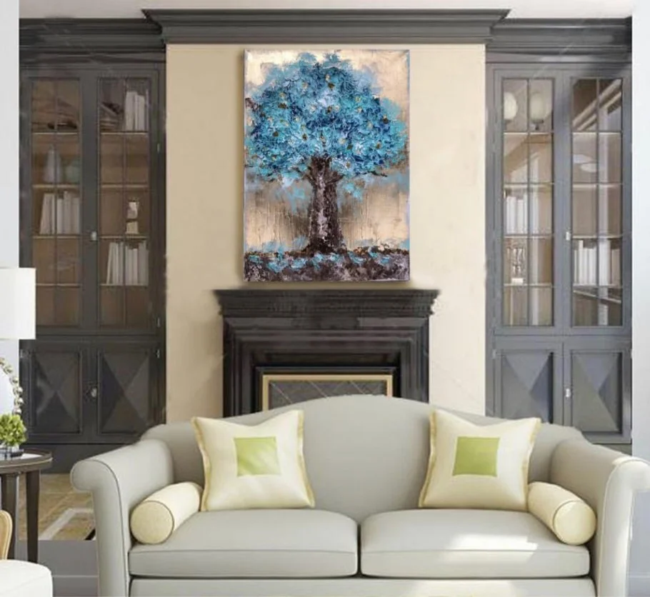
I like the way the artwork is positioned as the central bridge between the fireplace and the surrounding cabinetry. The dark framing elements give the painting a strong setting, while the pale sofa keeps the lower portion of the room from becoming too heavy. The two pale green pillow details also create a quiet color connection with the artwork without competing with its blue center.
For me, this is a good example of how one expressive painting can provide most of the color direction for a room. If I wanted to recreate the feeling, I would select one artwork with a dominant color and then repeat only a small amount of that color elsewhere. The result can feel coordinated without becoming overly matched.
Deep Blue Sectional With a Bold Botanical Mural
This room makes a much stronger statement with a large deep blue sectional placed beneath an oversized botanical wall mural. The mural combines large leaves and fine foliage-like forms in gray, black, white, and muted golden tones. Several mustard-colored pillows and a mustard ottoman add warmth against the blue upholstery. In front of the sofa is a small round table, while the rug introduces intersecting lines in several colors, creating an additional artistic layer.
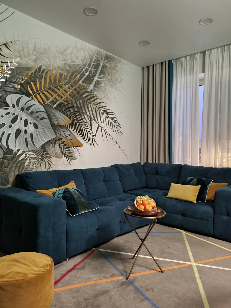
What I find successful here is the way the room embraces contrast. The dark blue sectional has substantial visual weight, but the pale wall and expansive mural keep the composition from feeling closed in. The mustard accents are repeated across the seating and ottoman, giving the stronger colors a sense of purpose. Even the rug participates in the artistic character through its colorful linear pattern.
I would approach a room like this by choosing the artwork and sofa together rather than treating the wall as an afterthought. The mural already contains several tones, so the furniture can reinforce one of them while remaining relatively simple in shape. For fall, I particularly like the combination of deep blue and warm mustard because it gives the room a naturally richer, cozier atmosphere.
Colorful Floral Artwork on a White Brick Wall
The seventh image shows a bright floral artwork mounted against a white painted brick wall above a white sofa. The artwork features flowers in pink, purple, red, blue, and green, creating a lively focal point in an otherwise pale room. A black floor lamp stands beside the sofa, while a simple light-toned side table holds two green apples. The pale flooring, white furniture, and white brick create a clean background that allows the artwork to dominate.
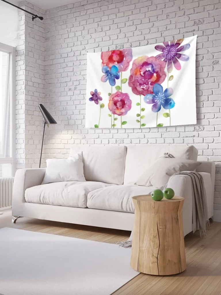
I like this arrangement because it demonstrates how a colorful artwork can transform a neutral room without requiring colorful furniture. The brick texture gives the background subtle character, but it does not compete with the painting. The white sofa and light surroundings act almost like a gallery setting, making the saturated colors of the artwork immediately noticeable.
If I wanted to achieve a similar effect, I would keep the surrounding palette quiet and let one artwork introduce the strongest colors. I would also avoid adding too many accessories around it. The image shows that a single expressive piece can be enough to give a simple seating area an artistic identity.
Monochrome Leaf Wall Mural Above a Gray Sectional
This living room uses a large wall mural of overlapping palm-like leaves in soft gray, white, and beige tones behind a substantial gray sectional. The sofa fills much of the lower portion of the image and includes several matching cushions. A blush-toned upholstered chair appears in the foreground, while a small round white table is partially visible at the side. The flooring has a pale marble-like appearance with dark veining, reinforcing the room’s sophisticated neutral palette.
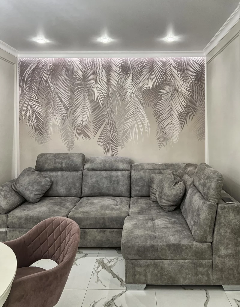
For me, the strength of this design comes from repetition. The leaf shapes spread across the wall, while the gray sectional repeats the quieter tones of the mural. Because the colors remain restrained, the oversized pattern feels artistic without becoming visually chaotic. The generous sectional also makes the room look designed for relaxed everyday seating rather than simply for display.
I would recommend this approach when someone wants a statement wall but prefers a quieter color scheme. A monochrome mural can provide considerable visual movement while remaining easy to coordinate with neutral furniture. I would also let the mural determine the overall intensity of the room instead of adding several competing patterns elsewhere.
Deep Green Living Room With Playful Botanical Illustrations
This image presents a rich deep green wall behind a matching green sofa, creating an immersive backdrop for three framed illustrations. Each artwork features a simple vase or abstract form with stylized stems and flowers in orange, blue, yellow, green, and muted red tones. The pale frames stand out clearly against the dark wall. A round light-toned coffee table sits in front of the sofa, and a woven hanging light fixture is visible at the side.
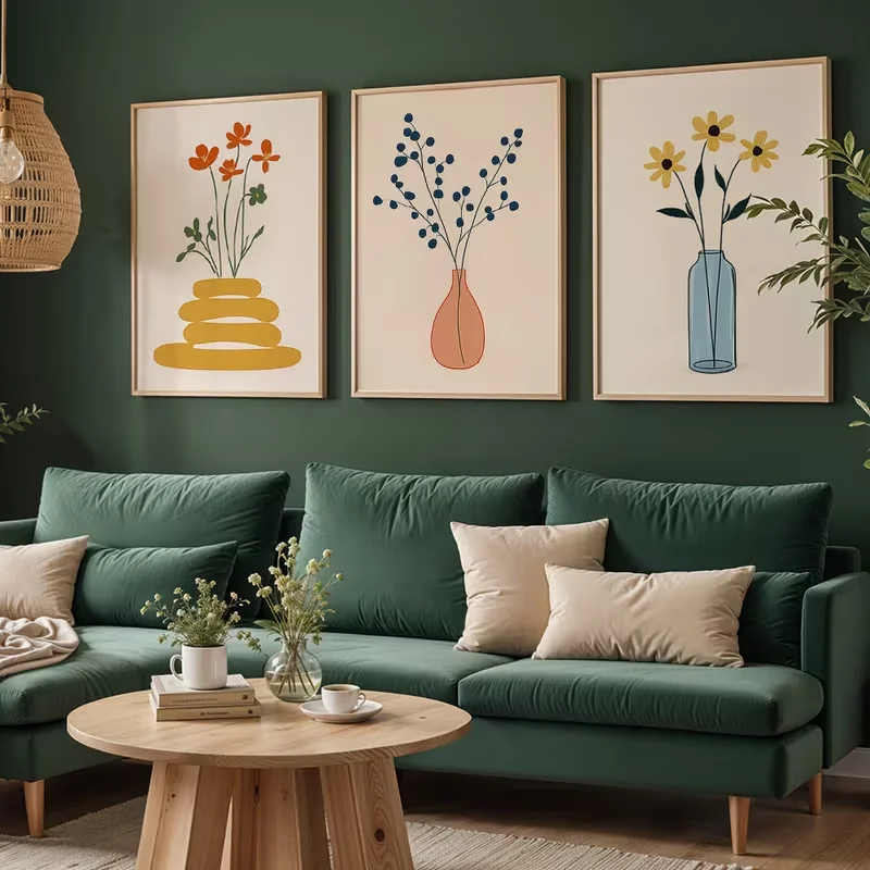
I love how the artwork brings a playful quality to an otherwise deeply colored room. The three pieces have different illustrations, yet their matching proportions and pale frames make them read as a unified arrangement. The light coffee table also creates a useful visual contrast against the green seating, while the pale pillows provide another quiet break in the darker palette.
For a similar composition, I would choose a deep wall color first and then select artwork with enough light space around the illustrations to remain clearly visible. The image shows that small, colorful artworks do not need to be oversized to have an impact. Their placement and contrast against the wall do much of the work.
Oversized White Floral Artwork in a Refined Gray Sitting Area
The final room uses large-scale white floral paintings as its primary artistic feature above two pale gray upholstered chairs. The artwork is set against a gray background and framed in a light finish, creating a soft monochromatic effect. Gold-toned metal appears on the chair frames and small side tables, while a large metallic-looking vase with white flowers sits in the foreground. The overall palette of gray, white, and warm metallic accents feels polished and restrained.
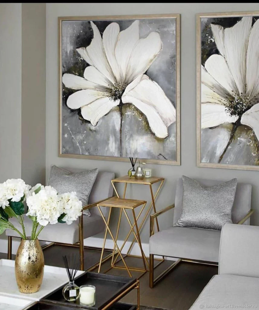
I find the oversized floral artwork especially effective because it gives the relatively compact seating arrangement a strong sense of scale. The two paintings work together as a pair, while the matching chairs create symmetry beneath them. The gold-toned details introduce a subtle contrast to the cool gray upholstery and prevent the room from feeling completely flat.
To recreate this atmosphere, I would focus on scale and repetition. Two large artworks can make a much stronger impression than several small pieces when the seating arrangement is symmetrical. I would also repeat the metallic finish sparingly, as shown here, so it feels like a refined detail rather than the dominant feature of the room.
Carved Crane Artwork Framed by Dark Wood
I love the sense of quiet drama in this living room, where an enormous white relief panel becomes the central feature between dark wood framing. The raised artwork depicts graceful birds with extended wings surrounded by intricate botanical forms, creating a sculptural surface that catches the light beautifully. A soft gray sectional occupies the foreground, while a black rectangular coffee table keeps the seating area grounded. Above it, a contemporary chandelier made from transparent glass globes and slender metallic arms adds another artistic layer. The combination of pale relief, rich brown framing, soft upholstery, and warm metallic details feels sophisticated without becoming visually crowded.
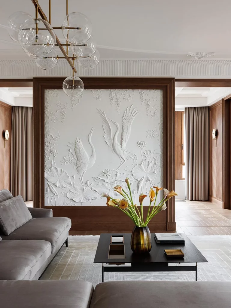
The composition works because the artwork is treated almost like part of the room’s architecture rather than an accessory placed on a wall. I notice how the dark frame gives the pale relief a strong boundary, allowing every raised detail to remain visible. The large sectional also provides a calm visual base, so the elaborate wall does not have to compete with patterned upholstery or excessive accessories. The coffee table is simple and low, which preserves the view toward the artwork and keeps the seating arrangement comfortable.
If I wanted to recreate this effect, I would begin with one oversized sculptural wall feature and let it dictate the rest of the palette. The image shows me that artistic impact does not necessarily require many decorative objects. A restrained combination of neutral upholstery, dark framing, a simple table, and statement lighting can actually make one expressive wall treatment feel much more important.
Floral Painting With Gold Details and a Classic Console
This elegant corner pairs a large floral painting with a narrow console table in a sophisticated gray and gold setting. I notice the oversized artwork immediately, particularly the layered flower rendered in soft whites, grays, muted beige, and metallic-looking gold accents. Beneath it, the slim console has a delicate gold-toned frame and two open shelves holding a few carefully arranged objects and books. A tall table lamp with a white cylindrical shade and ornate metallic base stands on one side, while a warm brown upholstered armchair fills the foreground. Floor-to-ceiling light curtains frame the area and soften the darker wall behind the artwork.
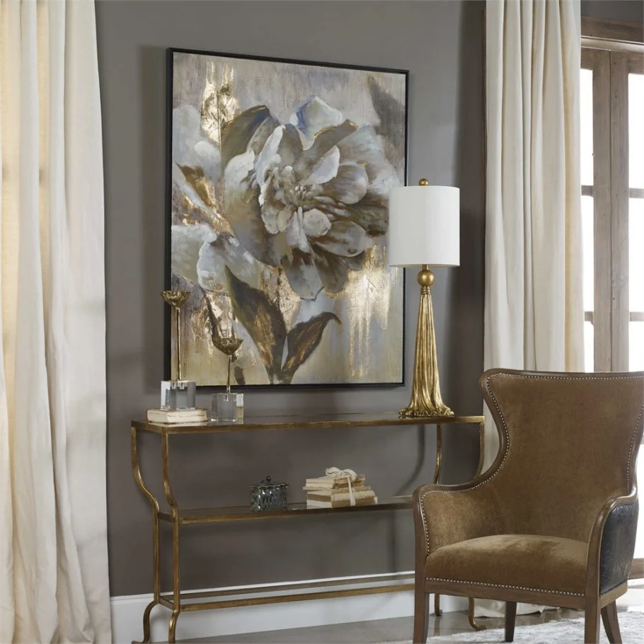
I think this arrangement succeeds because every piece supports the artwork without overwhelming it. The console is visually light, leaving plenty of wall space around the painting, while the chair introduces a deeper, warmer tone that makes the corner feel inviting. The open shelves provide useful display space without creating a heavy block beneath the artwork. I also like the vertical proportion of the lamp, which balances the height of the painting and gives the composition a clear sense of structure.
For my own decorating approach, I would use this image as a reminder that an artistic corner does not need an entire gallery wall. One substantial painting can be enough when it is given breathing room. Keeping the surrounding furnishings relatively refined allows the texture and metallic touches in the artwork to become the focus while still creating a practical reading or sitting area.
Monochromatic Bird Mural Above a Deep Blue Sofa
Here, the artwork becomes an atmospheric wall mural behind a deep blue sofa. I see a bird perched on a branch surrounded by large botanical forms, all rendered in dark monochromatic tones against a warm taupe wall. A circular outline frames the composition and gives the mural a graphic quality. On the left, vertical wall detailing adds rhythm, while a modern circular ceiling fixture echoes the rounded shape of the mural. The sofa is decorated with several contrasting cushions, and a small rounded coffee table sits in front of it. The room feels intimate, calm, and slightly mysterious.
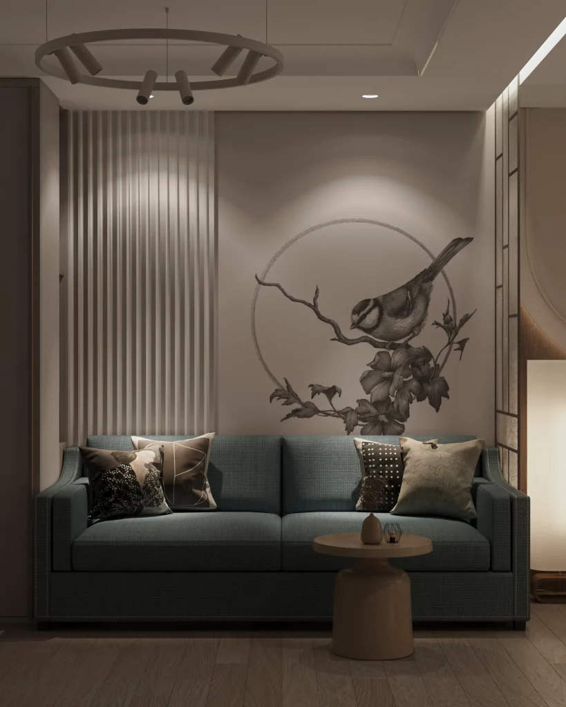
What works especially well for me is the way the wall artwork connects visually with the furniture without matching it literally. The deep blue sofa provides enough contrast to stand apart from the taupe wall, yet its muted character keeps the room from becoming loud. The vertical wall treatment introduces another texture, but because it remains close to the wall color, it does not compete with the bird motif. The circular mural and rounded lighting fixture also create a subtle repetition of shape.
I would approach a design like this by choosing one strong graphic composition and allowing the rest of the room to remain controlled. The image demonstrates how a limited palette can make detailed artwork feel more sophisticated. Rather than adding numerous decorative pieces, I would concentrate on the relationship between the mural, sofa, lighting, and a few cushions, keeping the visual story focused.
Minimalist Wall Sculpture With a Symbolic Tree Design
This light and airy living room uses a striking black wall sculpture as its main artistic statement. The artwork stretches horizontally above a large pale sectional and depicts two trees connected by a thin ground line, with roots extending underneath and two small human figures standing between the trees. The word “together” appears as part of the design. I notice how the simple black silhouette stands out against the almost white wall, while a tall floor lamp with a pleated white shade adds softness at the side. A pale marble-look coffee table, white seating, and understated accessories keep the room exceptionally calm.
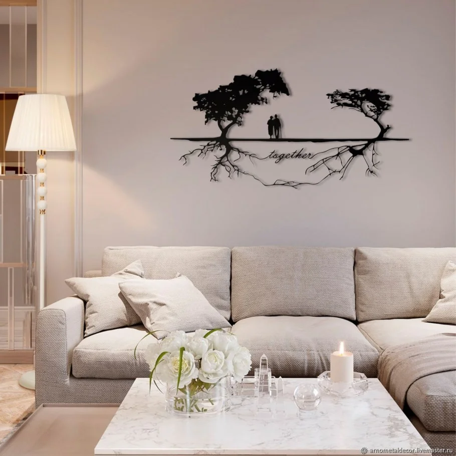
The strength of this room comes from its contrast and restraint. The sculpture is detailed enough to tell a story, but its black silhouette remains visually simple, so it does not make the room feel busy. The sectional provides generous seating while maintaining the soft, neutral appearance of the space. I also like the way the artwork sits above the sofa rather than being surrounded by additional frames or decorative objects. That empty wall space gives the sculpture room to breathe.
From my perspective, this is an excellent example of using meaningful artwork to create character in a minimalist room. If the furniture is already neutral, I would not feel pressured to add multiple decorative layers. One symbolic piece with a strong horizontal shape can provide personality, while a restrained palette keeps the living room feeling peaceful and contemporary.
Oversized Portrait on a Weathered Vertical Panel
This living room takes a much bolder artistic direction with an enormous monochromatic portrait positioned behind a white sectional. The portrait appears across a vertically segmented panel with a weathered, distressed surface, giving the artwork a tactile and graphic quality. The woman’s face dominates the wall, with dark splashes and softer gray areas creating a dramatic contrast. In front, the large white sectional has a clean, boxy silhouette, while the floor is dark and visually grounded. Exposed ceiling beams and visible ductwork reinforce the spacious character of the room.
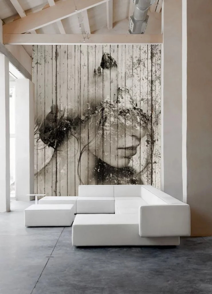
I find the contrast between the refined white sofa and the expressive portrait particularly effective. The seating is visually simple, which allows the artwork to remain the unmistakable focal point. At the same time, the generous scale of the portrait suits the large wall and high ceiling much better than a small framed piece would. The white furniture also helps prevent the room from feeling visually heavy despite the dark artwork and flooring.
For me, the lesson here is to consider scale before choosing artwork. A dramatic piece can work beautifully when its dimensions relate to the architecture around it. I would also keep the furniture relatively clean-lined if I were using such an expressive image, because adding too many competing shapes could weaken the impact. The photograph shows how one oversized artwork can completely define the atmosphere of a room.
Graphic Abstract Wall Composition With Navy Lounge Chairs
This room introduces a much more graphic interpretation of artistic decor. A large abstract wall design spreads across the pale wall behind two deep navy lounge chairs, using curved black lines, muted beige shapes, terracotta forms, olive-toned botanical silhouettes, and small scattered dots. A wall-mounted television is centered within the composition. The two chairs face inward toward a small round table with a dark metal base, creating a compact conversation area. Light wood flooring and the pale background keep the room open and allow the wall design to command attention.
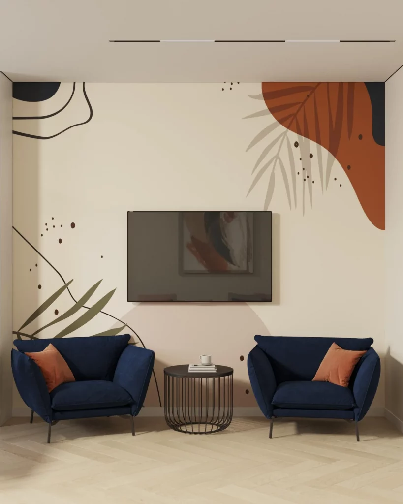
I like the way the artwork has been integrated around the television instead of trying to hide it completely. The composition makes the screen feel like one element within a larger graphic wall. The matching navy chairs establish symmetry, while the terracotta cushions pick up the warm tones in the artwork. The small round table keeps the center of the seating arrangement visually light and provides a practical surface without interrupting the open space between the chairs.
If I were creating a similar room, I would first identify two or three colors from the wall artwork and repeat them in the furniture or cushions, just as this image does with navy and terracotta. That creates cohesion without requiring everything to match. I also think the balanced placement of the chairs is important: the artwork is expressive, so the furniture benefits from a straightforward, orderly arrangement.
Marble-Like Abstract Artwork in a Paneled Gray Wall
This sophisticated living room places a large abstract artwork inside a framed gray wall treatment, creating the impression of a custom architectural gallery. The artwork features pale gray, white, and metallic brown or gold-like areas that resemble flowing natural textures. A light sectional sofa sits below it, covered with patterned and neutral cushions, while small round side tables with slender metallic frames add subtle structure. Two delicate wall lights flank the central artwork, and a pale patterned rug extends beneath the seating area. The overall effect is polished, soft, and highly composed.
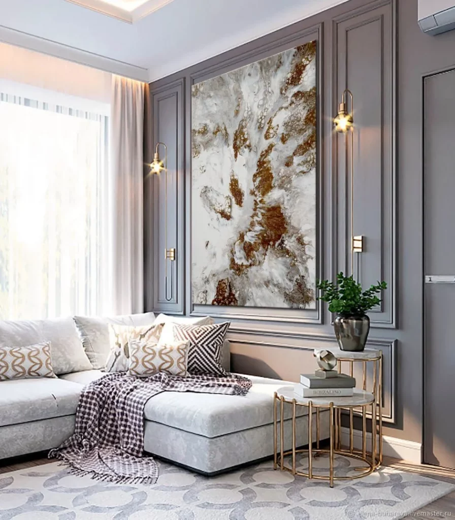
The framed wall treatment is what makes this arrangement especially effective. Instead of simply hanging the artwork on a blank wall, the surrounding molding gives it a dedicated visual zone. I also appreciate the repetition of rounded forms in the side tables and the softer shapes of the sofa and cushions. The metallic accents appear in several places without taking over, helping connect the artwork, lighting, and tables into one coherent composition.
My approach would be to think of large artwork and wall molding as a single design decision rather than two separate choices. When the artwork has strong internal movement, as it does here, the surrounding architecture can provide visual order. I would also keep the upholstery relatively light and quiet so the artwork remains the centerpiece while the room still feels comfortable and usable.
Textured Blue and Cream Sofa With Botanical Artwork
This living room creates a softer artistic mood through color, texture, and a botanical-style wall artwork. The sofa combines deep blue upholstery with cream-colored sections, giving its long form a distinctive sculptural appearance. Above it hangs a rectangular artwork featuring a dense arrangement of small pale blossoms or marks against a deep blue background, with a darker lower section. A large window brings in abundant natural light through sheer curtains and darker drapes. Overhead, an unusual circular chandelier with layered leaf-like forms becomes another decorative focal point, while a floor lamp adds a warm, intimate light source.
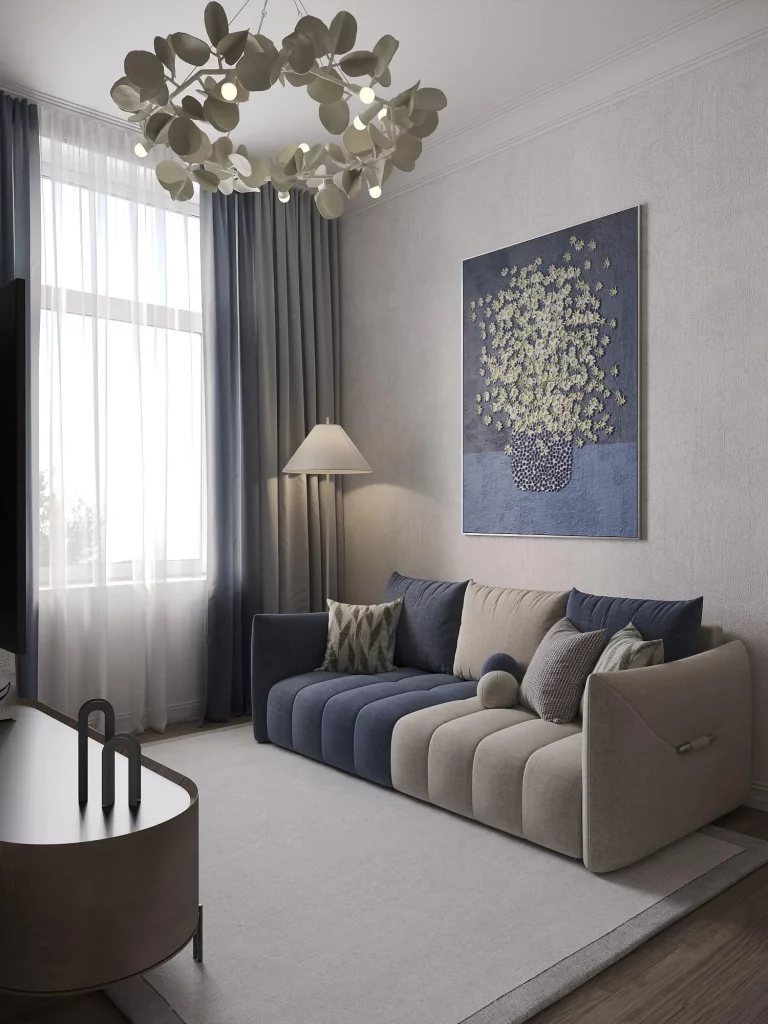
I think the room works because the artwork and sofa share a clear visual relationship without being identical. The dark blue from the wall piece appears again in the seating, while the pale details are echoed by the lighter upholstery and room surfaces. The large window prevents the darker elements from making the space feel enclosed. The unusual chandelier adds movement overhead, balancing the strong horizontal line of the sofa and artwork.
For Fall 2026, I would take inspiration from this image when working with a restrained but atmospheric color palette. Rather than using many colors, I would choose one deeper tone and combine it with several softer neutrals. The photograph also reminds me that artwork can influence furniture selection: repeating a color from the artwork in the sofa makes the room feel intentionally designed rather than randomly decorated.
Surreal Portrait Artwork Above a Dark Sofa
This room takes artistic expression into a more surreal direction with a large horizontal image of two faces moving toward a kiss. The figures are formed from delicate, thread-like lines against a deep blue-green background, creating an almost weightless effect. Below the artwork is a simple dark sofa with crisp lines and several white cushions. A tall white planter with a narrow green plant stands beside it, while the floor is composed of long dark-toned boards. The textured neutral wall provides a quiet background that allows the artwork to dominate the room.
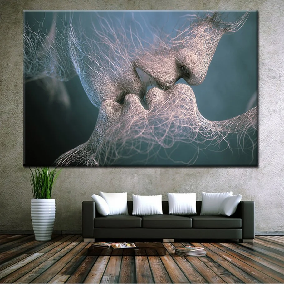
The simplicity of the furniture is essential here because the artwork carries so much emotional and visual information. I like the generous scale of the image above the sofa; it feels intentional rather than like a small decorative addition. The white cushions create a clean break between the dark sofa and the artwork, while the simple planter adds a small amount of vertical interest without competing with the central image.
I would use this room as an example of how personal artwork can make a living room feel distinctive even when the furniture itself is uncomplicated. When an image has a strong emotional subject, I prefer giving it plenty of visual space. A restrained sofa, limited accessories, and a quiet wall surface can actually make expressive artwork feel more sophisticated and powerful.
Serene Coastal-Inspired Abstract Artwork Over a White Sofa
The final image takes a calmer approach with a large two-panel abstract artwork hanging above a white sofa. The painting is dominated by soft whites and pale grays, with a horizontal dark landscape-like band crossing both panels and subtle muted green and warm beige accents. The sofa is decorated with cushions featuring leafy patterns, while a round coffee table with a white top and dark geometric base sits in front. A pale patterned floor and neutral wall keep the setting exceptionally light, creating a fresh and relaxed atmosphere.
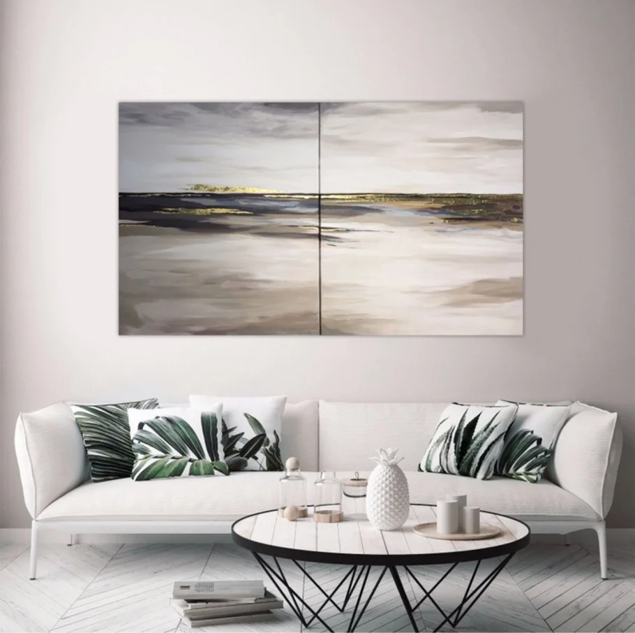
I find the balance in this room particularly appealing because the artwork introduces horizontal movement while the coffee table adds a strong circular shape. The white sofa gives the painting a clean visual foundation, and the patterned cushions bring a small amount of additional detail without disrupting the calm palette. The artwork is large enough to anchor the seating area, yet its subdued colors make the entire room feel peaceful rather than formal.
For my own decorating ideas, I would borrow the principle of using abstract artwork to establish a room’s palette. The muted tones in the painting can guide the choice of cushions and surrounding furnishings without requiring exact color matching. This image shows that artistic living room decor can be quiet and sophisticated too; sometimes the most successful statement is one that creates atmosphere rather than demanding attention.
Blue and Gold Living Room With Oversized Abstract Wall Art
I love how immediately this living room establishes its artistic identity through the enormous abstract wall treatment behind the sectional sofa. The composition combines blue, pale blue, white, black, and warm gold shapes in sweeping, irregular forms, creating the feeling of a large-scale artwork integrated directly into the room. In front of it, a deep blue-gray sectional with generous cushions and matching ottoman pieces creates a comfortable seating arrangement, while two mustard-gold cushions and a large matching ottoman bring warmth into the palette. A contemporary gold ceiling fixture with clear glass shades completes the look, and the warm wood-toned floor gives the room a grounded finish.
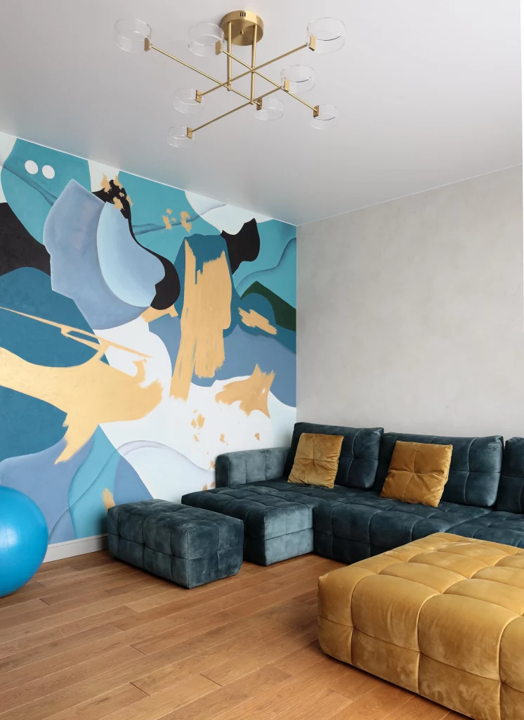
What works particularly well for me is the strong relationship between the wall artwork and the furniture. The blue upholstery picks up the dominant blue tones from the wall, so the sectional feels connected to the artwork rather than placed randomly in front of it. The gold accents provide a clear secondary color, appearing both in the wall composition and in the cushions and ottoman. I also like the generous open floor area in front of the seating, which keeps such a visually powerful room from feeling crowded.
From my perspective, this is a great example of letting one artistic feature determine the rest of the decorating direction. If I were recreating this idea, I would begin with the largest visual element and select upholstery and accessories from its existing color palette. That approach makes it easier to create cohesion without matching every detail. For a fall living room, the combination of deep blue, soft blue, warm gold, white, and natural floor tones already provides a sophisticated seasonal balance.
Classic Sofa Setting With Coordinated Botanical Artwork
This living room takes a much softer artistic direction, with three framed botanical artworks arranged symmetrically above a beige sofa. The artwork uses warm cream, brown, muted green, and golden tones, while the sofa is styled with cushions in beige, gray, soft mauve, and patterned cream. A crystal chandelier hangs centrally above the seating area, adding an ornate focal point, while neutral curtains, table lamps, a dark coffee table, and a textured area rug complete the composition. I find the overall atmosphere calm and carefully coordinated, with the artwork providing most of the visual interest.
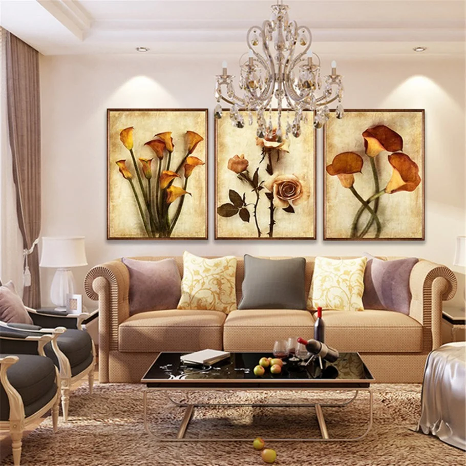
The three-panel arrangement works especially well because it gives the wall a strong sense of proportion. Instead of one large picture dominating the sofa, the repeated frames create a balanced horizontal rhythm that follows the width of the seating. I also appreciate how the artwork’s warm tones are repeated subtly throughout the room, particularly in the cushions and surrounding neutral finishes. The dark coffee table provides contrast and visually anchors the lighter sofa.
I would use this room as inspiration when I wanted an artistic living room that still felt restrained and comfortable. In my experience, a coordinated set of three artworks can make decorating a large wall much easier because the repetition creates structure automatically. For fall, I would pay particular attention to the warmer colors already present here, especially cream, brown, muted gold, and soft mauve, because they naturally create a cozy seasonal impression without overwhelming the room.
Golden Botanical Wall Mural With Sculptural Green Sofa
Here I see a much more immersive approach to artistic decorating. The entire wall behind the sofa becomes a large decorative scene filled with layered botanical imagery, butterflies, branches, and rich colors ranging from deep brown and black to gold, orange, cream, and dark blue. A sculptural green sofa sits directly in front of the mural, while a black rectangular coffee table and light textured rug provide a simpler foundation. Above the wall treatment is a striking gold decorative border with scrolling details, creating a clear transition between the artwork and the ceiling.
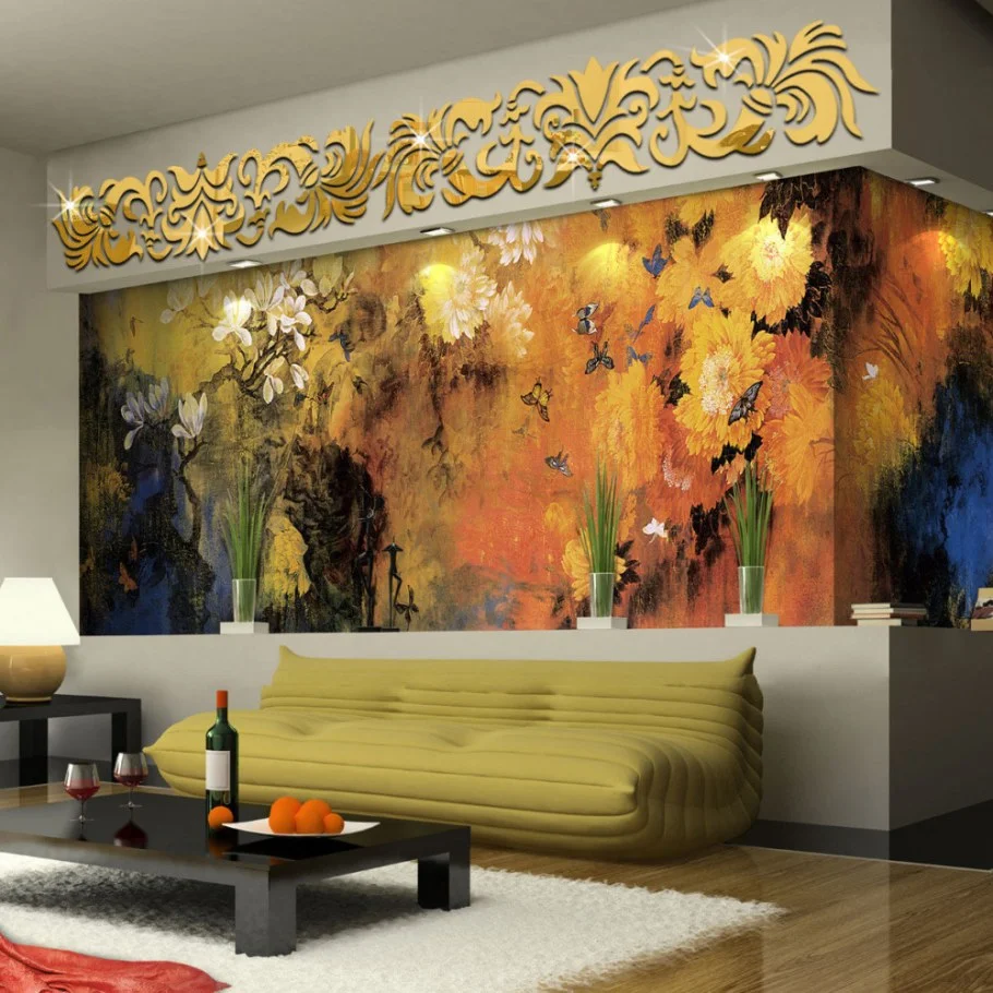
I think the success of this room comes from the decision to keep the furniture relatively simple against such an expressive background. The green sofa has a strong presence, but its shape remains straightforward enough to allow the wall to remain the main artistic feature. The black coffee table adds definition without competing with the mural, while the pale rug introduces visual breathing room below the intense wall composition. The result feels layered without requiring numerous separate decorative objects.
For me, this image demonstrates how an artistic wall can become the organizing principle for an entire living room. If I wanted to achieve a similar effect, I would choose one dominant wall treatment first and then select a sofa in a color that is clearly visible within the artwork. The deep green used here is particularly effective because it connects naturally with the darker tones of the wall while adding a rich contrast against the warmer background.
Black White and Red Tree Artwork Over a Contemporary Sofa
This room shows how graphic artwork can create an artistic focal point even when the furniture remains relatively understated. Three square panels hang above a contemporary sofa, with each artwork presenting tree silhouettes against a different background: black, white, and red. The sofa combines a light upholstered seat with dark side sections, and the cushions introduce neutral patterns and textures. A large dark coffee table sits in front, while a light rug and neutral walls soften the stronger black-and-red contrast.
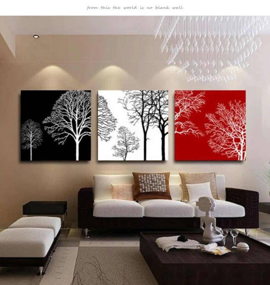
I particularly like the visual rhythm created by the three artworks. The repeated tree motif gives the arrangement continuity, while the alternating backgrounds keep it from looking too uniform. The red panel becomes an obvious accent, but because it is confined to a single artwork, it does not dominate the entire room. The darker coffee table also helps connect the artwork to the sofa’s dark sections, creating a subtle relationship between the wall and furniture.
When I look at this arrangement as a decorating idea, I see an easy way to introduce stronger color without repainting an entire room. A triptych with contrasting backgrounds can define a wall while leaving the surrounding furnishings neutral. I would also keep the artwork aligned carefully, as the clean spacing shown here is an important part of its polished appearance.
Silver Leaf Artwork Against a Deep Neutral Wall
This living room uses a dramatically simpler composition, and I find the restraint very effective. Three tall framed artworks display individual leaf forms in metallic-looking silver, cream, and muted gold against dark gray backgrounds. They are positioned evenly above a large white sofa filled with soft white cushions. A dark side table, table lamp, and small decorative objects sit beside the sofa, while the darker wall creates a strong contrast with the light upholstery.
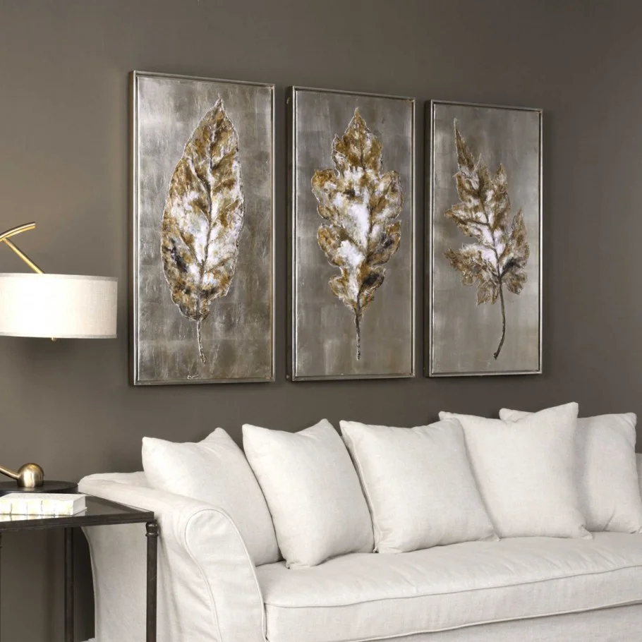
The vertical proportions of the three artworks work beautifully with the long sofa because they add height without making the wall feel crowded. I also like the contrast between the almost monochromatic furniture and the textured metallic artwork. The sofa provides visual softness, while the artwork introduces sharper outlines and reflective-looking surfaces. This balance makes the room feel calm but still visually interesting.
Personally, I would consider this one of the easiest ideas in the collection to adapt. The basic formula is simple: a neutral sofa, a deeper wall, and a coordinated set of vertically oriented artworks. The important detail is consistency. Because all three panels share a similar palette and presentation, the arrangement feels intentional. For fall, this restrained combination of gray, white, silver, and muted gold has a naturally cozy and polished quality.
Deep Green Sofa With Graphic Black Botanical Wall Design
This room makes a strong impression through its warm ochre wall and large black botanical-style graphic that stretches across the entire seating wall. The pattern includes branches, leaves, birds, and rounded fruit-like forms, creating an intricate silhouette behind a deep green sofa. A pale green paneled door appears on the left, while patterned curtains frame the window on the right. Under the sofa, a large round rug introduces a geometric pattern in cream, brown, and black, giving the lower part of the room its own decorative identity.
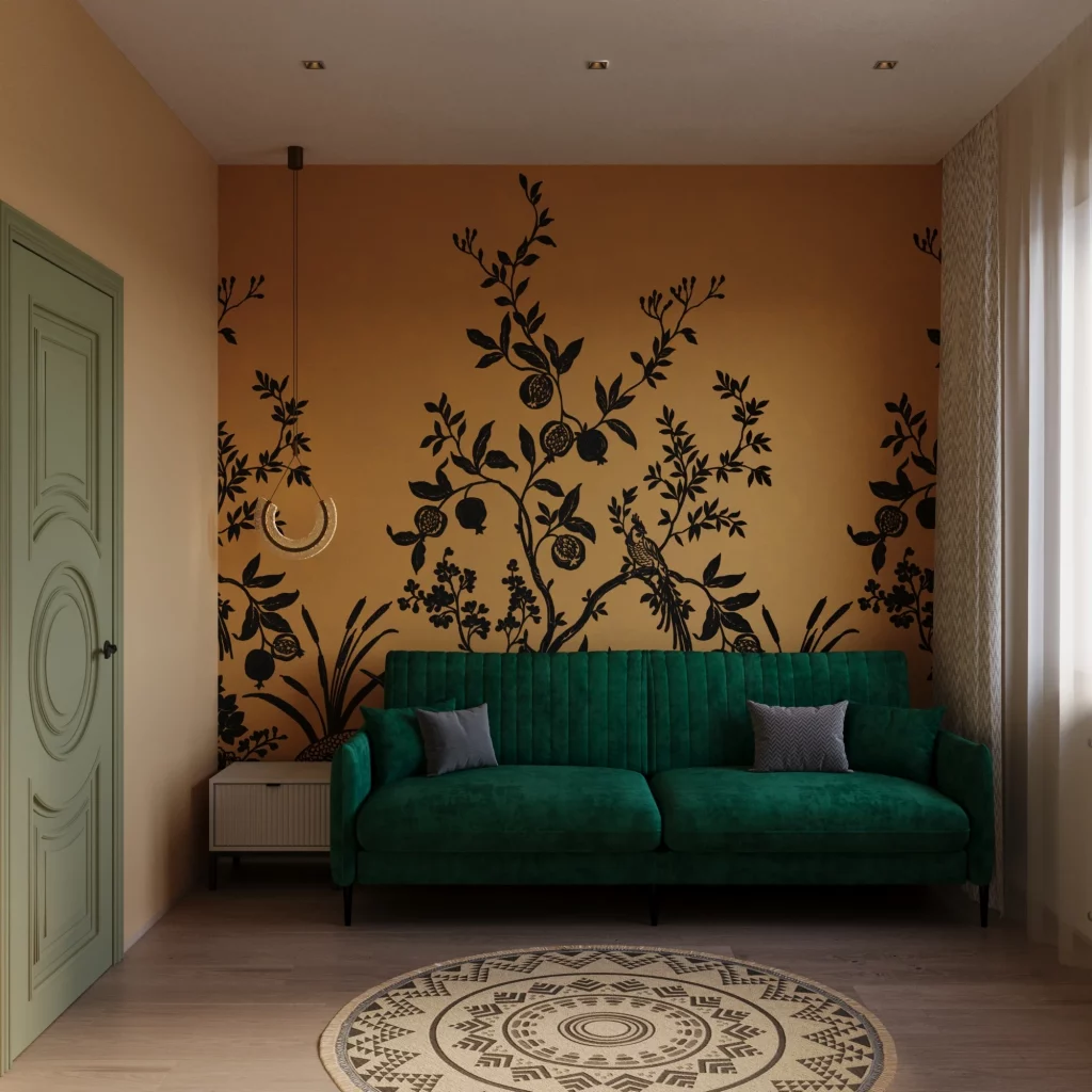
I like the way the room connects its major elements through color rather than through identical patterns. The ochre wall establishes a warm background, the black graphic provides definition, and the deep green sofa introduces a rich contrasting tone. The round patterned rug then echoes the darker graphic elements without copying them. The result is a layered room where the wall and floor both contribute to the artistic character while the sofa remains the central piece of furniture.
From my perspective, this is a useful lesson in balancing a highly decorated wall. The sofa has a relatively clean shape, which allows the intricate wall design to remain visible. I would follow the same principle if I were decorating a room with an expressive wall graphic: keep the main seating visually simple and let one or two strong colors carry through the space. The deep green and warm ochre combination also feels particularly appropriate for the fall season.
Soft Neutral Sofa With Black and White Botanical Prints
This living room uses a pale neutral palette and three black-and-white botanical artworks to create a quieter artistic atmosphere. The long light-colored sofa is decorated with cream, gold, and patterned cushions, while the three framed prints above it feature delicate plant forms against dark backgrounds. A sculptural white coffee table sits in front of the sofa, and warm recessed and ceiling lighting creates a soft glow across the textured wall. Neutral curtains and a plush-looking rug reinforce the comfortable character of the space.
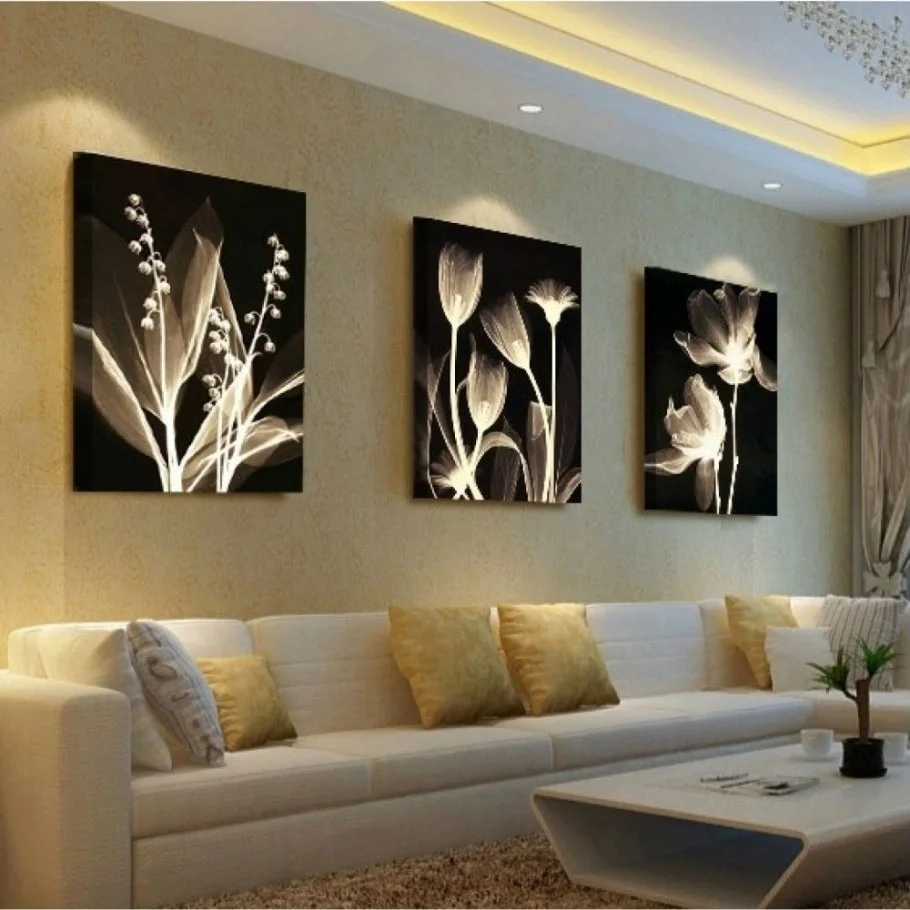
What I find most successful here is the contrast between the light furniture and dark artwork. The black backgrounds make the delicate pale forms stand out clearly, while the neutral sofa prevents the composition from becoming visually heavy. The three panels are also spaced generously, which gives the wall a relaxed appearance rather than making it feel overly decorated. The coffee table’s unusual shape adds another artistic note without competing with the artwork.
I would recommend this approach to anyone who wants artistic character but prefers a calm living room. Instead of relying on many decorative objects, I would concentrate on a small number of well-positioned artworks and one interesting furniture shape, as shown here. The soft neutral foundation also makes seasonal changes easy because cushions or other small textiles can introduce warmer fall tones without disrupting the main composition.
Blue and Gold Leaf Wall Panels Above a Gray Sofa
This image presents a contemporary living room built around two tall decorative wall panels. Each panel contains layered leaf-shaped forms in gold and blue, framed in a slim gold border against a gray background. Below them sits a soft gray sofa with a single deep green cushion and lighter textiles. A round coffee table with a dark top and angled legs occupies the center, while a striped rug creates subtle pattern beneath the seating area. Modern directional ceiling lights illuminate the artwork from above.
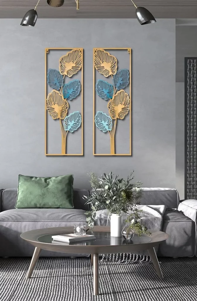
The paired panels work especially well because their narrow vertical format adds height to the wall while their mirrored arrangement creates symmetry. I also like the restrained color story: gray provides the neutral foundation, blue and gold define the artwork, and the green cushion introduces one deeper accent. The round coffee table softens the straight lines of the sofa and artwork, giving the seating arrangement a more relaxed visual flow.
If I were recreating this idea, I would focus on the relationship between the artwork and the room’s smaller accents. The green cushion is enough to give the otherwise neutral sofa some personality, while the gold framing connects visually with the artwork itself. For a fall setting, I could easily emphasize the warmer gold tones through textiles while keeping the overall gray-and-blue foundation intact.
Gold and Black Botanical Artwork in a Refined Neutral Room
This living room uses two large framed artworks as its main decorative statement. The panels combine black, white, gray, and multiple gold botanical forms, creating a graphic composition above a long light sofa. The sofa is styled with pale blue-green and mustard-yellow cushions, while round nested coffee tables in dark and gold finishes sit in front. Decorative objects, including a tall neutral vase and a black wire-like sculptural piece, add height and shape to the table arrangement.
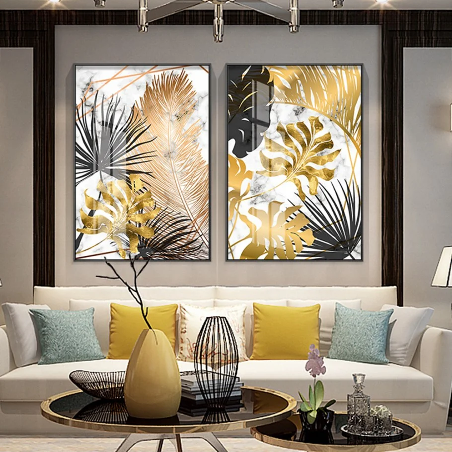
I like the way this room mixes several geometric and organic forms while keeping the color palette controlled. The rectangular artwork contrasts with the round coffee tables, and the linear botanical shapes contrast with the curved vase. The sofa remains light and visually calm, allowing the gold-and-black artwork to carry most of the attention. The mustard cushions also provide a warm accent that works naturally with the gold in the artwork.
For me, this is a strong example of how artwork can guide accessory selection. Rather than adding unrelated colors, I would pull small accents from the artwork itself, as this room does with gold, mustard, black, and pale blue-green. That method makes the room feel connected from one end to the other. It also provides an easy way to prepare a neutral living room for fall without making permanent changes.
Warm Neutral Sofa With Three Cream Botanical Art Panels
The final room returns to a soft, warm palette with three square botanical artworks arranged above a light sofa. The artwork features cream-colored blooms and stems against backgrounds combining beige, brown, gray, and darker accents. The sofa has a dark outer frame with light cushions, and several neutral pillows create a layered seating arrangement. A large dark rectangular coffee table anchors the foreground, while a pale rug and neutral wall maintain the room’s understated atmosphere.
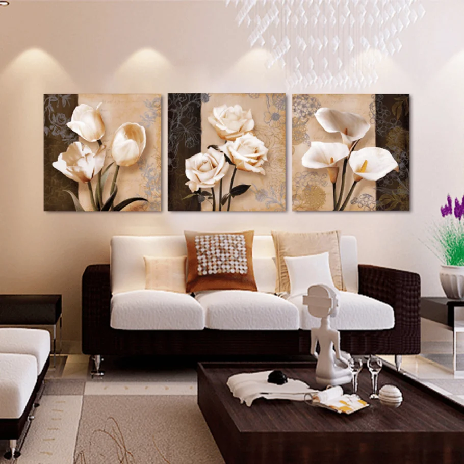
I find the three-panel artwork particularly effective because each image has its own composition while sharing the same warm palette. Together, the panels create a unified focal point above the sofa and give the wall a more finished appearance. The dark coffee table provides a strong horizontal anchor, while the lighter seating and rug keep the room from feeling too heavy. Small decorative pieces on the table add interest without distracting from the artwork.
This image reminds me that an artistic living room does not always need intense color or an unusual layout. Sometimes the most successful approach is simply choosing artwork with enough visual detail to make a neutral room feel considered. I would keep the surrounding furnishings relatively restrained and let the three panels establish the personality of the space. The combination of cream, beige, brown, and soft gold-inspired tones also translates beautifully into a fall-oriented decorating palette.
Botanical Panels Against a Deep Charcoal Wall
I immediately notice the strong contrast between the deep charcoal wall and the warm mustard-gold sofa. Above the sofa, three narrow rectangular artworks create a balanced triptych, each featuring birds, flowers, leaves, or a tree in muted cream, olive, brown, and gold tones. The sofa has a simple tailored shape, with light cushions and one dark navy cushion, while a dark wood coffee table sits centrally in front. Matching table lamps frame the composition on both sides and add a soft, symmetrical finish.
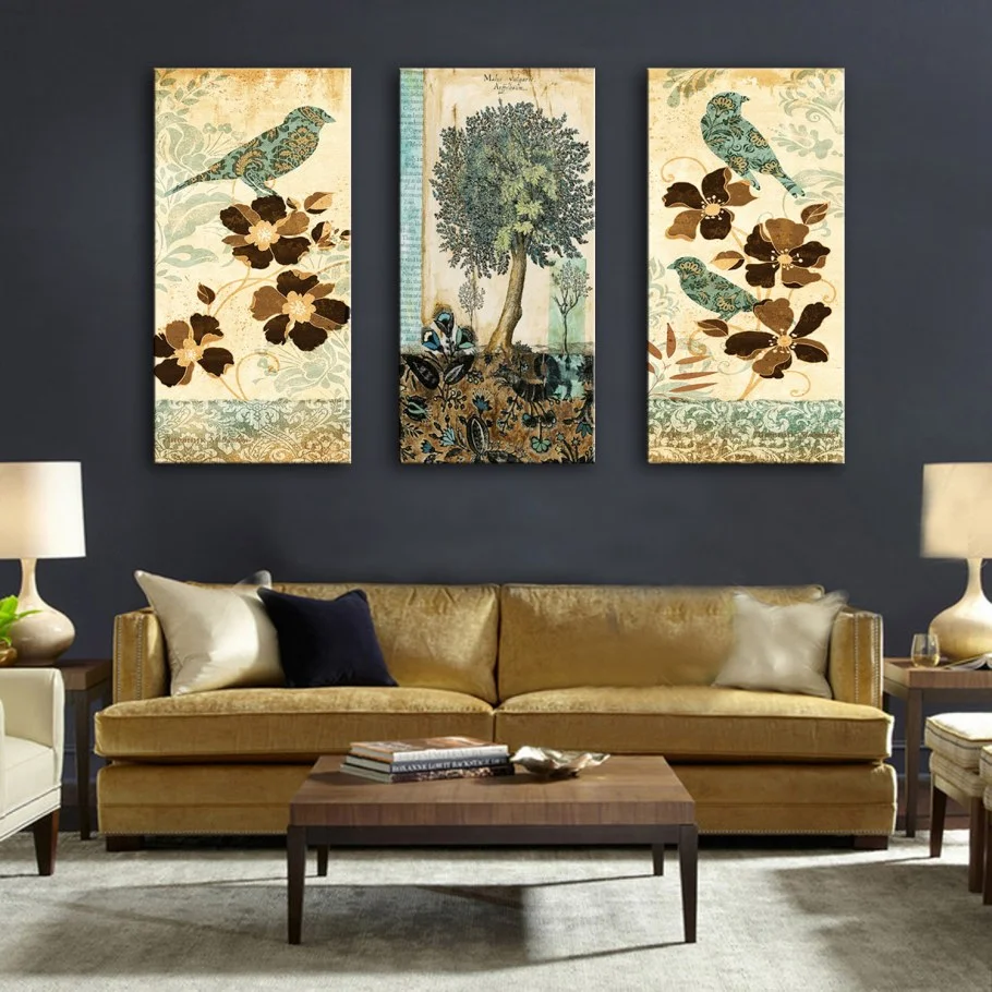
What makes this arrangement work so well for me is the relationship between the artwork and the sofa. The warm tones in the paintings echo the upholstery, while the darker background gives the artwork enough contrast to remain visible from across the room. I also like the way the three panels establish a clear horizontal rhythm above the sofa, making the seating area feel intentionally framed rather than simply decorated.
If I wanted to recreate this feeling, I would start with one dominant wall color and then choose artwork containing two or three shades already present in the furniture. I find that repeating colors between art and upholstery is one of the easiest ways to make a room feel cohesive without making every element match exactly. The symmetrical lamps and centered coffee table also demonstrate how simple geometry can give an artistic room a polished structure.
Red And Silver Waves Over A Neutral Sofa
This living room takes a completely different artistic direction with a three-panel abstract composition in red, silver, white, and gray. The sweeping lines appear to flow from one panel into the next, creating a continuous wave above a neutral brown-gray sofa. Two pale gold cushions reinforce the warm side of the palette, while the darker sofa base and dark trim give the room some visual weight.
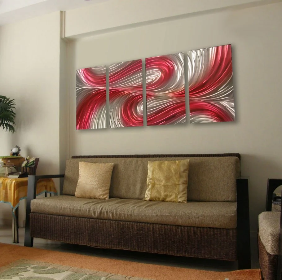
I particularly like how the artwork introduces energy without requiring a colorful room. The walls and sofa remain restrained, so the red-and-silver composition becomes the obvious focal point. At the same time, the three separate panels keep the large artwork from feeling too heavy over the sofa. For me, this is a useful approach when I want a statement piece but still prefer an understated furniture palette.
When working with abstract art like this, I would let the artwork determine the accent colors rather than adding several unrelated shades elsewhere. A pair of cushions can quietly pick up one or two colors from the composition, as shown here. Keeping the surrounding pieces relatively simple allows the movement in the artwork to remain the main visual story.
White Sculptural Geometry In A Serene Living Room
Here, the entire room is built around a pale and exceptionally clean palette. A light gray sectional sofa sits against a soft gray wall, with white cushions and a low white rectangular coffee table. Above the sofa hangs a white geometric artwork composed of overlapping curved and rectangular forms. The pale shag-style rug extends beneath the seating area, reinforcing the soft monochromatic atmosphere.
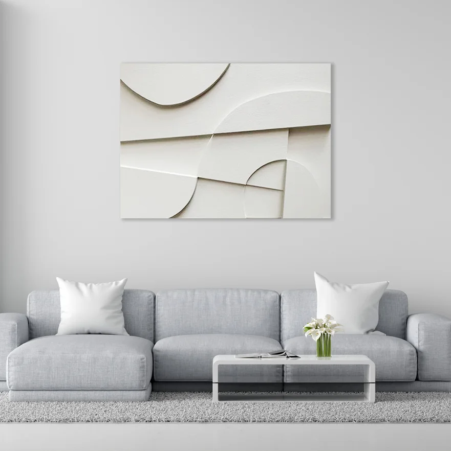
I find this room especially effective because the artwork adds dimension without introducing strong color. The curved shapes and layered surfaces create subtle shadows that can be appreciated against the otherwise quiet wall. The sofa’s sectional arrangement also gives the room a comfortable, generous seating zone while the low coffee table preserves the open visual feeling.
For a similar look, I would concentrate on differences in shape and texture rather than relying on multiple colors. This image reminds me that an artistic room does not necessarily need loud artwork. A sculptural composition in varying shades of white can create a sophisticated focal point, particularly when the furniture and accessories are kept within the same restrained family.
Expressive Blue Abstract Art Above A Velvet Sofa
The deep blue sofa immediately establishes a rich focal point in this room, while a large abstract painting above it introduces blue, cream, pale pink, and darker navy brushwork. The artwork is framed simply and positioned centrally over the sofa. A black coffee table, patterned cushions, and a distinctive gold-toned sculptural floor piece complete the arrangement, while the large window on the right brings in abundant natural light.
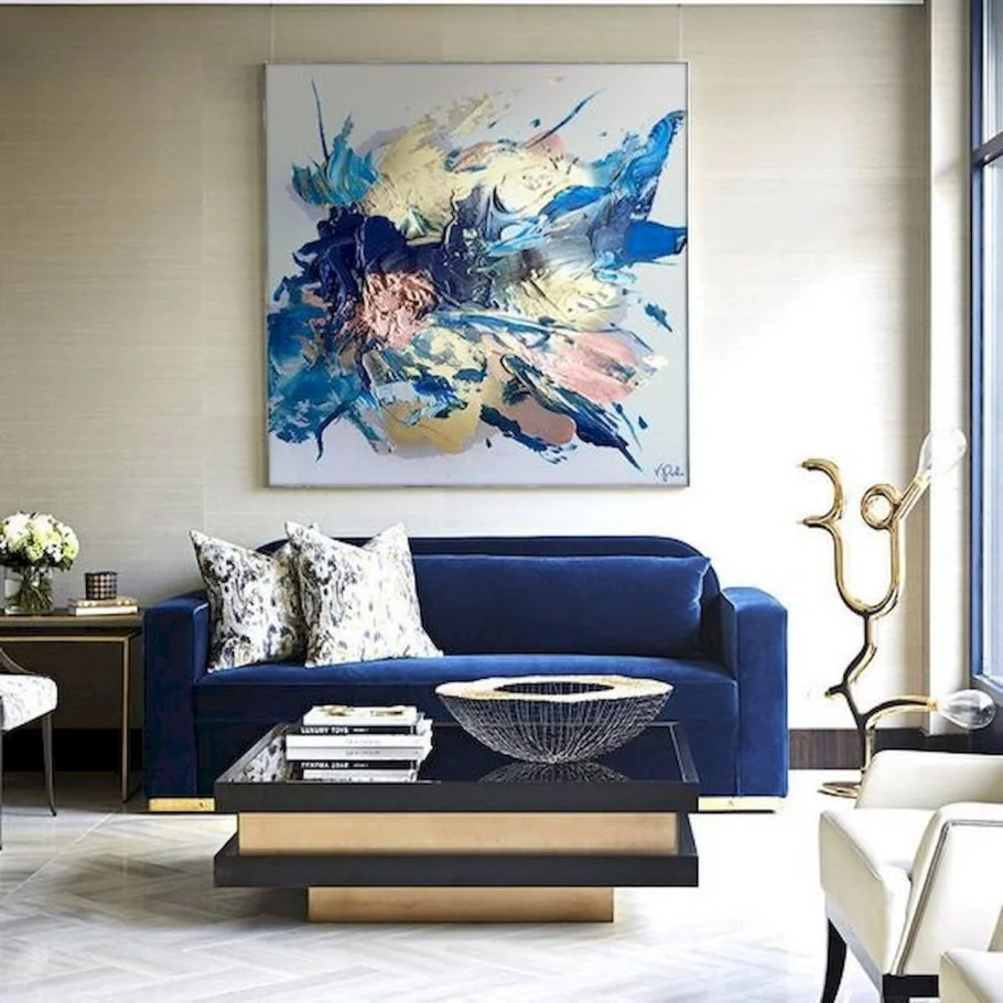
I like the confident relationship between the blue sofa and the artwork. Rather than treating the painting as an isolated decoration, the room allows its strongest color to continue through the seating. The patterned cushions soften the solid sofa while still remaining connected to the artwork’s expressive character. The open space around the furniture also gives the statement pieces enough room to breathe.
For me, this is a good example of how one saturated furniture color can make a living room feel artistic without covering every surface in decoration. I would choose one strong anchor, such as the sofa, and then use artwork to create a visual conversation with it. Keeping the coffee table relatively dark and simple helps maintain attention on the painting and seating.
Golden Radiating Artwork In A Soft Neutral Room
This room takes a quieter approach, with a pale sofa, soft gray walls, and a large square artwork positioned above the seating. The artwork is filled with fine golden lines radiating outward from a central point, creating the impression of movement and light. The wall itself has decorative rectangular molding, while pale cushions and rounded sofa arms contribute to the gentle, elegant appearance.
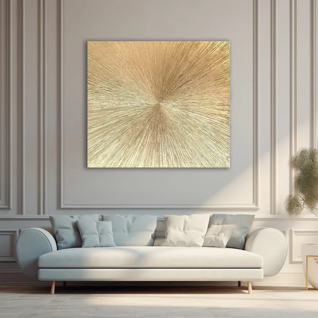
I think the artwork is particularly successful because its fine linear texture contrasts with the smooth, pale furniture around it. The gold remains subtle rather than overwhelming, allowing the composition to feel connected to the light-filled room. The generous sofa provides a comfortable visual base, while the centered artwork gives the entire seating area a clear focal point.
If I were creating something similar, I would look for artwork whose texture adds interest without competing with the architectural details of the wall. The restrained palette here demonstrates how a metallic-looking accent can be enough to make a neutral living room feel special. I would also keep the surrounding accessories quiet so the radiating pattern remains the star.
Metallic Feather Art Above A Rich Brown Sofa
The next room feels warmer and more layered, with a brown leather sofa set against a muted green wall with decorative panel molding. Above it is a large rectangular metal artwork featuring repeated feather-like forms in blue, gray, and bronze. Several cushions in teal, white, mustard, and patterned fabric add color across the sofa, while a large leafy indoor plant occupies the left side of the composition.
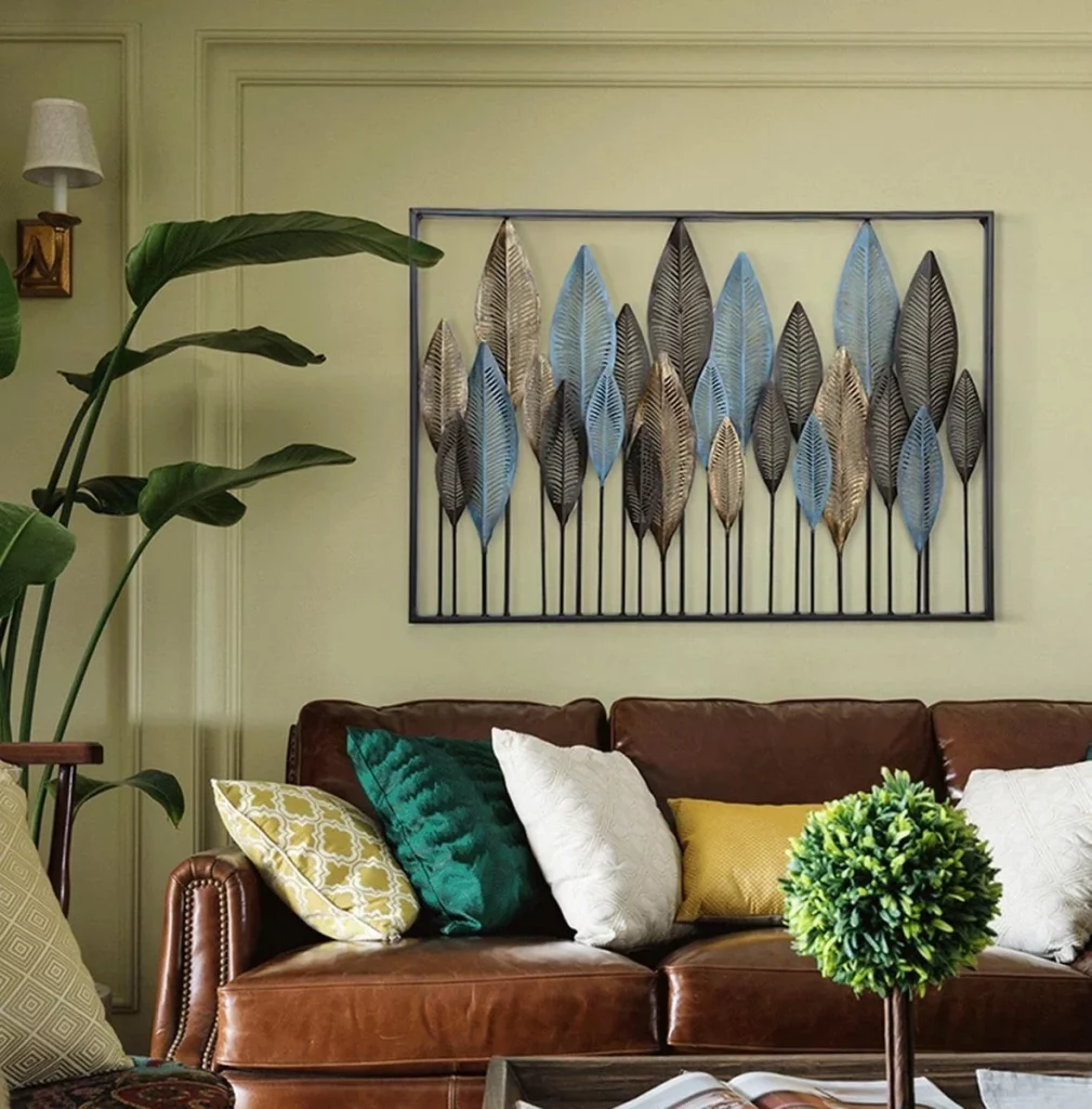
I like the way the metallic wall artwork bridges the traditional-looking sofa and the more decorative accessories. Its repeated vertical shapes create a strong rhythm above the seating, while the different cushion colors introduce enough variation to keep the composition lively. The brown leather also provides a substantial visual foundation for the lighter blue and metallic tones in the artwork.
For me, the lesson here is that an artistic focal point can become more convincing when its colors are echoed selectively around the room. I would not try to reproduce every shade from the artwork. Instead, I would choose two or three accents, as this room does, and let the larger pieces remain grounded in neutral or earthy tones.
Marbled Statement Art Framed By Gray Paneling
This sophisticated living room centers on a large vertical artwork with a marbled composition of white, gray, and warm metallic brown. The piece is installed within a gray paneled wall, where its large scale gives it an almost architectural presence. A pale sectional sofa sits beneath it, accompanied by patterned cushions, a round side table with a slim metallic base, and delicate wall lights.
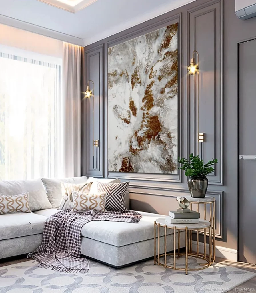
I find the scale of the artwork especially effective here. Because the wall already contains strong rectangular molding, the large artwork feels integrated into the architecture rather than simply hung on an empty surface. The pale sofa keeps the lower half of the room calm, allowing the intricate artwork and paneling to carry most of the visual interest.
When using a large statement artwork, I would pay close attention to the wall surrounding it. This image shows how framing an artwork with existing architectural lines can make the entire arrangement feel intentional. I would also repeat only subtle tones from the artwork in cushions or small furnishings, rather than competing with its complex pattern.
Layered Wave Panels In A Soft Gray Palette
A beige-gray sofa sits beneath a striking multi-panel artwork made from overlapping sections of curved lines. The artwork remains within a soft gray and white palette, with a stack of smooth stones incorporated into the central composition. The room itself is equally restrained, featuring a shaggy gray rug, a simple wooden-toned coffee table, pale cushions, and a black throw.
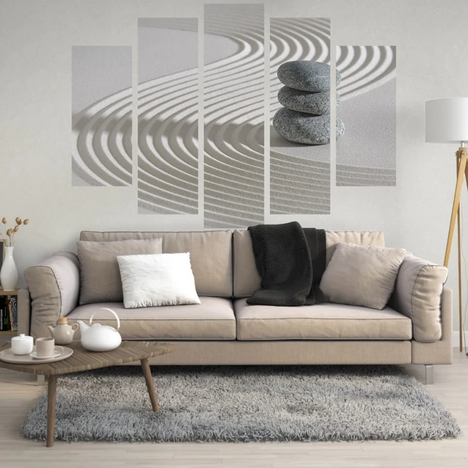
What I appreciate most is the sense of movement created by the artwork. Although the colors are quiet, the repeated curved lines keep the wall visually active. The staggered panel heights also create a more dynamic arrangement than a conventional single rectangular picture. Meanwhile, the neutral sofa and rug provide a comfortable background that prevents the artwork from becoming overwhelming.
I would use this idea when I want to introduce artistic character into a calm living room without changing the color scheme. The key, in my view, is to let the artwork provide movement while the furniture provides visual stability. A few carefully chosen contrasting details, such as the black throw shown here, can add definition without disrupting the peaceful palette.
Oversized Sculptural Portrait With Gold Details
This room makes the artwork almost inseparable from the living room itself. A huge sculptural-style portrait of a woman dominates the wall behind a pale sectional sofa, with flowing white forms surrounding the figure. Gold details appear on the figure’s hair, jewelry, and body accents, creating a subtle connection with the gold-toned floor lamp and the delicate bases of the round nesting tables.
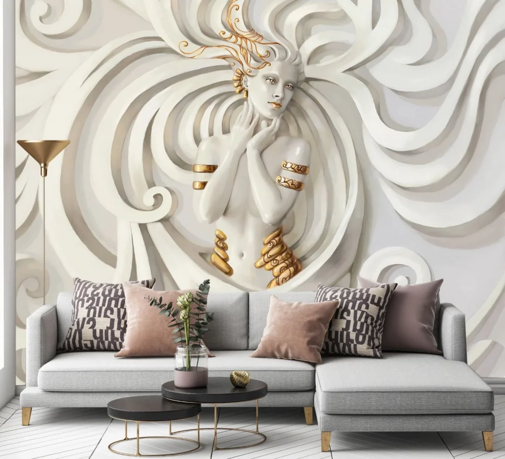
I find the scale especially dramatic because the artwork occupies nearly the entire visual field behind the sofa. Yet the pale sofa and white floor keep the composition cohesive rather than chaotic. Soft blush and mauve cushions introduce gentle color, while patterned black-and-white cushions add contrast and prevent the large white composition from feeling flat.
For a room with artwork this dominant, I would resist the temptation to fill every available surface. The image demonstrates how a single oversized piece can provide enough personality for an entire seating area. I would let smaller furnishings repeat only the artwork’s secondary details, such as the gold and muted blush tones, so the main composition remains visually powerful.
Graphic Orange Artwork Above A Contemporary Sofa
Warm orange becomes the defining color in this living room, appearing in the long leather sofa and in the three framed artworks above it. Each artwork has its own graphic composition, combining orange with black, cream, gray, and white. A long dark coffee table sits in front of the sofa, while the restrained furniture arrangement leaves the artwork clearly visible across the wall.
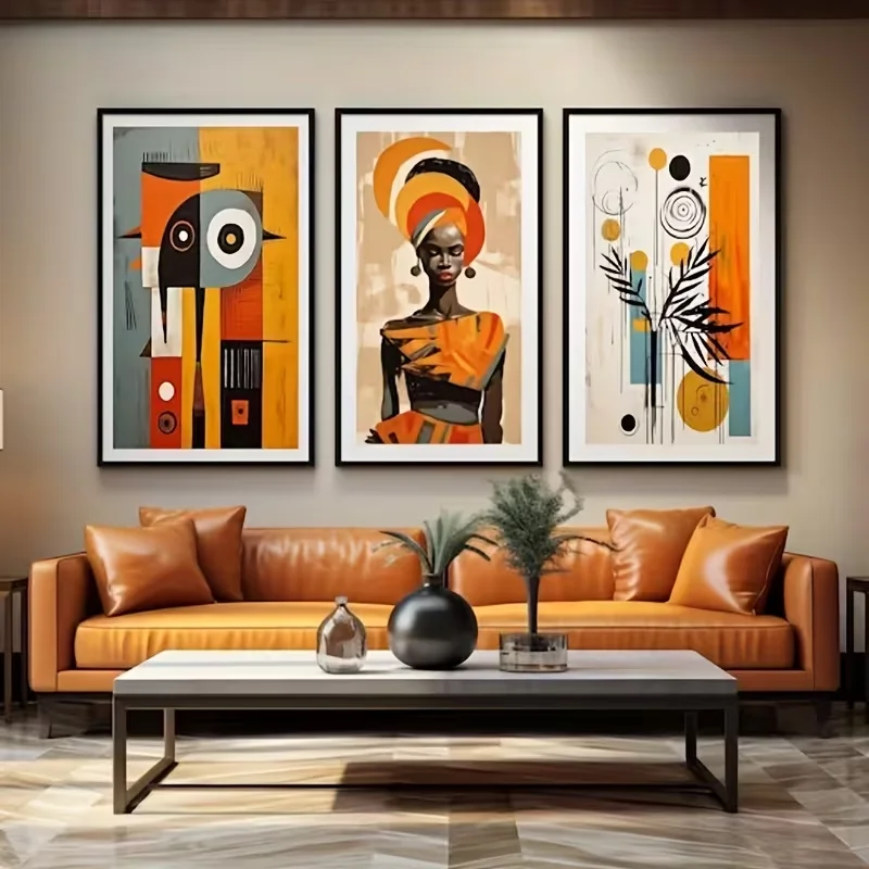
I like the three-piece arrangement because each artwork is different but shares a consistent visual language. The orange sofa connects directly with the strongest artwork color, making the room feel coordinated without appearing overly matched. The dark frames also provide a crisp outline against the wall and help unify the separate images.
This is one of my favorite approaches for creating a gallery-like focal point without covering the entire wall. I would choose several artworks that share at least one color or graphic quality, then place them with consistent spacing. Repeating a dominant shade in the furniture, as shown here, can make the whole room feel deliberate and confident.
Large Floral Painting In A Refined Sitting Area
A large floral painting occupies the central wall in this elegant sitting area, combining pale gray, cream, muted brown, and touches of gold. Two upholstered armchairs face inward toward a small white sculptural side table, while the dark floor creates a strong contrast beneath the pale furnishings. The wall has a softly textured gray appearance, adding another layer behind the artwork.
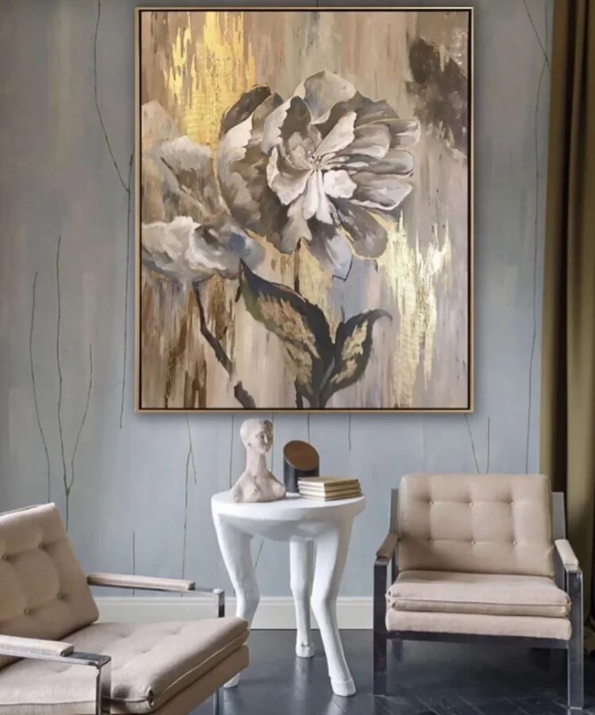
I think the scale of the painting gives this otherwise intimate seating arrangement a strong sense of purpose. Instead of using several small decorations, the room relies on one substantial artwork to establish the atmosphere. The unusual sculptural table beneath it reinforces the artistic quality without competing with the painting’s floral subject.
For me, this image demonstrates the value of leaving visual space around a statement piece. The chairs and table create a compact conversation area, while the large artwork provides the backdrop. If I were styling a similar room, I would keep the furniture arrangement simple and allow the artwork’s muted tones to guide the rest of the palette.
Black And Gold Abstract Lines Over A Cream Sofa
This living room combines a light cream sofa with a large rectangular abstract artwork framed in black. The artwork features sweeping black, white, gray, and gold lines that overlap across the composition. A black-and-white geometric rug grounds the seating area, while a dark green indoor tree-like plant adds height at the left edge of the room. A black throw on the sofa reinforces the darker accents.
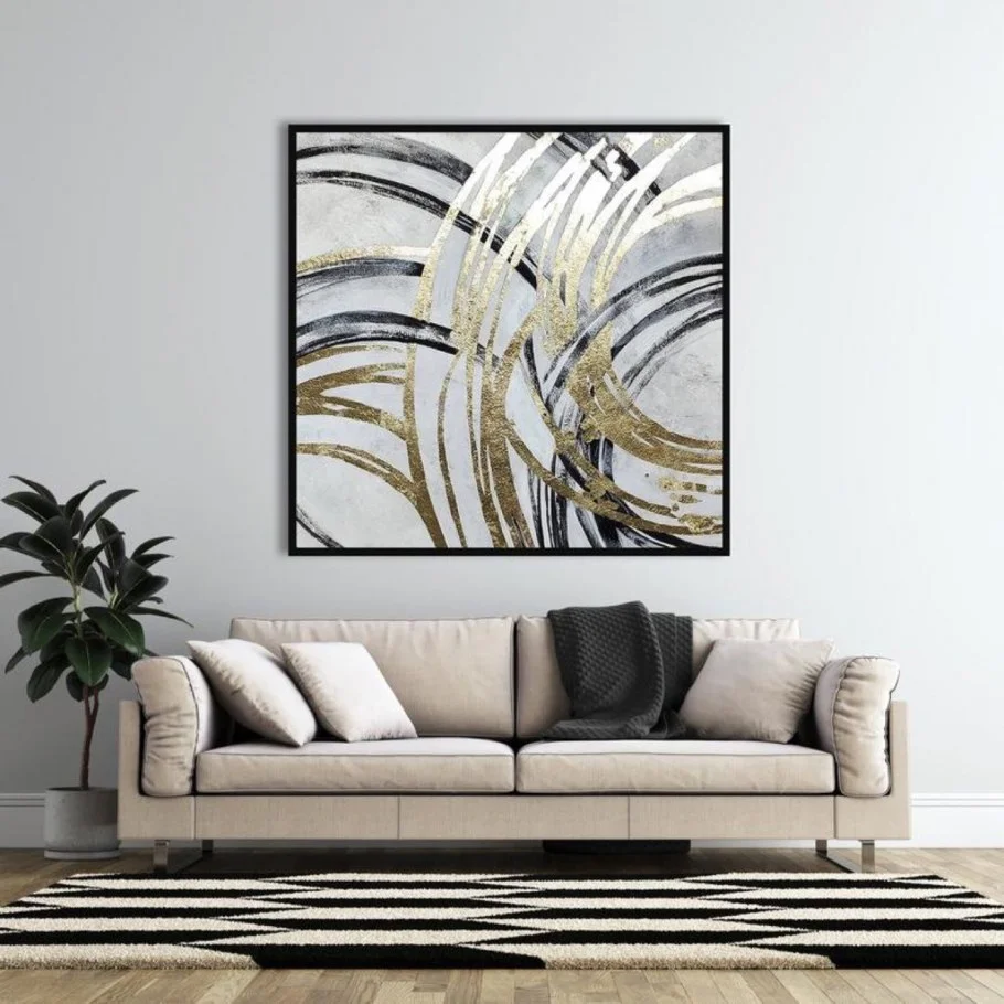
I like the balance between the soft sofa and the sharper graphic elements. The artwork introduces movement, while the rug repeats the black-and-white contrast at floor level. This creates a visual connection between the wall and the floor without requiring a large number of accessories. The plant also provides a contrasting organic shape against the linear artwork.
To recreate this type of room, I would think in terms of repeating visual weight rather than repeating identical patterns. The black frame, black throw, and dark rug create enough structure around the pale sofa. I would keep the artwork as the central statement and use smaller dark accents to distribute its visual impact throughout the room.
Metallic Tree Artwork Over A Soft Green Sofa
The final image features a soft green sectional sofa beneath a large circular-and-linear metal wall artwork. At the center is a stylized tree with branching lines, small birds, and gold and orange details, while two matching framed floral pieces flank it on either side. The pale gray wall provides a quiet backdrop, and cushions in green, gray, white, and patterned blue-gray fabrics continue the room’s soft palette.
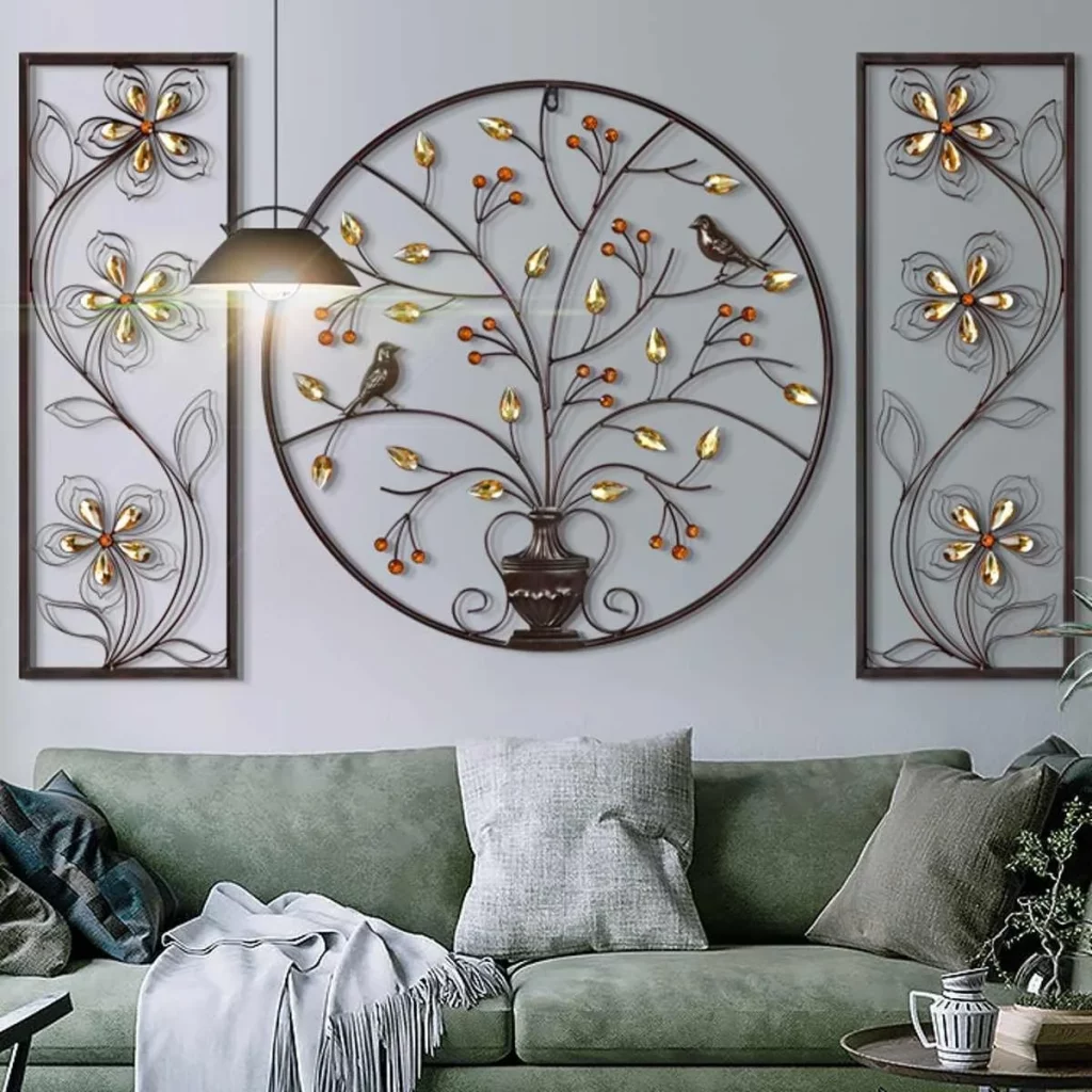
I find the three-part arrangement particularly appealing because the large circular center piece immediately establishes a focal point while the narrower side pieces provide symmetry. The gold details catch the eye against the pale background, and the green sofa creates a natural visual connection with the tree motif. The result feels decorative without requiring an excessive number of separate objects.
For me, this is a useful example of how wall art can be treated almost like a composition of its own. I would begin with the central statement piece and then choose supporting artwork that balances its scale and shape. Keeping the sofa in a related color family allows the wall arrangement to remain the focus while still making the seating area feel coordinated and comfortable.
Minimal Abstract Artwork With Organic Curves
The last room is exceptionally restrained, with a large pale abstract artwork leaning against a light wall rather than being heavily surrounded by decoration. The artwork features a large beige organic shape, a thin black circular line, and a delicate outlined form. In front of it are a sculptural gray armchair and a small black-and-white side table, while part of a dark sofa and a round white table appear in the foreground. The warm wood floor adds gentle contrast.
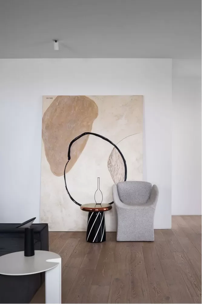
I love the calm confidence of this arrangement because almost every element has room to be appreciated. The artwork is large but quiet, and its beige and black details connect naturally with the neutral furniture. The sculptural chair adds a distinctive silhouette without requiring bright color or elaborate decoration, while the simple tables preserve the uncluttered feeling.
If I were recreating this look, I would focus on proportion and negative space. Rather than adding more accessories, I would choose one oversized artwork, one distinctive chair, and a few simple tables or furnishings with interesting silhouettes. This image reminds me that artistic living room decor can be just as expressive when it is subtle, restrained, and carefully composed.
Artistic living room decor is a beautiful way to make a space feel personal, expressive, and ready for the Fall 2026 season. From elegant gallery walls to oversized statement artwork, each idea shows how creativity can transform the atmosphere of an everyday living room. I especially love how thoughtful artwork choices can bring together color, furniture, texture, and mood without making the space feel overly decorated. Whether you prefer subtle framed prints or a bold artistic focal point, there is an approach here to suit your style. Which of these artistic living room ideas is your favorite? Leave a comment and share the design you would most love to recreate this fall.