
A minimalist kitchen doesn’t have to be cold or empty. It’s about choosing the right materials and finishes so the space feels calm without losing warmth or function.
This article walks through 32 real kitchen looks, from matte black cabinetry with marble islands to warm wood and white lacquer, each one proving that less really can be more in the heart of the home.
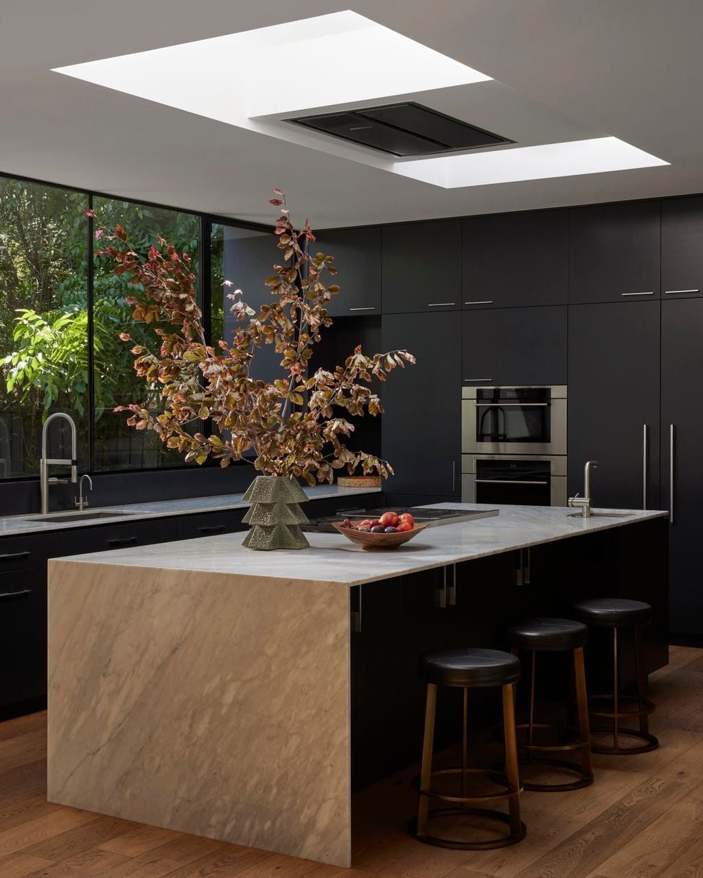
Sleek Matte Black Cabinetry with a Dramatic Marble Island
This kitchen pairs matte black cabinetry with a large marble island that anchors the open plan. A skylight and recessed lights keep the dark finish from making the room feel smaller. The wood tones in the flooring add warmth against the cool stone. It is a layout where the island does the heavy work as the main prep surface and gathering spot, while integrated appliances keep the look clean. The balance between dark cabinetry and light stone is the key move here.
Farmhouse Sink as the Hero in a White and Wood Kitchen
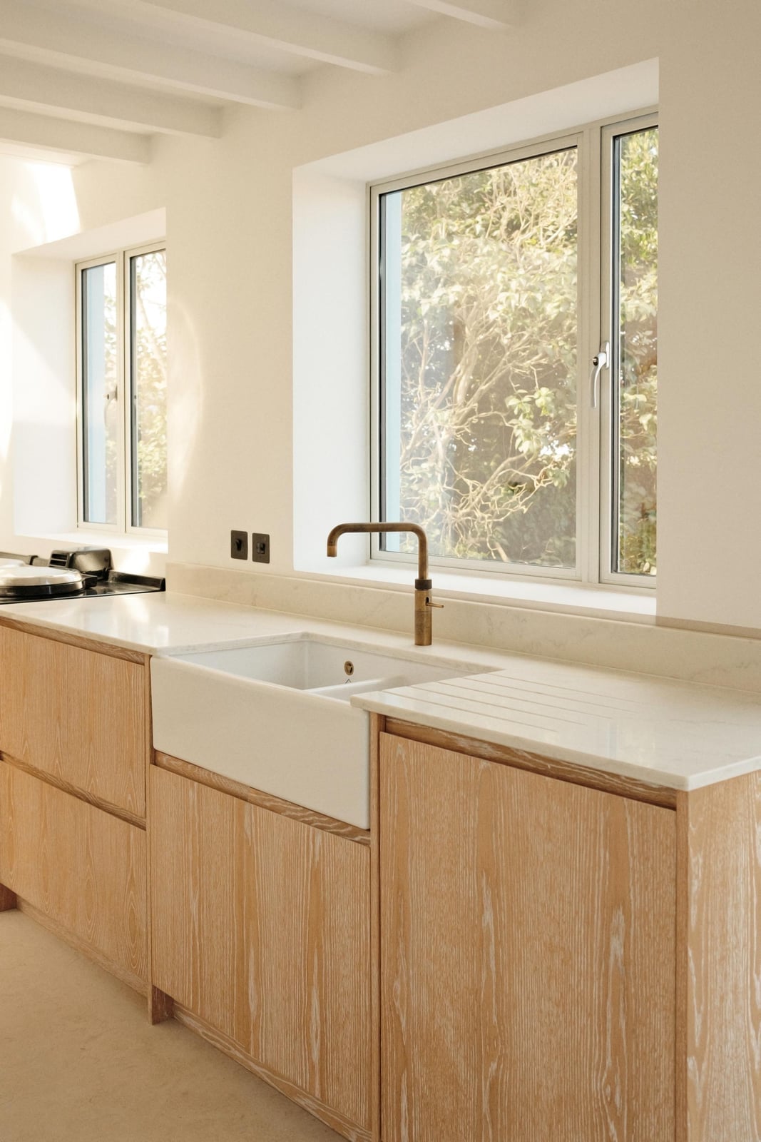
The farmhouse sink is the focal point in this galley kitchen, set between white marble countertops and natural oak cabinets. A brass faucet adds a subtle warm note against the clean palette. The sink’s ceramic finish stands out against the wood grain without competing for attention. This setup works because the sink is centered and the surrounding materials stay simple. White and wood keep the room feeling open, and the sink becomes the practical hero that defines the space rather than just blending in.
Seamless Marble Countertops and Integrated Cabinetry
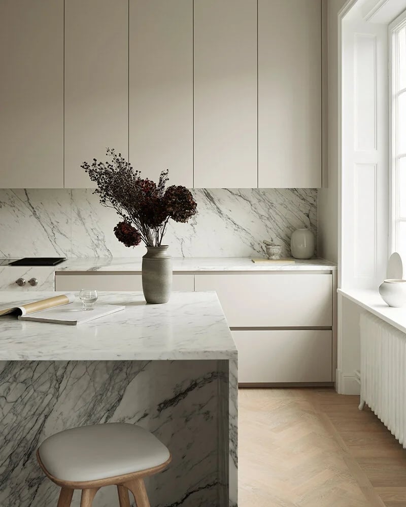
How do you make marble feel modern rather than formal? The answer is in the cabinetry. This kitchen uses sleek, integrated cabinets in a neutral beige and gray palette that sit flush with the marble island. The stone carries across the countertops without a visible seam, which keeps the eye moving. A modern stool at the island offers a spot to sit without breaking the clean lines. Natural daylight from the window softens the stone’s cool tone.
The materials here work as a single surface rather than a collection of parts. The marble is the star, but the cabinetry does not try to compete. It is a practical approach for anyone who wants a roomy kitchen that feels put together without needing a lot of decoration.
Light Wood Cabinetry and a Large Island with a Green View
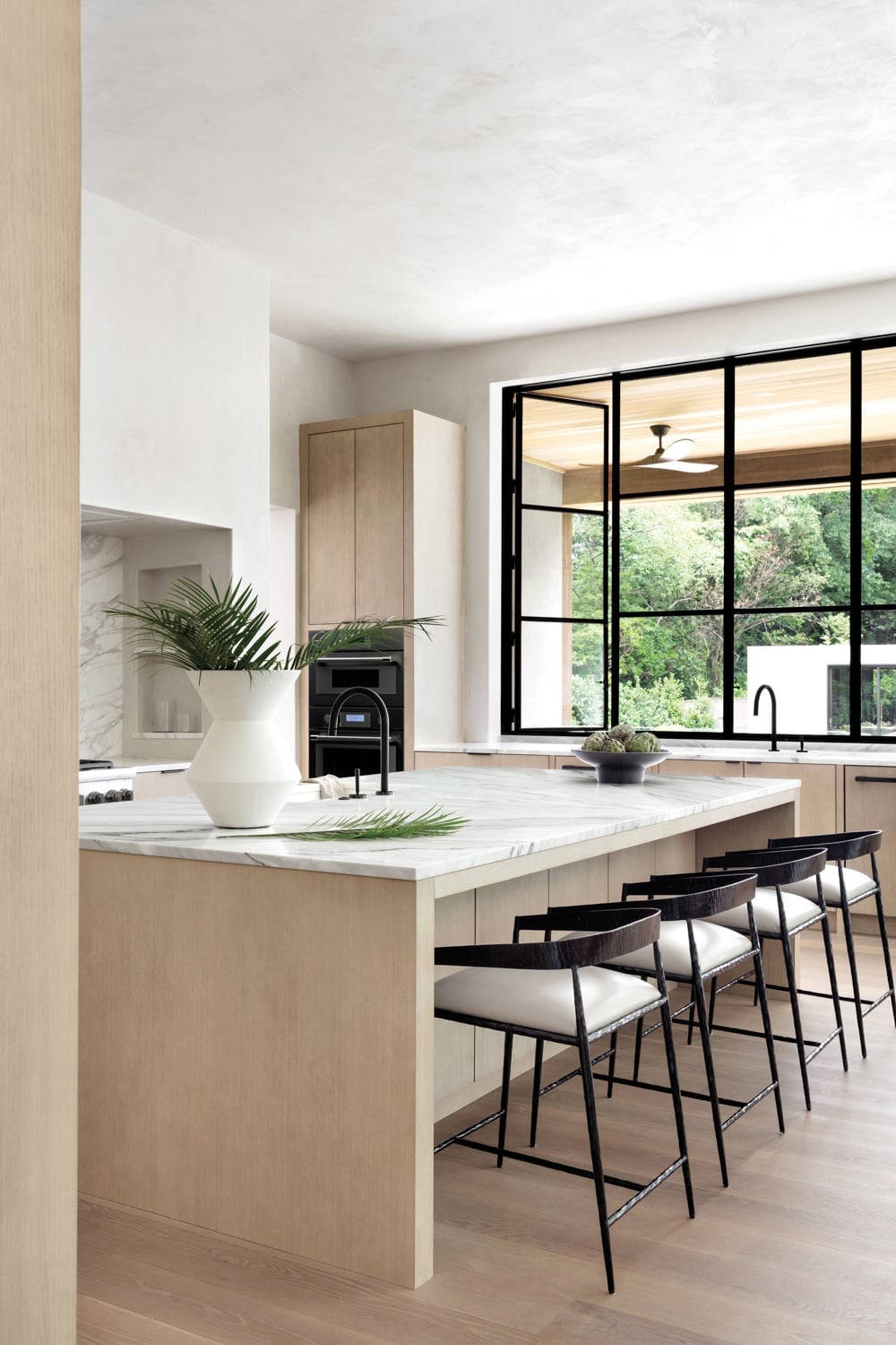
A large window with a green view changes how this kitchen feels. The light wood cabinetry stays neutral so the outdoors becomes the main decoration. A marble-topped island with bar stools offers a place to sit and look out. Pendant lights hang above the island for task lighting in the evening. The black accents in the hardware and fixtures keep the palette grounded. This is a kitchen that lets the view do the work, and the materials stay quiet so nothing distracts from it.
Geometric Tile Backsplash with Wood Island Accents
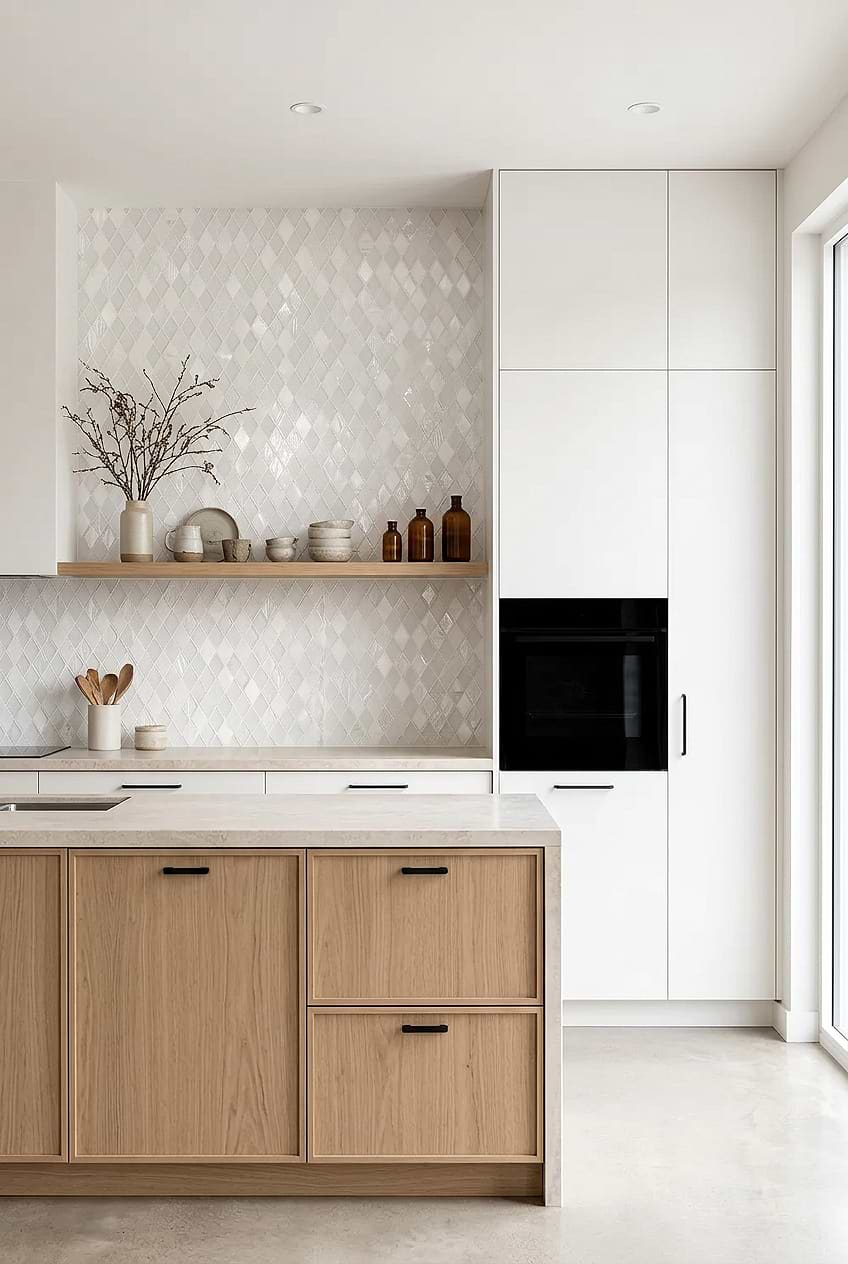
In a busy kitchen, let one surface carry the pattern. Here, the geometric tile backsplash adds visual interest behind the range, while the room stays calm. The island features wood accents that warm up the white cabinetry and stone countertops. An open shelf on the tall cabinet keeps everyday items within reach without cluttering the counters. Sunlight keeps the tile pattern from feeling too busy. The geometry works because it is contained to one area, and the wood balances the cool tile.
Integrated Cabinetry with a Central Wood Shelving Unit
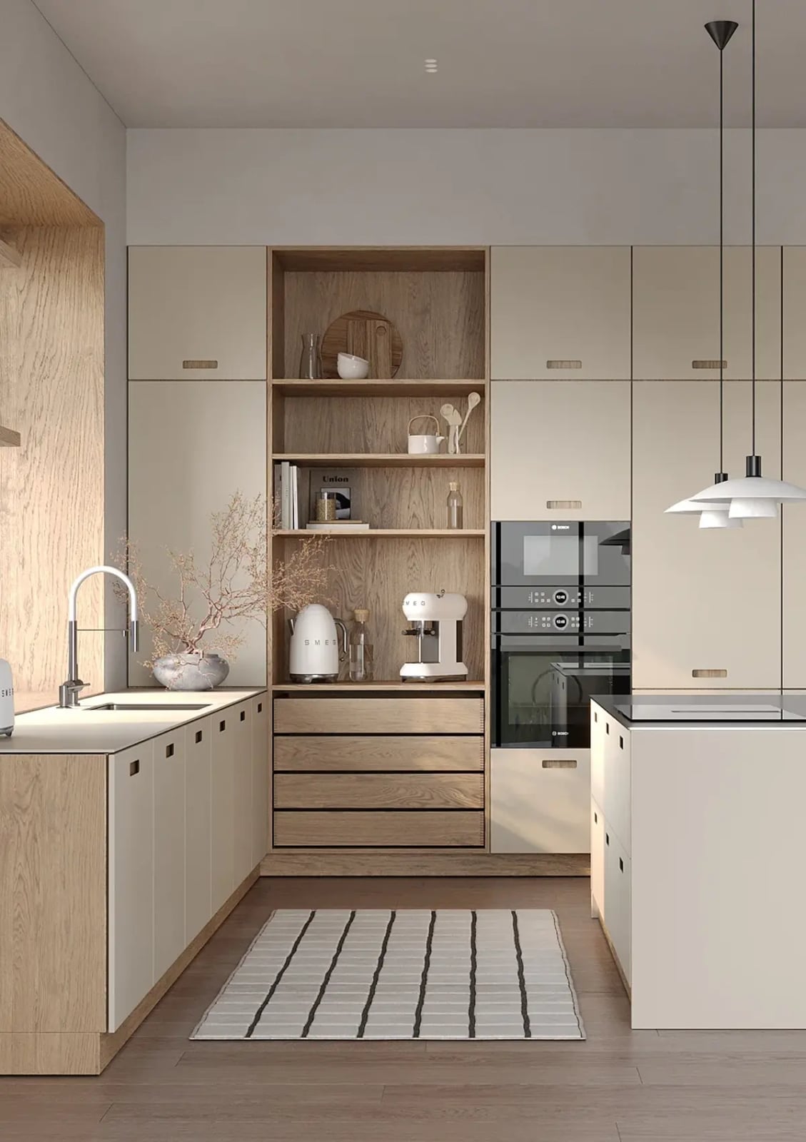
If you have been looking at open shelving but worry about dust and visual clutter, a single large central shelving unit is a good middle ground. This u-shaped kitchen keeps the perimeter in seamless beige laminate and stone, then lets the wood shelving unit break the monotony. The wood adds warmth without the upkeep of multiple small shelves because it is one built-in piece that anchors the middle of the room. Pendant lights above keep the surface lit for daily use, and the natural light from nearby windows softens the beige tones. The layout still feels roomy because the shelving unit does not block the sightline; it acts as a focal point rather than a barrier. If you rent, a freestanding wood shelving unit in a similar scale can give the same effect without attaching anything to the walls.
Stainless Steel Cabinets and a Speckled Range Hood
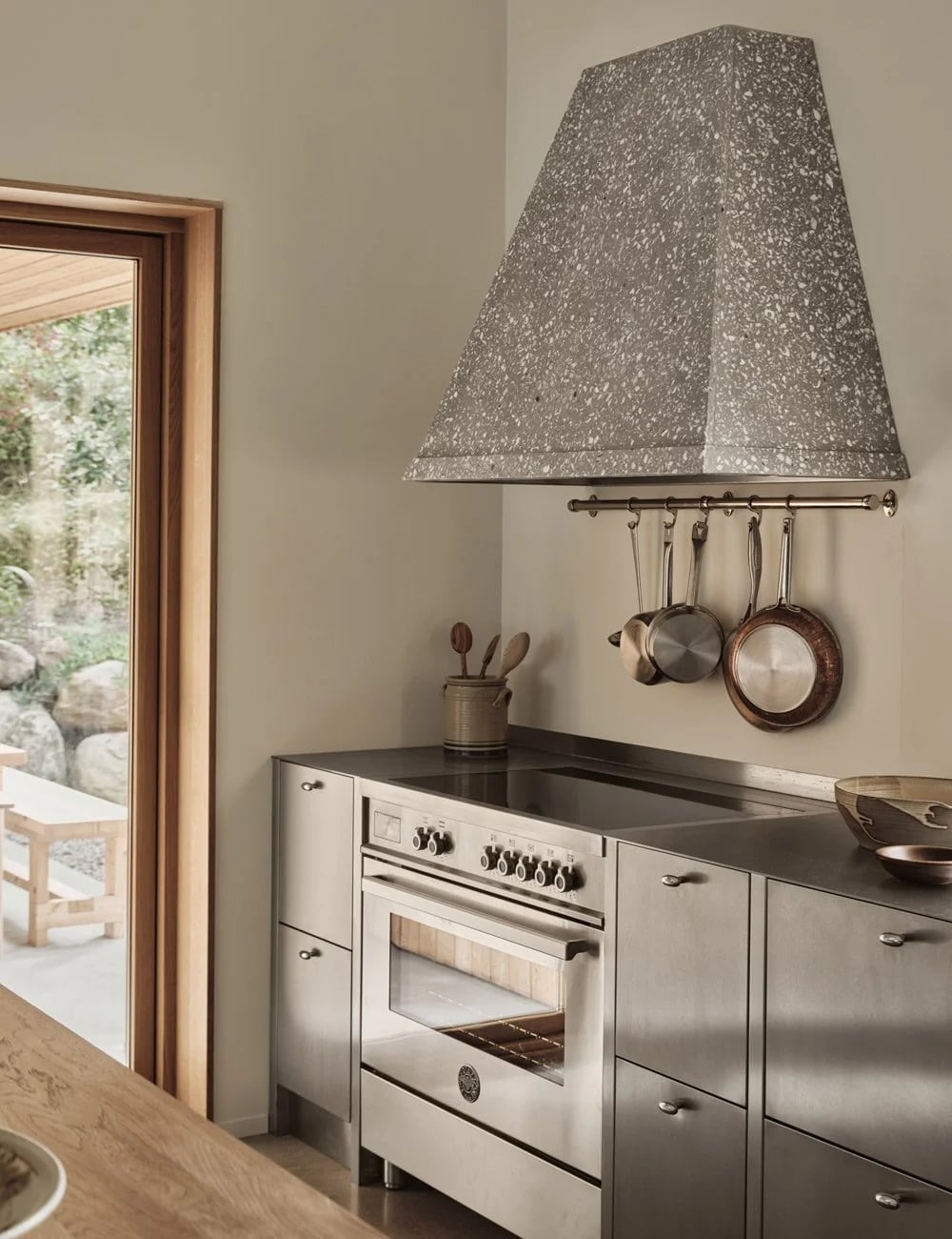
The speckled range hood stands out in this minimalist kitchen not because of its shape but because it adds texture to a room otherwise defined by smooth surfaces. Stainless steel cabinets keep the look clean and commercial, while the stone countertop and beige walls keep the palette neutral. The wood cutting boards and hanging pots on the wall bring a lived-in feel that balances the metal. A roomy corner kitchen like this one benefits from the range hood working as a visual anchor above the stove, especially when the rest of the cabinetry stays flat and handleless. For renters, swapping out a standard builder-grade hood for one with a speckled or textured finish is a single change that shifts the whole character of the kitchen.
Handleless Dark Gray Cabinetry and Dramatic Stone Backsplash
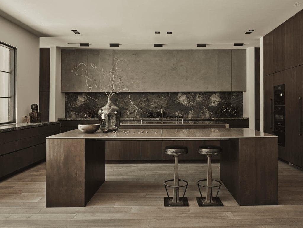
This is a dark palette that stays grounded rather than feeling heavy. The matte dark gray cabinetry wraps the perimeter and the large island, while the stone backsplash introduces subtle variation in tone. Handleless doors keep the surface uninterrupted, which is what makes the dark finish work in a roomy space. The recessed ceiling lights and under-cabinet lighting keep the countertops usable and prevent the dark cabinets from absorbing too much light. Wood tones on the island base or bar stools add the only warm contrast. The ratio is roughly two-thirds dark gray to one-third stone and wood, which keeps the minimalist look intact without letting the dark shade dominate.
U-Shaped Kitchen with Seamless Beige Lacquer Cabinetry
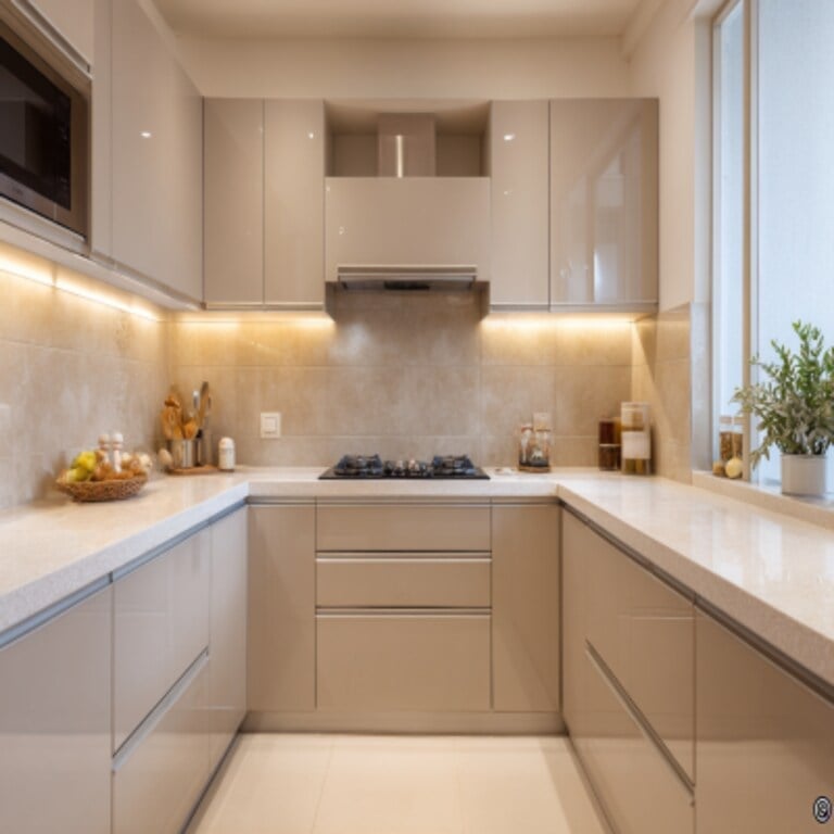
A u-shaped layout can feel closed off if the cabinetry is too dark or has visible handles breaking the line. This room solves that with seamless beige lacquer cabinets that reflect natural light and under-cabinet lighting, making the space feel open. The handleless doors continue the clean line around three walls, and the integrated microwave sits flush so nothing protrudes. The stone countertop adds a subtle pattern without competing with the cabinetry. For a u-shaped kitchen, keeping the countertops clear and the cabinetry uninterrupted helps the room breathe. The beige lacquer is a practical choice because it does not show fingerprints the way darker gloss does, and it works with nearly any accent color you might add later.
Compact Kitchen Corner with Oversized Pendant Light
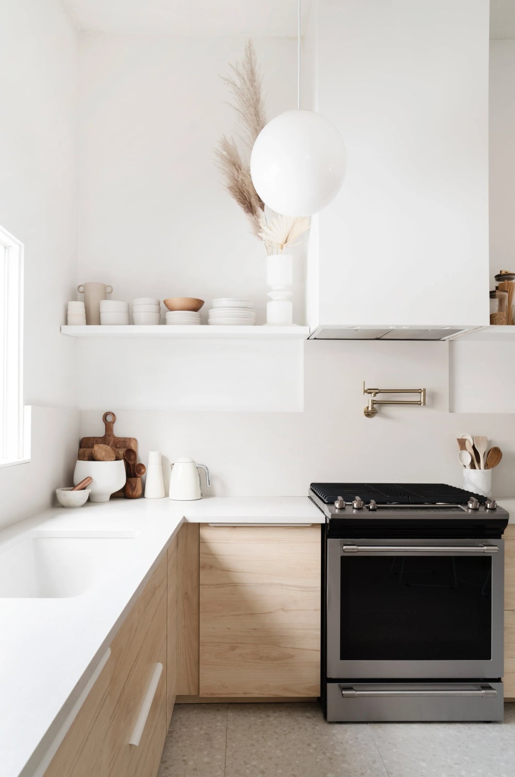
A compact kitchen corner relies on scale to make a statement, and a single oversized pendant light does exactly that. In this corner layout, the light hangs low over the range, drawing the eye upward and making the space feel taller than it is. The white cabinetry and open shelves keep the room light, while the wood cutting board and ceramic canisters add warmth without clutter. The pendant is large enough to read as a deliberate design choice rather than a leftover fixture. For small kitchens, one big light fixture often works better than multiple small ones because it simplifies the ceiling and gives the room a clear focal point.
Off-White Handleless Cabinetry with Floating Shelves
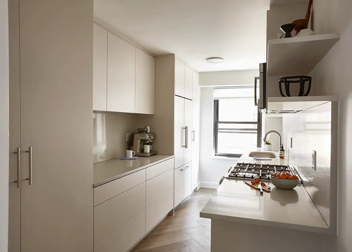
A practical rule for storage in a minimalist kitchen is to keep the tall runs flush and let the open bits carry the personality. Here the handleless cabinets run in a clean line, with integrated appliances tucked behind the same off-white faces, so the eye moves straight to the floating shelves and the island. The light wood on those shelves warms the gray stone countertop, and the recessed ceiling lights plus the shelf lighting keep the room bright without adding clutter. For renters, the swap is easy: skip the built-in look and mount a few floating shelves over a plain counter, then store everyday dishes within reach. That gives the same open, airy feel without touching the cabinetry.
Rose Gold Cabinetry Concealing Integrated Appliances
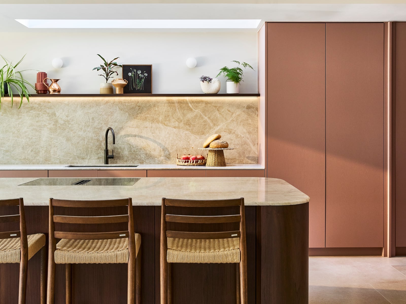
Set rose gold against a close alternative, say brushed brass or copper, and the difference is in the tone: rose gold leans pinker, softer, and less orange, so it reads as warmer. Here the flush cabinet doors in that finish hide the appliances completely, leaving the marble island and wood accents to carry the room. The warm ambient lighting and LED strips under the cabinets bring out the metal’s blush without making the space feel heavy. In a minimalist kitchen that still feels personal, this palette works because the metal is the single accent, not one of several. Keep the counters clear and the wood tones muted, and the rose gold stays the quiet focal point, not a novelty.
Black Granite Backsplash and Island with Gold Veining
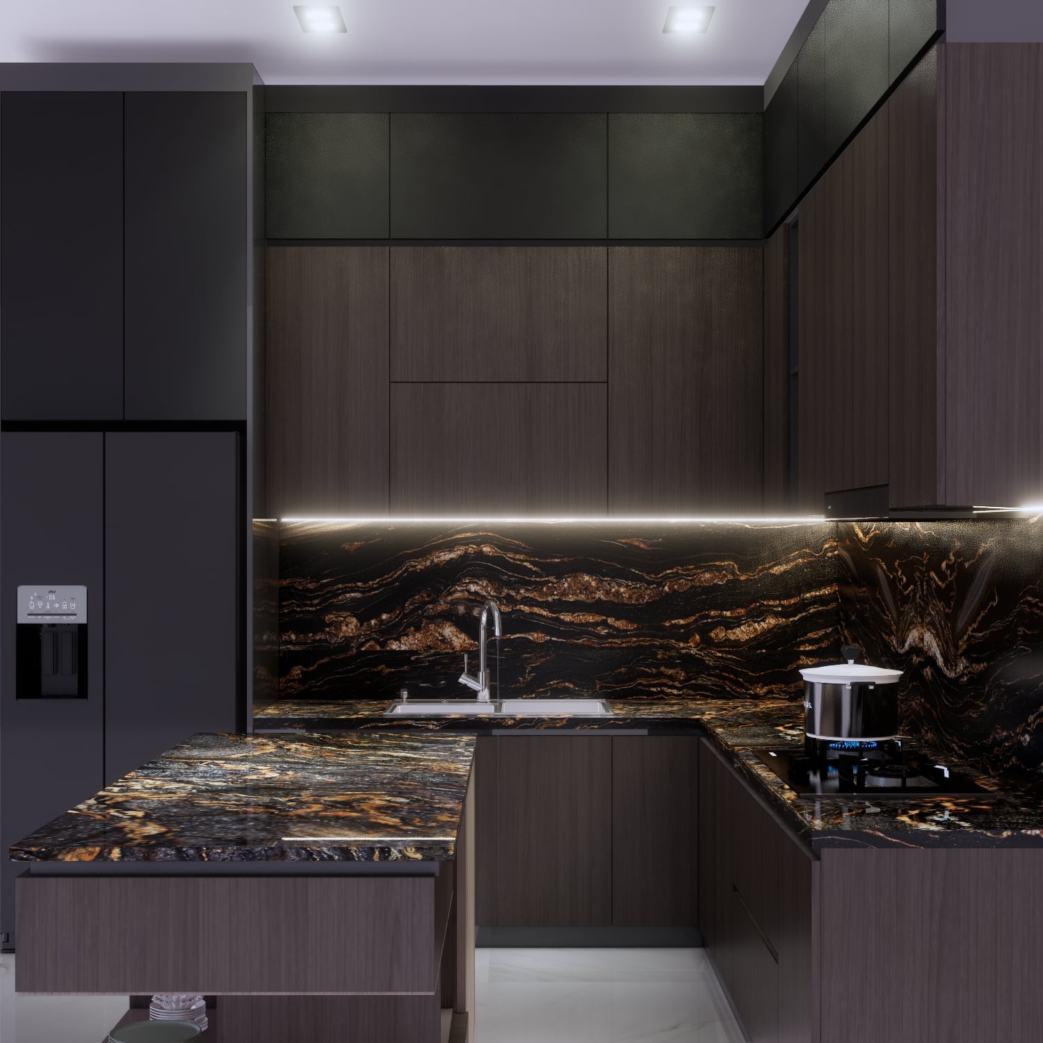
A precise observation about this kitchen is that the gold veining does the work that a backsplash pattern usually does, so the wood cabinetry stays plain and lets the stone speak. The dark granite runs across the backsplash and the island, with the gold lines catching the under-cabinet lighting and the ambient light above. The u-shape layout with the island in the middle gives plenty of room to move, and the wood cabinets soften the black so the space does not feel like a cave. This is a strong choice for anyone who wants drama in a minimalist kitchen but does not want to add color or clutter.
Slatted Wood Accent Wall with Handleless White Cabinetry
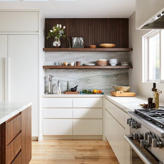
The slatted wood wall gives the room its texture, and the white cabinetry keeps it from feeling busy. In this galley layout, the handleless cabinets run along one side with ample counter space, while the slats run vertically behind them, catching the natural light and the recessed ceiling lights. The integrated fridge sits flush with the white doors, so the only visual break is the wood. To add warmth without adding color, use one accent material, keep everything else plain, and let the light do the rest. The wood repeats in the floating shelves, tying the wall to the storage.
Sleek Gray Laminate Cabinetry with Natural Wood Accents
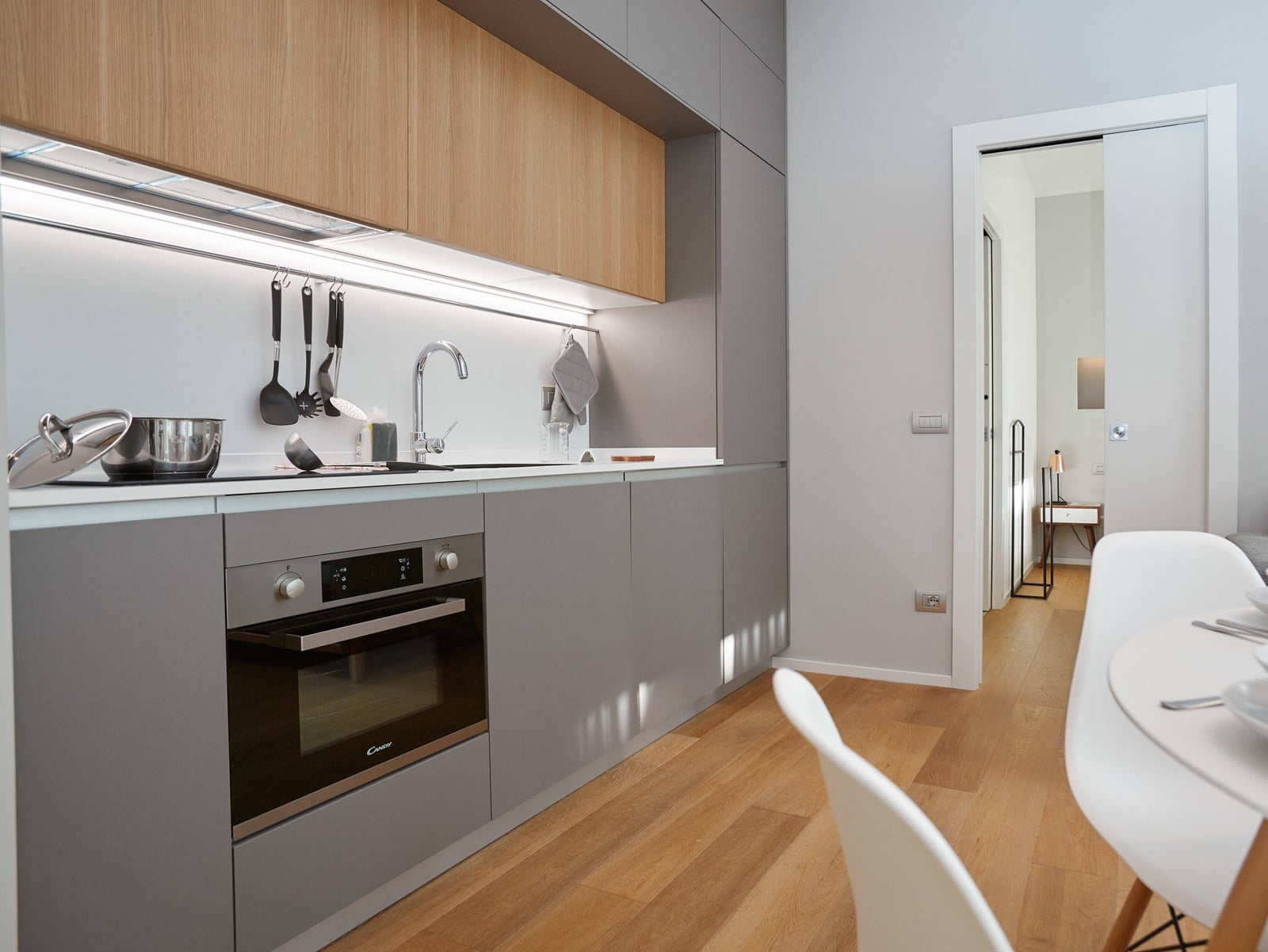
A practical rule for storage in a narrow galley is to keep the upper and lower cabinets the same finish so the line stays unbroken, then use one accent material for contrast. Here the gray laminate cabinets run from floor to ceiling, with the integrated oven and sink tucked behind the same faces, and the wood accents appear in the open shelving and the countertop edge. The under-cabinet strip lights brighten the work surface without adding pendant shadows, which matters in a linear layout where you do not want visual stops. For renters, this look is easy to mimic: paint or wrap existing cabinets in a matte gray, then add a few wood shelves above the sink. That gives the same sleek, continuous feel without replacing anything.
Sage Green Cabinetry with a Concrete Countertop and Wood Ceiling
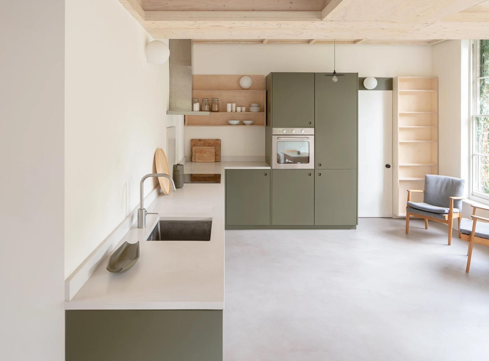
A kitchen with sage green cabinets and a concrete countertop uses the wood ceiling as a counterbalance. The green feels settled rather than loud, and the concrete gives the run of cabinets a solid, practical surface. The wood overhead wraps the room in warmth, so the palette does not feel cold. The ratio here is about one part green and concrete to two parts wood. What breaks it is a light that washes out the green or a countertop that competes with the concrete. A simple, warm bulb keeps the sage in its best light.
White Cabinets with Glass Displays and a Black Task Lamp
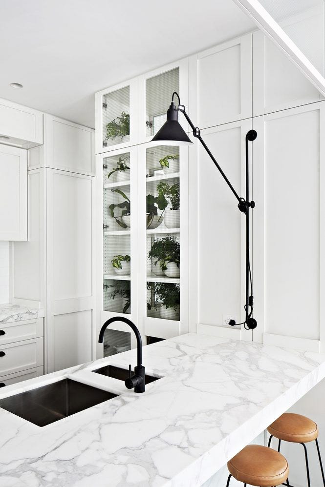
A practical rule for a minimalist kitchen is to let one dark object set the tone. Here, white lacquer cabinets with glass display fronts meet a black faucet and a black adjustable task lamp. The lamp is the anchor: it gives the room a focal point without adding clutter. The glass displays keep the upper cabinets from feeling heavy, and the white lacquer reflects the ambient ceiling light. For a renter, this is a simple swap. Change out a standard overhead for a plug-in task lamp on the counter. It shifts the room’s focus and adds a layer of useful light without any wiring work.
Galley Kitchen with Light Wood, Marble, and a Large Window
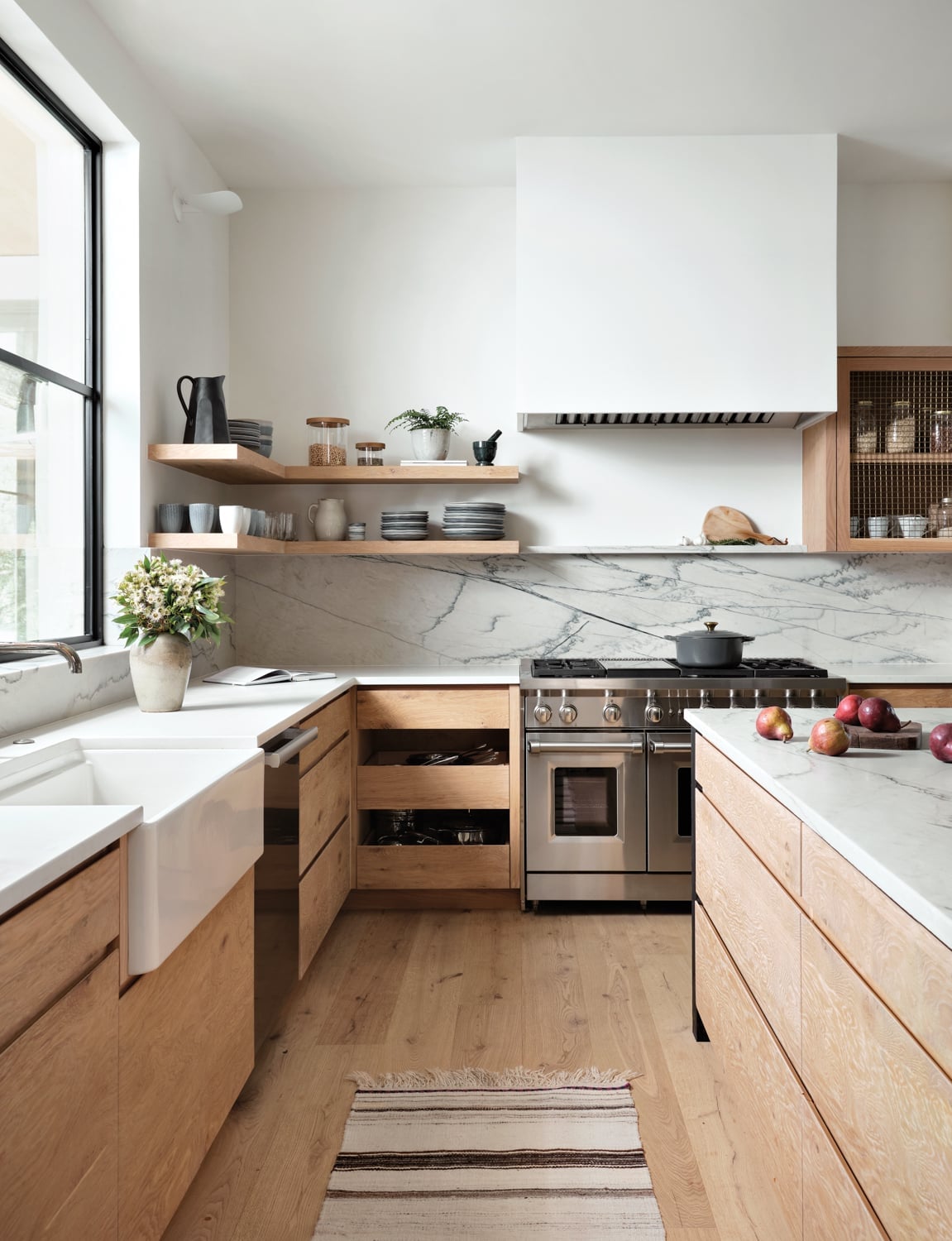
A galley kitchen risks feeling narrow, but this one uses a large window and a light palette to open up. The range hood sits as the practical center, framed by light wood cabinetry and marble countertops. The window at the end pulls the eye forward, so the galley shape works with the room rather than against it.
The layout is the real lesson here. The sink and range sit on one side, with open shelves above for everyday items. The opposite run of cabinets keeps prep surfaces clear. The light wood and white palette keeps the room from feeling crowded. A galley like this relies on that one strong window for depth. Without it, the room would feel closed in. The marble and stainless steel add a polished finish that holds up to daily use.
Wood Grain Cabinetry with a Small Round Dining Table
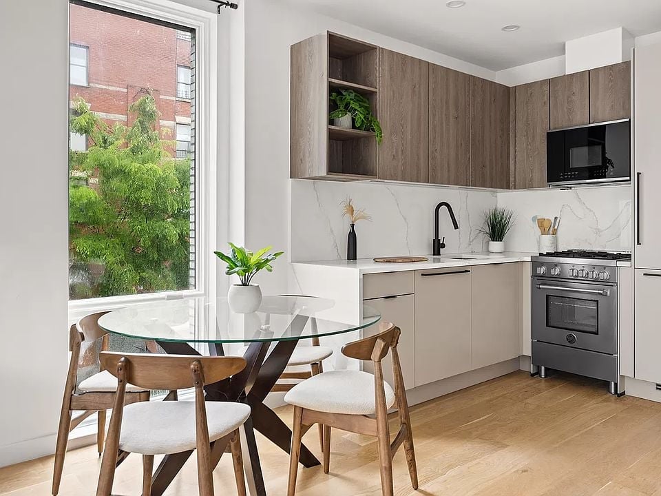
A galley kitchen with wood grain handleless cabinets and integrated appliances gains a small round dining table at one end. The table is scaled to the room, so it does not crowd the walkway. The wood grain runs through the cabinets, giving the kitchen a continuous, warm surface. The round shape of the table softens the long lines of the galley. The marble countertop adds a cool, smooth contrast to the wood. The window at the far end ties the two zones together. This setup suits a household that cooks and eats in the same footprint.
Concrete Island with Warm Wood Base and Gray Pendant Lights
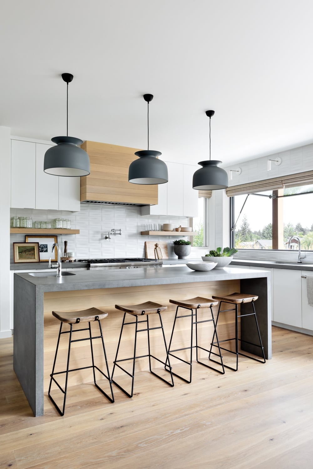
This kitchen works because the concrete island is the clear anchor. The warm wood base softens the industrial feel of the concrete, and three gray pendant lights hang low above it, defining the work zone. The concrete provides a durable, heat-resistant surface for prep and casual meals. The wood base and open shelving behind the island add warmth and storage without blocking the sightline. The palette stays in a narrow range of gray, wood tones, and white. What breaks the look is adding a bright color or a glossy finish that fights the concrete’s matte texture. Keep the pendants simple and the wood natural.
Glossy Beige Cabinetry with a Striking Marble Backsplash
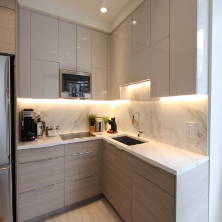
In a corner kitchen, mirror the direction of the glossy cabinets with your backsplash material. Here, the beige laminate cabinets reflect the integrated under-cabinet lighting, making the room feel larger than its footprint. The marble backsplash acts as a textural counterpoint to the smooth cabinet faces, and the natural wood elements in the space keep the palette from reading as too cool or uniform. This kitchen works because the glossy finish on the cabinets reflects the natural light, while the wood adds warmth. The layout is efficient, with the sleek cabinetry wrapping the corner and keeping the countertops clear for prep. The ratio of glossy to matte surfaces is roughly two to one, and the wood breaks the monotony of the beige and white palette.
Matte Gray Cabinetry with Natural Wood Accents and Modern Atmosphere
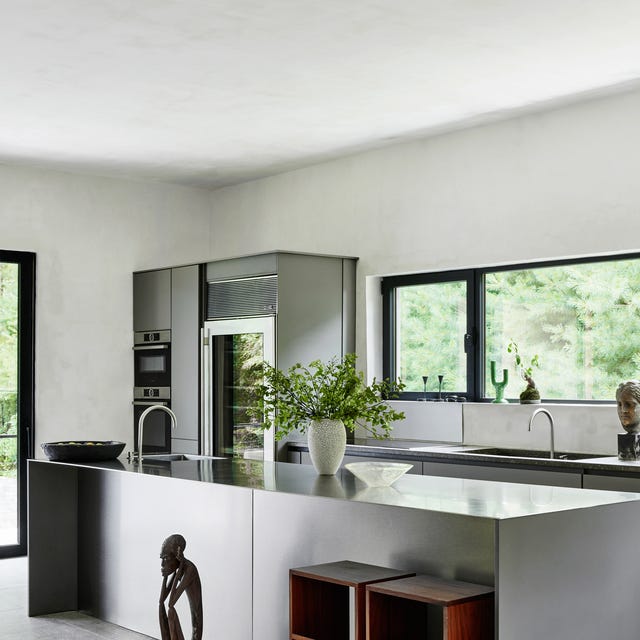
The matte gray cabinets in this linear kitchen are the anchor, with the natural wood accents providing the only major shift in the palette. The stainless steel appliances and recessed lighting keep the look modern, while the wood tones prevent the gray from feeling too cold. The palette stays within a narrow range of gray, white, and wood. The wood breaks the gray in a ratio of about one part wood to three parts gray, which keeps the minimalist aesthetic intact. The matte finish is softened by natural light, and the kitchen feels both sleek and approachable.
Large White Quartz Island with Dark Gray Cabinetry
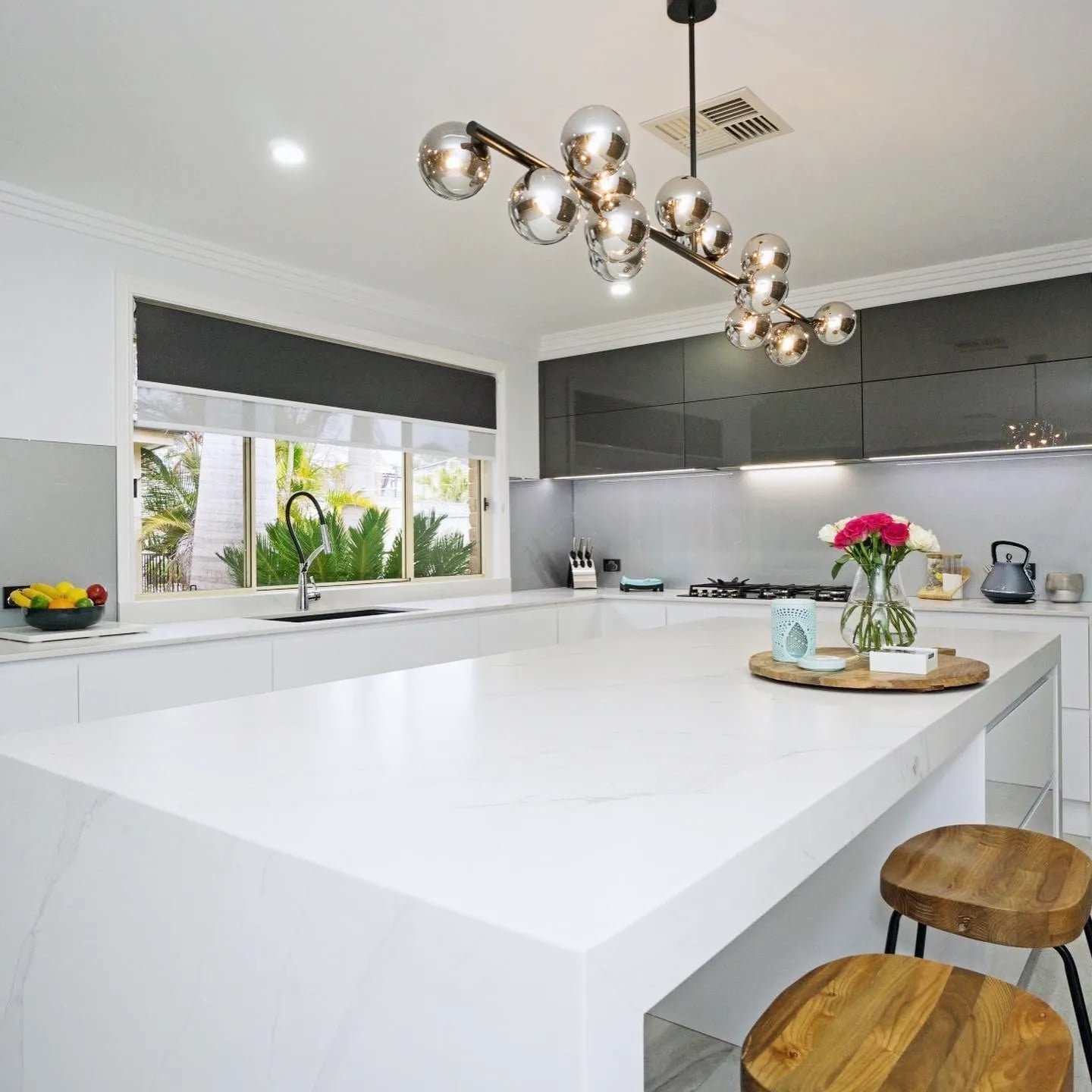
A large island can set the tone for the whole kitchen. Here, the white quartz island anchors the room, with the dark gray laminate cabinets providing contrast. The overhead pendant light draws the eye to the island’s surface, while natural light softens the dark cabinetry. The ample counter space on the island makes it the primary work zone, and the dark gray cabinets recede visually, keeping the focus on the bright quartz. The scale of the island works because it is proportional to the room, and the dark cabinets ground the space without overwhelming it.
Curved Island in a Cream and Marble Kitchen
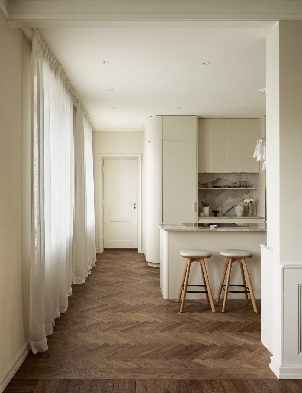
A straight island is the default, but a curved one changes how the whole room feels. In this open plan kitchen, the curved island with its marble top and cream laminate base becomes the central piece, with the bar stools tucked around the gentle arc. The pendant light above the island defines the work zone, while the wood cabinetry warms the neutral palette. The curve breaks the typical rectangular layout, making the space feel more fluid and less boxy. The layout is island centered, and the curve allows for easier traffic flow around it. The cream and marble palette stays cohesive, with the wood accents adding just enough contrast to prevent the room from looking washed out.
Extensive Natural Wood Cabinetry with a Stone Island
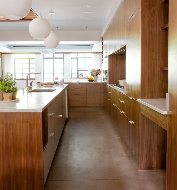
The full-height wood cabinetry in this galley kitchen wraps the walls, creating a warm, unified backdrop. The stone island in the center provides a cool counterpoint, with the concrete-like surface balancing the warmth of the wood. Natural daylight and recessed ceiling lights illuminate the long layout, and the wood tones dominate the palette in a ratio of about two to one against the white and gray accents. The room feels roomy because the cabinetry is extensive but handleless, so the lines stay clean. The stone island breaks the wood, preventing the kitchen from reading as too rustic or too dark.
Slatted White Cabinetry with a Matte Black Faucet
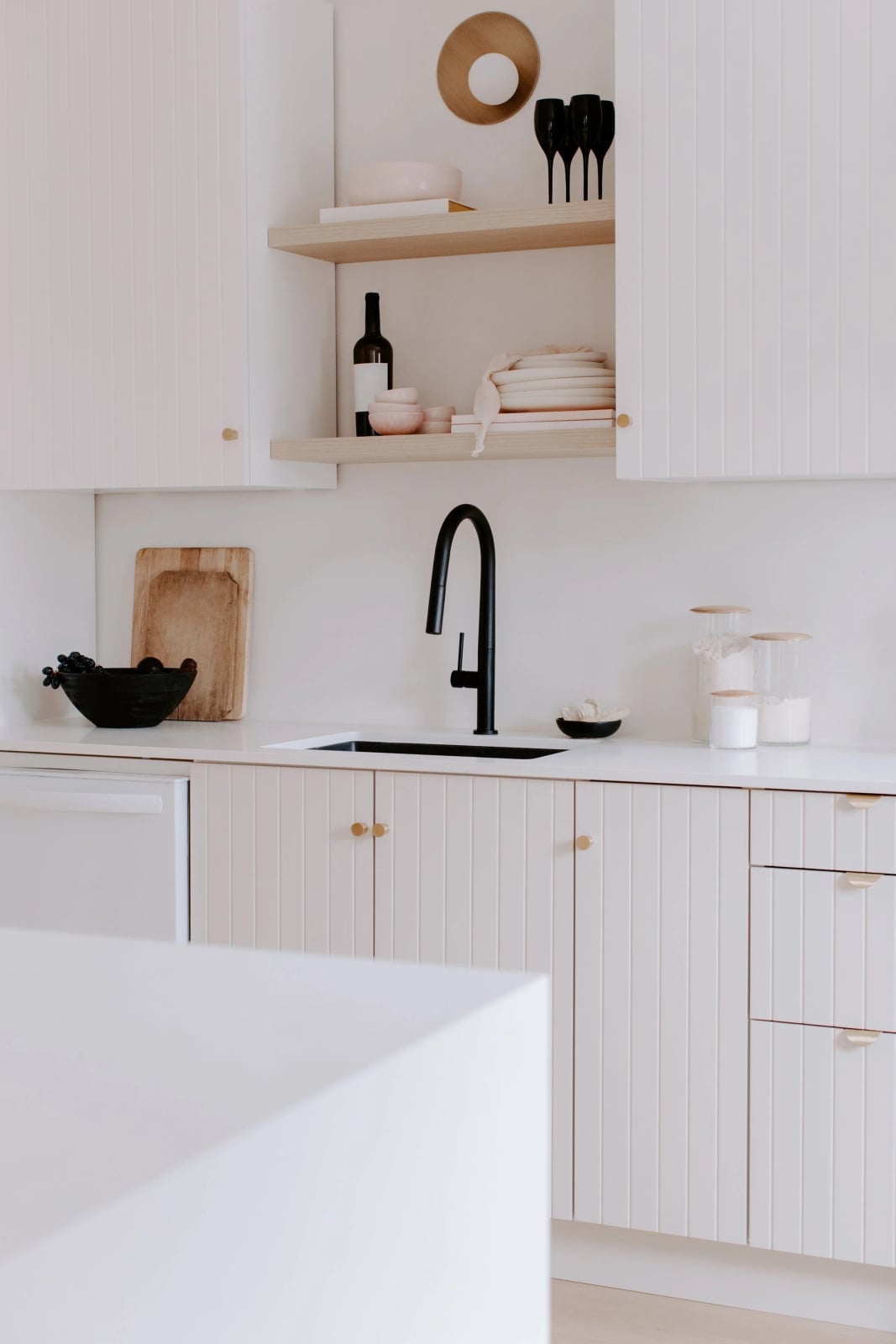
A run of slatted white cabinet doors gives this kitchen a clean, textured front without adding visual bulk. The vertical grooves catch soft ambient light, so the wall reads as both simple and deliberate. A matte black faucet becomes the only dark point, pulling the eye to the sink zone. Wooden shelves above the counter keep daily dishes within reach and break up the white run. The trick here is the slat ratio: narrow enough to read as a finish, wide enough to stay dust-friendly. A quick wipe with a microfiber cloth keeps the grooves clear. This setup suits anyone who wants the calm of handleless cabinets but prefers a little surface detail over a flat slab.
Compact Kitchen with Wooden Countertops and Range Cooker
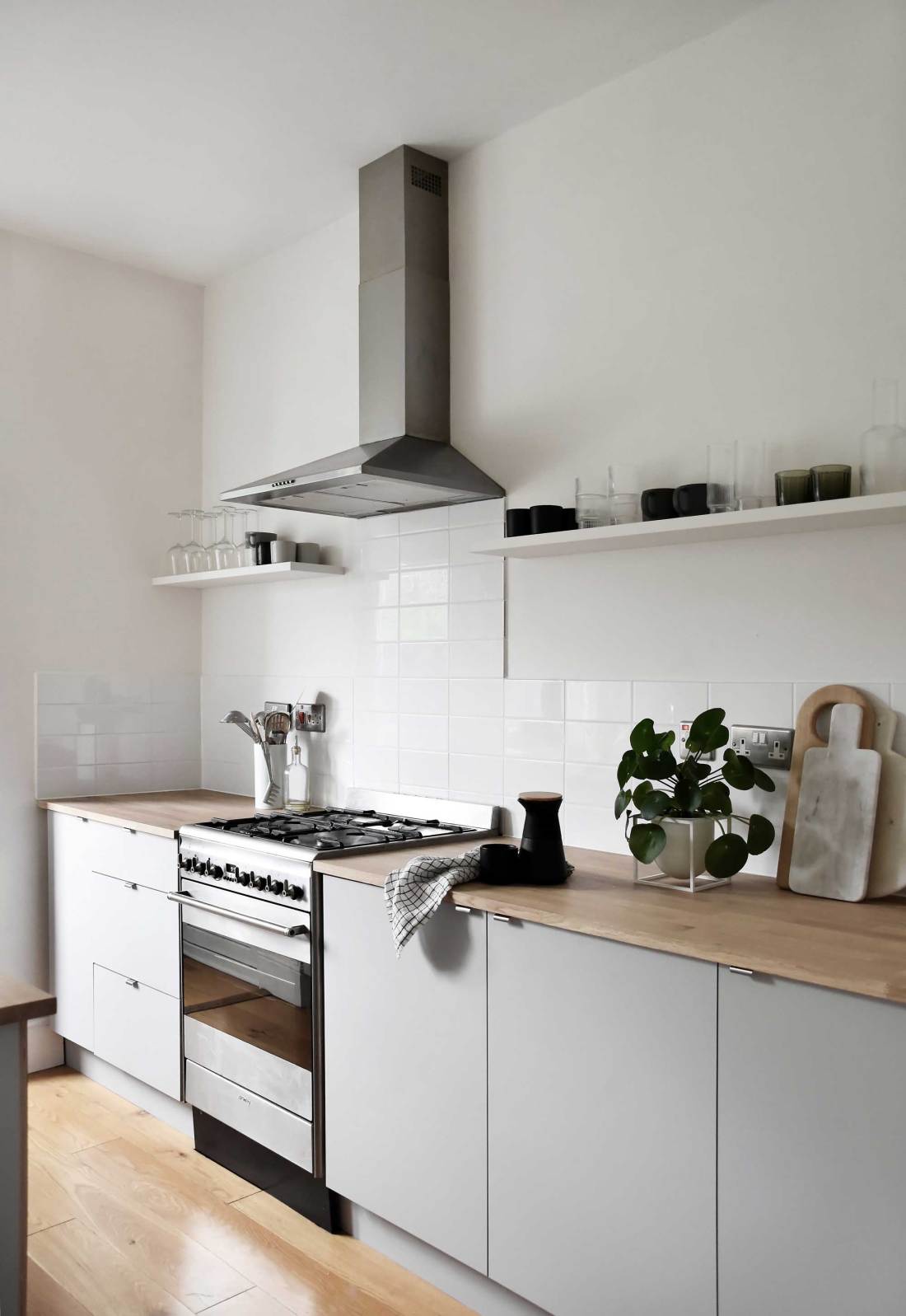
One material sets the character in a compact kitchen while everything else stays neutral. Warm wooden countertops run the full length of the base cabinets, giving the narrow room a continuous work surface that feels generous. The white upper cabinets and tiled backsplash stay light to keep the space open. A range cooker anchors one end, its metal body contrasting the wood without competing. Overhead lighting and natural light keep the counter bright for prep work. For renters, this layout is a reminder that you do not need new cabinets to shift the feel. A butcher-block countertop can replace a worn laminate surface with just basic tools and a weekend. The linear plan works because nothing blocks the path from sink to stove to counter.
Recessed Wooden Shelving for Integrated Storage
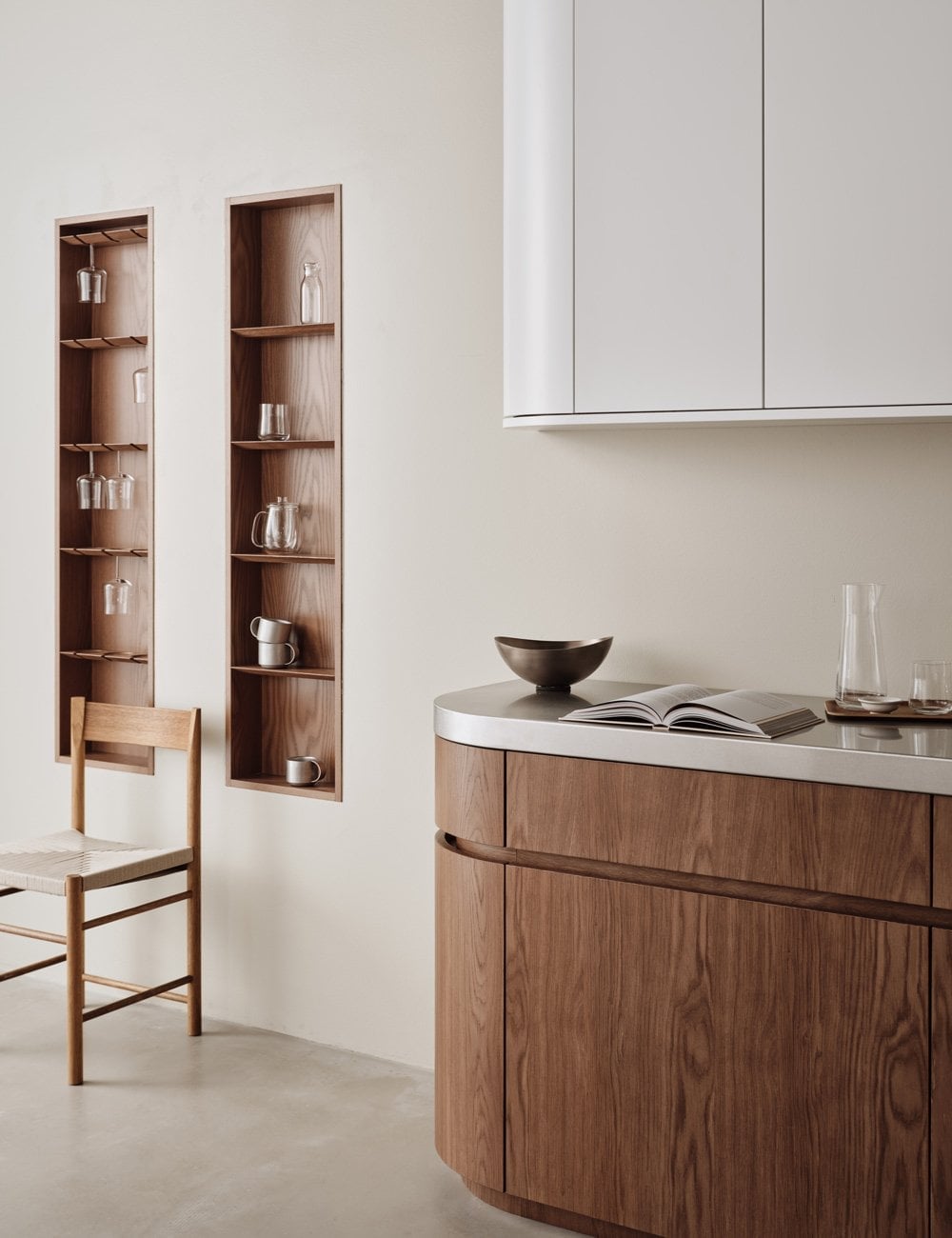
Recessed wooden shelving turns a standard wall into a built-in storage zone without adding cabinet depth. The shelves sit flush with the surrounding wall, so the room keeps its clean lines while gaining a spot for cookbooks, ceramics, or a small plant. A minimalist chair nearby suggests the area doubles as a breakfast nook or reading corner. The palette stays neutral, with wood tones carrying the warmth. Because the shelving is set into the wall, there is no visual clutter from brackets or frames. This approach works best during a renovation or when you are willing to cut into drywall. For a renter-safe swap, a shallow floating shelf in a matching wood tone can mimic the look without structural work.
All White Lacquer Cabinets with Glass Fronts
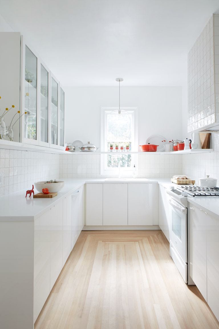
An all white lacquer kitchen relies on finish and light rather than color contrast. The glossy cabinet fronts bounce natural window light around the room, making a galley layout feel wider than it is. Glass-front upper cabinets break up the white expanse and provide a focal point on organized dishes or glassware. A wood floor and a simple pendant light add just enough warmth to keep the space from feeling cold. The palette holds to white and wood, with no third color competing. Lacquer is a durable finish that resists moisture and wipes clean easily, though it does show fingerprints more readily than a matte surface. This combination of gloss, glass, and natural light delivers a bright, airy kitchen that still feels polished.
Warm Wood Cabinetry with Geometric Pendant Lights
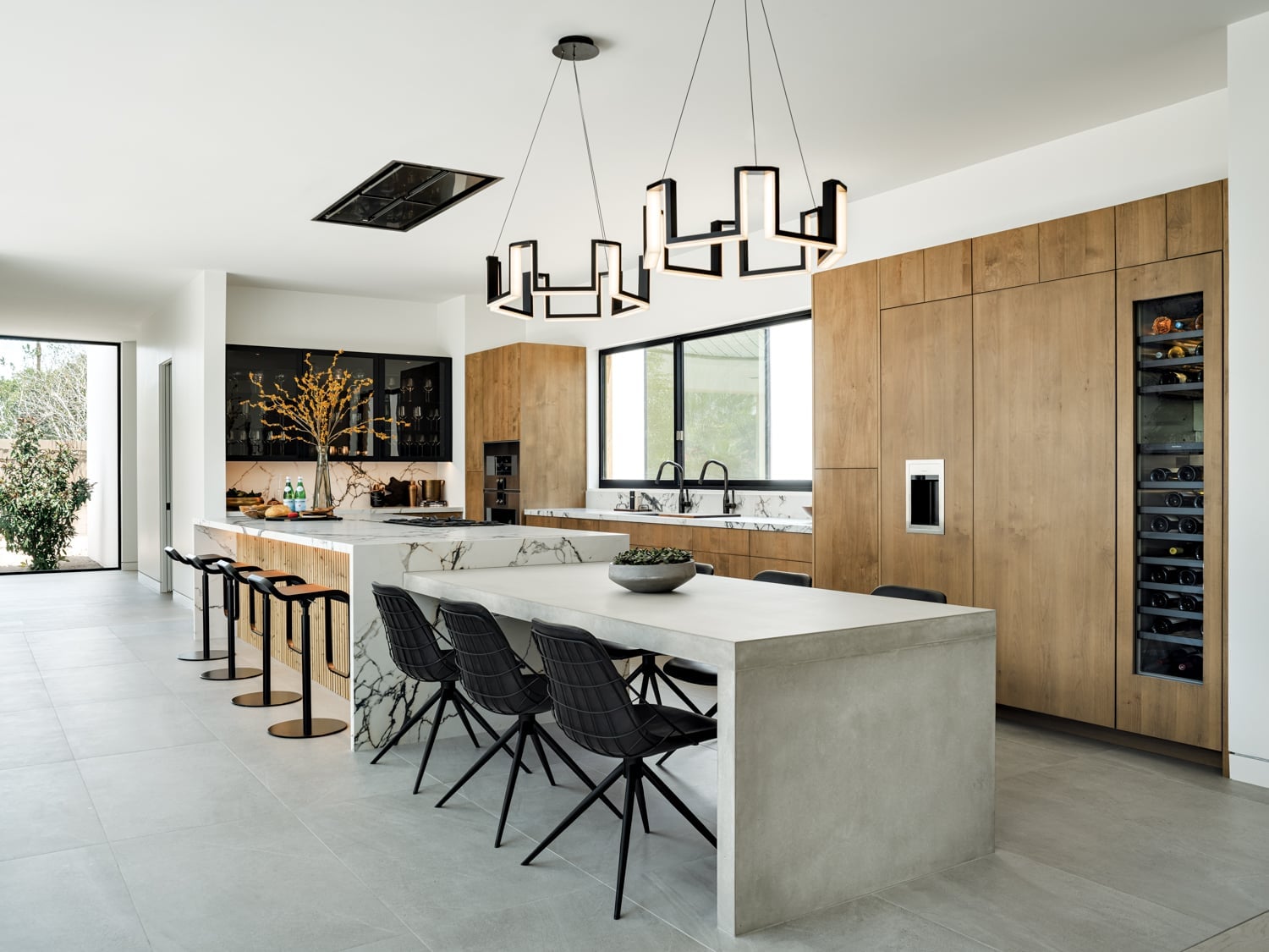
Where many minimalist kitchens lean entirely on white or gray, this one lets warm wood cabinetry take the lead. The island, clad in the same wood, anchors the open plan with a solid, furniture-like presence. Integrated appliances keep the run of cabinets uninterrupted, so the eye moves straight to the island and the geometric pendant lights above it. Those pendants do double duty: their angular shapes contrast the flat cabinet fronts, and their height defines the work zone below without blocking sightlines across the room. Recessed lighting handles general brightness, while the pendants focus warm light on the island surface. The stone countertop on the island adds a cool, smooth surface that balances the wood. For anyone who finds all-white kitchens too stark, this mix of wood, stone, and metal offers a warmer version of the same clean look.
Textured Gray Tile Backsplash with Integrated Range Hood
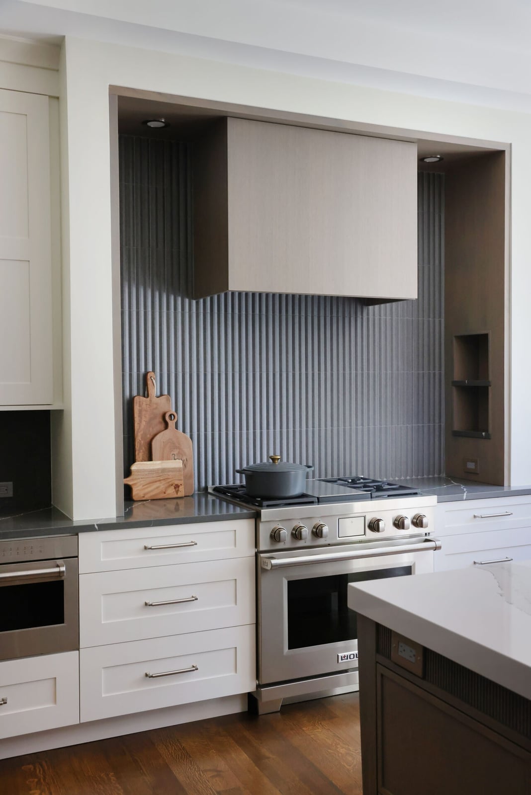
A central range with an integrated hood anchors this kitchen, and the surrounding cabinetry in white and beige keeps the layout clean. The textured gray tile backsplash adds depth behind the stone countertop without cluttering the look. Task lighting above the range pairs with ambient light to make the work zone practical for daily cooking. When a backsplash carries this much visual weight, keeping the countertops clear helps it look deliberate.
Abundant Natural Wood Cabinetry with Brass Accents
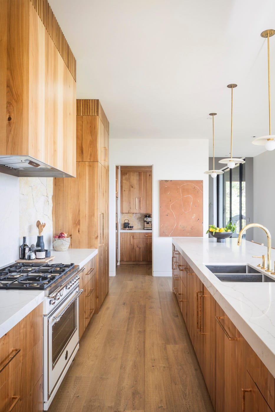
This kitchen leans into natural wood cabinetry and an island that together warm up the open plan. The palette sticks to wood tones, white stone counters, and brass details like the faucet, which keeps the look cohesive. Pendant lights and natural light from nearby windows balance the roominess without overwhelming the wood. Brass reads as the accent that breaks the monotony of an all-wood surface, adding a polished finish. For a similar approach, choose one metal finish and repeat it on hardware and fixtures to tie the whole space together.
Final Thoughts
A minimalist kitchen works best when every surface and cabinet has a reason to be there. Matte finishes hide fingerprints, handleless fronts keep the line clean, and natural materials stop the space from feeling cold. If a look feels too spare, add texture through wood or stone rather than extra objects. The common thread across these 32 kitchens is that less truly becomes more when the choices are deliberate. Keep the counters clear, pick one accent material, and let the room breathe. That is the real takeaway: simplicity is not empty, it is edited.