
Beautiful home decor ideas on budget can completely transform a space without requiring a major renovation or a large investment. I love how simple details, creative furniture arrangements, interesting textures, and thoughtfully chosen accessories can make an ordinary room feel personal and inviting. The key is to work with what you already have and add affordable pieces that bring function and character to the space. From cozy seating corners and creative wall decor to practical storage and charming outdoor spaces, there are plenty of ways to refresh your home without overspending. In this collection, I’m sharing inspiring ideas that show how color, pattern, texture, and smart styling can create a polished look on a realistic budget. Whether you are updating one small corner or refreshing an entire room, these beautiful home decor ideas on budget can give you plenty of inspiration to start.
Layered Outdoor Lounge With Soft Textures
I see a covered outdoor lounge that feels wonderfully relaxed and inviting. A large cushioned seating area fills the foreground, layered with cream throws and textured pillows, while a wooden coffee table sits centrally on a patterned rug. A woven hanging chair becomes the main focal point, and sheer cream curtains frame the open sides of the space. Round paper lanterns hang overhead, while baskets filled with pink flowers add color around the perimeter. Beyond the curtains, a neatly maintained green lawn and mature trees create a peaceful backdrop.
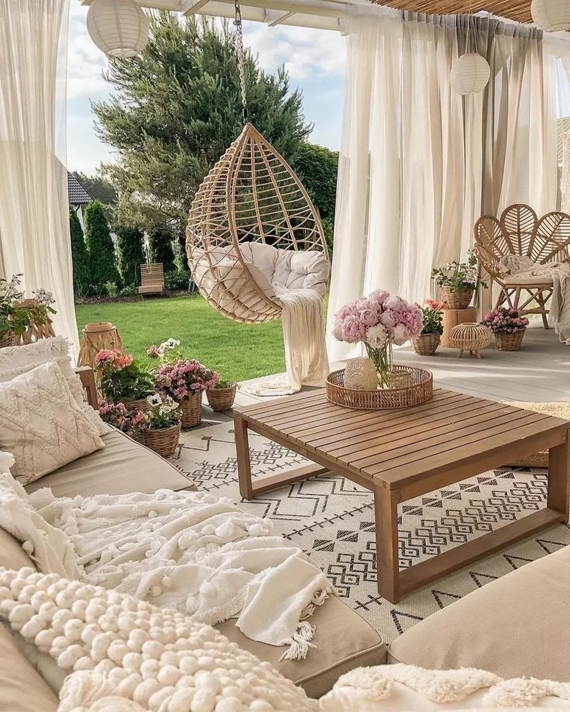
What I like about this arrangement is the way the furniture creates a genuine outdoor living room rather than simply placing a few chairs on a patio. The coffee table gives the seating area a practical center, while the rug visually connects the pieces. The curtains also make the covered space feel more enclosed and comfortable without blocking the garden view. For a budget-friendly version, I would focus first on comfortable cushions, one outdoor rug, and a simple central table, then build the look gradually with textiles and smaller accessories.
From my experience, texture is one of the easiest ways to make inexpensive decor feel much more considered. Here, the woven chair, baskets, patterned rug, soft blankets, and sheer curtains all contribute something different without competing with one another. I would also borrow the idea of repeating one accent color, such as the pink visible in the flowers, because it gives a collection of inexpensive accessories a more intentional appearance.
Compact Dining Nook With Blue Built-In Seating
This compact dining nook combines a deep blue upholstered bench with pale cabinetry and a small round table. I notice a decorative arrangement of different plates on the wall above the bench, while a delicate chandelier adds a more decorative focal point overhead. The cabinetry beside the seating includes glass-front upper doors and closed storage below, and the white tiled backsplash keeps the adjoining kitchen area visually fresh. A patterned gray-and-white floor completes the space.
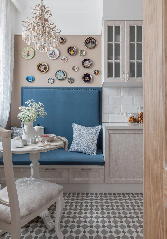
I think the built-in bench is particularly effective here because it uses the wall efficiently while providing generous seating in a relatively compact area. The storage beneath the bench adds another practical layer without taking up additional floor space. The small round table also makes sense for this arrangement because its shape allows people to move around the nook more easily. The decorative plates are an especially accessible idea: a wall can become part of the decorating scheme without requiring expensive artwork.
When I am looking at budget decorating, I always pay attention to surfaces that can perform two jobs at once. The seating here is both furniture and storage, while the wall above it becomes a display area. I would recreate the idea by choosing a strong upholstery color for the bench or even adding a removable seat cushion, then using plates, small framed pieces, or other objects already owned to create a personal display.
Mint Green Sofa With Sculptural Branch Shelving
The third image shows a calm sitting area centered around a low mint-green sofa with matching cushions. A gray throw rests casually across the seat, and a small sculptural wooden stool stands in front of it. On the adjacent wall, a large branch-like wooden installation incorporates several small shelves holding books, vessels, and decorative objects. Three irregular wooden-framed mirrors hang together on the opposite wall, while a woven light fixture adds texture overhead.
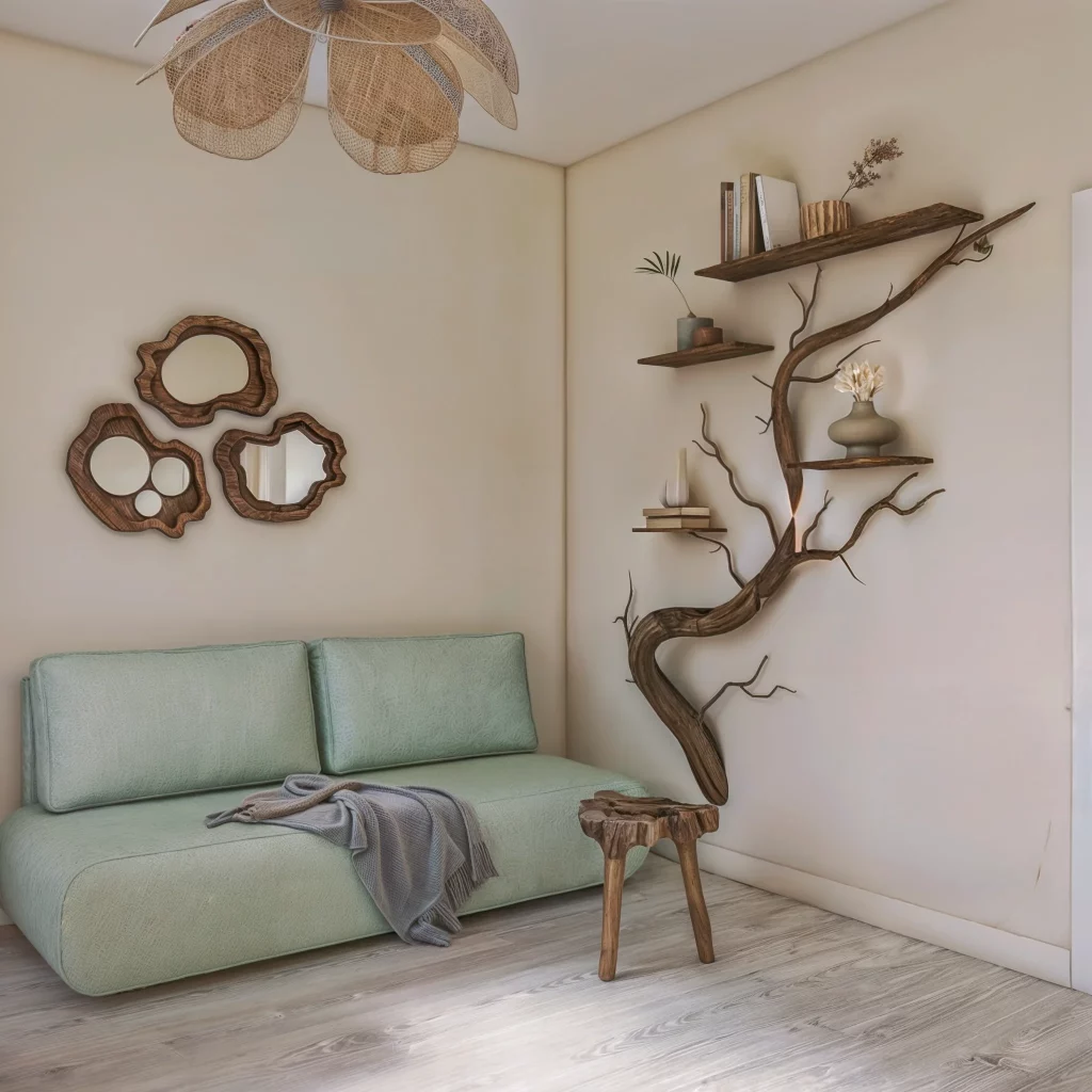
For me, the strongest idea here is using the walls to create visual interest while keeping the floor relatively open. The sofa provides the main comfort zone, but the sculptural wall shelving gives the room personality without requiring a large cabinet or display unit. The small stool is also useful because it occupies very little space and can function as a compact side surface. This is a good example of how unusual wall decor can make a simple sofa feel much more distinctive.
I would take inspiration from the principle rather than trying to duplicate every detail. A homeowner on a budget could use one interesting wall shelf or a collection of irregular mirrors instead of buying several large pieces of furniture. I also like the restrained color relationship between the pale walls, mint upholstery, natural wood, and gray textile. Keeping the palette controlled allows inexpensive individual pieces to look like part of one cohesive room.
Natural Wood Console With Layered Mirrors
Here, a slim wooden console table sits against a light wall, topped with a few small decorative and functional objects. Above it is a striking arrangement of three irregularly shaped mirrors with substantial wood frames. To the right, a tan upholstered rocking chair sits beside several potted green plants, while narrow glass shelves display small accessories against a vertical textured wall treatment. A simple wall light illuminates the console area, and a small upholstered stool sits beneath the table.
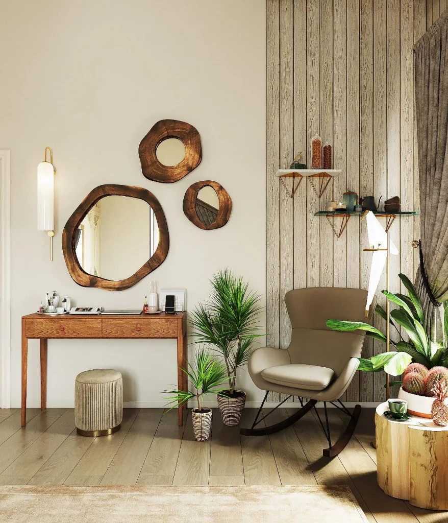
I find this arrangement particularly smart for a smaller room or transitional area because the console is visually light and does not dominate the floor. The mirrors add depth and reflect light, while the shelves provide display space without requiring a bulky storage unit. The rocking chair also creates a comfortable destination rather than leaving the area as purely decorative. Every piece has a clear visual role, but the composition still feels relaxed.
If I were recreating this look economically, I would start with a narrow console and concentrate my budget on one distinctive decorative feature, such as an unusual mirror. The image also reminds me that a group of related objects often has more impact than one isolated accessory. Similar shapes, natural tones, and repeated materials can make affordable pieces feel intentionally selected rather than randomly assembled.
Tree-Shaped Bookshelf Against a Sunny Yellow Wall
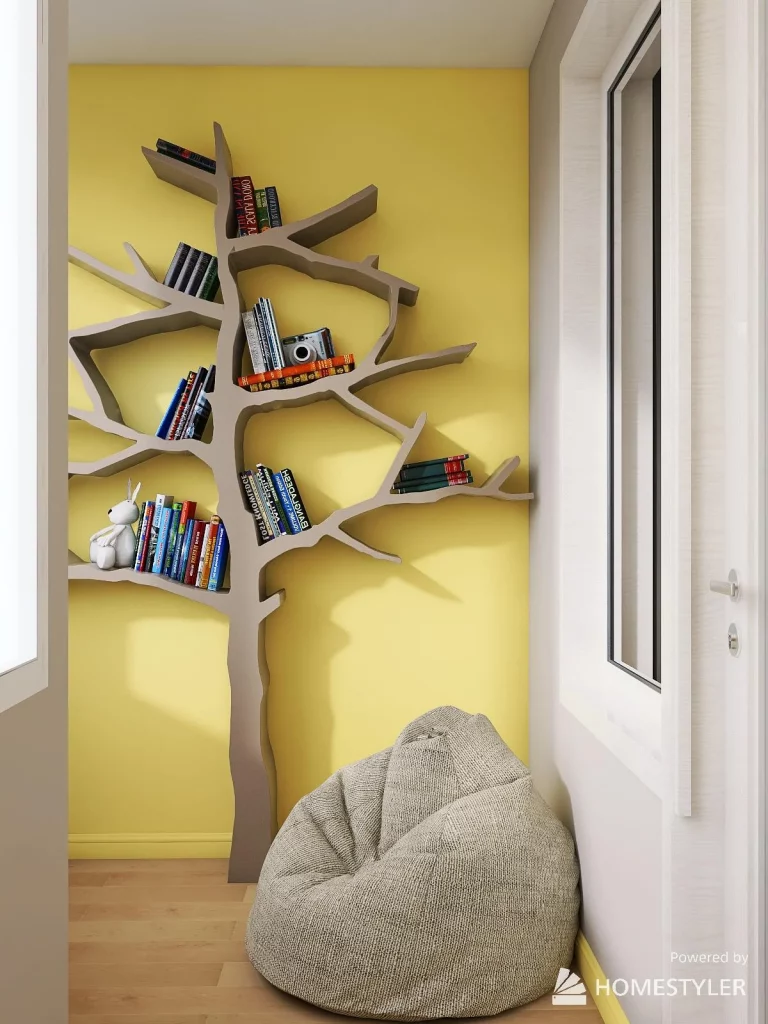
The fifth image takes a much more playful approach. A bright yellow wall forms the backdrop for a large tree-shaped shelving unit in a muted taupe tone. The branches create separate open compartments filled with books, a small camera, and decorative objects. At floor level, a soft gray-beige beanbag provides a casual reading seat. White-framed windows surround the niche, bringing daylight into the compact space.
What makes this idea work so well is that the shelving becomes the decoration itself. Instead of filling the wall with multiple separate pieces, the tree form provides storage, display, and a strong visual focal point in one element. The open shelves also keep the books accessible and visible. I especially like the contrast between the energetic yellow background and the quieter neutral seating because it keeps the little reading corner from feeling visually overwhelming.
This is the kind of budget decorating idea I would consider when a room needs personality more than additional furniture. A creative shelf can completely change an otherwise plain wall, and books already owned can become part of the display. If building a custom shape is outside the budget, I would apply the same principle with affordable modular shelves arranged in an interesting composition rather than buying a conventional bookcase.
Patterned Entryway With a Decorative Round Mirror
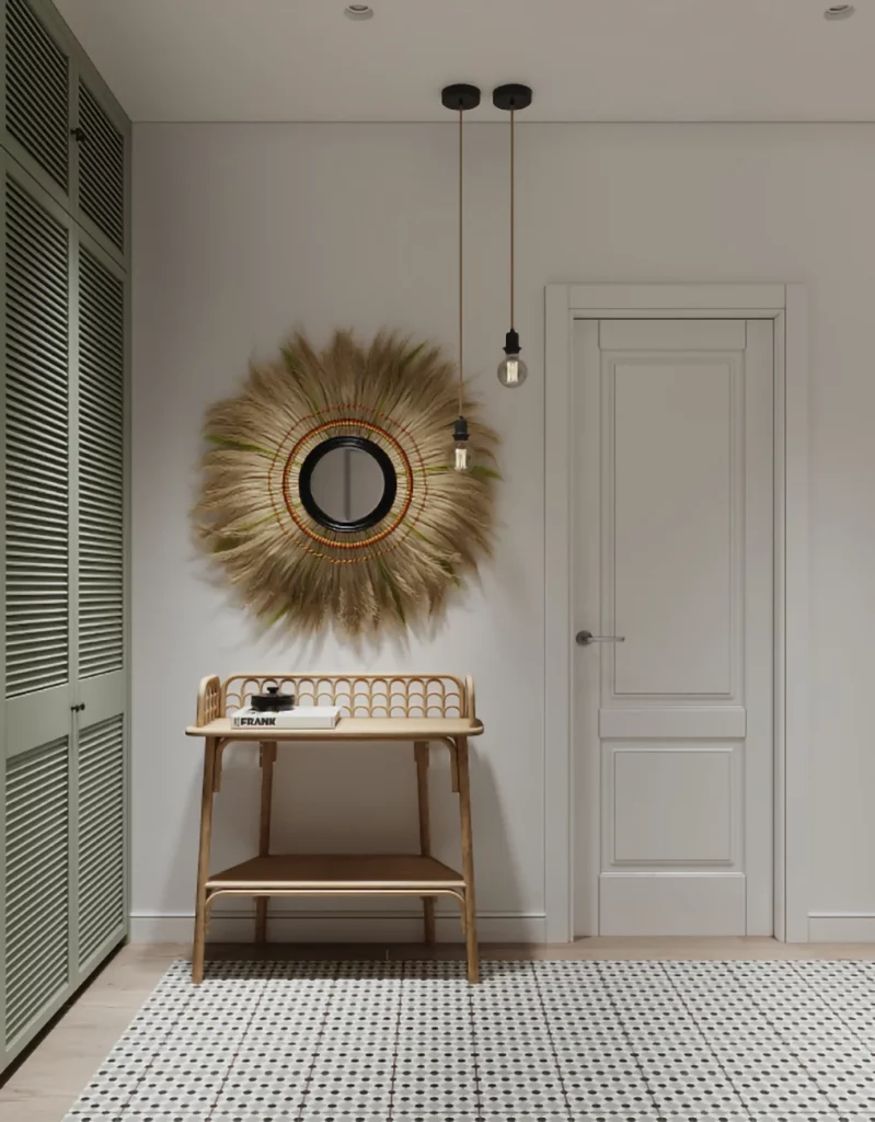
This entryway uses a soft neutral palette with a particularly expressive patterned floor. A narrow console-style bench stands beneath a large round mirror surrounded by a feather-like textured frame. Two small pendant lights hang above the area, and a tall slatted storage unit occupies the left side. A mirror-fronted storage piece appears on the right, accompanied by a small bench with a cushioned seat. The combination of pale walls, natural wood tones, and patterned flooring creates a calm but detailed entrance.
I like how much functionality is packed into this relatively compact area. The storage furniture gives the entryway a practical purpose, while the bench provides a convenient place to sit. The large decorative mirror helps anchor the wall and is useful in an entrance where a final appearance check is naturally convenient. Meanwhile, the patterned floor adds character without requiring additional wall accessories.
For a budget project, I would keep this image in mind as proof that the floor can become the statement element. If replacing flooring is not realistic, the same visual principle can be introduced with a patterned runner or smaller rug. I would also prioritize a mirror with an interesting frame over filling the wall with many inexpensive decorations. One memorable object can often do more for a room than several unrelated accessories.
Creative Reading Corner With a Sculptural Bookcase
The sixth image features a compact reading nook built around another tree-inspired shelving design, this time placed against a saturated yellow wall. Books fill several of the irregular open compartments, and a small camera and decorative objects are mixed into the display. A large neutral beanbag sits directly beneath the shelving, creating an informal place to read or relax. Bright daylight enters through the surrounding white-framed windows.
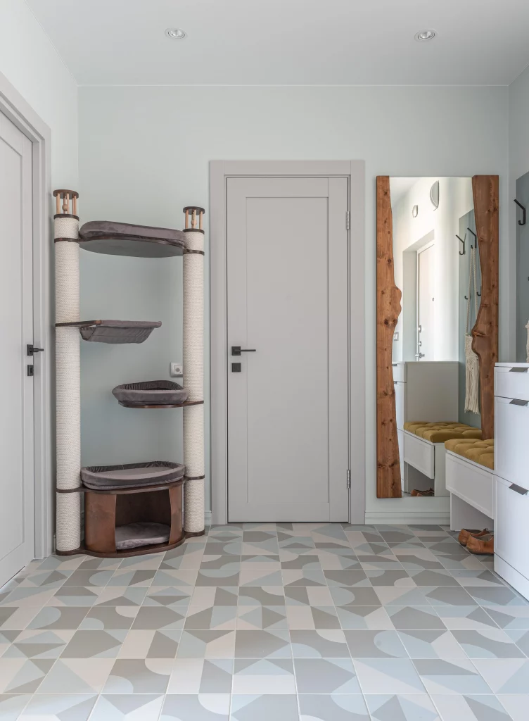
I see this as a very effective use of a narrow or awkward wall because the shelving takes advantage of vertical space while leaving the center of the floor open. The beanbag is also a flexible seating choice: it is visually softer than a conventional armchair and can be moved when the space needs another purpose. The open shelves make the books easy to reach, while their arrangement adds color naturally through the book covers.
What I would borrow from this image is the idea of letting everyday possessions provide the decoration. Books, a camera, and a few small objects are enough to make the shelves feel personal. When decorating on a budget, I would rather display things that already have meaning than spend money filling every empty surface with new accessories. The result usually feels more authentic and costs considerably less.
Minimal Beige Seating Area With Macramé Accent
This room is extremely restrained, with two connected beige upholstered seating pieces positioned on a light textured rug. A small white side table extends from one seat, creating a convenient surface without adding another freestanding table. On the wall above, a small woven macramé decoration hangs beneath a circular wall light. Wooden blinds cover the large window on the left, while a tall wood-toned storage unit occupies the right side.
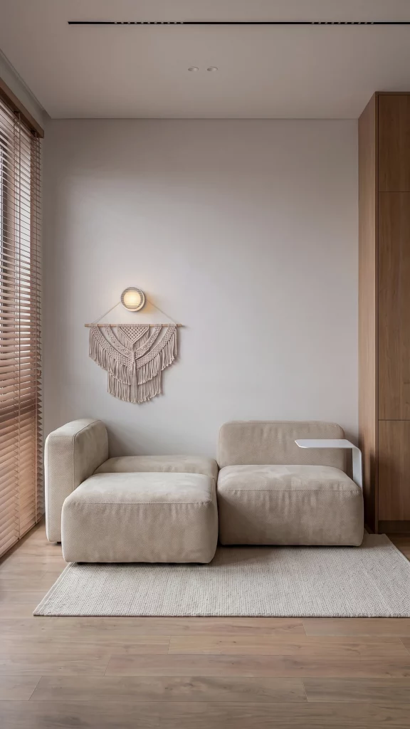
The strength of this room comes from proportion and restraint. The seating is generous but low, the rug defines the lounge area, and the small integrated side surface provides just enough functionality. I also like the way the wood from the blinds and storage unit adds warmth to an otherwise very neutral room. Nothing feels crowded, which makes the space appear calm and usable.
For an affordable version, I would focus on creating the same visual hierarchy rather than purchasing identical furniture. A simple neutral sofa, a modest rug, and one small wall decoration can establish the foundation. I would also avoid the temptation to fill every blank wall immediately. This image shows me that leaving generous negative space can actually make a few inexpensive decorative elements feel more significant.
Soft Family Daybed With Playful Wall Art
The ninth image shows a cozy daybed-style sofa upholstered in a soft beige tone. It is layered with green, cream, patterned, checked, pink, and yellow cushions, while a green runner stretches across the seat. Above the sofa, pale sculptural wall pieces depict trees, animals, and playful figures. A framed childlike artwork hangs on the adjoining wall, and a patterned rug covers part of the dark floor. The overall palette mixes gentle neutrals with small amounts of stronger color.
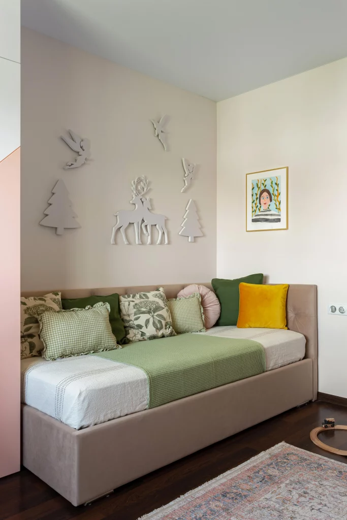
I particularly like how the seating becomes a flexible family-friendly surface rather than a formal sofa arrangement. The many cushions make it look comfortable and relaxed, while the different patterns create personality without changing the main furniture. The wall decorations are also well suited to the room because they introduce a playful theme without taking up floor space. For a budget-conscious makeover, textiles and wall art can have a surprisingly large effect on an existing sofa.
My favorite lesson from this image is that coordinated does not have to mean perfectly matched. The cushions share several soft colors and natural-looking patterns, but they are not identical. I would use this approach when refreshing a room inexpensively: keep one or two colors consistent, then mix patterns and textures within that palette. It is a simple way to make existing furniture feel newly styled.
Covered Outdoor Dining Room With Relaxed Layering
The final image brings the collection outdoors again, this time with a dining-focused arrangement. A large rectangular wooden table occupies the center, surrounded by woven chairs and a long bench. Cream round placemats sit across the tabletop, while a central arrangement of pink flowers provides the main decorative accent. Sheer curtains surround the covered structure, and a woven overhead covering adds texture above. Paper lanterns and a string of small lights provide additional visual interest, while baskets and pots with pink flowers are arranged around the perimeter.
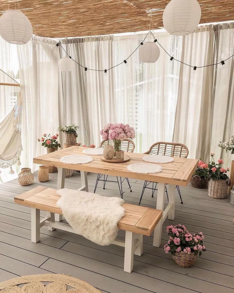
I think this works beautifully because the dining furniture remains simple while the surrounding layers make the space feel special. The bench increases seating flexibility, while the rectangular table gives everyone a comfortable shared surface. The curtains soften the structure and frame the outdoor view, and the repeated baskets and flowers help connect the edges of the space with the central table. It feels like an outdoor room designed for lingering rather than simply eating.
For a budget approach, I would start with the table and seating I already have and then add atmosphere gradually. A few cushions or simple placemats, soft curtains, and warm decorative lighting can transform a basic covered area without requiring a complete renovation. I also like the repetition of the same pink accent around the room because it creates cohesion. It is a useful decorating trick when working with inexpensive accessories: repeat one noticeable detail in several locations and the entire space immediately feels more intentional.
Warm Bedroom Nook With Layered Wall Decor
I love how this compact bedroom corner turns a small amount of space into a genuinely inviting retreat. The neutral room is framed by light cabinetry and a bed on one side, while the main nook features two deep, rounded lounge chairs in brown and orange tones. Above them, two wall-mounted planters bring dark green foliage into the composition, and an arrangement of large, thin metal wall pieces creates a striking focal point. A round textured rug grounds the seating area, while the tall curtains allow plenty of daylight to soften the room.
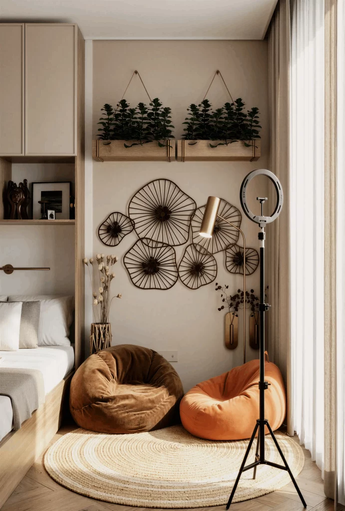
What makes this idea particularly useful on a budget is the way the designer gives personality to a relatively simple room through accessories rather than complicated architectural changes. The chairs create a separate place to sit without requiring a full sofa, and the rug visually defines the nook. I also like the contrast between the soft upholstery, woven rug, metal wall decor, and greenery because each texture gives the neutral background more depth.
For my own home, I would take this as a reminder that one carefully styled wall can do a lot of work. Instead of buying several expensive pieces, I would concentrate on creating one strong focal arrangement and then balance it with inexpensive textiles and greenery. The two chairs also demonstrate a practical approach for smaller rooms: matching or complementary seating can make an unused corner feel intentional.
Compact Hallway With A Decorative Bench
This hallway makes a strong impression through its simple symmetry and carefully selected details. A wooden bench with built-in drawers sits directly against the central wall, providing both seating and concealed storage. Above it hangs a large macramé-style textile, flanked by two slim wall lights. Wooden doors frame the composition on both sides, while the patterned rug adds visual interest across the floor. The dark geometric ceiling fixture provides another decorative focal point without overwhelming the space.
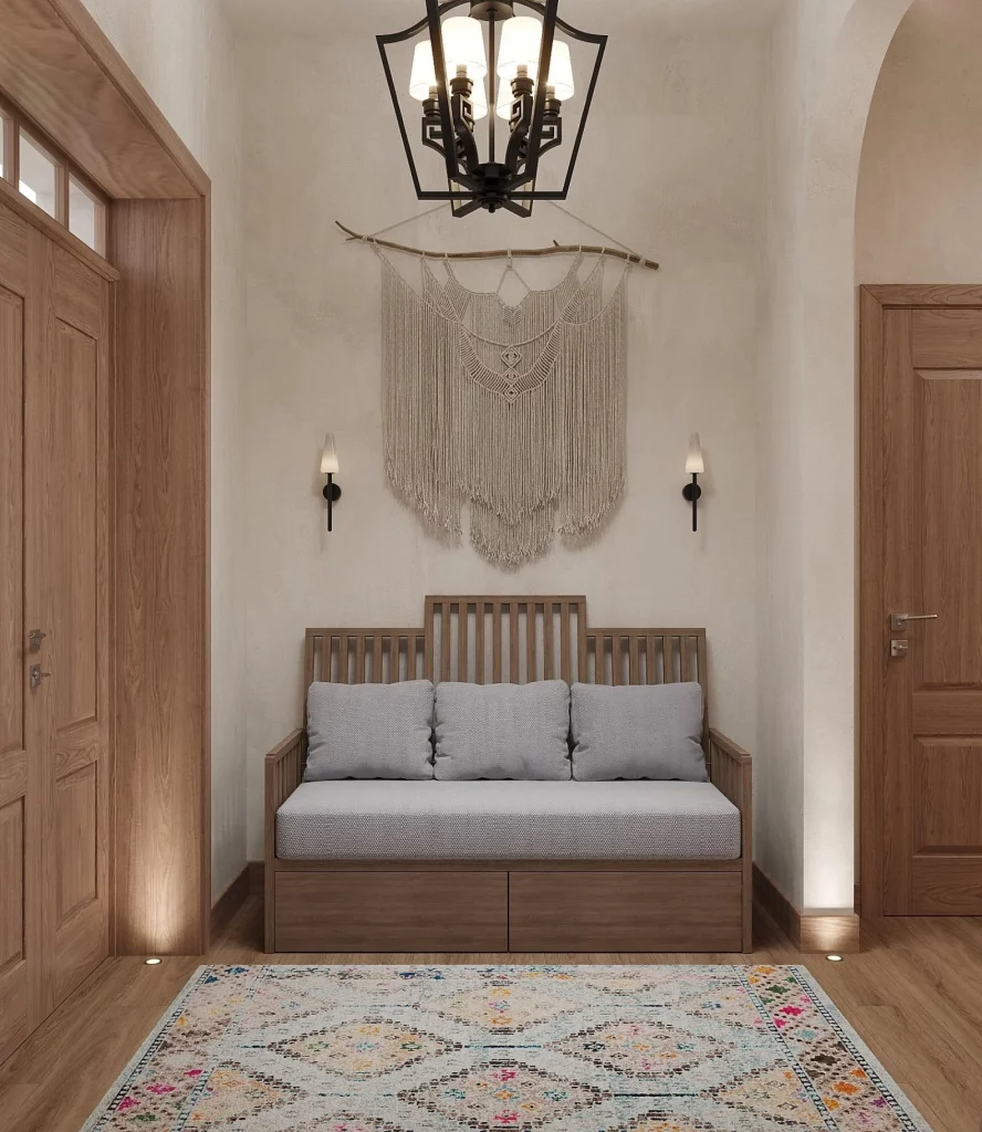
I particularly like the bench because it combines several functions in one compact piece. It offers a place to sit while also providing storage underneath, which is especially valuable in a hallway. The wall textile fills the vertical space above it without making the passage feel crowded, and the symmetrical lighting gives the arrangement a finished appearance.
If I were recreating this look economically, I would focus on the central wall first rather than trying to decorate the entire hallway. A simple bench, one substantial textile, and two coordinated lights can create a complete arrangement. The existing wooden doors and floor already provide warmth, so the neutral wall treatment and restrained accessories keep the overall effect balanced.
Colorful Bedroom With An Ornate Folding Screen
This bedroom takes a much more expressive approach to decoration. A large upholstered bed sits against a pale gray wall, while an ornate carved folding screen rises behind it to create an impressive headboard effect. The bedding remains relatively neutral, but the purple throw and collection of colorful patterned pillows introduce plenty of personality. A small dark side table and green accent stool add more visual contrast, while the large window brings daylight into the room.
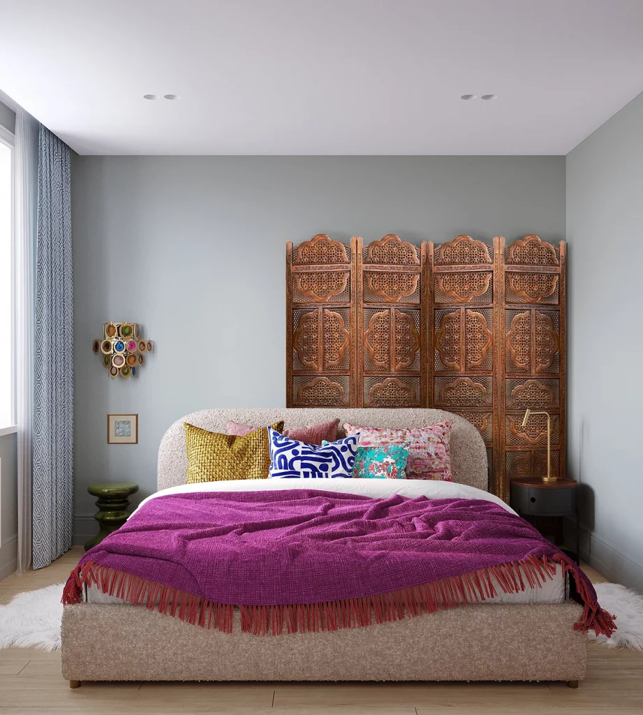
The folding screen is the element I find most interesting because it creates the appearance of a custom feature behind the bed without changing the wall itself. It gives the bed a defined backdrop and adds height to the room. Meanwhile, the colorful textiles can be changed much more easily than a permanent wall treatment, making them a practical way to refresh the space.
For a budget-conscious version, I would use the same principle: let one large decorative element carry most of the visual impact. A secondhand folding screen or similarly substantial decorative piece could create a comparable focal point, while colorful cushions and a throw can provide the changeable accents. I also like keeping the main upholstery relatively neutral because it allows the more distinctive accessories to stand out.
Soft Bedroom Vanity With A Rounded Mirror
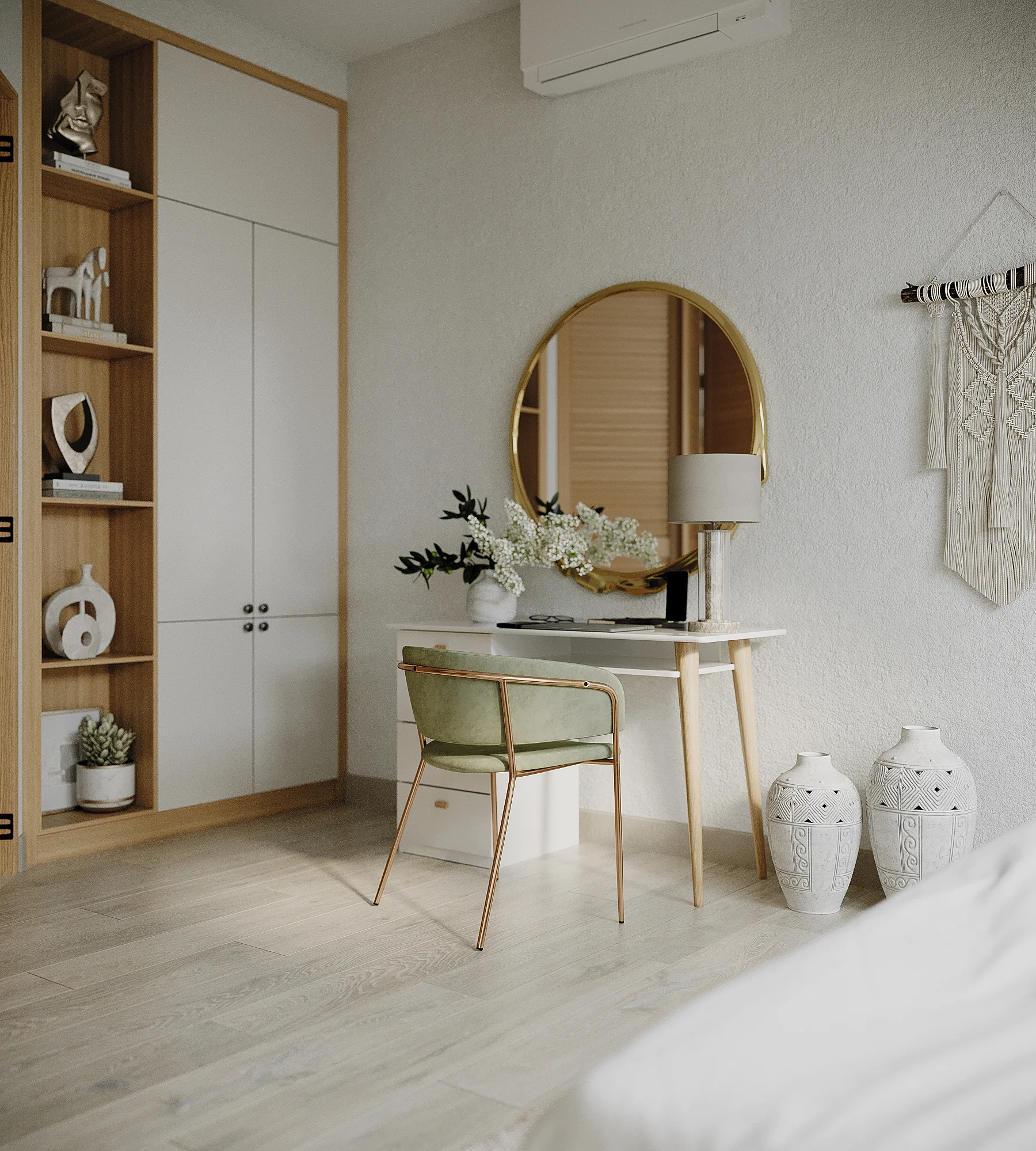
This bedroom corner feels light, calm, and exceptionally organized. A slim white desk is positioned beneath a large rounded mirror with a warm metallic frame, while a small upholstered chair with a green seat and delicate metal legs fits neatly underneath. Built-in cabinetry and open shelving occupy the adjacent wall, combining closed storage with display space. A small lamp, simple decorative objects, and a vase arrangement finish the vanity, while two large ceramic vessels sit on the floor nearby.
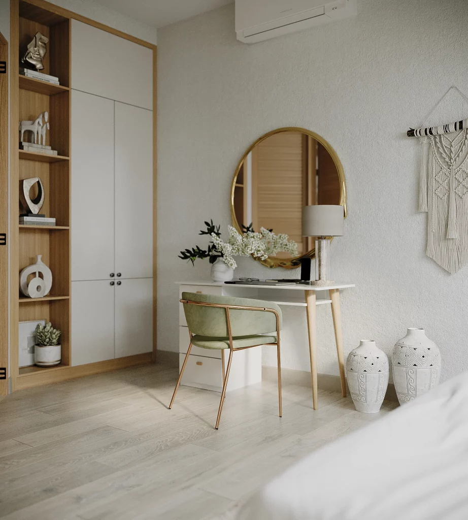
The strength of this arrangement is its efficient use of a relatively small section of the room. The desk does not dominate the space, and the mirror visually expands the wall while making the vanity feel more substantial. I also appreciate the combination of closed cabinetry and open shelves because it provides a place for everyday belongings as well as selected decorative pieces.
This is one of the easiest ideas in the collection for me to adapt to a budget. A narrow desk can perform the same role, and a single large mirror can immediately make a small dressing or work corner feel more finished. I would keep the accessories limited and let the mirror, chair, and storage provide most of the visual structure rather than filling every available surface.
Relaxed Outdoor Lounge With Layered Textures
This covered outdoor lounge feels like an extension of a comfortable living room. A large L-shaped seating arrangement occupies the back of the space, layered with neutral cushions and soft throws. A wooden coffee table sits in the center on top of a patterned rug, while numerous woven containers and textured decorative pieces surround the seating area. Light curtains soften the large windows, and round hanging lights add a gentle decorative element overhead.
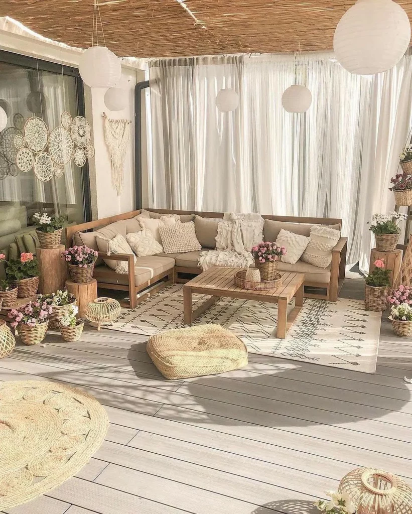
I like how the design creates several layers without relying on complicated furniture. The seating defines the main gathering area, the rug visually anchors it, and the coffee table creates a natural center. The abundance of different textures makes the otherwise restrained palette feel interesting, while the open arrangement keeps the space comfortable and usable.
For a budget approach, I would concentrate on textiles and arrangement rather than replacing the major furniture. Existing outdoor seating can look completely different when grouped intentionally and layered with cushions, throws, and one large rug. Even the lighting concept can be recreated gradually, adding a few simple hanging or portable lights instead of trying to transform the entire ceiling at once.
Bright Entryway With Organic Decorative Accents
This bright corner uses a very simple palette of white, pale wood, and green. A large irregularly shaped mirror is positioned above a narrow wooden console, while a small round sunburst-style mirror decorates the wall nearby. The console displays a white sculptural vessel, books, and a potted plant, and a dark surfboard-shaped decorative object leans casually against the wall. The pale floor and walls allow every accessory to remain clearly visible.
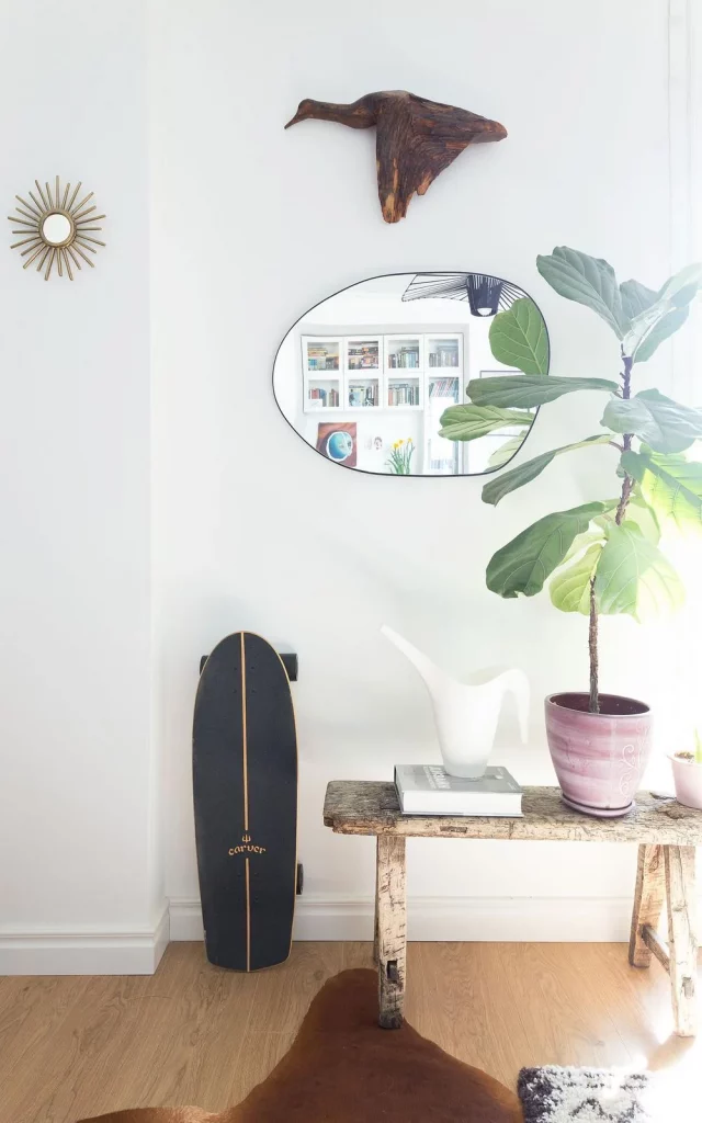
What works particularly well here is the balance between practical furniture and expressive objects. The console provides a useful surface without taking up much floor space, while the large mirror adds visual depth. The leaning decorative piece introduces a relaxed character, and the plant brings a contrasting organic shape into an otherwise very clean composition.
I would recreate this look by starting with whatever narrow console or small table is already available. Then I would choose one mirror as the main focal point and add only a few objects with noticeably different silhouettes. This image reminds me that budget decorating often becomes more successful when I edit rather than accumulate: a small number of distinctive pieces can have more impact than a crowded display.
Small Reading Corner With Vertical Plant Display
This narrow room has been turned into a peaceful seating corner with an olive-green upholstered armchair positioned between two windows. Along the wall beside it, a tall vertical shelving system holds individual plants at several levels. The wall has a textured light finish, while simple vertical lights create warm pools of illumination. The floor continues the muted palette, allowing the green chair and foliage to become the main accents.
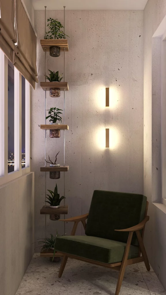
The vertical plant shelving is an especially smart solution for a narrow space because it uses height instead of spreading objects across the floor. The armchair creates a dedicated place to relax, while the lighting adds atmosphere without requiring a large lamp or bulky furniture. I also like the restrained palette because it keeps the small room visually quiet.
If I were decorating a similar corner on a budget, I would look upward before adding more furniture. A narrow vertical shelf can provide several display levels while preserving valuable floor space. I would also choose one comfortable chair as the main investment and use smaller decorative additions around it, following the same principle of giving one piece a clear starring role.
Cozy Bedroom Corner With Fire Feature And Soft Textiles
This intimate corner is built almost entirely around comfort and warmth. A bed or daybed is covered with a thick gray cable-knit textile and layered with soft beige cushions. Beside it sits a small round table holding candles and a cup, while a compact fire feature filled with pale stones occupies the foreground. The warm candlelight and firelight create a distinctly relaxing atmosphere against the darker textiles.
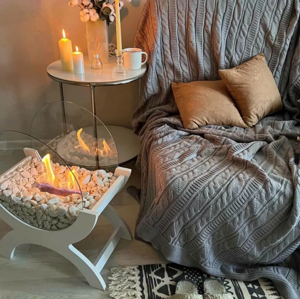
I think the success of this space comes from repetition of texture. The heavy knitted covering, plush cushions, smooth tabletop, pale stones, and soft candlelight all contribute different tactile qualities. The arrangement also feels personal because the small table is styled with everyday objects rather than treated purely as decoration.
For a lower-cost interpretation, I would focus first on textiles and lighting. A chunky throw, a couple of comfortable cushions, and a small side table can create much of the same cozy feeling without changing the furniture. If using any real flame indoors, I would of course choose a suitable product and follow its safety instructions; the visual lesson here is simply how much atmosphere can come from warm, localized lighting.
Playful Study Space With A Sculptural Wall Shelf
This compact workspace has a completely different personality from the neutral rooms earlier in the collection. The walls are covered with a pale geometric pattern, while a bold blue wall installation forms the shape of a tree and incorporates several floating shelves. A white desk and transparent chair sit beside it, creating a light work area. Small framed pictures, books, and colorful decorative pieces occupy the shelves, giving the wall a playful, personalized appearance.
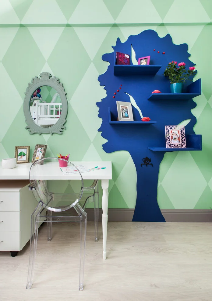
The tree-shaped shelving is the obvious focal point, but I like how it also serves a practical purpose. Instead of using a conventional freestanding bookcase, the shelves take advantage of the wall and keep the floor area open. The transparent chair reinforces that feeling of openness, while the white desk provides a simple visual counterbalance to the stronger wall colors.
For a budget-friendly approach, I would borrow the idea rather than trying to reproduce every detail exactly. A few wall-mounted shelves arranged creatively can create a similarly personalized display, especially when combined with one strong painted shape behind them. The important lesson for me is that storage does not have to look purely functional; it can become part of the room’s decoration.
Covered Patio With Layered Seating And Evening Lighting
The final image shows a welcoming covered patio arranged as an outdoor lounge. A large sectional wraps around the seating area, with pale cushions and several patterned pillows providing comfort. A rectangular coffee table sits in the middle over a round textured rug, while large potted greenery fills the corners. String lights run across the ceiling, and glowing round floor lights create soft illumination around the seating. A circular wall mirror adds another decorative focal point to the paneled wall.
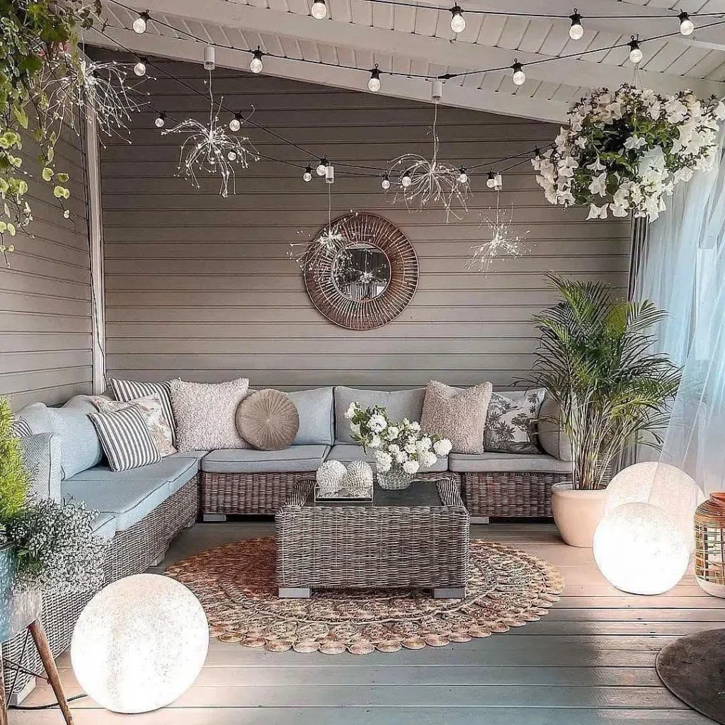
I like the way this patio is organized around a clear central seating zone. The sectional makes the most of the available area, while the coffee table keeps everything within easy reach. The combination of overhead string lights and low glowing lights gives the space multiple levels of illumination, making it feel intentionally decorated rather than simply furnished.
If I wanted to achieve a similar result without spending heavily, I would build the space in stages. I would begin with comfortable seating and a practical central table, then add one rug and gradually introduce lighting and decorative accessories. The image also shows how repetition can make inexpensive pieces feel cohesive: several similar lights and coordinated cushions create a finished look even when the individual elements are relatively simple.
Round Dining Table With Decorative Plate Wall
The dining area immediately catches my eye with its round light-colored table surrounded by curved-back chairs in soft neutral upholstery. Behind the table, a pale gray wall becomes the main decorative feature thanks to an arrangement of round plates in different sizes and subtle shades of white, cream, and pale blue. A woven-style pendant light hangs directly over the table, while open shelves in the adjoining alcove display plates, small framed pieces, cups, and potted greenery. The light tile floor and neutral palette keep the entire corner feeling airy and calm.
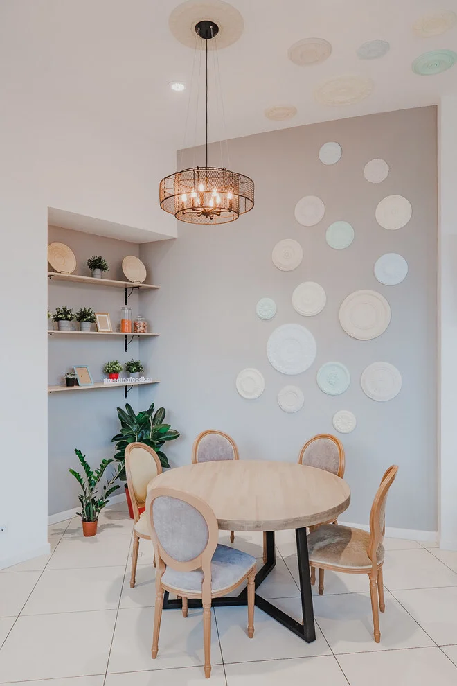
I like how the decoration is concentrated vertically rather than taking up valuable floor space. The plate arrangement gives the empty wall a strong visual identity, while the open shelves provide useful storage and display space at the same time. The round shapes are repeated throughout the room, from the table and chairs to the wall plates and ceiling details, which creates a surprisingly cohesive effect. For a budget-friendly approach, I would focus on arranging a collection of similarly shaped objects rather than buying one large piece of artwork.
From my perspective, the most effective detail here is the layering. The wall is not simply decorated with one object; it combines plates, shelving, small accessories, and greenery at different heights. That makes the dining corner feel collected rather than overly decorated. I would also keep the color range restrained when recreating this look, because the soft neutrals allow the shapes and textures to do most of the visual work.
Woven Basket Arrangement With Soft Lighting
This close-up shows a compact decorative surface styled with a large woven basket, a transparent glass table lamp with a natural fabric shade, a fern in a simple planter, and blue-and-white ceramic pieces. A curved wall sconce is positioned above the arrangement, adding another layer of warm metallic detail. The combination of woven texture, clear glass, ceramic, fabric, and greenery gives this small vignette considerably more depth than its simple arrangement might suggest.
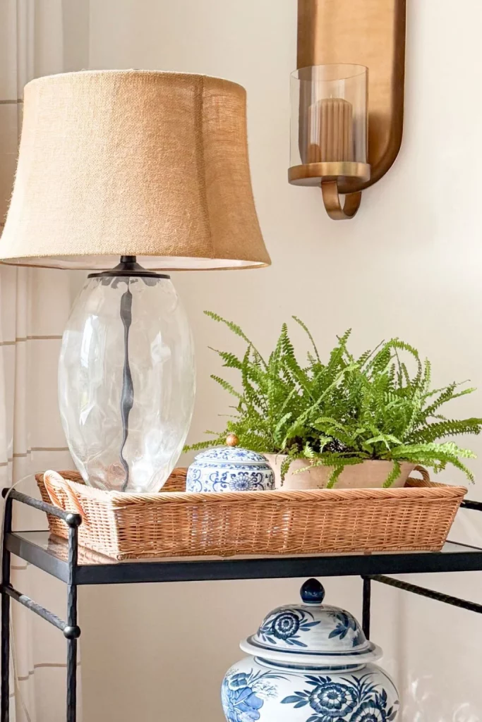
I think this is one of the easiest ideas in the collection to adapt on a budget because the visual impact comes from combining different textures rather than relying on a large amount of furniture. The basket creates a practical container and a strong horizontal shape, while the lamp adds height and useful illumination. The ceramics introduce a small amount of pattern, and the fern brings a lively green element into the composition. Everything occupies a relatively small footprint, which makes the idea especially useful for a console or narrow side table.
When I create a similar arrangement, I like to start with the largest object and build around it. Here, the basket establishes the base, the lamp creates height, and the smaller decorative pieces fill the space between them. I would avoid buying everything at once; instead, I would look for pieces with complementary shapes and tones and allow the arrangement to develop gradually. That approach can make decorating feel much more affordable.
Layered Neutral Sofa With Blue Decorative Accents
The sofa shown here is upholstered in a light neutral fabric and styled with several cushions in cream, muted green, beige, and blue. Some cushions feature botanical-inspired patterns, while another has a simple checked design. A ceramic table lamp sits behind the sofa, and a blue patterned ceramic vase with a leafy branch adds a deeper accent. The window in the background brings natural light into the space, emphasizing the soft textures and restrained colors.
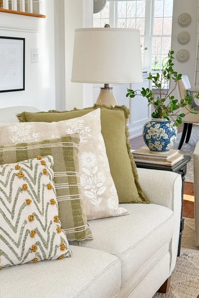
What works particularly well for me is the way the cushions transform a very simple sofa without changing the furniture itself. Several patterns are mixed, but they remain connected through the muted palette. The books beneath the vase also give the small side table a little more height and visual layering. This is a practical decorating trick because accessories can change the character of an existing seating area without requiring a new sofa or major renovation.
I would take inspiration from the color balance here rather than trying to copy every pattern. A neutral sofa provides a flexible foundation, so I could introduce two or three accent colors through cushions and one decorative object. Keeping the larger furniture understated allows smaller accessories to be changed whenever the room starts to feel tired. For me, this is exactly the kind of budget decorating that makes sense: work with what you already own and use smaller details to refresh it.
Soft Living Room With Glass Vase And Decorative Tray
This living room has a pale upholstered sofa positioned against a soft green-gray wall, with a small collection of framed artwork arranged behind it. A wreath-like circular decoration sits among the frames, creating a centered focal point. In the foreground, a large transparent blue-green glass bottle stands on a dark reflective table beside a wooden bowl filled with light decorative beads and a small potted plant. A flowering branch rises dramatically from the bottle, adding height and movement to the composition.
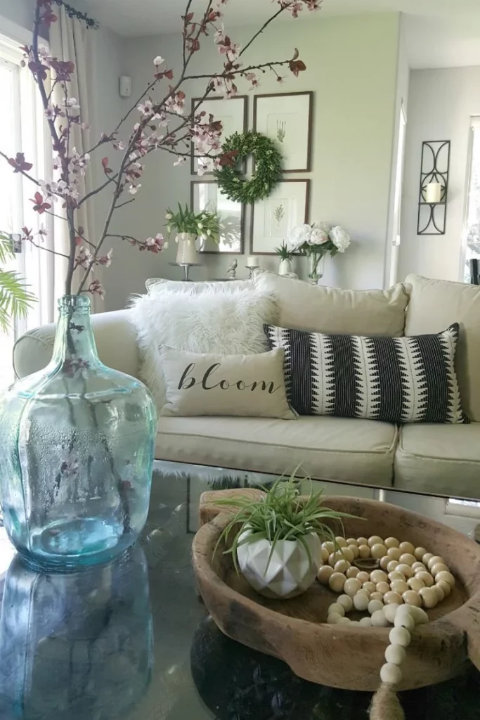
I love the contrast between the soft sofa and the darker reflective tabletop. The glass bottle becomes an especially effective focal point because it is transparent but still introduces a noticeable color accent. The wooden bowl balances that cool glass with a warmer, tactile material, while the small plant adds another layer of texture. None of these objects needs to dominate the room, yet together they make the coffee table feel intentionally styled.
For a budget version, I would concentrate on scale rather than price. One oversized vessel can have more decorating impact than several tiny accessories scattered across a table. I would also use a simple branch arrangement to bring height into the composition, as the image demonstrates. The key is to leave enough open surface around the main objects so the display still feels calm rather than crowded.
Covered Outdoor Retreat With Curtains And Hanging Chair
This covered outdoor area feels like a relaxed extension of the home, with a light-toned deck, sheer curtains surrounding the space, and a woven ceiling treatment overhead. A comfortable seating arrangement includes a sofa with layered cushions, a low wooden coffee table, a patterned rug, and a hanging chair positioned at the open edge. Several baskets and lantern-like accessories are placed around the seating area, while potted flowering arrangements add soft color throughout the space.
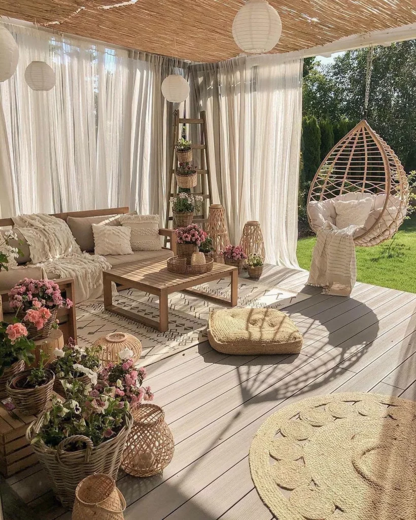
The layout works because it creates several visual zones without making the outdoor area feel divided. The sofa anchors the main sitting area, the coffee table keeps everything practical, and the hanging chair creates a separate spot for relaxing. The curtains also give the covered space a softer, more enclosed feeling while still allowing plenty of daylight through. I particularly like the way the repeated woven textures connect the ceiling, baskets, hanging chair, and other accessories.
To recreate this atmosphere without spending heavily, I would prioritize textiles and a few strong accessories rather than trying to furnish every corner. A simple seating arrangement can immediately become more inviting with cushions, a rug, and soft curtains. I would also repeat one material or texture in several places, as this image does, because repetition makes a collection of inexpensive pieces look much more intentional.
Compact Gray Dining Room With Plate Gallery
This dining room uses a deeper gray wall as a backdrop for a collection of white decorative plates featuring delicate black illustrations. The plates are arranged in an informal gallery composition above a wooden dining table with modern gray chairs. Open white shelves display cups, bowls, pitchers, and plates, while a compact pendant light hangs over the table. A television is mounted on the adjacent wall, showing how the dining area shares its space with everyday living functions.
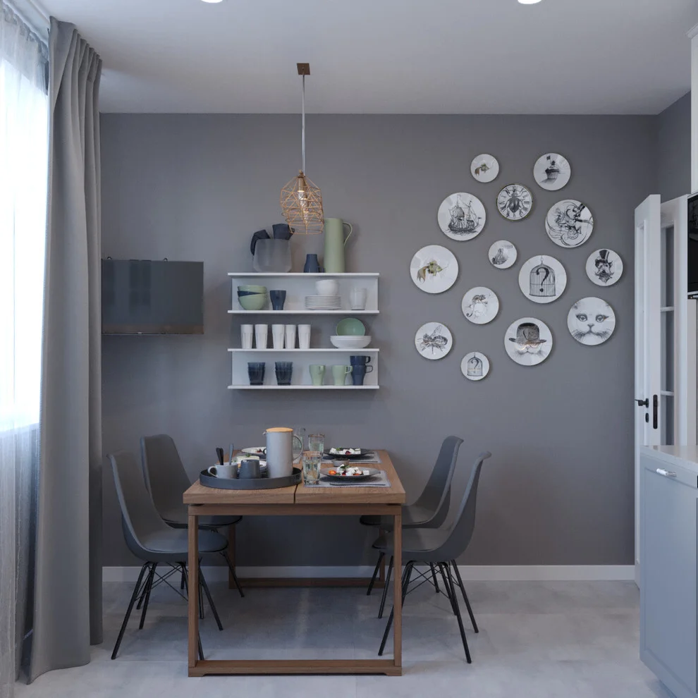
I think this is a strong example of making a small dining area feel personal without filling it with furniture. The table provides a clear central zone, while the wall-mounted shelves use vertical space for both storage and display. The plate gallery adds character to the gray wall and visually balances the shelving on the opposite side. Because the chairs, shelves, and accessories stay within a relatively controlled palette, the room remains organized despite having many individual objects.
For me, the budget lesson here is to look at ordinary household items differently. Plates do not have to remain inside a cabinet; when arranged thoughtfully, they can become wall decoration. Open shelves can also reduce the need for additional storage furniture in a compact room. I would simply plan the arrangement on the floor first so the spacing feels deliberate before putting anything on the wall.
Cozy Window Seat With Patterned Blue Pillows
This compact window seat creates a quiet little reading corner with a cushioned beige seat, soft curtains, and two prominent decorative pillows. One pillow is dark navy with a large white butterfly design, while the other features a blue-and-white floral pattern. A small wall-mounted lamp with a pleated shade provides focused lighting, and a book rests directly on the seat. The radiator cover below the window adds another geometric texture to the corner.
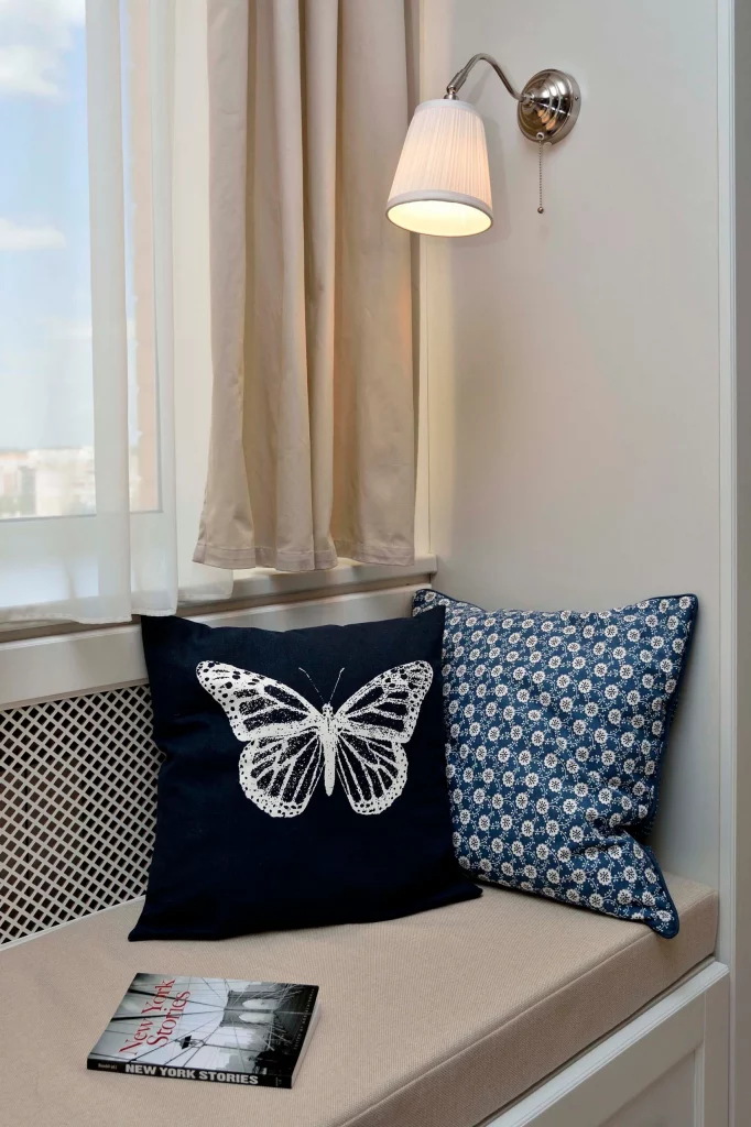
I like how little is actually needed to make this space feel complete. The built-in seating provides the practical foundation, while the pillows supply most of the color and pattern. The wall lamp is especially useful because it adds illumination without requiring a floor or table lamp to occupy the limited space. The book makes the purpose of the corner immediately clear: this is a place designed for sitting, relaxing, and reading.
If I were recreating this idea on a budget, I would put most of my attention into the cushions and lighting. Even a simple window seat can feel personalized when the textiles have contrasting patterns but share a common color family. I would also choose a compact light fixture that stays close to the wall, preserving as much usable seating space as possible.
Woven Basket Centerpiece In A Warm Home Office
Here, a large woven basket filled with decorative gourds, pinecones, dried-looking arrangements, and small natural accents sits prominently on a dark wooden table. Behind it, a light upholstered armchair occupies one side of the room, while a desk and chair create a workspace near the windows. The walls are covered with light horizontal boards, and the room receives generous natural light through the windows and glass door.
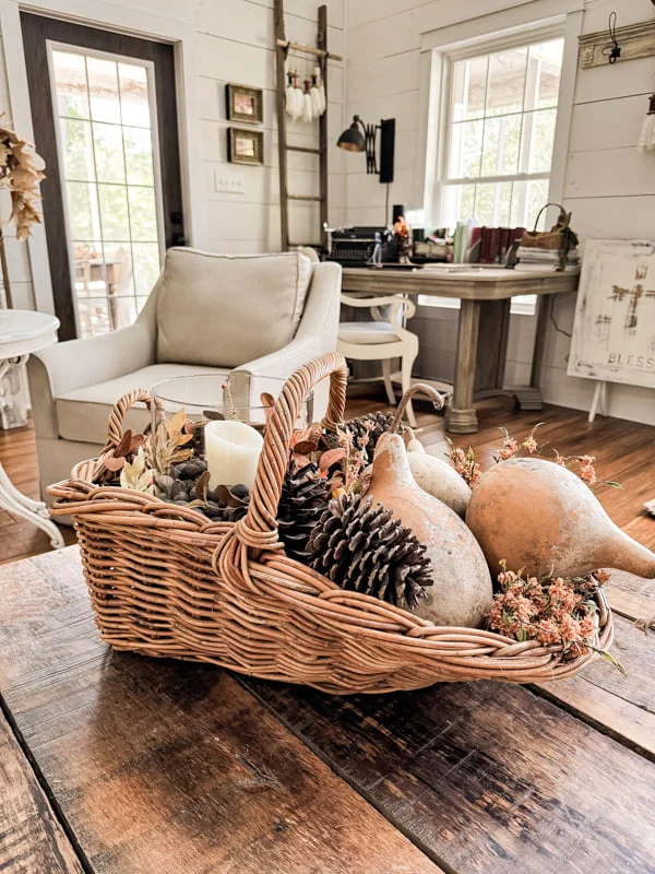
The centerpiece works because its size makes a strong statement without requiring numerous separate decorative objects. The basket gathers everything into one contained arrangement, keeping the table visually organized. At the same time, the desk and chair remain clearly available for work, so the room balances decoration with function. The combination of the dark table, pale upholstery, woven basket, and light walls creates noticeable contrast while retaining a comfortable atmosphere.
I would use this image as inspiration for styling a table when I want maximum effect from a single purchase or existing container. A large basket can hold a seasonal arrangement and be refreshed without changing the rest of the room. I also like the idea of using the surface of a worktable for one substantial display rather than covering it with many small objects, especially when the room already has an active workspace.
Black Entry Wall With Woven Circular Art
This entryway makes a strong impression with a black accent wall covered by an arrangement of woven circular pieces in different sizes and natural tones. The collection forms an organic vertical composition beside a wood-framed glass entry door. White louvered doors occupy the opposite side, while a neutral ceramic vase with leafy stems sits on the floor. The warm wood flooring ties the contrasting black, white, and natural woven elements together.
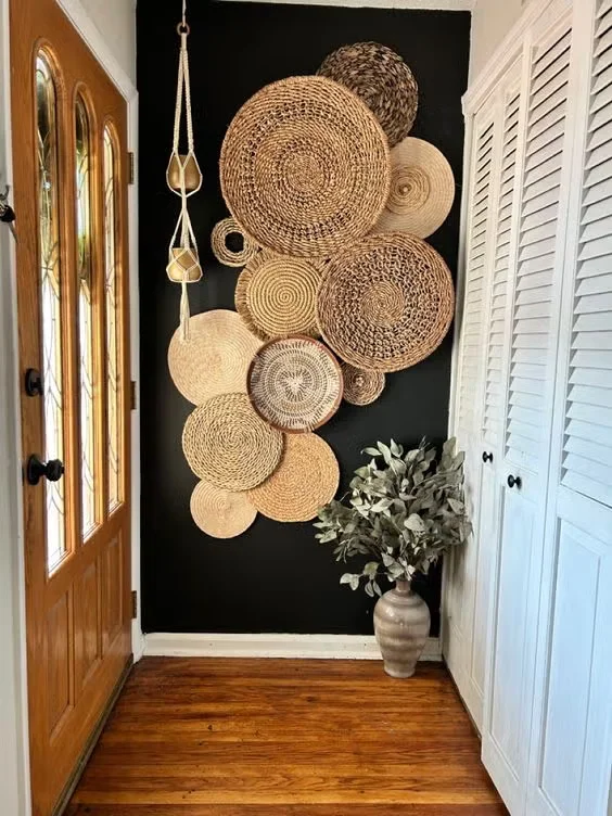
I think the most effective idea here is the transformation of a blank wall into a focal point using a collection rather than one expensive artwork. The different sizes of the circular pieces create movement, while their similar woven appearance keeps the composition connected. The white doors provide a clean counterpoint to the dark wall, and the floor vase fills the lower portion of the arrangement without competing with it.
For a budget-friendly interpretation, I would search for several pieces that share a similar texture and then arrange them together instead of trying to find one oversized decorative piece. The important part is the composition: larger pieces can establish the main structure while smaller ones fill the gaps. I would keep the surrounding area relatively simple, as shown here, so the wall remains the clear star of the entryway.
Floating Log Shelves With Leather Strap Supports
The final image shows a creative wall storage solution made from three thick, weathered-looking wooden shelves supported by wide dark leather straps. Small potted plants and metallic containers are displayed across the shelves, while a trailing plant hangs from the upper level. A small glass vessel sits above, completing the vertical arrangement. The textured wall behind the shelves provides a subtle background, allowing the rough shelf surfaces and darker straps to stand out.
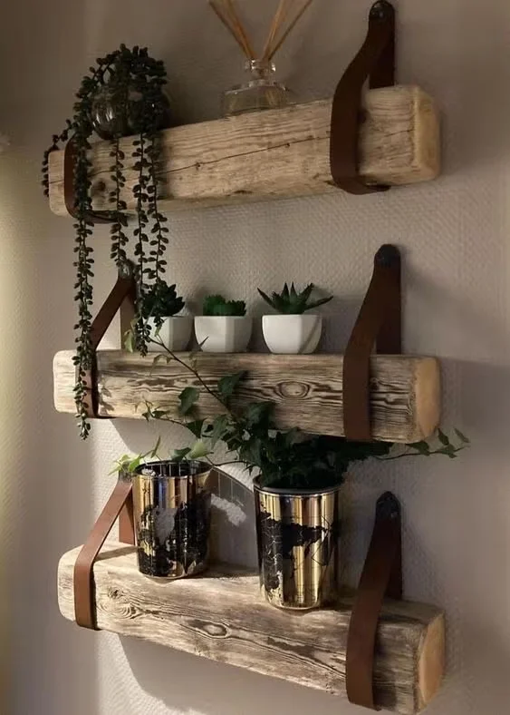
What I find especially appealing is that the shelving combines decoration and storage in a very compact footprint. The shelves extend outward just enough to hold small objects, while the vertical arrangement makes use of wall space rather than floor space. The plants soften the heavier appearance of the shelf material, and the metallic containers introduce a little contrast. It is a practical solution for displaying small decorative pieces without adding a bulky cabinet.
I would borrow the basic principle rather than trying to reproduce every material exactly. A few simple shelves can become much more interesting when the supports are treated as part of the design instead of being hidden. I also like the restrained styling: only a handful of objects are placed on each level, leaving some of the shelf surface visible. That balance makes the display feel intentional and prevents a small storage area from becoming visually overwhelming.
Floating Display Shelves With Collected Decorative Accents
I see a bright corner arranged with several dark brown floating shelves that wrap slightly around the wall, creating a generous display area beside a large window. The shelves hold a mix of decorative objects, framed pieces, vessels, small sculptures, greenery, and a striking bird figurine on the top level. A round textured mirror hangs above one shelf, while two large dark vessels sit directly on the floor beneath the lowest shelf. The light walls and pale flooring keep the overall setting airy despite the deeper shelf finish.
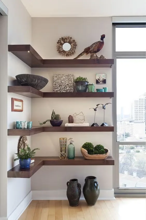
What I like most here is how the shelves turn an otherwise unused wall into both storage and decoration. Because the shelving is open, the objects remain visible and easy to rearrange, which makes this a particularly useful budget decorating idea. Instead of buying one large statement cabinet, I could build the look gradually by adding a shelf and then styling it with pieces I already own. The vertical arrangement also makes good use of the wall without taking valuable floor space.
For me, the strongest lesson is to treat open shelving as a small gallery rather than filling every available inch. The combination of different heights, shapes, textures, and colors gives the display visual variety while leaving enough empty space around the objects. I would use the same principle at home: start with a few meaningful pieces, step back, and only add something when the composition actually needs it.
Compact Entryway With Slatted Wall and Slim Console
This entryway combines a slim wood console with a large rounded mirror and a vertical slatted wall section. The console has a simple natural finish and dark legs, while a woven basket sits on top alongside a few small decorative objects and books. Another basket is tucked underneath, and shoes, a larger soft bag, and hanging accessories are arranged around the slatted section. A trailing green plant adds softness to the otherwise structured vertical lines.
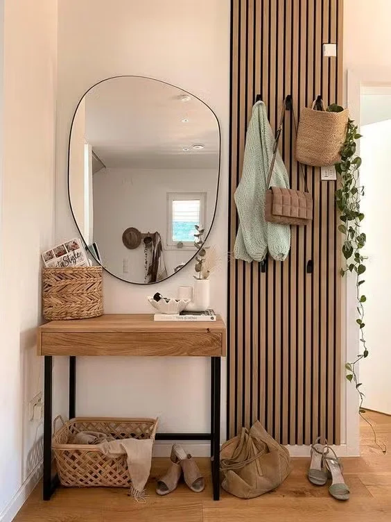
I find this arrangement especially practical because almost every element serves a recognizable purpose. The narrow console provides a landing spot for small everyday items without making the passage feel crowded, while the basket underneath offers additional storage. The mirror is useful for a quick check before leaving the house and also visually opens the compact area. The slatted wall creates a defined zone for hanging items, turning an ordinary transition space into something much more intentional.
If I were recreating this on a budget, I would focus first on the basic combination of a narrow console, mirror, basket, and hooks or hanging points. The decorative styling can come later. I also like the restrained palette here because the natural wood tones, neutral textiles, and greenery work together without requiring many expensive accessories. The result feels organized because the storage is part of the design rather than hidden as an afterthought.
Decorative Console Surrounded by a Sentimental Gallery Wall
The third image features a curved-front console table in a light finish against a soft gray wall. Above it is an extensive arrangement of framed signs, small artworks, decorative lettering, a round ornamental piece, and a central framed display. The tabletop holds a tray, a vase with pale foliage, and framed decorative pieces, while baskets and additional objects are arranged on the lower shelf. The abundance of words and family-oriented messages gives this corner a distinctly personal character.
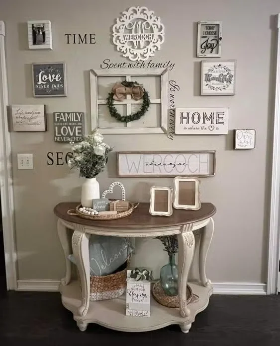
I think the strength of this space comes from the fact that the wall is treated as one large composition rather than a collection of unrelated frames. The console anchors everything below it, while the gallery arrangement fills the vertical space and creates a strong focal point. The lower shelf is also used for decoration and storage, which makes the furniture more useful than a purely decorative table. For a budget-conscious makeover, this approach is appealing because inexpensive frames and printed artwork can create a substantial visual effect.
Personally, I would take inspiration from the layering rather than trying to copy every individual piece. A collection becomes much more convincing when it reflects the people who live in the home. I would choose a limited frame palette, vary the sizes, and arrange the pieces around one central element. That gives the wall a collected feeling while keeping the console area visually connected.
Small Green Corner With Repeated Wall-Mounted Pots
Here, a muted green corner wall becomes the backdrop for a series of black ribbed pots mounted at different heights. Each container holds a green plant, creating a vertical arrangement that follows both walls of the corner. Gold-toned details beneath several pots add a small metallic accent, while white trim and a dark floor create a clean border around the composition. The doorway beside the arrangement keeps the display connected to the rest of the home.
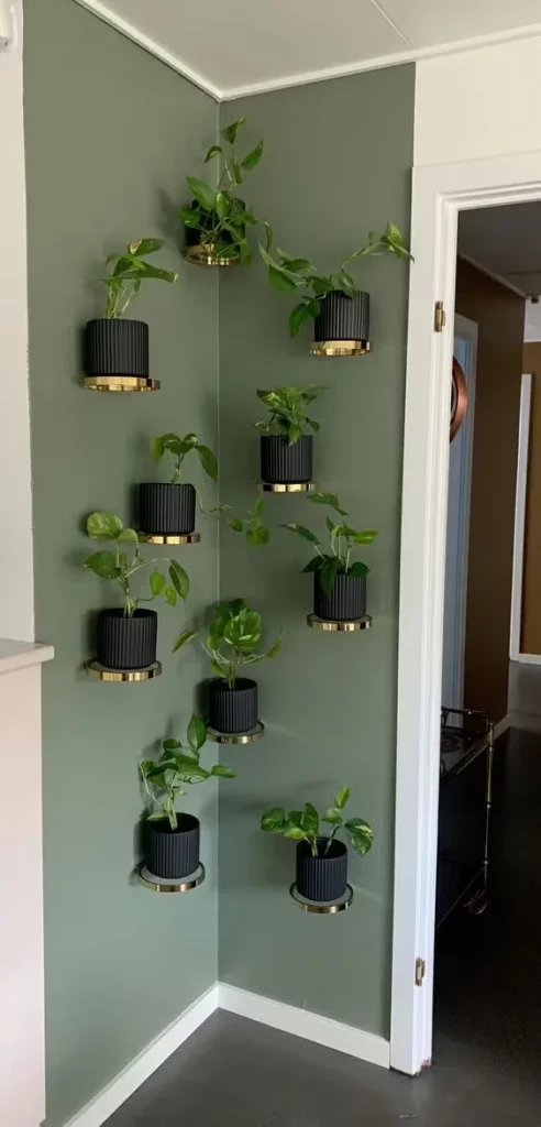
I like this idea because it uses an awkward corner instead of leaving it empty. The repeated shape of the pots creates consistency, while the varying heights keep the arrangement from looking rigid. Since the containers are lifted from the floor, the area remains open and easy to walk through. It is also a clever way to introduce greenery when there is little room for traditional floor-standing pots or furniture.
For me, repetition is the key decorating lesson here. Using containers with the same general shape and finish creates a much more deliberate result than mixing too many unrelated styles. I would also plan the spacing before attaching anything to the wall, because the balance between the two sides of the corner is what makes this display look intentional. A small corner can make a surprisingly strong statement when its vertical space is used well.
Soft Blue-Gray Console With Greenery and Layered Accessories
This room has a blue-gray wall supporting a white four-compartment console cabinet. The cabinet contains books, framed objects, a decorative basket, a metal bowl, and softly illuminated accessories. A large green plant in a woven container sits on top, accompanied by a traditional-style table lamp, while an ornate round mirror hangs above. Warm natural light enters from the adjoining space, creating a relaxed contrast with the cooler wall color.
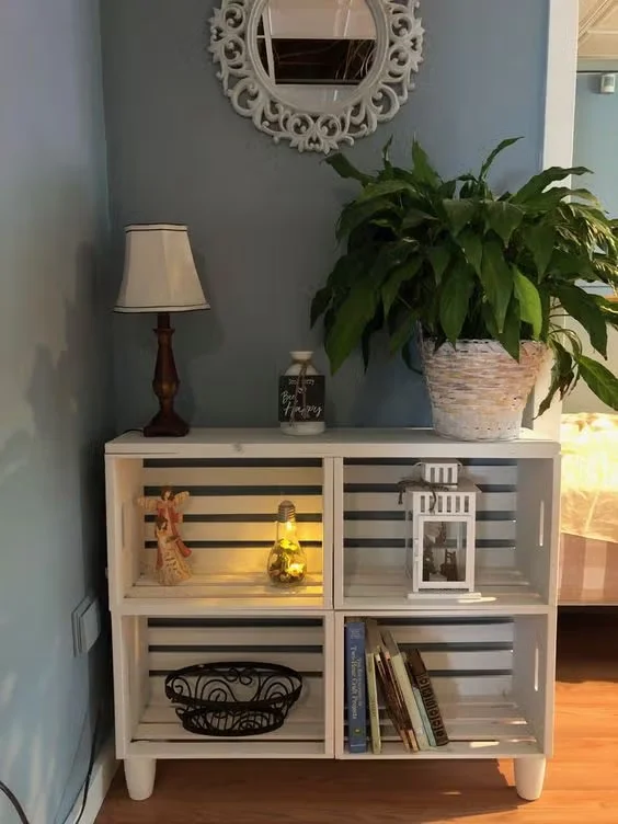
I think this works particularly well because the white cabinet creates a clear visual break against the darker wall. The open compartments provide accessible storage while allowing decorative pieces to remain visible. The large plant adds height above the cabinet, and the mirror brings another layer to the wall without overwhelming the relatively compact arrangement. It feels useful as well as decorative, which is exactly what I look for in an affordable home update.
If I were styling a similar cabinet, I would resist the temptation to fill every compartment. Leaving some areas relatively simple allows books, containers, and decorative objects to remain easy to distinguish. I also like the idea of combining a practical storage piece with one larger element above it, such as the mirror shown here. It creates the impression of a deliberately designed zone without requiring a large amount of furniture.
Repurposed Cabinet Turned Into a Cozy Coffee Station
This image shows a white cabinet with drawers and a framed upper opening transformed into a compact coffee station. The upper section has a dark wood-look backdrop, two small pendant-style lights, narrow shelves, and coffee-making equipment placed neatly across the counter. Small containers and accessories are arranged around the appliances, while the white cabinet below provides closed storage. The curved decorative trim around the top gives the piece a distinctive finished appearance.
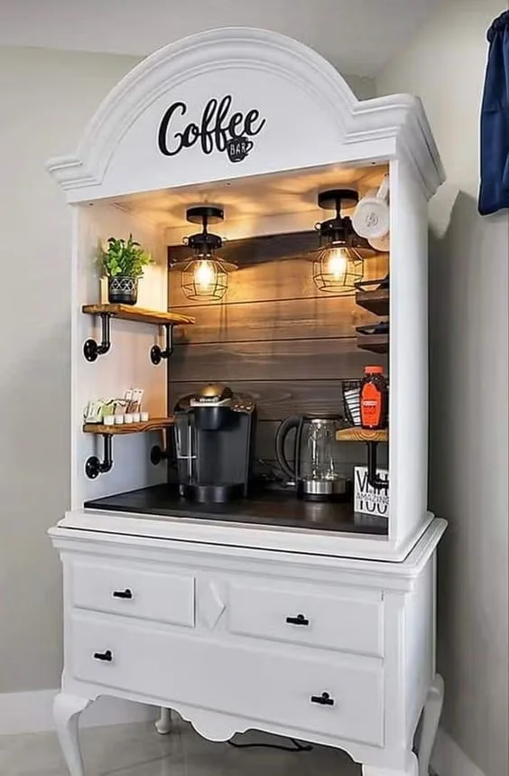
What makes this idea stand out to me is the way an existing piece of furniture can become a dedicated functional zone. Instead of purchasing a specialized coffee cabinet, a dresser-style unit provides both a work surface and storage. The shelves keep frequently used items within reach, while the lower drawers can hold supplies out of sight. Even in a small home, creating one compact station like this can make everyday routines feel more organized.
I especially like this as a budget decorating concept because the transformation depends heavily on styling. The dark backdrop, small lights, shelves, and carefully arranged equipment make the cabinet feel purposeful. If I were attempting something similar, I would first choose furniture with enough surface space for the appliances and then keep the surrounding accessories limited to items that genuinely support the coffee setup. That keeps the display attractive without sacrificing usability.
Black Accent Wall With Horizontal Wood Strip Artwork
A deep black wall provides the backdrop for an installation of narrow wood strips arranged horizontally at different lengths and heights. The irregular pattern creates a strong graphic effect, while a hanging green plant softens the upper right side. More greenery appears near the floor, and a small round bar cart with woven baskets occupies the lower corner. White trim at the base and ceiling provides a crisp transition around the dark wall.
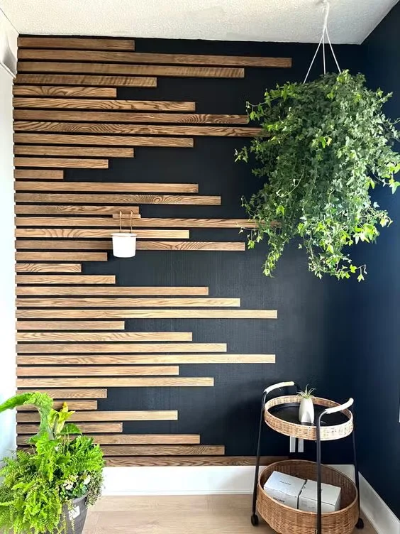
I find this especially effective because the wall treatment creates visual interest without covering the entire surface in a complicated pattern. The different lengths of the strips produce movement, while the dark background makes their natural tones stand out. The bar cart adds a practical element at floor level, and the greenery balances the strong geometry. It is a good example of how one carefully planned wall can become the main decorative feature of a room.
For a budget-friendly version, I would concentrate on the arrangement rather than trying to make the wall overly elaborate. The strips can be positioned with deliberate variation, leaving portions of the dark wall visible between them. I also think the greenery is important to the visual balance shown here because it introduces softer shapes against the straight lines. When a wall treatment is already strong, a few complementary elements are usually enough.
Blue Paneled Wall With Collected Plate Gallery
This sophisticated wall composition features a deep blue-gray paneled background with a collection of decorative plates, small framed artworks, and circular pieces arranged above a narrow dark console. The display mixes blue, white, black, and small touches of yellow and green. On the console are stacked books, a blue vase with delicate branches, a small decorative object, and a black angled desk lamp. The paneled wall gives the entire arrangement a structured architectural frame.
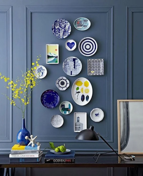
I like how the plate collection becomes the main artwork while the console below keeps the composition grounded. The repeated circular shapes provide consistency, but the different sizes and designs stop the arrangement from feeling too uniform. The books and decorative objects on the console add a lower layer of interest, making the wall feel connected to the furniture beneath it. This is a particularly useful idea for anyone who has decorative plates or small artworks sitting unused around the house.
From my perspective, the most important step would be planning the arrangement before putting anything on the wall. I would begin with the largest pieces, then build outward with smaller ones while keeping enough breathing room between them. The image also shows why a strong wall color can be useful: it allows a collection of inexpensive individual pieces to read as one intentional statement.
Warm Seating Corner With Woven Mirror and Botanical Artwork
This inviting corner combines a green upholstered armchair with a natural wood frame, two neutral cushions, and a small round side table. Above the chair is a large round woven-framed mirror surrounded by framed botanical artwork and small decorative wall pieces. Hanging containers with trailing greenery appear on both sides, while additional greenery sits on the side table and near the chair. A patterned area rug brings together the muted green, beige, and warm pinkish tones of the space.
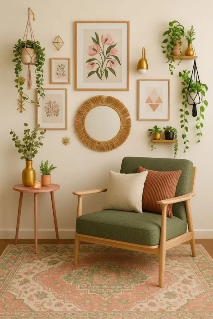
For me, the appeal comes from the layering of simple elements around one comfortable chair. The mirror creates a central anchor, the framed pieces add height and personality, and the greenery gives the wall arrangement a softer outline. The small side table is appropriately scaled for the chair, so the corner feels functional without becoming crowded. Even the rug helps define the seating area as its own little destination.
I would recreate this type of corner by starting with the chair and then building the wall around it rather than buying everything at once. A mirror can provide a strong focal point, while smaller frames and existing decorative pieces can gradually fill the surrounding area. I also appreciate the mix of textures here because the woven mirror, upholstered chair, framed artwork, rug, and greenery prevent the neutral palette from feeling flat.
Entry Bench With Mirror, Baskets, and Layered Greenery
This entry area centers on a light upholstered bench positioned beneath a large rectangular mirror with a woven frame. Bright turquoise and pale blue cushions add color across the seat. On both sides are woven containers holding greenery, while round woven wall baskets with greenery are arranged around the mirror. The floor is light gray, and the pale wall creates a calm background that allows the blue accents and natural textures to stand out.
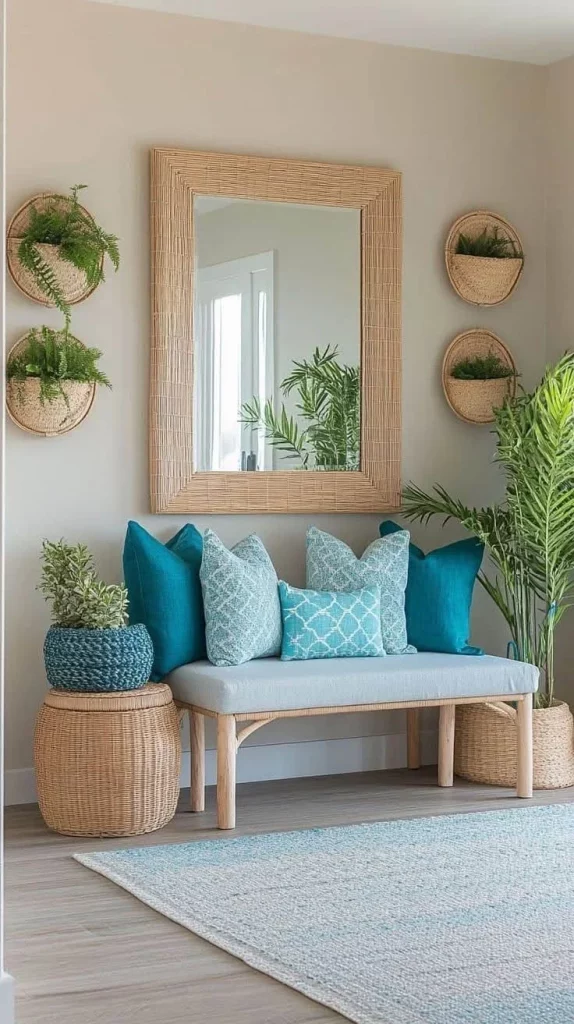
I think this is a strong example of making an entryway feel welcoming without filling it with large furniture. The bench provides a practical place to sit while putting on or removing shoes, and the baskets can help contain smaller belongings. The mirror adds everyday functionality and visually enlarges the area, while the repeated woven textures connect the different pieces. The blue cushions give the otherwise neutral arrangement a clear accent without overwhelming it.
What I would borrow from this image is the idea of repeating a few materials instead of buying many different decorative objects. The woven frames and baskets create continuity, while the cushions supply the color. For a budget makeover, I could work with an existing bench and simply introduce a mirror, baskets, and a few coordinated textiles. That would change the character of the space without requiring major construction.
Warmly Lit Living Corner With Floating Shelves
This cozy corner uses three dark floating shelves against a warm neutral wall. Each shelf displays framed botanical artwork, a small plant, a vase, and a few carefully spaced decorative pieces. Warm lighting beneath and around the shelves gives the wall a soft glow, while a neutral sofa occupies the lower right corner. A textured wall hanging adds interest on the adjacent wall, and a patterned rug grounds the seating area.
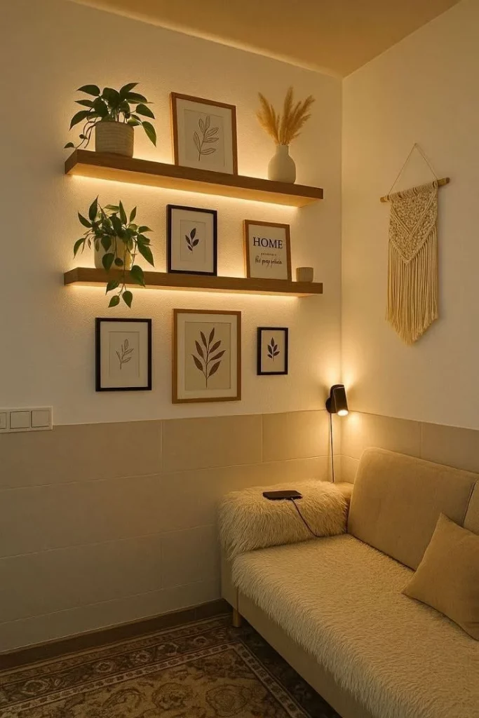
I particularly like the way the shelves provide both decoration and ambient lighting. The illumination separates each shelf from the wall and makes the artwork and accessories more noticeable in the evening. Because the sofa sits directly below the composition, the shelving effectively becomes the visual backdrop for the seating area. The limited palette of warm neutrals, dark frames, and natural accents keeps the corner cohesive.
If I were adapting this idea, I would pay attention to the height of the shelves in relation to the sofa. The arrangement works because the wall display feels connected to the seating rather than floating too high above it. I would also use lighting selectively, since the image demonstrates how a relatively simple shelf becomes much more atmospheric once it has its own gentle illumination.
Textured Wall Gallery Above a Deep Sectional Sofa
The final image features a large dark gray sectional sofa with tufted upholstery and a combination of cushions in neutral, black, and mustard tones. Above the sofa is a prominent cream-colored macramé-style wall hanging, surrounded by round woven wall pieces, hanging greenery, and framed artwork. The arrangement extends across the wall without feeling completely symmetrical, while the sofa occupies most of the lower portion of the room.
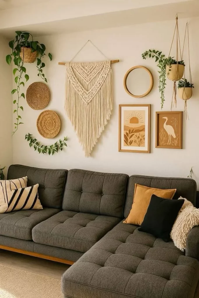
I like the balance between the substantial sectional and the lighter decorative wall treatment. The large textile creates a clear focal point above the sofa, while the smaller circular pieces and framed artwork help spread visual interest across the wall. Greenery adds another layer of texture, and the mustard cushion introduces a warm accent against the charcoal upholstery. The result feels comfortable and decorated without relying on a large number of furniture pieces.
For me, this photograph is a reminder that the wall behind a sofa can completely change the personality of a living room. Rather than replacing a perfectly good sectional, I could refresh the space by concentrating my budget on one substantial wall feature and then building around it with smaller pieces. I would keep the largest artwork or textile near the center and use the surrounding elements to create balance, just as this arrangement does.
Beautiful home decor ideas on budget prove that a stylish space does not have to come with a high price tag. I love how simple touches like textured textiles, creative wall decor, practical storage, and thoughtful furniture placement can completely refresh a room. The best results often come from combining what you already own with a few carefully chosen affordable details. I hope these ideas inspire you to experiment and create a home that feels comfortable, personal, and beautifully styled without overspending. Leave a comment and share which idea you liked most!